On our next installment of Behind the Stationery, we’re bringing you to Bunny Bear Press in the great state of Washington! For Adina, taking great strides to pivot her stationery business came from a rediscovery of herself and her business. From discontinuing her greeting card line to dyeing her hair purple, Adina divulges us in the ways she has changed her business perspective, time management, and even the way she decides what to design. Here to share about her journey, design process, and favorite resources, here’s Adina! –Megan Soh
From Adina: Here is the long-short version of how my first line came to be and why I decided to kill it. I fell in love with letterpress printing back in college. After the job market crash in 2008 and the birth of my first daughter in 2009, I decided I wanted to work from home and become a letterpress printer. I bought a tiny toy press and did a ton of playing.
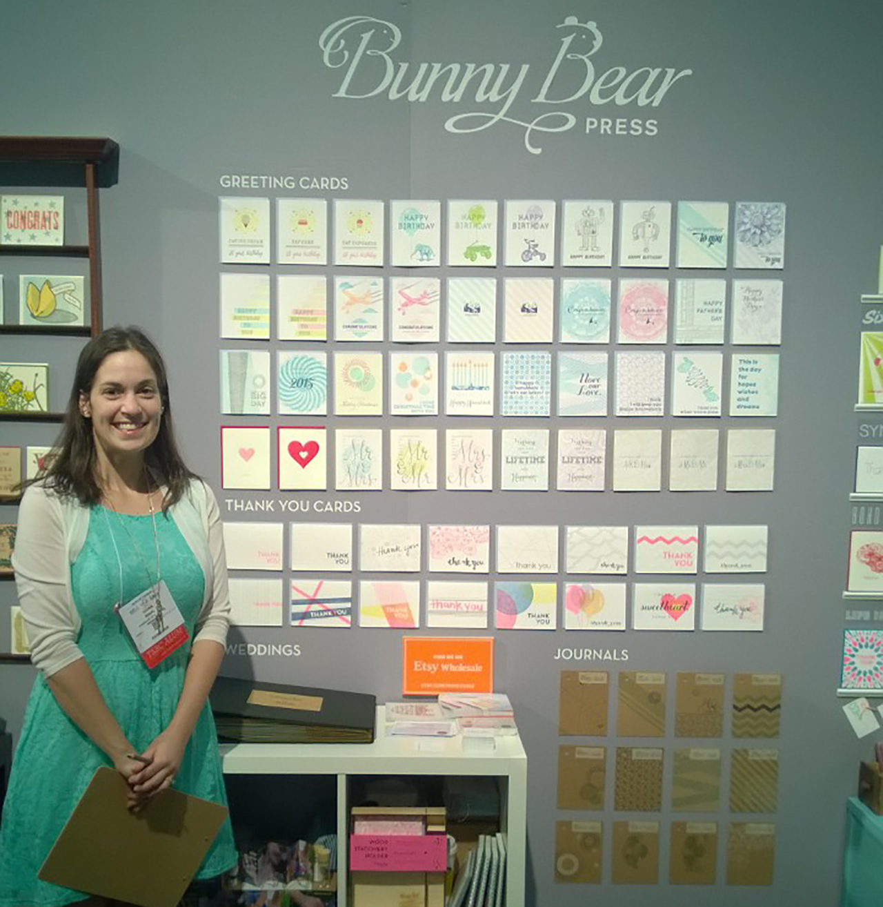
In 2013 my husband, my parents, and I drove my (then) 2 kids down to Portland to buy my first big ass letterpress machine. Six short months later, I had signed up to do the 2014 National Stationery Show in a HUGE group booth with the Ladies of Letterpress.
 Left: Penny, my 45 pound Kelsey 3×5 printing press, Right: Ruby, my 1,800 pound Chandler & Price 10 x 15 printing press
My professional background had been in print design, but I had only ever worked for other brands. While creating work for my debut launch I was exploring and trying finding my style and visual voice for the first time. Looking back, I think I ultimately played it safe with generic wording on my cards, beautiful found clip artwork, mixed with some minimal original illustrations.
I had no idea what I was doing. I didn’t really know much about how to define my target market, or really which direction I wanted to take my brand in. It was very much a trial by fire and I dove in head first. I found Tradeshow Bootcamp, created a huge amount of work in 6 short months, and headed off to NYC for the first time to the National Stationery Show. I wrote some orders, made some contacts, learned a TON, went to the incredible OSBP Paper Party, and came home pregnant with baby #3.
During the next 2 years I went through a transformation. My business wasn’t growing, my son wasn’t sleeping, I was becoming more and more sleep deprived and feeling more and more lost about what to do about my business.
Everything changed for me when I found podcasts and rediscovered a desire to create hand lettering. I was big into the seanwes podcast, and Confessions of a Female Entrepreneur. I was introduced to marketing and business strategies, I learned about target markets, crafting stories, and finding my WHY. Through all the brand soul searching I found something I didn’t expect. I realized that not only was my brand middle of the road, so was I. I had played it safe (in life and in business) and in doing so, not only was I not turning people off, I wasn’t turning people on either. My few close true friends knew the real me, but to everyone else I felt as though I was a hollow facade.
So I did what anyone would do while going through an existential crisis: I dyed my hair purple, pulled away the barriers between myself and the way I present myself to others, pursued my consuming desire to draw letters, and began to express my inner monologue through my card line and blog.
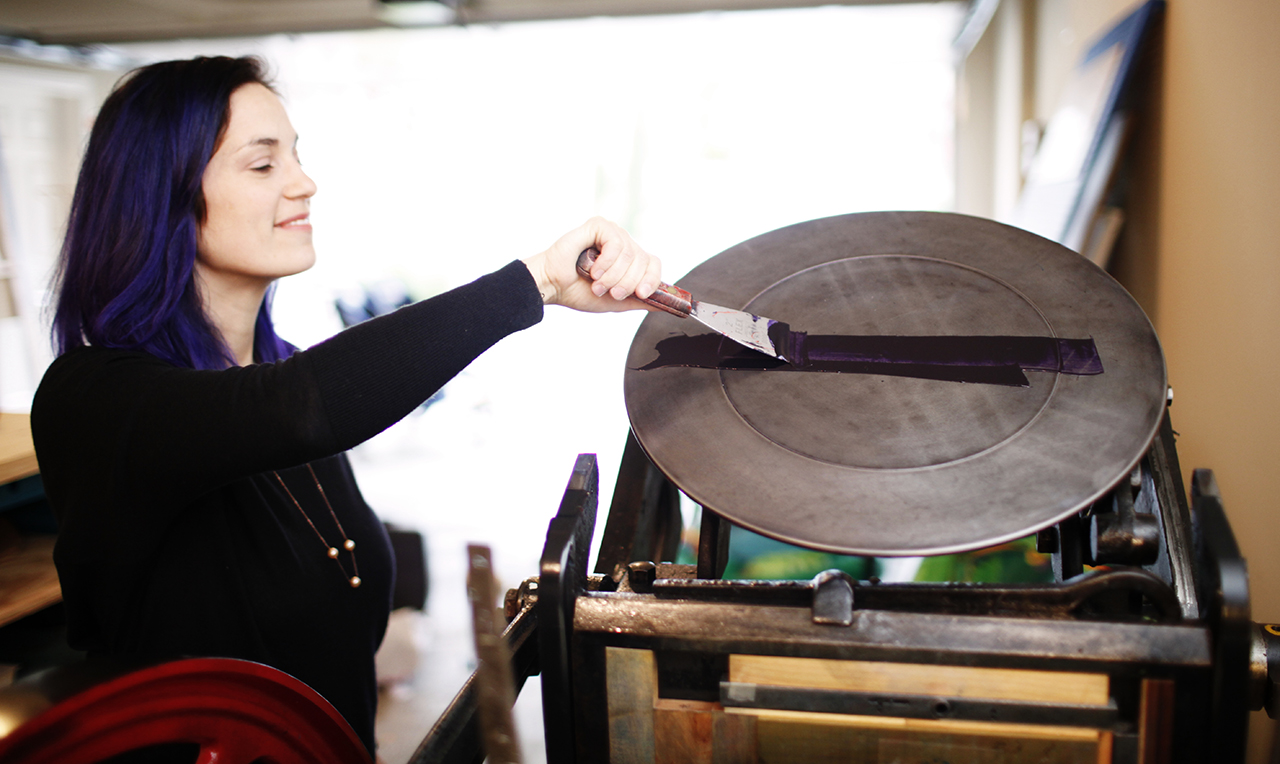
Photo by Belathée
It was during these 2 years that I determined that my “safe designs†weren’t serving me OR the people I was trying to help. So I killed them all.
I took on a 365 lettering challenge to force myself to create and not to become so attached to each of my drawings. In doing this I helped to push aside my perfectionism and instead focus on creating a large body of work. The natural result of doing so many was that I improved my technique. And in letting go of a little bit of my perfectionism, I had so many lettering pieces that I felt were good enough as opposed to 1 or 2 that I could never finish because they were never quite right. I know looking into the future I will be a better letterer for it, and with the work I am making now I can help my target audience today and not in some imaginary distant future.
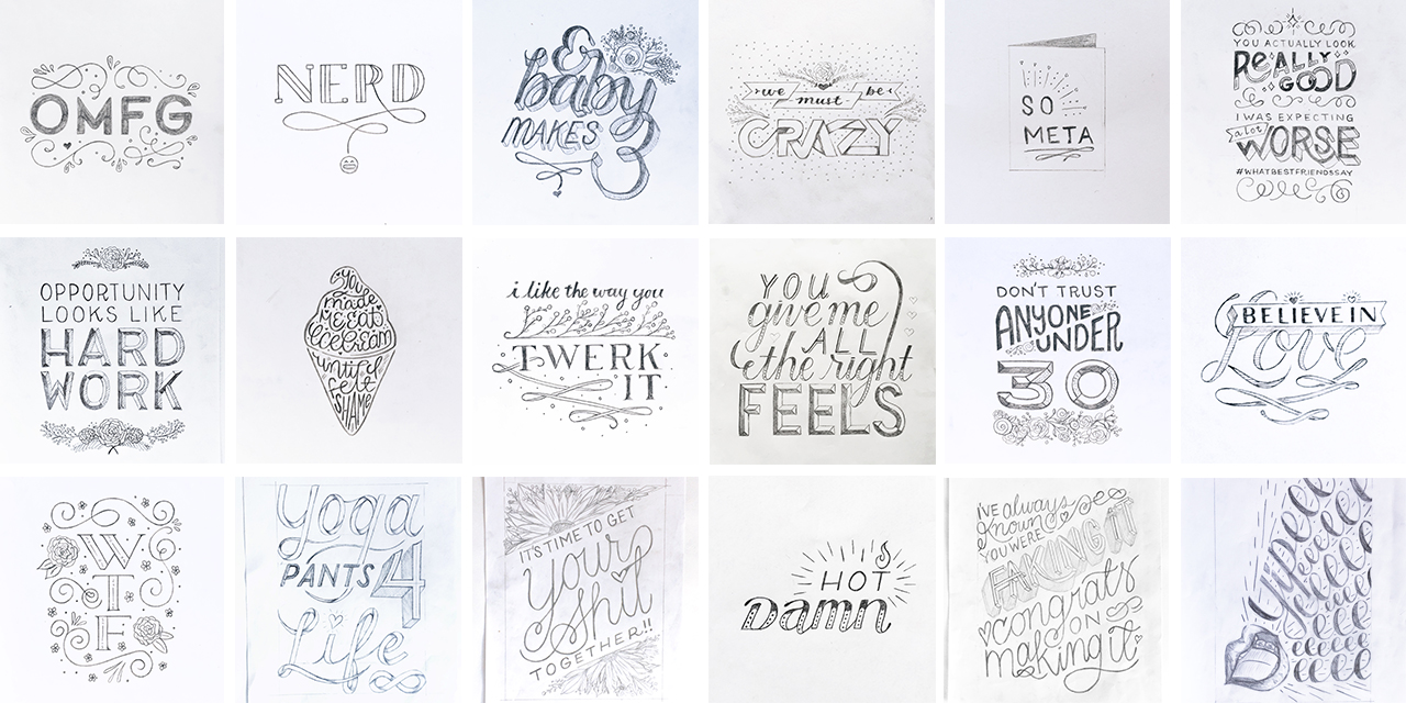
I didn’t make 365 lettering pieces but I did do well over 80 and that was 80 more than I had ever done before. I learned that, in the doing, my creation process is very cyclical. I work in batches like on a production line. So first I sketch a ton to pieces, then I ink them all, scan them into the computer and send away for a large volume of plates at once. (This also helps me save on shipping costs and I never sit on designs waiting to fill up an order.) Once my plates arrive I can now print them in batches.
In letterpress printing you can only print one color at a time so I will print all the cards with pink, for example, before moving on to the next. This allows me to maximize my press time and to minimize the number of times I switch colors.
My original line was a whopping 27 core colors and some cards were as many as 6 colors all on their own. I learned really fast that when you needed to print a ton of cards that were similar colors it is easier to get a large volume of them done, but when having to reprint just one card in those 6 colors suddenly you had a huge problem. The amount of labor required no longer justified the cost of that $5 card (retail and even less for wholesale).
Right now my typical day is all over the place, and I wouldn’t recommend my schedule to anyone. Once all of my 3 kids are old enough to be in all day school, I am hopeful things will get more consistent. I wake up between 5 and 6am before my kids get up to write for my blog. This is the time of day where I am my most focused. On the days I start with writing I find that I feel more productive overall than on the days that I don’t.
At 7 am, my husband and I work on getting my kids out the door and to their various schools and daycare. On the 3 days a week my son goes to daycare, I have 2 and a half hours to work before I need to pick my middle daughter up from preschool. It’s in these hours that I will draw, print, or send emails to my list of stores and buyers I would love to work with.
The end of my work day is after the kids go to bed around 8:30pm. During this time I try to finish up on the tasks that didn’t get done during the day. Like I said, I wouldn’t recommend this schedule to anyone. There is always too much to do and not enough time to do it.
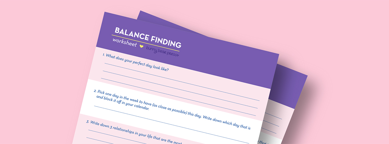
In order to figure out what to focus on in my limited hours, I look at my balance finding worksheet that I filled out for myself (you can read more about this worksheet here). I look at what I goals I set for myself and then try to only focus on the tasks that will get me there. This really helps me cut through the noise of ALL THE THINGS that are screaming for my attention. Right now my team consists of myself and a friend who occasionally helps me with packaging cards. Delegating the packaging production was a huge relief and I don’t know why I waited as long as I did to bring in help there.
If I had to give any advice to my younger self starting this company, it would be to focus on the people you are trying to help. Create something that they will love and be drawn to. In order to create that desire you are also going to turn other people off and that is OK. Don’t try to please everyone because in the end you please no one, not even yourself.
Have fun, be curious and let that curiosity and the fear you feel about doing something unknown be your guiding compass. Fear is something to be embraced because on the other side of that fear are your dreams and if you want them you need to go and get them.
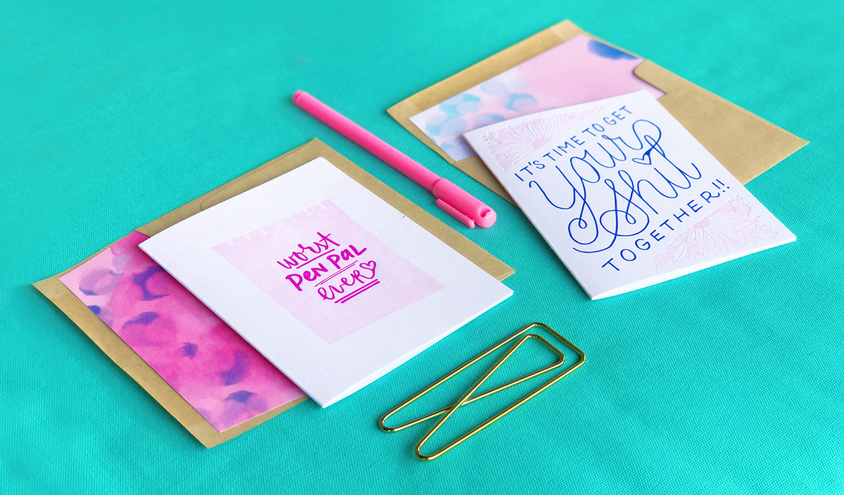
Pushing through my fear and following my curiosity has renewed my passion for paper and making greeting cards. I feel good when I am creating the designs and feel excited once I see them come out of my printing press. Before I began lettering my cards the task of design felt more like a chore, but now I have lists and lists of cards I want to create.
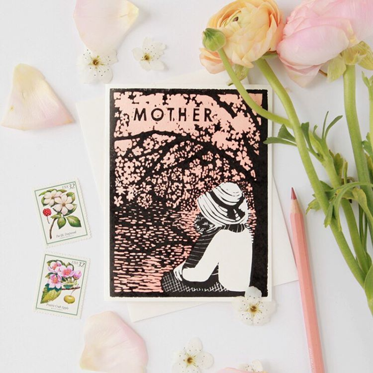
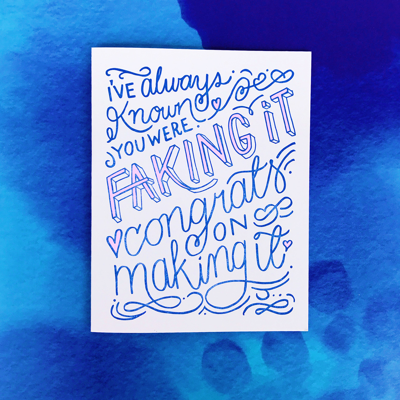
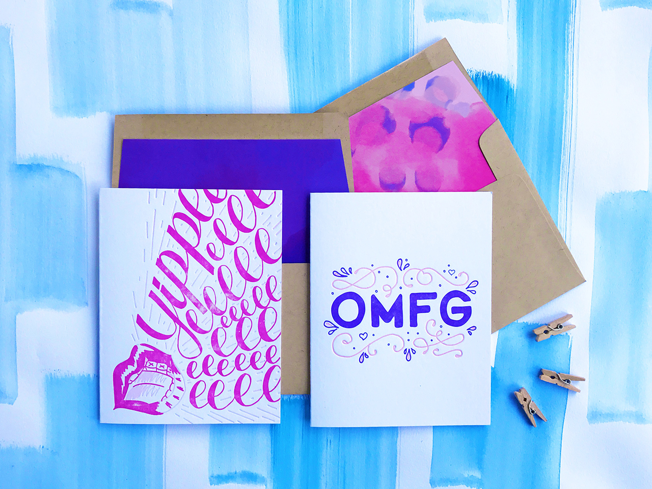
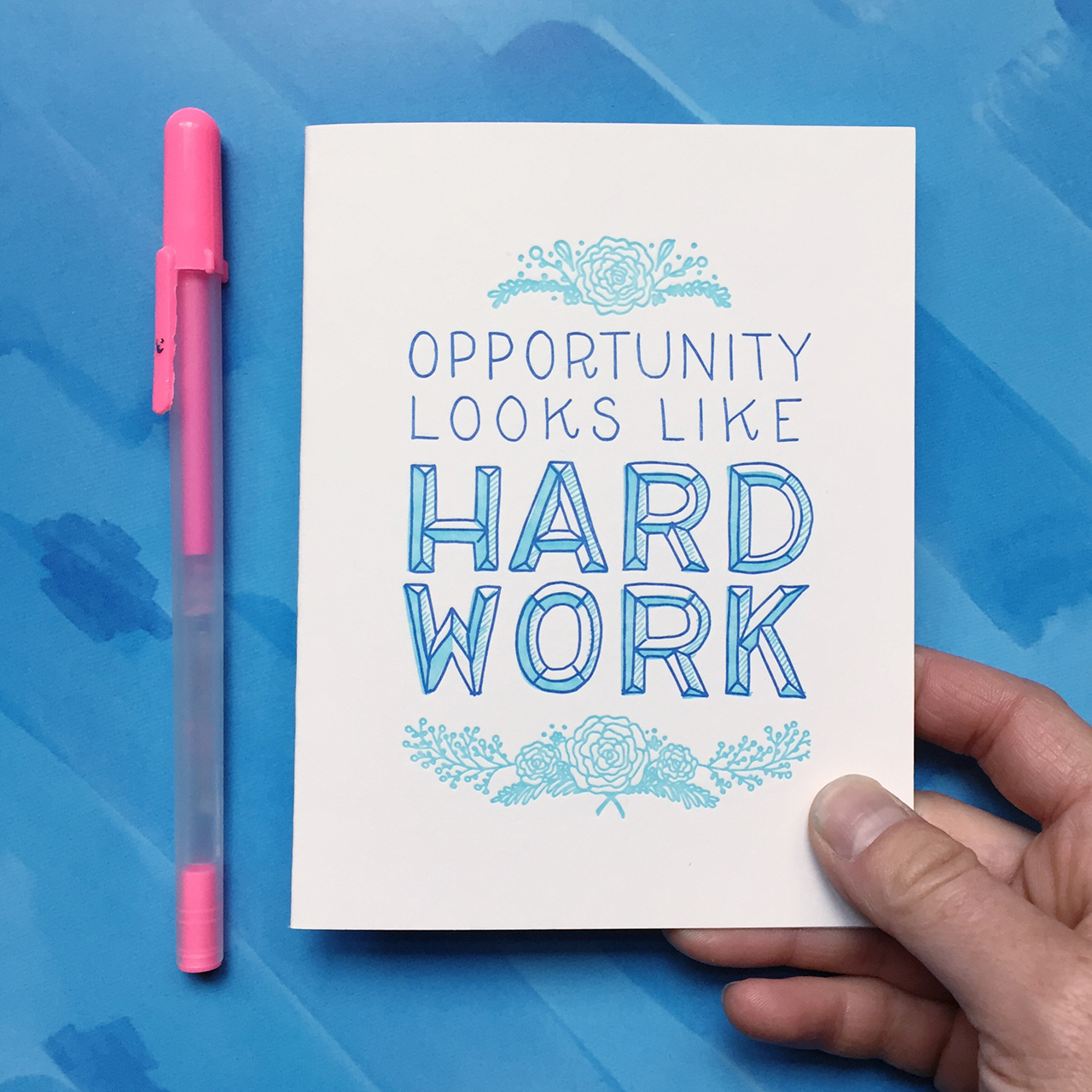
I am really excited about my newest release! Here are some photos from my newest release. The new cards are available wholesale now and will be shipping to my website customers starting June 15th.
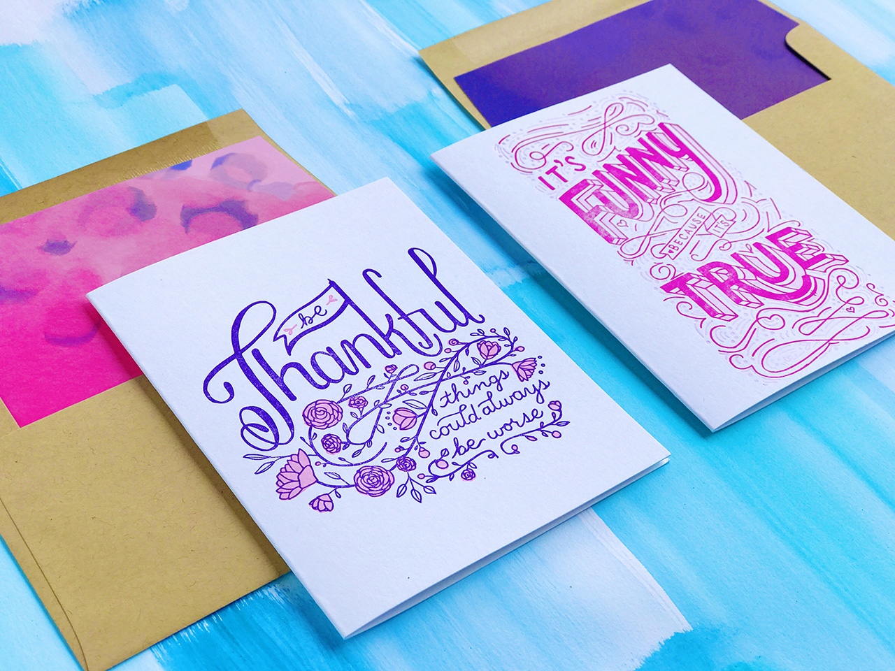
All photos courtesy of Bunny Bear Press except where noted.
Want to be featured? Reach out to Megan at megan[at]ohsobeautifulpaper.com for details.



 Left: Penny, my 45 pound Kelsey 3×5 printing press, Right: Ruby, my 1,800 pound Chandler & Price 10 x 15 printing press


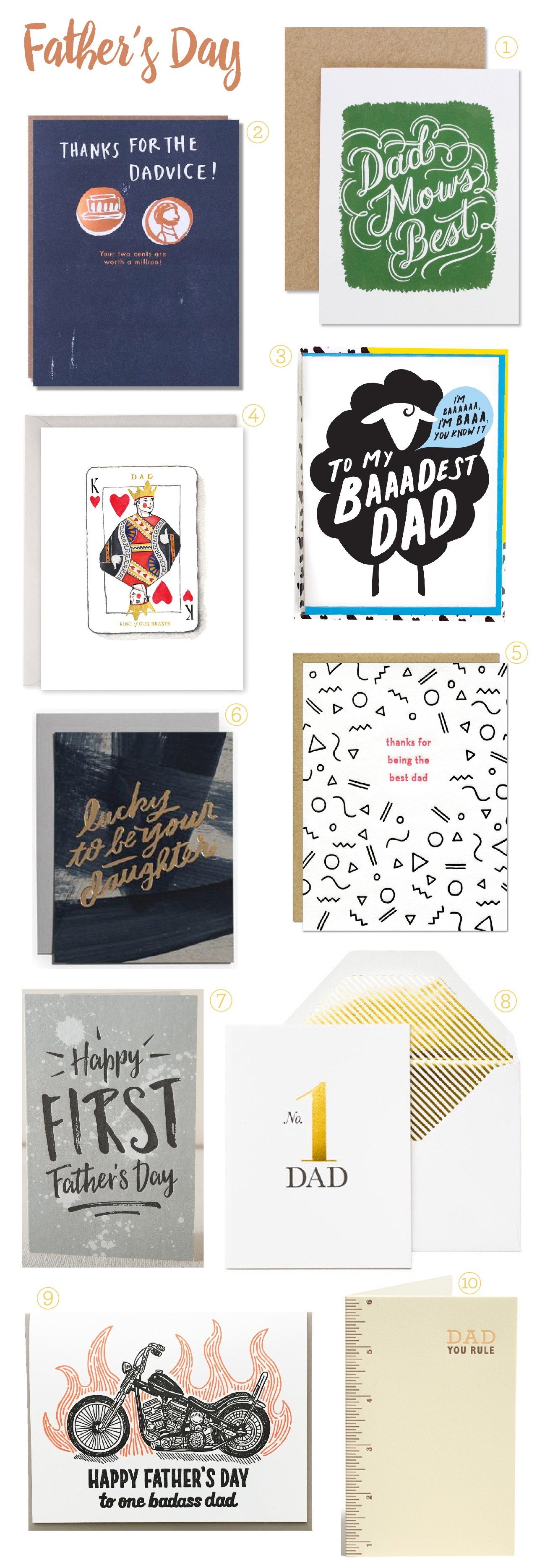
 From top right: