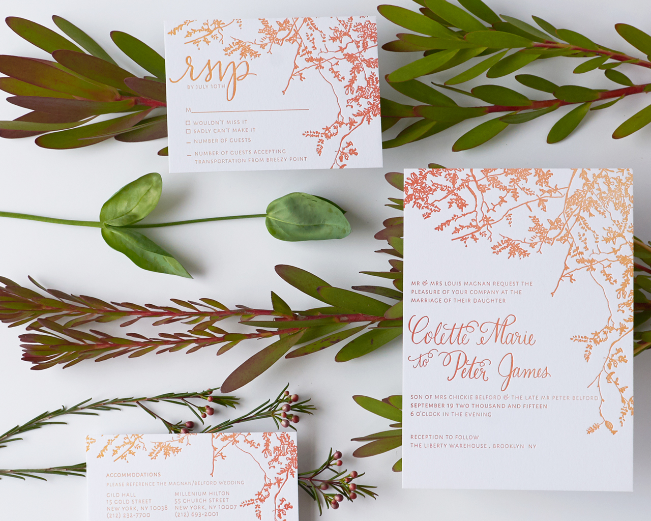
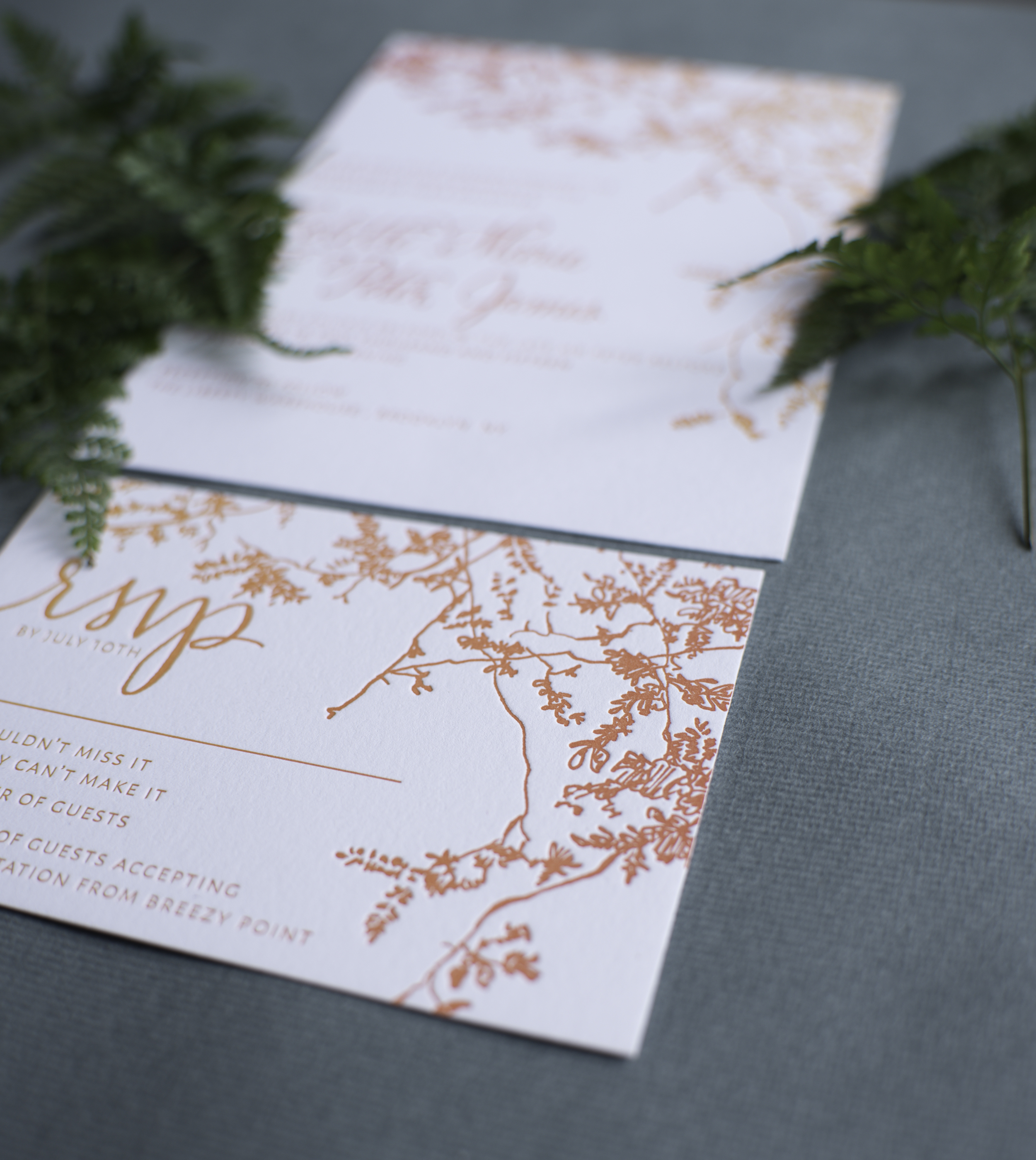
I always love the colors of changing leaves in Autumn: crisp red, warm orange, and bright yellow. To create these autumn ombré letterpress wedding invitations, Alex of Al Stampa utilized one of my favorite letterpress printing techniques – the split fountain – to create a wonderful color gradient that evokes all those wonderful autumn colors. Can’t you just see everyone gathered around a fire drinking a cup of warm apple cider??
From Alex: This wedding invitation was designed for a sweet couple, Colette and Petey. They wanted a colorful, fire crackling, leaf-turning, autumn wedding, and we wanted to inspire guests with the first piece everyone would receive… the wedding invitation!
The wedding took place in Red Hook, Brooklyn at the Liberty Warehouse – right on the water. Colette was the mastermind behind everything having to do with planning her wedding, and she took it all on her own shoulders. It was such a pleasure to be able to take this portion of the wedding planning away from her and ease her to-do list.
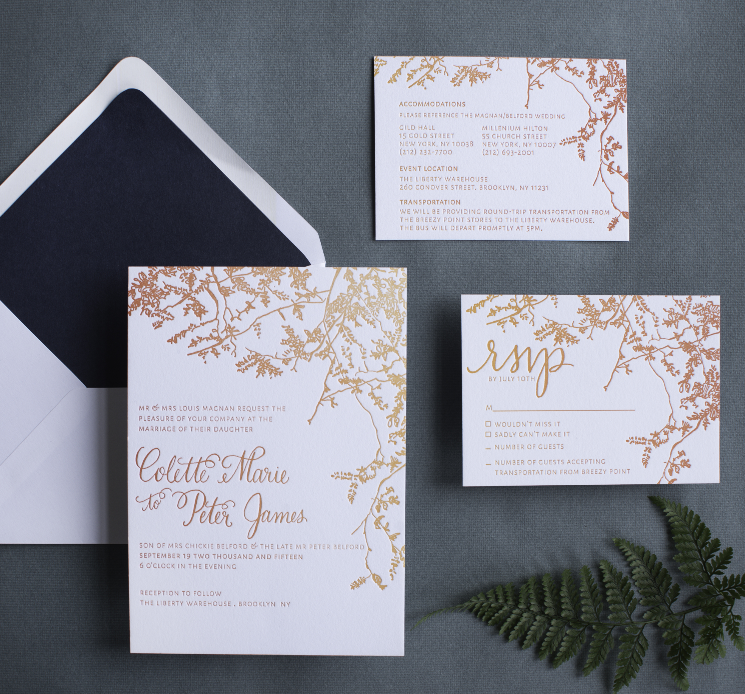
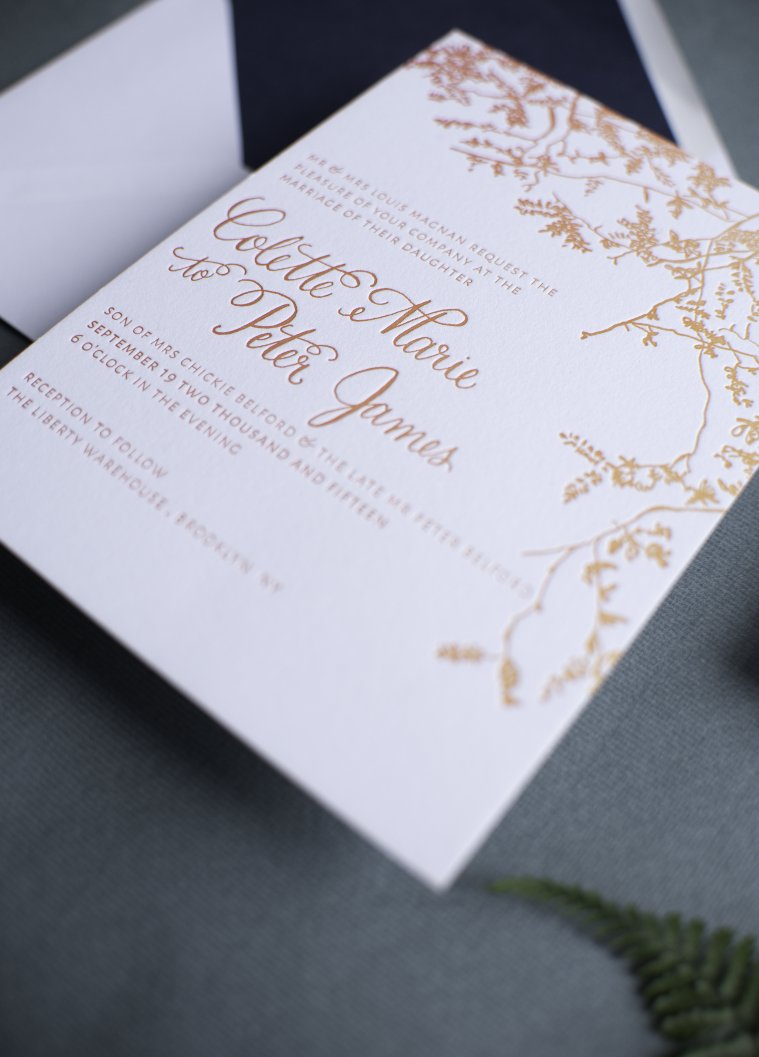
Because coloring is so important with an autumn wedding, and the fact that it can become quite pricey to letterpress multiple colors, especially for a wedding of 200+ people, I suggested we treat the press, and how I print the colors, similarly to how nature treats the trees in October. We decided to use an ombré technique called a split fountain to make the amazing colors of the season the focus, by inking up the press with various yellows, oranges, and reds and letting it do its work on each invitation. In doing this, each invitation came out a bit different, but with the same amazing gradient effect.
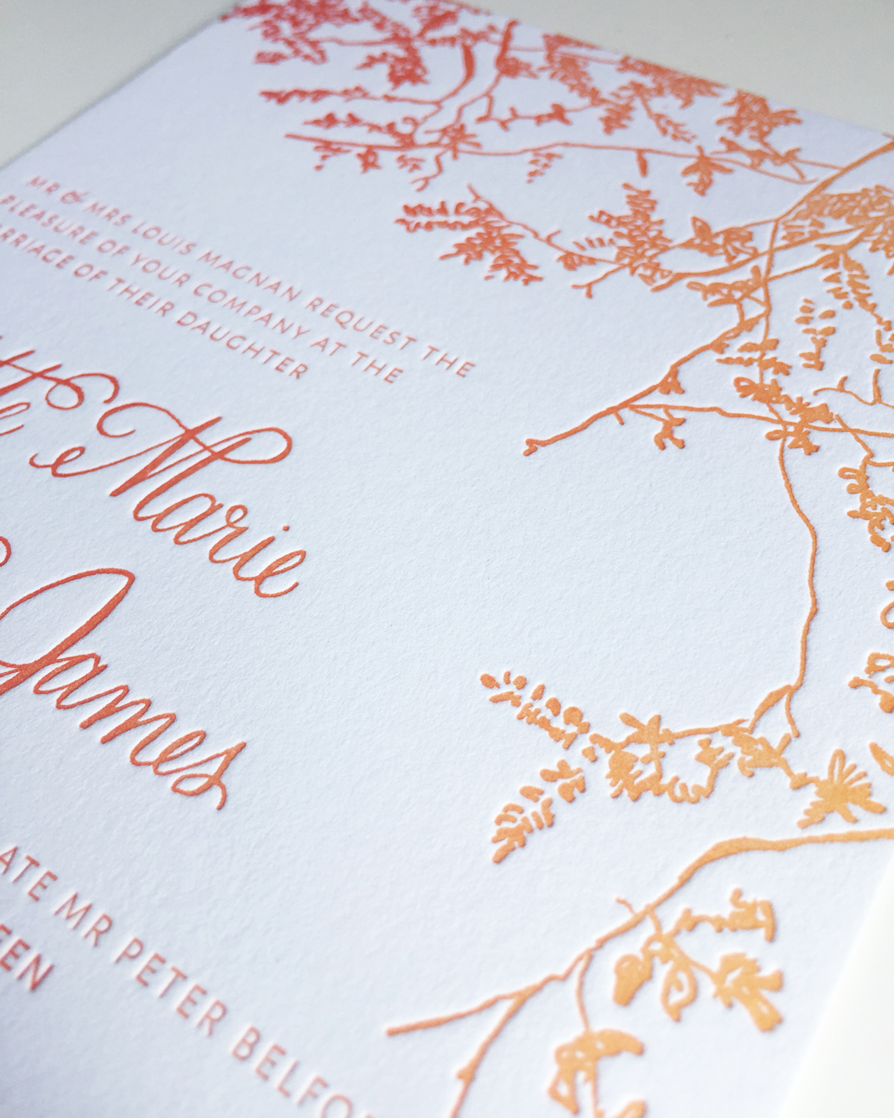
The illustration of the branches and leaves were meant to take over the invitation, and also create a large illustrated area that would absorb the ink’s changing of colors perfectly. We paired the branch illustrations with lovely calligraphy by Ashley Curry and a modern typeface to maintain the modernity of the wedding invitations and complement the wedding’s modern warehouse venue. Printed on 120 lb Reich Bright White paper, the invitation had a wonderful heaviness to it – and the beautiful ombré colors made these invitations something really special!
Thanks Alex!
Design, printing, and styling: Al Stampa
Calligraphy: Ashley Curry
Paper: Reich Paper
Check out the Designer Rolodex for more talÂented wedÂding inviÂtaÂtion designÂers and the real inviÂtaÂtions gallery for more wedding invitation ideas!
Photo Credits: Roland Kielman and Alex Labriola