Welcome to Behind the Stationery! After a brief hiatus, we’re excited to jump back into this fan favorite series with behind the scenes peeks and advice from some of our favorite stationers. Today we’re joined by Isabel Davis, the designer and owner behind 9th Letter Press. Isabel is here to share her story with us, including how she decides which designs make it to print, how she ruthlessly edits her collection each quarter to keep inventory under control, and her design secret for making sure her collection stays true to brand. Welcome Isabel! –Megan
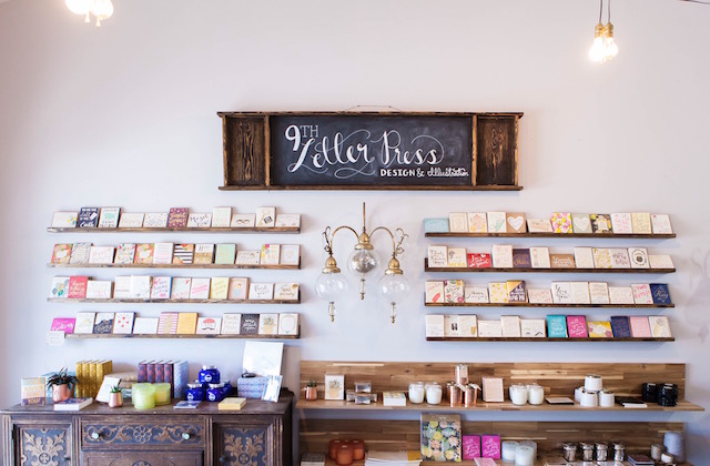
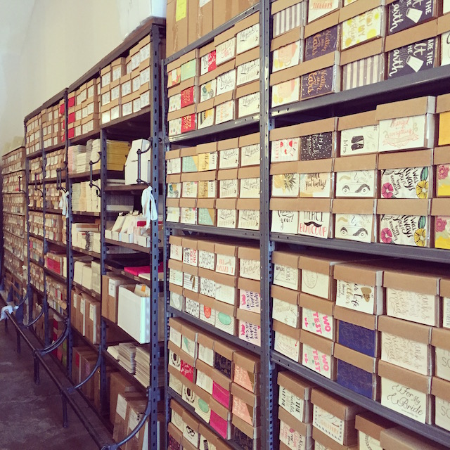
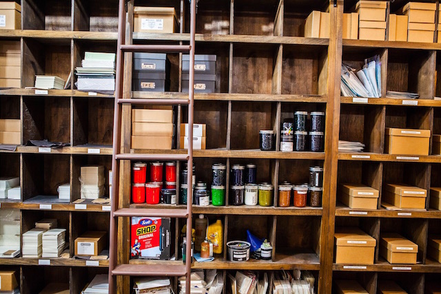
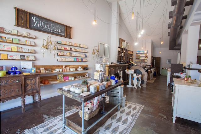
From Isabel: 9th Letter Press is in the heart of Winter Park, Florida. Our studio houses every part of our business — our letterpress, production and assembly, office area, and retail store. We moved in almost in five years ago and haven’t looked back since. We love our location, even if at times it does feel like we’re literally swimming in paper, envelopes, cardboard boxes, and tissue paper.
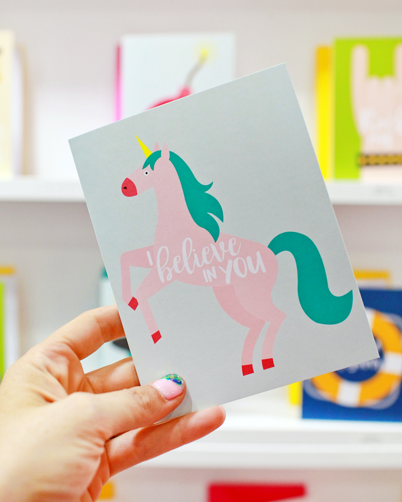
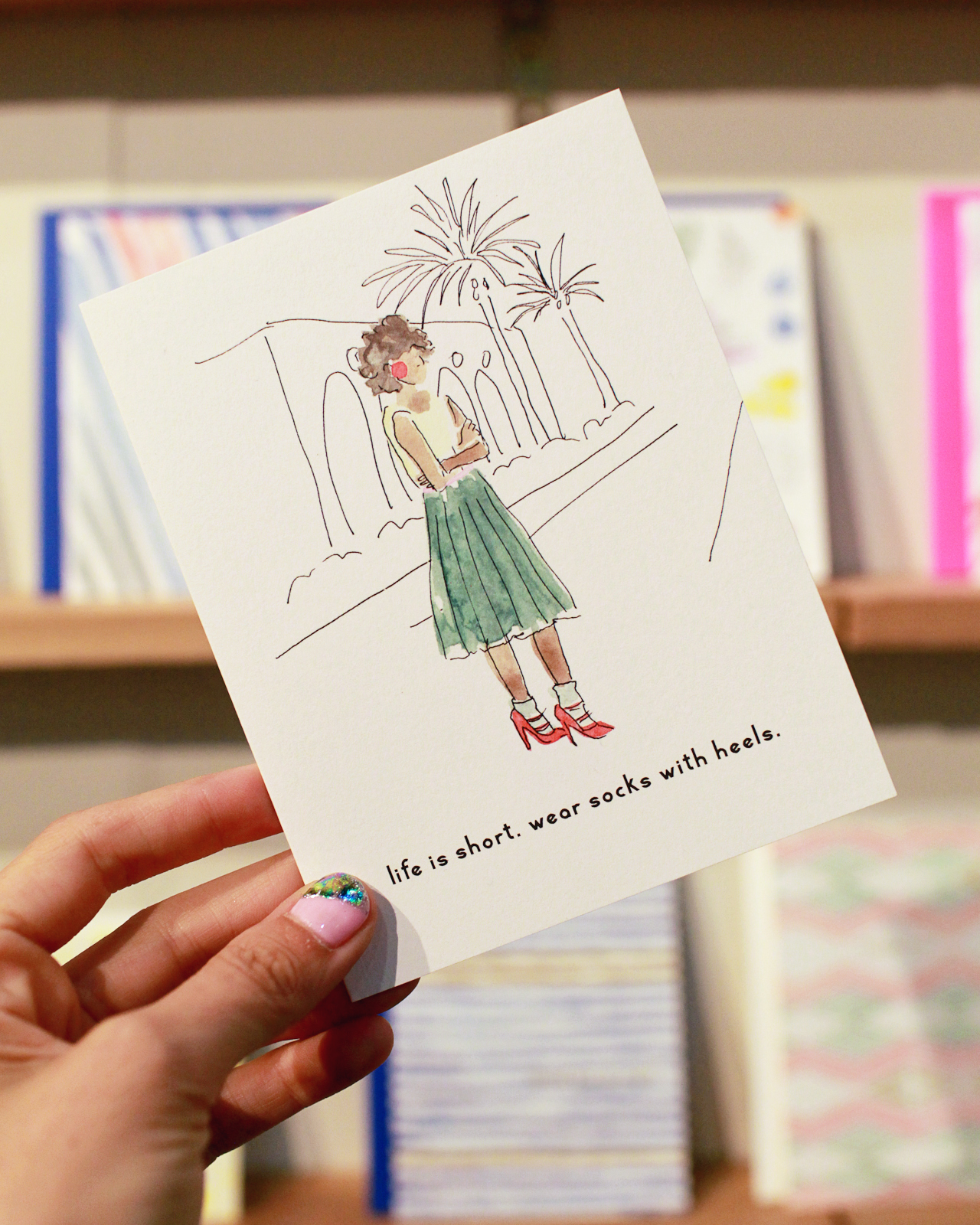
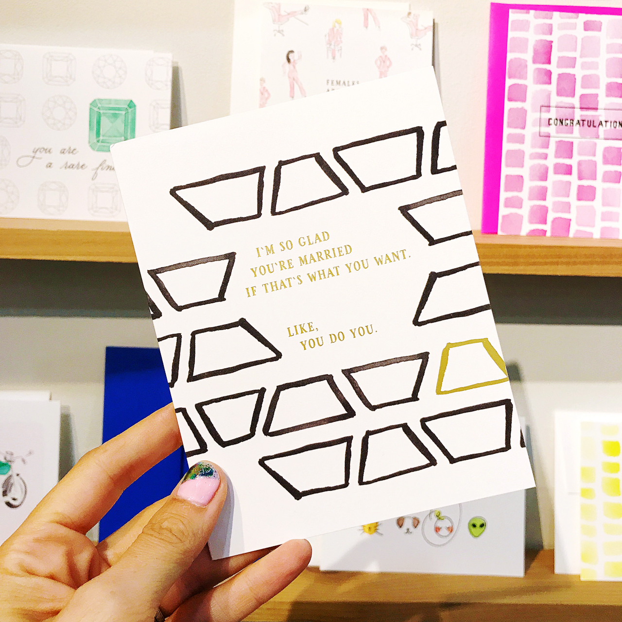
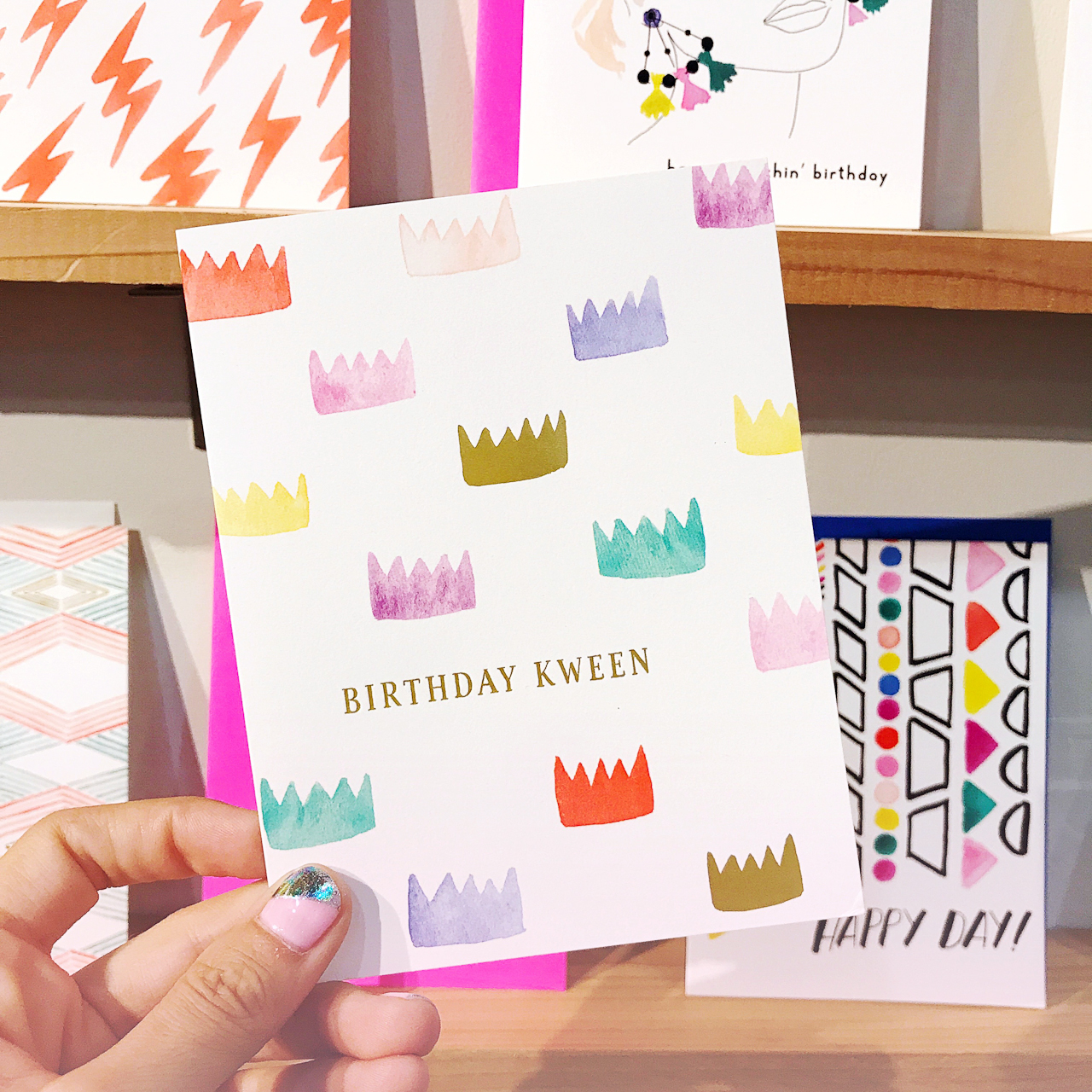
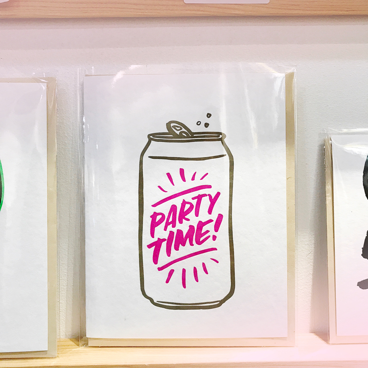
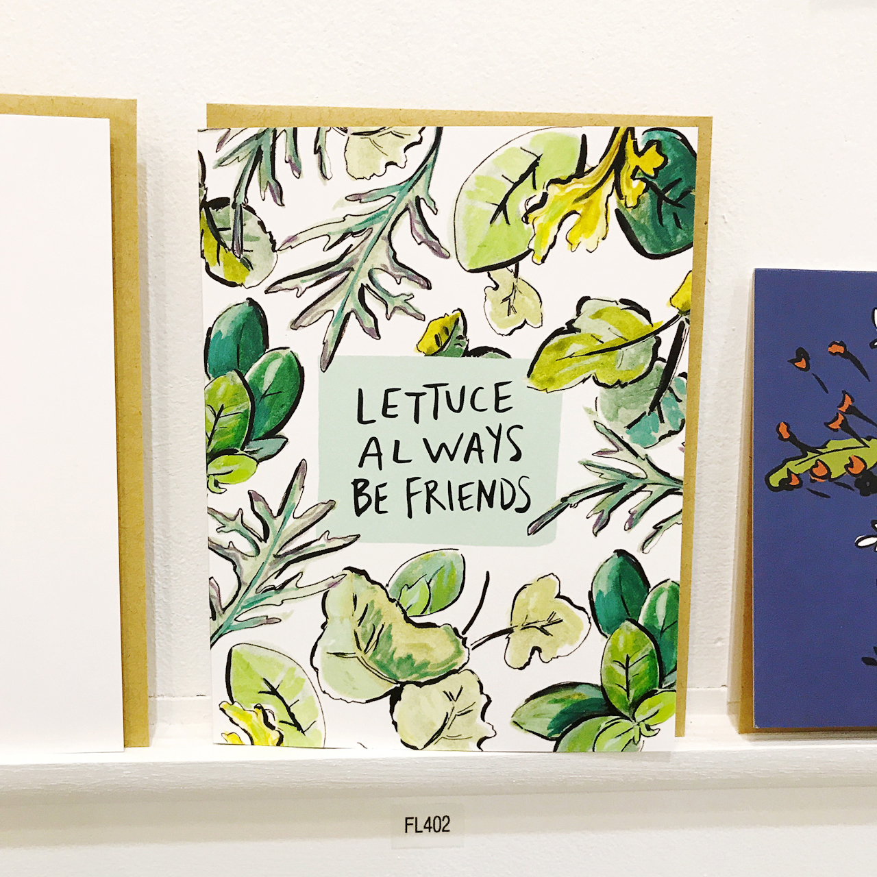
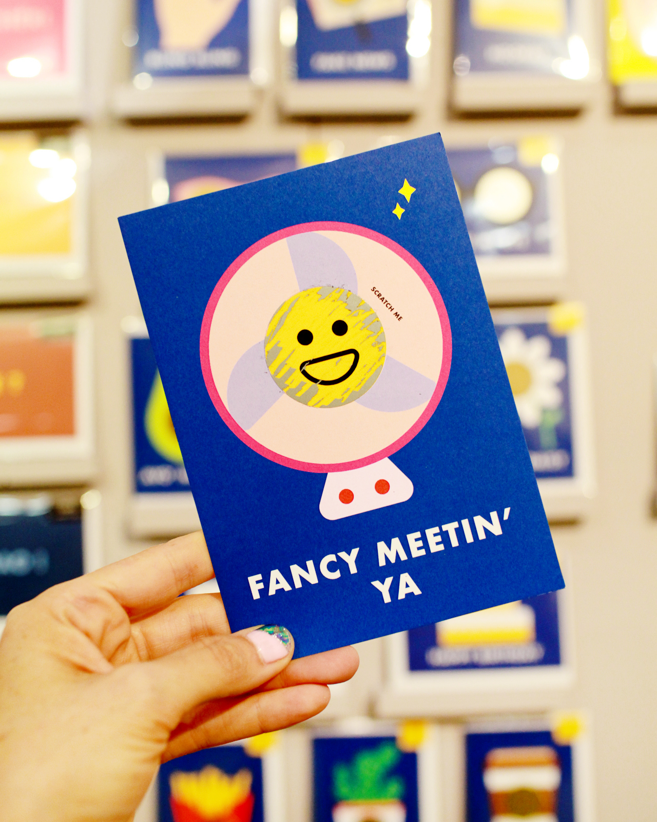
The stationery world is a saturated industry and I had to come to terms with the breadth of stationers out there — it’s grown tremendously since I first started! At first, I tried to offer so much and so many things to keep up. But after a while, I noticed our best sellers were the products I started the business with: charming and whimsical stationery with a blend of pretty and quirky lettering (bonus points if I could wrangle in an illustration).
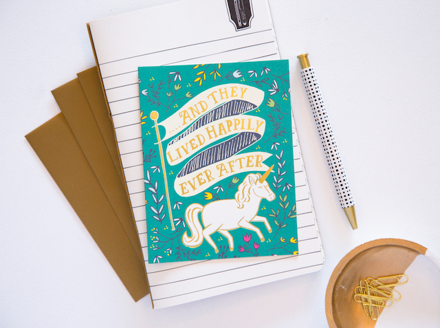
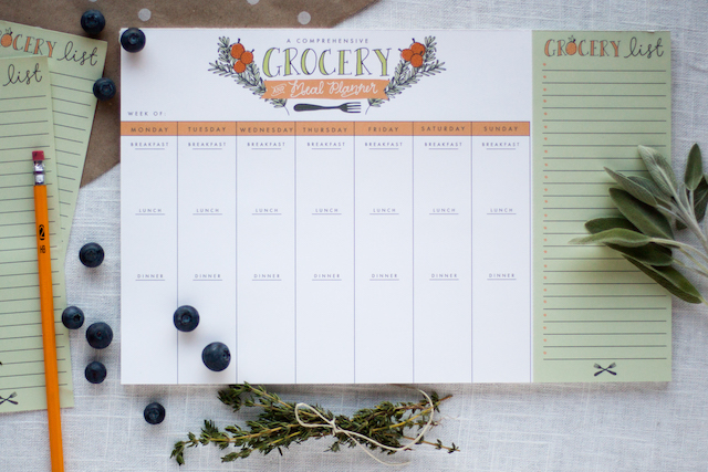
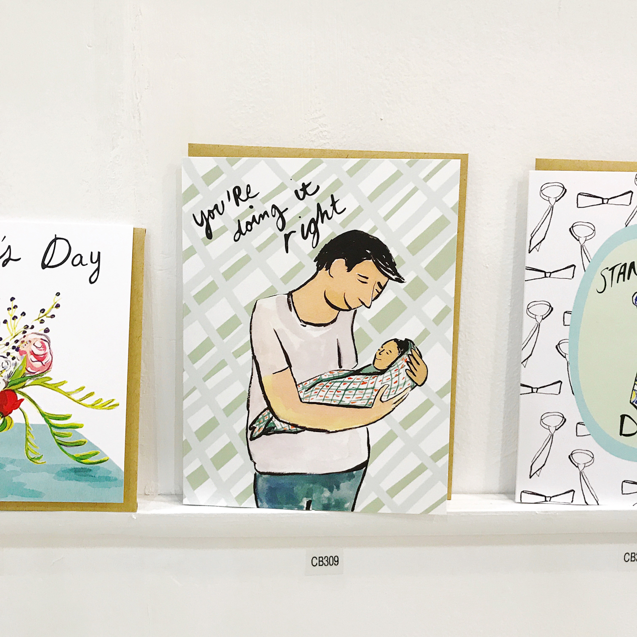
Today, I’m still of the same mindset and happiest designing and selling letterpress and foil printed greeting cards. If I get a really great notepad idea, I’ll for sure do it if I just LOVE it. Our Grocery List and Meal Planner is the perfect example. It continues to be a bestseller, so I’ll be coming out with a new design for May. Basically, if I love it and if it’s true to us and our brand, we’ll run it. I only want to offer what I personally love, which might mean offering less. But learning that I didn’t have to do it all freed up space to concentrate on products that work well for us, and our assortment.
We’re a very flexibly run enterprise. Everyone knows their job and a typical day looks different for each position. Our Wholesale Coordinator is in every day, and hers looks like the typical 9-to-5. However, if we’re hosting workshops in the studio, or pop up shops around town, she’ll adjust her hours so her life isn’t 9th Letter Press, all day every day.
Our printer works to keep up with our ever changing inventory, and the season might demand she puts in more hours to make sure we have enough of everything we need. On our production and assembly end, there are days we have lots of orders to get out the door, and other days it’s slower. That’s been true for us since we’ve started. Whenever we go through a busier season, I’ll make sure to hire more part timers to package and ship orders.
As for me, I’m the sole designer at 9th Letter Press, as well as the Instagram poster, buyer for our retail shop, and point person for any pop-ups or events. My to do list varies from day to day. Usually it means planning and coming up with new card ideas for the upcoming buying quarter, or keeping up with the website. I try to post on social media at least once a day, and once that’s done, I’m emailing potential custom design clients (anyone from brides to people needing birthday party invitations). Sometimes, I’ll reach out to prospective shop owners and send samples, too. It just depends on the needs of the day.
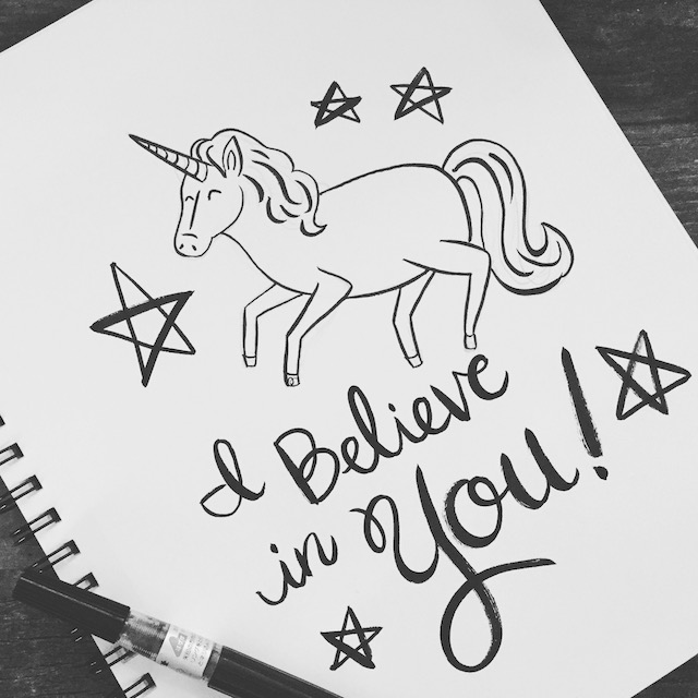
As a night owl, my creativity comes roaring to life some point after 11PM. I keep a notebook with me at all times, and I’ll jot down phrases that might make great cards. Most of the time, I’m designing something because there’s a need for it. This year we’ll be coming out with new bachelorette cards, which is a first for us. There is always something new to try. A new angle. A new way of saying something. I get so excited when I’ve stumbled onto a fresh take on a birthday card.
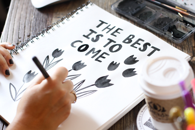
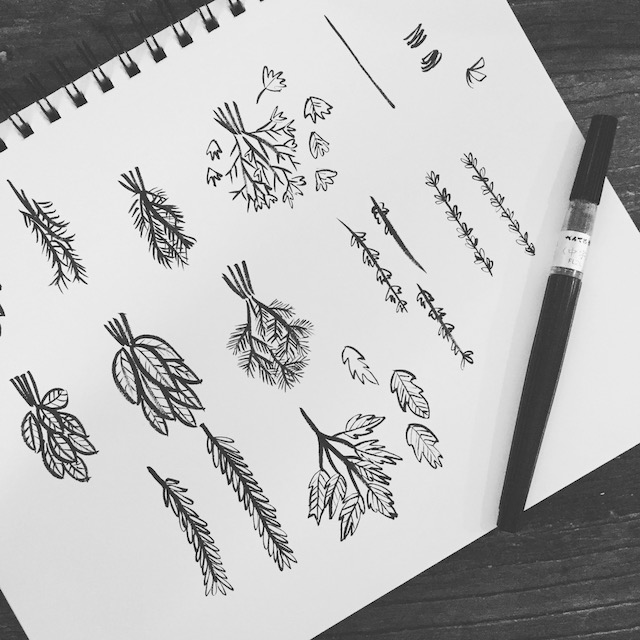
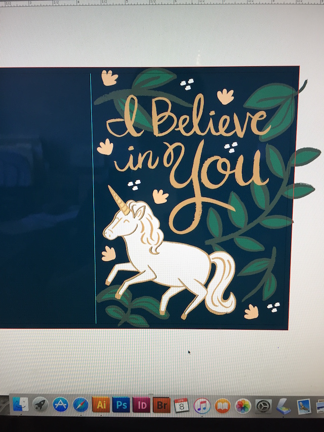
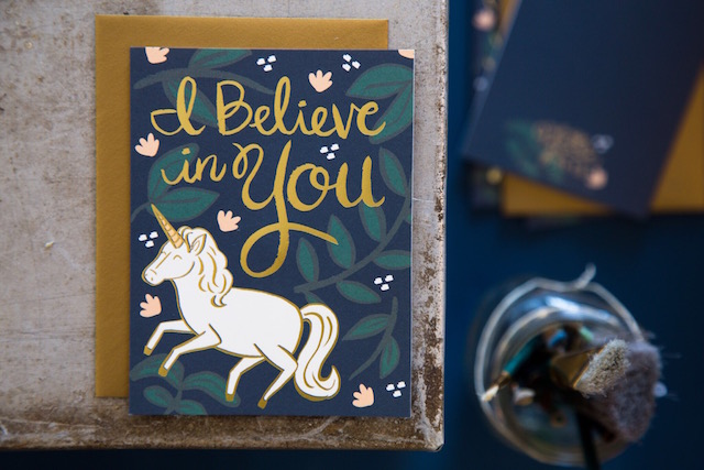
Once I get my idea, I’ll start drawing and lettering. I really prefer to only start designing once I have an idea in my head. Sessions that begin that way always fare better than when I’m “forcing†something into creation. I always design in black ink to ensure our style stays true to 9th Letter Press. Once I’ve scanned in the sketch, I’ll add color. But I’ve found starting with the same color/ink ensures I’m staying under our umbrella brand. If I started using watercolor, or gouache paint, etc., it wouldn’t feel like 9th Letter Press.
It used to be only me that saw the new design before it went to print – not so anymore. Over three years ago we started having a “line review†where the team, plus friends who I trust, come to the studio to discuss each new card. Over lunch, we’ll vote on each one. (You can imagine how nerve-wracking this is!) Only the cards that score high for everyone make it into our new releases for that quarter and ensures that all new cards have a shot at becoming bestsellers.
With each line review, we also ruthlessly discontinue cards. If we don’t, our inventory turns into a scary beast — unmanageable and too expensive to keep up with. I always look at a report that tells me what cards haven’t sold well in the last year, and no matter how much I personally love it, the card is transferred onto our discontinued list. I used to get sad about this, but in the end pruning our inventory has meant keeping only the cards that continue to pull in business.
Once we’ve landed on the winning designs, I’ll turn around and make sure the files for the letterpress cards are ready to be turned into plates. We locally outsource the foil printing, so that basically means the same thing except I’m doing press checks at their facility instead of in house.
My favorite day is seeing the finished card, all shiny and new, and come to life from my sketchbook. Then I usually say a prayer that it’s well-received and finds a home in a cute mom and pop shop somewhere in the country. 😉

All photos by Soo Peterson Photography and Isabel Davis.
Want to be featured? Reach out to Megan at megan[at]ohsobeautifulpaper.com for details.
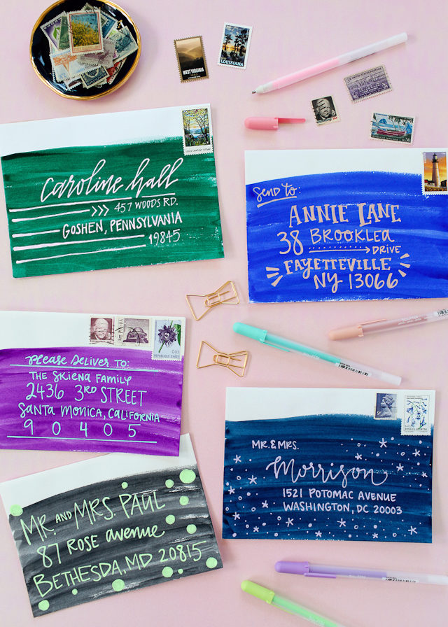
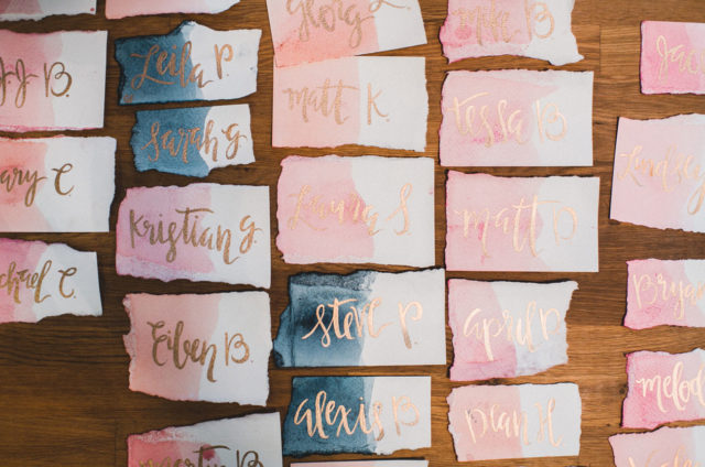
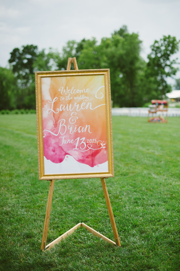

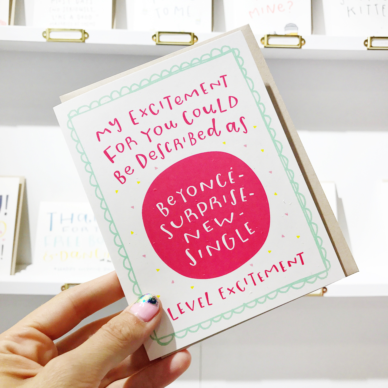
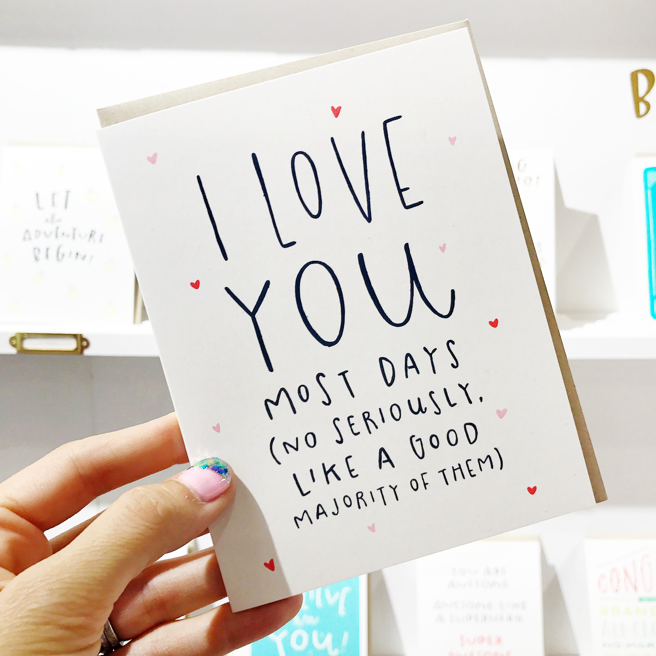
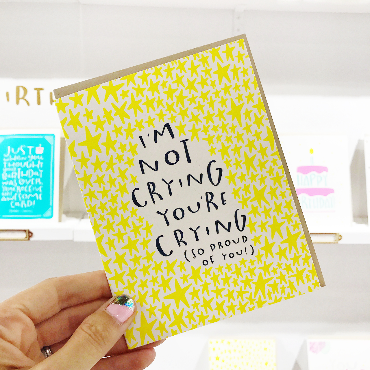
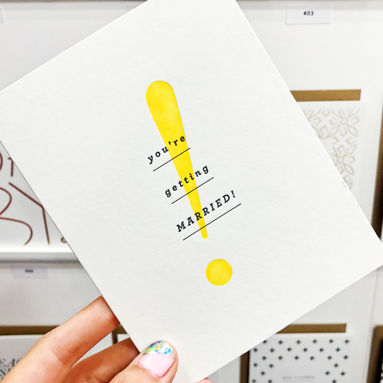
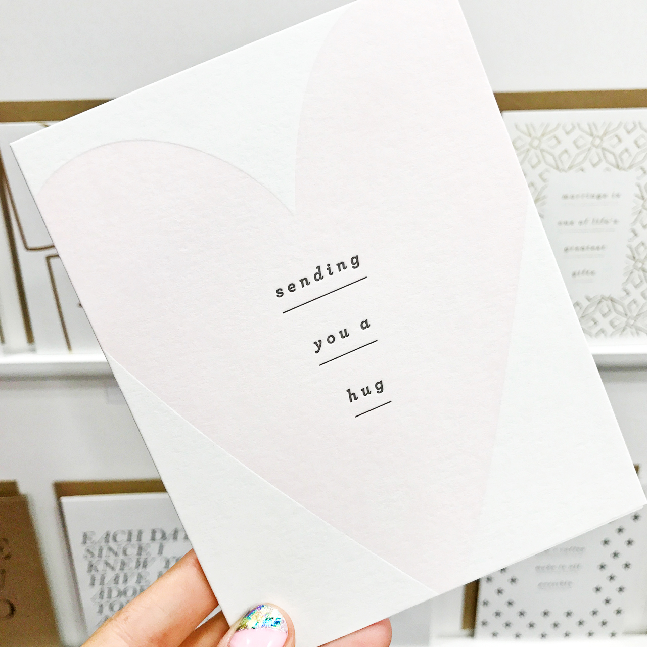
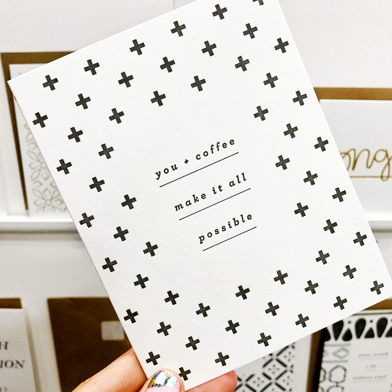
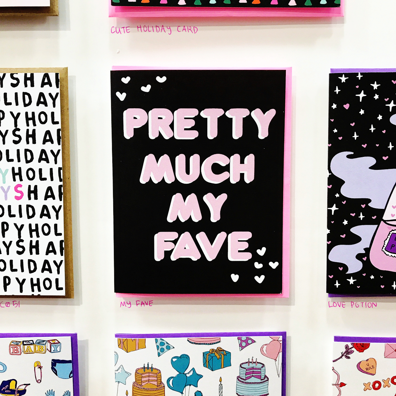
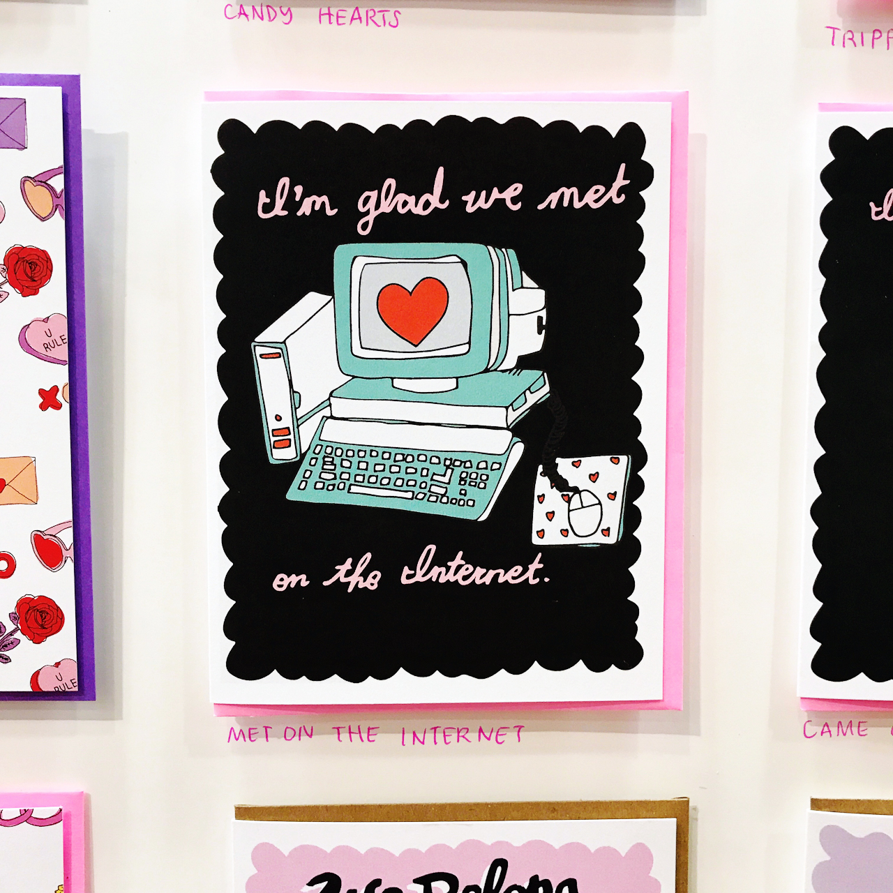
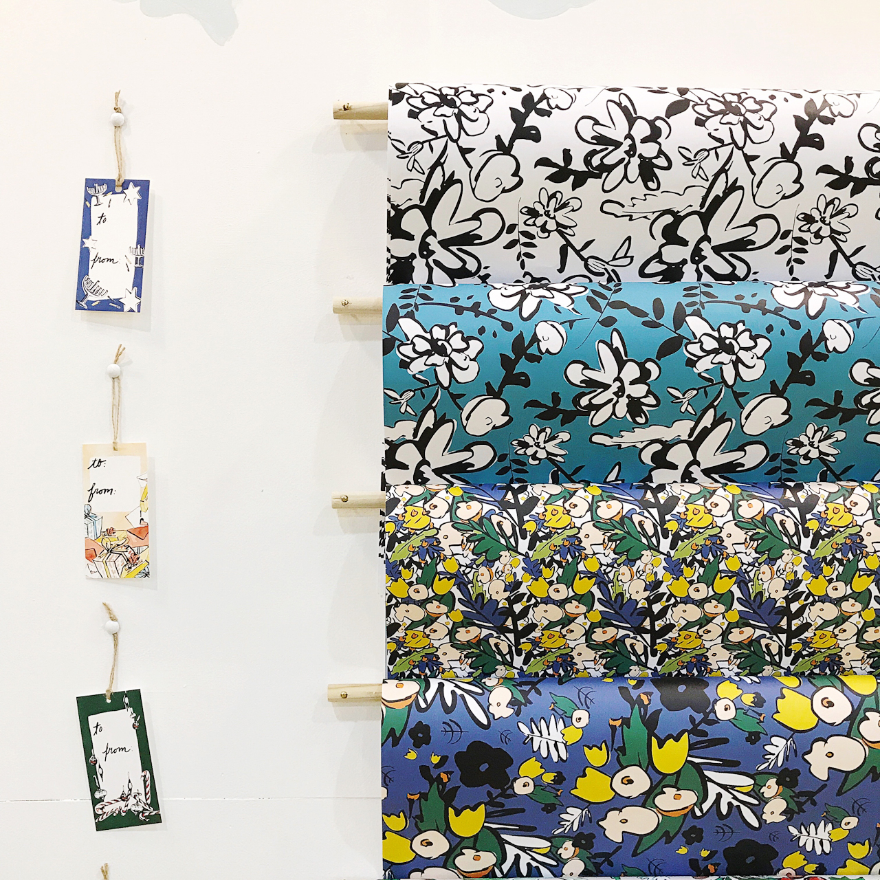
 From top right:
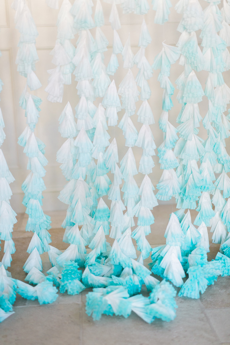
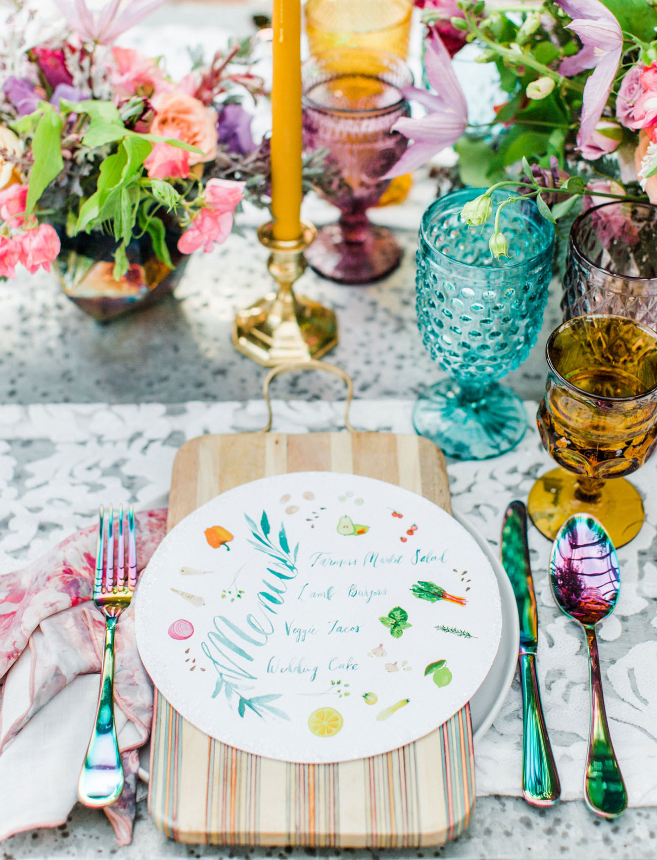
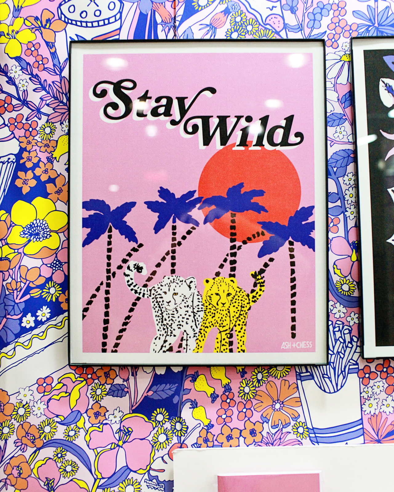
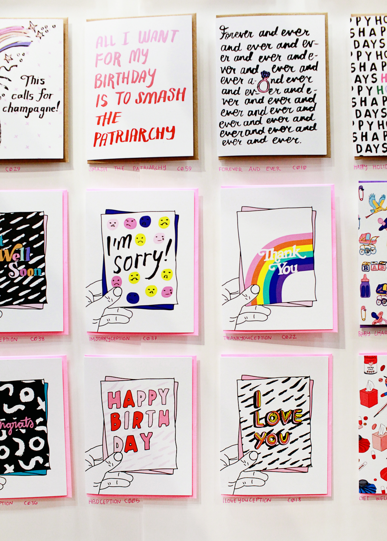