Our Moving Announcements

This definitely falls in the waaaay overdue category, but after spending all weekend painting my bedroom, I remembered that I never shared my own moving announcements with all of you!  I’m thrilled to finally correct this oversight, and I hope you all love them as much as I do!

Oh-So-Beautiful-Paper-Fabric-Moving-Announcements-Detail

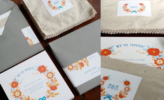
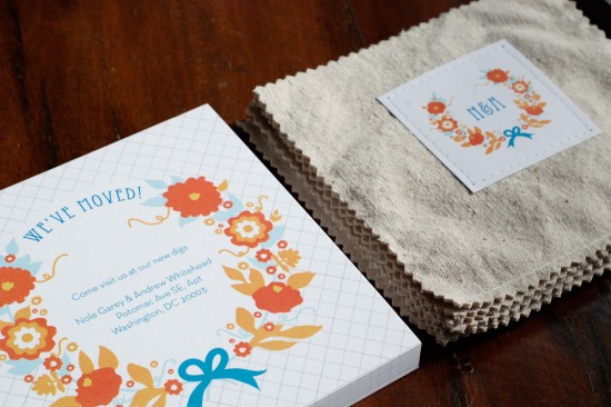
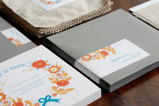
My husband and I moved into a new apartment in January of 2010, and of course I wanted real moving announcements to send to our closest family and friends.  We worked with my friend Katie from Petal and Print, who gifted us with these amazing announcements as a housewarming present.  I wanted bright pops of color and my husband’s favorite color is blue, so we settled on a fun color palette of orange, red, and turquoise with a floral wreath illustration and soft gray accents.

Oh-So-Beautiful-Paper-Fabric-Moving-Announcements

Oh-So-Beautiful-Paper-Fabric-Moving-Announcements-Envelope

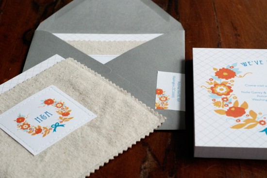
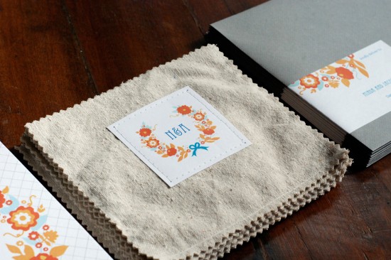
I also really loved the idea of somehow incorporating fabric (something I’d originally wanted, but wasn’t able, to do with our wedding invitations), so Katie came up with the fabulous idea of enclosing each announcement in a simple linen pocket, which was then placed inside the mailing envelope.  Katie is seriously amazing – she made each individual linen pocket on her sewing machine and then attached a matching paper tag with our initials.

Oh-So-Beautiful-Paper-Fabric-Moving-Announcements-Envelopes-Vintage-Stamps

Oh-So-Beautiful-Paper-Fabric-Moving-Announcements-Mailing-Label

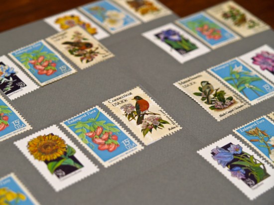
The complete announcement was enclosed in a pewter gray envelope with a wrap-around mailing label and vintage postage stamps.  I found these awesome state bird postage stamps and tried to match recipients with the appropriate state (or at least something close by, since I only had one sheet).

Oh-So-Beautiful-Paper-Fabric-Moving-Announcements-Linen-Pocket

The announcements were everything that we wanted them to be – playful, quirky, joyful and incredibly beautiful!  Thanks again Katie!

Photo Credits: Petal and Print

{happy weekend!}

Happy Friday everyone!  This week practically flew by (as is often the case after a holiday weekend), but I’m looking forward to the weekend – even though painting my bedroom is the most exciting thing I have planned.  I’m trying to check some home projects off my to do list before my husband comes home in a couple of months, and although painting is tedious work I’m looking forward to a bit of change.  But in the meantime…

Summertime

…a few links for your weekend:

This week on Oh So Beautiful Paper:

That’s it for me this week!  I hope you all have a wonderful weekend, and I’ll see you back here on Monday! xoxo

Photo Credit: Simple Tess

Lindsay + Ben’s Modern Venn Diagram Wedding Invitations

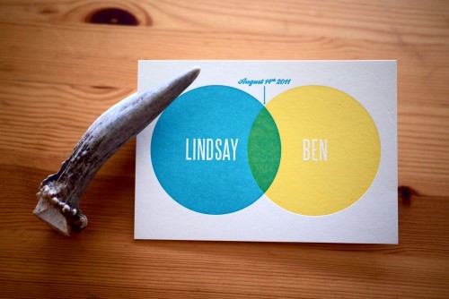
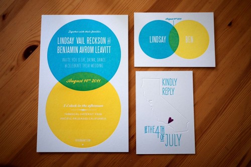
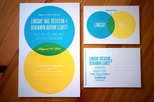
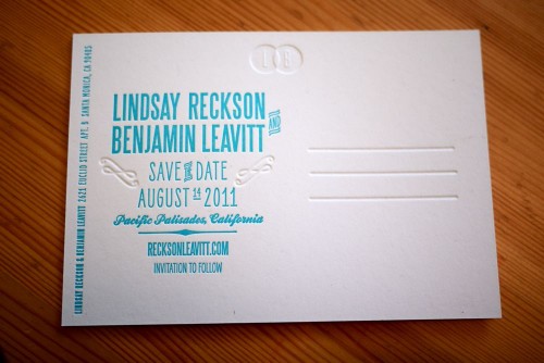
The concept behind this wedding invitation suite – a venn diagram – is just so completely perfect I can barely stand it.  Lindsay and Ben have been a couple for more than a decade, so when it came time to create their wedding invitations they couldn’t imagine a symbol that would better represent their relationship and upcoming nuptials.  From the bright color palette to the beautiful blind impression and overprinted letterpress elements, I’m loving every single detail from Lindsay and Ben’s invitations.

Modern-Blue-Yellow-Venn-Diagram-Letterpress-Wedding-Invitations

From Lindsay:  In February of this year, my fiancé Ben and I enlisted our close friend and Ben’s directing partner Nick Carbonaro to help us create an invitation suite that would capture our modern, upbeat aesthetic. The venn diagram became a way to mark our longtime union (we’ve been together for over ten years) and to celebrate the wonderful overlap that is our life together.  Another friend noted that our invitation color scheme mimics the ziplock seal: fittingly, as we like to keep things fresh (both relationship-wise and design-wise) and we love snacks.

Modern-Blue-Yellow-Venn-Diagram-Letterpress-Wedding-Invitations

Modern-Blue-Yellow-Venn-Diagram-Letterpress-Wedding-Invitations

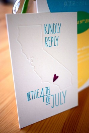
As our save-the-date postcard and invitation used the same venn diagram design, we wanted to do something a little different for our reply card.  Using a tiny, hand-carved stamp from etsy seller little t jane, we created a California-themed (and happily rhyming) postcard.

Modern-Blue-Yellow-Venn-Diagram-Letterpress-Wedding-Invitations-RSVP Modern-Blue-Yellow-Venn-Diagram-Letterpress-Wedding-Invitations

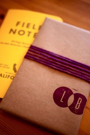
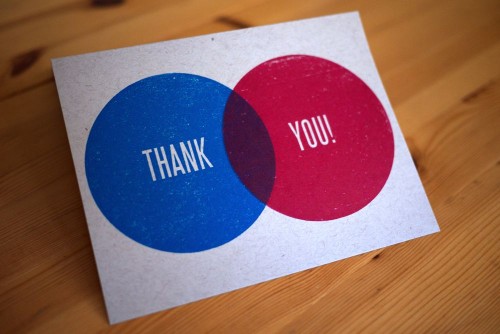
 We also carried the venn diagram into our wedding favors, wrapping small California state notebooks from Field Notes in butcher paper and stamping them with our initials.  And most recently, we used two enormous stamps and primary color inks to make our thank you cards.

Modern-Blue-Yellow-Venn-Diagram-Letterpress-Wedding-Invitations-Thank-You-Cards

Our good friend Laurie Smithwick of LEAP Design provided wonderful advice and guidance, and Studio on Fire printed the whole suite in gorgeous letterpress.

Modern-Blue-Yellow-Venn-Diagram-Letterpress-Wedding-Invitations-RSVP-Back

Just stunning Lindsay!  And totally pitch perfect from start to finish.  Congratulations!

Photo Credits: Lindsay + Ben

Illustrated Note Cards from Wiley Valentine

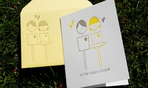
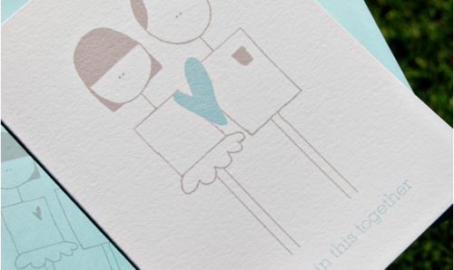
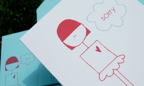
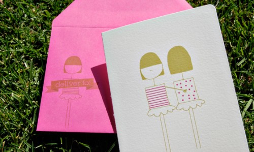
How cute are these new greeting cards from Wiley Valentine?  The illustrations came from a collaboration with a recent bride (check out the gorgeous watercolor + chevron invitations here) and I think they’re just adorable.

Check them out over in the Wiley Valentine shop right here!

*Wiley Valentine is a spon­sor of Oh So Beau­ti­ful Paper.  For more on my edi­to­r­ial poli­cies, please click here.


Blue + Copper Invitations for a Hindu Jewish Wedding

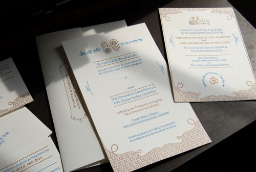
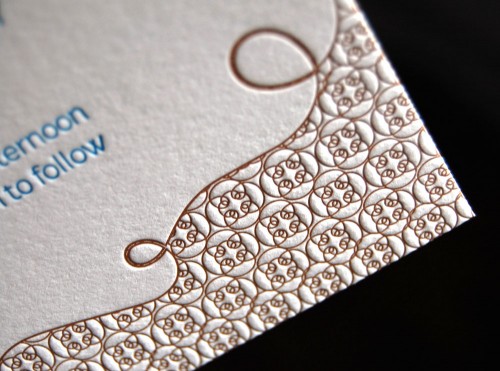
Pistachio Press recently printed these amazing wedding invitations for a Hindu/Jewish wedding, and I fell in love the minute I saw them.  The invitations were designed by the bride’s sister, seamlessly blending the cultures of the bride and groom into one complete design.  I love the blue and copper color palette and the use of complementary symbols and both hindu and hebrew text to bring the suite together!

Hindu-Jewish-Wedding-Invitations

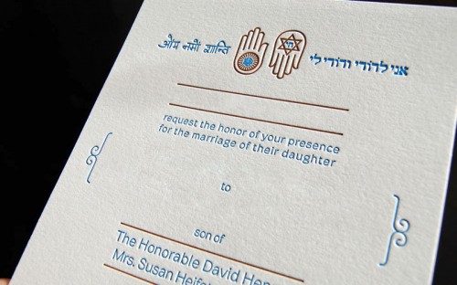
From the bride’s sister, Cheena: Our goal was to capture two religions and both the Indian and Jewish cultures in a single invitation.  Essentially, we wanted the invitation to reflect traditional Indian themes, but allow the Jewish cultures to also be reflected. It was a challenge to incorporate (evenly) two very different cultures, but by using similar symbols like the Hamsa Hand and the Jain Ahimsa hand, we were able to help develop a unified design sensibility.

Hindu-Jewish-Wedding-Invitations

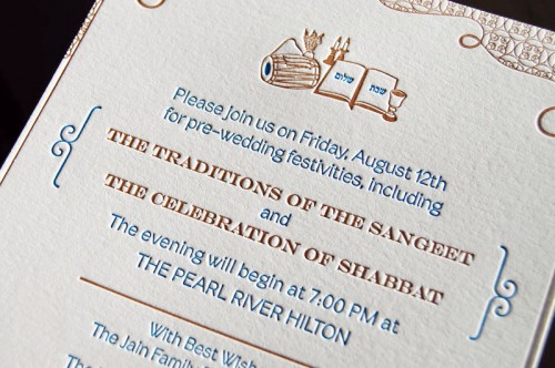
I incorporated a Hindi script (a blessing of peace) counter balanced with the Hebrew (a saying about love) as well as the image of the drum (dholak) and peacock feathers, which are traditional for a “Sangeet” invite.  The Shabbat/Shalom prayer as a symbol of the Shabbat service that will take place at the wedding also helped unite the theme.  Since it was hard to find usable Hindi, the text was handwritten and then vectorized so that we could have something to match with the Hebrew saying that we wanted to incorporate.

Hindu-Jewish-Wedding-Invitations

I wanted to incorporate a border that has some level of Western culture (the pattern was created from an ornament in the font Brownstone that pays homage to New York City, which has a deep meaning to the bride and groom), but also created a masking of this pattern in a way that made it very eastern and Indian in some ways.  The invitation is a symbol of the unitying of two cultures with this marriage.  It’s almost the first step the bride and groom have taken to do this aside from overall wedding planning.

Hindu-Jewish-Wedding-Invitations

So stunning!  A big congratulations to the bride and groom – and you can see more of Cheena’s design work right here and beautiful letterpress work from Pistachio Press right here!

*Pistachio Press is a spon­sor of Oh So Beau­ti­ful Paper.  For more on my editorial poli­cies, please click here.