Lauren + Joel’s Old Timey Letterpress Wedding Invitations

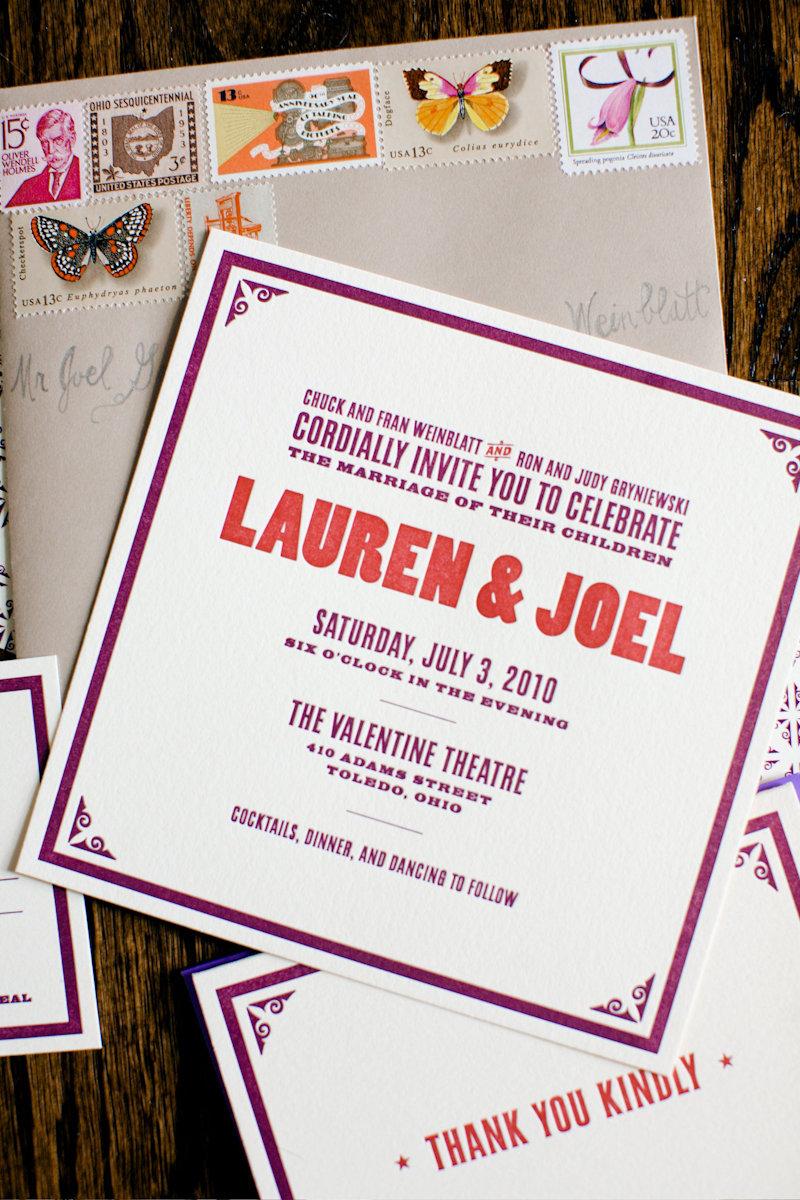
I love it when designers get married – I get practically giddy in anticipation of the awesome wedding stationery.  So when Lauren and Joel from Old Tom Foolery got married last summer, I couldn’t wait to see what they came up with for their invitations and save the dates.  The result is an old-timey-meets-classic wedding invitation suite that perfectly suits both Lauren and Joel’s personalities as well as the cool venue where they were married – all with a total sense of fun, fun, and fun.

Old-Tom-Foolery-Red-Purple-Letterpress-Save-the-Dates Old-Tom-Foolery-Red-Purple-Letterpress-Wedding-Invitations

From Lauren and Joel: We wanted the event to feel fun, with a hint of old-timey-ness.  After all, we were trying to convince friends and family from around the country to come to Toledo, Ohio. (Not a destination on everyone’s ideal vacation list.)  We tried to get people excited with an oversized theater poster-type save the date.  This is really where we had our fun with the printed pieces.  The save the dates were then followed up with a more toned-down invitation that still retained the look and feel of the first piece.  We kept the look going with ceremony programs, thank you notes, place cards, and cookie jar labels for my mom’s famous homemade cookies.

Old-Tom-Foolery-Red-Purple-Classic-Letterpress-Wedding-Invitations Old-Tom-Foolery-Purple-Red-RSVP-Envelope-Vintage-Stamps

The invites were printed by Norman Clayton of Classic Letterpress in Emeryville, CA on Crane’s Lettra and the envelopes were from Paper Source.  We also tried to find vintage stamps that fit our personality, like a funny guy with a mustache, a printing press, Ohio stamps, and a retro film stamp since we got married at an historic theater.  Tor Weeks did the hand lettering on the outside of our envelopes (she is also the designer of our Typestache poster).

Old-Tom-Foolery-Wedding-Lauren-Joel-Ceremony Old-Tom-Foolery-Wedding-Lauren-Joel

Old-Tom-Foolery-Wedding-Bouquet Old-Tom-Foolery-Red-Orange-Purple-Bouquet

Old-Tom-Foolery-Wedding-Lauren-Joel-Seating-Cards Old-Tom-Foolery-Wedding-Lauren-Joel-Cake

Old-Tom-Foolery-Wedding-Lauren-Joel-Birch-Centerpiece Old-Tom-Foolery-Wedding-Lauren-Joel-Reception-Decor

The whole look of our event was based on the colors and vibe of two things: The Dahlia Dell in Golden Gate Park, which we used to walk to when we lived in San Francisco, and the gigantic mural of historic performers at the Valentine Theatre, where we were married.  We pulled rich magenta and plum colors from the garden and mural and accented them with a variety of reds, oranges, greens, and neutral browns.  But the best part of the night was really the awesome Motown band we brought in from Detroit.

Old-Tom-Foolery-Lauren-Joel-Wedding-Venue Old-Tom-Foolery-Lauren-Joel-Wedding-Motown-Band

Old-Tom-Foolery-Lauren-Joel-Wedding

So cute!  Congratulations you guys!  For more awesomeness from Lauren and Joel, check out Old Tom Foolery right here!

Photo Credits: Aruna B. Photography


Sneak Peek – Martha Stewart Weddings Summer 2011

The newest issue of Martha Stewart Weddings hits newsstands soon – and this time it’s the DIY issue!  The Summer 2011 issue is full of beautiful inspiration, from flowers to music to fashion, but today we have a special sneak peek at the invitation inspiration!

There’s an amazing five-page story just on wedding invitations, with lots of creative ideas on how to personalize your wedding invitations and save the dates with crafty DIY touches – from rubber stamps to twine to wax seals.  My personal favorite involves dry-brushed (and super colorful) watercolor paint on a letterpress wedding invitation.  So, so pretty.

The editors even had some fun playing around with non-traditional DIY invitation ideas – like these invitations created using a P-touch label maker and colored index cards.  Such a great idea for a modern wedding, or even a school theme wedding!

Check out the rest of the story in the Summer 2011 issue!

Photo Credits: Cover by Patricia Heal; Invitation Photography by Philip Ficks, both for Martha Stewart Weddings, Summer 2011


{happy weekend!}

Happy Friday – and long holiday weekend – everyone!  I’ve always heard that Memorial Day is considered the unofficial start of summer, and here in DC it certainly feels that way.  We’ve been having a hot and humid stretch – just a hint of what to expect once summer really gets going in a couple of weeks.  This is the time of year that I usually start dreaming of beach vacations and any excuse to get out of the city.  Sigh.  But in the meantime…

summer-ice-cream-social

…a few links for your weekend!

This week on Oh So Beautiful Paper:

That’s it for me this week!  I hope you all have a wonderful holiday weekend, and I’ll see you all back here next week! xoxo

Photo Credit: Laura Taylor via Design for Mankind


Classic Black + White Calligraphy Wedding Invitations

After all of the stationery eye candy from the National Stationery Show, I’m in the mood for something sweet and simple to help close out the week – and these letterpress calligraphy wedding invitations from Blackbird Letterpress totally fit the bill.  Kathryn worked with calligrapher Sidney Vallon to create two versions of the invitation – one for both the ceremony and reception and another for those invited to the reception only.  Timeless, elegant, and positively stunning.

Calligraphy-Wedding-Invitations-Blackbird-Letterpress

Calligraphy-Wedding-Invitations-Blackbird-Letterpress


Thanks Kathryn!

Photo Credits: Blackbird Letterpress

National Stationery Show 2011 – Part 12

Whew!  With more than 90 booths covered from this year’s National Stationery Show, this is the final post for this year’s show!  I’m ready for a nice long nap at this point, but first let’s get to the good stuff.  First up, Portland-based Oblation Papers and Press, with an industrial-meets-vintage booth design and a collection of classic and clean letterpress cards, invitations, calendars and notebooks.

Letterpress advent calendars – such a cute idea!

My husband would looove these architecture cards…

Oblation Papers & Press

The collection over at Someday Designs is seriously amazing – not only are the letterpress cards seriously adorable, but they’re also hand watercolor painted one by one.  The result is a delicate card that is both completely unique and entirely hand crafted.

Someday Designs

Lots and lots of super colorful stationery over at the Kelp Designs booth – pretty and eco-friendly at the same time!  In my opinion, Katie from Kelp Designs is pretty much superwoman; not only did she put together a fabulous booth for the Stationery Show, but she also organized Tradeshow Bootcamp (to help new trade show exhibitors) and exhibited at 8 months pregnant.  Ah-mazing.

Love those cardboard clipboards!

Kelp Designs

Julie from Up Up Creative made her trade show debut this year, with a super colorful (hello orange!) booth and modern collection of note cards, calendars, gift wrap, and artwork.

Love this color wheel alphabet print!

Up Up Creative

Like the Ladies of Letterpress booth, the Let {Her} Press booth features multiple exhibitors – this year it was Paper Stories, Paper Parasol Press, Robin Beth, and Lucky Bee Press.

Paper Stories

Paper Parasol Press

Robin Beth

Lucky Bee Press

So much color and pretty paper at Envelopments – and a brand new lookbook showcasing some of Envelopments’ custom wedding, baby, and social stationery designs.


Envelopments

At Crane & Co. this year, I got to browse through the new wedding album, check out some of the new social stationery designs, and look at tons of new holiday cards and designs.

Loving the crisp and modern combination of red and white in these two sets of engraved social stationery…

And of course, lots and lots of holiday cards…

Crane & Co. usually offers a fun demonstration in its booth – this year it was the custom monogram process.  I chose a classic swirly monogram for myself…


For a little something special, this year the Crane & Co. booth had these stunning window displays – just like fancy New York department stores!  So stunning…

Crane & Co.

That’s it folks!  I hope you enjoyed the recaps from this year’s National Stationery Show!  If you missed any of the last eleven posts or want to check out the booths from last year, you can see all of my stationery show coverage from the last three years right here!

Photo Credits: Nole Garey for Oh So Beautiful Paper

*Envelopments is a spon­sor of Oh So Beau­ti­ful Paper.  For more on my edi­to­r­ial poli­cies, please click here.