National Stationery Show 2011 – Part 5

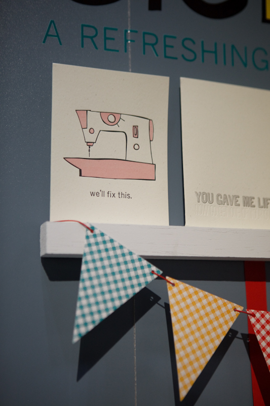
Well, the 2011 National Stationery Show has officially come to a close – although of course my coverage from this year’s show is far from over!  And while it’s always a bit sad to say goodbye to everyone, I can cheer myself up with more photos from this year’s exhibitions.  First up for today, Hello!Lucky – which always has a fun booth full of personality and lots (and lots) of color.

Hello!Lucky

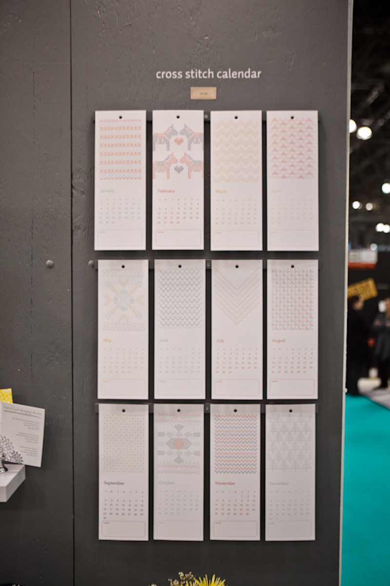
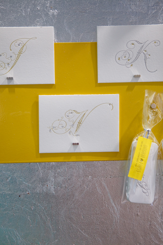
After making their debut at last year’s show, Pistachio Press was back this year with lots of new products, including some gorgeous cross-stitch note cards, notebooks, and calendars, along with colorful birthday cards and wedding invitations.

Pistachio Press

I’m loving all of the new fabric tote bags from Chewing the Cud, not to mention the new patterns in Viola’s line of fabric gift wrap.  And those new rubber stamp sets?  Couldn’t be cuter!

Chewing the Cud

Lisa from Sapling Press just may be the funniest person I know – and you don’t need to look further than her cards for proof.  Oh, and don’t forget about these awesome tote bags!

Sapling Press

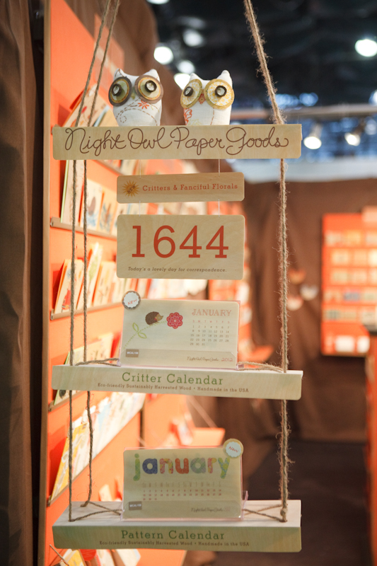
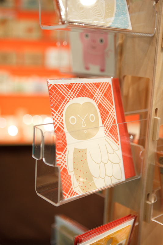
Night Owl Paper Goods is a perennial favorite at the Stationery Show, and this year is no exception!  The Night Owl team recently added some fun wood veneer banners and lots of cute new designs to their collection of letterpress and wood veneer note cards, prints, calendars, and note books.

Night Owl Paper Goods

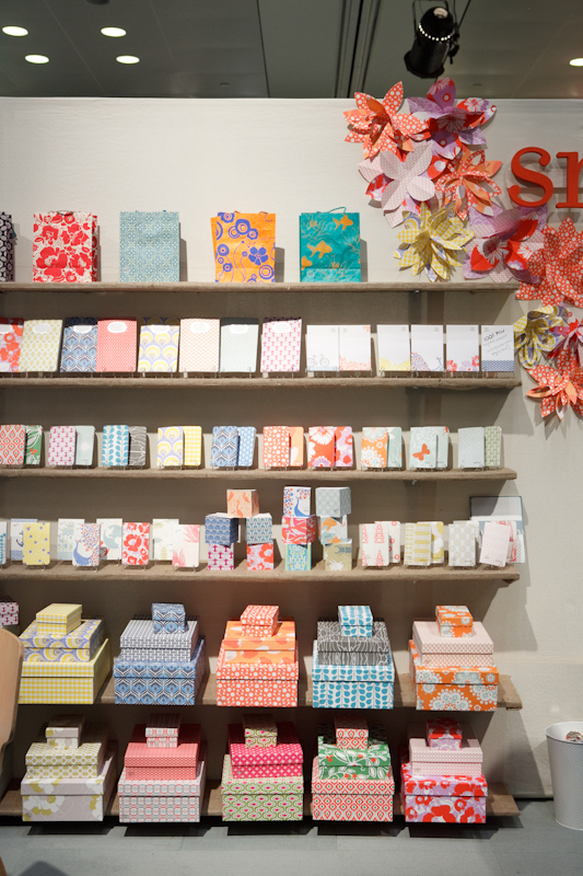
Color was definitely back in a big way at this show, and I was so happy to see lots of vibrant color at Egg Press – from touches of neon to unusual color combinations on some of the holiday cards – alongside sweet illustrations and fun geometric patterns.

I really love seeing stationers experiment with die cuts to achieve unique card shapes – and these heart-shaped cards are too cute!

Egg Press

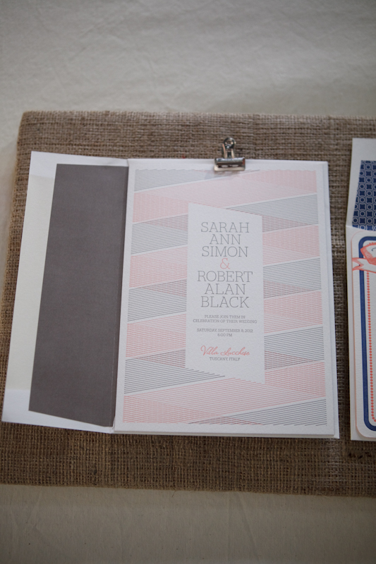
Color also had a large presence at Fine Day Press, from Ashley’s letterpress note cards to her new illustrated calendar.  So pretty!

Fine Day Press

Photo Credits: Brian Tropi­ano for Oh So Beau­ti­ful Paper, please do not repost with­out permission

*Hello!Lucky and Pistachio Press are spon­sors of Oh So Beau­ti­ful Paper; for more on my editorial poli­cies please click here.


National Stationery Show 2011 – Part 4

As promised, I’m back with more from this year’s National Stationery Show, with beautiful images from photographer Brian Tropiano.  I’ve been running around the show trying to catch up with old favorites and check out the work of new exhibitors, so the last couple days have just flown by!  First up, a first time exhibitor that is a familiar face around here – Dingbat Press!  Adrienne from Dingbat Press did an amazing job with her booth; each wall is covered with silver leaf!  I’m loving Adrienne’s letterpress initial note cards and funny chess greeting cards.

Dingbat Press

Smock is no stranger to the Stationery Show, but their sister company Bella Figura was also exhibited for the first time at this year’s show.  There was a lot of color going on in the joint booth, from greeting cards to gift wrap to gift boxes to calendars to wedding invitations.  So fun!

Smock and Bella Figura

The Ladies of Letterpress booth is a bit of a doozy – with TEN designer/printers exhibiting in a shared booth.  It’s a lot to take in all at once, but there’s so much amazing work from a group of seriously talented stationers.  This year participating printers included Thomas Printers, Anemone Letterpress, Cleanwash Letterpress, Heartfish Press, Ink Petals, Wildhorse Press, Dandy Lion Press, Studio SloMo, Lulabelle, and Paper Lovely.

Ink Petals

Paper Lovely

Lulabelle

Dandy Lion Press

Heartfish Press

Thomas Printers | Studio SloMo

Gorgeous wedding invitations from Studio SloMo

Cleanwash Letterpress

Anemone Letterpress

Wildhorse Press

Sigh, I love that balloon print from Wildhorse Press

Photo Credits: Brian Tropiano for Oh So Beautiful Paper, please do not repost without permission

*Smock, Bella Figura, Thomas Printers, and Dingbat Press are sponsors of Oh So Beautiful Paper; for more on my edi­to­r­ial poli­cies please click here.

Lauren + Dave’s Modern Red and White Letterpress Wedding Invitations

I’m taking another quick break from this year’s Stationery Show coverage to share these sweet wedding invitations from Three Fifteen Design, with letterpress printing by Czar Press.  For the invitation design, Ravyn from Three Fifteen Design combined modern graphic elements with a script font to complement the elegance of the wedding venue.  I’m loving the fall-inspired red and white color palette!

Red-White-Modern-Banner-Letterpress-Wedding-Invitation-Save-the-Date

From Ravyn: This suite was largely influenced by the ornate and elegant wedding venue where the couple will be married this October.  While the couple was super excited about this really elegant location, they wanted to pull a few fun elements into the design as well.  For the save the date card, we decided to use a photo from their engagement session by Jim + Ravyn Photographers.  We paired the photo with the same script and graphic elements that would later be used on their wedding invitation suite.

Red-White-Modern-Banner-Letterpress-Wedding-Invitation

Lauren and Dave are getting married in the Fall and wanted a warm hue, but not the typical orange.  We chose this rusty red to ad an element of rustic-sophistication. Because the save the date was a little less formal, they wanted to go all out for the invitations. We had them letterpress printed on beautiful, soft-white cotton stock.  Czar Press did an amazing job printing the invitations & the response cards.

Red-White-Modern-Banner-Letterpress-Wedding-Invitation


Red-White-Modern-Banner-Letterpress-Wedding-Invitation

Again, we tried to be a little more playful with the response card, by using graphics for the meal choices and again, using the flag/banner graphic from the invitation.

Red-White-Modern-Banner-Letterpress-Wedding-Invitation


Red-White-Modern-Banner-Letterpress-Wedding-Invitation

We finished everything off with kraft paper envelopes from Paper Source and a custom return address stamp from RubberStamps.net.


Red-White-Modern-Banner-Letterpress-Wedding-Invitation 

Red-White-Modern-Banner-Letterpress-Wedding-Invitation

Thank you so much Ravyn!  For more from Three Fifteen Design, check out their website right here!

Photo Credits: Three Fifteen Design

*Czar Press is a spon­sor of Oh So Beau­ti­ful Paper; for more on my edi­to­r­ial poli­cies please click here.

National Stationery Show 2011 – Part 1: Big Debuts

This is always an exciting week, but this year there are a ton of new exhibitors making their trade show debut at the 2011 National Stationery Show.  So for my first recap post, I thought I’d highlight a few of the booths making an awesome debut this year.  First up, Minneapolis-based Printerette Press, with an adorable booth chock full of stunning letterpress greeting cards.  From illustrations to recipe note cards to brightly colored chevron strips, this booth was simply impossible to resist.

Love those astrology/constellation note cards – so pretty!

Printerette Press

McBitterson’s has its share of snarky cards, including some pretty hilarious holiday cards that I’m sure will make another appearance later in the year.  But I couldn’t resist the adorable letterpress animal note cards:

McBitterson’s

I was pleasantly surprised to run into another DC resident, Katharine Watson, making her Stationery Show debut with her folk art-inspired block printed note cards, tea towels, notebooks, and canvas pouches:


Katharine Watson

Super cute and brightly colored note cards, all lovingly screen printed by hand from Fisk & Fern:

Fisk & Fern

My friend (and another fellow DC resident) Claudia from Fig. 2 Design Studio made her Stationery Show debut with a collection of neon-infused letterpress greeting cards, modern wedding invitations, and adorable gift tags.  I can’t wait to give you a more in depth look at Claudia’s new collection after the show!

Fig. 2 Design Studio

You saw a sneak peek of the new Fawnsberg collection last week, and the Fawnsberg ladies created the cutest and coziest booth to help showcase their boxed correspondence sets.  From the vintage map to the hand carved wood sign, each detail perfectly complemented the new collection.


Fawnsberg

Coming all the way from Ottawa, Canada, I’m loving this quirky collection from Dempsey Press!

Dempsey Press

I’ll be back with more from the National Stationery Show tomorrow!

Photo Credits: Nole Garey for Oh So Beautiful Paper

Dauphine Press Wedding Invitation Collection

I love getting to see all the new collections and goodies that make their debut at the National Stationery Show; it’s one of my favorite parts of the whole show.  This year, Dauphine Press has a whole new wedding invitation collection, and you get to see it first!  The new collection features lots of fun design details, from edge painting to foiling to beautiful envelope liners, combined with Dauphine’s classic yet modern style.

Dauphine-Press-Wedding-Invitations

Dauphine-Press-Wedding-Invitations Dauphine-Press-Wedding-Invitations

Dauphine-Press-Wedding-Invitations

Dauphine-Press-Wedding-Invitations Dauphine-Press-Wedding-Invitations

So pretty!  You can check out more from the Dauphine Press wedding invitation collection right here.

Coming up, coverage from the Stationery Show!

Photo Credits: Dauphine Press