The big weekend is finally here – the Stationery Show starts on Sunday!  I head up to New York tomorrow and can’t wait to catch up with everyone at the show.  Speaking of the Stationery Show (which as of the last few days has been all the time, I know), I’ll be participating in a panel about the importance of written correspondence in the digital age.  I’d love to be able to share a few anecdotes from my readers, particularly why you enjoy sending and receiving stationery.  So if you have a few moments, please share your thoughts and help answer a few short questions right here!  But in the meantime…

…a few links for your weekend!
- I’m hoping to check out this sample sale in NYC next week
- Peonies in Paris, le sigh…
- One more reason to love the ombre trend
- I’m seriously thinking about getting one of these for my husband for this summer
This week on Oh So Beautiful Paper:
- Jackie + Tyler’s gray and gold baby shower invitations
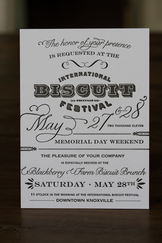
- Invitations for the International Biscuit Festival
- Stationery Show sneak peeks: Yellow Owl Workshop, Hello!Lucky and Fawnsberg, and Paper Mill Designs
- Lindsey and Evan’s gilded formal wedding invitations
- A recipe card scavenger hunt at the Stationery Show
- Rebecca + Nick’s Rocky Mountain wedding invitations
I’m planning a rare Saturday post so that I can share the photos from our trip to Italy, finally! Â Have a wonderful weekend everyone! xoxo
Photo Credit: Samantha Lamb


