Behind the Stationery: Printfresh

Today we’re headed to Philadelphia to chat with Amy Voloshin of Printfresh about her stationery business story! As a textile designer, Amy has taken a unique path to developing a stationery line. She’s here to share the integral role that fabric, textures, and patterns play in her designs. Amy is also a huge supporter of her community in Philly and shares about the various ways she teams up with local organizations to give back. — Megan Soh

Behind the Stationery: Printfresh

From Amy: I studied textiles at the Rhode Island School of Design and focused on print and knitting. My first job out of school was working for URBN designing prints and garments for the Urban Outfitters and Free People lines. It was back in 2003 when technology was still limited in the industry and the work was very hands on — we used gouache to mock up colorways, and made repeats with pencil and a photocopier. It was an incredibly creative environment and the experience opened the door to an art director position for a textile design studio in New York. I loved the work but missed Philadelphia, and I decided pretty quickly to move back and use what I had learned to start my own studio.

Behind the Stationery: Printfresh

I rented a small warehouse space and began developing a print collection to sell to fashion designers. At the time I was screen printing many of our designs by hand and going on sales appointments myself! Our company grew tremendously over the next 10 years, and I was able to pull together an amazing team of talented designers and passionate saleswomen. Print design is so focused on behind-the-scenes work, and as our business became more established I started dreaming about what creative avenues I wanted to explore next. I’ve always loved stationery, but find that so many of the designs out there are too preppy for my personal bohemian aesthetic. After a lot of thought, I decided to apply my love and expertise in textiles and pattern to the world of paper. I signed up for the 2017 National Stationery Show and started working with a few of our textile designers to develop the very first Printfresh stationery collection. We got such amazing feedback at the show, I knew I’d made the right choice.

Behind the Stationery: Printfresh

Our studio is based in the Kensington area of Philadelphia. My husband and I are obsessed with old warehouses and found a beautiful carpet factory built in the late 1800s. We decided to renovate and relocate our studio here, and we finally moved in last fall. I love that our building was was used for textiles in the past. It still has many of the gears and industrial equipment from working with carpet rolls, and we’ve done our best to preserve some of it and show the history of the space. The Kensington neighborhood faces a lot of social and economic challenges, and our hope is that by restoring this warehouse and creating a community of small business owners and creatives we can help spur economic development and revitalization here.

Behind the Stationery: Printfresh

We’re invested in the Philadelphia community (I live less than a mile from our studio) and when starting the stationery line I knew I wanted to find a way to leverage the brand to give back. For the past two years we’ve partnered with Philly Paper Jam to donate a full year’s supply of paper to two local schools. We’ve also started giving 5% of our online sales to organizations that provide creative programming to children in Philadelphia’s public schools. Each quarter we feature a select group of amazing local organizations on our social media and blog, and it’s been great learning about and connecting with men and women who are really making a difference in Philadelphia.

My typical work day is very scheduled. I’m pretty busy between my entrepreneurial ventures and being a working mom. I’m a nut about Google calendars — everything is scheduled. I usually get up pretty early (around 5:45AM every day) to start working on something I really want to do, whether it’s a creative project or a walk around the neighborhood. That’s my power hour and I really try to do the thing I most want to do then. I spend time with my kids when they wake up and get them ready for school, and then I’m off to the office. During the work day most of my time is dedicated to meetings with my teams. I help direct all things visual – upcoming marketing materials, product development, progress on new collections, and ideas for upcoming selling events.

Behind the Stationery: Printfresh

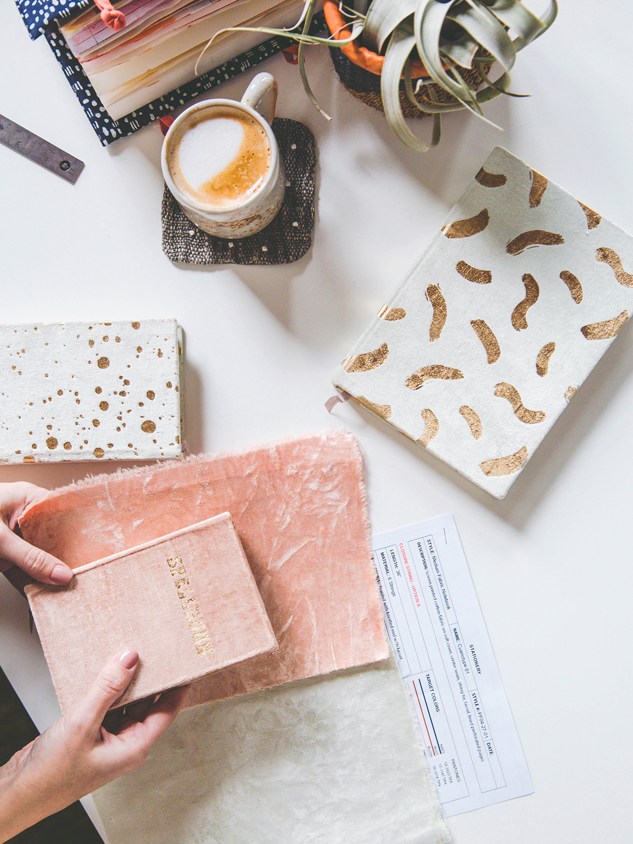
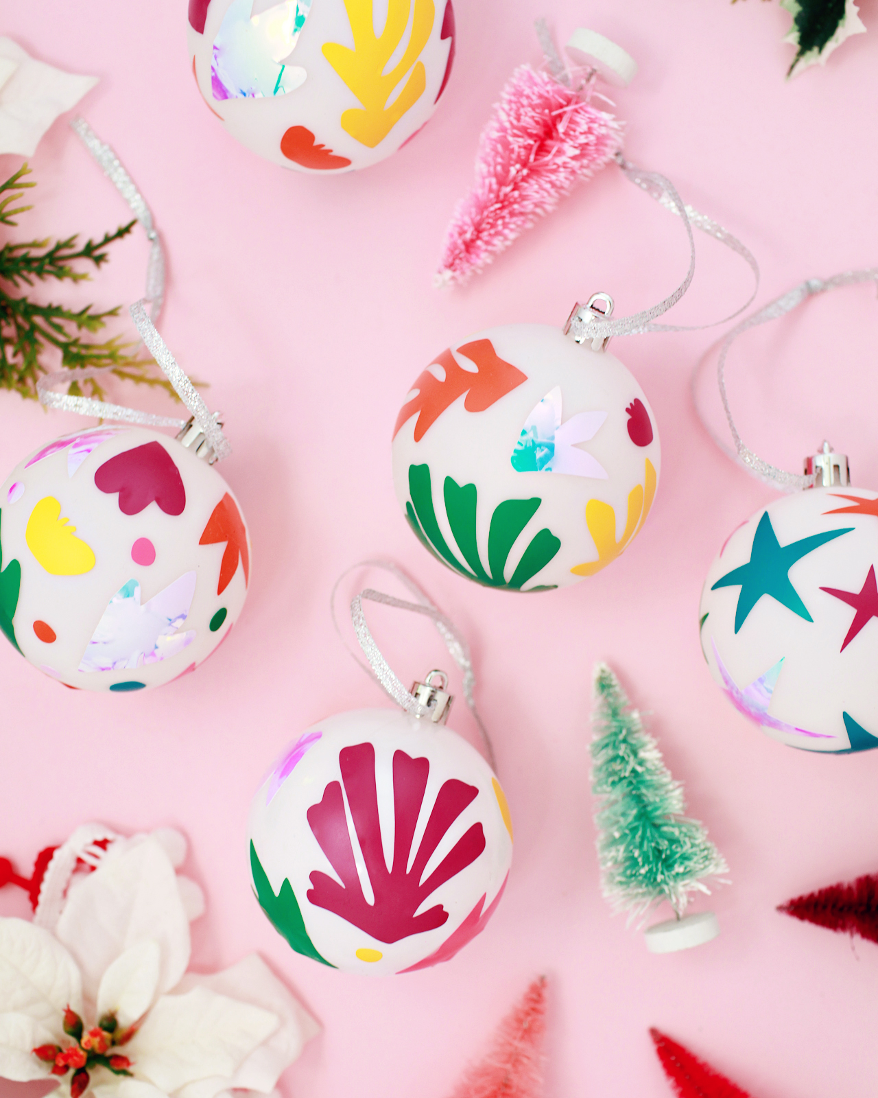
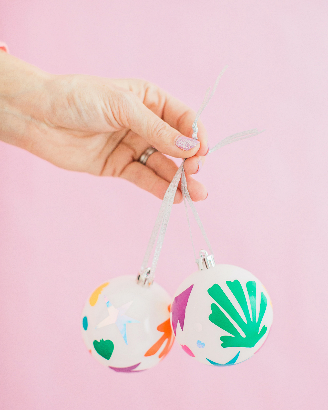
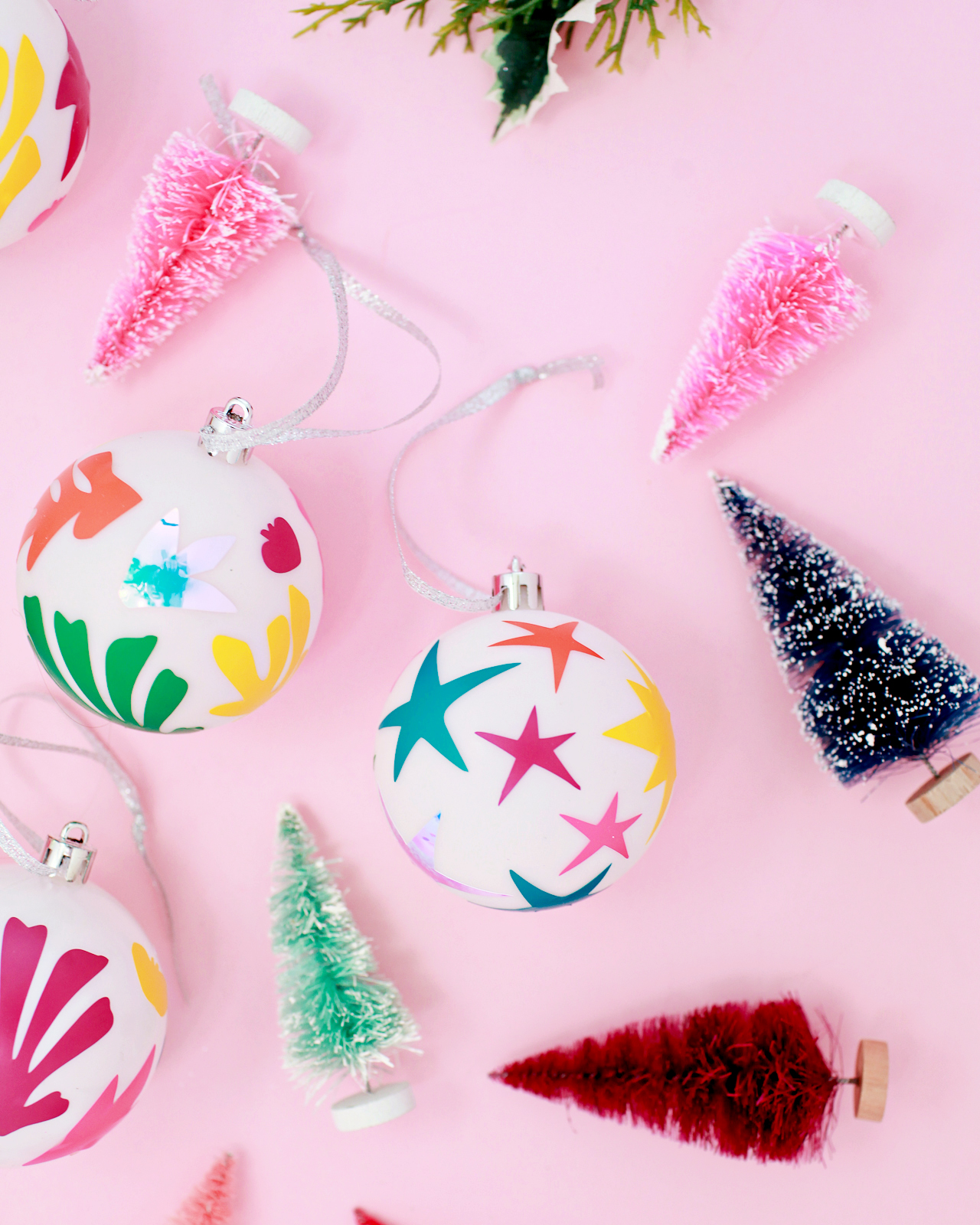
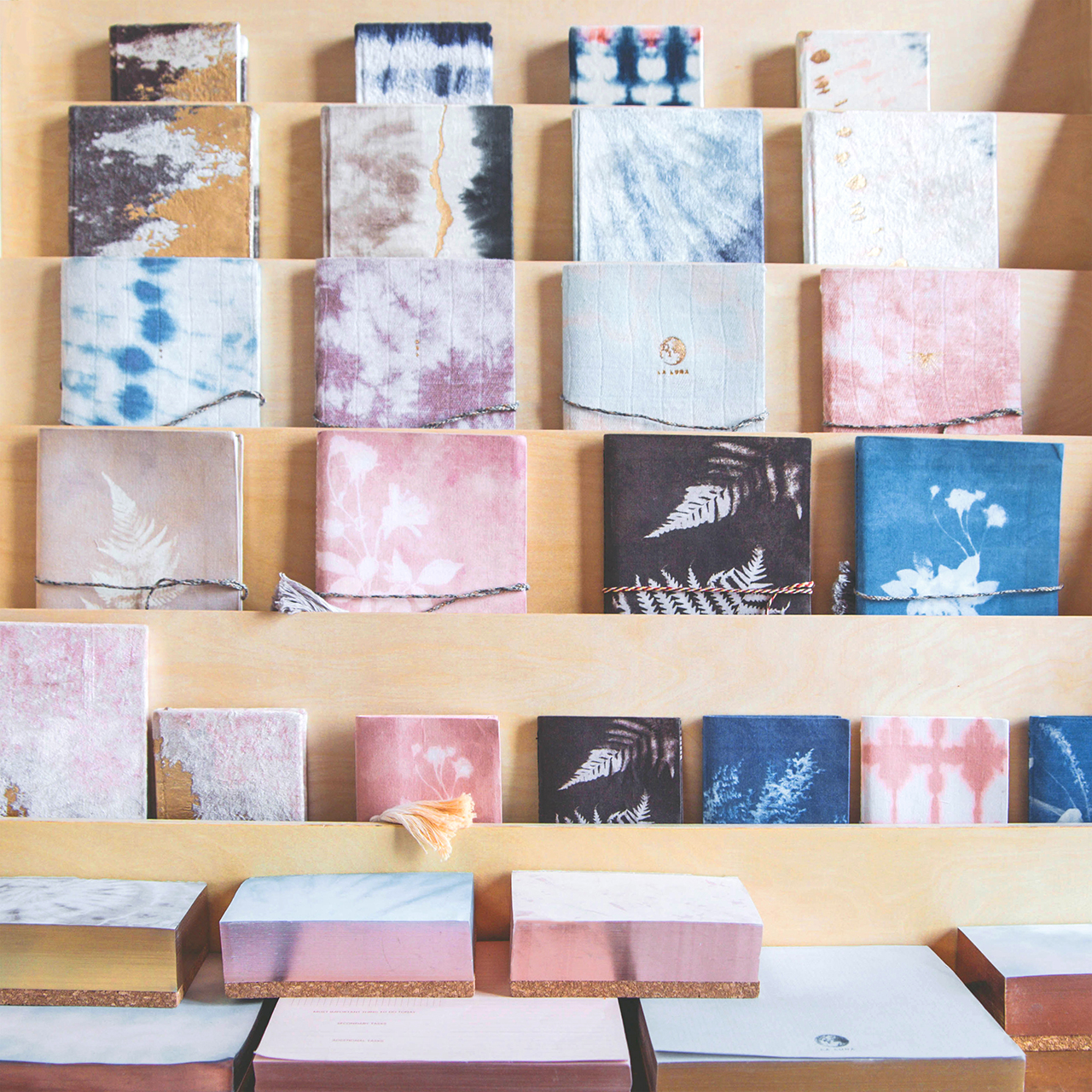
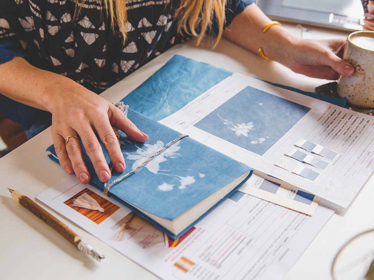
Our current collection focuses on journaling and desk, and I think that our point of view (combining a love for fabric, subtle patterns, soothing color and purposeful design) is what really makes us unique. While we’ve developed some purely paper products, the majority of our collection features fashion-inspired touches like fabric covers, woven wraps, ribbon bookmarks, and traditional textile processes like silkscreen and hand-marbling. One of our most popular product categories are our velvet journals, featuring plush velvet accented with metallic foil text and patterns. Another of our most popular styles are the noteblocks – they’re the absolute best desk accessory. Natural cork bases give these notepads a touch of something tactile, while the gold foiled edges evoke a modern shine.

Behind the Stationery: Printfresh

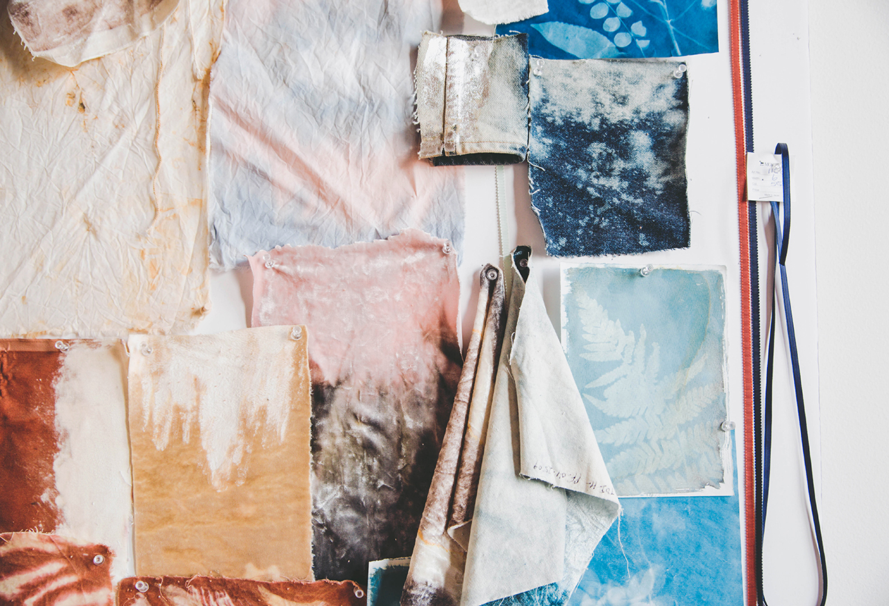
While the products and inspiration changes, my process for creating each new collection is usually pretty consistent. Like most people these days I start with a new Pinterest board. I gather inspiration for color, silhouette and pattern and start identifying what kind of products and finishes are most inspiring me. I try not to spend too much time there, since another big part of the concepting process includes seeking inspiration in-person. I try to go to museums, art exhibits and flea markets to find more primary sources for my work. It helps the designs feel more pure and less derivative, and plus it’s more fun!

Behind the Stationery: Printfresh

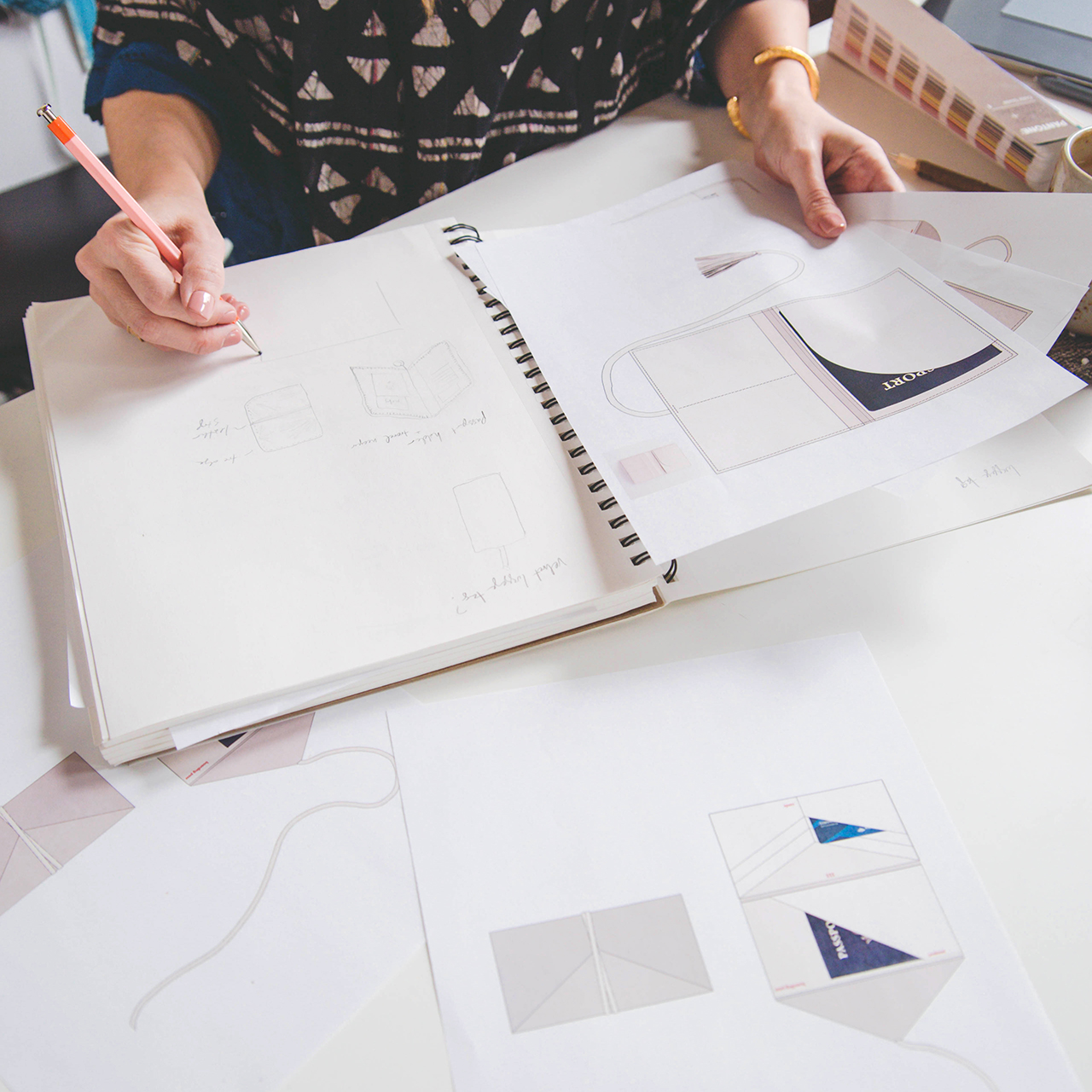
Once I have a few general concepts I start creating really loose sketches illustrating different types of silhouettes. Finding time to sketch in the office can be hard during a busy day, so I tend to do my most creative work away from the studio. I started drawing the latest collection after Thanksgiving dinner! You never know when creativity is going to strike, so I always love to have a sketchbook on hand.

Behind the Stationery: Printfresh

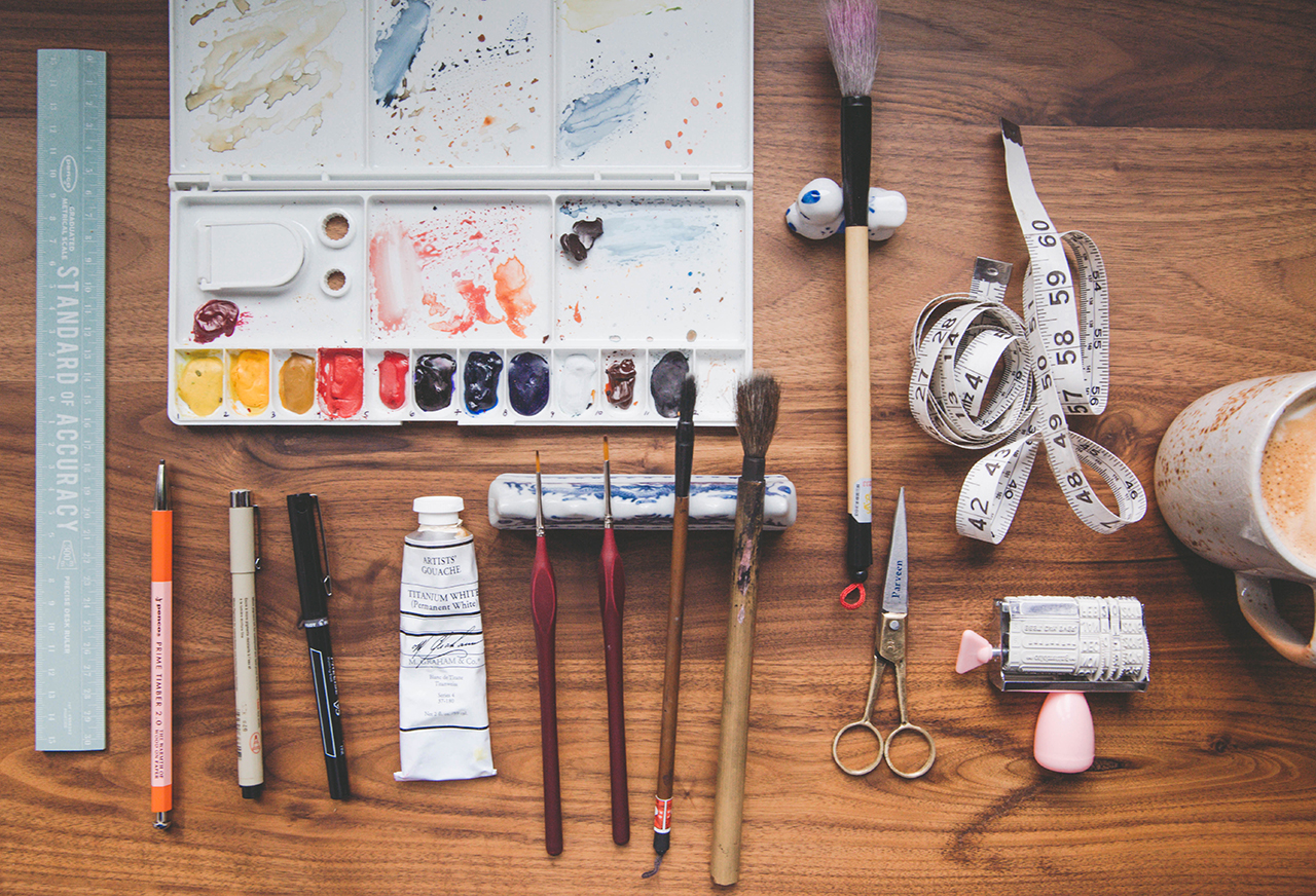
After I’ve finished sketching I start making decisions on materials, choosing fabrics, embellishments and trims. Then when I’ve developed a clearer vision I work with a team member to start creating the artwork and rendering the silhouettes in Photoshop. We render all of our designs in fairly high detail – I’m a very visual person, and I find it helpful to see exactly what the designs would look like in real life. It’s also incredibly important on the production end of things, since we work with artisans and craftspeople in India rather than manufacturing in-house. We need to be very specific about almost every aspect of each design, and we prepare incredibly detailed instructions (including everything from overall dimensions to paper weight to Pantone colors) that we call tech packs. If something is even just a little bit off in the tech pack, the finished product will suffer for it!

Behind the Stationery: Printfresh

Once we receive our first prototypes we review the product, decide on any style changes, and work with our vendors to develop a 2nd prototype. At that point we have to make the tough decision about which products make the cut and are good enough to be shown at the big industry trade shows like NYNOW, the Atlanta Gift Show, and NSS.

Starting a new line is never easy, and it definitely comes with challenges. I’ve found that creating and cultivating a cohesive brand is the most difficult and also most rewarding part. I don’t have a lot of experience in branding, especially since my textile design studio focuses more on relevant designs and great business-to-business relationships (a much different market than that of the direct to consumer). But since this brand is my aesthetic, I’ve learned that I just need to trust my gut instincts. If something doesn’t sit right with me about the colors, pattern, silhouette or wording then it’s probably off brand. I try to make sure I’m making decisions on an emotional level and always staying true to my intuition.

Behind the Stationery: Printfresh

All photos courtesy of Printfresh.

Want to be featured in the Behind the Stationery column? Reach out to Megan at megan [at] ohsobeautifulpaper [dot] com for more details.

Soft Neutral Vineyard Wedding Invitations

Soft neutral hues never go out of style. Michelle of Honey Paper designed these soft neutral vineyard wedding invitations inspired by the gorgeous venue nestled in the California mountains. Add in some vinyeard-inspired botanical illustrations, gold wax seals, and curated vintage postage and you’ve got the recipe for one seriously elegant and refined wedding invitation!

Soft Neutral Vineyard Wedding Invitations by Honey Paper

From Michelle: Between the San Rafael and Santa Ynez Mountains the summers are warm and rainless, dense with thickets of shrub and stippled in gray pine, wild cotton and a long list of oaks. The narrow, steep ranges are considered young at five million years old. Alluvial soils of the valley bear the plants of myth: bay laurel, rosemary, grape and olive. The Santa Ynez Valley is vintner’s and an artist’s dream. Gravelly soil bakes white in the sun while the slender olive leaves shake and bristle like birds in flight. The villa at Sunstone Vineyards and Winery was built under a seafaring sky in the heart of this beautiful place.

Soft Neutral Vineyard Wedding Invitations by Honey Paper

Soft Neutral Vineyard Wedding Invitations by Honey Paper

When the Rice family founded Sunstone Vineyard and Winery it became one of the first organic vineyard estates in the region. Everything about their venture has remained true to the story of the land, from practicing sustainable viticulture to incorporating hillside caves among dense blankets of wild grasses and evergreen. Antique wooden beams, once privy to the smells and sounds of a Victorian lavender factory, were brought from England and integrated into the architecture. The villa is a testament to the materials and practices of the old world integrated seamlessly to meet modern standards. Thick walls of local stone were finished with imported French limestone and elegant terra cotta roof tiles. The villa is an architectural gem that simultaneously preserves the past and shapes the future.

Soft Neutral Vineyard Wedding Invitations by Honey Paper

We wanted the stationery to capture the essence of the light at Sunstone. We paired a pale clay-colored ink with soft white paper. Each piece of the suite and day-of details, including menu and escort cards incorporate the silhouette of slender olive leaves and branches. The subtle design is reminiscent of a sun print – light waves patiently breaking down the fragile color bonds leaving only traces of color. The envelope and invitation enclosure are a nod to sandstone – a rock whose only memory is of the sea. Each invitation was wrapped in a buttery white ribbon and completed with a golden wax initial seal.

Soft Neutral Vineyard Wedding Invitations by Honey Paper

Fine linens and freshly cut greenery were arranged on long tables with wooden benches and tawny pillows under the shade of the high walls. The wedding cake arrived: three tiered, quartz on sky on the softened teal of mountain bluebird. All of the details came together in this inspiring land of rocky outcroppings, sandstone, shale and limestone. A place where the sun leaves a trace of its brightness behind.

Soft Neutral Vineyard Wedding Invitations by Honey Paper

Thanks Michelle!

Design and Calligraphy: Honey Paper

Check out the Designer Rolodex for more tal­ented wed­ding invi­ta­tion design­ers and the real invi­ta­tions gallery for more wedding invitation ideas!

Photo Credits: Ashley and Erik Fine Art Photography

DIY Matisse-Inspired Easter Eggs

My kids think Easter is the greatest thing ever. They get to decorate eggs, then hunt for them several times over with their friends and cousins, and of course there’s plenty of chocolate involved. Total kid jackpot, right?? Over the years I’ve done some really fun Easter egg projects, from simple marbled Easter eggs (which I’ll be doing with my 3 year-old’s preschool class on Friday!), to DIY illustrated temporary tattoo Easter eggs, to Easter eggs dipped in hologram glitter, to DIY galaxy Easter eggs. But I realized that I’ve never done anything specifically for plastic Easter eggs – the kind that split in half so you can hide something inside. Let’s fix that today with these DIY Matisse-inspired Easter eggs!

DIY Matisse-Inspired Easter Eggs

After doing temporary tattoos, marbling, nail polish, and glitter – this was my first time using craft vinyl to decorate Easter eggs! But after making these colorful Matisse-inspired pumpkins for Halloween, I knew I wanted to give it a try! This time, I let the plastic eggs bring in all the color and chose a “neutral” silver hologram vinyl to make the shapes. If hologram vinyl isn’t your thing, these eggs would be super cute with a regular metallic vinyl or a mix of colorful vinyl. The more color, the better!

DIY Matisse-Inspired Easter Eggs

My kids LOVE this kind of plastic Easter egg. And with a fun surprise inside, what’s not to love? I grabbed a few colorful plastic eggs from my local Target and a roll of silver hologram vinyl – and voila! Between the colorful plastic eggs and vinyl shapes, this was so easy and fun! Just pop a little treat inside, apply the vinyl shapes, close it up, and you’re good to go! Are you ready to make some??

DIY Matisse-Inspired Easter Eggs

DIY Matisse-Inspired Easter Eggs

Supplies

Plastic Easter eggs in fun colors

Craft vinyl in your chosen color (I used this hologram foil)

Silhouette Cameo or Cricut Explore cutting machine

Note: If you don’t have a Silhouette or Cricut, you could also paint the Matisse-inspired shapes onto the Easter eggs using acrylic craft paint. I know a couple of you painted the shapes on your pumpkins back in October – so clever!

DIY Matisse-Inspired Easter Eggs

To make the DIY Matisse-inspired Easter eggs:

Step 1. Download our templates at the bottom of the post, and use your Silhouette Cameo or Cricut to cut the shapes from your vinyl. Each template should cover approximately a dozen Easter eggs.

Step 2. Carefully peel individual shapes from the adhesive backing and apply to the faux Easter eggs like a sticker. I found it easiest to start by placing two or three of the larger shapes around the Easter egg, then fill in with the smaller shapes. If you place a shape and then change your mind, you should be able to move it by very carefully peeling the vinyl from the Easter egg and moving it to a new spot.

Step 3. Continue placing vinyl shapes until you’ve covered the entire Easter egg, and enjoy!

DIY Matisse-Inspired Easter Eggs

DIY Matisse-Inspired Easter Eggs

DIY Matisse-Inspired Easter Eggs

So fun, right? If you make these, or any of our other Easter egg projects, please be sure to share a photo on Instagram with the hashtag #madewithosbp so I can see it!

Download the templates below!

MATISSE-INSPIRED EASTER EGG TEMPLATE (Silhouette Studio file)

MATISSE-INSPIRED EASTER EGG TEMPLATE (SVG file)

p.s. DIY Hologram Foil Easter Eggs, DIY Painterly Pink and Gold Easter Eggs, and DIY Illustrated Temporary Tattoo Easter Eggs

Photo Credits: Nole Garey for Oh So Beautiful Paper

International Women’s Day

March is Women’s History Month, and today is International Women’s Day. Last year, we marked the occasion with A Day Without a Woman, but this year I wanted to focus on something a bit more proactive. So I’m sharing a stationery round up focused on supporting and empowering women, from art prints to notebooks to greeting cards. Dear Hancock just released this stunning print with illustrations of the imagined desks of twelve historical women who provided great contributions to Fashion, Science, Astronomy, Art, Design, Aviation, Literature, Primatology and Women’s History. Dear Hancock worked with the foundations of each woman to create the illustrations, and prints with some of the individual illustrations (like the Georgia O’Keeffe desk) are being carried in their museum gift shops. Proceeds from the print will be donated to Time’s Up!

Historical Women's Desks Art Print by Dear Hancock

From the top, left to right; Sonia Delaunay, Dian Fossey, Vera Rubin, Amelia Earhart, Rosie the Riveter, Marie Curie, Frida Kahlo, Ray Eames, Athena, Georgia O’Keeffe, Jane Austen and Mary Shelley.

Dear Hancock

And even more lady power stationery for International Women’s Day:

International Women's Day Round Up

From top right:

1. One of four illustrated cards from Paper Parade celebrating International Women’s Day, with messages of women’s empowerment, friendship, and encouragement.

2. I’m absolutely loving the entire International Women’s Day collection from Cardtorial, with notebooks and cards featuring different quotes and phrases in collaboration with several lettering artists – like this design in collaboration with Anne Robin!

3. The Kiss My Pumps collection from Paper Epiphanies is dedicated to empowering women. I love this art print so much!

4. We all get by with a little help from our friends – and I need at least half a dozen of these cards from Emily McDowell

5. Kathryn from Blackbird Press comes up with the most creative ways to celebrate inspiring women in history, like this fold-out card and this Brillian Women Spinner.

6. Dahlia Press has so many fantastic cards and art prints celebrating women’s empowerment, including this beautiful silhouette card with hand lettering. I also love this set of illustrated postcards for political advocacy.

7. Pick your favorite inspiring female figure in this Boss Ladies series from Boss Dotty

8. Pink power suits and an Unbreakable Kimmy Schmidt reference in this card from Party Sally

9. The future is female indeed, from Dahlia Press

10. The perfect card for your favorite boss lady from Ladyfingers Letterpress

DIY Matisse-Inspired Ornaments

Remember the Matisse-inspired pumpkins that I made back in October? Well, I’m back at it with DIY Matisse-inspired ornaments! I had some solid white ornaments from Target that needed a bit of dressing up and I happened to have a few leftover Matisse-inspired shapes from when I made the pumpkins back in October, so I decided to stick a few shapes onto the white ornaments – and ta da! I’m loving the pops of color against the matte white ornaments, but you could definitely make these with any color ornaments. These DIY Matisse-inspired ornaments are super easy to make, are a really fun way to add some color to your Christmas tree, and they’re also a fun project for little helpers. I’m sharing my template below so you can make your own!

DIY Matisse-Inspired Ornaments

DIY Matisse-Inspired Ornaments

DIY Matisse-Inspired Ornaments

When I did the pumpkins back in October, I used a mix of large and small Matisse-inspired shapes. Since ornaments are even smaller than the tiny pumpkins, we’ll just use the small shapes for this project. I also experimented with a couple ornaments that were all just one shape, like stars, but I really prefer the ornaments that combine all the shapes in a random pattern. These Matisse-inspired shapes are just so lovely when all mixed together!

DIY Matisse-Inspired Ornaments

DIY Matisse-Inspired Ornaments

Supplies

Solid color ornaments, either plastic or glass

Matte craft vinyl in a variety of colors – I used pink, orange, yellow, green, teal, purple

Opalescent vinyl (optional – but I love the way it looks!)

Silhouette Cameo or Cricut Explore cutting machine

Note: If you don’t have one of those machines, you can still use our template to trace the shapes onto the vinyl and cut the shapes out by hand – but it will go a LOT faster with a cutting machine. You can download our templates at the bottom of the post!

DIY Matisse-Inspired Ornaments

DIY Matisse-Inspired Ornaments

To make the DIY Matisse-inspired ornaments:

Step 1. Download our templates at the bottom of the post and use your Silhouette Cameo or Cricut to cut the shapes from each color of vinyl. You can do a colorful rainbow like I did – or keep things simple with just one or two colors!

Step 2. Carefully peel individual shapes from the adhesive backing and apply to the ornaments like a sticker. I found it easiest to start with two of the larger shapes on either side of the ornament, then fill in with the smaller shapes in between. If you place a shape and then change your mind, you should be able to move it by very carefully peeling the vinyl from the ornament and moving it to a new spot (I did this a few times!).

Step 3. Continue placing vinyl shapes until you’ve covered all of your ornaments, and enjoy!

DIY Matisse-Inspired Ornaments

DIY Matisse-Inspired Ornaments

DIY Matisse-Inspired Ornaments


So easy, right? And such a great way to add some color to your Christmas tree!

Download the templates below!

MATISSE-INSPIRED ORNAMENT TEMPLATE (Silhouette Studio file)

MATISSE-INSPIRED ORNAMENT TEMPLATE (SVG file)

p.s. DIY hologram foil ornaments and DIY Matisse-inspired pumpkins

Photo Credits: Meghan Marie Photography and Nole Garey for Oh So Beautiful Paper