Behind the Stationery: Hartland Brooklyn

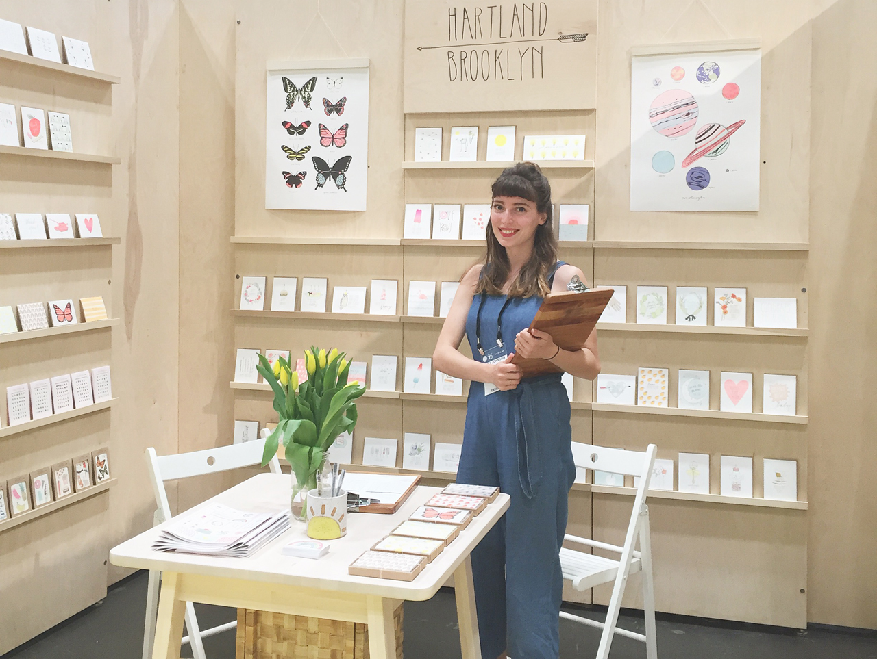
Our next installment of Behind the Stationery ventures up to New York and highlights Emily’s story from Hartland Brooklyn. From hand painting her first cards to walking her line sheet into a local stationery shop, Emily is here to share her stationery business story. Her journey takes us to upstate New York where she opened a quaint stationery storefront, office, and home — all in one building. Hartland Brooklyn has always put a priority on making eco-conscious goods, and Emily explains how her printing process has shifted as she’s grown her business. Welcome, Emily! –Megan Soh
Behind the Stationery: Hartland Brooklyn

From Emily: Since I was a little girl, I always knew I would be in a creative field, and most likely have my own business. My grandmother is a watercolor painter and my mom has a dried flower farm, and they both were huge influences growing up (and still are!). I saw that you could make your living off of something you love to do. I set off to NYC for college to study fashion design, and worked for about 6 years in both small and large fashion companies. This is where I learned the ins and outs of design, running a business, and found my creative voice.
Behind the Stationery: Hartland Brooklyn

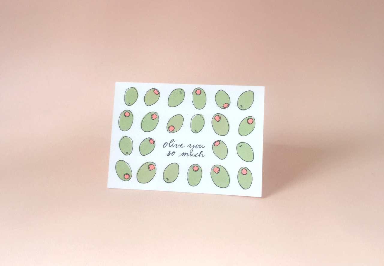
I began making birthday cards at my desk for co-workers, and soon their friends and family. With some encouragement I set up an Etsy shop and started selling my hand painted cards. The beautiful stationery store Papel was around the corner from my apartment in Brooklyn, and I brought my tiny line sheet and samples in to share. They placed an order and became my first wholesaler, and from there Hartland took off!
Behind the Stationery: Hartland Brooklyn

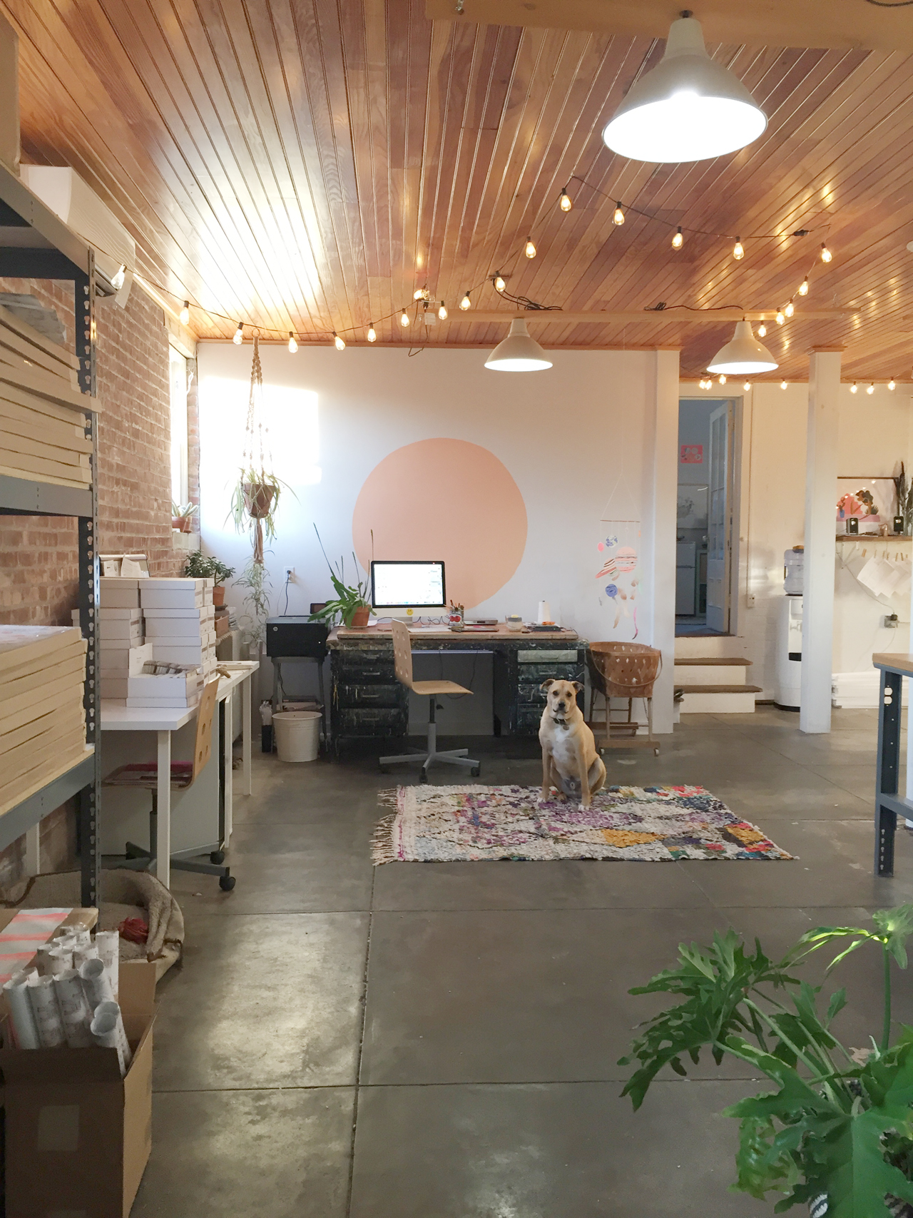
I worked from my apartment for a year or so, then moved to a tiny studio in Greenpoint the following year. I quickly grew out of that space as well, and while looking for a new studio I started looking upstate. An old general store 2 hours north of NYC caught my eye, when my husband and I saw that the post office was located across the street, I knew it was meant to be.

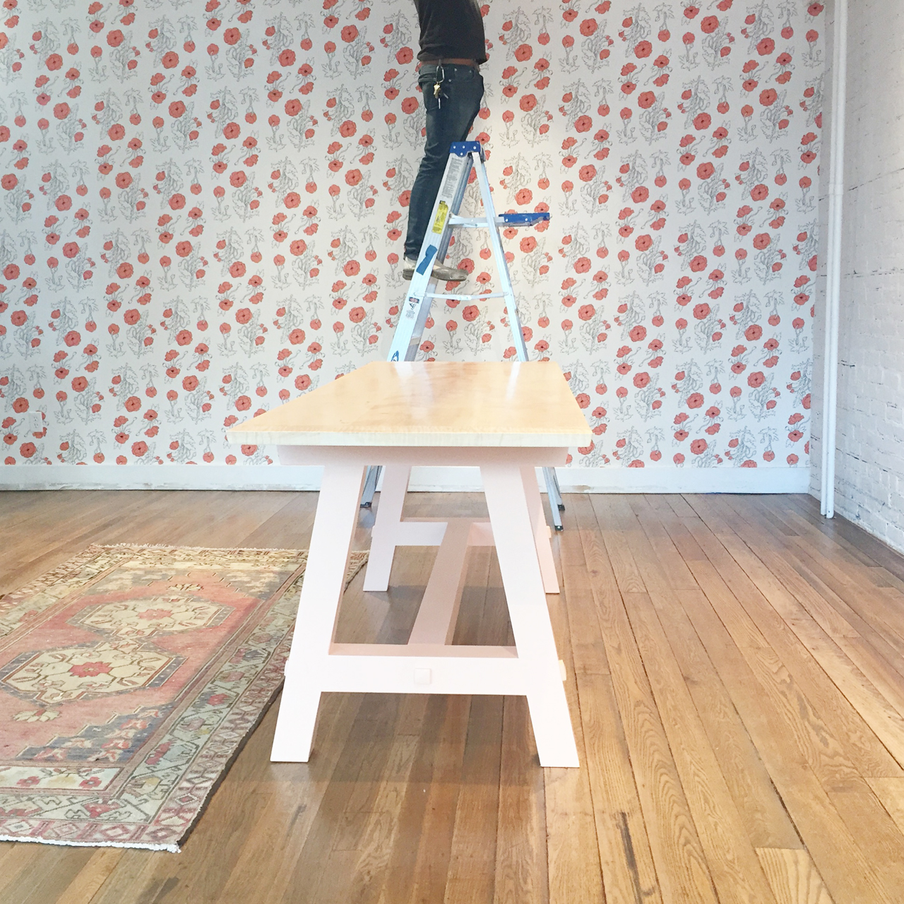
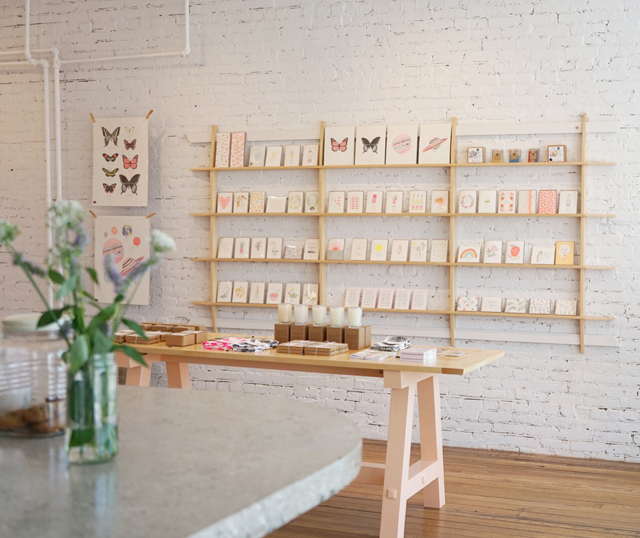
Since the building had a storefront, we decided to open a card and coffee shop. I designed the wallpaper, and we worked with a few local contractors to build out the space. Hartland on Hudson opened fall 2016. My husband runs the coffee/card shop and I run Hartland Brooklyn from behind the storefront.
Behind the Stationery: Hartland Brooklyn

Behind the Stationery: Hartland Brooklyn

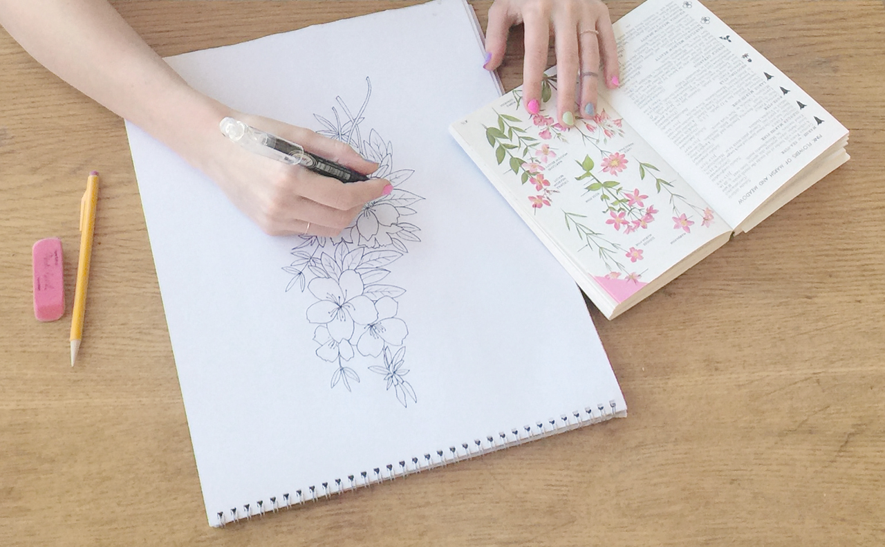
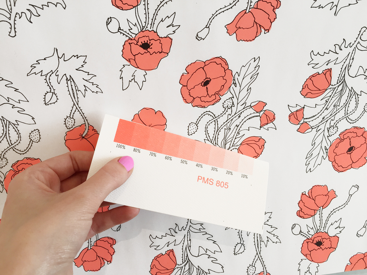
All my designs are hand illustrated with ink, then imported to the computer to color. This way I can edit and add the neon Pantone colors that are the core of Hartland Brooklyn.

I’m always jotting down card ideas, and find inspiration all around me. I come up with the best ideas while traveling, since you’re removed from so many distractions. I sometimes end up designing new cards when I have an occasion to give a card and realize I don’t have the perfect one. In each new design, I make sure it’s something that I would be excited to give to someone. Ideas can come from many sources — I am particularly inspired by nature at the moment with our new life in the country.
Behind the Stationery: Hartland Brooklyn

Behind the Stationery: Hartland Brooklyn

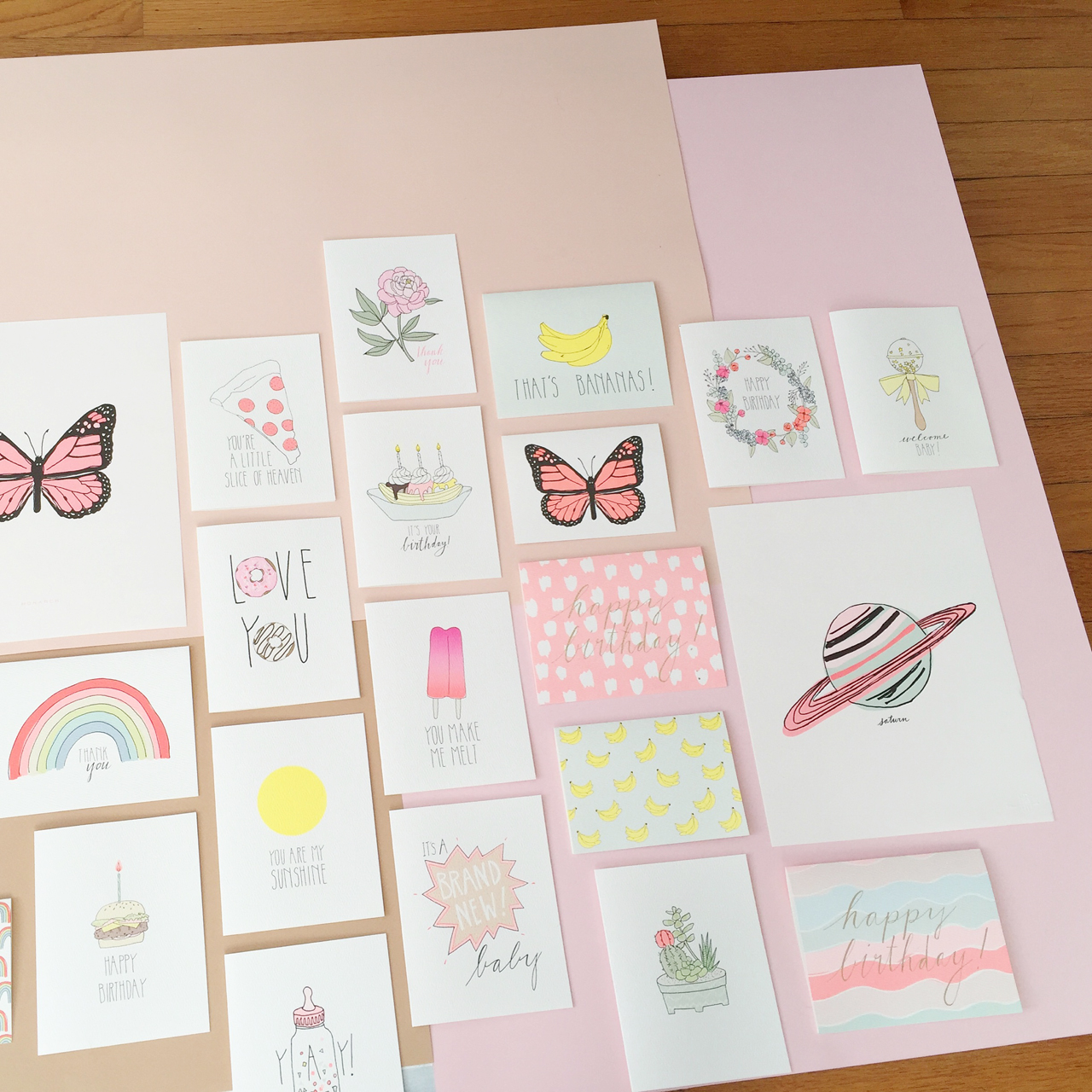
Each card is offset printed with added neon pigment in Brooklyn, NY. We work with a wonderful printer who is eco-conscious and prints with vegetable-based ink. We’ve worked together to match our neon Pantone colors and have had great success. I also love to add foil stamping, which is stamped in midtown Manhattan. I chose a felted paper to give it a hand-painted feel.

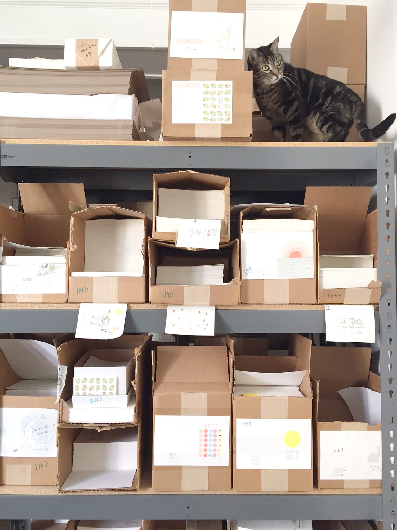
When I first started Hartland Brooklyn I didn’t have the minimums to offset print, so I was hand painting the neons on the cards (it was very labor-intensive). This way I could test styles and see what works, without investing all my money into printing thousands of cards. With the quantities I now order, the neons can be printed, which gives me the ability to add even more color and saves me an incredible amount of time.
Behind the Stationery: Hartland Brooklyn

Behind the Stationery: Hartland Brooklyn

I think the graphic illustrations and color palette are a unique combination. The paper is felted, which gives it a hand-made feel. I’ve recently introduced wrapping paper sheets, with my added neons that I haven’t seen in the market. I’m hoping to expand on these, since I love patterns and it feels so new in the line.

We also offer soy-based temporary tattoos and nail tattoos.

I try not to pay attention to what other companies are doing. I like my ideas to come from my life and experiences and not from short-lived trends. I also try and keep it fun, so people can send a little happiness with every card.
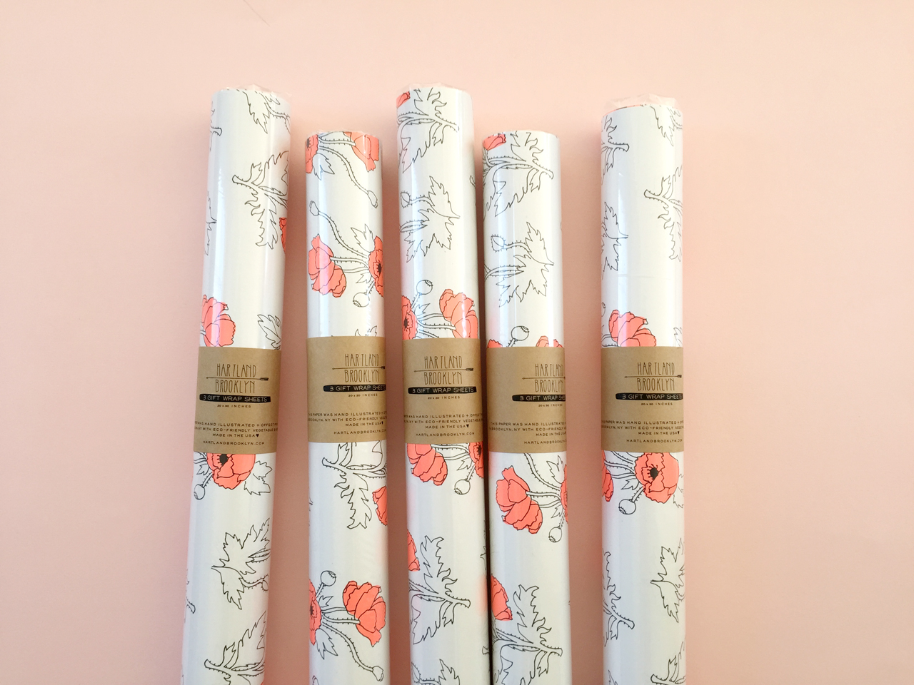
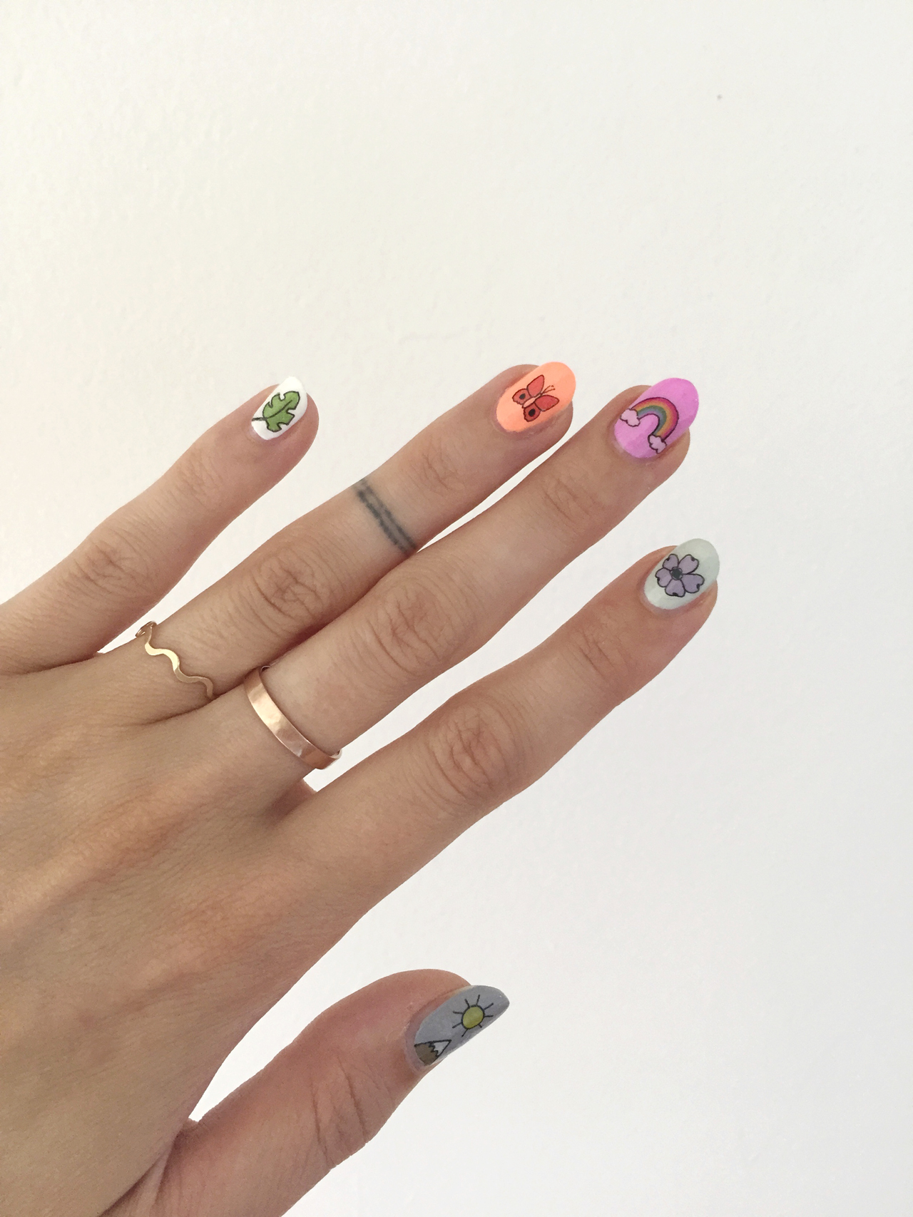
Behind the Stationery: Hartland Brooklyn

Behind the Stationery: Hartland Brooklyn

Our typical workday is a little more complicated now that have a newborn. It’s been interesting finding a good work/life balance. We live above the studio, so I can take my time coming down to work or pop in and out and check on the status of orders. I think I was away from the office for about 3 or 4 days after Olive was born..! I can’t stress how thankful I have been for the people I have helping me pack cards, since every second free is more valuable now!

Once the shop closes at 3 (and my husband can watch the baby if she’s not napping) I spend some time shipping out orders, and we run everything to the post office by 4:30.
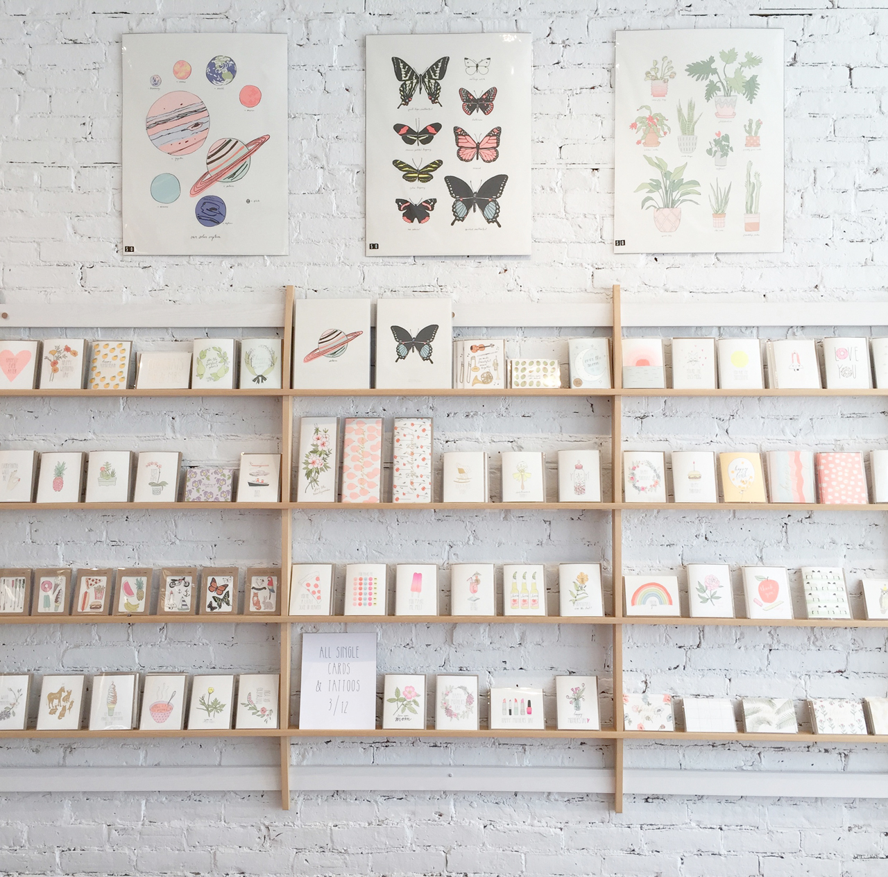
Behind the Stationery: Hartland Brooklyn

Thanks so much for stopping by Emily!

Romantic Copper Foil Wedding Invitations

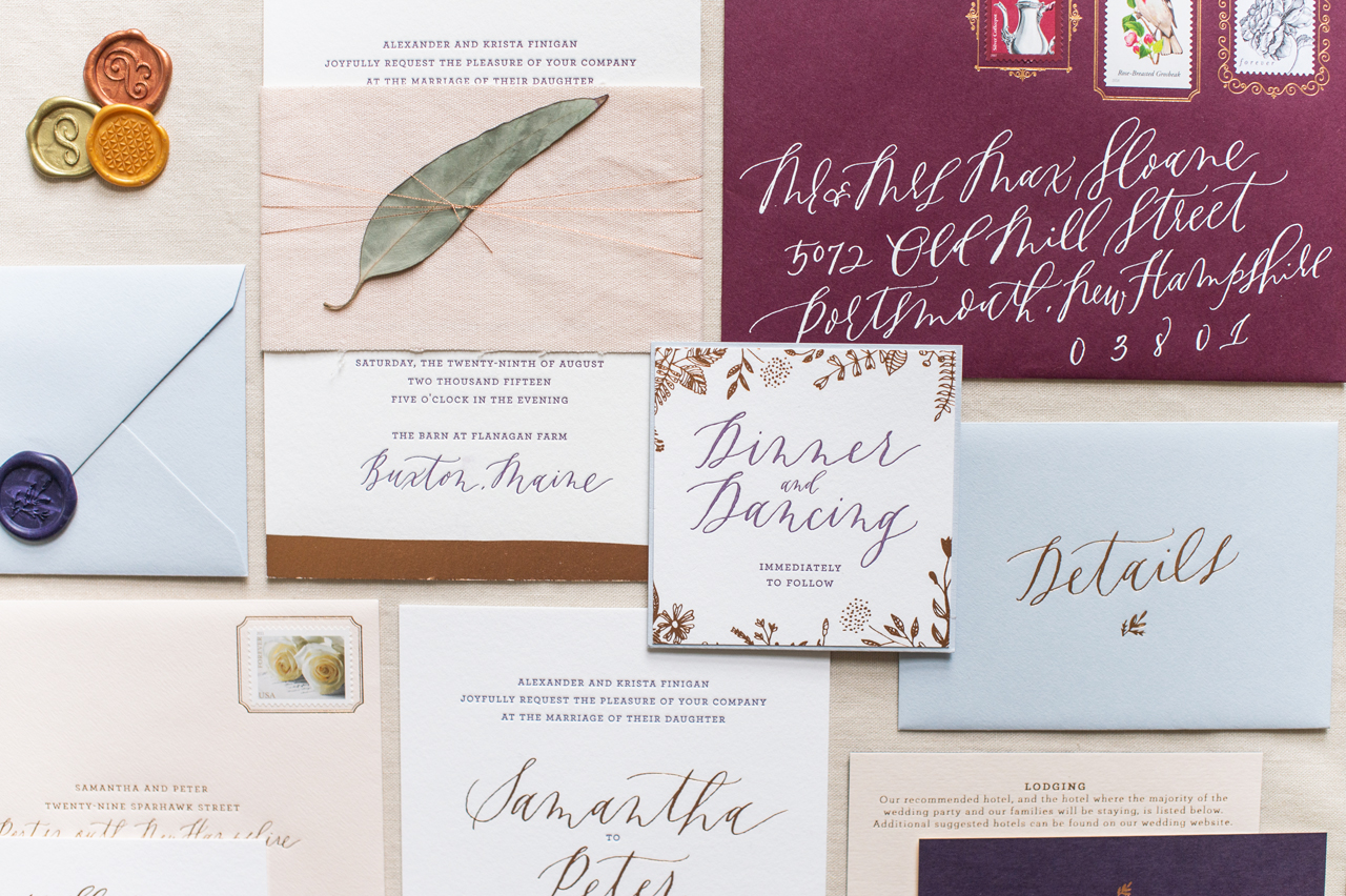
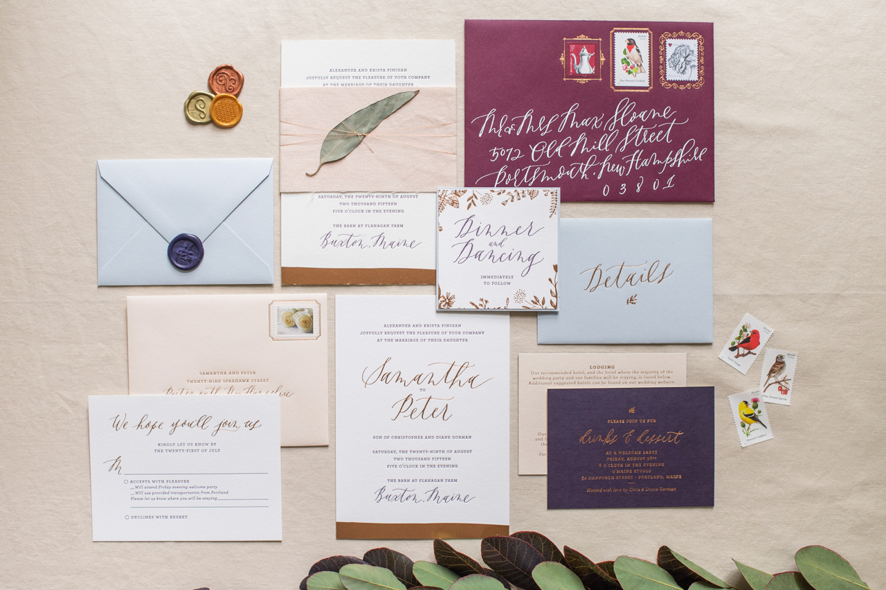
Happy Monday everyone! Are you ready for some truly beautiful wedding invitations with one of the most gorgeous envelope details I’ve EVER SEEN???? These romantic copper foil wedding invitations come to us from two ladies that are near and dear to my heart: Samantha and Whitney of Gus & Ruby Letterpress! Whitney designed (and printed!) these invitations for Sam’s wedding a couple summers ago, with beautiful calligraphy from Graceline, a soft and romantic color palette, and copper foil details woven throughout the suite. So pretty!

Romantic Copper Foil Wedding Invitations by Gus & Ruby Letterpress

From SamanthaMy absolutely incredible business partner and best friend, Whitney, designed this custom suite for me, welcoming guests to my weekend-long wedding held outside Portland, Maine. Though the wedding was held in a refurbished barn, the event was not at all rustic and instead featured an elegant, romantic color palette of deep purples, rich raspberry, slate blue, copper, and a few blushy pinks. My overall aesthetic was inspired by a moody Vermeer still-life.

Romantic Copper Foil Wedding Invitations by Gus & Ruby Letterpress

Romantic Copper Foil Wedding Invitations by Gus & Ruby Letterpress

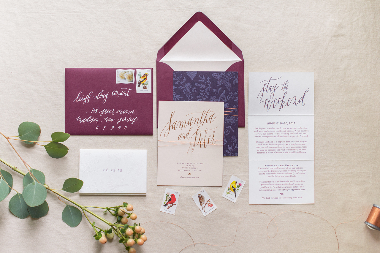
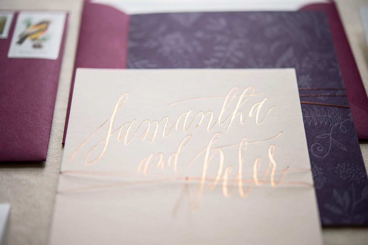
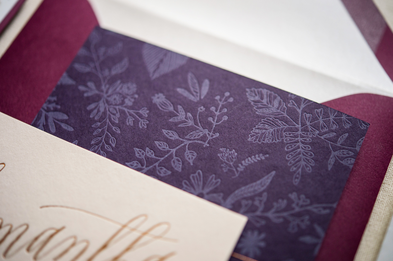
An interactive tri-fold save the date introduced guests to the event with information about the weekend. The piece was then tied with metallic twine atop a card featuring duo-tone papers (soft pink and deep plum) and a full-bleed floral pattern.

Romantic Copper Foil Wedding Invitations by Gus & Ruby Letterpress

Romantic Copper Foil Wedding Invitations by Gus & Ruby Letterpress

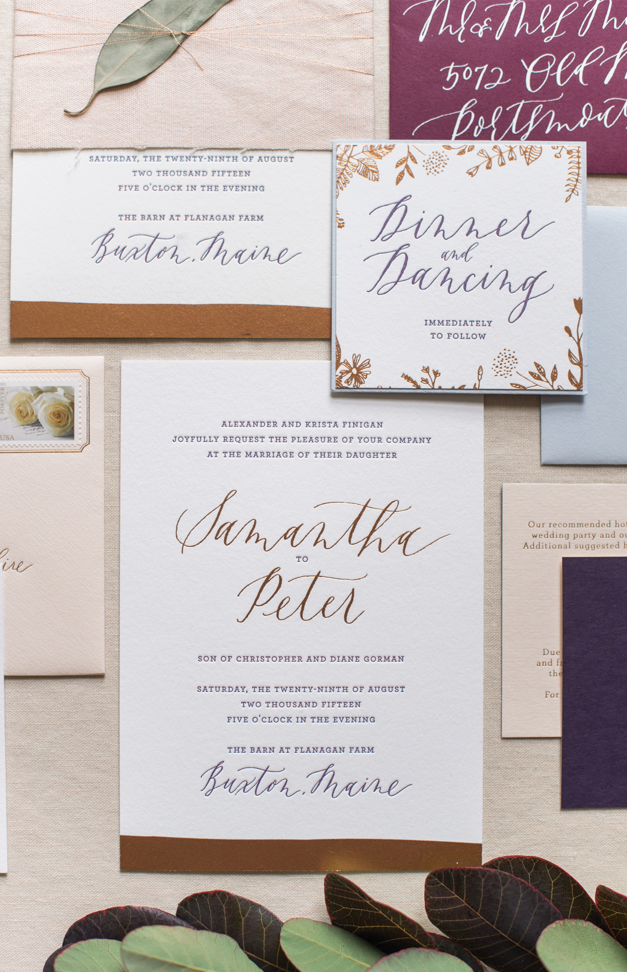
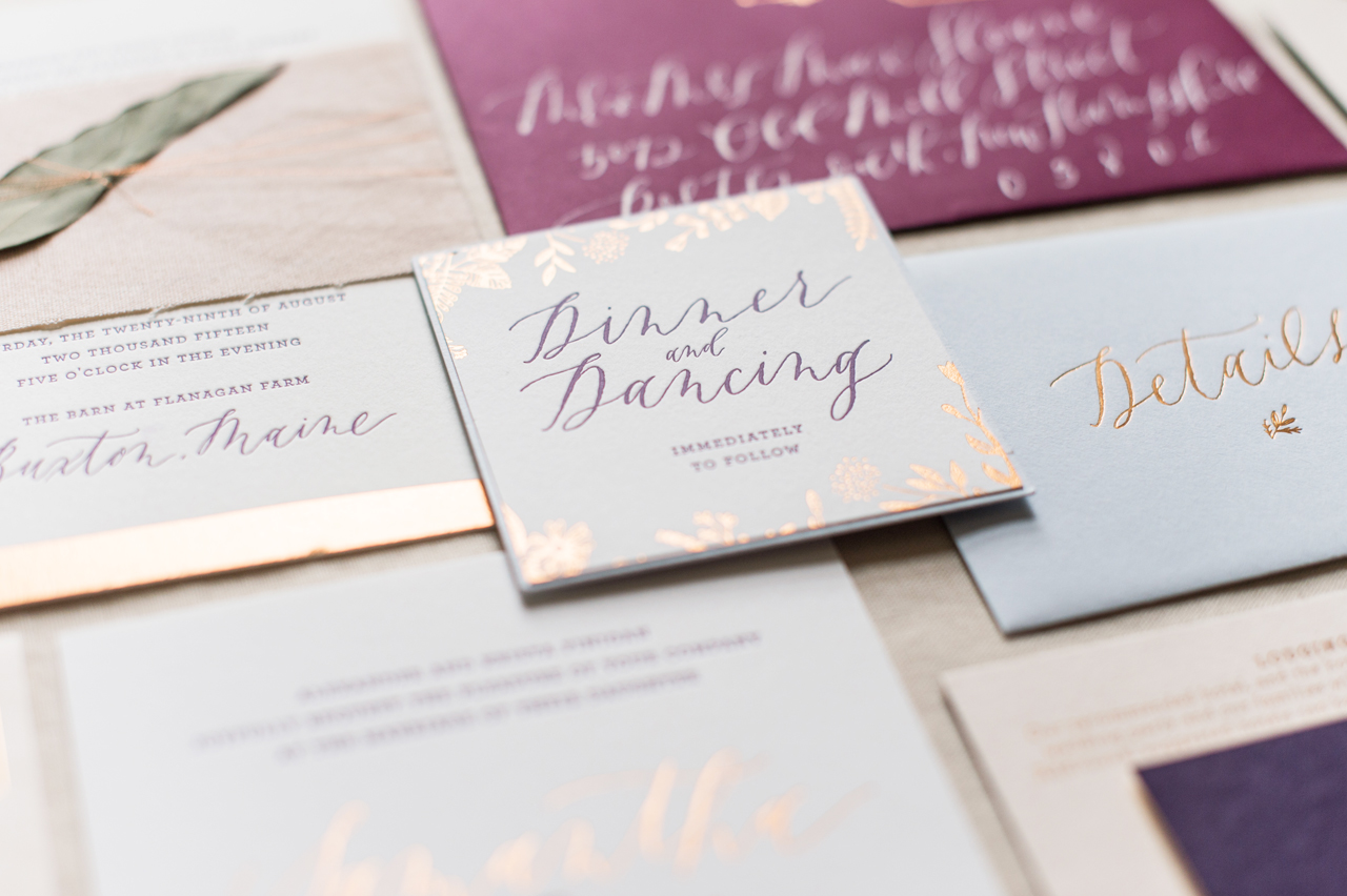
The invitation suite featured romantic, contemporary calligraphy by Jenny Sanders of Graceline Art and a classic roman font. The actual invitation featured a swath of copper foil along the bottom while other pieces used varying paper colors and small amounts of florals to convey the elegant tone. Each invitation suite was wrapped in a hand-dyed linen band, tied with metallic twine and had dried eucalyptus leaves atop them.

Romantic Copper Foil Wedding Invitations by Gus & Ruby Letterpress

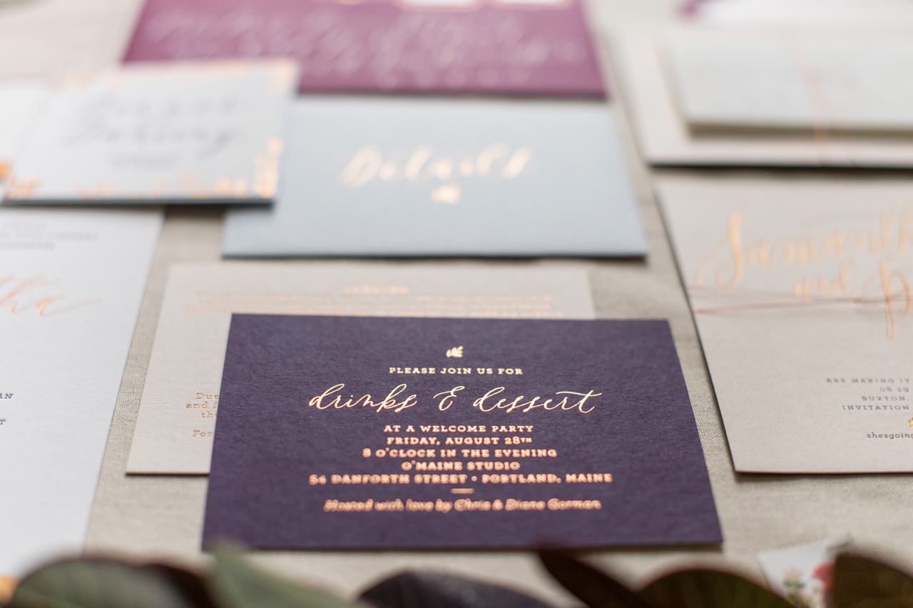
Weekend events cards were printed on duo-toned paper (deep plum and soft pink) and housed in small slate blue “details” envelopes featuring custom wax seal closures. All pieces were printed on a mix of double-thick 100% cotton paper and rich colored stock. As always, the pieces were lovingly letterpress printed and foil-stamped by hand on our antique presses here in NH.

Romantic Copper Foil Wedding Invitations by Gus & Ruby Letterpress

Romantic Copper Foil Wedding Invitations by Gus & Ruby Letterpress

Romantic Copper Foil Wedding Invitations by Gus & Ruby Letterpress

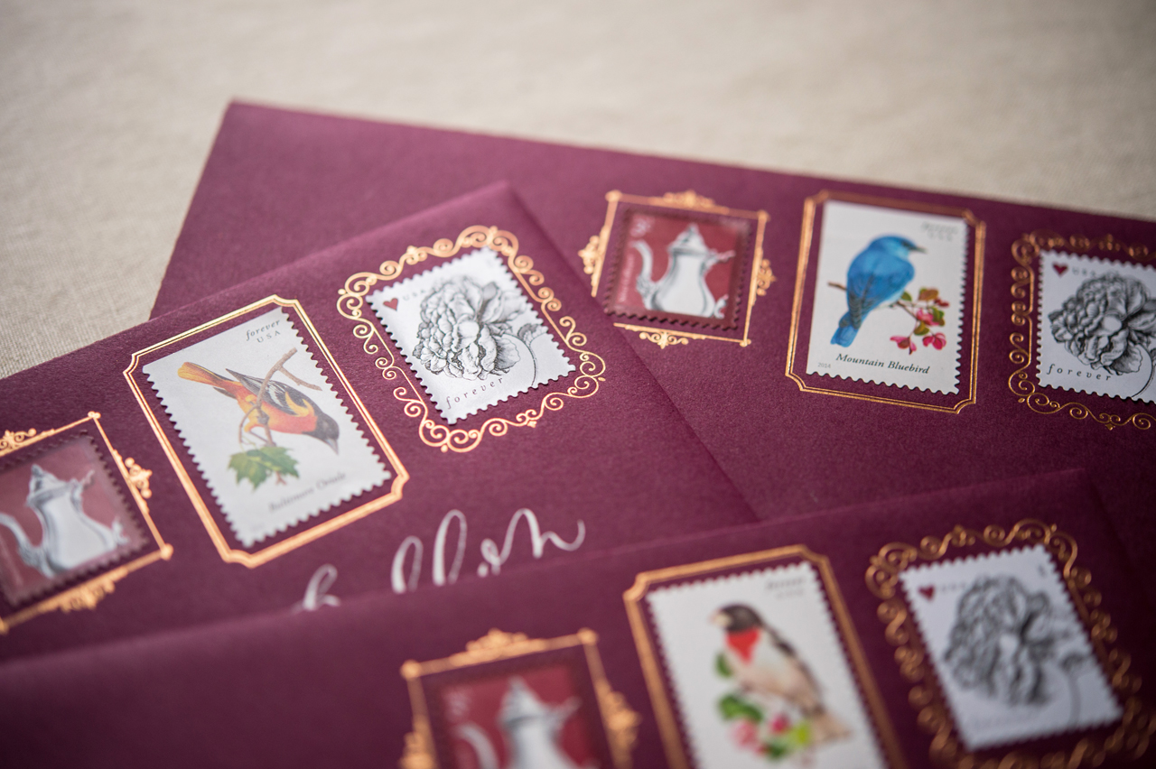
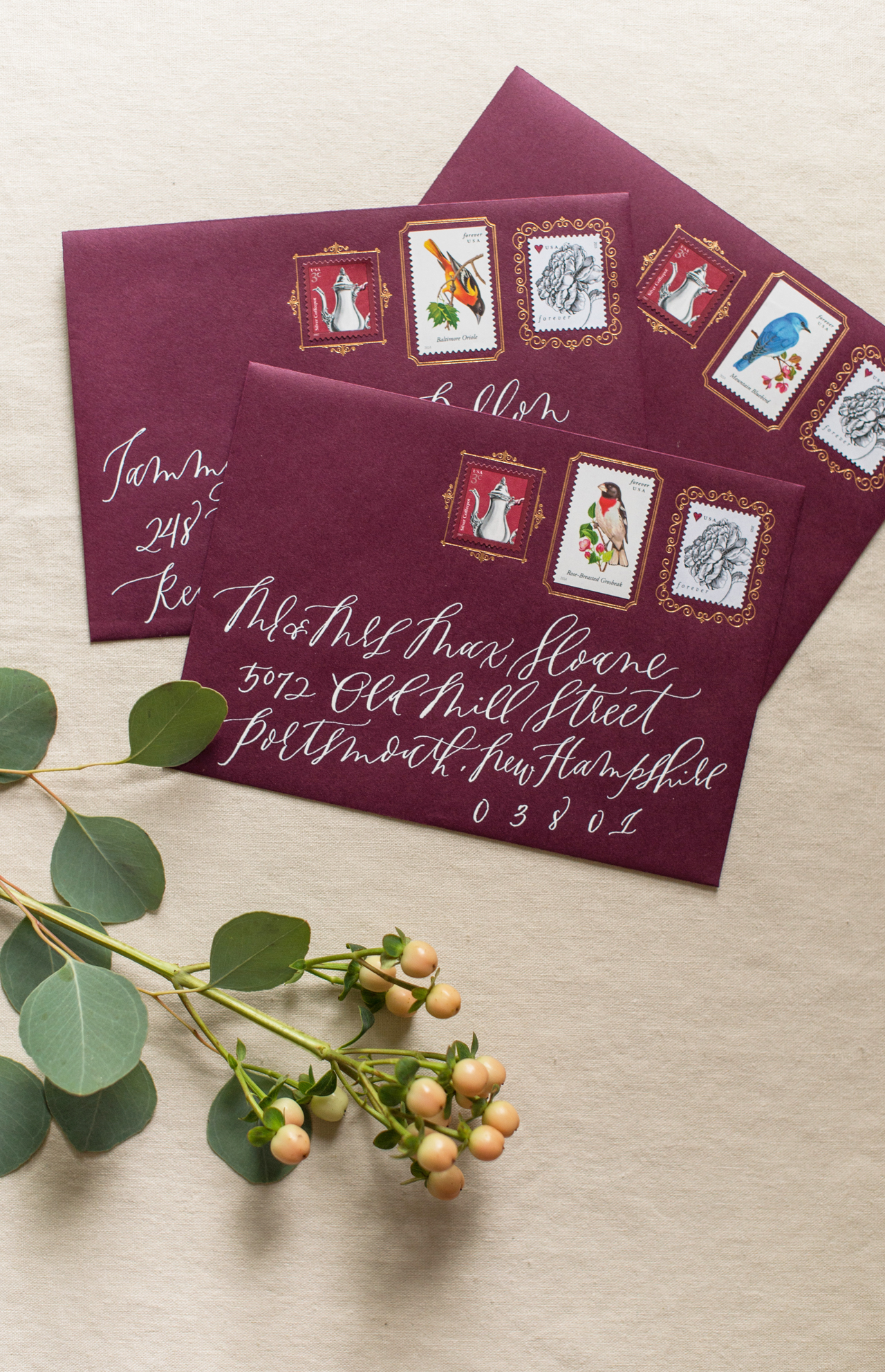
The whole bundle was then housed in a deep wine-colored envelope with a soft blush liner. Delicate copper frames were foil stamped on the front of the envelope to encircle a selection of carefully curated stamps and white calligraphy finished the design.

Romantic Copper Foil Wedding Invitations by Gus & Ruby Letterpress

Romantic Copper Foil Wedding Invitations by Gus & Ruby Letterpress


Thanks so much Samantha & Whitney!

Design and Printing: Gus & Ruby Letterpress

Envelope Calligraphy: Jenny Sanders of Graceline

Gus & Ruby Letterpress is a member of the Designer Rolodex â€“ check out more of their beautiful work right here or visit the real invi­ta­tions gallery for more wedding invitation ideas!

Photo Credits: Brea McDonald Photography for Gus & Ruby Letterpress

Backyard Black Tie Wedding Invitations

Sophisticated yet laid back. These backyard black tie wedding invitations from Ashling of Lotus & Ash welcomed guests to a barefoot, relaxed, and formal wedding celebration. We love the juxtaposition of high fashion and low-key relatability! This is such a fun suite, including nods to the couple’s collegiate days where they first met. The modern calligraphy by Nicole Miyuki and classic serif typefaces make the perfect final detail of juxtaposition to pull it all together!

Backyard Black Tie Wedding Invitations by Lotus & Ash

From Ashling: As a wedding invitation designer, it’s what I’ve come to call the “triple crown” – a collaborative bride with impeccable taste, a film-worthy love story over a decade in the making, and a shared goal to design a suite that was traditional and timeless, but didn’t take itself too seriously.

Backyard Black Tie Wedding Invitations by Lotus & Ash

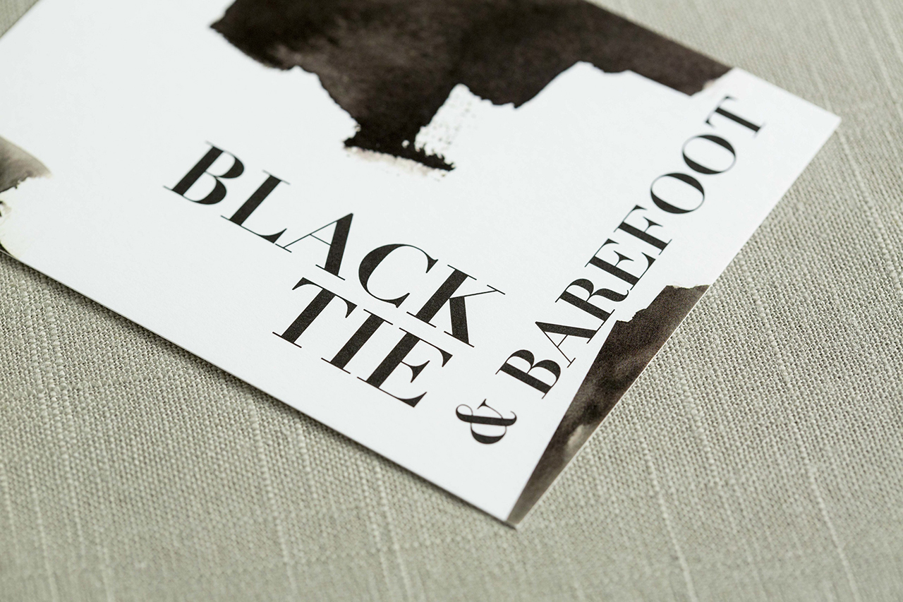
The mature, edgy, and meaningful invitation suite was such a trifecta. The thread for their wedding weekend was “Black Tie and Barefoot,” and it lived every bit up to its promise. The couple was married in front of the groom’s childhood home, followed by an elegant black tie reception held in the backyard. The celebration ended with an after party in the pool house, and the bride and groom jumping, fully clothed, into the pool.

Backyard Black Tie Wedding Invitations by Lotus & Ash

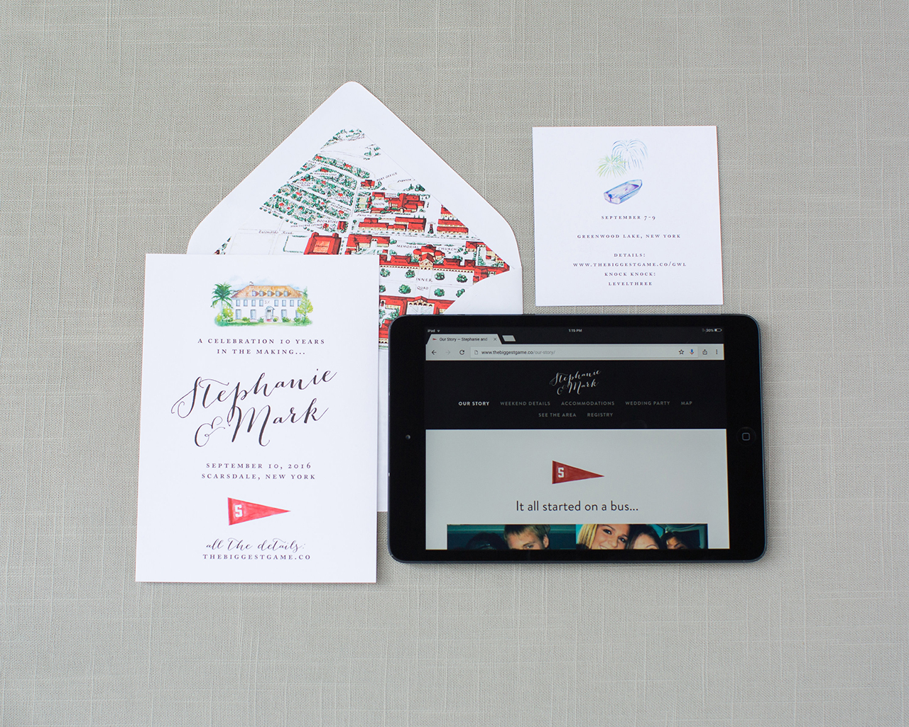
When Steph and Mark first came to us to design their full wedding stationery suite in less than 5 months, we were beyond excited for the opportunity, but needed to get their save the dates out quickly. Still unsure of what their exact wedding aesthetics would be, we celebrated their days as Stanford students with a save the date that incorporated watercolor university ephemera and a portrait of the fraternity house where they first met. We incorporated a vintage map of Stanford from the couple’s collection as a personal, colorful envelope liner.

Backyard Black Tie Wedding Invitations by Lotus & Ash

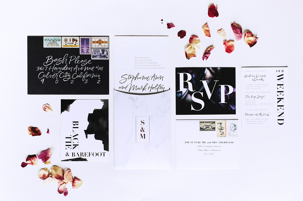
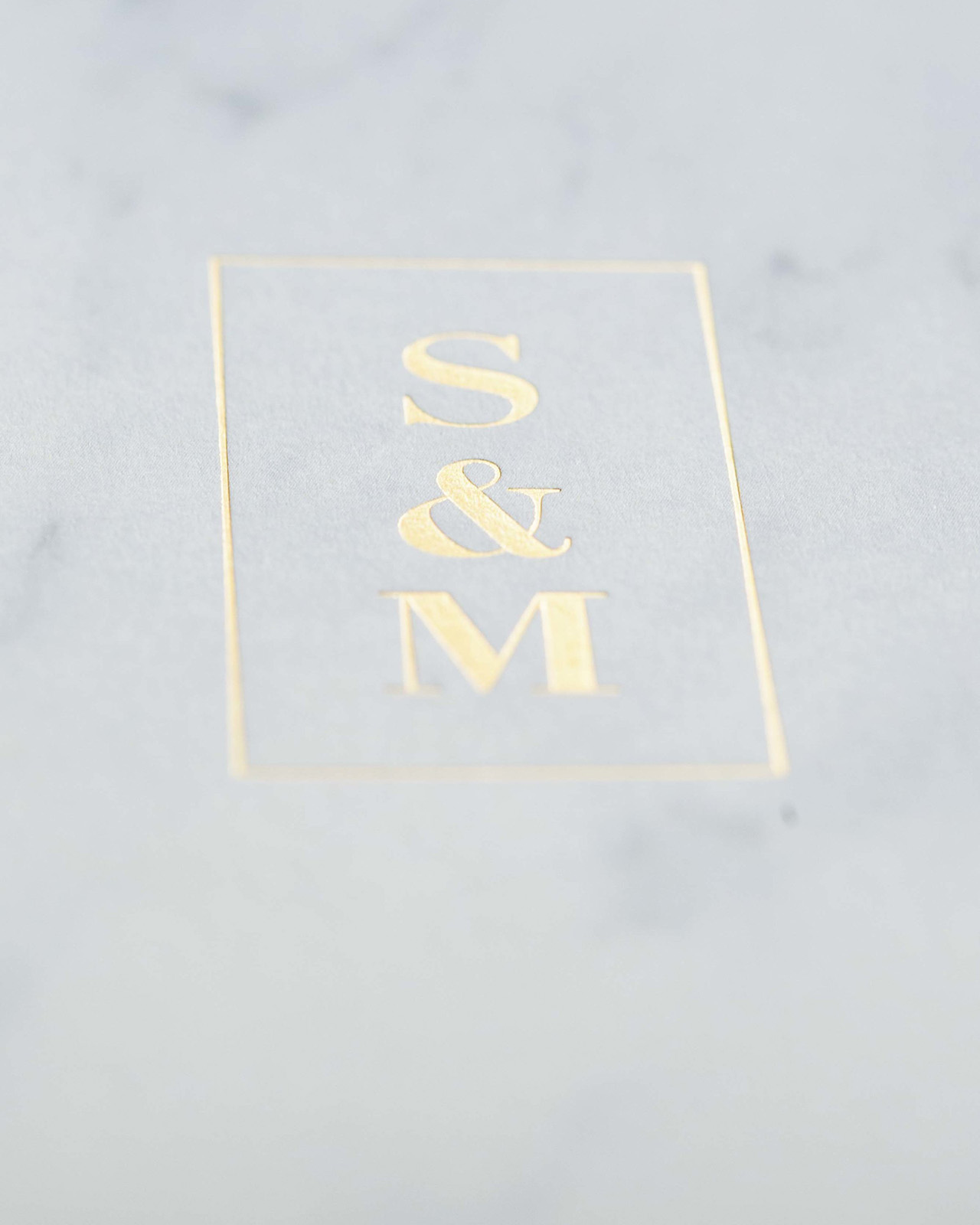
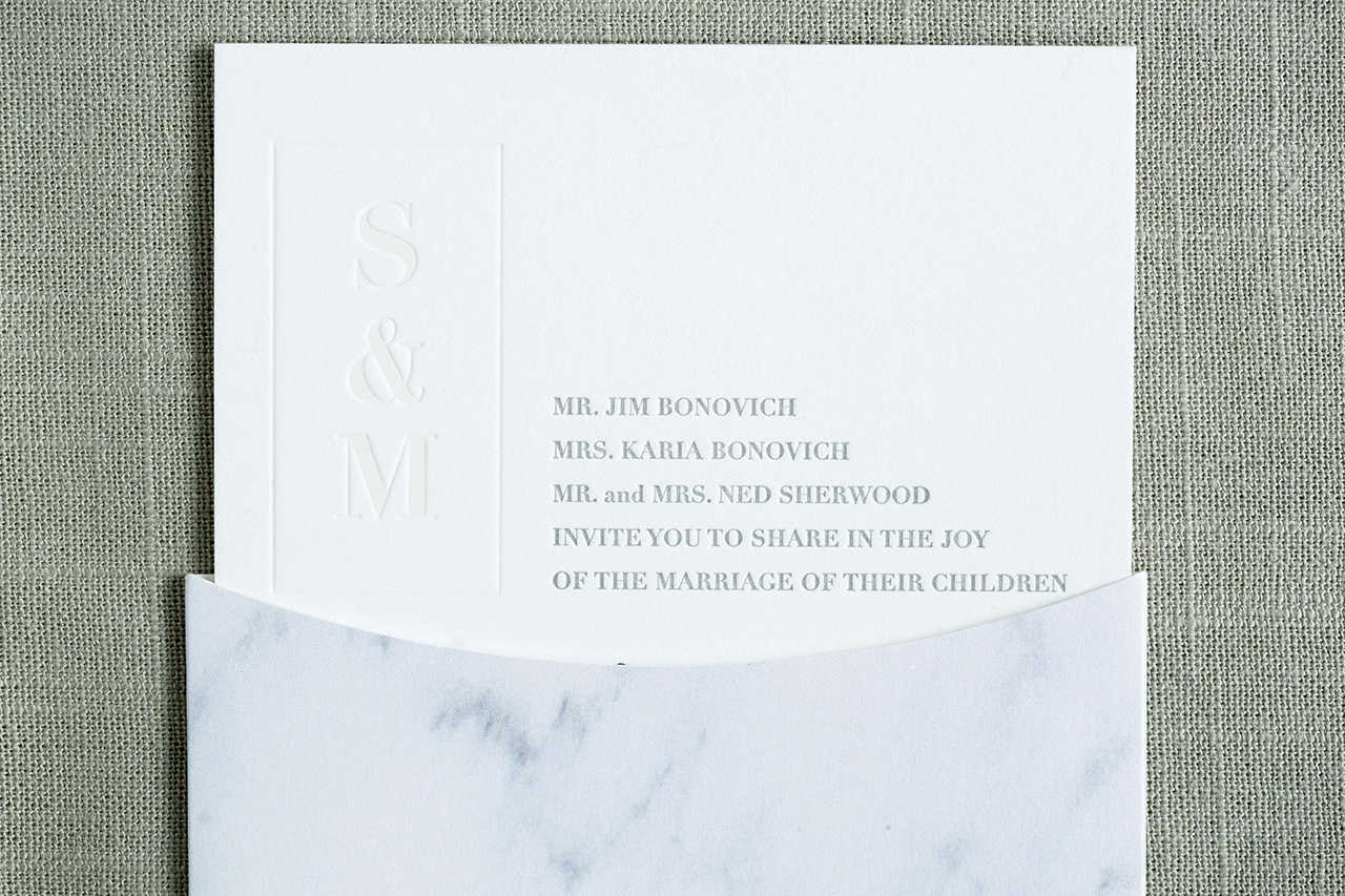
As the details came together for Steph and Mark’s backyard, black tie wedding, we knew we wanted to create something that was both sophisticated and formal, yet fun and modern. Aubergine envelopes with brush calligraphy opened to reveal a Carrara marble liner and foil-stamped pocket, inspired by the wedding decor.

Backyard Black Tie Wedding Invitations by Lotus & Ash

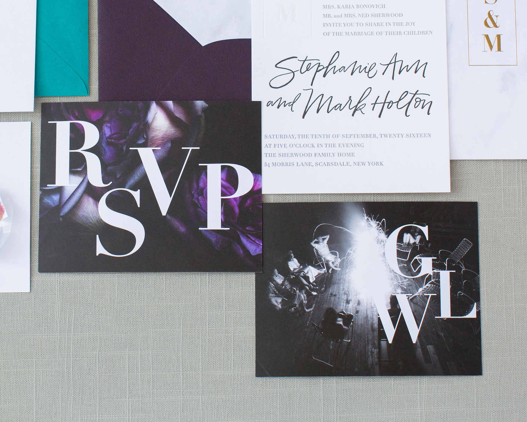
The letterpress announcement, printed on the ever gorgeous 2-ply Crane’s Lettra, featured modern calligraphy paired with a classic serif typeface and a blind deboss detail on both the front (the couple’s monogram) and back (a rose pattern). The suite also included weekend details and reply cards with arresting typography, dark floral photography, and haphazard black watercolor swashes, digitally printed on an Indigo press on #130 Classic Crest.

Backyard Black Tie Wedding Invitations by Lotus & Ash

Backyard Black Tie Wedding Invitations by Lotus & Ash

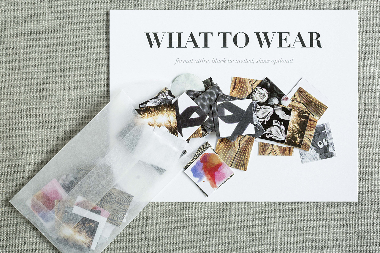
Our personal favorite element from the suite? It’s nearly impossible to choose, but the attire card takes the crown. It featured glassine envelopes filled with colorful swatches to inspire guests attire and the instructions “black tie invited, shoes optional.” In our dream world, that would be the requested dress code for all weddings!

Backyard Black Tie Wedding Invitations by Lotus & Ash

Thanks Ashling!

Design and Illustration: Lotus & Ash

Calligraphy: Nicole Miyuki

Letterpress Printing: Dependable Letterpress

Foil Printing: JR Press

Check out the Designer Rolodex for more tal­ented wed­ding invi­ta­tion design­ers and the real invi­ta­tions gallery for more wedding invitation ideas!

Photo Credits: Katrina Jayne Photo

Stationery A-Z: Copper Foil

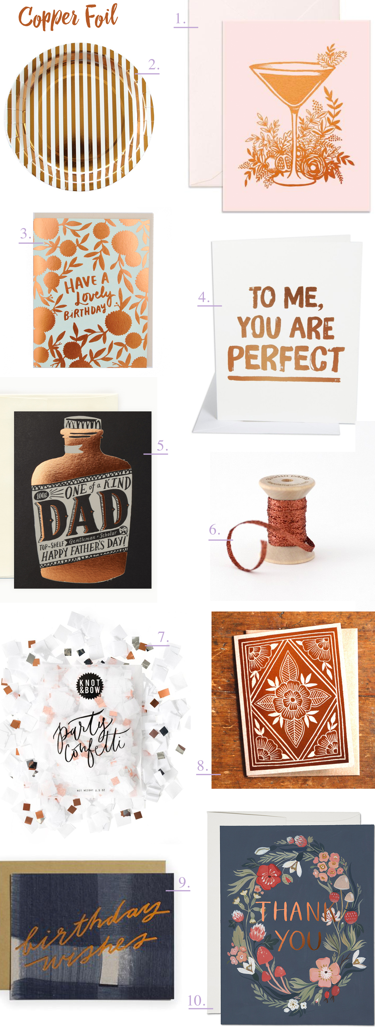
We’ve often waxed poetic about our love of gold, holographic, and rose gold foil on wedding invitations and greeting cards, but today we thought we’d sing the praises of copper foil! Copper has a striking beauty all its own (case in point: this stunning skirt from Proenza Schouler or this sleek light fixture from Anthropologie), and is quickly making a home for itself in the stationery world. I’m especially loving the use of copper on dark backgrounds (so modern!). Here is a collection of some recent favorites:

Trendspotting: Copper Foil

From top left:

1. A copper foil cocktail on gorgeous blush pink paper from Fox & Fallow

2. Fun striped copper foil party plates from Bash Party Goods!

3. The combination of hand lettering and copper foil in this birthday card from Hello!Lucky is the perfect balance of elegance and fun

4. If you’re behind on your Valentine’s day greetings (or missed all three of our earlier posts), might you consider this simple, yet direct, message from The Social Type.

5. The copper is the whiskey…get it? This clever usage comes courtesy of Idlewild Co.

6. Stunning metallic cotton ribbon from Angela Liguori

7. Toss some of this copper confetti from Knot & Bow into a greeting card for a fun surprise – or sprinkle it on a table at your next party!

8. I’ve been a fan of printmaker Katharine Watson’s work for awhile now and I love that she moved in the foil space.

9. Meg from Moglea always comes up with the most amazing color stories and combinations, so it’s not surprising that she was an early adopter of this metallic trend.

10. Now, this is what I’m talking about: copper foil on gray paper is so fresh. Add some illustrated flowers and you’ve got yourself a winner. By Kelsey Garrity Riley for Red Cap Cards.

What’s your favorite metallic foil these days? Classic silver or modern gold? Are you loving copper foil, or feeling all things holographic? Let us know in the comments below!


Stationery A-Z: Engagement Congratulations

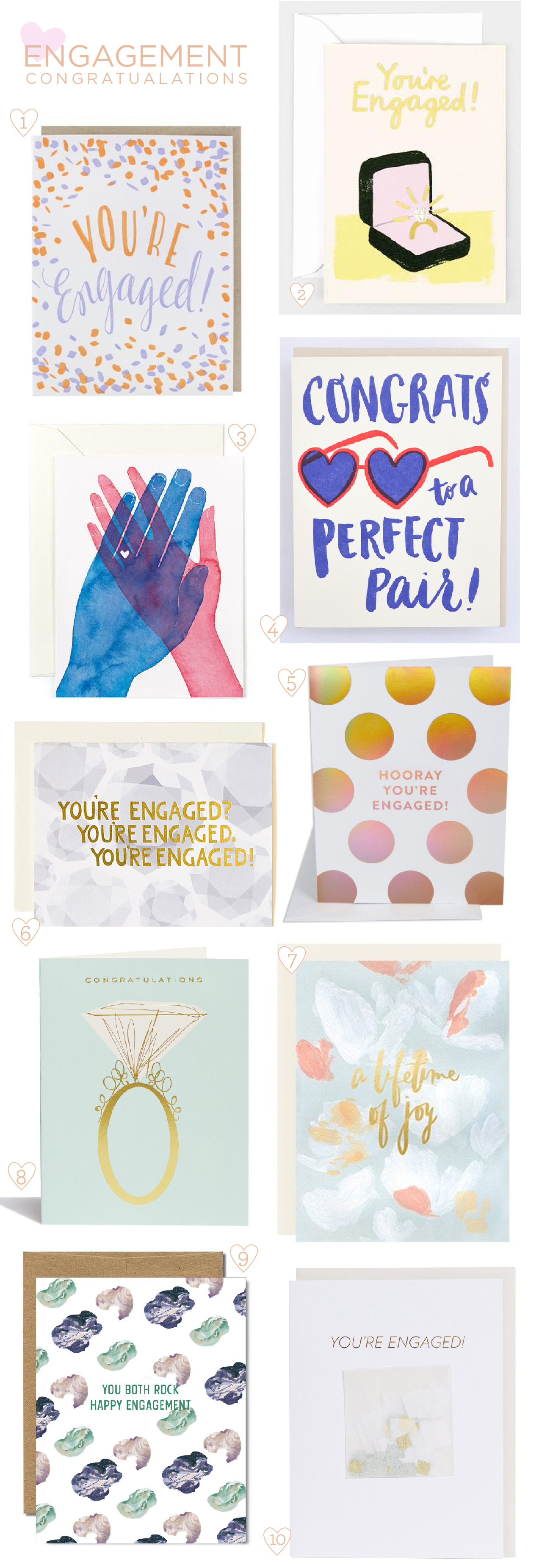
Wild guess, but do you know someone who just got engaged? I’ll bet you do, as we’re currently in the midst of engagement season (no, really – 40% of all couples get engaged between the months of November and February). Before all the bridal showers, bachelorette parties, and actual real life weddings start consuming the majority of your free time, why not sit back, pick up your trusty pen, and send that dear, newly engaged friend a heartfelt letter of congratulations? Today we’re sharing a quick engagement congratulations card round up with a few of our favorite picks to help celebrate this momentous occasion:

Engagement Congratulations Card Round Up

From top left:

1. Celebrate your bestie’s engagement with illustrated confetti and general exuberance with this design from Smudge Ink.

2. Spending two months salary on one item is no joke, so why not honor the generosity of that purchase with this bling-ed out foil stamped design from Wrap Magazine?

3. Love this sweet watercolor illustration from Golden Fox Goods. No sentiment needed.

4. Don’t forget to accessorize with a fun illustration and a punny messaging from Hello!Lucky.

5. I wouldn’t think twice about saying yes to gold hologram foil. From The Social Type (if you are in the Los Angeles area, be sure to check out their new brick and mortar location!).

6. One Canoe Two has got your reaction down pat. Plus diamonds.

7. This card from Our Heiday honors engagement with a soft abstract painterly design, a touch of gold foil, and a celebration of the impending marriage.

8. Let’s call a spade a spade: some occasions just require a giant sparkling ring (a classic from Snow & Graham).

9. This Ferme à Papier design is great for its gender neutral palate and casual sentiment. I also really like that it addresses both members of the couple – after all, they’re both getting married!

10. Finally, what better occasion for some IRL confetti? Those party experts at Knot & Bow have got you covered. Literally.

Next week: the Valentines extravaganza begins!