Moody and Glam Romantic Wedding Invitations

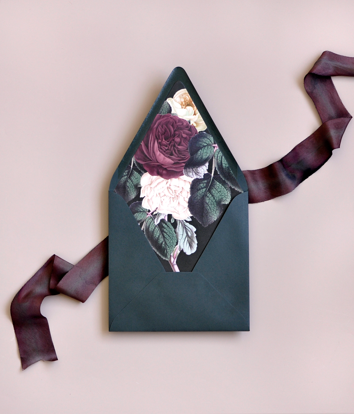
Oh, hello gorgeous floral envelope liner! These moody and glam romantic wedding invitations from Amy of Smitten on Paper had me at those beautiful bold florals, but it was true love when I saw the matte gold foil, hand dyed silk ribbon, and seed paper in the rest of the invitation suite! The floral pattern on the envelope liner and plantable seed paper speaks to the couple’s love of the outdoors, while the dark and moody tones and matte gold foil are pure elegance and romance!

Moody and Glam Romantic Wedding Invitations by Smitten on Paper

From Amy: How do you choose wedding invitations when you have all of the options at your fingertips? Kathryn, our custom production manager and strategic planning lead, had a vision for her wedding but was overwhelmed with choices when it came to her wedding invitations.

Moody and Glam Romantic Wedding Invitations by Smitten on Paper

Kathryn and her fiancé Terry planned their wedding in their hometown of Branson, Missouri. The festivities included a week of activities with multiple locations and events and coordinating family and friends from near and far. Naturally, their invitation needed to capture the feeling of their event and provide all of the necessary information for guests.

Moody and Glam Romantic Wedding Invitations by Smitten on Paper

Moody and Glam Romantic Wedding Invitations by Smitten on Paper

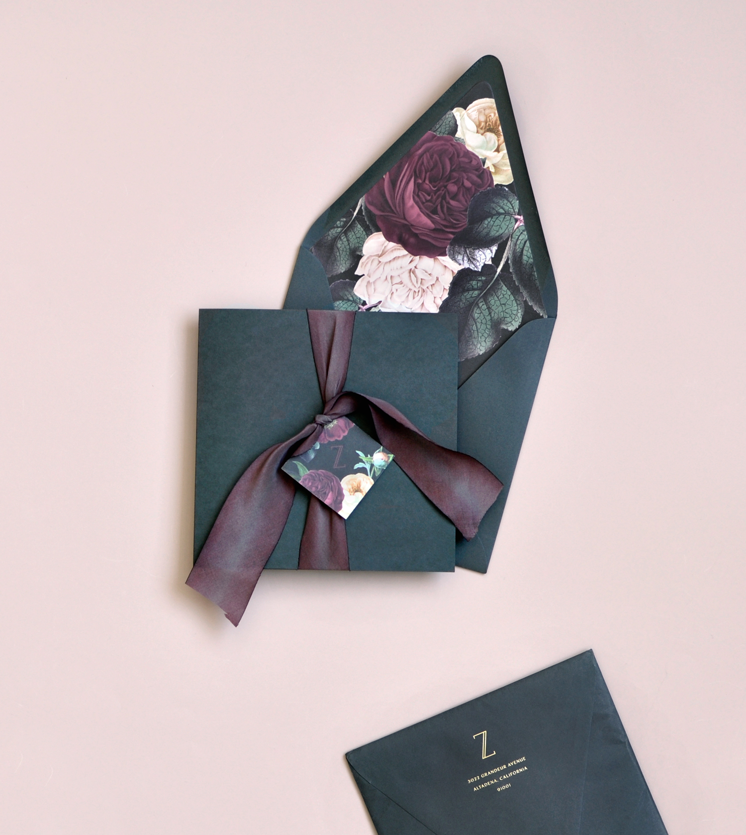
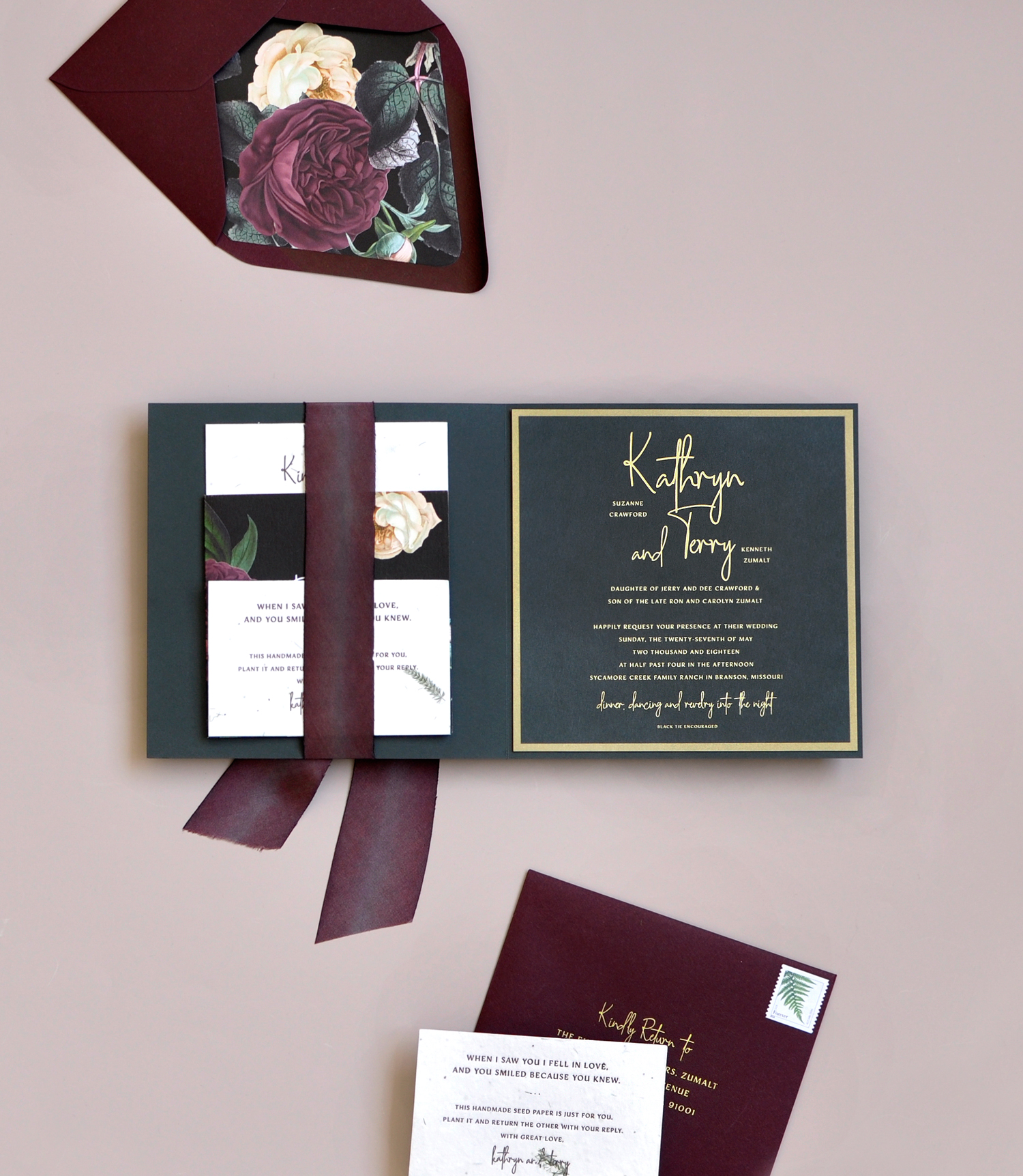
They settled on a square folded invitation with a silk ribbon pocket to keep all of the important information in one place. They added matte gold foil stamping for a touch of luxe. The end result is a stunning suite that touches on their dark romance wedding theme, their love for the outdoors and their personality as a couple.

Moody and Glam Romantic Wedding Invitations by Smitten on Paper

The full invitation suite features matte gold foil stamping, letterpress printing and digital accent pieces. Hand dyed silk ribbon and a monogramed tag hold it all together. The dark grey folder opens up to the invite mounted on the right and cards neatly tucked under the ribbon on the left.

Moody and Glam Romantic Wedding Invitations by Smitten on Paper

Moody and Glam Romantic Wedding Invitations by Smitten on Paper

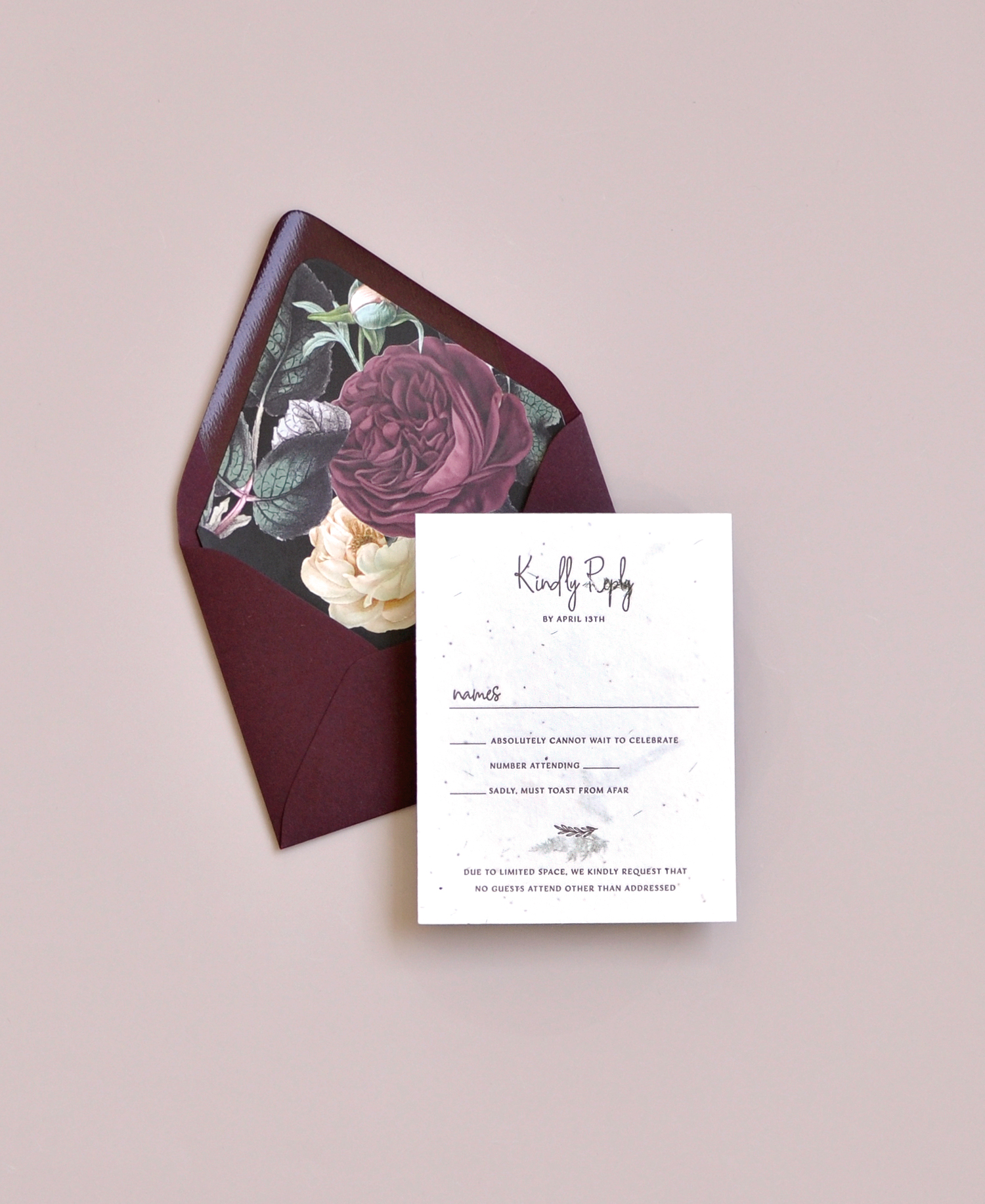
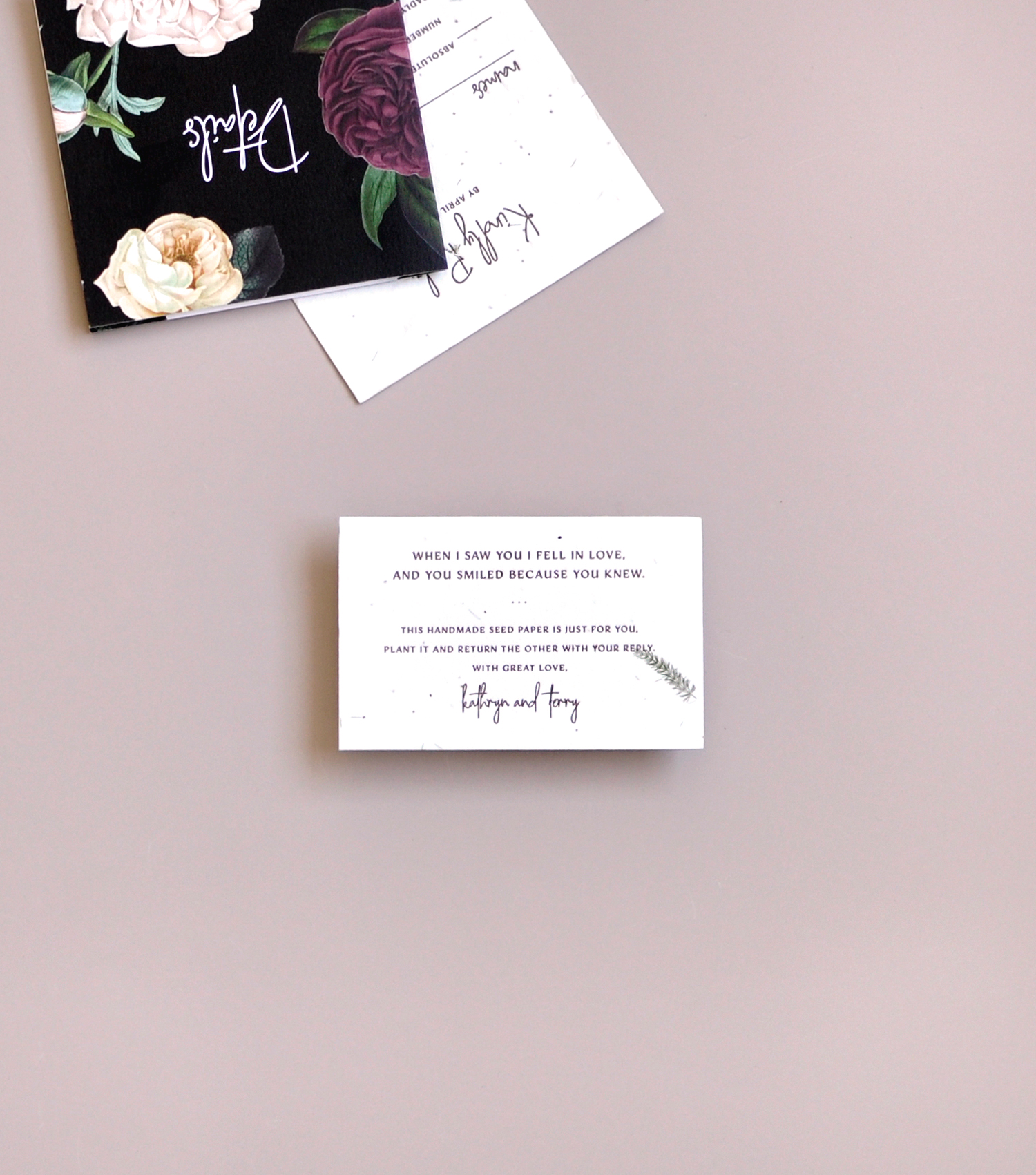
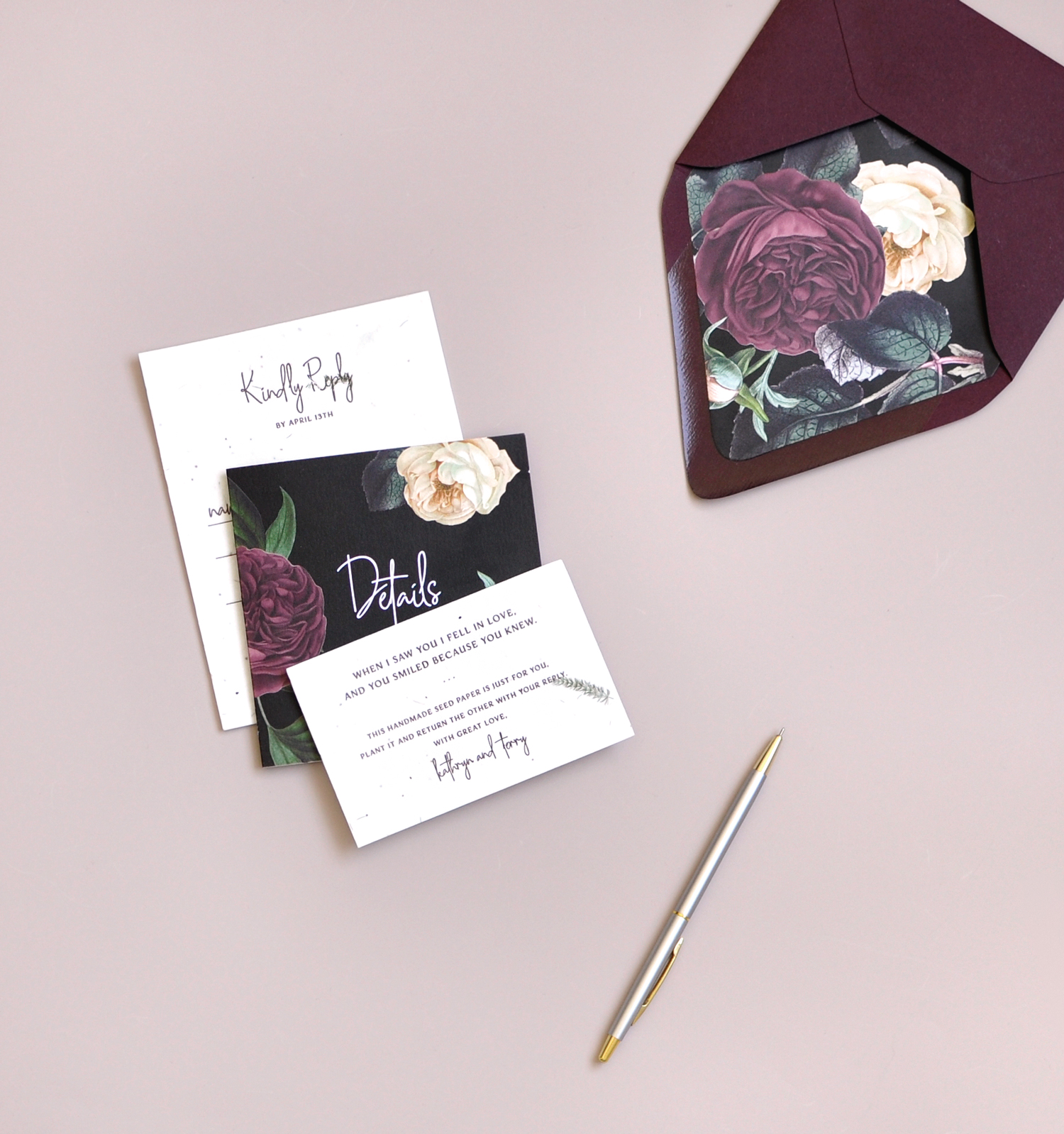
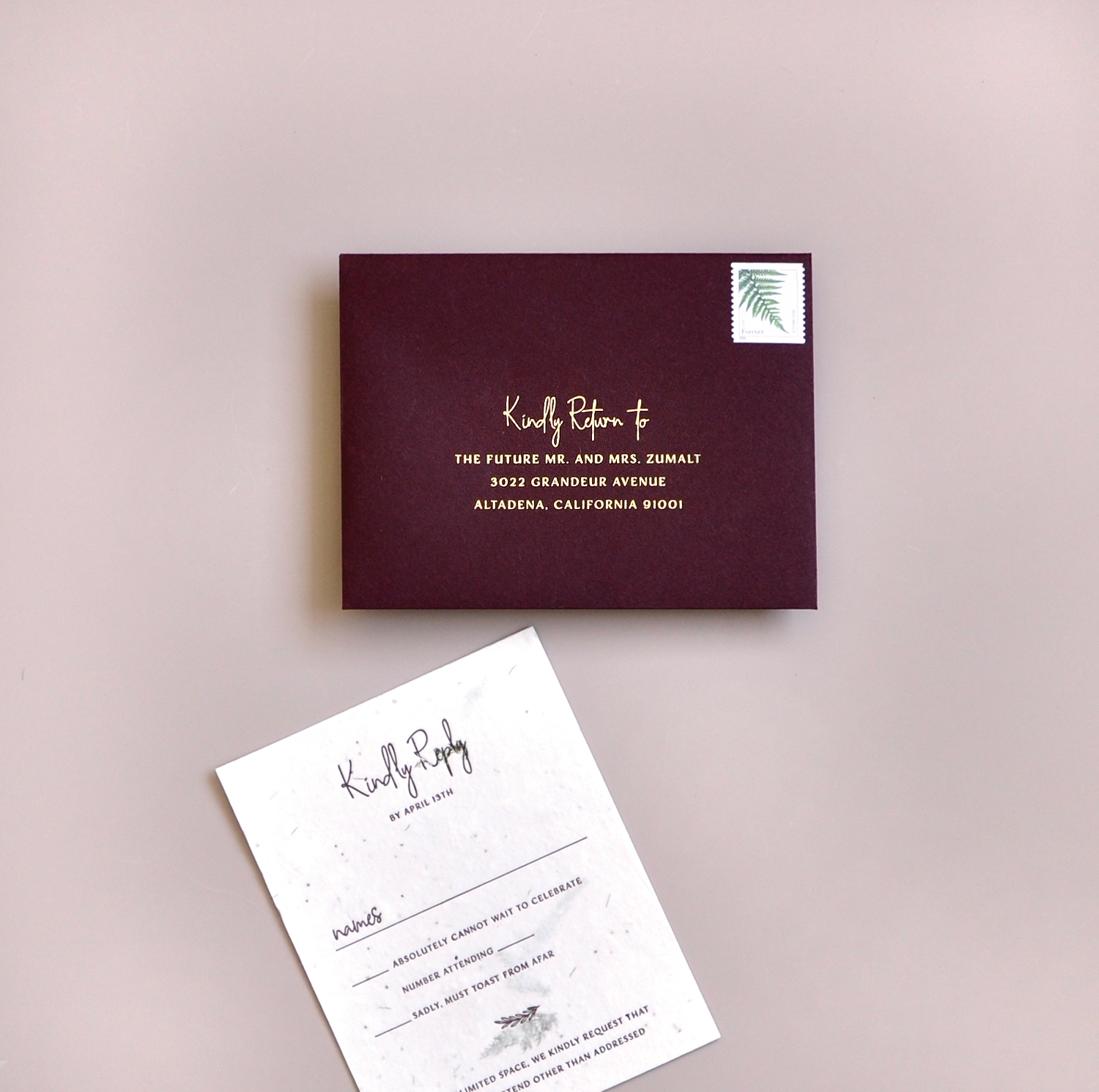
The reply card and small enclosure card were letterpress printed on handmade seed paper, a nod to Kathryn and Terry’s love for the outdoors and their naturally beautifully hometown in the Ozark mountain region. The reply envelope was foiled stamped with matte gold foil on wine envelopes for a touch of elegance.

Moody and Glam Romantic Wedding Invitations by Smitten on Paper

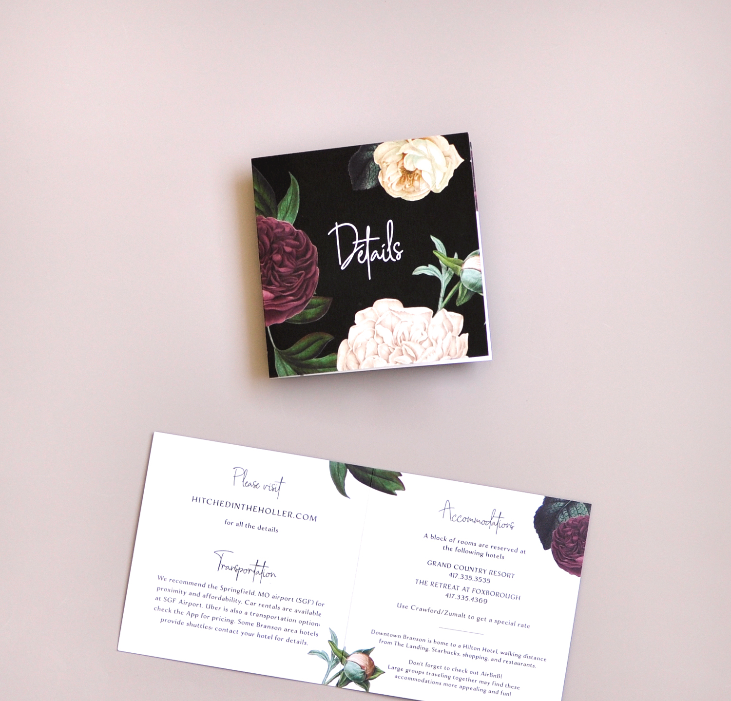
All of the details for the week were included in a small booklet, meant to reflect the larger invite booklet. It was also a great place to bring in the dark romance florals from the envelope liner to tie the collection together. Guests were encouraged to plant their small enclosure card printed on seed paper as a memory of this special wedding. The whole suite was finished inside a gorgeous envelope liner customized with florals that pulled from their wedding colors. Addresses were hand written in gold ink for a personalized touch.

Moody and Glam Romantic Wedding Invitations by Smitten on Paper

Moody and Glam Romantic Wedding Invitations by Smitten on Paper

Thank you so much Amy!


Design and Printing: Smitten on Paper

Seed Paper and Hand Dyed Silk Ribbon: Of The Earth


Smitten on Paper is one of our fabulously talented Designer Rolodex members – you can see more of their beautiful work right here! Or visit our wedding invitations archive for more custom wedding invitation ideas!

Modern Orange and Burgundy Acrylic Wedding Invitations

These modern orange and burgundy acrylic wedding invitations have ALL THE THINGS! Pops of die-cutie cut acrylic, vintage stamps, a crisp sans serif typeface, and a warm bold color palette! Katie of Ink and Sable drew inspiration from the industrial modern venue and brought in fun acrylic elements to make this modern suite one that really packs a punch! So fun!

Modern Orange and Burgundy Acrylic Wedding Invitations by Ink and Sable

From KatieWhen Lauren Townsend from A Tale of Two Towns Wedding and Event Design came to with this modern speakeasy challenge I was, to be honest, a little nervous. One of the first questions I asked was “what’s the venue?” She told me The Glass Factory in Jacksonville FL. I Googled the venue and I knew from looking at the images exactly what I was going to make to bring accomplish Lauren’s desired look.

Modern Orange and Burgundy Acrylic Wedding Invitations by Ink and Sable

Modern Orange and Burgundy Acrylic Wedding Invitations by Ink and Sable

The aesthetic is all about gold, burgundy, and crisp accents to offset the historic industrial venue, which is an awesome combination! I really wanted to play up the name of the venue and hit it hard with the modern look versus the industrial look or even an organic calligraphy look. After seeing some acrylic invitations float around, I knew that was going to pack the biggest punch! Plus, it totally looks like frosted glass! See what I did there?

Modern Orange and Burgundy Acrylic Wedding Invitations by Ink and Sable

I really wanted to use a modern typeface, and as some stationers might know, writing perfectly on acrylic is quite a task! So what would get me the best results? Screen printing! While my invitation and menu were going to be the stars of the show, I didn’t want to do a disservice to the RSVP and Details card, so I embellished the typography with foil printing through CatPrint who does short-run foil press (YAY!). RSVP and Details paired with a shimmery gold return envelope really accented the gold.

Modern Orange and Burgundy Acrylic Wedding Invitations by Ink and Sable

Once I got the silkscreen, I had to test it on sheets of acrylic to make sure it was going to work. After testing and retesting I was ready to do the REAL one. I silkscreen printed the invitation first and let it dry over a period of a few days and put a heavy spray of varnish on top to make sure the ink would stay on the acrylic. I flipped it over to mark where my die cut would be and very carefully cut off the edges to make my invitation and menu asymmetrical. The final touch was to add the wash of gold to the back to add that extra punch of modern flair.

Modern Orange and Burgundy Acrylic Wedding Invitations by Ink and Sable

This suite paired with a burgundy envelope stamped with vintage 1920s speakeasy postal stamps was the perfect amount of jewel tone to really bring this look together. With the details laid flat on black velvet with hints of greenery and, of course, the rings, this suite was super sexy! Can you say that about a suite? Because I just did.

Modern Orange and Burgundy Acrylic Wedding Invitations by Ink and Sable

Thanks Katie!

Design: Ink and Sable
Foil Printing: Cat Print
Event Planning/Design: Laura Townsend of A Tale of Two Towns Wedding and Event Design
Venue: The Glass Factory 
Floral: Liz Stewart Floral Design
Jewelry: Chloe and Isabel, Styled by Markie 
Ring Box: The Mrs. Box
Linens: BBJ Linen

Check out the Designer Rolodex for more tal­ented wed­ding invi­ta­tion design­ers and the real invi­ta­tions gallery for more wedding invitation ideas!

Photo Credits: Arielle Johnson

Behind the Stationery: Fox and Fallow

Today we’re taking you all the way to Australia to meet Janet from Fox and Fallow! Her bright designs and style reflect her surroundings in Brisbane. Janet shares her schedule for creating new product collections, how she brings each new product to life from design through production, and how her team helps to get it all done and shipped out each day. Take it away, Janet! —Megan Soh

Behind the Stationery: Fox & Fallow

From Janet: My background is in graphic design and art direction but after spending 10 years in design studios and advertising I felt like I needed a bit of a change. I really wanted to build my own brand after so many years of building other people’s brands. I fell in love with weddings after designing our own wedding stationery and signs and in 2013 we began creating wedding stationery and signs for couples as a side project. After about a year and a half I really wanted to reach a wider audience and create products of my own. So in 2015 we jumped right into the deep end and we launched our brand at the National Stationery Show in New York in 2015 and haven’t looked back!

Behind the Stationery: Fox & Fallow

We’re located in sunny Brisbane, Australia. It’s a fabulous city, the people are laid back, the food and bars are great and we’ve got more sunshine than we can handle! Our style is bright, fun, intricate and we love foil, so most of our paper goods are offset printed and foil stamped. I like to design in collections, releasing 3-4 collections per year, each with a totally different theme and style. This keeps things fresh and interesting and allows us to keep evolving our style each year.

Behind the Stationery: Fox & Fallow

Our studio is part office, part warehouse. All the design work, invoicing etc. gets done in the office and orders and products are checked, assembled, packaged and shipped out of the warehouse.We make a wide range of paper goods including greeting cards, gift wrap, flat notes, gift tags, prints, journals, notebooks, notepads and calendars.

We also make clipboard packs which are a really fun gift item and we make the clipboards in house, which involves sourcing the wood from a local supplier, laser cutting and engraving them, sanding, riveting and shrink wrapping the whole pack together.

Behind the Stationery: Fox & Fallow

We take care of the design, quality checking, packaging and assembly but leave the printing to our local and offshore printers. We make most of our products locally in Brisbane or Sydney, but a few products we had to get manufactured offshore to make sure the price points work for our customers.

Behind the Stationery: Fox & Fallow

I usually start with a double espresso and an attempt to clean out my inbox (which rarely happens)! We’ll get any orders from the previous day and ones that have come in overnight to the team to pick and pack so they’re shipped out ASAP. We try to wrap this up by 2pm so they’re ready to be collected by our couriers. After the orders are done for the day the team often keeps working on quality checking, assembling and packaging products and anything else that needs doing before finishing up around 5pm. If we’ve got a big order to get out, it’s all hands on deck and we’ll do some pretty big hours to get it out in time, but it’s great we can be flexible and have our team take product home to package – which works great! No one wants to be working late in the office right?

Behind the Stationery: Fox & Fallow

I’ll usually grab another coffee and get started on artwork, product sourcing, bill-paying and general day-to-day business things. Darrell and I are both night owls, so we usually work pretty late. I wish my days were filled with painting and making new products, but as I’m sure all creative business owners know, the creative part is a tiny sliver of the running-a-small-biz pie.

Behind the Stationery: Fox & Fallow

Behind the Stationery: Fox & Fallow

I start each collection with a bunch of random thoughts in a notepad file on the computer and on my phone, then I’ll scour Pinterest, Google or books for snippets to create a mood board. I like having the inspiration and colours for each collection all nutted out on a mood board so I can show Darrell and get his thoughts. Once we’re happy with the direction it’s a matter of more research, sketching, scanning, detailed ink sketches, painting, scanning, colouring and refining and deep-etching each element in Photoshop.

Behind the Stationery: Fox & Fallow

Behind the Stationery: Fox & Fallow

I like painting all artwork as separate components so I can change the colours easily in Photoshop and change the size if needed. If I’m working on custom typography I’ll usually start with sketches and then use a brush pen and ink before I scan each word and vectorize them in Illustrator. I composite all artwork in InDesign and send it off to print for the proofing stage. Once we’ve checked and approved the proofs we wait for the finished goods to arrive.

Behind the Stationery: Fox & Fallow

This is the most fun part of what we do and it’s so rewarding when we see our retailers and customers loving our products. We love doing trade shows and pop up events as you really get to see people’s reactions to your products – it’s super valuable having that face-to-face contact. We love it when we meet people who are discovering us for the first time – it makes all the hard work so worthwhile!

Behind the Stationery: Fox & Fallow

All photos by Fox & Fallow.

Want to be featured in the Behind the Stationery column? Reach out to Megan at megan [at] ohsobeautifulpaper [dot] com for more details.

Funky Art-Deco Gold Foil and Floral Wedding Invitations

A little party never hurt nobody! We’re loving these modern and funky art-deco gold foil and floral wedding invitations from Jennifer of Society Paper Goods. Geometric patterns, adorable hand lettering, and glamorous gold foil – it’s all there folks! The multifunctional coaster details cards are the perfect way to toast to the happy couple before the celebration!

Funky Art-Deco Gold Foil and Floral Wedding Invitations by Society Paper Goods

From Jennifer: This stationery suite was designed for a couple who was planning a glamorous, Old Hollywood-inspired fall wedding. We had a completely blank slate to create stationery that gave guests a fabulous first impression of their special day and did so through bold colors and metallics, “statement” pieces, delicate letterpress details, and cohesive packaging.

Funky Art-Deco Gold Foil and Floral Wedding Invitations by Society Paper Goods

We loved the idea of a black invitation with white and gold foil! It seemed like the perfect statement piece in a world of often white or ivory invitations. The bride and groom’s names were handwritten just for this project (this special handwritten lettering found its way onto other pieces like the details card, RSVP card, save the date, and program).

Funky Art-Deco Gold Foil and Floral Wedding Invitations by Society Paper Goods

In lieu of a traditional details card, we chose to die-cut the card into the shape of a coaster; we knew this wedding was going to be a party and maybe even reminiscent of Gatsby’s great parties! The coaster, featuring an art deco border, was first letterpress printed by Elefant Press in Dallas and then sent to Saint Louis to be gold foil printed and cut.

Funky Art-Deco Gold Foil and Floral Wedding Invitations by Society Paper Goods

The RSVP card showcases another “statement” in the visual pattern on the front side. It too was letterpress printed in Dallas and sent to Saint Louis for foil printing and finishing. We completed the invitation suite with emerald green velvet ribbon, hand-sewn by the bride’s mother herself, and floral envelope liner, both strong features of the overall look of the wedding. Lauren Saylor at A Fabulous Fete added her gorgeous calligraphy to put the beautiful finishing touches on this invitation suite.

Funky Art-Deco Gold Foil and Floral Wedding Invitations by Society Paper GoodsFunky Art-Deco Gold Foil and Floral Wedding Invitations by Society Paper Goods

The save the date, featuring childhood photos of the bride and groom, also showcased the handwritten lettering from the invitation suite.

Funky Art-Deco Gold Foil and Floral Wedding Invitations by Society Paper Goods

The day-of stationery included whimsical menu placemats, patterned table numbers, floral signage, and a bold, black program featuring the couple’s monogram which was foil-stamped on the cover.

Funky Art-Deco Gold Foil and Floral Wedding Invitations by Society Paper Goods

Thanks Jennifer!

Design: Society Paper Goods
Printing: Elefant Press and Furlong Printing
Calligraphy: Lauren Saylor at A Fabulous Fete
Paper: Reich Paper and Neenah Paper

Check out the Designer Rolodex for more tal­ented wed­ding invi­ta­tion design­ers and the real invi­ta­tions gallery for more wedding invitation ideas!

Photo Credits: Jennifer Walker

Elegant Copper Foil Wedding Invitations on Handmade Paper

What better item to choose for your “something old and something new” than gorgeous invitations inspired by your own parents’ wedding invitations? These copper foil wedding invitations on handmade paper from Alex of Al Stampa are an homage to the bride’s mother’s invitation from the 1970s. With elegant copper foil text on handmade paper with delicate torn edges, not to mention STUNNING emerald green envelopes, these invitations are a fresh take on a vintage beauty!
Copper Foil Wedding Invitations on Handmade Paper by Al Stampa

From Alex: Janice and Spencer have one of those love stories that you only see in the movies. In love in high school, separated for almost 10 years, only to then fall in love again years later when a friend organized them to be at the same New Years party.

Copper Foil Wedding Invitations on Handmade Paper by Al Stampa

Their wedding was set in a lavender field in Wiscasset, Maine at the stunning Marianmade Farms. To say it was a beautiful wedding is an understatement. Janice put her vision into every aspect of the wedding, and they both created magical moments all throughout the evening. Some examples include handmade paper florals, a watercolor backdrop for a photo booth, all of which came back to the colors we used in the invitation; lavender, copper, and emerald.

Copper Foil Wedding Invitations on Handmade Paper by Al Stampa

The most spectacular part of this suite was the inspiration. The bride wanted to emulate her parent’s invitation from 1973. The simplicity of this invitation, with the handmade paper, copper text, and hand torn edges, is something you don’t see too often nowadays and was an honor to use as part of this couple’s story.

Copper Foil Wedding Invitations on Handmade Paper by Al StampaCopper Foil Wedding Invitations on Handmade Paper by Al StampaI worked with Signora e Mare and ordered their ecru handmade paper, which had a subtle lavender color to it and was the perfect choice for this suite. Because the couple loves a certain modernity to their life and their special day, I opted for a modern font and added an illustration of the camper van that is situated on Marianmade Farm, in front of which they took their wedding portraits.

Copper Foil Wedding Invitations on Handmade Paper by Al Stampa

I foil stamped the invitation in the copper color, which was a beautiful contrast to the lavender hued paper. The RSVP card was our all time favorite, a small, almost circular tearing of the paper, with a matching envelope.

Copper Foil Wedding Invitations on Handmade Paper by Al Stampa

Copper Foil Wedding Invitations on Handmade Paper by Al Stampa

For the envelope, I scoured the internet for the perfect emerald color that the bride had envisioned. I found the most beautiful soft-touch emerald envelopes called Plike, and foil printed their return address stamp on the back. The finishing touch? Sarah Vaughan Stamps to throw in another rich color to the mix, and to nod to the couple’s love of jazz music.

Copper Foil Wedding Invitations on Handmade Paper by Al Stampa

Thanks Alex!

Design, printing, and styling: Al Stampa

Handmade paper: Signora e Mare

Envelopes: Plike Envelopes

Check out the Designer Rolodex for more tal­ented wed­ding invi­ta­tion design­ers and the real invi­ta­tions gallery for more wedding invitation ideas!

Photo Credits: Roland Kielman and Alex Labriola