Lesley + Chad’s Accordion Save the Dates

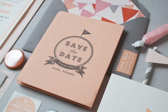
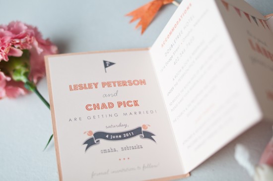
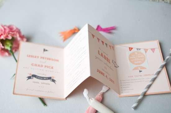
Last month we featured the country elegance wedding invitations of Lauren from Inclosed Studio.  Today we’re showcasing the save the dates of Lesley – Lauren’s other half at Inclosed Studio!  Lesley and her now-husband Chad decided to use an accordion fold-out format so they could incorporate accommodation and travel information into their save the dates, along with a fun sticker that guests could place on their calendars to remember the wedding date.

From Lauren and Lesley: The front and back of the accordion save the date was printed by hand using our vintage letterpress on handmade peach-scented paper.  The inside piece is digitally offset on a pale pink Crane cover stock.  The last page features a hand-made pocket that holds two custom “Save the Date” stickers so guests can mark their calenders with the date!  Pennant flags were a theme of the wedding, so we included them throughout the design including the hand-cut envelope liners!

So cute!  Thanks Lauren and Lesley!

Design + Letterpress: Inclosed Studio
Handmade Paper: Porridge Papers

Check out the Designer Rolodex for more tal­ented wed­ding invi­ta­tion design­ers and the real invi­ta­tions gallery for more beau­ti­ful cus­tom wed­ding invitations!

Photo Credits: Daniel Muller

Arley-Rose + Morgan’s Neon Wedding Invitations

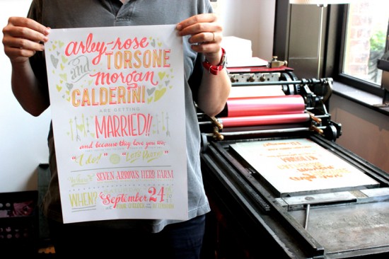
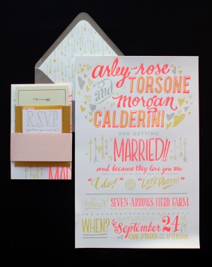
Happy Monday everyone!  And my oh my, do I love today’s wedding invitations.  The ladies of Ladyfingers Letterpress, Arley-Rose and Morgan, created these invitations for their Massachusetts farm wedding this past September.  They both have design school backgrounds and lots of experience designing and printing custom wedding invitations, so they knew they wanted to create something totally unique for their own wedding.  They ended up creating a fantastic poster-size invitation with exuberant hand lettering and neon ink.  So awesome!

From Arley-Rose and Morgan: At Ladyfingers Letterpress, we had been doing a lot of A7-size invitations for other couples.  We knew we wanted to break out of the box on many levels – including size – for the invitations, so we explored the idea of creating a poster.  After months of sketching and experimenting, we finally arrived at a colorful text-based drawing as the invitation.

A friend of ours showed us a really neat glow-in-the-dark silkscreen poster, and as soon as we saw it we knew we had to have some glow-in-the-dark element to our invitations.  The large, 11 x 17″ poster was printed in three color offset and one color letterpress (fluorescent red!) on text-weight 32lb Lettra in fluorescent white and folded down in quarters to fit in a gray A9 envelope.

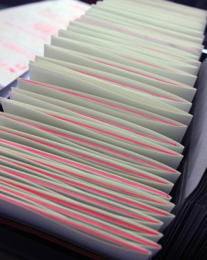
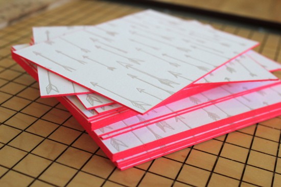
The location of our wedding was called Seven Arrows Herb Farm, so we incorporated these hand-drawn arrows throughout the design.  We created a pattern out of them and printed them on the backs of our RSVP and “Backyard Soiree” (aka rehearsal dinner) cards that were printed on thick 220lb Lettra and edge painted in fluorescent pink.  We also used the arrow pattern to create a one-color envelope liner.


We created a booklet called “Interesting Bits of Knowledge” that included info regarding accommodations, attire, and one small yet important notice regarding an allergy of our wedding officiant.  This booklet enclosed our Soiree card and fit inside a gold enclosure with two pockets that we designed and die cut.  Our RSVP and return envelope fit inside the other golden enclosure pocket.

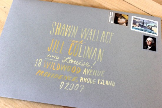
We didn’t have a giant mulit-tiered wedding cake, but in some ways, we did. It was called our invitation: The folded invite was stacked with the filled-up golden enclosure and wrapped with a pink plastic-like belly band and stuffed into our lined envelopes.  Arley hand-painted the addresses on the front with gold and white guache and the envelopes were sealed and taken over to the post office!

Thanks Arley and Morgan!  Check out their wedding over on their blog Ladies in Love – and check out more of their beautiful letterpress work right here!

Check out the Designer Rolodex for more tal­ented wed­ding invi­ta­tion design­ers and the real invi­ta­tions gallery for more wedding invitation ideas!

Photo Credits: Ladyfingers Letterpress, with many thanks to Carrie for sending over the link.

Friday Happy Hour: The Sazerac

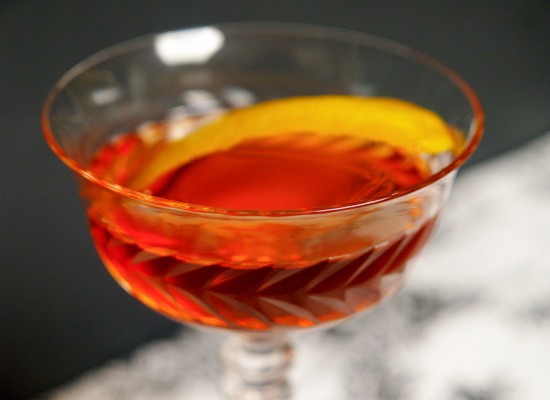
This is, hands down, my favorite cocktail.  It is rich and complex, bitter and sweet and herbal all at the same time, with a real sharpness to it.  It’s a classic cocktail and a perfect pre-dinner drink for whetting the appetite.

Read below for the full recipe!

The Sazerac

2 oz Brandy or Whiskey (we did half of each for this recipe)
3-4 Dashes of Peychaud’s Bitters
1/4 oz Simple Syrup
1 Dash Absinthe

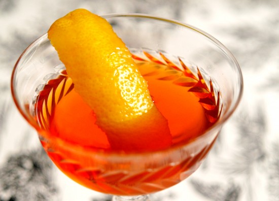
You’ll need two glasses for this one.  Fill one with ice to chill and set aside for a moment.  In the other, combine the spirits, bitters, and syrup.  Stir well with ice – give this a good 50 or more stirs.  Dump the ice out of the first glass, add a dash of Absinthe, swirl the glass to coat the inside with the Absinthe, then pour out any excess.  Strain the cocktail into the first glass, garnish with a lemon twist, and enjoy.

This is an old cocktail, a variation on the Old Fashioned that was invented in New Orleans some time in the mid-1800s.  It was first made from brandy and gets its name from the Sazerac-de-Forge et Fils cognac. Starting in the 1860s, a nasty bug called Phylloxera wiped out most of Europe’s grapes, and the Sazerac cognac (along with many others) disappeared.  Bartenders switched to whiskey, which works just fine in the Sazerac, either rye or bourbon or a combination of both.  Brandy is the most traditional.  My personal favorite is apple brandy, which gives the Sazerac a nice roundness.  Play around with this one.


Don’t skimp on the Peychaud’s bitters, which give the Sazerac much of its color and a lot of its flavor.  Some recipes call for adding Angostura or other bitters, but after lots of experimenting I can say: don’t.  Don’t worry about the Absinthe: it has a dramatic reputation that it doesn’t really deserve. It’s an herbal liqueur, a lot like Benedictine or Chartreuse, that gives the Sazerac its sharpness and a lot of its complexity, but the legends about it causing hallucinations, madness, or death are just that.

Don’t forget the garnish which, like all garnishes, should pitch in and not just sit around looking pretty.  Cut a piece of lemon peel, just the yellow part and not the bitter white pith.  Twist it over the drink to express the oils into the drink, which helps blunt some of the bitterness and balance all the different flavors.  Rub the rim of the glass with the lemon and either toss it away or into the drink.  Sip your Sazerac, savor it, and get to know why this is the official cocktail of the Big Easy.

Photo Credits: Nole Garey for Oh So Beautiful Paper

{happy weekend}

Happy Friday everyone!  I’m finally feeling better after coming down with a cold last weekend, just in time for the weather to turn legitimately cold here in DC.  Between the cooling temperatures and shorter days, it’s really starting to feel a lot like winter here.  Right now I’m trying to enjoy the last few changing leaves and looking forward to great food and family company at Thanksgiving next week (!!).  But in the meantime…

…a few links for your weekend!

This week on Oh So Beautiful Paper:

That’s it for me this week!  I have a cocktail post coming up a bit later this afternoon – and don’t forget to enter the custom map giveaway from Swiss Cottage Designs!  I hope you all have a wonderful weekend, and I’ll see you back here on Monday!  xoxo

Photo Credit: Samantha Nason

Calligraphy Inspiration: Kathryn Murray

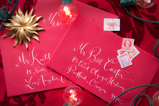
Gone are the days when western calligraphy was synonymous with traditional and predictable handwriting.  Kathryn Murray consistently delivers amazing work with her fresh and elegant style.  You may have seen it before on greeting cards, prints, and in magazines.  Kathryn’s impressive portfolio of work has earned her a go-to standing in today’s world of wedding calligraphy.  Though, it may also have something to do with the fact that the only thing more delightful than her work, is working with her. – Julie

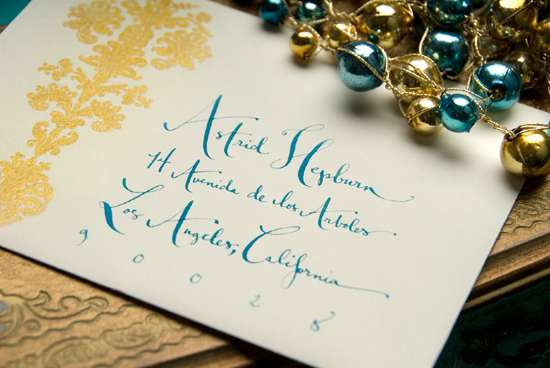
Kathryn Murray holiday envelopes

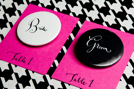
Kathryn Murray bride & groom buttons

Never one to be afraid of colour, Kathryn’s portfolio showcases an array of hues. (And this is not only visible in her work, but also in her styling!)

Kathryn Murray envelope detail

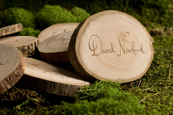
Kathryn Murray wood placecards

Words cannot express how much I adore these place cards. A lovely contrast of soft hand-written lines and rough, natural wood.

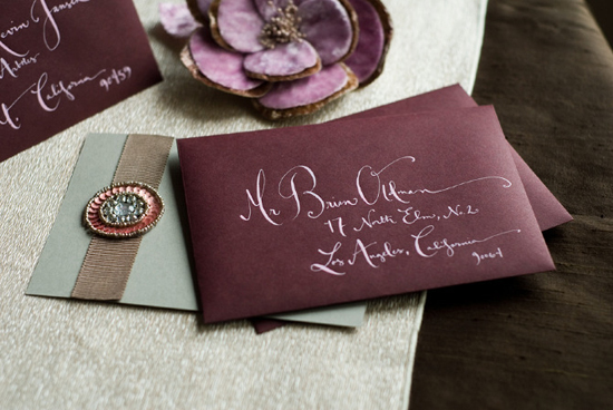
Kathryn Murray addressed envelopes

Kathryn Murray labels

She has mastered a wonderfully fanciful calligraphic style that is playful yet refined. A perfect balance!

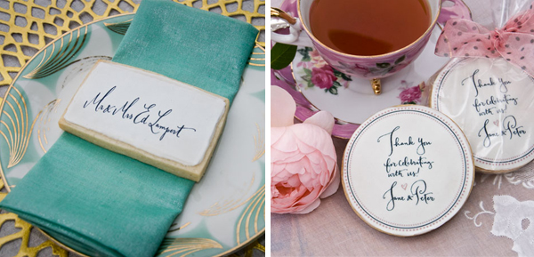
Kathryn Murray edible calligraphy cookies

Kathryn has also launched a new product recently: edible calligraphy cookies to be used as customized favors or even place cards.  She noted that, “The calligraphy is printed on edible paper with edible ink as part of a delicious shortbread cookie, with just a hint of cinnamon.”  That’s quite a sweet touch for any special event, don’t you think?

Photo Credits: All photos by Matt Murray, except image(s) no.6 by Sweet Monday Photography