Amarides + Aaron’s Brooklyn Wedding Invitations

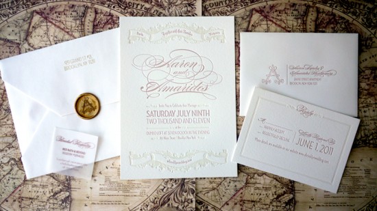
Our second set of wedding invitations today comes to us from graphic designer and recent bride Amarides.  She incorporated a reproduction map of Brooklyn from the 1800s into the wedding invitation suite, along with a fun gold wax seal.  Amarides also mixed elegant scrolls and script fonts with modern sans-serifs for a fun mix of classic and modern design elements.

From Amarides: My wedding invitations and save the dates were designed loosely around the theme of “Brooklyn as a destination” since both my husband and I grew up in the Southwest and half of our guests came from out of town.  The invitations were designed so that the envelope would open into a map of Brooklyn from the 1800s.

The suite contained an invitation, reply card, and information card.  I wanted the experience to feel the way New York truly feels, layering elements of old with new, and classic fonts with modern sans-serifs.

The map and save the dates were digitally printed in Manhattan, and the invitations were letterpress printed in Williamsburg.  The wax seal is from a Jessica Hische dropcap.

Thanks Amarides!

Letterpress Printing: Coeur Noir Specialty Printers
Save the Date: Digitally printed by Mirror NYC
Map: Digitally printed by Mancum Graphics

Check out the Designer Rolodex for more tal­ented wed­ding invi­ta­tion design­ers and the real invi­ta­tions gallery for more wedding invitation ideas!

Photo Credits: Amarides Montgomery

Lisa + Adam’s Yellow Floral Wedding Invitations

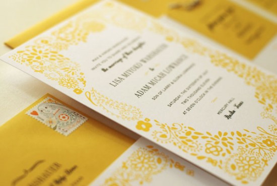
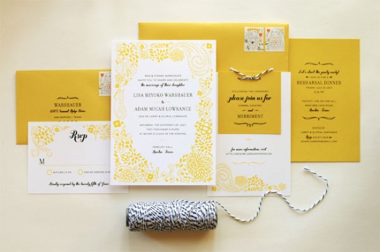
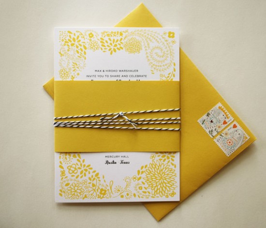
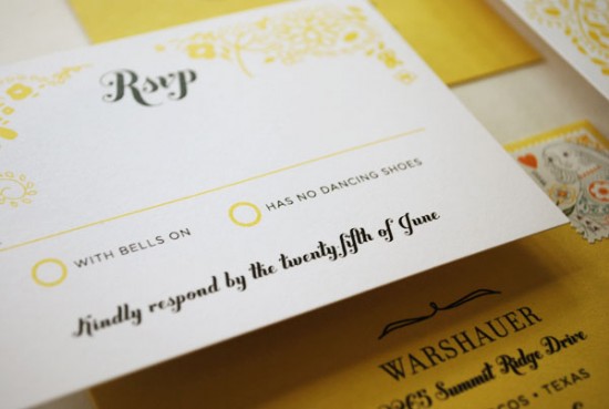
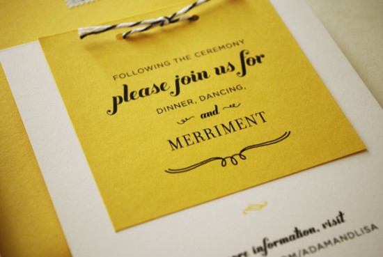
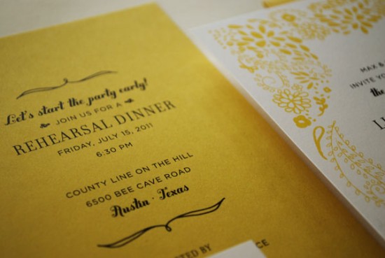
Happy Monday everyone!  We’re starting the week off with a fabulous yellow wedding invitation suite from Leslie at Lilly and Louise.  Lisa and Adam wanted fun and colorful wedding invitations for their casual summer wedding in Texas, and Leslie knew that bright and sunny yellow was the perfect fit.  Leslie incorporated a sweet illustrated pattern and playful black and white baker’s twine to complete the invitation suite.

From Leslie: Lately I’ve noticed that I’ve been magnetized to the bold, golden hue of yellow! I can’t get enough!  When Lisa contacted me about her wedding invitation with the parameters of “we want something fun and we’re open to color ideas,” I couldn’t wait to get started.

Lisa and Adam were planning a fun, casual, summer wedding in Texas.  They wanted to set the tone for their guests with their invitation.  I worked through a few color variations and designs before realizing that bold beautiful yellow was the answer… but once I came to that realization, I knew it was perfect.

In this invitation suite, the yellow hand-drawn floral and  paisley pattern and the playful type bring the fun, while the black and white baker’s twine and refined typefaces balance the fun with sophisticated.  It truly gives guests a taste of the fun summery wedding to come.

Thanks Leslie!

Check out the Designer Rolodex for more tal­ented wed­ding invi­ta­tion design­ers and the real invi­ta­tions gallery for more wedding invitation ideas!

Photo Credits: Lilly and Louise

Friday Happy Hour: The Old Fashioned

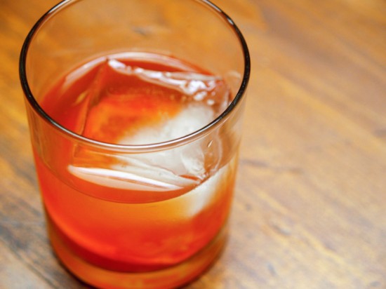
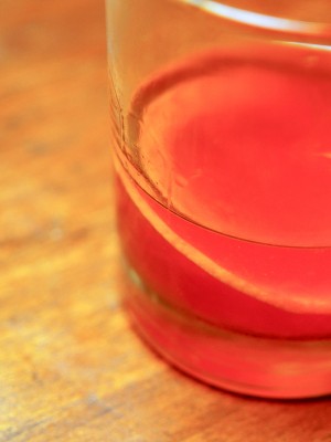
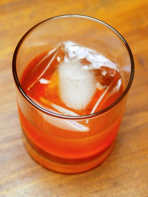
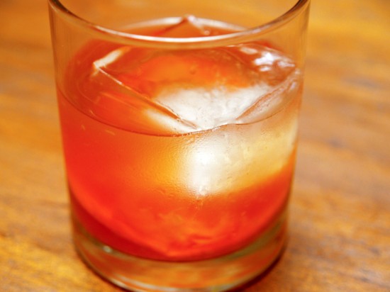
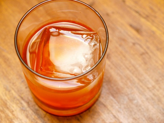
This week we’re all about a classic cocktail.  The Old Fashioned is, as the name suggests, an old fashioned drink.  It’s pretty much the oldest cocktail around, one of the most simple cocktail recipes – and one of the best.  This is my version of the Old Fashioned, and here’s why I love it: this creates a layered drink that starts out bracingly crisp from the bitters, gets warmer and spicier as you make your way through the rye, and finishes with sweetness and spice and fruit.  It’s delicious and refreshing, simple and classic.

Read below for the full recipe!

The Old Fashioned

2 oz Whiskey, Brandy, or Jenever (we used rye whiskey)
1/4 oz Simple Syrup
2 Dashes Angostura Bitters
1 Dash Water
Cherry and Slice of Orange for Garnish


In an Old Fashioned glass (it’s telling that it gets its own glass), muddle the syrup, a thin orange slice, and a cherry.  Add your spirit of choice – I’m partial to rye whiskey, which gives this drink a nice spiciness.  Add a good dose of ice and then top with the water and bitters.  Give it a gentle stir to chill it a bit and enjoy.

This is not the most authentic Old Fashioned.  The first, oldest cocktails from the turn of the 19th Century were made with just spirits, bitters, sugar, and water – all you need for a true cocktail.  Ice probably didn’t even make its appearance in cocktails until the 1830s.  But authenticity isn’t all its cracked up to be.  You can reproduce a 200+ year old cocktail, or you can make your own version.

Where did the Old Fashioned get its name?  The best guess is this: when drinkers in the 90s – the 1890s – got tired of all the fancy, complicated, modern cocktails and just wanted something simple, they asked their bartenders for an old fashioned cocktail, the sort of thing that Americans would have been drinking in 1850.  In other words, this drink has staying power.

Photo Credits: Nole Garey for Oh So Beautiful Paper

{happy weekend!}

Happy Friday everyone!  This weekend I’m looking forward to breaking out the holiday decorations and putting up our Christmas tree, and to helping my Mom celebrate her birthday on Sunday.  Plus, my Dad and step-mom are in Mexico this weekend to attend a wedding, and my 70 year-old Dad got to use his passport for the very first time!  Yay Dad!  We’ve also been dying to see the new Muppets movie.  Have any of you seen it?  But in the meantime…

…a few links for your weekend!

This week on Oh So Beautiful Paper:

On a personal note, if you follow me on twitter or instagram, you may have seen that we recently welcomed a foster cat, Simon, into our home.  We’ve been working with an organization called Homeward Trails over the last couple of weeks (through our friend Leah, the talented photographer who took the photos below) to rescue a few homeless cats in our neighborhood.  We think Simon was abandoned by his previous owners; he’s incredibly social and was living with a colony of cats in an alley.  When we first met Simon he practically jumped into our arms, and now that he’s indoors he loves nothing more than to curl up in someone’s lap and rub his head on their chin.  He’s incredibly well-behaved, affectionate, and playful.  We’re hoping to find a home for him soon to make room for a couple of other needy cats before it gets really cold.  So if any readers in the Mid-Atlantic area are looking to adopt a cat – please consider Simon!

There are an estimated 50,000 stray and feral cats here in Washington, DC.  Some of the stray alley cats are some of the sweetest cats you’ll ever meet and it breaks my heart to think about these cats trying to brave the winter outdoors.  If you’re not looking to adopt, but have a spare room or even a basement, please consider fostering rescue animals.  You can also donate to Homeward Trails here to help cover medical costs for rescued cats and dogs.

We’ve got an awesome cocktail recipe coming up a bit later this afternoon, but otherwise that’s it for me this week!  I hope you all have a wonderful weekend, and I’ll see you back here on Monday! xoxo

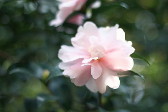
Photo Credits: Camelia via With This Nest, Simon’s photos by Studio Juno

Inspired By: Textile Patterns

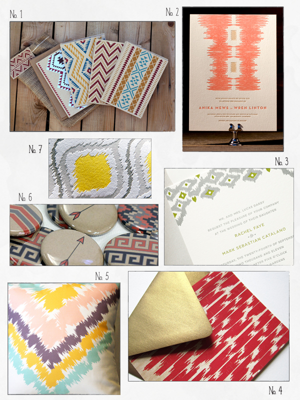
Ikat and southwestern patterns have been everywhere in fashion and interior decor for the last couple years; my pinterest boards are full of living and dining rooms with these gorgeous pattern textiles.  It’s so nice to see some of these beautiful patterns make their way into stationery design – from sophisticated ikat wedding invitations to high contrast southwestern pattern cards and notebooks.

No. 1 Assorted note cards from Hero Design Studio; No. 2 Ikaty wedding invitation by Kamal for Bella Figura; No. 3 Ikat wedding invitation from the Claremont Collection by Curious & Co.; No. 4 Ikat flat wood veneer note card from Ink + Wit; No. 5 Leah Duncan pillow cover; No. 6 Magnets from Red Star Ink; No. 7 Ikat letterpress cards from Wild Ink Press

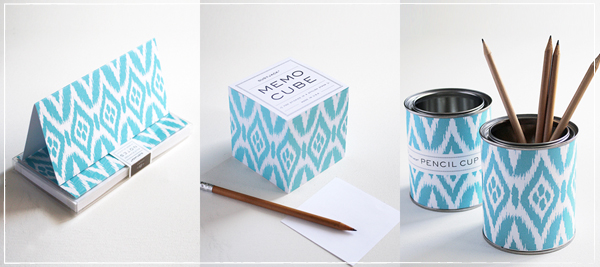
p.s. Susy Jack has an awesome collection of ikat note cards, notebooks, and office accessories.  Check out the collection in her brand new website right here!

Bella Figura and Curious & Co. are mem­bers of the Designer Rolodex â€“ you can see more of their beau­ti­ful work here!

{images via their respective sources}

*Bella Figura is one of my fab­u­lous spon­sors; for more on my edi­to­r­ial poli­cies please click here.