Anastasia’s Paint Drip Birthday Party Invitations

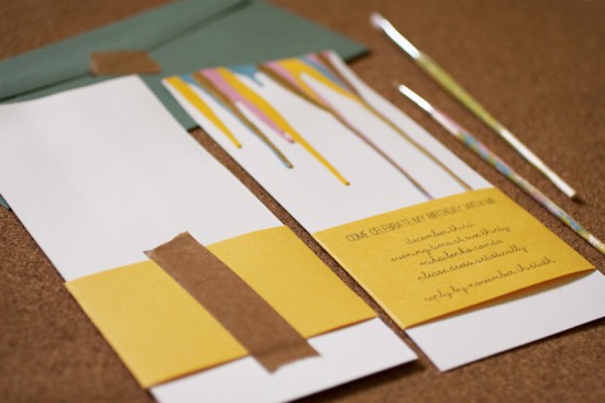
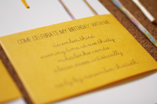
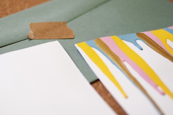
You might remember Anastasia’s bright and colorful Kate Spade-inspired birthday party invitations from last year, and today Anastasia is back to share the invitations for this year’s birthday party!  I love the simple inspiration behind these invitations: Anastasia simply dipped into her personal paint supply and let a few drips run down a trimmed sheet of paper!  Anastasia printed all the relevant details on a yellow belly band, using kraft paper tape to secure the two pieces.

From Anastasia: I found some super thick paper that I had lying around and picked out four colors of paint (sunny yellow, ocean blue, pink, and metallic gold) from my craft box.  I squeezed the paint onto the trimmed thick paper, letting the excess roll down the invitation.  All the party info was printed on yellow paper and trimmed just so I could wrap it around the invitation.

I secured the yellow strip with super sticky kraft tape on the back.  I also added puff tape underneath the front portion of the strip to give it a bit of lift.

So fun!  Thanks Anastasia – and happy birthday!

Photo Credits: Anastasia Marie

Josh + Lauren’s Illustrated Letterpress Wedding Invitations

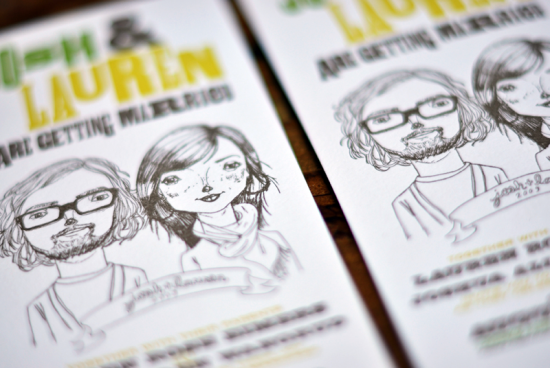
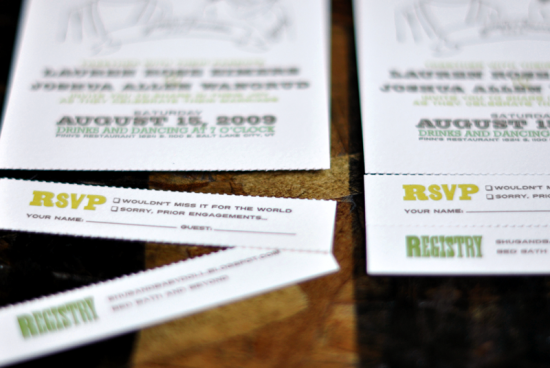
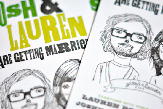
Around this time every year, I start going back through all my pins and bookmarks – all the pretty things that have caught my eye throughout the year.  Last night I came across these invitations over on The Mandate Press – designed by art director Josh Wangrud for his own wedding, with an adorable custom illustration by Merilee of Tuesday Mourning.  The invitation features a simple vertical layout with a perforated rsvp at the bottom.  So sweet, don’t you think?

Check out more from The Mandate Press right here and a couple more images over on Josh’s website.

Design: Josh Wangrud
Letterpress Printing: The Mandate Press
Illustration: Tuesday Mourning

Check out the Designer Rolodex for more tal­ented wed­ding invi­ta­tion design­ers and the real invi­ta­tions gallery for more wedding invitation ideas!

Photo Credits: The Mandate Press

Martini Sliders

Proportions matter a lot in mixing drinks.  Of the culinary arts, mixing drinks is most like baking in this regard.  When ingredients are measured in ounces, a dash or two of something can either make or overwhelm a drink. The first modern Martinis were made with equal parts of dry gin and dry vermouth (hence: the Dry Martini).  Over time, people began drinking Martinis with less and less vermouth until the vermouth has become an afterthought.  Some recipes today call for a vermouth wash or a spray – or, as Winston Churchill was said to have done, a glance in the direction of France.  This is a tragedy!  These drinks are basically a cup of gin with maybe a hint of vermouth.  I don’t even want to call this a mixed drink.  So here’s a fun way to serve a drink and to explore the role of proportions in cocktails: the Martini Slider.
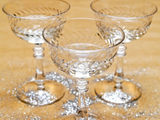
Read below for the full recipe!

Martini Sliders

For your first slider:

1 oz Dry Gin
2 Tsp Dry Vermouth
1 Dash Orange or Lemon Bitters
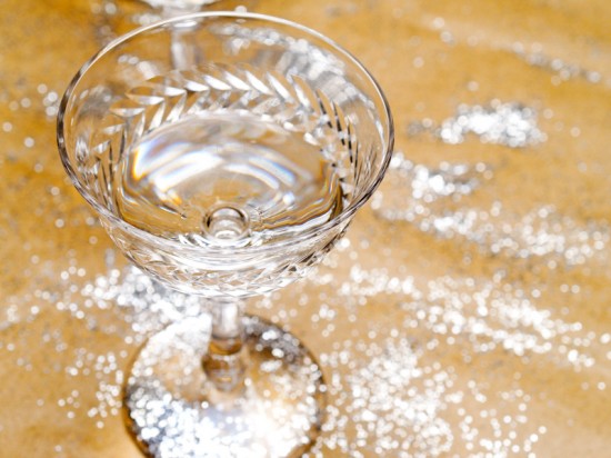
Stir with some ice and strain into a chilled cocktail glass.  With fresh ice, repeat these steps with:

3/4 oz Gin
1/4 oz Vermouth
1 Dash Bitters


And again, for your third slider:

1/2 oz Gin
1/2 oz Vermouth
1 Dash Bitters

Twist a lemon piece of lemon peel over your sliders and enjoy.

The first slider is closest to the typical Martini served these days.  It will be very, very dry, dominated by the gin’s juniper and other botanicals, with a real booziness.  The second should still be dry, boozy, and gin-forward, but you should start to see the effects of the vermouth in smoothing out the sharpness of the gin and adding complexity.  The third should tell you why the Martini is called the King of Cocktails: smooth, crisp, complexly botanical, with hints of citrus and a mouthwatering tang from the vermouth.
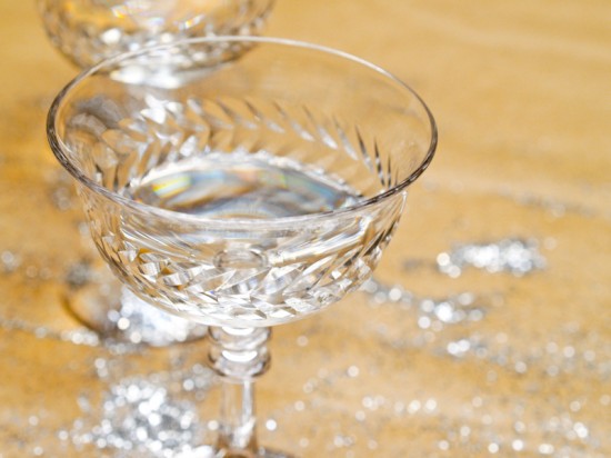
If you want to get fancy, try making a fourth slider just as you would the Dry Martini, with equal parts gin and vermouth, and add a teaspoon of Cointreau or Luxardo Maraschino liqueur.  The ancestors of the Dry Martini were much sweeter than the drink is today, so this should give you hint of what those were like and show you how just a bit of sweetness can transform a Martini.
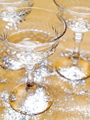
 

You can make drink sliders by playing around with proportions of pretty much any drink, but I find vermouth drinks like the Martini and the Manhattan (and their venerable ancestor, the Martinez, which I’ll explore soon) really highlight the importance of slight differences in ingredients.  A word of caution: each of these sliders is a mini-drink that doesn’t seem like much, but drinking a row of sliders (especially if you make all four) can pack a real punch.  Drink carefully!

Photo Credits: Nole Garey for Oh So Beautiful Paper

{happy weekend!}

Happy Friday everyone!  I’ve been a flurry of activity this week – I’m determined to make it through a bunch of apartment projects that have been on my to do list for what feels like months.  I’ve been hanging shelves and artwork, painting, organizing, and much more.  The last few weeks have been crazy busy, but I love the sense of accomplishment that comes with checking something off my list.  Don’t you?  I’m off to go pick up some paint samples for my next project, but in the meantime…

Photo Credit: Sam Hurd Photography

…a few links for your weekend!

This week on Oh So Beautiful Paper:

I’ve got a cocktail post coming up a bit later, but otherwise that’s it for me this week!  Don’t forget to enter our gift wrap giveaway from Felt + Wire – the contest closes at midnight tonight!  Have a wonderful weekend, and I’ll see you back here on Monday. xoxo

DIY Rubber Stamp “Banner” Wedding Invitations

It’s the ladies of Anti­quaria, back with another fab­u­lous and cre­ative DIY project for you!  This week they’re here with some awe­some DIY rubber stamp wedding invitations!

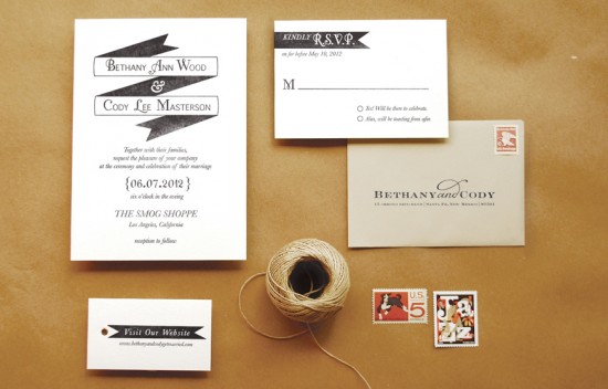
This invitation suite is simple, but it packs a graphic punch!  We wanted to design a suite that looked modern and was easy to execute.  There aren’t any fancy techniques or tools needed for this one, but when all the pieces come together, it looks very high end and custom!  There are so many color options for this invitation suite.  In addition to black and white, think about navy and gray or eggplant and kraft!

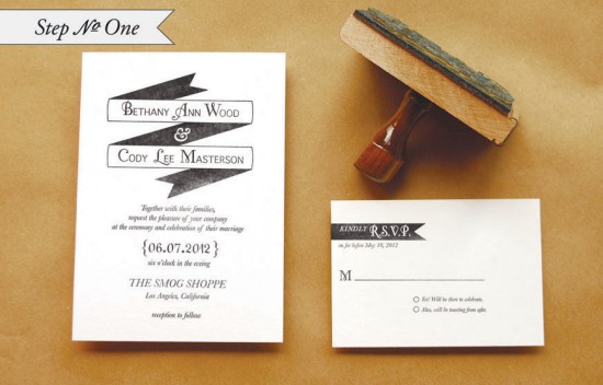
Step One: Stamp the invitation cards.  For the invitation, you will use an A7 card; for the reply, you will use a 4bar card.  When making a print, ink the stamp throughly and apply even pressure for the best results.  On the large stamps, such as the“Modern Banner” invitation and “Modern Banner” reply, cover stamp with both palms and press, focusing on the center (near the handle).  Moderate pressure is required but too much can make for a muddy print.

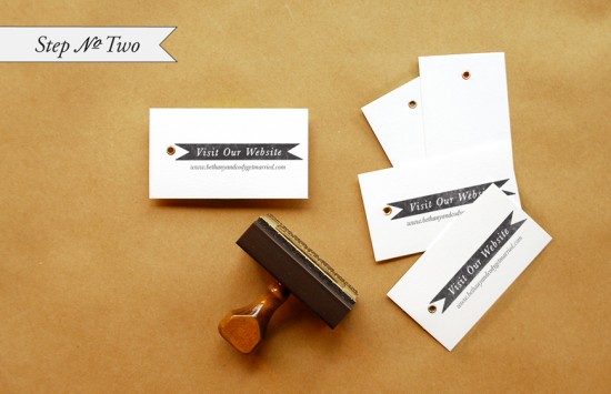
Step 2: Stamp the website cards.  We used our small “Modern Banner” Website stamp.  Follow the directions above for making a good print.

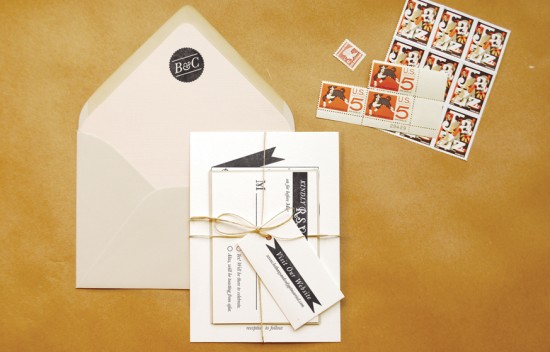
Step 3: Cut your envelope liners.  We used tan text weight paper for a monochromatic neutral look.  To make the liner, trace a template and cut on the traced line.  Be sure to stamp your monogram (we used our “Seal Initial” monogram) on the liner so that when your guests open the envelope there is a lovely surprise!

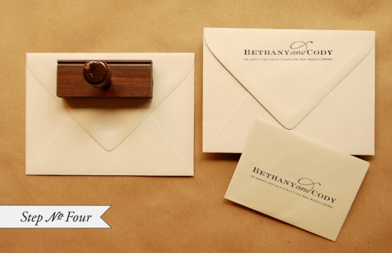
Step 4: Stamp return and reply addresses on the envelopes.  We used our “Sophisticate” Return Address stamp for this suite.  It’s a great money saving tool to be able to use one stamp for both your return and reply address.

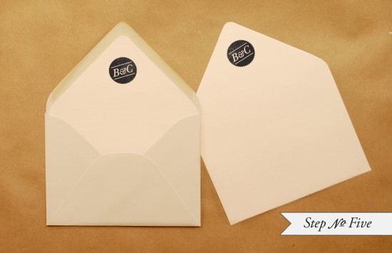
Step 5: To install the liner into the envelope, apply double sided tape (or use a glue stick) around the top triangle of the liner (on the back).  Slide the liner into the envelope, holding the taped edge away from the envelope.  Once the liner is positioned correctly, press down on the tape to adhere.

Finishing touches: Tie the whole suite up with twine, address, and add postage!

Materials:

“Modern Banner” Invitation Stamp from Antiquaria 

“Modern Banner” Reply Card Stamp from Antiquaria

“Modern Banner” Website Card Stamp-Large  from Antiquaria

“Seal Initial” Monogram Stamp from Antiquaria

“Sophisticate” Return Address Stamp from Antiquaria

Color Box Stamp Pad in Black

Metal Eyelet Tags for website card

A7 Cardstock,

4Bar Cardstock

A7 Envelopes

4 bar Envelopes

Envelope liner templates

81/2″ x 11″ text paper, for liners

Twine

Postage (we used the Jazz Forever Stamps mixed with vintage stamps)

Photo Credits: Antiquaria