Inspired By: Kraft Paper

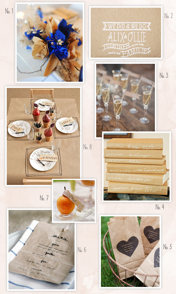
Kraft paper is one of my favorite materials any time of year, but even more so during the holiday season.  I love the combination of kraft paper (or even chipboard) and white lettering for party invitations and place cards.  You can also use kraft paper lunch bags as easy menus for holiday dinners or attach little flags to toothpicks or straws to help guests keep track of their drinks for a New Year’s Eve party.  Since Thanksgiving is next week (!!), I thought I’d round up a few of my favorite kraft paper details…

No. 1 Kraft paper + cobalt paper flowers Hey Look via The Sweetest Occasion; No. 2 Invitations Rebecca Hansen via Once Wed; No. 3 Kraft paper drink flags Michael and Anna Costa via Style Me Pretty; No. 4 Neither Snow via Design Sponge; No. 5 Kraft paper favor bags Tec Petaja via Once Wed; No. 6 Menu Karen Mordechai for Sunday Suppers; No. 7 Place card via Martha Stewart Weddings; No. 8 Table setting via Country Living

p.s. A few favorite kraft paper posts:

New Giveaway! Custom Map from Swiss Cottage Designs!

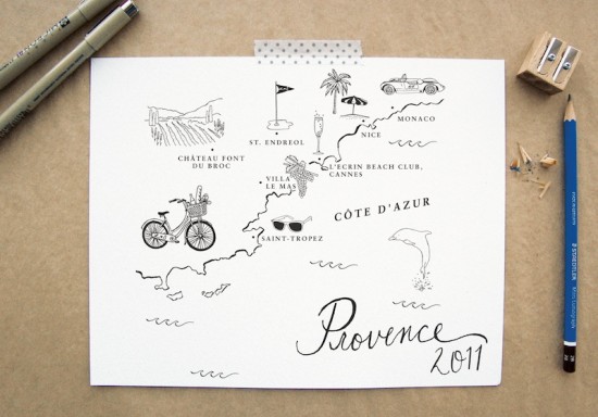
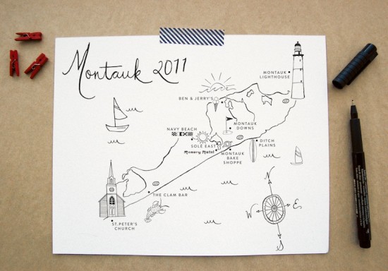
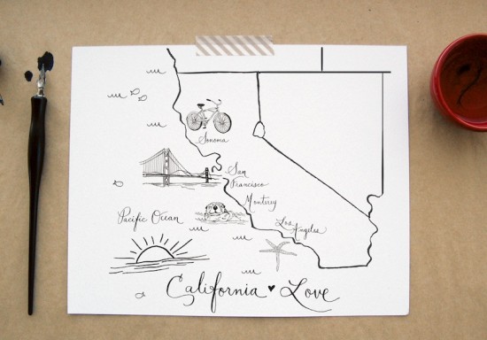
I’m still trying to wrap my head around holiday cards, much less gift ideas – but whenever possible I always try to come up with unique and personal holiday gift ideas for close friends and family.  Today, Courtney from Swiss Cottage Designs is giving one lucky reader the chance to win a completely personal holiday gift: one of her gorgeous custom illustrated maps!

Courtney is offering one lucky reader the chance to win a custom 8 x 10″ black and white map print – just like the three pictured here!  The map design can include up to 8 custom locations, tailored to the winner’s specifications.

To enter, just leave a comment below with a destination that you would love to visit someday.  We’ll chose a winner randomly, and you’ll have until 11:59 p.m. EST on Friday, November 18 to enter – bonne chance!

Photo Credits: Swiss Cottage Designs

Wood + Foil NASCAR Invitations from Lettered Olive

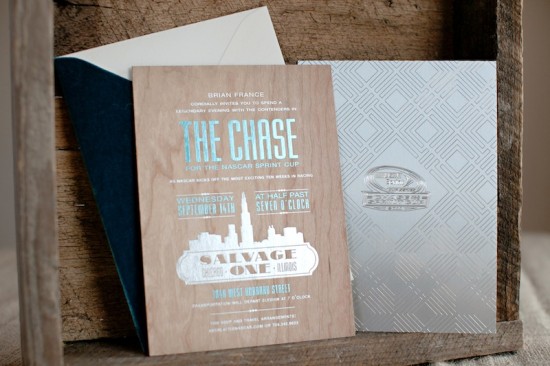
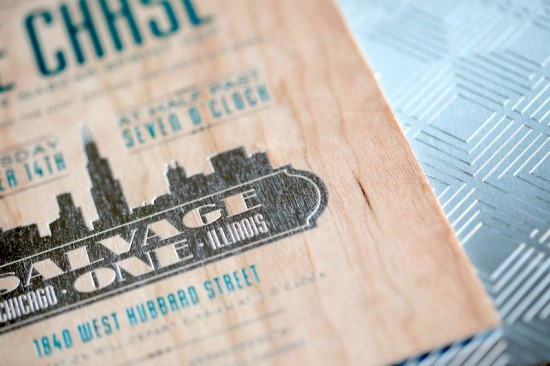
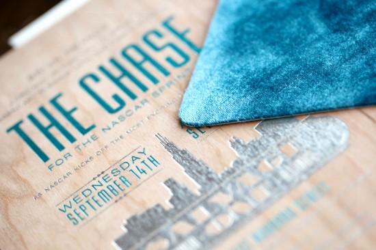
I’m used to gushing over the beautiful wedding invitations from the ladies of Lettered Olive, but today they’re sharing something a bit different – NASCAR invitations!  These gorgeous mixed media invitations were created for a celebratory party for the NASCAR Sprint Cup.  Inspired by the industrial event space in Chicago, these invitations combine wood, etched metal, and beautiful metallic foils.

From Christine at Lettered Olive: We recently worked with NASCAR to create an invitation for a celebratory evening kicking off the Chase for the NASCAR Sprint Cup.  This event was at a fabulous space in Chicago called Salvage One.  The space is industrial, with wood beams, brick walls, and exposed metal.  We just loved the space and found it so inspiring!  So we created the invitation for a “Legendary” evening (the dinner entertainment was John Legend!).

The invitation was metallic blue and silver foil on wood, backed with etched metal.  The great thing about this job is that it allowed us to get in touch with our “masculine side” – this invitation was all about clean lines, the mixed materials, and total sophistication.  To add another luxe element to the invitation, we foil stamped the envelope and created a teal velvet envelope flap to mimic the amazing vintage velvet sofas at the venue.

So amazing!  Thanks ladies!

Lettered Olive is a mem­ber of the Designer Rolodex – you can see more of their beau­ti­ful work right here!

Photo Credits: Melanie Mauer for Lettered Olive

p.s. I have an awesome giveaway coming up a bit later, so check back soon!


Emily + Matt’s German Beer Wedding Invitations

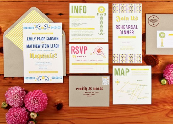
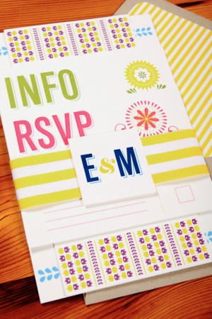
How fun!  In these invitations from Lauren at The Creative Parasol, Emily and Matt were inspired by their German heritage and German beer for the design of their wedding invitations.  It’s probably a good thing that my husband didn’t realize this was an option back when we were choosing our own wedding invitations!  Lauren and Emily drew their inspiration from vintage folk patterns, crewel embroidery, and beer packaging to come up with a whimsical and colorful design.

From Lauren: Emily and Matt had three important ingredients for their wedding: German. Folk. Beer.  In coming up with the design, Emily and I were inspired by vintage folk patterns, specifically old crewelwork and embroidery designs.  The inspiration for the typography came from some of the great beer packaging, specifically Shiner, whose brewery is just outside of Austin.


Thanks Lauren!

Check out the Designer Rolodex for more tal­ented wed­ding invi­ta­tion design­ers and the real invi­ta­tions gallery for more wedding invitation ideas!

Photo Credits: The Creative Parasol

Lauren + Andrew’s Orange and Gray Fall Wedding Invitations

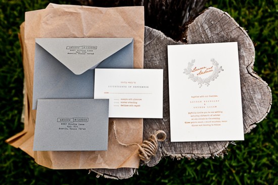
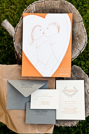
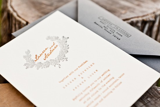
Happy Monday everyone!  I’m still feeling kind of cruddy from the cold that I caught last week, so I’m hoping these pretty fall wedding invitations from Stephanie at Salt + Pepper Press will help cheer me up.  I’m loving the warm orange and gray color palette, the classic laurel illustration, and the adorable sketch (from one of the couple’s love notes!) used as a cover for the enclosure that included hotel and activity information.

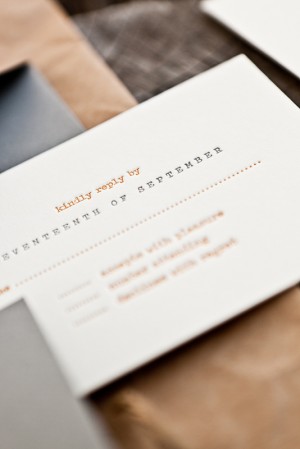
From Stephanie: The bride and groom were planning a vintage-inspired fall wedding with lots of homemade touches.  We incorporated a typewriter font in the invitation text and RSVP card for a vintage element, while the bright orange and muted warm gray really played up the fall aspect of the wedding.


The couple used a sketch that was made on a quick love note from their past as the front cover of the poster.  The poster held all the additional information such as hotels and activities around the wedding.

Thanks Stephanie!

Design and Printing: Salt + Pepper Press

Photography: Lauren Reynolds

Check out the Designer Rolodex for more tal­ented wed­ding invi­ta­tion design­ers and the real invi­ta­tions gallery for more wedding invitation ideas!

Photo Credits: Lauren Reynolds