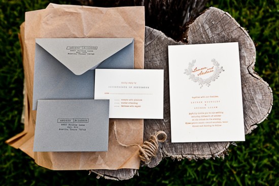
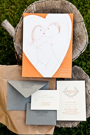
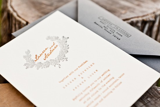
Happy Monday everyone! Â I’m still feeling kind of cruddy from the cold that I caught last week, so I’m hoping these pretty fall wedding invitations from Stephanie at Salt + Pepper Press will help cheer me up. Â I’m loving the warm orange and gray color palette, the classic laurel illustration, and the adorable sketch (from one of the couple’s love notes!) used as a cover for the enclosure that included hotel and activity information.
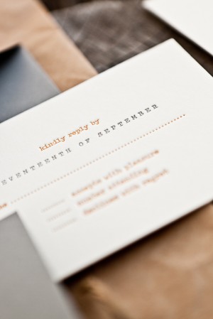
From Stephanie: The bride and groom were planning a vintage-inspired fall wedding with lots of homemade touches.  We incorporated a typewriter font in the invitation text and RSVP card for a vintage element, while the bright orange and muted warm gray really played up the fall aspect of the wedding.
The couple used a sketch that was made on a quick love note from their past as the front cover of the poster. Â The poster held all the additional information such as hotels and activities around the wedding.
Thanks Stephanie!
Design and Printing: Salt + Pepper Press
Photography: Lauren Reynolds
Check out the Designer Rolodex for more talÂented wedÂding inviÂtaÂtion designÂers and the real inviÂtaÂtions gallery for more wedding invitation ideas!
Photo Credits:Â Lauren Reynolds


This is super cute. I love that stickman sketch, what a lovely touch!
What a beautiful color combination. I love that it is not super bright, staying true to vintage. Did Salt+Pepper Press also create the address label for the front and back of the envelope? If not, would love to know where it came from.
Thanks in advance for sharing!
What a pretty color palette! Especially loving that grey with the slate blue undertones