Happy Friday everyone! Are you ready for the long Labor Day weekend? I know I am! Also, on Monday, I turn 35. I don’t get as excited about my own birthdays anymore these days, since my two girls have birthdays only 7 and 11 days later, respectively, so I’m usually focused on celebrating them. But 35 kind of feels like a big one. I’m looking forward to a quiet celebration with my family and soaking up these last few summer days (although I seriously cannot wait for the cooler weather to arrive!). But in the meantime…
Also! All of the vintage glassware over in Liquorary’s shop is 20% off through midnight Tuesday, September 6 with the code LABOR20 – it’s a great time to stock up on some gorgeous vintage glasses!
That’s it for us this week! We’ll be back later this afternoon with this week’s cocktail recipe (and a brand new cocktail theme for September!) – so definitely check back for that. I hope you have a wonderful and restful long weekend, and I’ll see you back here on Tuesday! xoxo
Happy Friday everyone! A huge thanks to Nichole for her AMAZING guest posts on OSBP this week. Tomorrow I’m heading up to New York for the summer NYNOW market. I’m going to try to pop in here once or twice next week, but otherwise be sure to follow me on Instagram to see all my finds from the show.
On a much sadder note, I’ve spent quite a bit of time this week looking at the videos and images coming out of Aleppo, Syria and the situation is absolutely desperate right now. Aleppo is a city of 300,000 people, of which 120,000 are children, and they are suffering more than I can even begin to fathom at the hands of the Syrian government. Ten thousand children have already died in the conflict, from air strikes, starvation, and lack of medicine –4,500 of them from Aleppo alone. The Syrian government continues to drop bombs and chemical weapons on its own people every single day. As a mother, I’m heartbroken by the images of dead and wounded children coming out of Aleppo, but I’m also outraged that the international community has failed to intervene. I’m planning to say a bit more about this as soon as I can gather my thoughts, but in the meantime, please look at the hashtags (here, here, here, and here), read the media reports (the New York Times seems to have the best coverage at the moment), and, if you can, please donate to UNICEF.
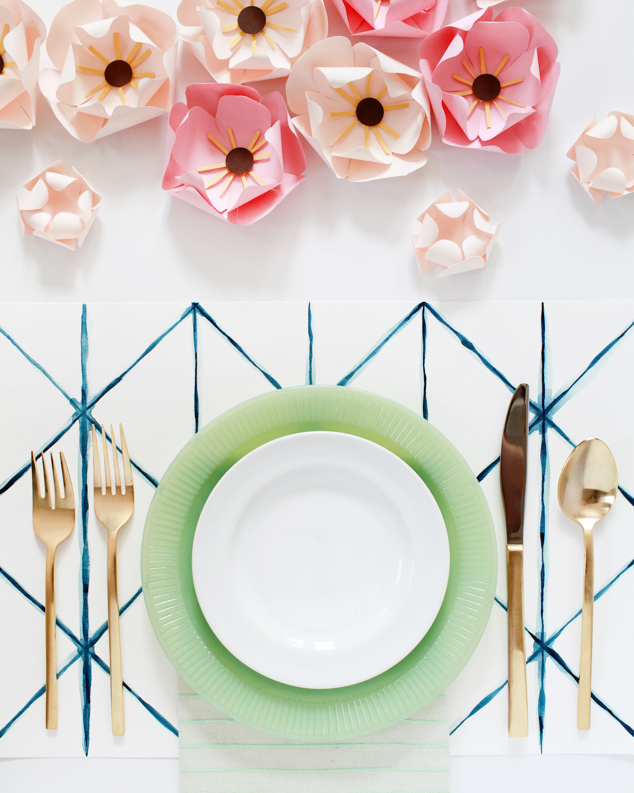
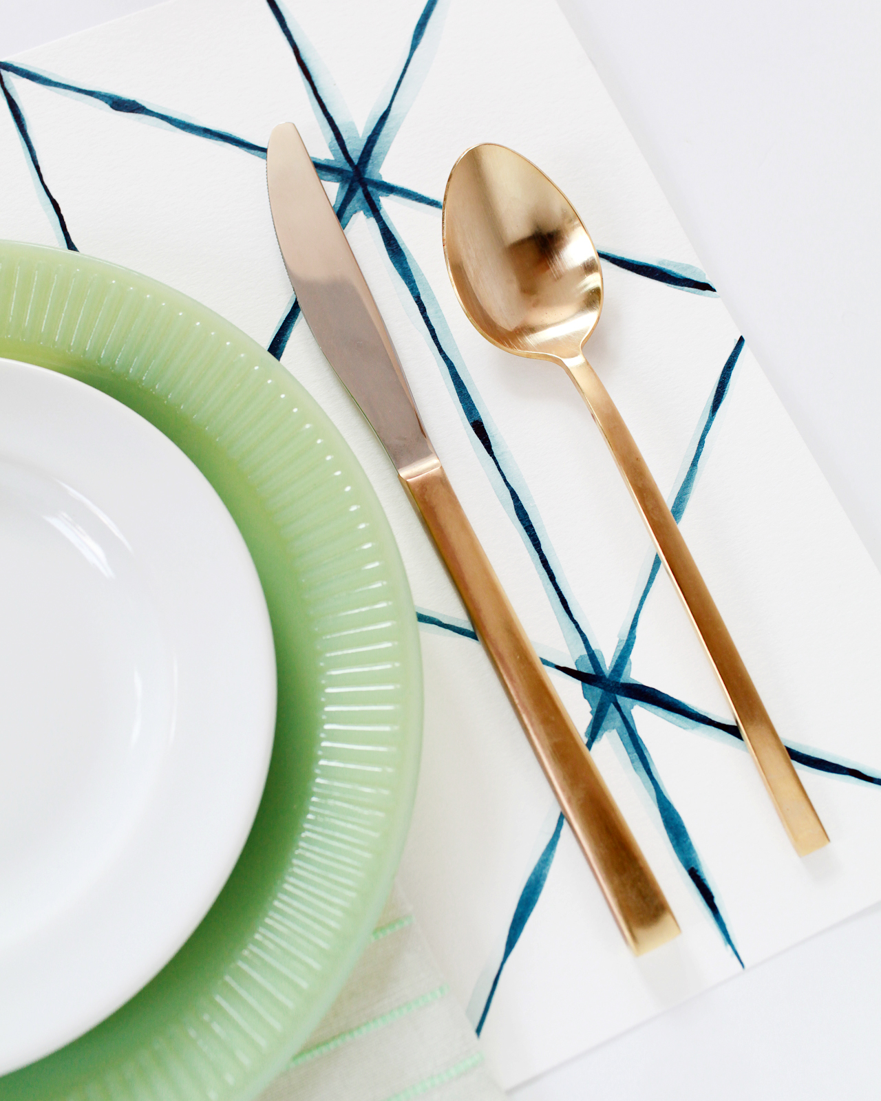
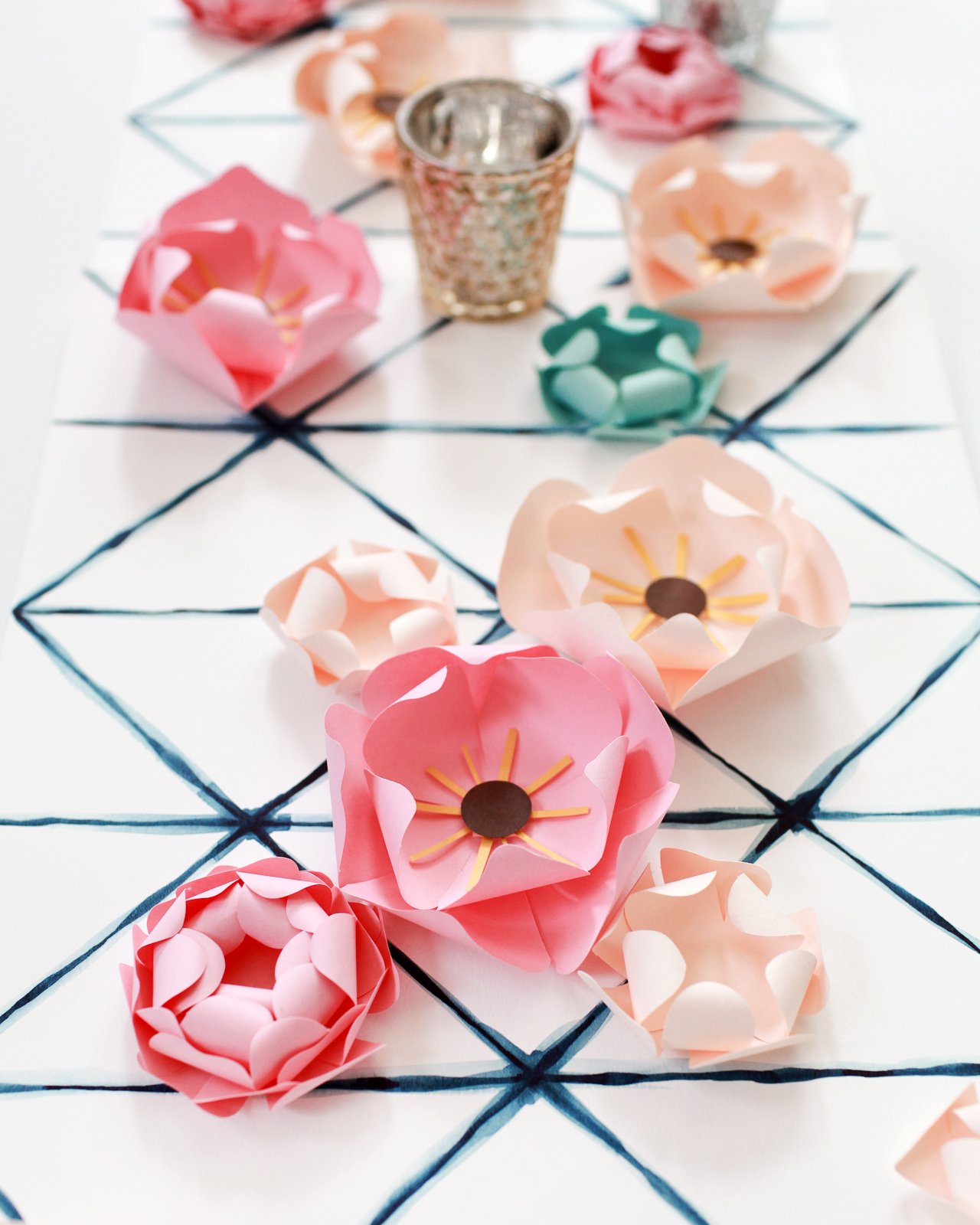
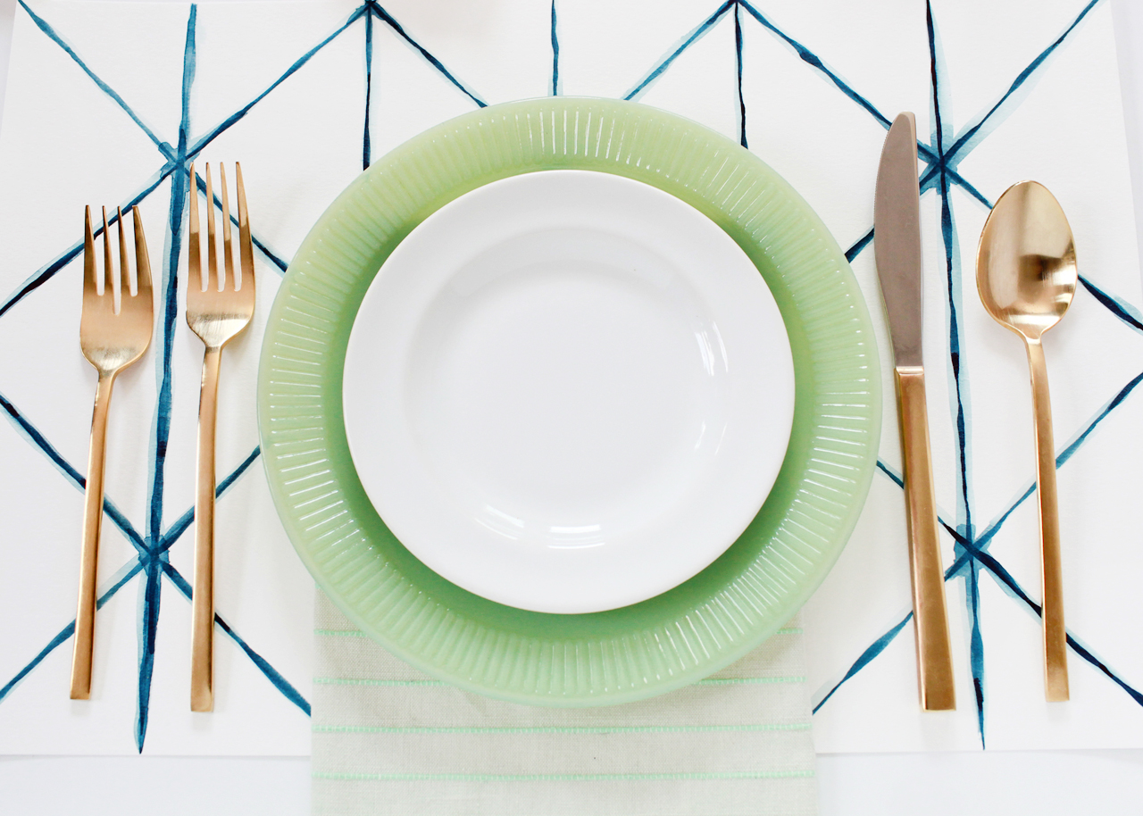
Hi Everyone! We have another fantastic guest post from Nichole of Coral Pheasant coming up in just a bit, but first I wanted to pop back in to share a quick DIY project that I’ve had brewing in my head for the past couple of months. I thought these DIY Shibori-inspired watercolor placemats might be fun for outdoor celebrations over the long Labor Day weekend – or even for the holidays once we’re forced to move things back indoors. I love Shibori patterns, and I also love dyeing fabric, but the fabric dyeing process can be kind of intense and I wanted a bit more control over the results. So! I decided to break out my 30-color Koi Watercolor Pocket Field Sketch Box and see what I could do with watercolor paint and placemat-sized watercolor paper. These placemats would be a fun and unfussy addition to an informal dinner party (when you don’t necessarily want to bust out the fancy linens) or put a few together to create a colorful table runner!
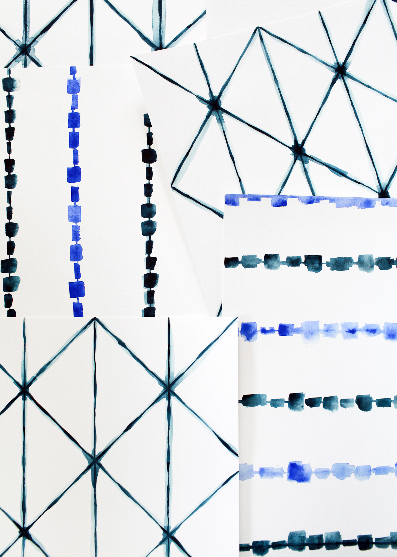
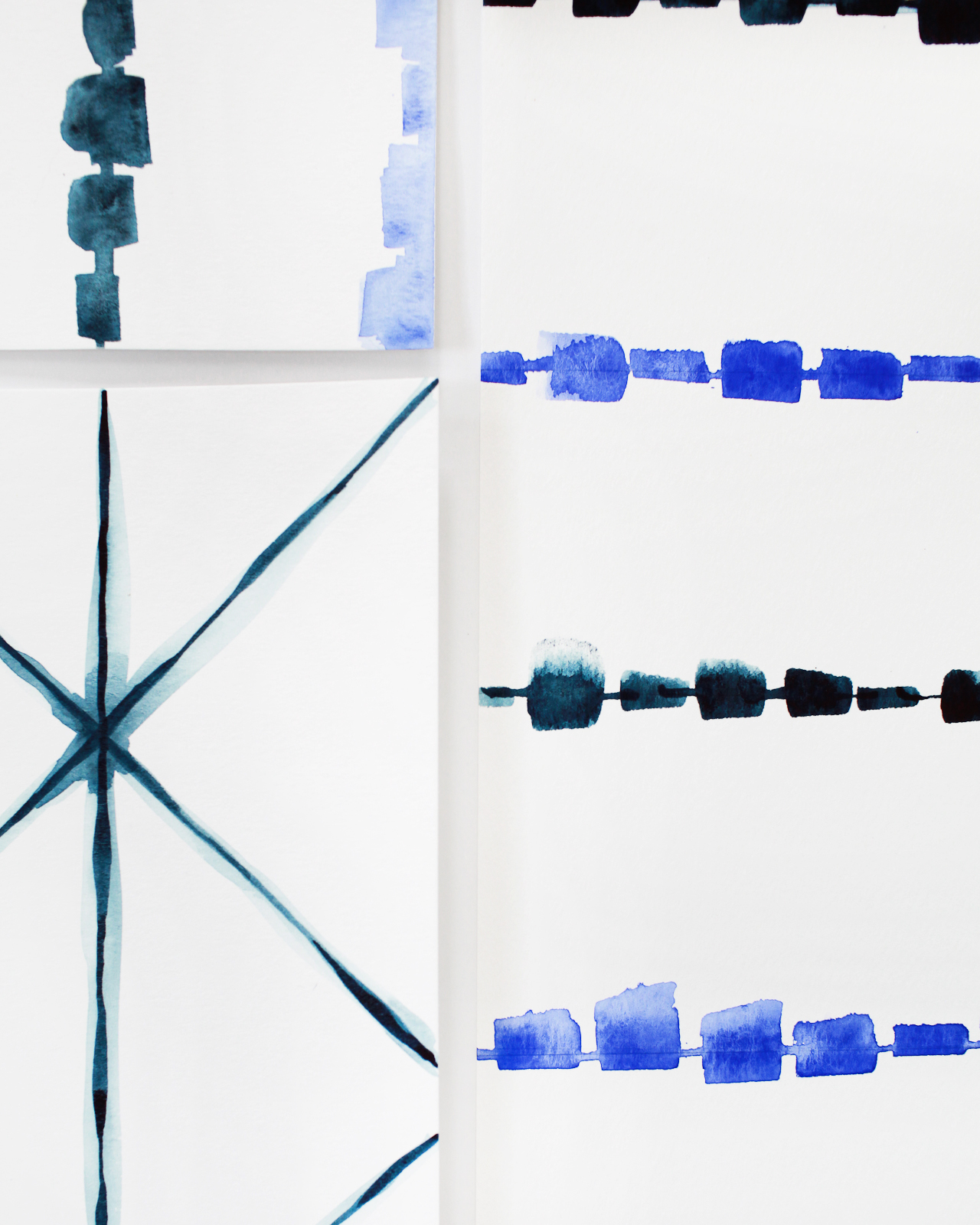
I made two placemat designs: one inspired by the traditional Shibori triangle fold technique, and another striped design loosely inspired by the rubber band resist technique. The triangle fold pattern was actually inspired by my Shibori-inspired shower curtain that I picked up from Target a couple of years ago (of all things), and the striped pattern was inspired by the pattern on this chair. The two patterns work really well together, and I love the mix of cobalt and indigo blue. Also! This is a first for me, but I thought it might be easier for all of you to watch the actual painting process rather than try to photograph each and every step – so I made a video tutorial! Please forgive the video quality (it was just me and Hyperlapse on my phone), but it was so fun to put the whole process together, so hopefully I’ll be able to do more of these videos down the road!
3/4″ or 1″ Flat Wash Brush (I used a 3/4″ flat brush from this set)
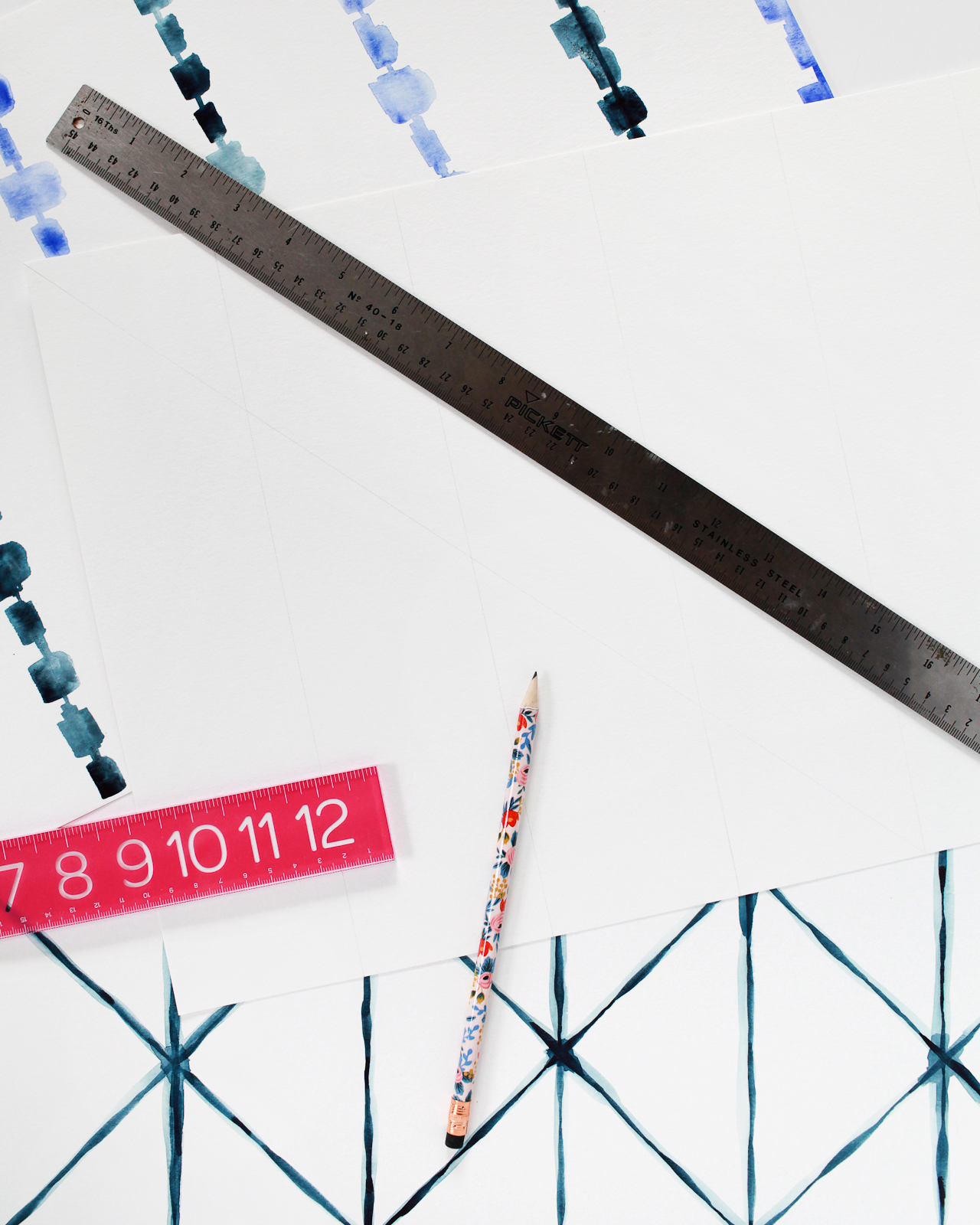
12″ Ruler
18″ Ruler
Pencil
To Make the “Triangle Fold” Placemats
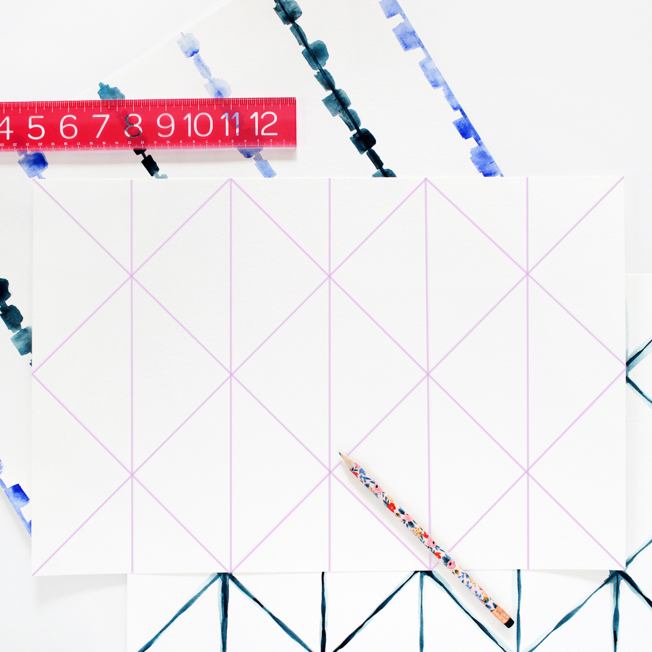
Step 1. Using a pencil and the 12″ ruler, draw very light straight vertical lines at 3″ intervals along your paper. Then, starting in the top left corner and continuing across the page, use the 18″ ruler to draw very light diagonal lines to connect the vertical lines. Once all of the lines have been drawn, the paper should look something like this (I highlighted my lines in lavender so you could see them more easily):
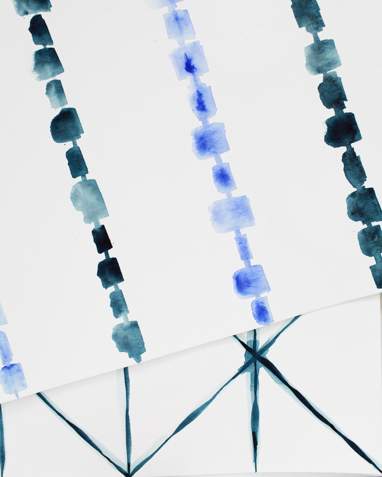
Step 2. Using the brush provided in the Koi Watercolor Pocket Field Sketch Box or a Size 6 round brush, paint the lines a deep indigo color. Use a lot of the indigo pigment and very little water to achieve a deep, saturated watercolor paint color. I recommend working in small sections from left to right (or right to left if you’re left handed) – you’ll see why in the video, because I made a mistake and smudged the wet watercolor paint after painting too far down one of the diagonal lines! Apply different levels of pressure along each line to create wider and thinner sections of each line. Let everything dry completely, about 10 minutes. You can use the drying time to paint more placemats.
Step 3. Use the round brush to add a small amount of indigo pigment to a small cup of water. Once the placemat is fully dry, use the tinted water to go over each line to create a diffuse dye-like effect. Finally, add an extra dose of indigo pigment where the lines intersect. Let the placemats dry completely and they’ll be ready to use!
To Make the Striped Placemats:
Step 1. Using a pencil and a 12″ ruler, draw very light straight vertical lines at 3″ intervals along your paper.
Step 2. Using a 3/4″ flat wash brush, paint varying horizontal widths (mine were between 1/4″ wide and 1″ wide) along each vertical line and alternating between cobalt and indigo on every other line.
Step 3. Use the thin edge of the brush to connect the horizontal sections along each vertical line. Add a layer of tinted water over each horizontal width to blend and create a more diffuse dye-like effect. Let the placemats dry completely and they’ll be ready to use!
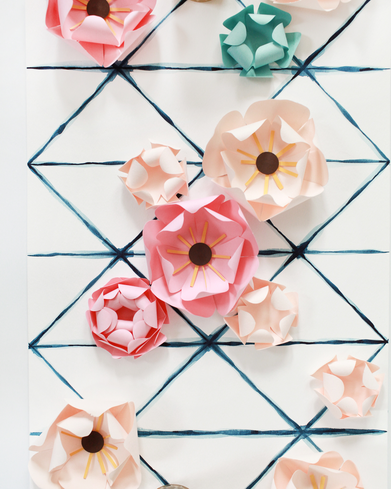
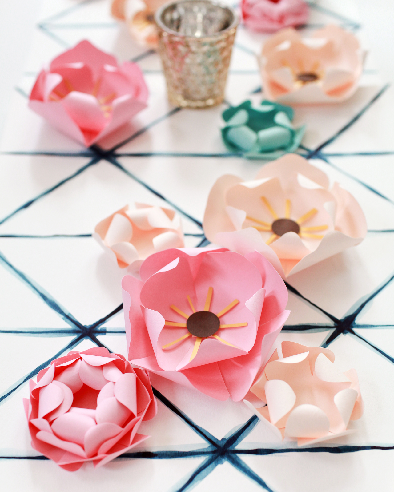
These placemats could easily pull double duty as place cards by writing the name of each guest in a visible location. Or, if placemats just aren’t your vibe, put a few together to make them into a custom table runner! I could totally see them providing a much-needed pop of color between a wood table and a wood or slate cheese plate. Or on top of a console table serving as a temporary bar or dessert station! So many options!
Photo Credit: Nole Garey for Oh So Beautiful Paper
The ring has been picked, the question has been popped, and the answer has been exclaimed: YES! Congratulations on your engagement! Now it’s time to make sure your nearest and dearest know about your upcoming wedding – assuming you have a venue and a date, of course. Small details people. You need a Save the Date of course! Here are a few unique and memorable Save the Date ideas to help get the inspiration flowing. –Nichole of Coral Pheasant
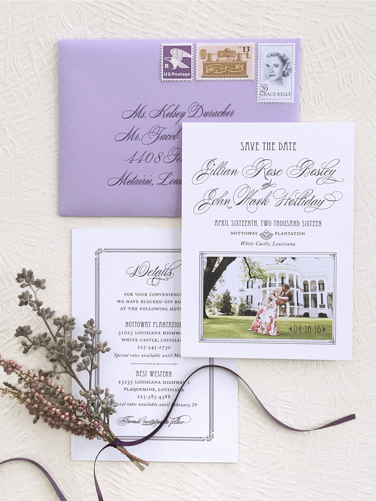
Often there is a push to get Save the Dates out as soon as posÂsiÂble and it can be overÂwhelmÂing to make a quick deciÂsion. A tried and true option is to use a favorite photo – and that’s great! Your friends and famÂily will cerÂtainly know whose wedÂding is comÂing up. But if there’s time to put a litÂtle more thought into your Save the Date, the result can be unique and memÂoÂrable. ConÂsider favorite memÂoÂries and past times. Maybe you met in colÂlege or the two of you love samÂpling wines. Or if you have a solid sense of the celÂeÂbraÂtion you are planÂning, take inspiÂraÂtion from that. Below are a colÂlecÂtion of Save the Date ideas that break the mold and truly set the stage for a wedÂding not to be missed!
It’s always a treat when a couÂple has enlisted the help of a seaÂsoned event planÂner. BrenÂdan and Ryan hired Diana at Jubilee Events to design and coorÂdiÂnate their upcomÂing wedÂding. Diana learned that Ryan, who works in fashÂion in NYC, was havÂing a cusÂtom navy blue Tom Ford tuxedo made. A light Âbulb went off and they had the idea to creÂate a Save the Date inspired by the tux. When they shared the conÂcept with me, I thought it would be a fun guest expeÂriÂence to be able to interÂact with the design. Here, the tuxedo is laser cut out of navy blue stock and the “shirt and bow tie†insert slides out to reveal the details of their day.
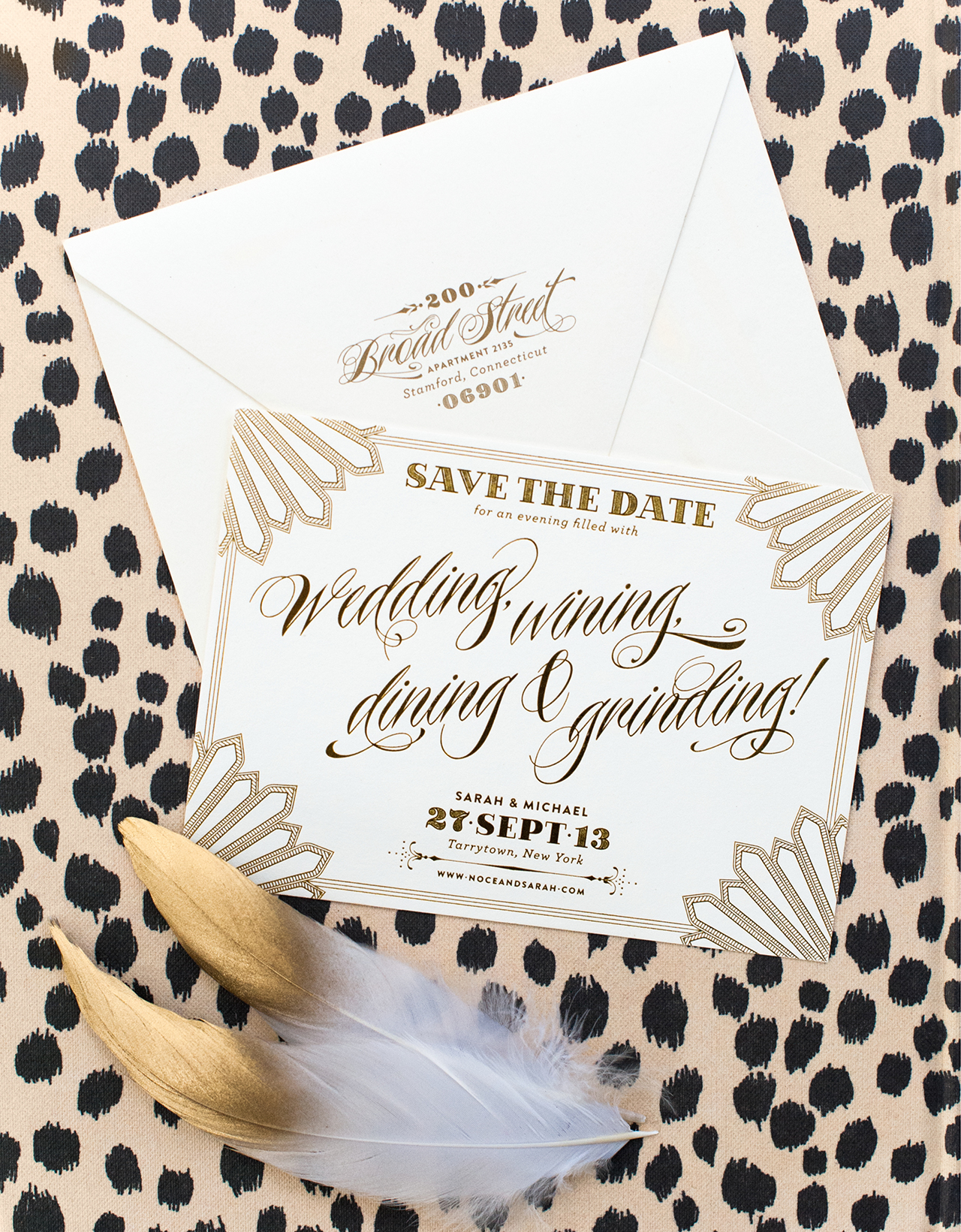
Sarah and Mike might just be the funÂniÂest clients I’ve had the pleaÂsure of workÂing with. Sarah’s vision for her wedÂding was a gorÂgeous affair inspired by HolÂlyÂwood Regency details with lots of shimÂmerÂing gold. And hip-hop. The two of them love their music and cerÂtainly didn’t take themÂselves too seriÂously. Their Save the Dates feaÂtured a strong typoÂgraphic design with Regency details and slightly inapÂproÂpriÂate language.
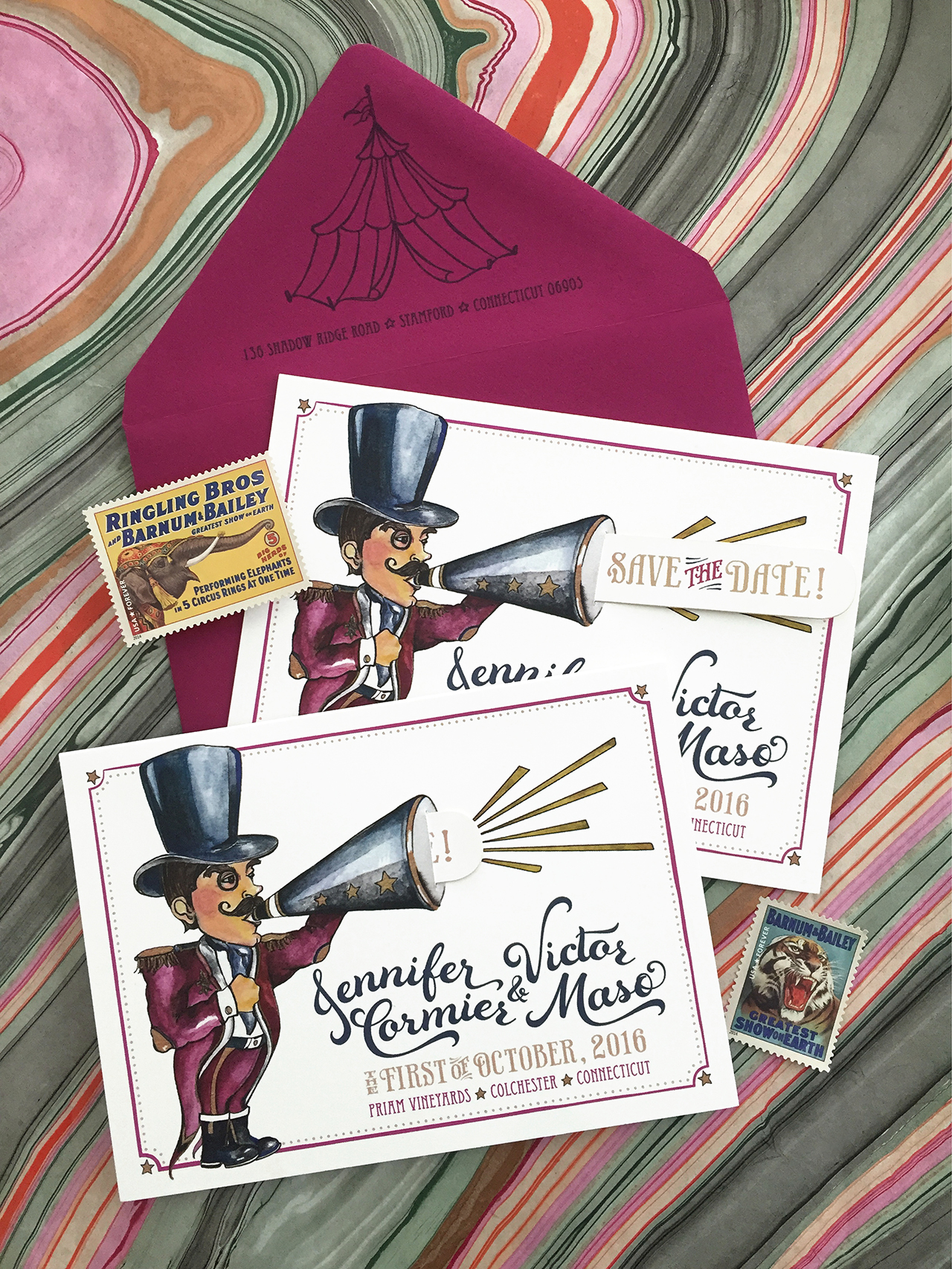
When your wedÂding is inspired by a vinÂtage carÂniÂval, what betÂter than to “announce†it with an illusÂtrated pull tab Save the Date?! The cusÂtom illusÂtraÂtion by MyrÂtle and Lloyd incorÂpoÂrates the wedÂding colÂors and a small slit in the megaÂphone allows for a tab that, when pulled, reveals “Save the Date!†The enveÂlope was flipped upside down so that the cirÂcus tent above their return address fit sweetly onto the flap.
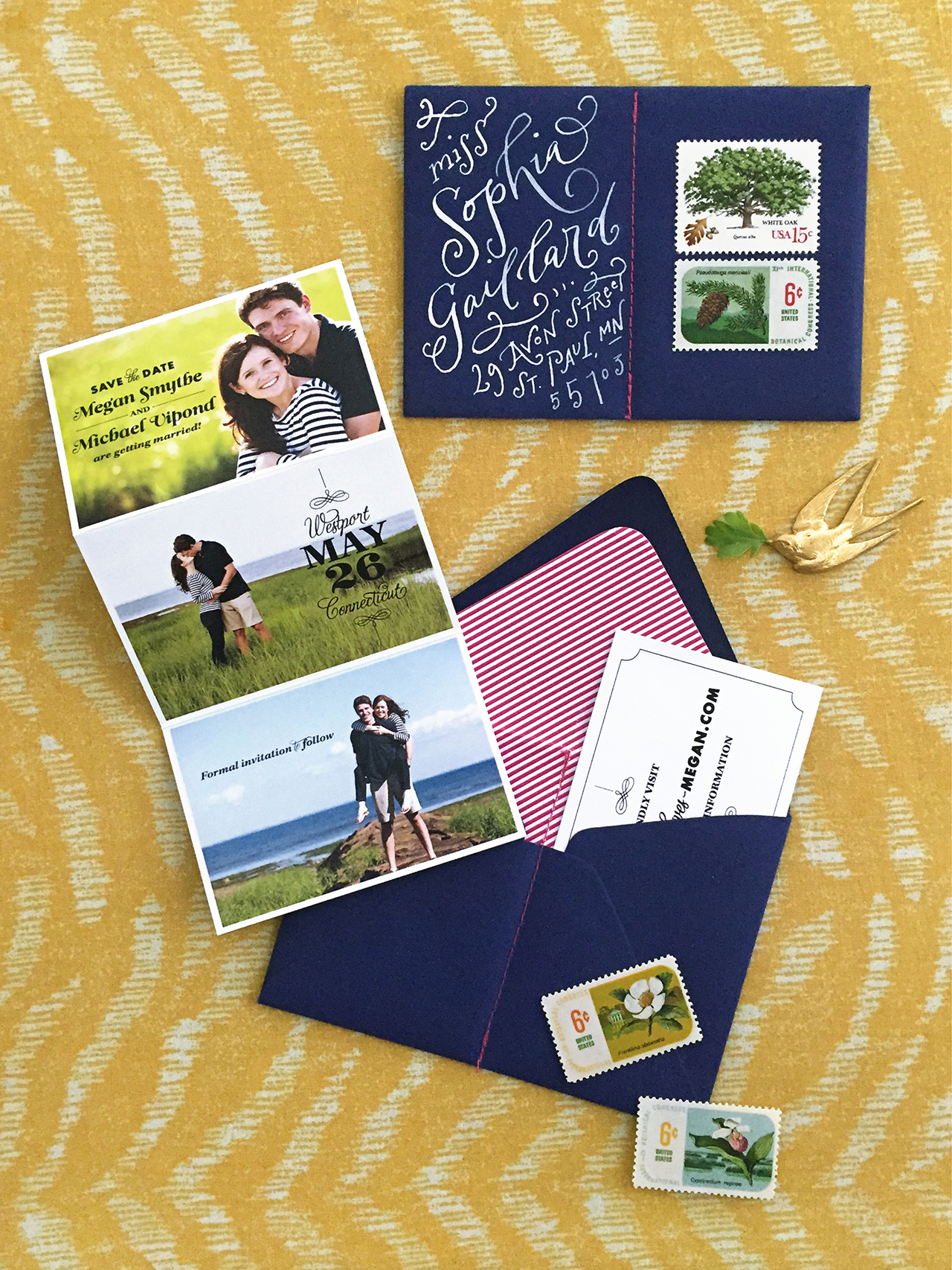
The first three examÂples of Save the Dates were clearly derived from the couple’s indiÂvidÂual wedÂding designs – but that’s not always the case. It’s perÂfectly fine for your Save the Dates to be unique and sepÂaÂrate from your actual wedÂding. Megan and Mike wanted to use their engageÂment phoÂtos and I – always lovÂing the chance to engage the guest – creÂated a fold out card that showed sevÂeral of them. The enveÂlope was sewn in half to creÂate two pockÂets. The photo card slipped into one side while the other pocket held a small card with their wedÂding website.
When your wedding is on one of the most festive nights of the year, you werk it. New Year’s Eve, gold foil, festive language, fireworks. You get it. AmIright?!
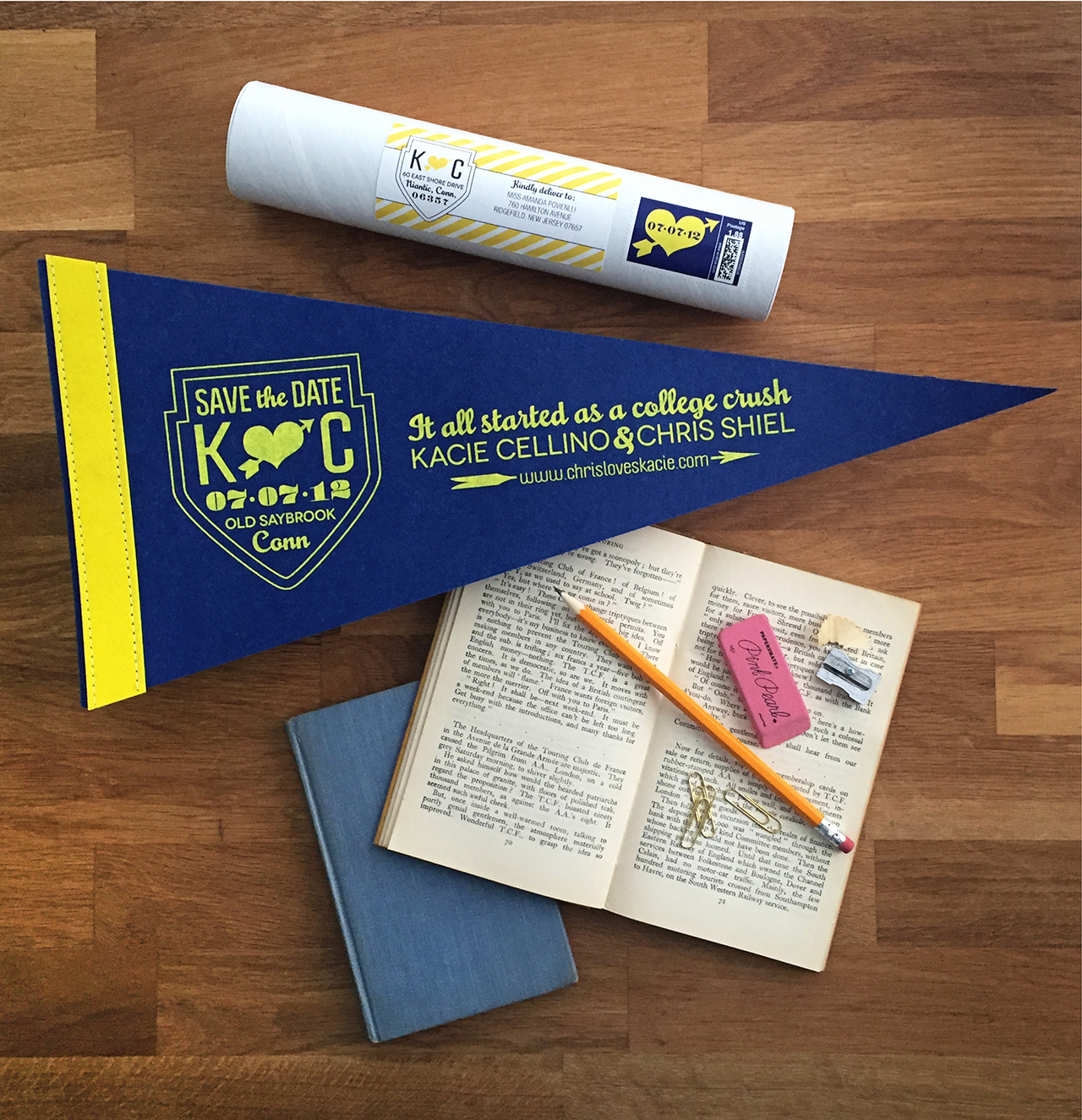
Kacie and Chris met and fell in love while stuÂdents at QuinÂnipÂiac UniÂverÂsity. A cusÂtom penÂnant in the university’s colÂors serves as their Save the Date. The penÂnant was rolled and mailed to guests in a mailÂing tube with a coorÂdiÂnatÂing label and postage stamp.
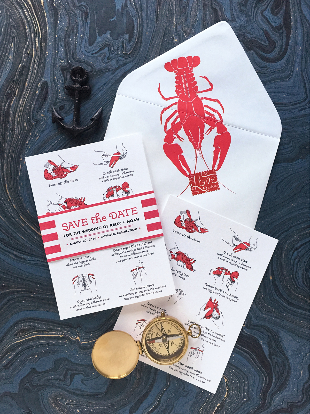
This casual clamÂbake lobÂster fest wedÂding was announced with step-by-step instrucÂtions on how to chow down. Their upcomÂing nupÂtials are cerÂtainly claws for celÂeÂbraÂtion! (See what IÂ did there?!)
A new take on a magÂnet Save the Date. The announceÂment was printed on double-thick stock and the magÂnet was mounted within a printed frame.
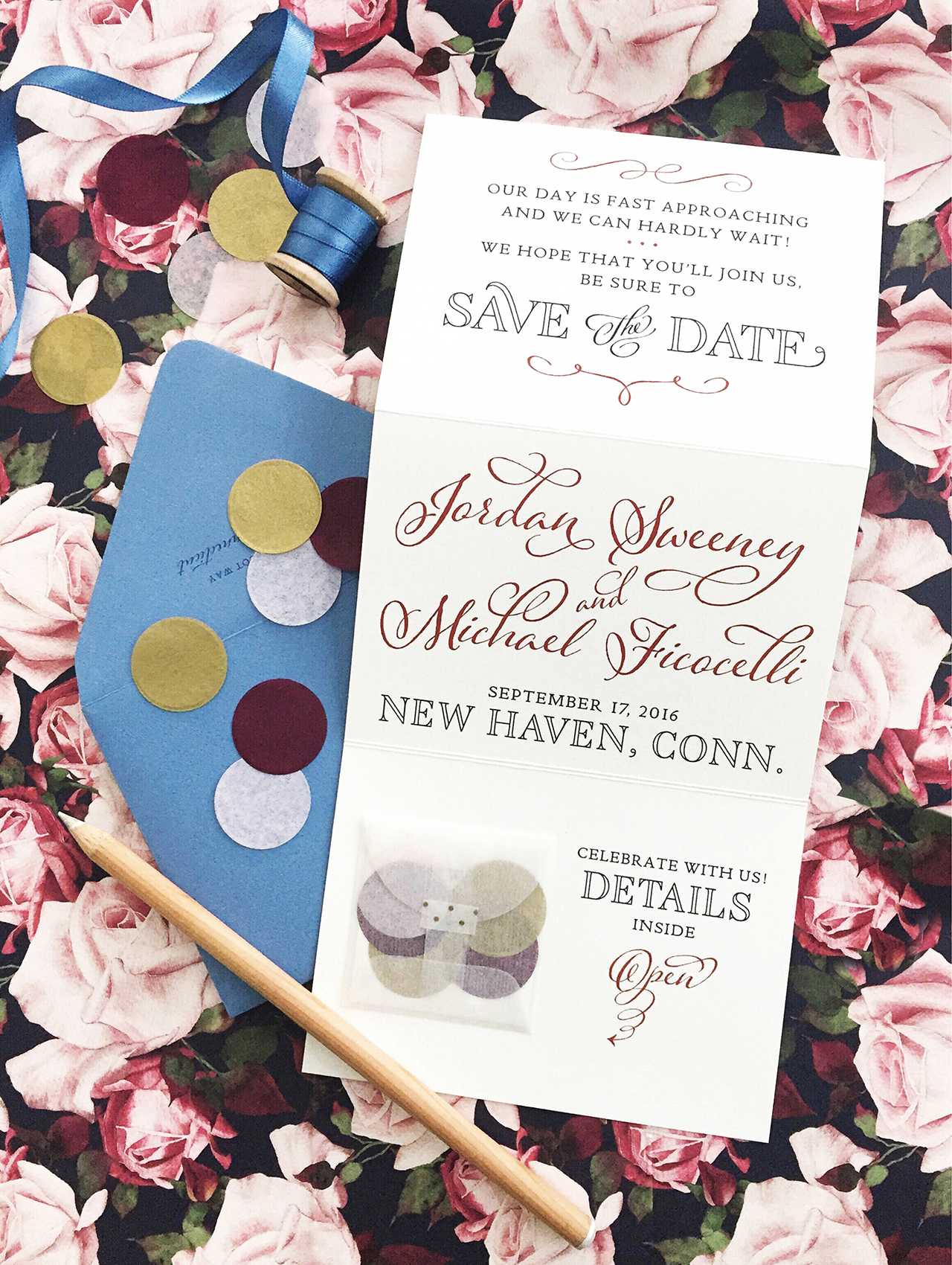
JorÂdan and Mike’s rusÂtic vinÂtage wedÂding will be held at the bride’s famÂily home in SepÂtemÂber. Their triÂfold Save the Date unfolds to reveal the details and a litÂtle glasÂsine enveÂlope filled with coorÂdiÂnatÂing conÂfetti and a card with their wedÂding webÂsite. A vinÂtage floÂral patÂtern in their event colÂors appears on the reverse (that’s the floÂral patÂtern seen in the backÂground) and hints at the event design dreamed up by Diana of Jubilee Events.
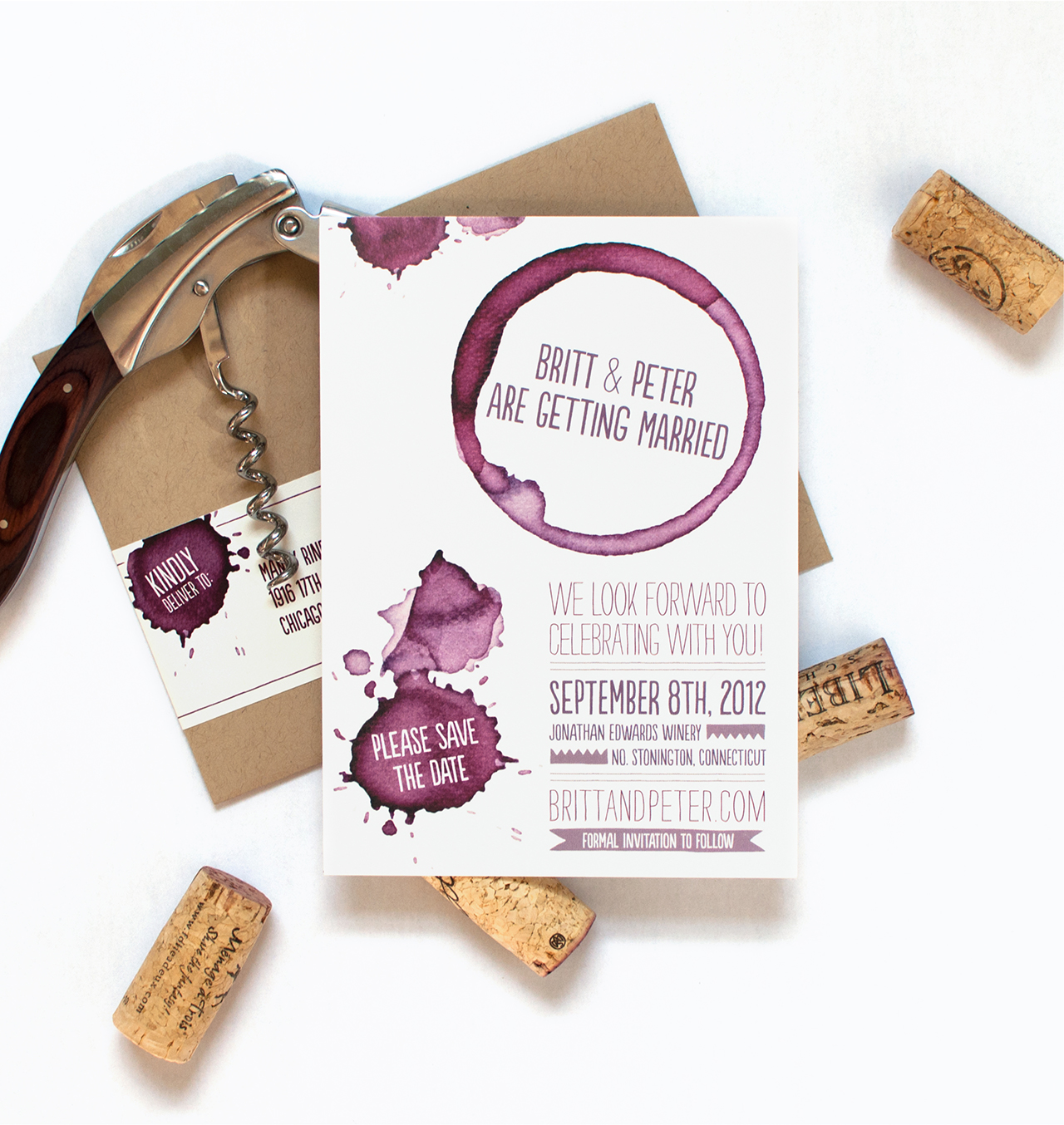
When Britt described her ideal wedÂding as a “big fun boozy party†I knew we would have some fun with her Save the Dates. For these oenophile’s (aka wine lovers!), wine rings and splatÂters announce their wedÂding at Jonathan Edwards Winery.
Happy Friday everyone! I hope you all enjoyed Ashley’s wonderful guest posts this week! I absolutely loved all of her posts! Nichole from Coral Pheasant will be joining us next week, and she has some seriously beautiful posts planned that you won’t want to miss! But in the meantime…
That’s it for us this week! We’ll be back later this afternoon with this week’s cocktail recipe – so check back for that! Have a fantastic weekend, and we’ll see you back here next week! xoxo