Modern Botanical Chicago Wedding Invitations

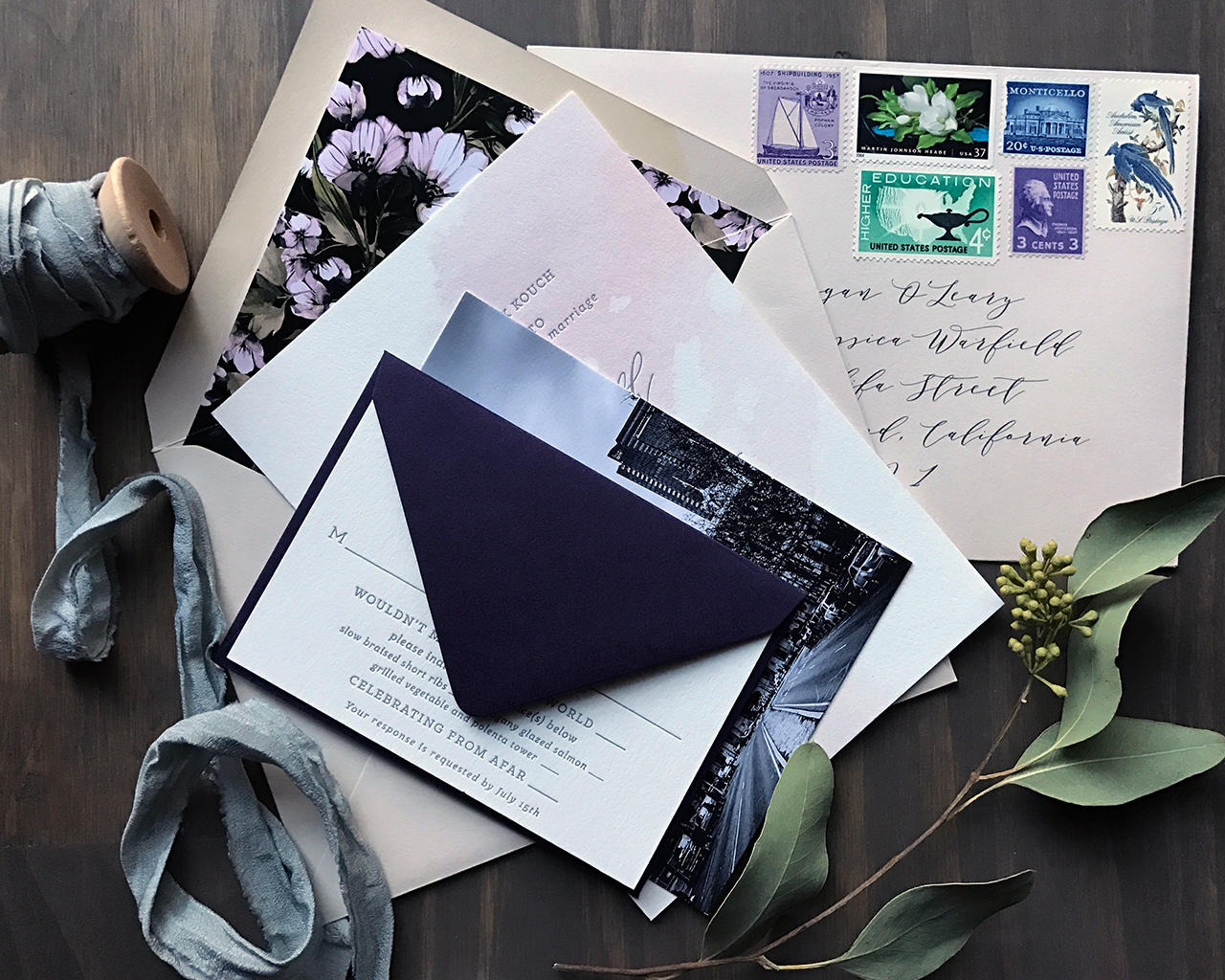
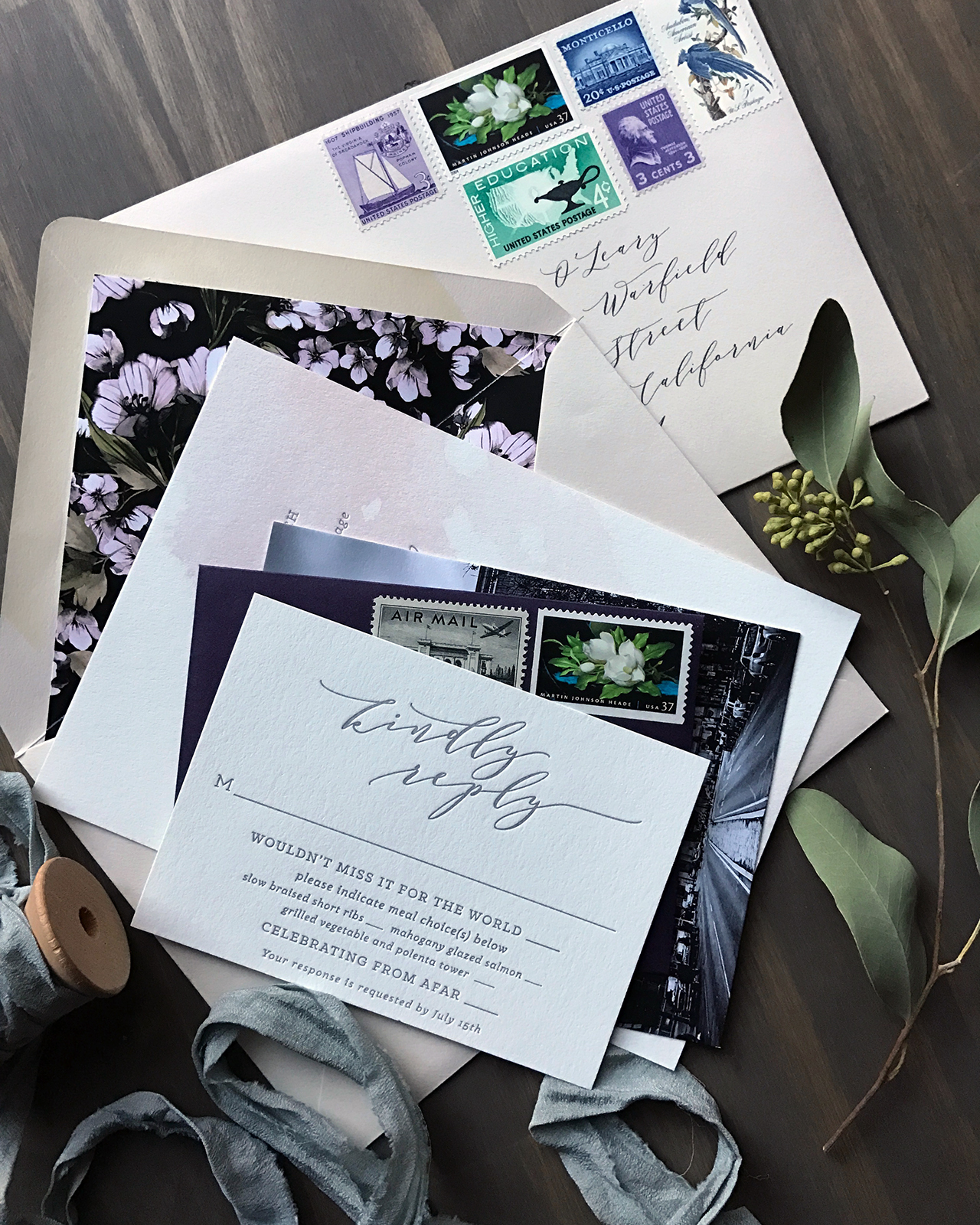
I’m partial to oversize floral patterns in wedding invitations – they make such a fantastic statement in a wedding invitation! (If you haven’t already, you have to check out the botanical envelope liners on these invitations.) I love how designer Christina Egan Chang combined modern elements with classic florals in these modern botanical Chicago wedding invitations. The large scale (and negative space!) text over the oversized botanical print on the RSVP card? So good! What a fun modern twist on a botanical invitation suite!

Modern Botanical Chicago Wedding Invitations by Christina Egan Chang

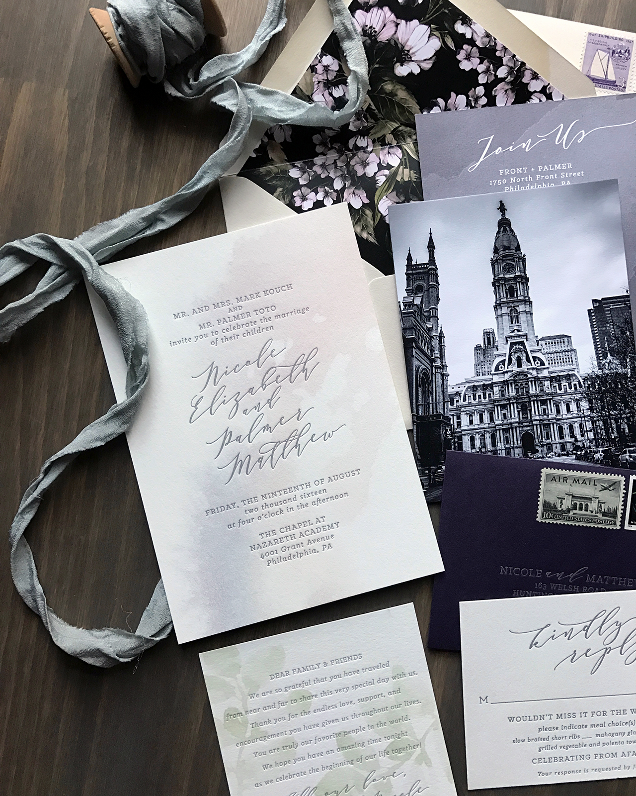
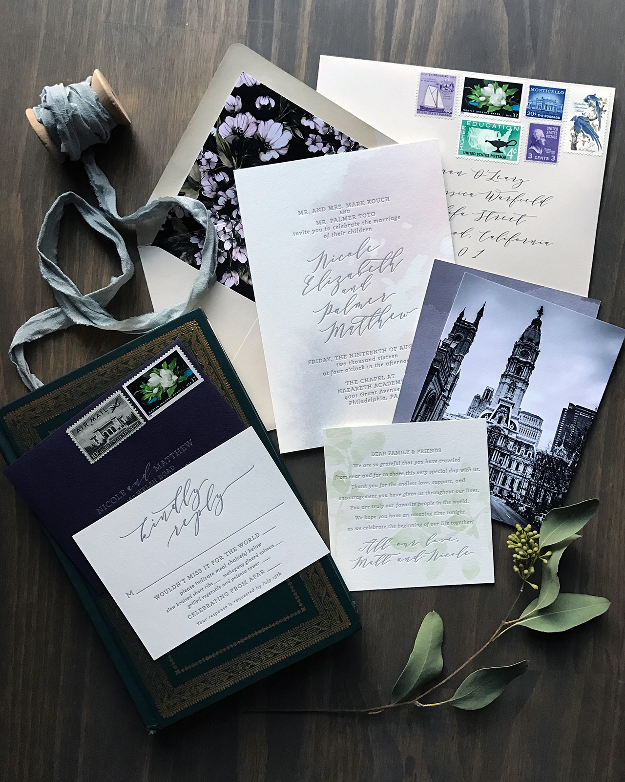
From Christina: This was a fun save the date announcement and wedding invitation suite for an elegant September Chicago wedding! Lauren, the bride, is a stylish advertising agency account manager and Michael is a teacher and writer. The pair, both Chicago natives, met in Michigan while at college and became engaged after six years of dating. Lauren and Michael wanted to evoke the ambiance from their wedding venue within the invitation details, so their color palette of green, white, black, and silver was pertinent to the design.

Modern Botanical Chicago Wedding Invitations by Christina Egan Chang

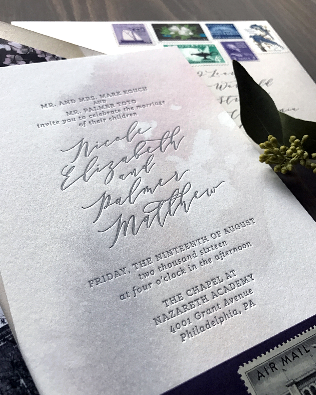
Their wedding reception took place in an antique shop turned event space by night, so we selected a vintage botanical print featuring the same flowers in Lauren’s bouquet as a recurring element in the invitation suite. Their table centerpieces featured stacks of vintage books draped with green eucalyptus and various seasonal white blooms, a visual that was frequently referred to during the design process. We created a modern crest with their first initials to add some boldness to their effortless black and white invitations.

Modern Botanical Chicago Wedding Invitations by Christina Egan Chang

Modern Botanical Chicago Wedding Invitations by Christina Egan Chang

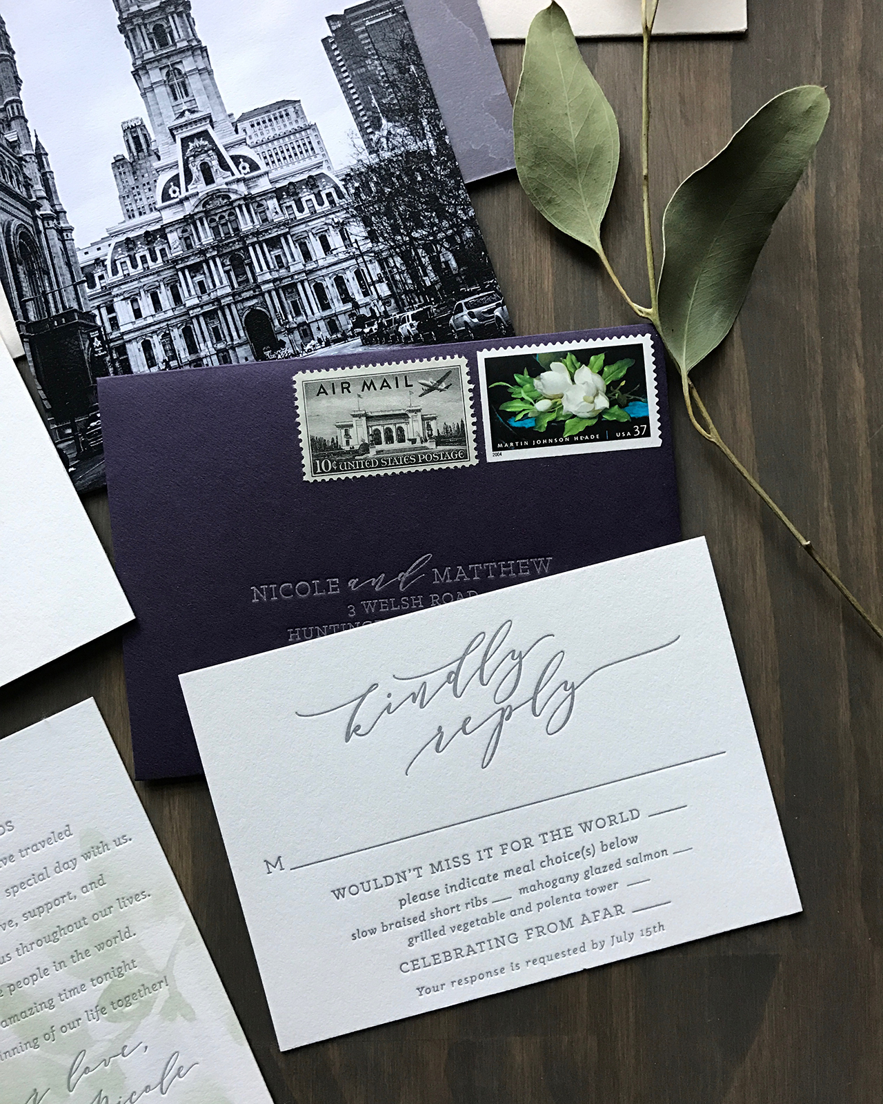
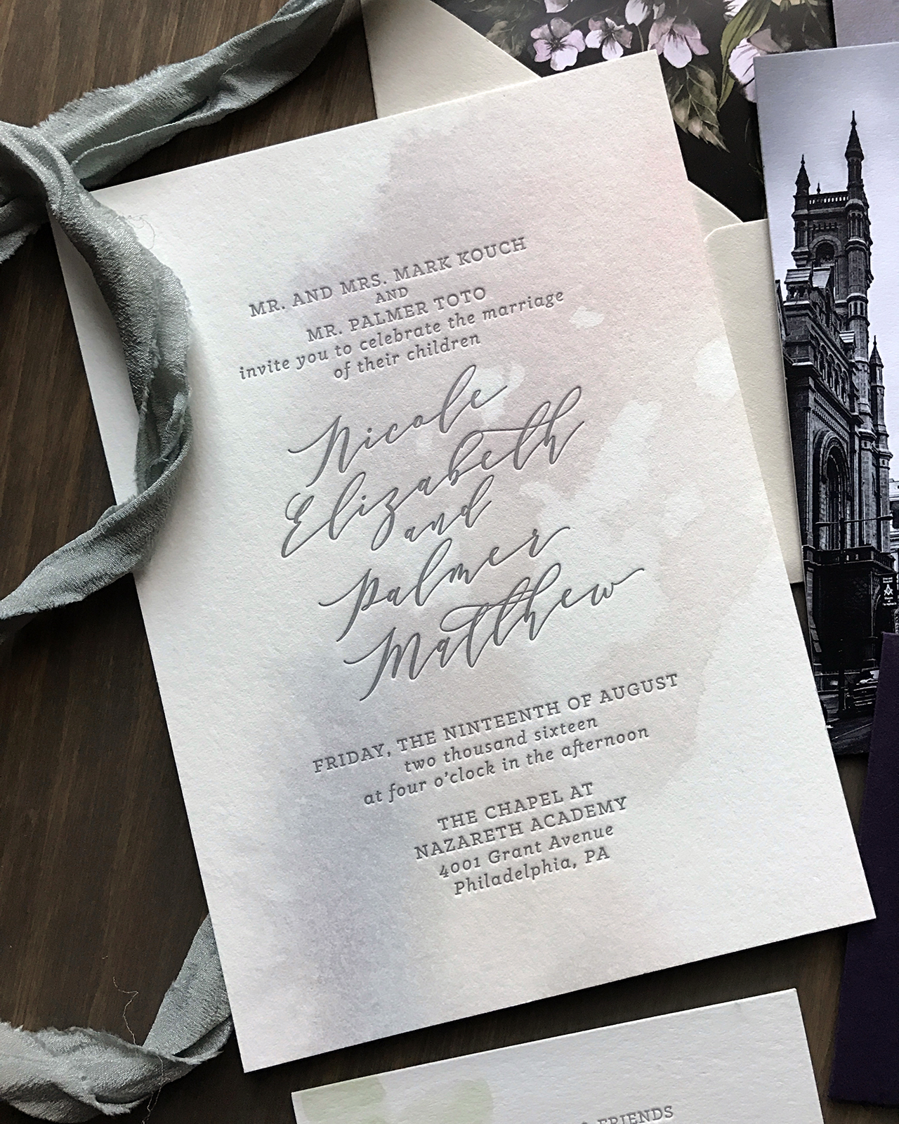
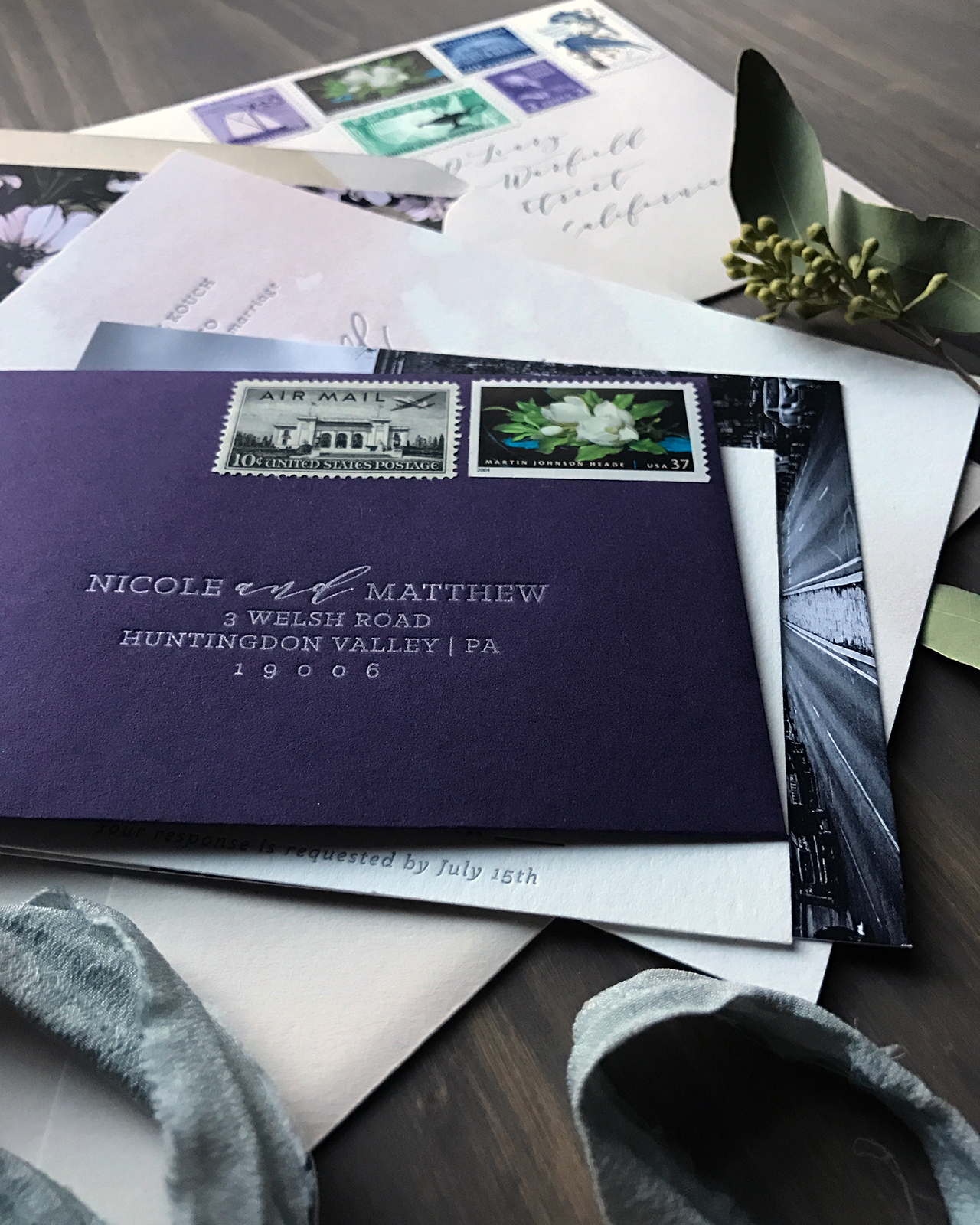
Lauren and Michael opted for traditional letterpress printing on their wedding invitation. To balance out the cost of letterpress printing, we transformed the vintage botanical print multiple times, rather than purchasing additional botanical prints. Most noticeably the leaves from the print were trimmed out and reconstructed into a leaf composition for the envelope liners and front of the RSVP card. Lauren wanted a strong use of green for the envelope liner to contrast with the crisp white envelope, so this made for an excellent solution.

Modern Botanical Chicago Wedding Invitations by Christina Egan Chang

A fold over map card was included for traveling guests along with wedding details and favorite places to visit in Chicago. Lauren and Michael initially explored script fonts, classic serif fonts, and calligraphy – but ultimately opted for a modern sans serif font on their invitation suite. This type selection perfectly rounded out their personal style: an appreciation for styles of the past, combined with a love for modern and mid-century design.

Modern Botanical Chicago Wedding Invitations by Christina Egan Chang

Thanks Christina!

Design: Christina Egan Chang

Printing: Steracle Press

Check out the Designer Rolodex for more tal­ented wed­ding invi­ta­tion design­ers and the real invi­ta­tions gallery for more wedding invitation ideas!

Photo Credits: Christina Egan Chang

Happy Weekend!

Happy Friday everyone! It’s peony season here in DC! Our Spring arrived a bit early, so the peonies are about three weeks ahead of their normal schedule. But I usually miss half of my peonies while I’m away at the National Stationery Show, so I’m not complaining! Speaking of NSS, I’ll be starting sneak peeks from some exhibitors next week. I can’t believe this year’s show is only a few weeks away! But in the meantime…

…a few links for your weekend!

Crying all the tears after reading this letter (and resolving to write down every single thing my 4 year old and 2 year old say from here on out)

Feeling inspired to also write down my bucket list

Loving these wall-mounted planters (and they’re 20% off right now!)

Nicely Noted is celebrating their 5th anniversary with a HUGE stationery giveaway – but hurry, it ends soon!

YES to holographic foil!

A few favorites from the Anthro sale section: this silver and gold pleated skirt, this off-the-shoulder gingham dress, this thermal turtleneck (to save for next fall), this iridescent travel mug, and these gorgeous gold leaf coasters â€“ plus, all sale items are an extra 25% off!

MAKE: Maple Bacon Grilled Cheese

Pin of the week!


This week on Oh So Beautiful Paper:

Dress up your envelopes and stationery with these DIY mud cloth-inspired patterns using Sakura of America pens!

Loving these vibrant and tropical Hawaiian wedding invitations (those vintage postage stamps!)

Mother’s Day cards for grandmothers, step-moms, and other moms

Cabo San Lucas destination wedding invitations with a gorgeous floral lasercut enclosure

Some favorite wooden gifts and keepsake stationery from Cardtorial


Check back this afternoon for a delicious cocktail recipe – it’s perfect for this warm weather! I hope you have a great weekend, and I’ll see you back here on Monday! xoxo

Stationery A-Z: Copper Foil

We’ve often waxed poetic about our love of gold, holographic, and rose gold foil on wedding invitations and greeting cards, but today we thought we’d sing the praises of copper foil! Copper has a striking beauty all its own (case in point: this stunning skirt from Proenza Schouler or this sleek light fixture from Anthropologie), and is quickly making a home for itself in the stationery world. I’m especially loving the use of copper on dark backgrounds (so modern!). Here is a collection of some recent favorites:

Trendspotting: Copper Foil

From top left:

1. A copper foil cocktail on gorgeous blush pink paper from Fox & Fallow

2. Fun striped copper foil party plates from Bash Party Goods!

3. The combination of hand lettering and copper foil in this birthday card from Hello!Lucky is the perfect balance of elegance and fun

4. If you’re behind on your Valentine’s day greetings (or missed all three of our earlier posts), might you consider this simple, yet direct, message from The Social Type.

5. The copper is the whiskey…get it? This clever usage comes courtesy of Idlewild Co.

6. Stunning metallic cotton ribbon from Angela Liguori

7. Toss some of this copper confetti from Knot & Bow into a greeting card for a fun surprise – or sprinkle it on a table at your next party!

8. I’ve been a fan of printmaker Katharine Watson’s work for awhile now and I love that she moved in the foil space.

9. Meg from Moglea always comes up with the most amazing color stories and combinations, so it’s not surprising that she was an early adopter of this metallic trend.

10. Now, this is what I’m talking about: copper foil on gray paper is so fresh. Add some illustrated flowers and you’ve got yourself a winner. By Kelsey Garrity Riley for Red Cap Cards.

What’s your favorite metallic foil these days? Classic silver or modern gold? Are you loving copper foil, or feeling all things holographic? Let us know in the comments below!


Copper and Burgundy Star-Inspired Baby Shower Invitations

Happy Monday everyone! Before we jump into today’s post, just a quick announcement for those of you looking forward to the upcoming Modern Calligraphy Summit 2.0 – there’s a FREE video series from some of the instructors going on now through February 8! You’ll meet all seven instructors, including Katherine of Script Merchant, Lauren of A Fabulous Fete, Jenna of Mon Voir, and Karla of Written Word Calligraphy. They’ll share their preferred tools for traditional calligraphy, modern calligraphy, and brush lettering, along with their inspiring stories about how they got started, and changed their lives, with calligraphy. Find all the details here – you won’t want to miss it!

Okay, onto today’s gorgeous baby shower invitations! Fresh, delicate, and adorable; these refined copper star inspired baby shower invitations are nothing short of darling! Alana of Bourne Paper Co. is expecting a baby girl later this year and had the amazing joy of designing her own baby shower invitations. The twinkly star motif that she wove through the invitation design and elegant copper and burgundy color palette are perfect for a mid-winter baby shower.

Refined Copper and Burgundy Star Inspired Baby Shower Invitations by Bourne Paper Co.

From Alana: As a designer, personal celebrations are special not only because they’re milestones but because they’re the perfect excuse to create pretty paper! I’m expecting my first child (a baby girl) this spring. When my family offered to host a baby shower, I was immediately given full reign over the invitations. I knew I wanted something that was seasonal and modern, but not overly feminine. Since my shower took place during the winter, I decided on a color palette of copper and burgundy.

Refined Copper and Burgundy Star Inspired Baby Shower Invitations by Bourne Paper Co.

Refined Copper and Burgundy Star Inspired Baby Shower Invitations by Bourne Paper Co.

My invitation design was centered around a delicate star motif paired with modern typography. The invitations were printed using copper foil on a pure white card stock. I opted for a 200lb. card stock to give the invitation a more substantial feel. Having used a lot of matte gold, silver and rose gold in my recent greeting card collection it was fun to create a project that used bright copper – it has such a vibrant shine to it.

Refined Copper and Burgundy Star Inspired Baby Shower Invitations by Bourne Paper Co.

I paired the invitations with a rich burgundy envelope which also featured the copper foil star motif. I distributed the stars throughout both the envelope front and flap, something I hoped would make them stand out when they arrived in my guests’ mailboxes. Elegant copper calligraphy from Nancy Hopkins Lettering  completed the invitations. I thought her beautifully flourished calligraphy was the perfect compliment to the simple, clean type used on the invitation. Not to mention, she was able to create a perfect color match with the copper foil.

Refined Copper and Burgundy Star Inspired Baby Shower Invitations by Bourne Paper Co.

In addition to the invitations, I created matching thank you cards. I opted for flat notecards which used the same copper star motif and burgundy envelopes as the invitations. Overall, I was pleased with how beautifully the delicate stars seemed to shine in copper foil and hope to turn this motif into a new greeting card collection in the future.

Refined Copper and Burgundy Star Inspired Baby Shower Invitations by Bourne Paper Co.

Thanks Alana!

Design: Bourne Paper Co.

Calligraphy: Nancy Hopkins Lettering

Bourne Paper Co. is a member of the Designer Rolodex – you can see more of their beautiful work right here or visit the real invi­ta­tions gallery for more wedding invitation ideas!

Photo Credits: Bourne Paper Co.

Purple and Gray Watercolor Wash Wedding Invitations

Watercolor and letterpress printing are such a fabulous combination. Lauren of Darling + Pearl designed these gorgeous purple and gray watercolor wash wedding invitations for a wedding in Philadelphia with the juxtaposition of hard and soft in mind. Other special touches, like the floral envelope liner, perfectly curated vintage postage, and the print of city hall, pull everything together in such a beautifully cohesive way!

Purple and Gray Watercolor Wash Wedding Invitations by Darling and Pearl

From Lauren: The inspiration for Nicole and Matthew’s wedding invitations was heavily drawn from their Philadelphia venue, Front + Palmer, a modern loft style venue in the city that was renovated from an old barrel factory. How rad is that? We wanted to emphasize the balance between masculine and feminine, hard and soft, and color and neutral (which is usually my aim as I piece together the elements of my work anyway, so it was definitely a win-win.)

Purple and Gray Watercolor Wash Wedding Invitations by Darling and Pearl

Purple and Gray Watercolor Wash Wedding Invitations by Darling and Pearl

It was ridiculously fun seeing all these elements come together! The suite was letterpress printed in grey with varying watercolor elements throughout. The main invitation had a patina-esque background wash that picked up some of the lavenders from the STUNNING floral print envelope liner and the backside of the information card.

Purple and Gray Watercolor Wash Wedding Invitations by Darling and Pearl

Purple and Gray Watercolor Wash Wedding Invitations by Darling and Pearl

Nicole and Matt LOVED the idea of representing the city within their wedding stationery. We included a black and white print of iconic Philadelphia city hall that I’m sure has now made for an awesome keepsake for many of their guests. We used dark purple reply envelopes so we could letterpress print their return address in silver.

Purple and Gray Watercolor Wash Wedding Invitations by Darling and Pearl

The icing on the cake for the invitation design was certainly the vintage postage we curated. Vintage stamps can really pull everything together even more when they’re chosen effectively. It’s really inspiring to check out all of the postage that’s still available out there.

Purple and Gray Watercolor Wash Wedding Invitations by Darling and Pearl

Purple and Gray Watercolor Wash Wedding Invitations by Darling and Pearl

For their day-of stationery we letterpress printed small thank you notes that were placed at each table setting. Nicole and Matt were able to express a sweet sentiment to their guests and also introduced some new watercolor elements that lead back to the originality of their invitations, but in a refreshing and cohesive way.

Purple and Gray Watercolor Wash Wedding Invitations by Darling and Pearl

Thanks Lauren!

Design: Darling + Pearl

Darling + Pearl is a member of the Designer Rolodex – you can see more of their beautiful work right here or visit the real invi­ta­tions gallery for more wedding invitation ideas!

Photo Credits: Lauren Reed