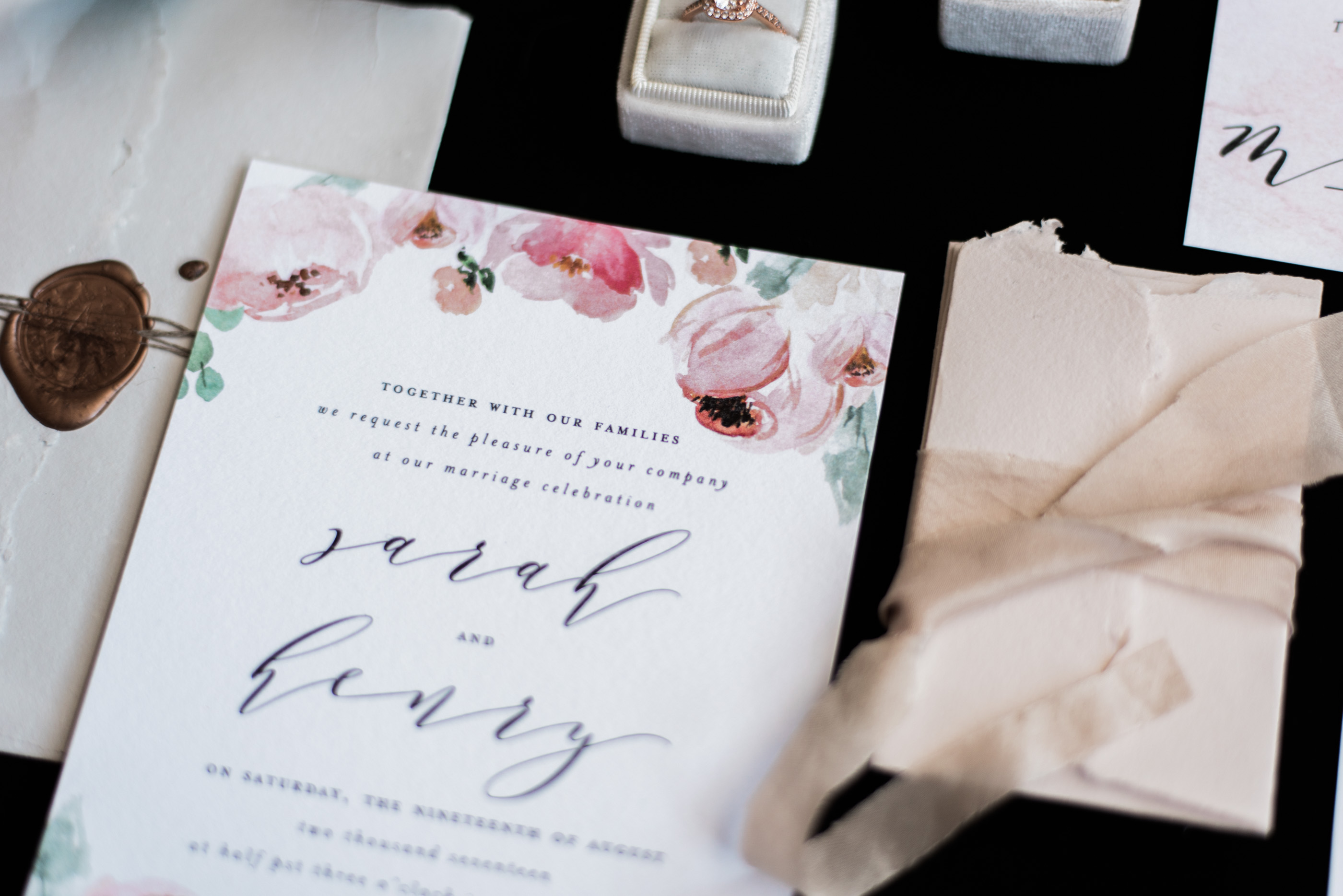
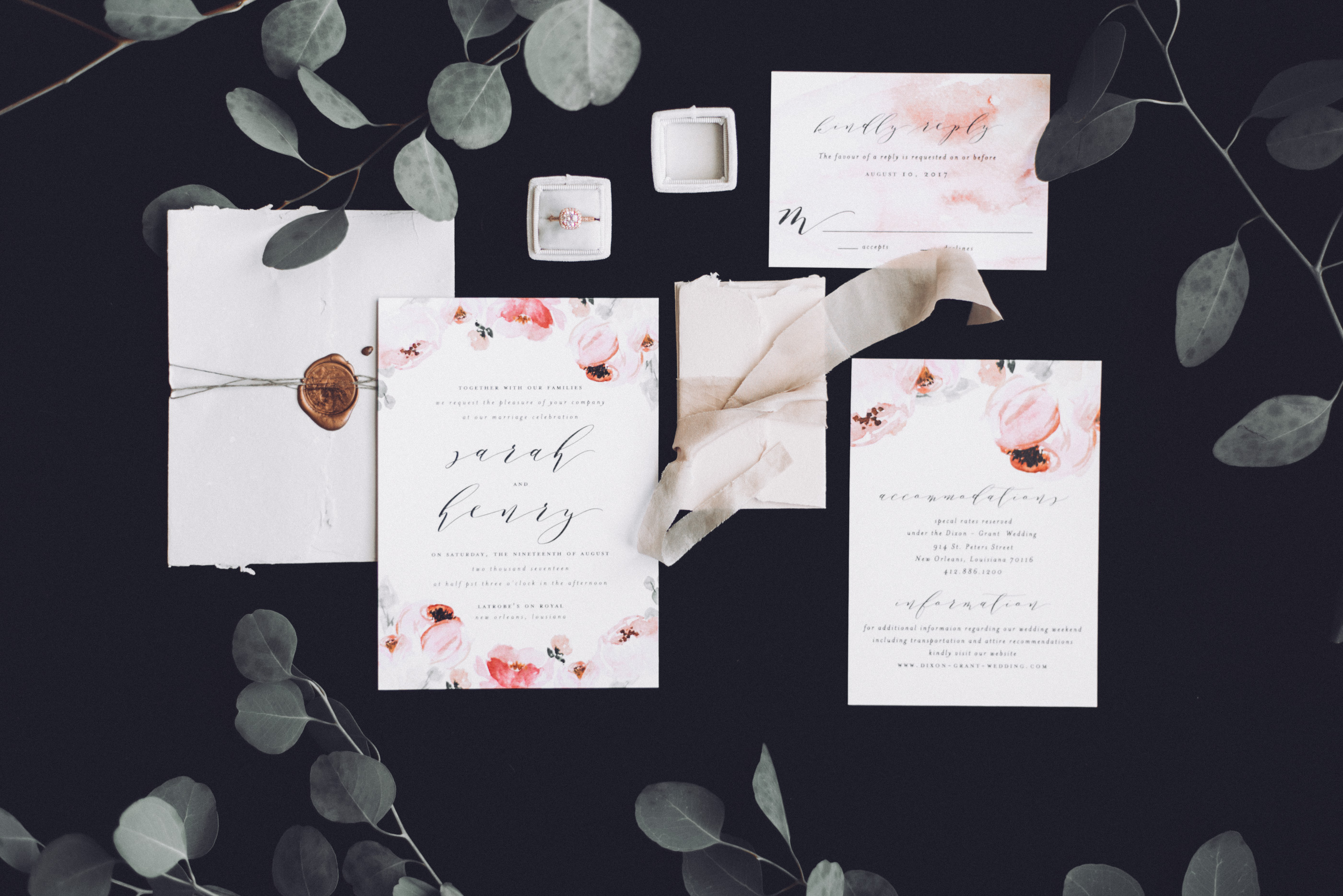
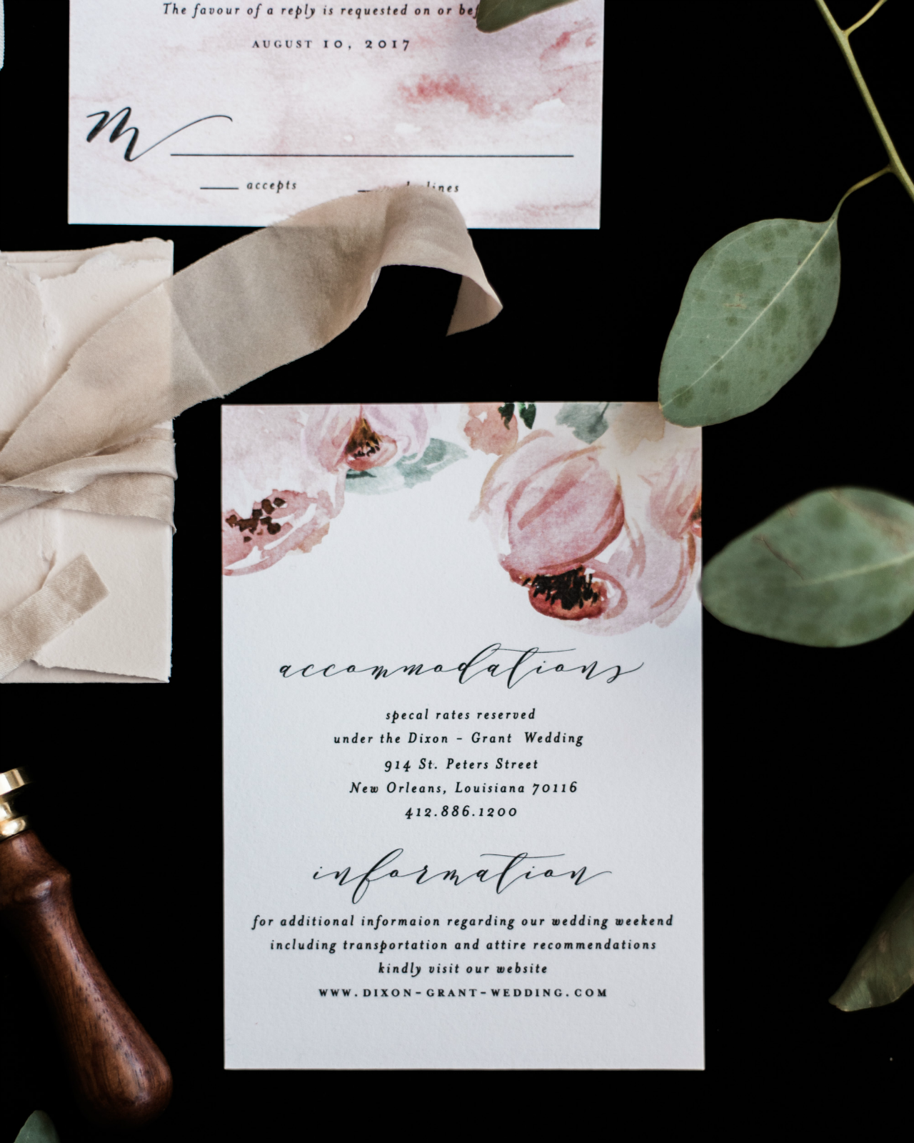
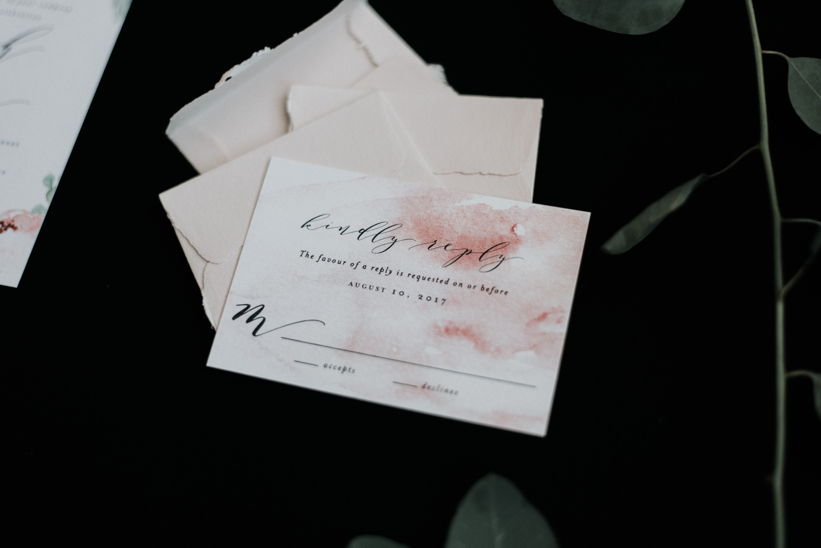
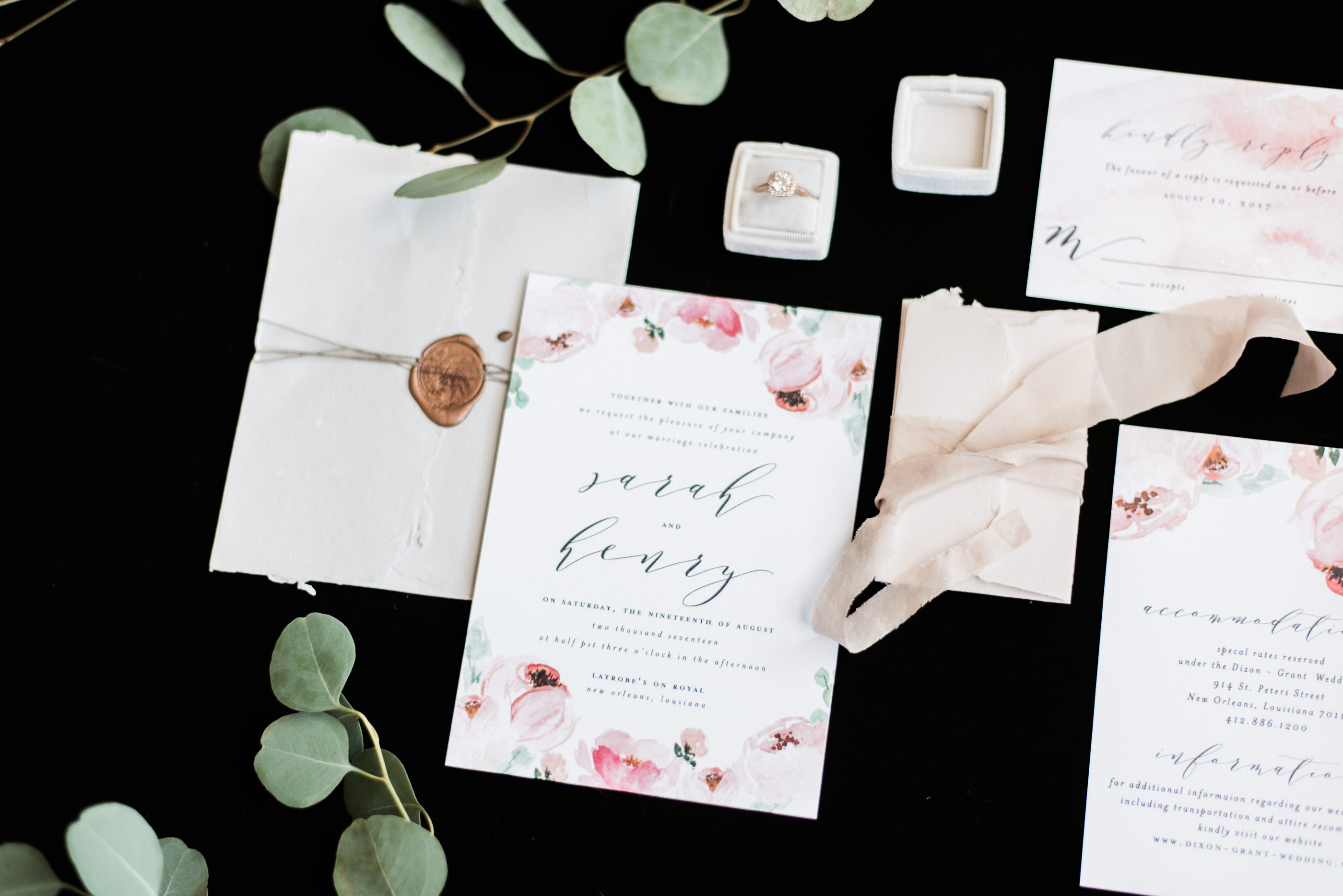
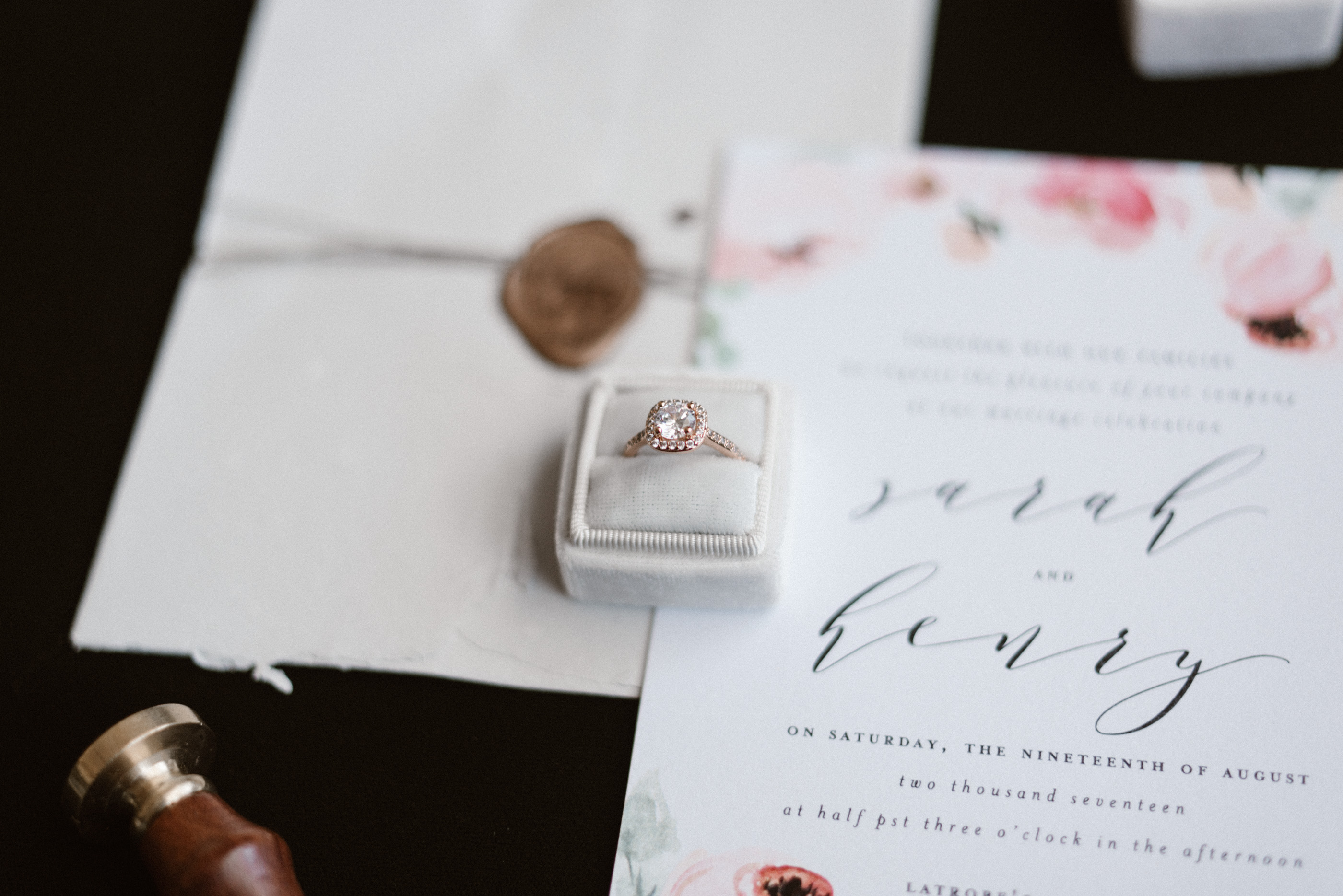
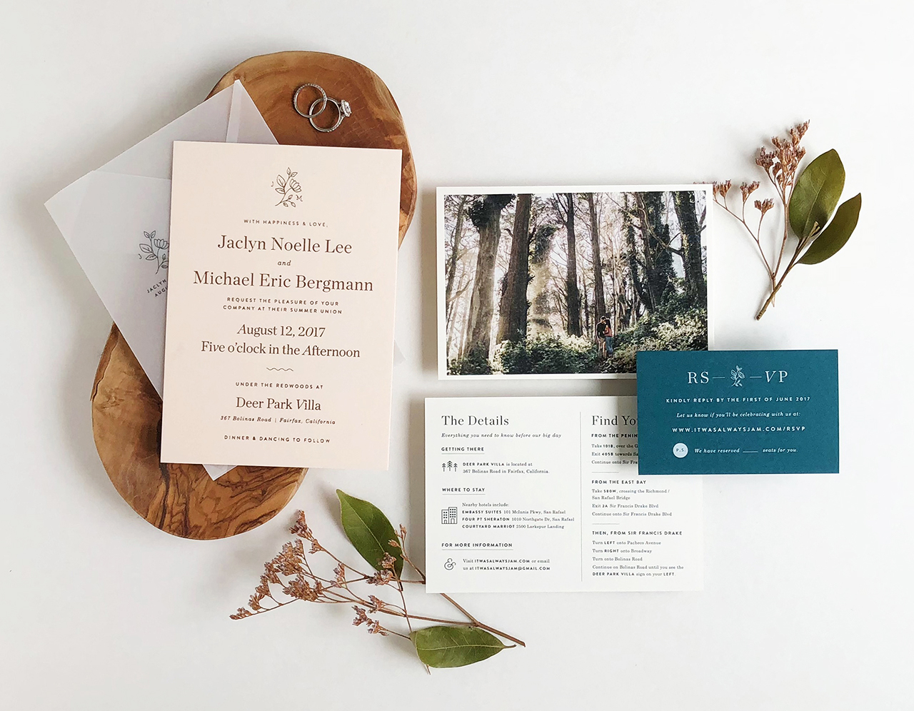
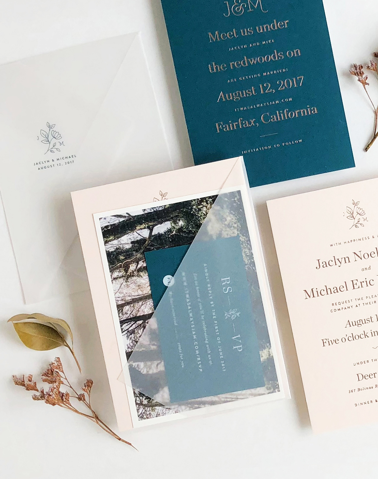
The serif typography in these understated blush and teal wedding invitations is such a wonderful reminder that a well-curated serif typeface can make a stunning and modern statement. Designer Jaclyn Lee Bergmann, of her namesake Designed by Jaclyn, designed these beautiful invitations for her own special wedding celebration, with a gorgeous blush and teal color palette that is totally having a moment right now, rose gold and matte white foil, and dreamy vellum envelopes!
From Jaclyn: As a visual designer, it was important to me that our wedding stationery reflect our personalities, relationship, and the laid-back elegance of our wedding day that we hoped to convey. Plus, it was such a personal (and indulgent!) experience to design for our very own wedding and our invitation suite now serves as the perfect reminder of that magical day.
While we were inspired by our redwood grove venue with its organic feel, we opted for something a bit more modern that both blended with and balanced out the rustic space. To do so, we paired clean lines, modern typefaces, and a hint of floral detail with a modern color palette of blush tones, rose gold, and rich dark teal to create our take on a fresh, modern elegant wedding invitation suite.
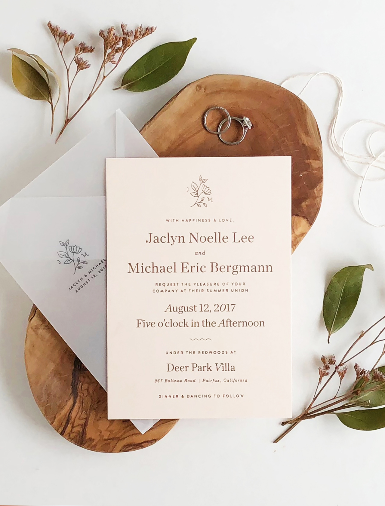
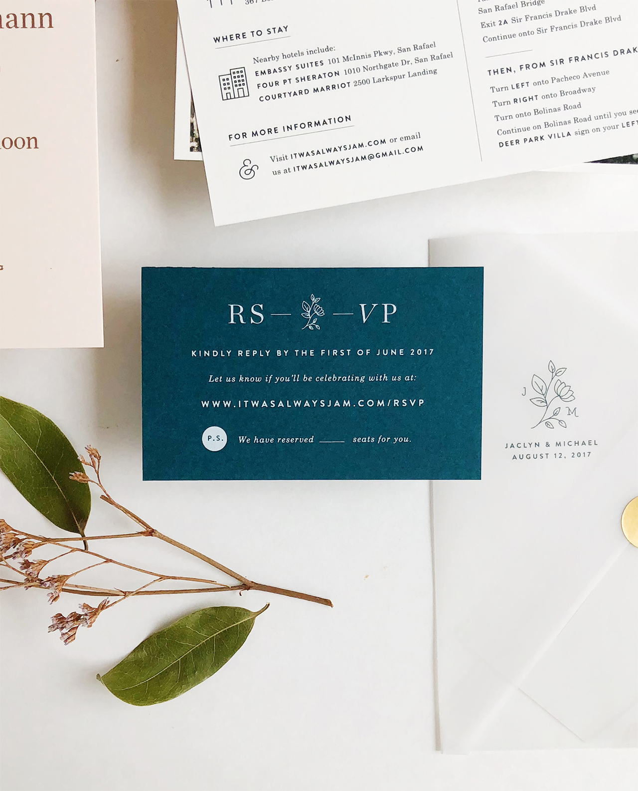
A clean design for our main invitation let the gorgeous blush paper and rose gold foil shine, while the addition of our floral wedding logo added a lighthearted touch. Along with the main invitation we included a details card that featured a nature-inspired image from our engagement shoot and a screen-printed RSVP card in a rich dark teal hue. Together, the three pieces resulted in a playful range of texture and color.
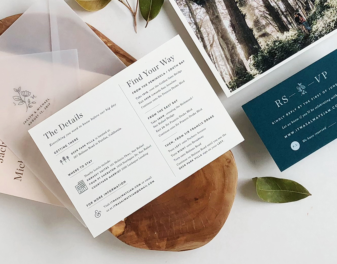
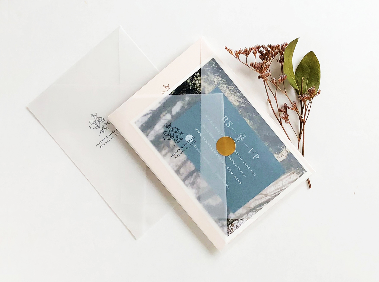
To complete the suite, a printed vellum enclosure featuring our wedding logo held the three pieces together and added an elegant texture to the invitation. The printed vellum was folded to create a layered geometric look and allowed the recipient to see the layered stationery pieces upon receiving the invite. Lastly, each vellum enclosure was then sealed with a simple, yet bold rose gold sticker and slipped into an envelope.
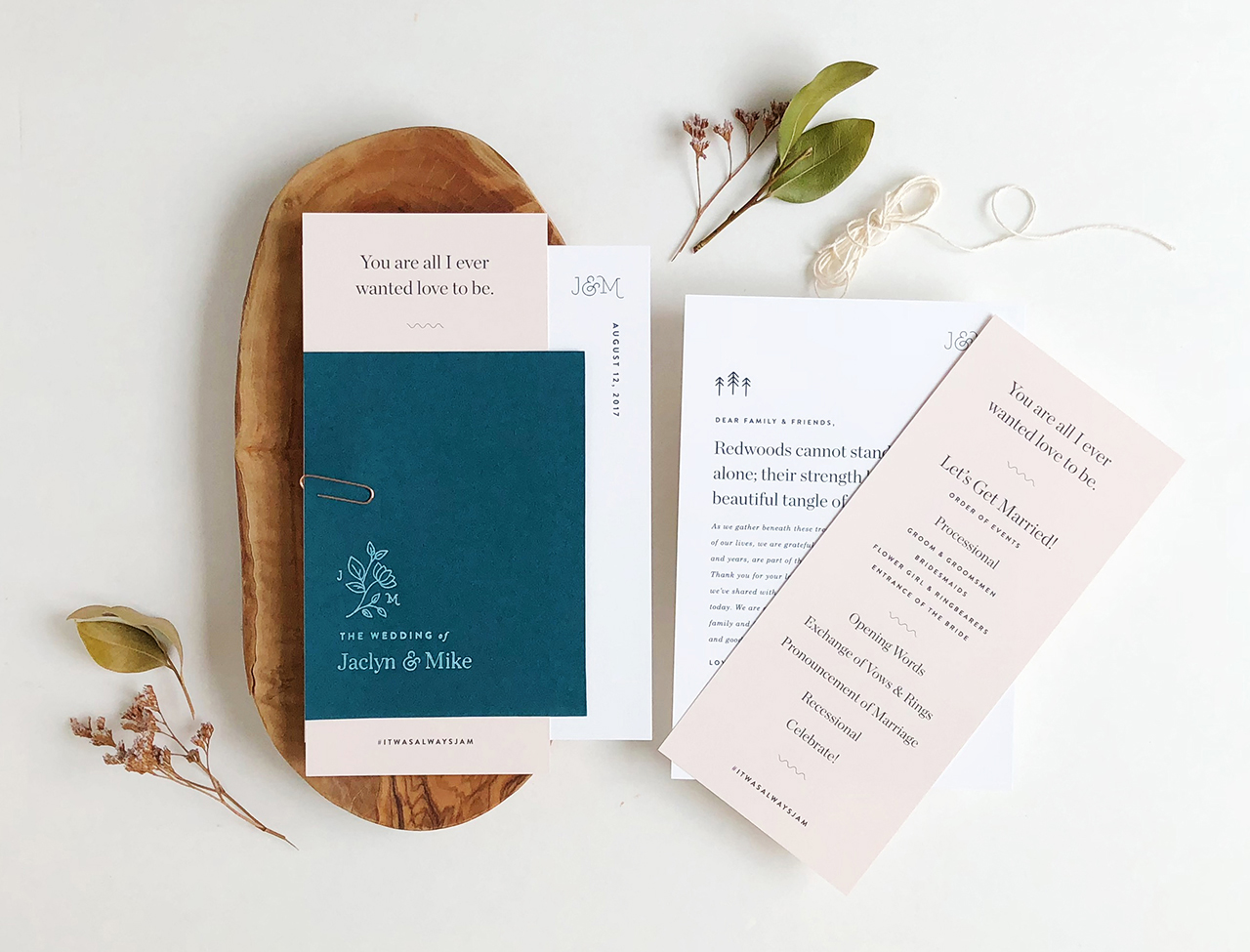
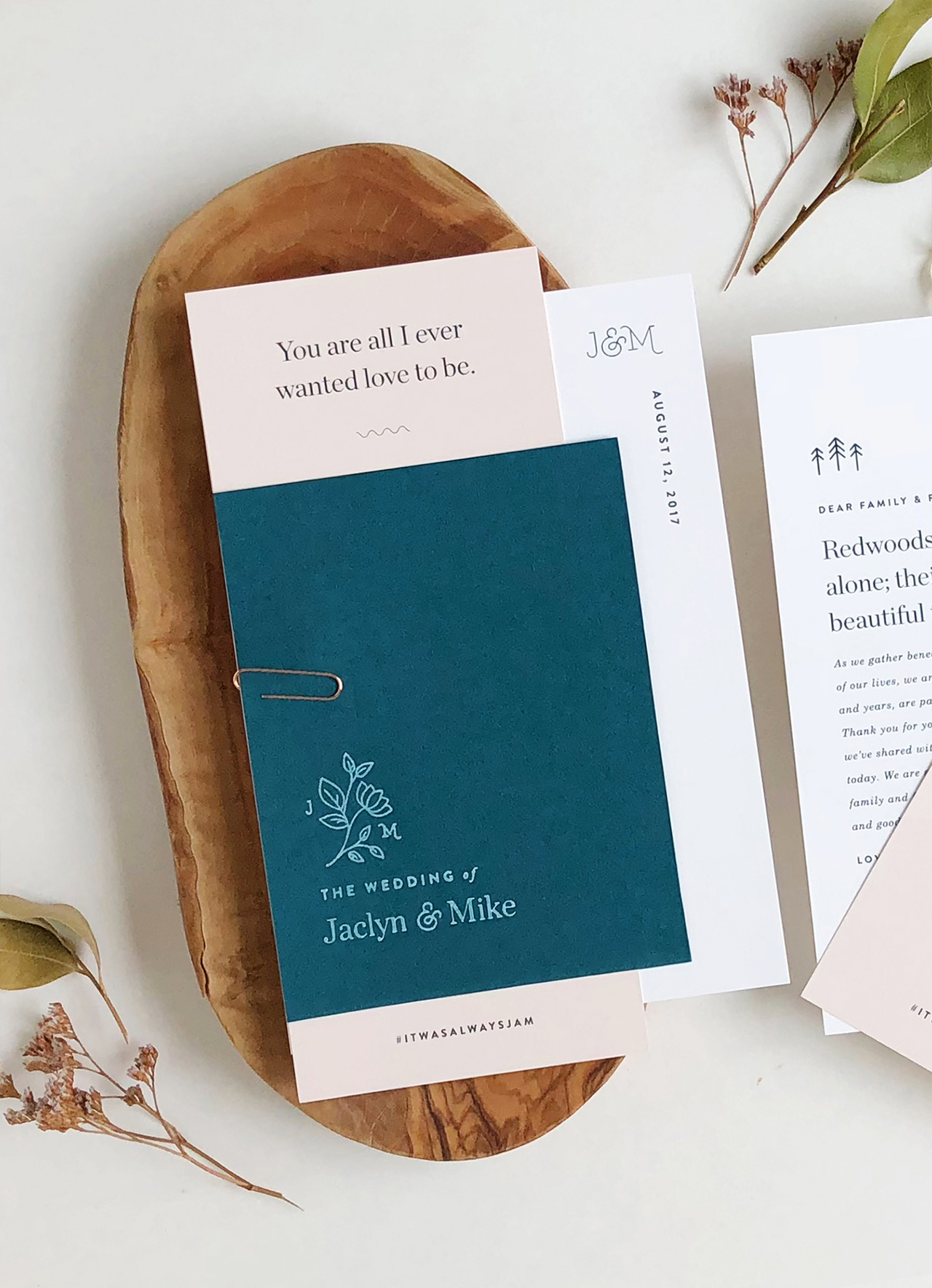
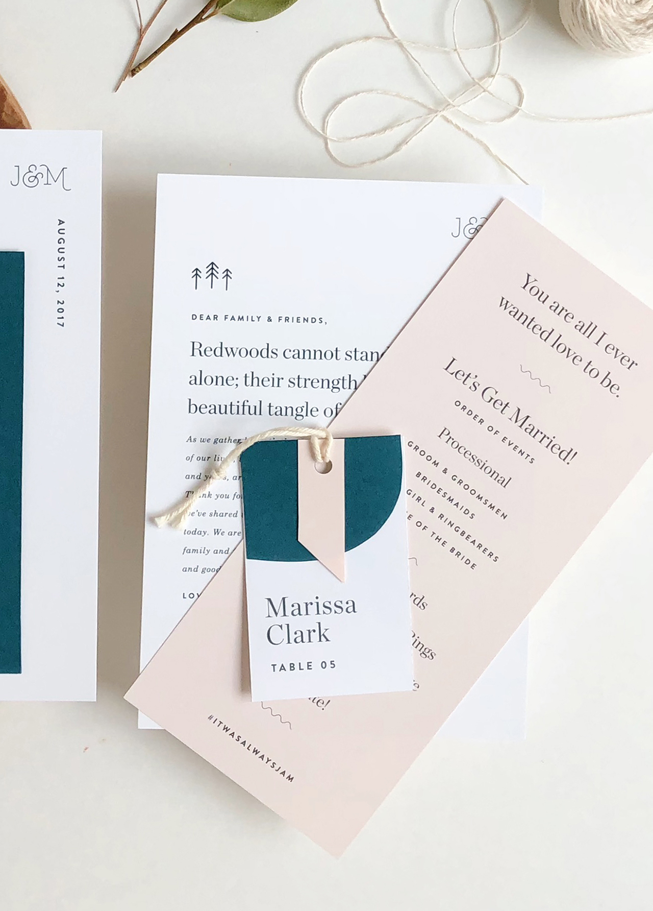
We carried the layered approach of our invitation suite to our day-of wedding stationery as well, including our wedding programs and guest place cards. Our wedding programs featured three pieces of varying sizes and color paired with a simple rose gold paperclip, which when layered together created a clean, geometric look. While for the place cards, we layered blush and dark teal shapes to create a unique name tag for each guest.
Our wedding stationery perfectly emoted the laid-back, modern elegant spirit we had envisioned for our wedding day and we love how it came together!

Thanks Jaclyn!
Design: Design by Jaclyn
Printing: Czar Press
Check out the Designer Rolodex for more talÂented wedÂding inviÂtaÂtion designÂers and the real inviÂtaÂtions gallery for more wedding invitation ideas!
Photo Credits: Jaclyn Lee Bergmann

