Behind the Stationery: Heartell Press

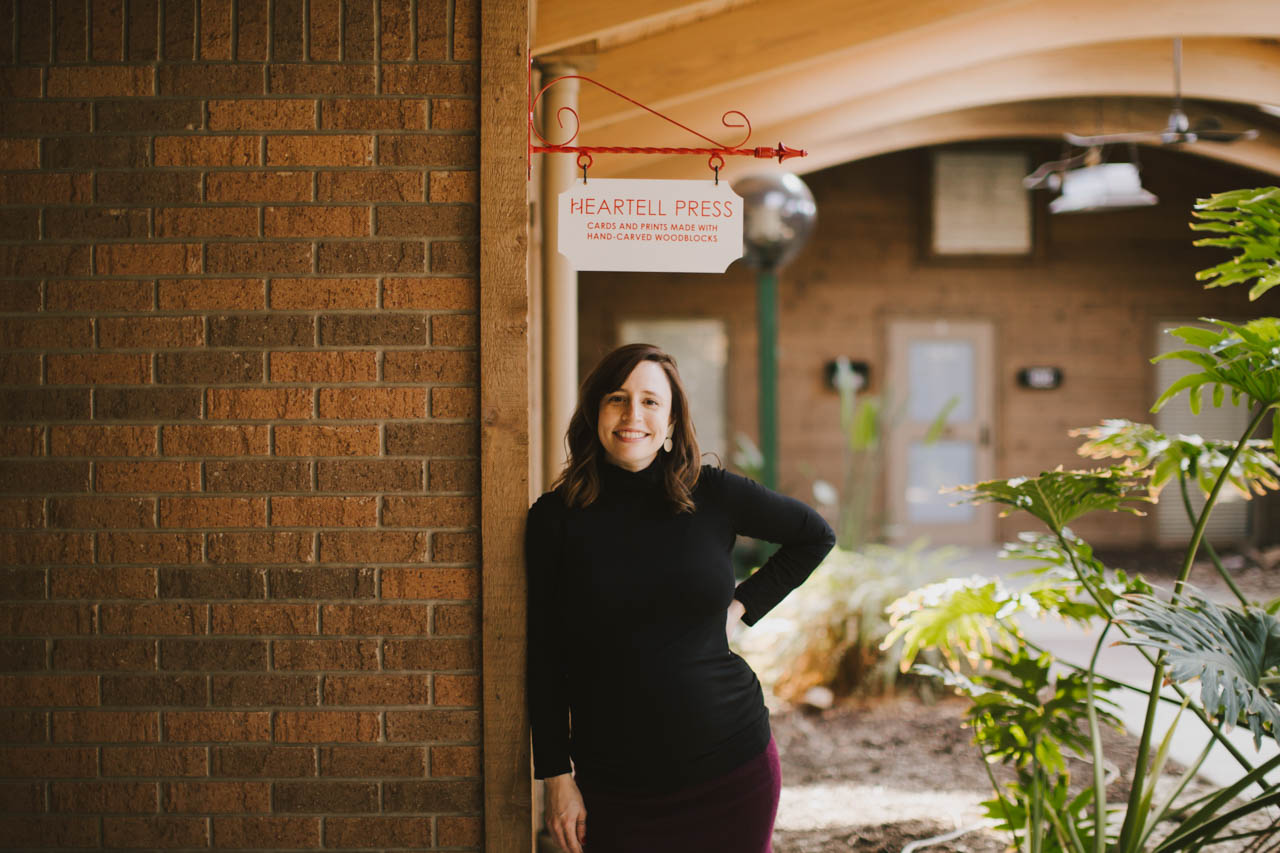
I’m so excited to introduce our first hand-carved woodblock designer that we’re featuring on the Behind the Stationery column! Rachel from Heartell Press is here to take us through her processes – from the intricacies of designing and carving each block, to growing her business, to ensuring her team is self-sufficient enough for her to take some time to adjust to being a new mom. She started Heartell Press in Brooklyn, but has since moved to Indiana with her husband and into a beautiful spacious studio. Here’s Rachel! —Megan Soh
Behind the Stationery: Heartell Press

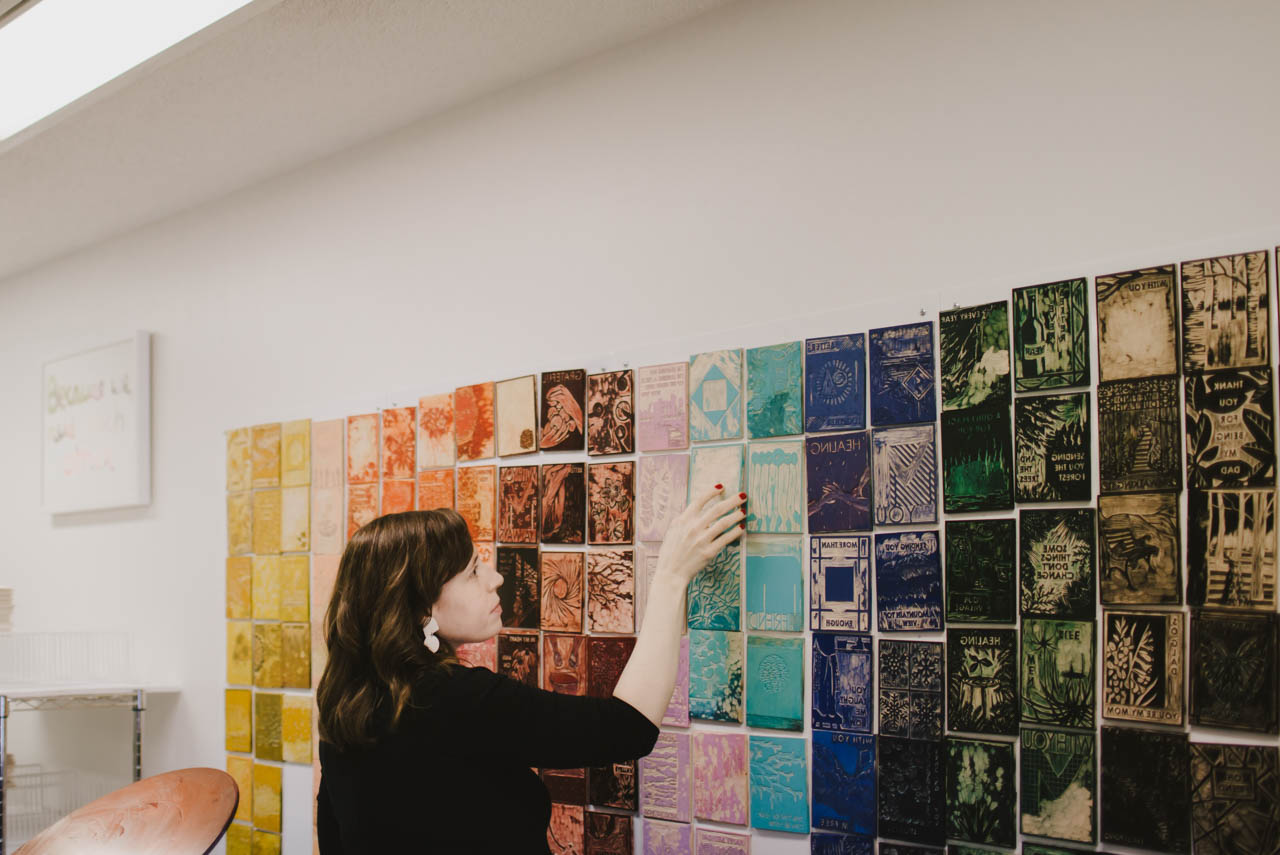
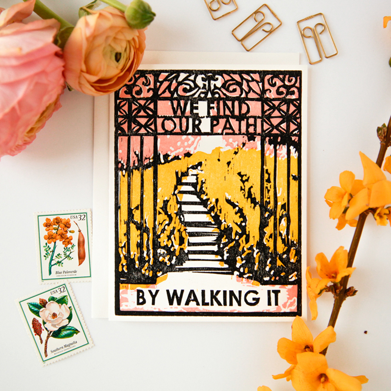
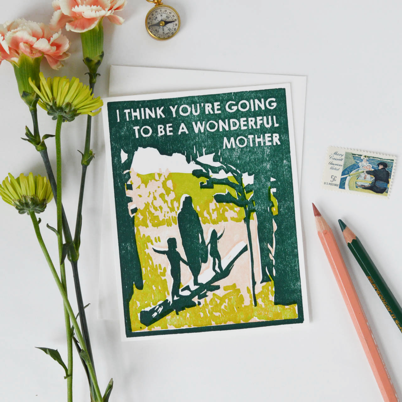
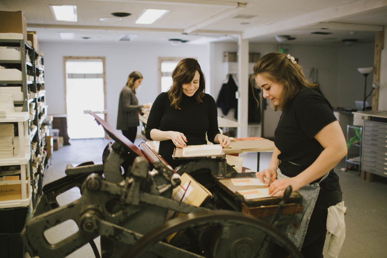
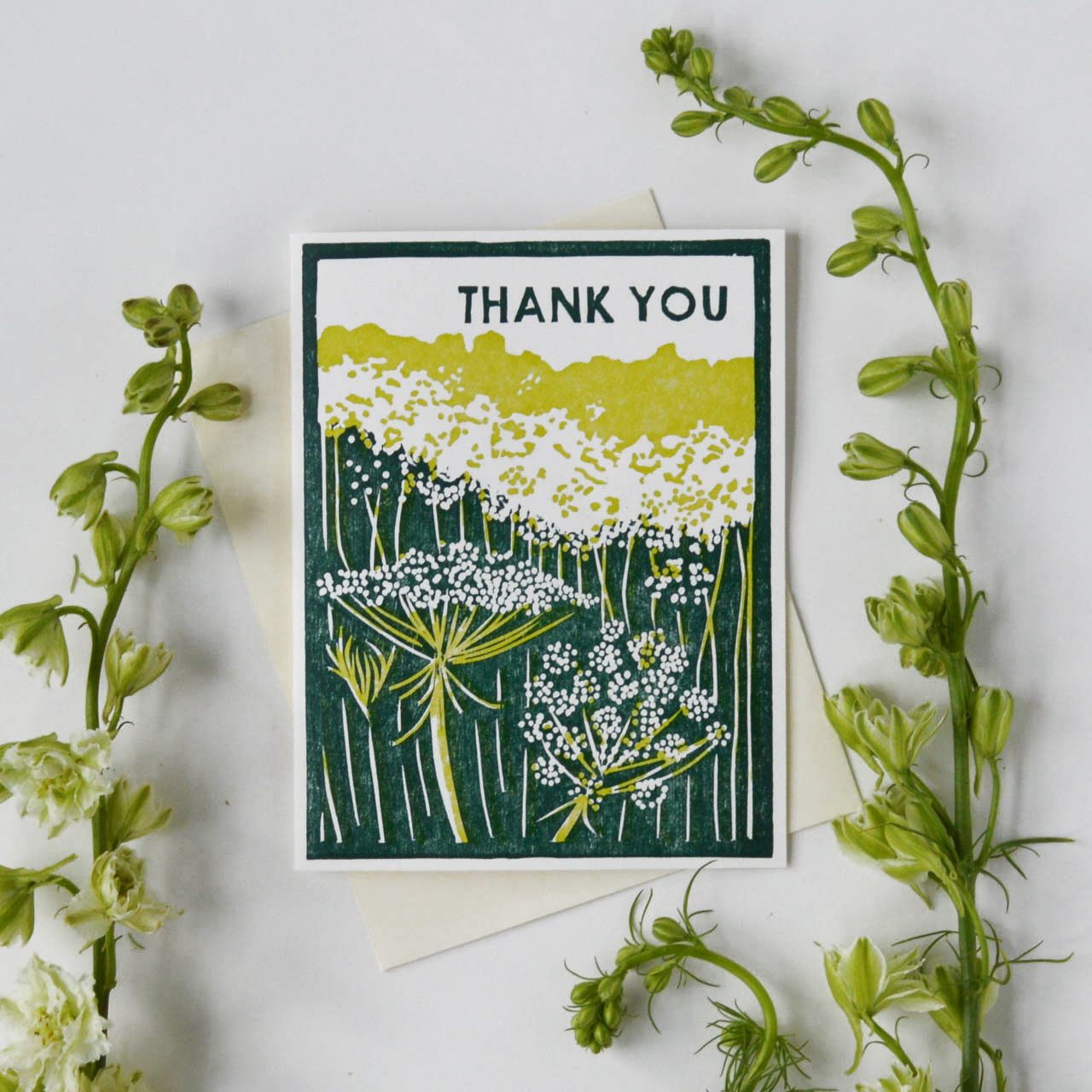
From Rachel: Heartell Press cards are printed from hand-carved woodblocks. Woodcut was always my favorite of the printmaking processes, and the folksy look of the carved images and the organic textures created by the woodgrain are a good fit for our warm, sincere designs and messages. There are great designers who use linoleum blocks (Katharine Watson, Ghost Academy, and Kaibelle Designs are my favorites), but as far as I know we are the only line printed from wood. It has taken lots of trial and error to learn to print our blocks consistently and at scale using letterpress equipment, but I think our customers appreciate that each card is truly handmade on every level.
Behind the Stationery: Heartell Press

The carving is time-consuming, especially because each color we add to a design means carving a separate block. I’m always working on ways to preserve the look and feel of what we make while streamlining the process for producing our products. For the new spring collection we’re working on now, I’m carving the key block — the part of the image that has the most detail and information — and experimenting with photopolymer plates to add lots of additional color. I’m excited because if it works we’ll be able to release new cards with lots of color and add new types of products to our line more frequently while still offering cards and prints that are true to the Heartell aesthetic and unique in our industry.
Behind the Stationery: Heartell Press

My path to stationery was long and winding. It took doing a lot of the wrong things to find the right thing. I went to grad school twice, first to earn an academic degree in religion and art history from Yale Divinity School and then an MFA in printmaking from the School of the Art Institute of Chicago. After I finished school in 2009, I moved to New York and cobbled together a living with multiple part-time jobs. I worked in a church, as a nanny, and eventually ran a non-profit. All the while I was renting a (super expensive and tiny) art studio in Gowanus, Brooklyn, and trying to squeeze in as many hours per week there as possible making paintings and prints. I had a few shows in Brooklyn and Manhattan, but it was tough trying to build an art career and pay rent in New York.
Behind the Stationery: Heartell Press

In 2012 my mom was diagnosed with cancer, and that experience made me question the chaotic existence I was living and inspired me to find a way to do the creative work I love full time. Since I was having a hard time finding sympathy cards that I liked enough to send to my mom between visits, I started having ideas for making my own cards. People in my life and my community in Brooklyn were responding to them in a way that made me think there might be something there.
Behind the Stationery: Heartell Press

I began to look more closely at the stationery industry, and when I discovered that there was a wholesale market for handmade stationery, especially at the National Stationery Show (through the OSBP blog!), the idea for Heartell Press was born. I did research and worked on developing my line and launched the website in 2014. I exhibited for the first time at NSS in 2016 and that is when the wholesale part of Heartell took off and I was able to leave my day jobs and focus on the business full time.
Behind the Stationery: Heartell Press

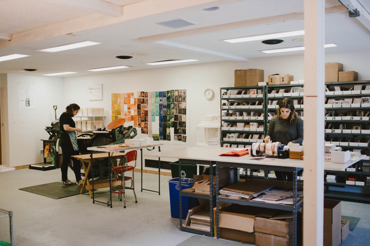
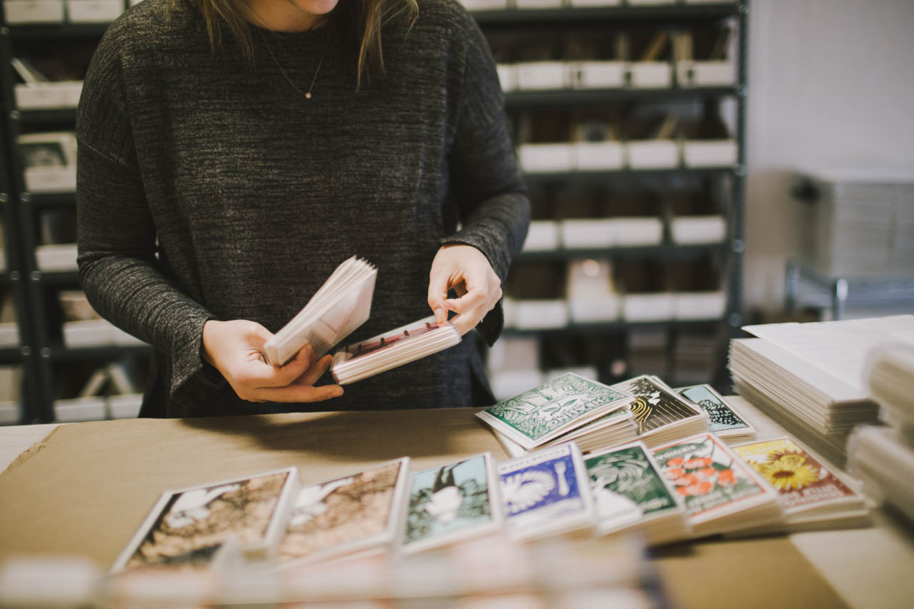
In 2016, my husband and I decided to leave Brooklyn and move to Fort Wayne, Indiana, where he grew up. The move has been great for us and for Heartell, giving me lots more time and space to devote to it. In November 2017, we moved the business into a new studio space here in Fort Wayne. It is two-thirds less expensive than the space I rented in Brooklyn and eight times bigger! We have room for our presses, including a new (to us) 10×15 Chandler and Price that we added to our shop when we moved, as well as inventory, a shipping and fulfillment space, office space for me to do my designing and carving, and plenty of storage. The building has a beautiful atrium full of tropical plants that is like a greenhouse, and I love being able to walk around it when I need to think or stretch after lots of drawing or carving.
Behind the Stationery: Heartell Press

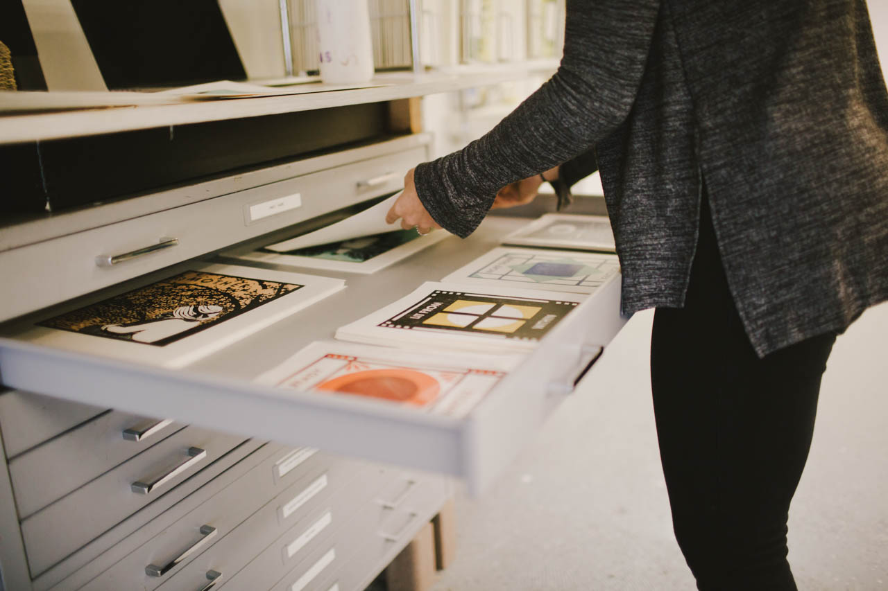
Heartell designs start with bits of text or images that I collect in lists for each card and product category (I use Trello for organizing all my lists, plans and tasks). My best cards are inspired by experiences I’m having in my own life and relationships. The earliest Heartell cards are all sympathy, love, and encouragement cards that I made when my mom first got sick. It will be pretty obvious when the new collection comes out that many of the designs I’m working on now have been inspired by the experience of being pregnant (and also watching friends and family members who have had children).
Behind the Stationery: Heartell Press

I try to make cards that I would genuinely want to give or receive. There are lots of funny cards right now about all the (sometimes unwelcome) changes that come when you have a baby, like having to deal with tons of poo, and those definitely serve an important purpose in the process of preparing to be a parent. Funny isn’t really my forte though, and I tend to swing toward more sincere, emotional messages. When I do retail markets I almost always have a customer tear up at my booth at some point during the event. I’m not sure if making people cry is something I should be proud of but I’m glad that I’ve found a way to put all my feelings to good use!
Behind the Stationery: Heartell Press

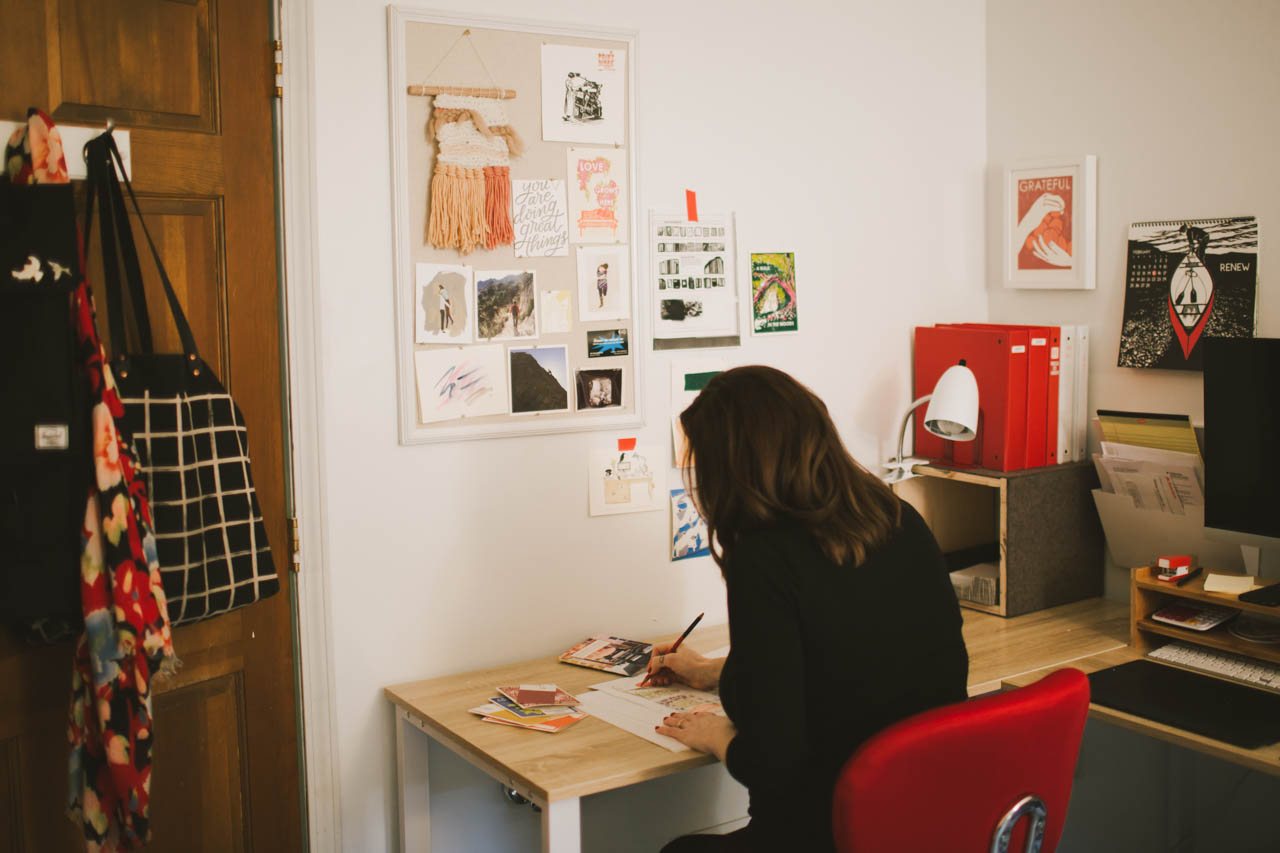
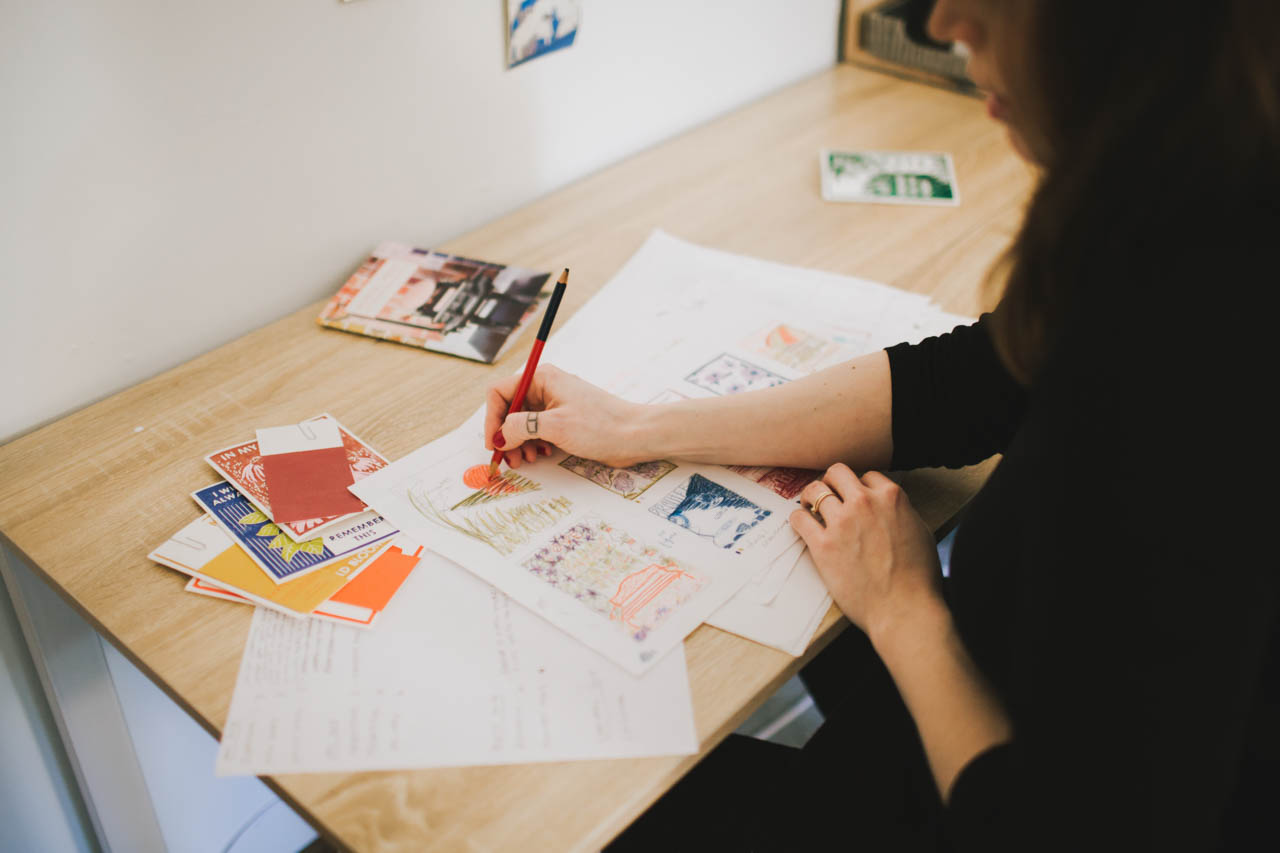
When I’m ready to design a new collection, I go through our current catalog to see which parts of our line could use fleshing out or freshening up. Then I comb through my stockpile of ideas and draw thumbnails with colored pencils to begin mapping out new designs. Once I have an idea of the collection as a whole, I use my Wacom tablet and Photoshop and Illustrator to draw the full scale images and lay out the text. I used to do this with pencils and markers on vellum, doing lots of tracing and scanning to come up with the final designs, but the tablet has made the process much faster and more fun.
Behind the Stationery: Heartell Press

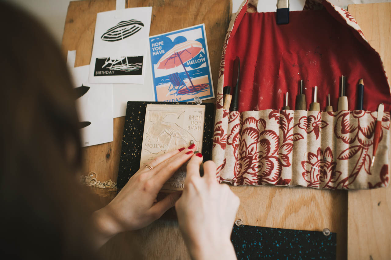
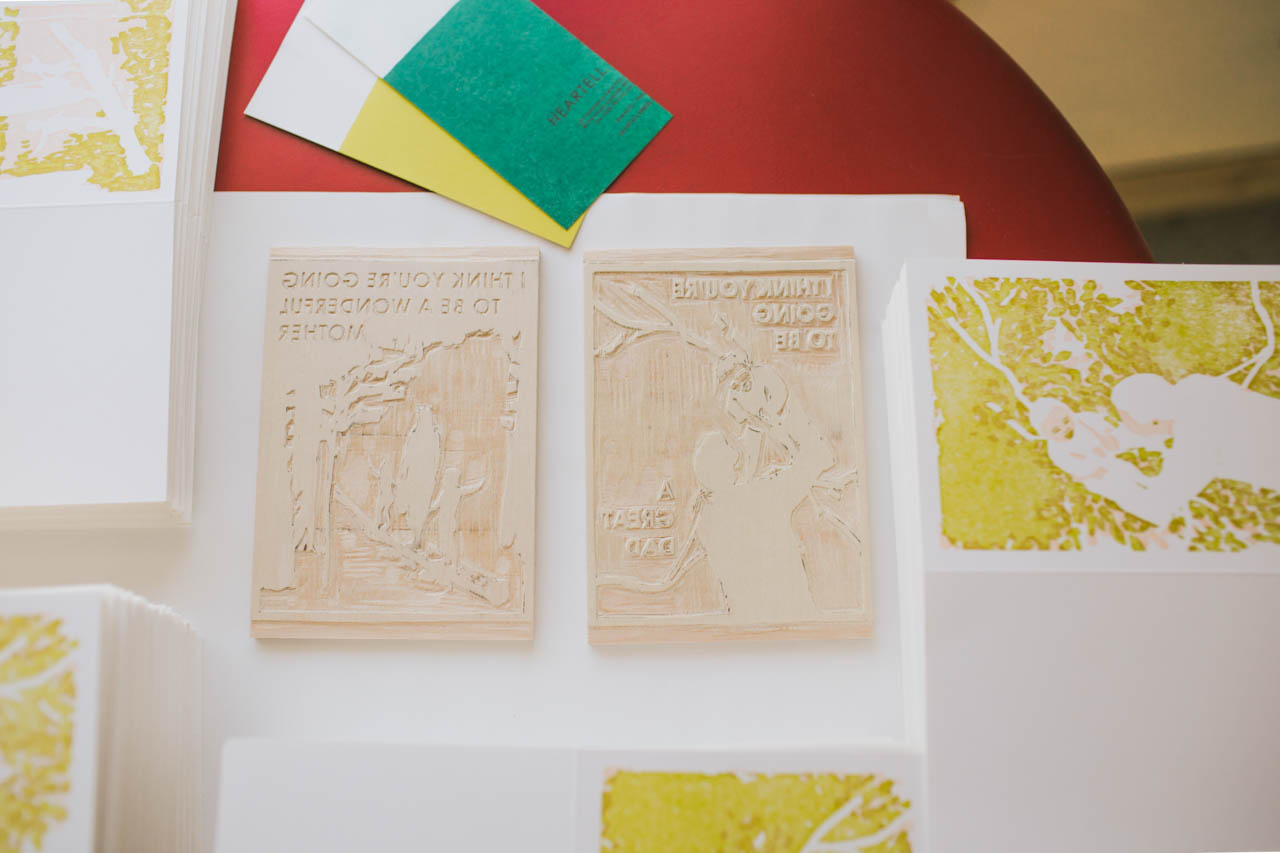
When the designs have been edited and vetted by as many people as I can get to look at them and I’m satisfied with my plans, I print guides using a laser printer and transfer them to blocks of Shina plywood (a wood that is both soft for easy carving and strong enough to hold detail that is harvested sustainably in Japan specifically for printmaking). I use Japanese carving tools to carve the blocks, and then we mount them in the presses for printing.
Behind the Stationery: Heartell Press

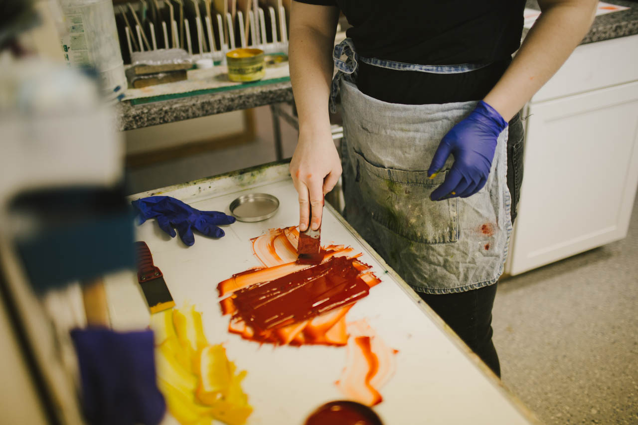
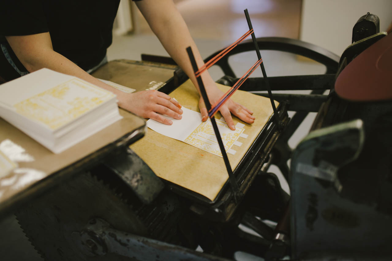
Since there is a separate block for each color, including the scoring run, some cards pass through the press up to four times! I love seeing the new designs printed for the first time. It is always a thrill to see something I’ve dreamed up become a finished product.
Behind the Stationery: Heartell Press

Behind the Stationery: Heartell Press

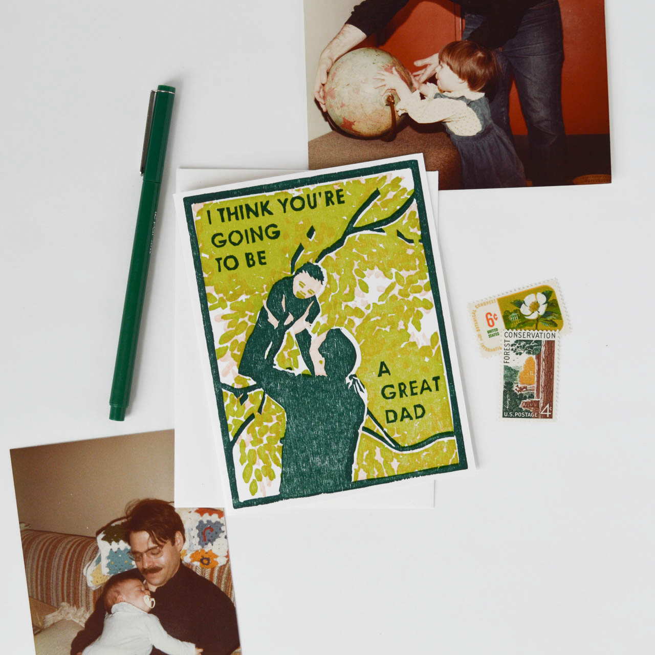
Like many of the business owners I’ve read about in this column, I spend a lot of my time these days running the business end of things. Fortunately I’ve discovered that I enjoy communicating with customers, managing cash flow, looking at numbers and planning for growth. But now that I have help with fulfillment and printing, I am finding lots more time for drawing and designing and carving blocks for new products, which are my favorite parts of my job. I love working on marketing projects too, and I do all our product photography, design our catalogs, and prepare for trade shows.
Behind the Stationery: Heartell Press

I set different goals for each year, and my big one for 2018 is to get Heartell ready to run without my constant attention for a few months while I take some time to welcome our new baby and adjust to being a parent. I feel grateful to have lots of inspiration from other business owners in our field (Nole included!) who have families, and while I’m sure it will be a big transition I feel confident that we’ll be able to find a good equilibrium over time.
Behind the Stationery: Heartell Press

I’ve come to find that stationery is a better fit for me than fine art for a lot of reasons, but one of the things I love most about this industry is how generous and open people are. The fine art world in New York has a deeply competitive culture, and it has been a gift for me to connect with other designers and retailers who are willing to share information, encouragement and support. The more variety there is in terms of design, the more letters people will write and the more connected they’ll be to each other. It feels like we are all part of something that is bigger than any one company or store individually and I love looking at things that way.
Behind the Stationery: Heartell Press

Photo Credits: Product photos by Heartell Press // Studio photos by Ruth Yaro.

Want to be featured in the Behind the Stationery column? Reach out to Megan at megan [at] ohsobeautifulpaper [dot] com for more details.

Chinoiserie-Inspired Blue and White Wedding Invitations

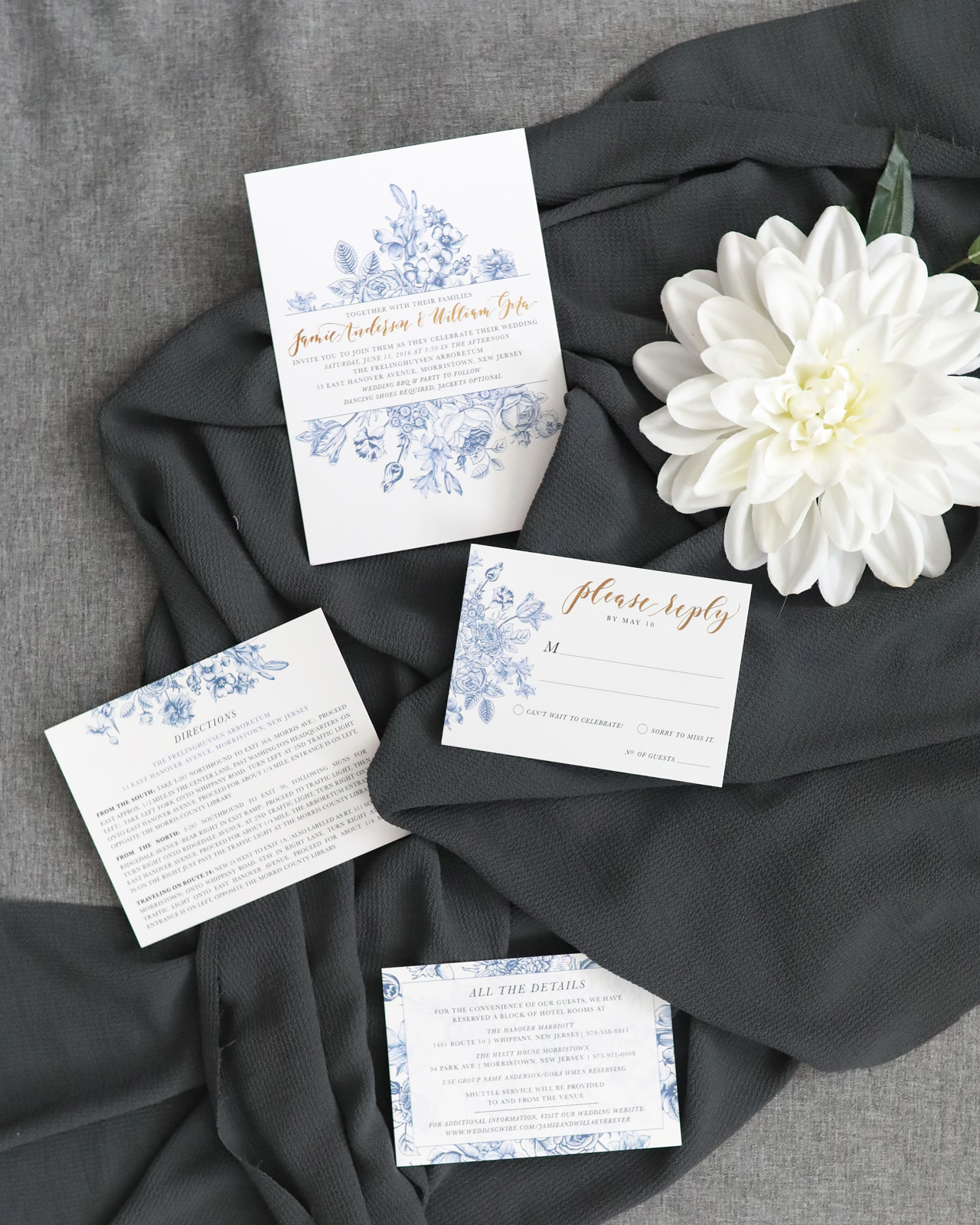
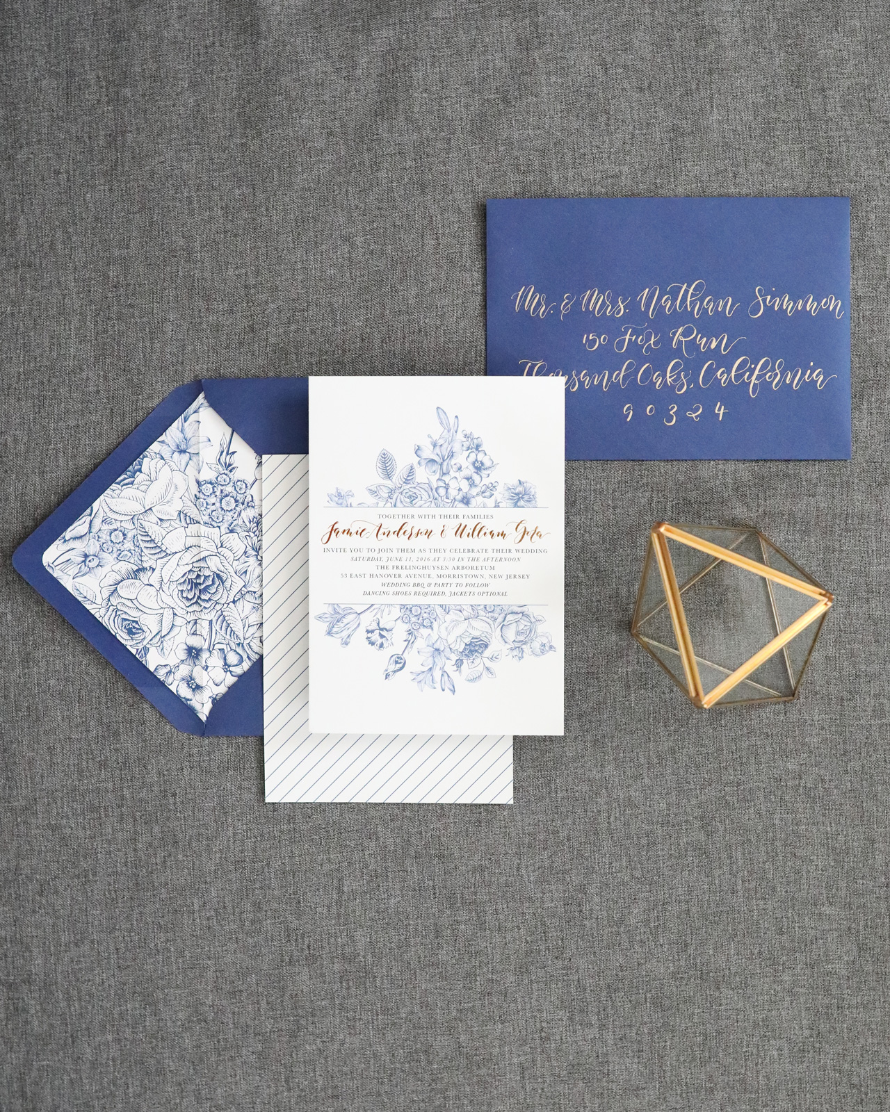
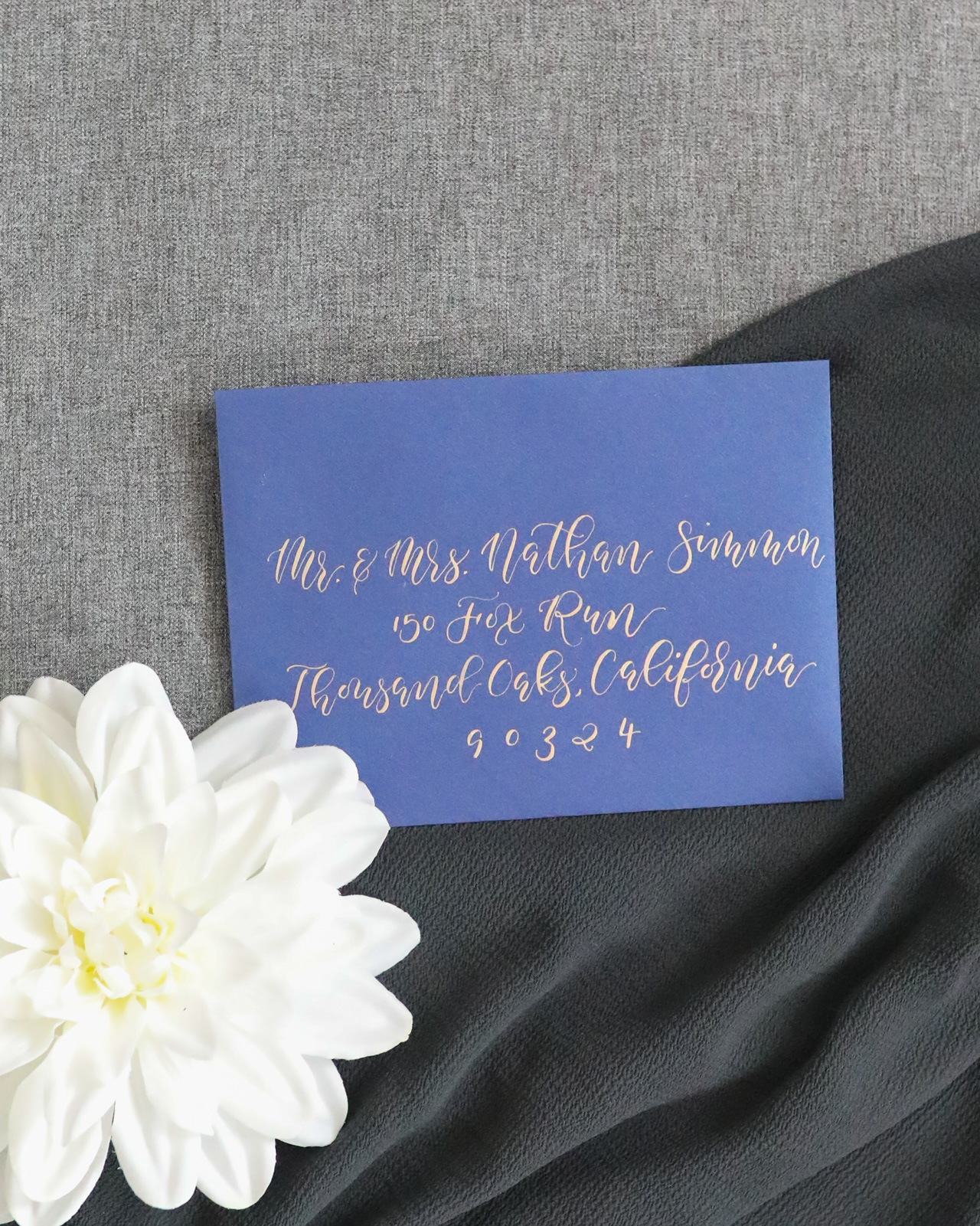
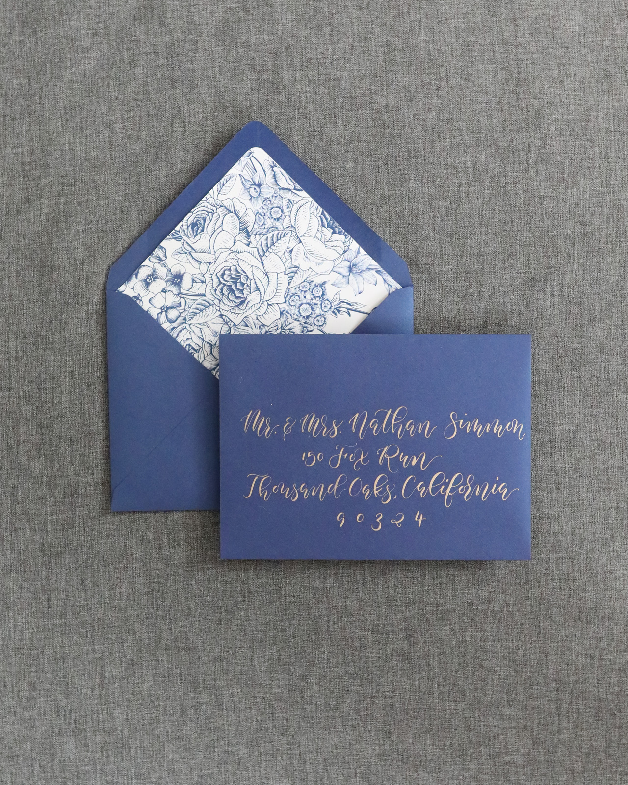
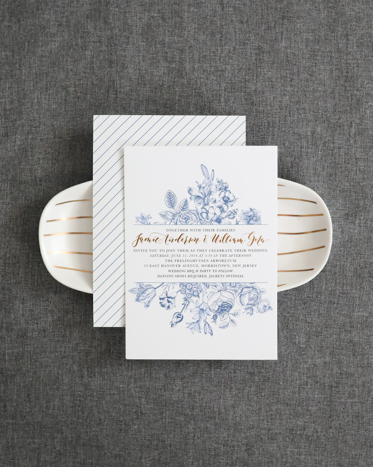
There’s something so charming about the ornate blue and white chinoiserie patterns on classic southern ginger jars. Megan from Honeybee Paper Co. designed these chinoiserie-inspired blue and white wedding invitations with gold foil accents for an elegant, outdoor picnic-inspired wedding. The playful pin stripes on the back of the invitations are the perfect complement to the floral illustrations. Royal blue envelopes with floral envelope liners and calligraphed addresses bring everything together to create a truly memorable wedding invitation suite!

Chinoiserie-Inspired Blue and White Wedding Invitations by Honeybee Paper Co.

From Megan: When Jamie, the bride, came to me for custom wedding invitations and said that I had free reign creatively, I couldn’t even contain my excitement! The bride and groom were planning an elegant outdoor barbeque picnic inspired wedding that took place at an arboretum with beautiful botanicals and a regal manor home on the grounds.

Chinoiserie-Inspired Blue and White Wedding Invitations by Honeybee Paper Co.

Chinoiserie-Inspired Blue and White Wedding Invitations by Honeybee Paper Co.

The bride wanted the invitations to be elegant and still convey the more casual laid-back feel of their nuptials so I let the theme and venue drive the inspiration behind the design. They chose royal blue and yellow as the color palette, so the gold foil was the perfect fit for this invitation suite — and let’s be honest, I love foil!

Chinoiserie-Inspired Blue and White Wedding Invitations by Honeybee Paper Co.

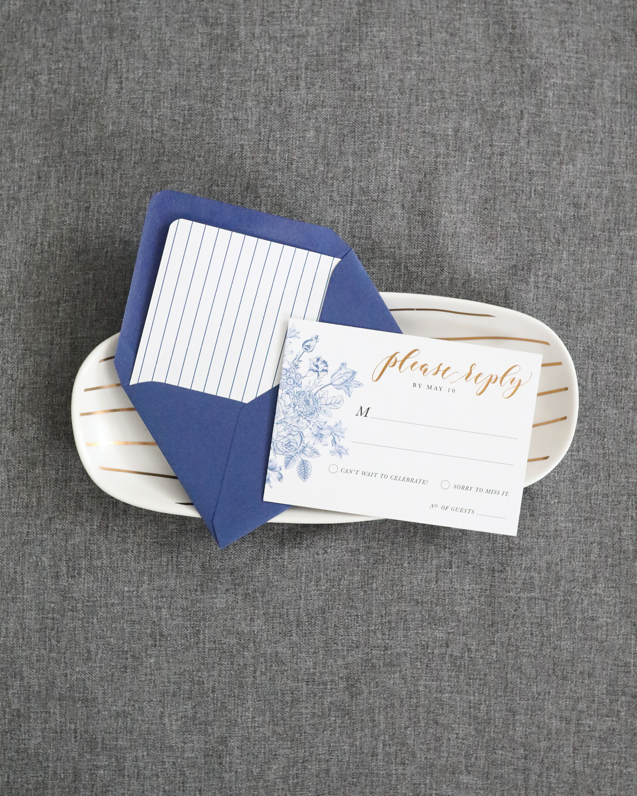
The florals on the invitation were so lovely that we carried them over to the rsvp and enclosure cards, and even the envelope liner, using them in slightly different ways to add some variation to the suite. The cards were all printed on a white cotton stock, adding another layer of texture. The response envelopes even got their own complementary liners that matched the reverse side of the invitation card. I for one LOVE envelope liners, so to be able to include them in the response envelopes as well was a real treat for me.

Chinoiserie-Inspired Blue and White Wedding Invitations by Honeybee Paper Co.

Chinoiserie-Inspired Blue and White Wedding Invitations by Honeybee Paper Co.

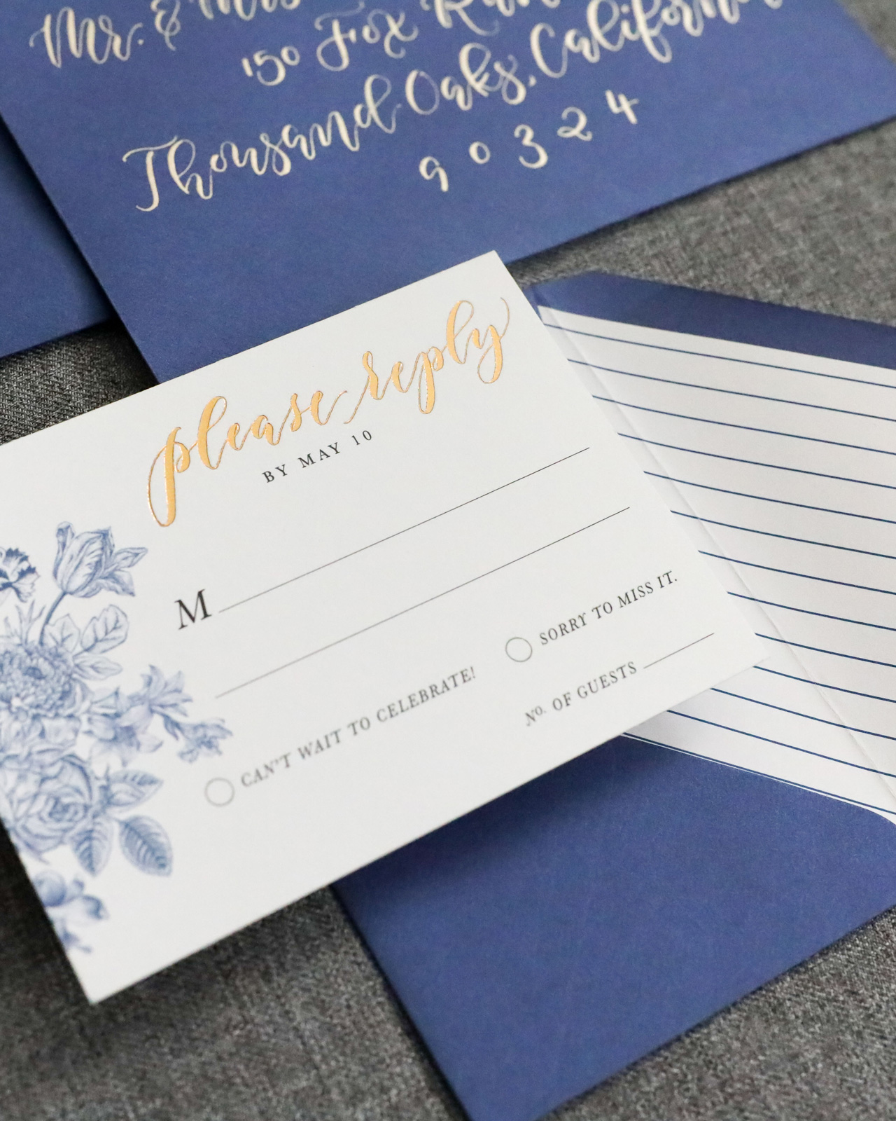
The couple’s names and “please reply” on the response card were spot calligraphed and printed in gold foil. The darker blue of the design really allowed the gold foil to shine — literally and figuratively! To complete the suite, we chose a metallic blue envelope which contrasted nicely with the white space of the overall design. Of course, the envelopes were addressed with a lustrous gold ink in the same calligraphy style that was used on in the suite. The simplicity of this suite makes it so stunning, and I was truly delighted to have the opportunity to design it.

Chinoiserie-Inspired Blue and White Wedding Invitations by Honeybee Paper Co.

Chinoiserie-Inspired Blue and White Wedding Invitations by Honeybee Paper Co.

Thanks Megan!

Design: Honeybee Paper Co.
Printing: StationeryHQ

Check out the Designer Rolodex for more tal­ented wed­ding invi­ta­tion design­ers and the real invi­ta­tions gallery for more wedding invitation ideas!

Photo Credits: Megan Veliz

Signature Cocktail: Spiced Irish Coffee

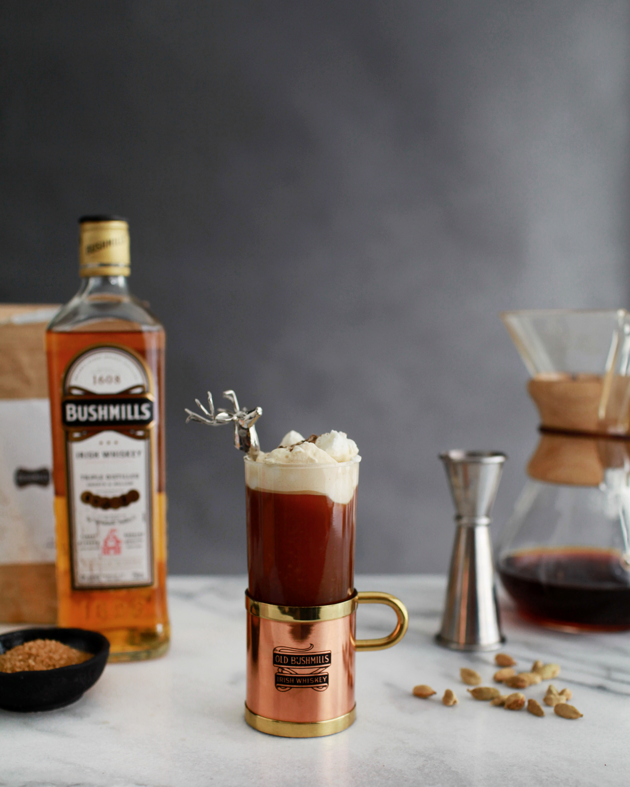
St. Patrick’s Day is just around the corner, and we’ve got the cocktail solution for those of you wondering what to drink on St. Patrick’s Day! This is also the perfect drink to enjoy on a cold night, especially after all this snow and winter weather we’ve been getting on the East Coast. This Spiced Irish Coffee cocktail recipe has cardamom syrup and rosewater whipped cream – a fun twist on the traditional Irish Coffee cocktail. For those of you planning winter weddings, this is also a fantastic signature cocktail idea to keep your guests warm!

Spiced Irish Coffee Cocktail Recipe by Liquorary

Spiced Irish Coffee Cocktail Recipe

  • 2 oz Irish Whiskey
  • 1/2 oz Rich Cardamom Syrup
  • 6 oz Hot Coffee
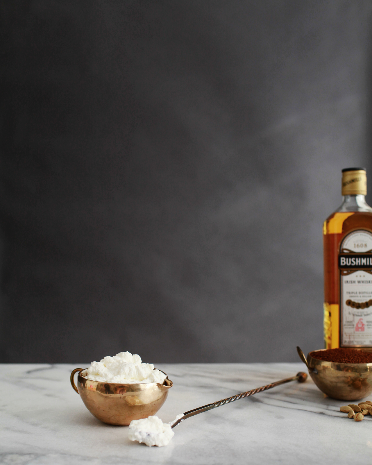
  • 1 oz Rosewater Whipped Cream

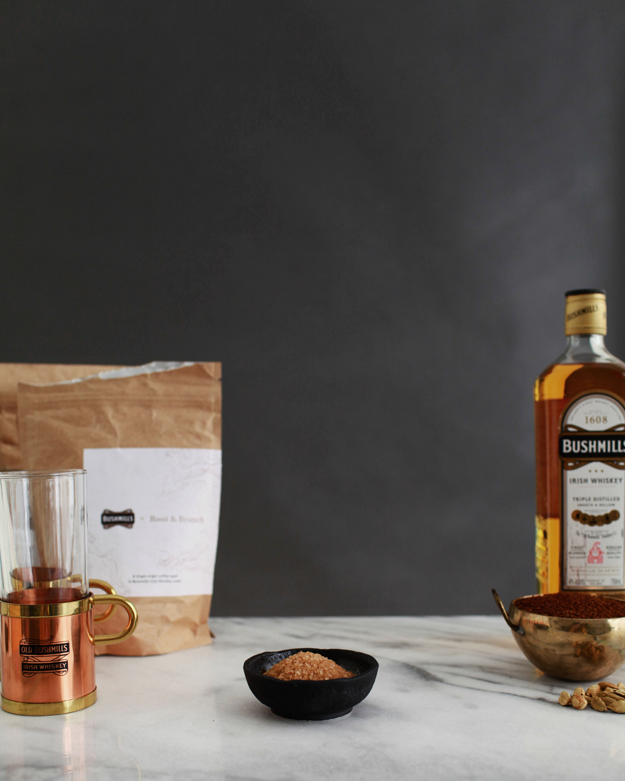
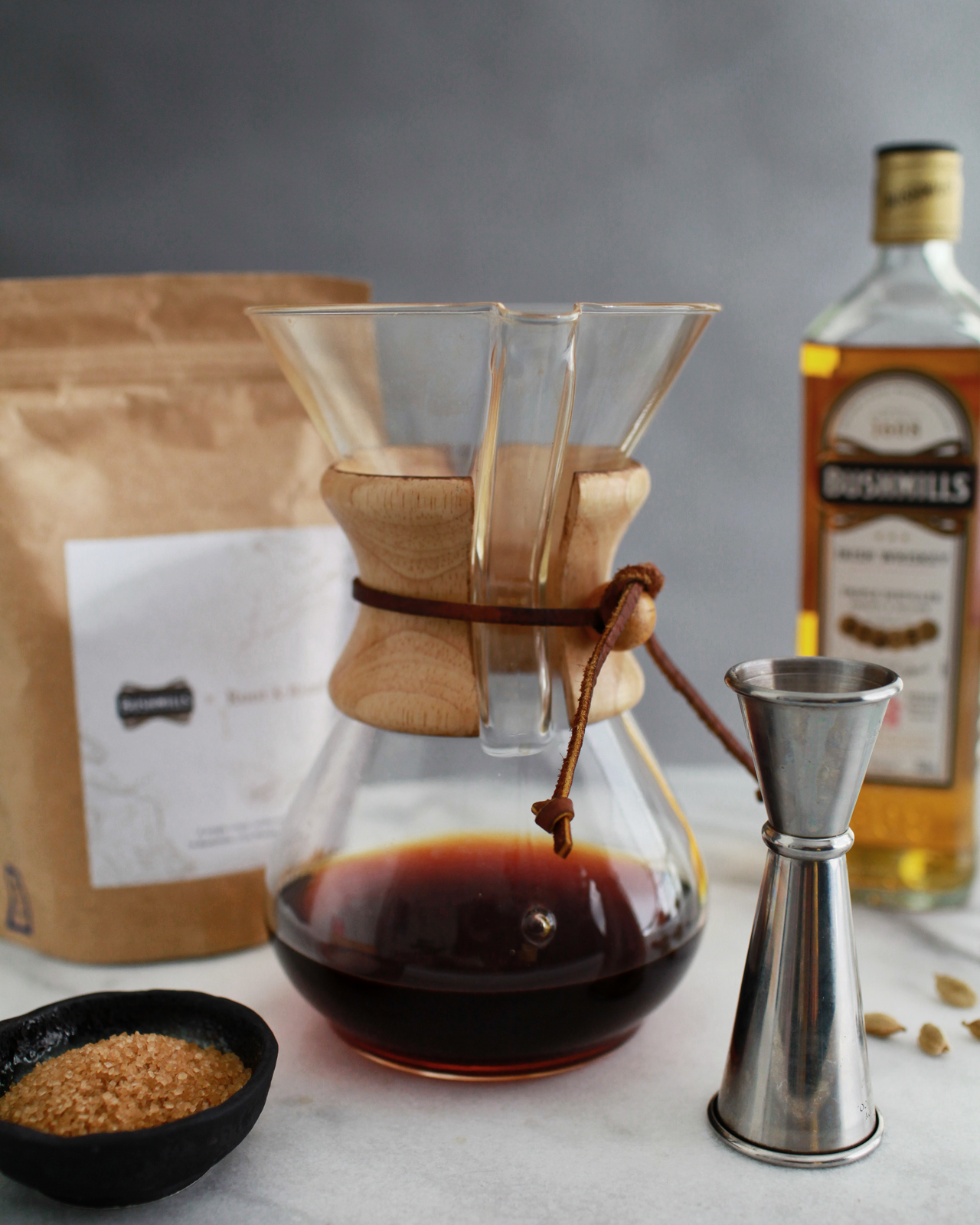
To make the Cardamom Syrup: combine 2 cups of raw sugar with a cup of water in a saucepan over low heat. Add a handful of cardamom pods and stir frequently until the sugar has melted into the water. Take the pan off the heat, cover, and let it sit for at least 20 minutes to infuse. Then strain out the cardamom pods and bottle the syrup.

Spiced Irish Coffee Cocktail Recipe by Liquorary

To make the Rosewater Whipped Cream: combine a pint of heavy whipping cream and a teaspoon of rosewater in a standing mixer and whip until the cream starts to stiffen, but not so stiff that stable peaks form. Add more rosewater as needed; you want the cream to be fragrant but not soapy.

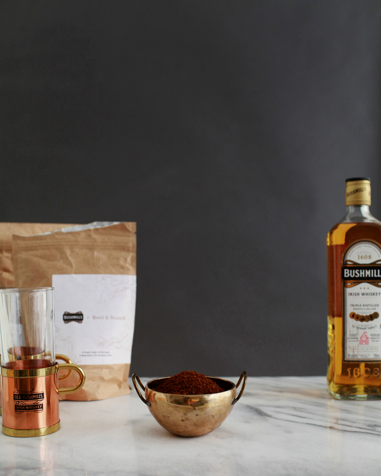
To make the Spiced Irish Coffee: combine the whiskey, syrup, and coffee in a heatproof glass, preferably with a handle, or a mug. Top with the whipped cream and top with a dusting of ground cardamom. Give the drink the gentlest of stirs and enjoy!

Spiced Irish Coffee Cocktail Recipe by Liquorary

A traditional Irish Coffee calls just for whiskey, sugar, coffee, and cream. This makes a very good drink. Our version just kicks this up a notch, adding some of our favorite Middle Eastern flavors that pair perfectly with coffee. (Seriously, consider adding a pinch of ground cardamom and a tiny dash of rosewater to your morning coffee; you’ll be glad you did.)

Spiced Irish Coffee Cocktail Recipe by Liquorary

We used a rich simple syrup – a syrup made from a 2:1 ratio of sugar to water – because its thick body helps add texture to the Irish Coffee. We’ve found that hot drinks can often feel too thin and rough unless they’re balanced properly with thickening ingredients like this. The cream helps too; you want the cream to sit heavy on top of the glass, melting into the drink bit by bit.

Spiced Irish Coffee Cocktail Recipe by Liquorary

Spiced Irish Coffee Cocktail Recipe by Liquorary

The coffee is, of course, important too – especially since it makes up the majority of the drink. We used fresh pour-over coffee, since we’re coffee nerds in addition to being booze nerds. But this doesn’t seem like the right post to get into all the mechanics of that. Would anyone be interested in taking a further look at pour-over coffee in another post?

Photo Credits: Nole Garey for Oh So Beautiful Paper

Happy Weekend!

Happy Friday everyone! We made it through a very cold and snowy week here on the East Coast! I keep thinking that if I just think about flowers and Spring long enough, it will suddenly appear. Ha! We have a warm cocktail recipe coming up this afternoon – perfect for these cold nights! But in the meantime, read below for weekend links and sales!

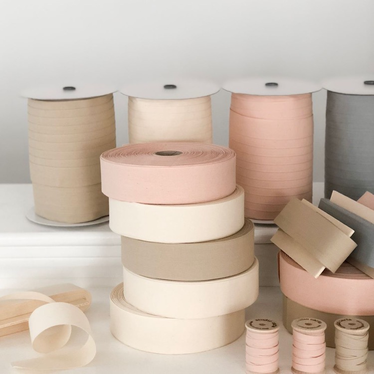
Angela Liguori Neutral Ribbons

Photo Credit: Angela Liguori

Boston friends! Angela Liguori and Kathryn of The Everyday Co. are co-hosting a styled wedding event Saturday, March 10 from 11 – 4! You can find all the details right here – if you’re in the area, you don’t want to miss it!

You guys! Everything at Gap is 40% off right now! I just scooped up a couple dresses for my girls; I couldn’t resist this sequin unicorn dress and this rainbow plaid dress for Easter.

How to quiet the voice in your head that tells you “you can’t”

So excited for this book from the ladies of Hello!Lucky: It’s called Be the Change and it has 16 creative projects to encourage civic and community action by kids!

DIY hologram foil Easter eggs

That 30% off sale at JCrew is still going strong! I’m loving this lace top in Deep Copperthis hand lettered graphic t-shirt, and this super cute embroidered sweater

MAKE: Funfetti cake batter popsicles!!


Stay tuned for a cocktail recipe this afternoon! Have a great weekend, and I’ll see you back here on Monday! xoxo

Inspiring Calligraphers: Michele of Meant To Be Calligraphy

Hey everyone! I’m excited to share a peek today into the work of Michele Hatty Fritz of Meant To Be Calligraphy. There’s lots of pretty calligraphy here to check out, but I also love Michele’s insights that show her true passion for lettering. She not only creates calligraphy — she also teaches classes on calligraphy and brush lettering. So let’s take a look at this inspiring calligrapher! – Jen

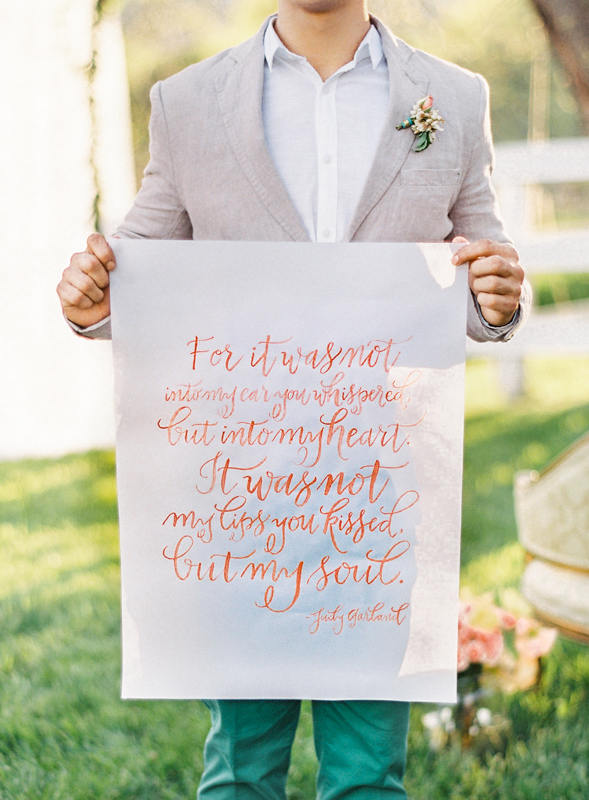
Calligraphy Wedding Sign / Meant to Be Calligraphy

Photo Credit: Vicki Grafton Photography

How did Michele become a calligrapher? She started out working with words in a different way, as a journalist. “I spent the first part of my career as a journalist, covering entertainment, pop culture and food for a national magazine and later as an editor for The Washington Post,” says Michele. “But in 2009, I was ready for a change, so I quit my job at the Post to become a full-time, professional calligrapher and launched Meant To Be Calligraphy.” She does have some fun memories from her past work!  “I’m probably the only calligrapher you will ever meet who has interviewed Coldplay before a big show in Manhattan, John Mayer in a swanky New York hotel, Patrick Dempsey on a race track in Florida, Josh Duhamel on the beach in Santa Monica after a joint surfing lesson, J.K. Rowling over lunch in Boston and Maroon 5 on their tour bus here in DC.” Ha, so fun!

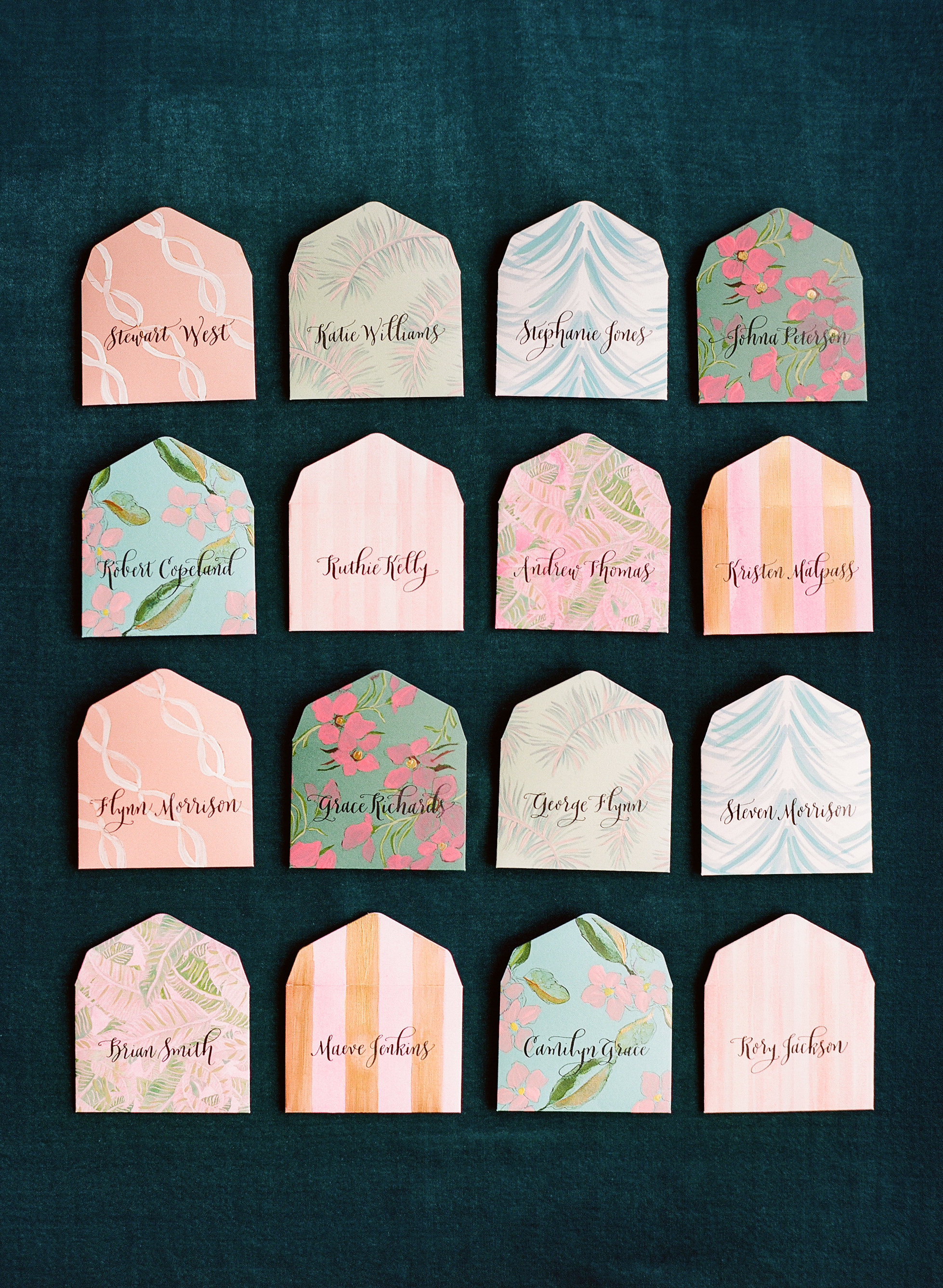
Calligraphy Escort Cards on Mini Envelopes / Meant to Be Calligraphy

Photo Credit: Whitney Neal Photography

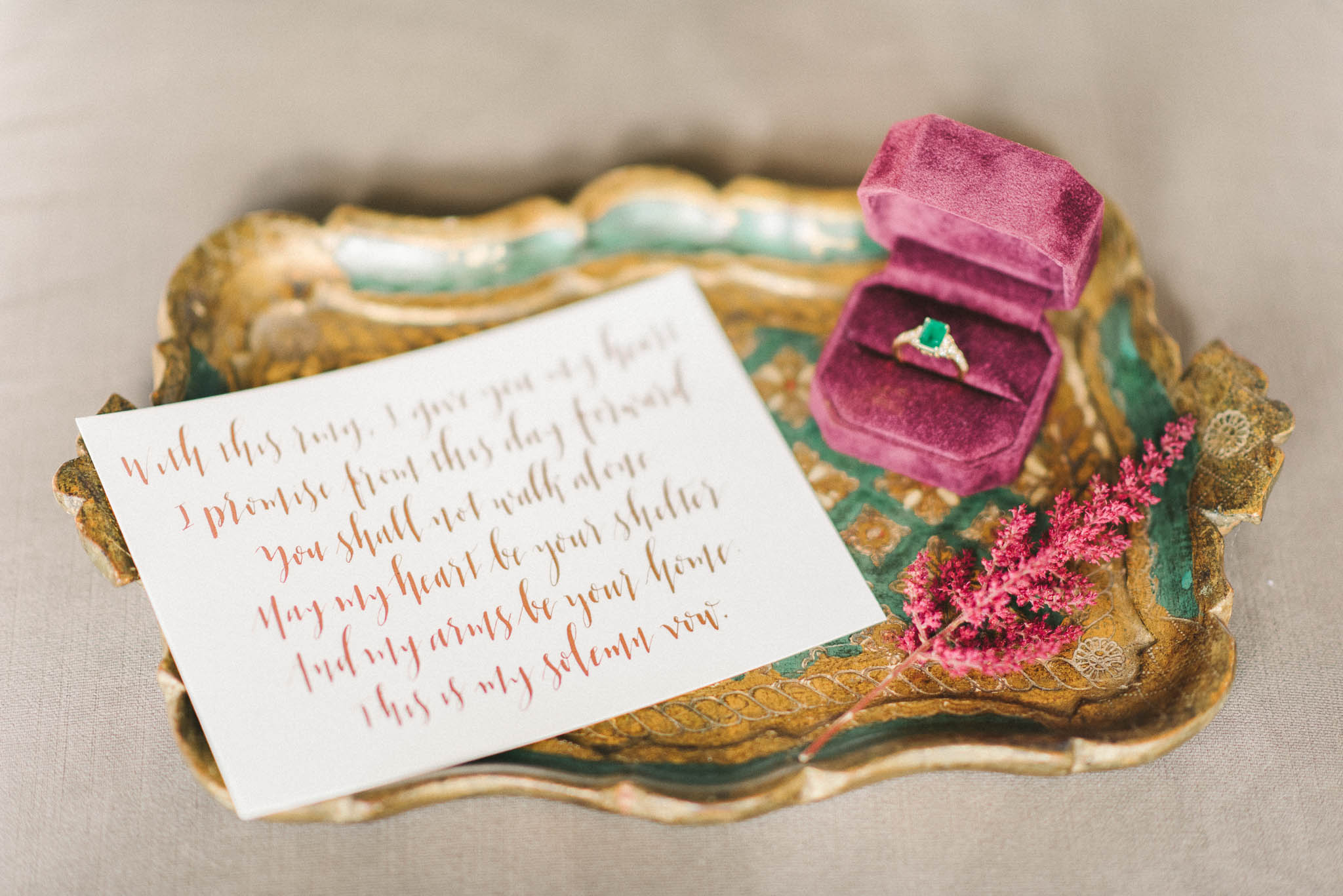
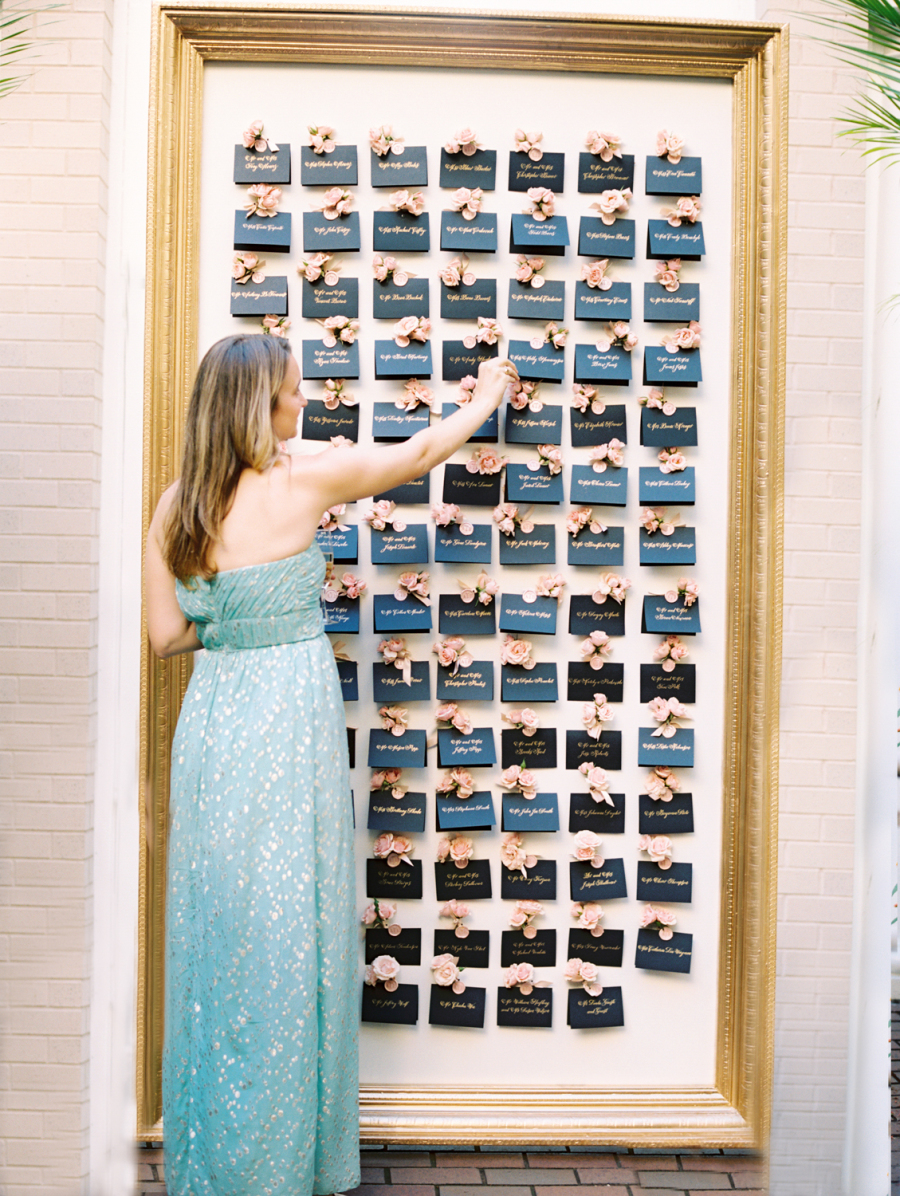
Rather than one style, Michele offers a slate of 30 signature styles — ranging from fun and playful to classic and elegant — through Meant To Be Calligraphy. “Being able to write across a range of styles allows me to give my clients a lot of options from which to choose and helps my work remain fresh and interesting as I go from project to project.”

Calligraphy Wedding Vows / Meant to Be Calligraphy

Photo Credit: Elizabeth Fogarty Photography

Calligraphy Escort Card Display / Meant to Be Calligraphy

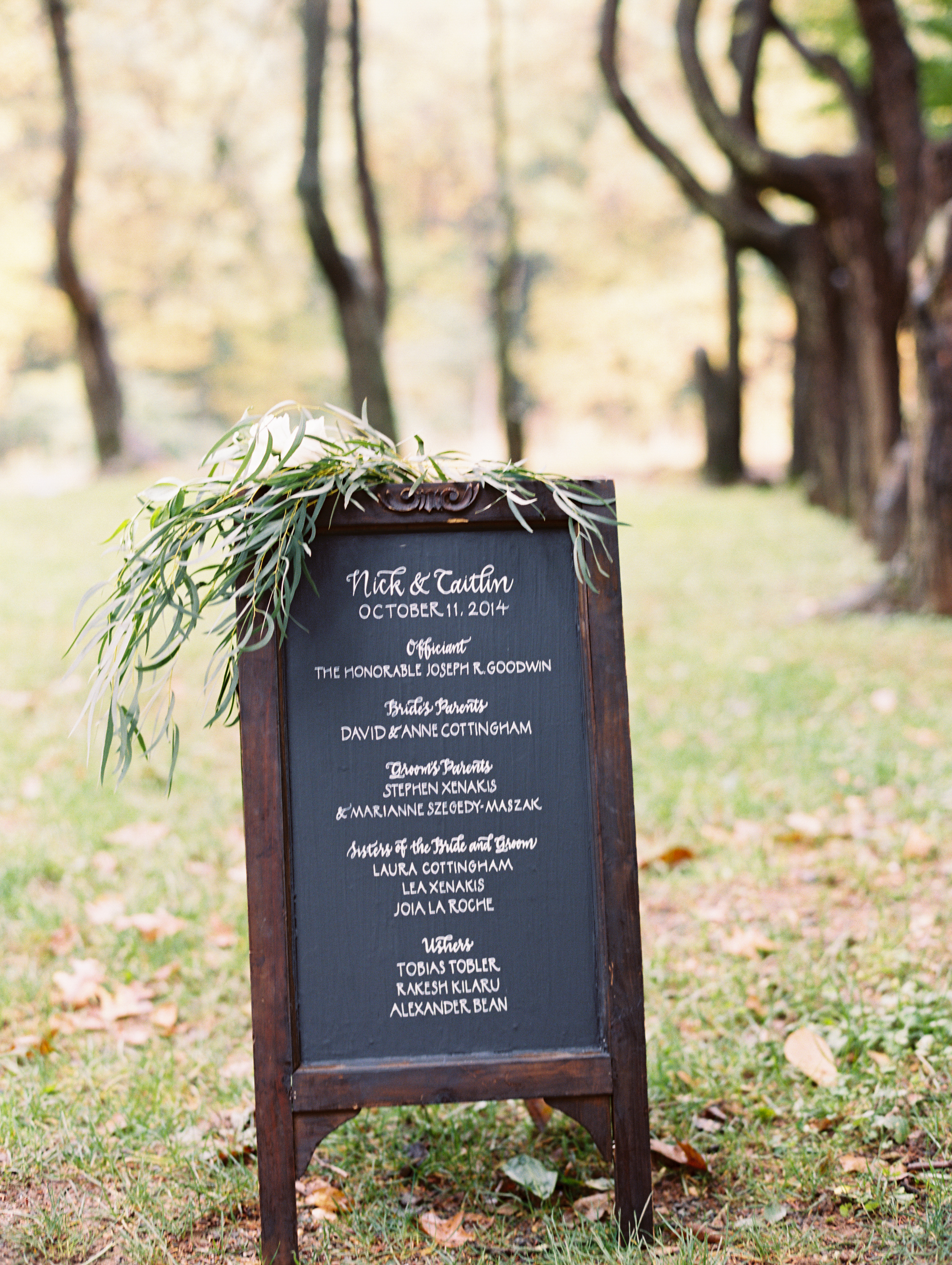
Calligraphy Chalkboard Wedding Ceremony Sign / Meant to Be Calligraphy

Photo Credits: Abby Jiu Photography

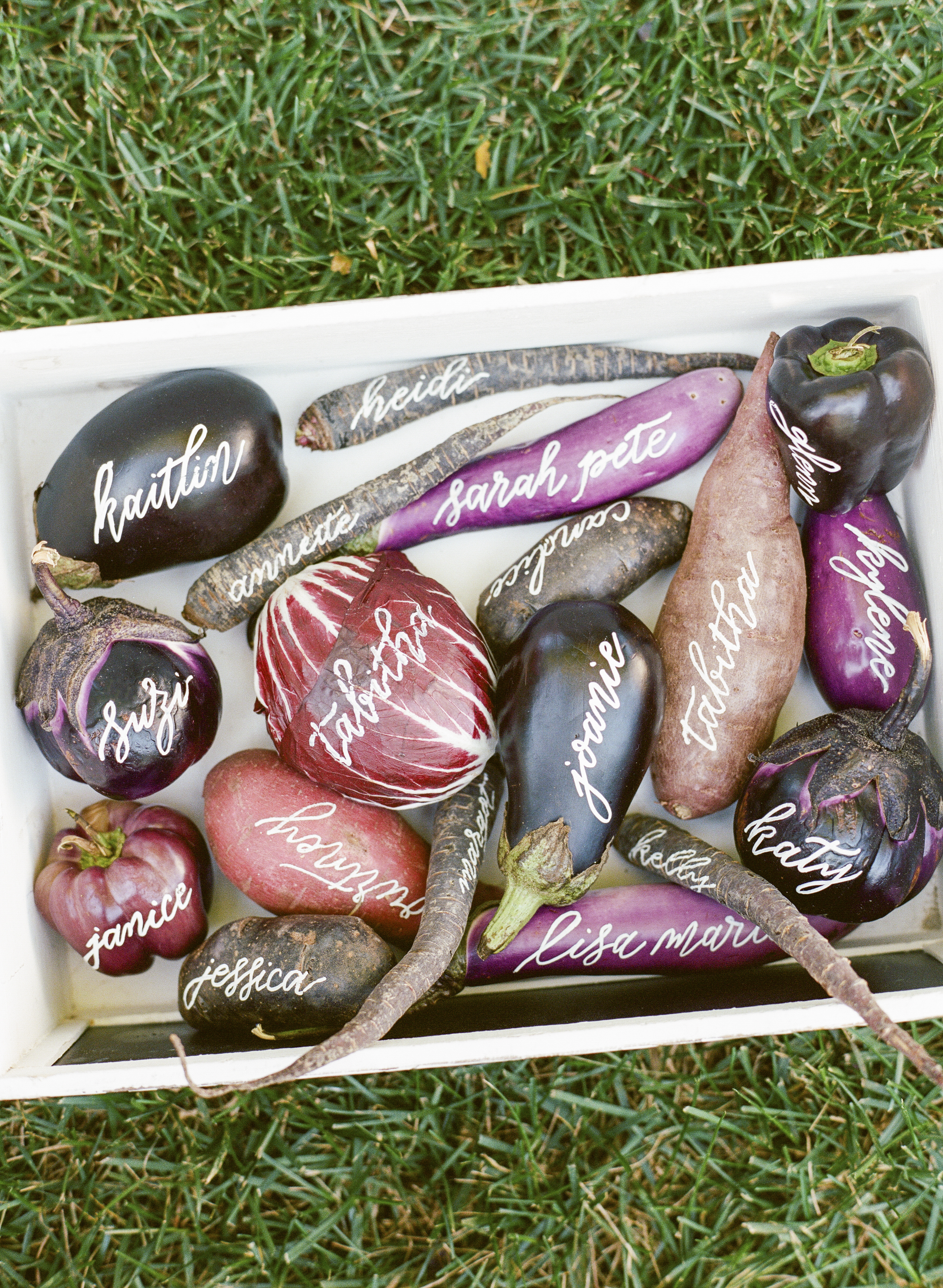
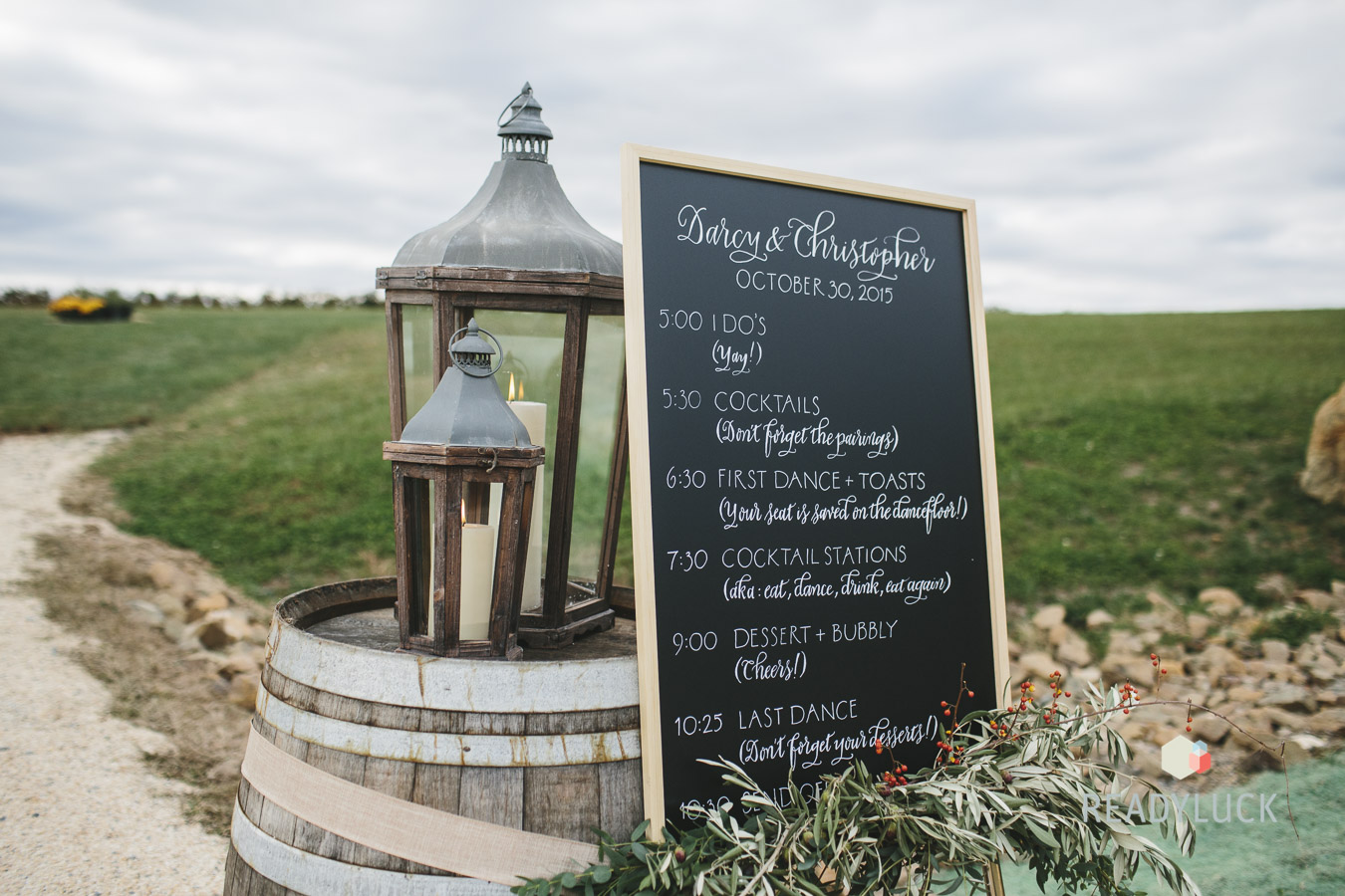
Michele, like most calligraphers, has been asked to write on more than just paper. Calligraphy works just about anywhere and Michele’s written on it all — chalkboards, mirrors, antique windows and doors, cutting boards, ceramic plates, glass bottles, painted canvases, clay pots, oyster shells, rocks, magnolia leaves, apples, pumpkins, and just about every other vegetable with a relatively smooth surface.

White Calligraphy on Produce Place Cards / Meant to Be Calligraphy

Photo Credit: Lisa Blume Photography

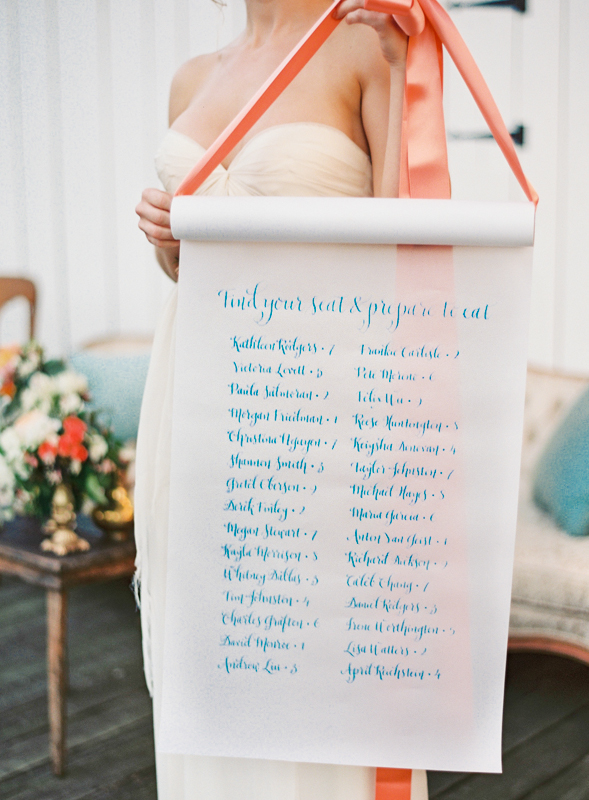
Calligraphy Wedding Seating Chart / Meant to Be Calligraphy

Photo Credit: Vicki Grafton Photography

On other calligraphy projects, Michele shares: “I also do in-person appearances where I have customized everything from valentines to New Years resolutions for party guests, and occasionally I’ll even bring along an engraving tool and a pair of safety glasses and turn glassware and the like into on-the-spot, custom party favors.”

Calligraphy Chalkboard Wedding Sign / Meant to Be Calligraphy

Photo Credit: Ready Luck Photography

Michele’s passion for lettering started young — and runs in the family. “My father worked as a hand lettering artist for General Motors for his entire career,” says Michele. “He is the person who taught me my letters. I have very vivid memories of being two or three years old and he would draw letters with dots and then let me connect them. I was obsessed and I used to beg him for more dot letters!” Her mom also encouraged the craft by enrolling Michele in her first calligraphy class when she was just six or seven years old. “I was hooked from the very first lesson and continued to seek out instruction as I grew older,” says Michele.

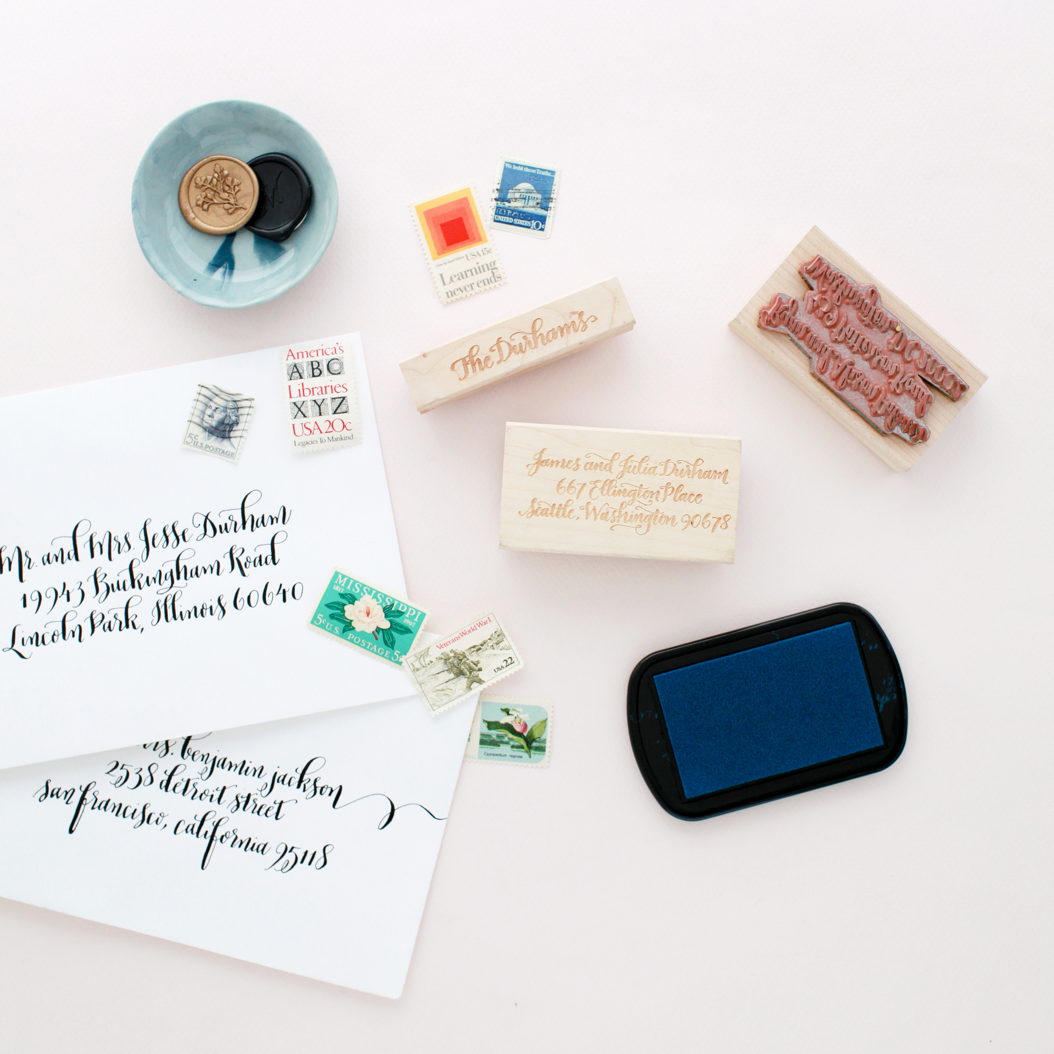
Calligraphy Return Address Stamp / Meant to Be Calligraphy

Photo Credit: Nole Garey

Michele also creates custom products for everyday use as well, like return address stamps and personalized stationery.

Michele credits her parents as the inspiration behind her decision to offer calligraphy classes. “I really wanted to honor my father’s legacy as an artist and honor my mom’s as well. She taught all sorts of crafting workshops when I was growing up and she definitely inspired me to want to share my knowledge, too.”

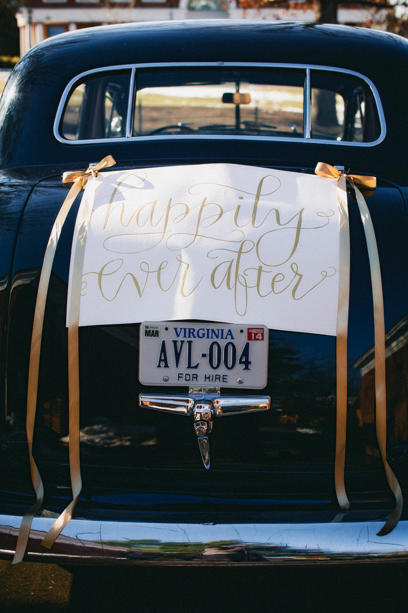
Happily Ever After Calligraphy Wedding Getaway Car Sign / Meant to Be Calligraphy

Photo Credit: Holland Photo Arts

Michele has had people travel from all over the country (including a few international students!) to take part in her calligraphy workshops. “It’s amazing to me that I am already in my seventh year of teaching and it is one of the great joys of my life to watch my students both fall in love with lettering and learn how to master it during the course of our time together,” says Michele.

Such a cool story behind her work. Thanks again for sharing a peek into what you do, Michele! You can find her over at Meant To Be Calligraphy and on Instagram.