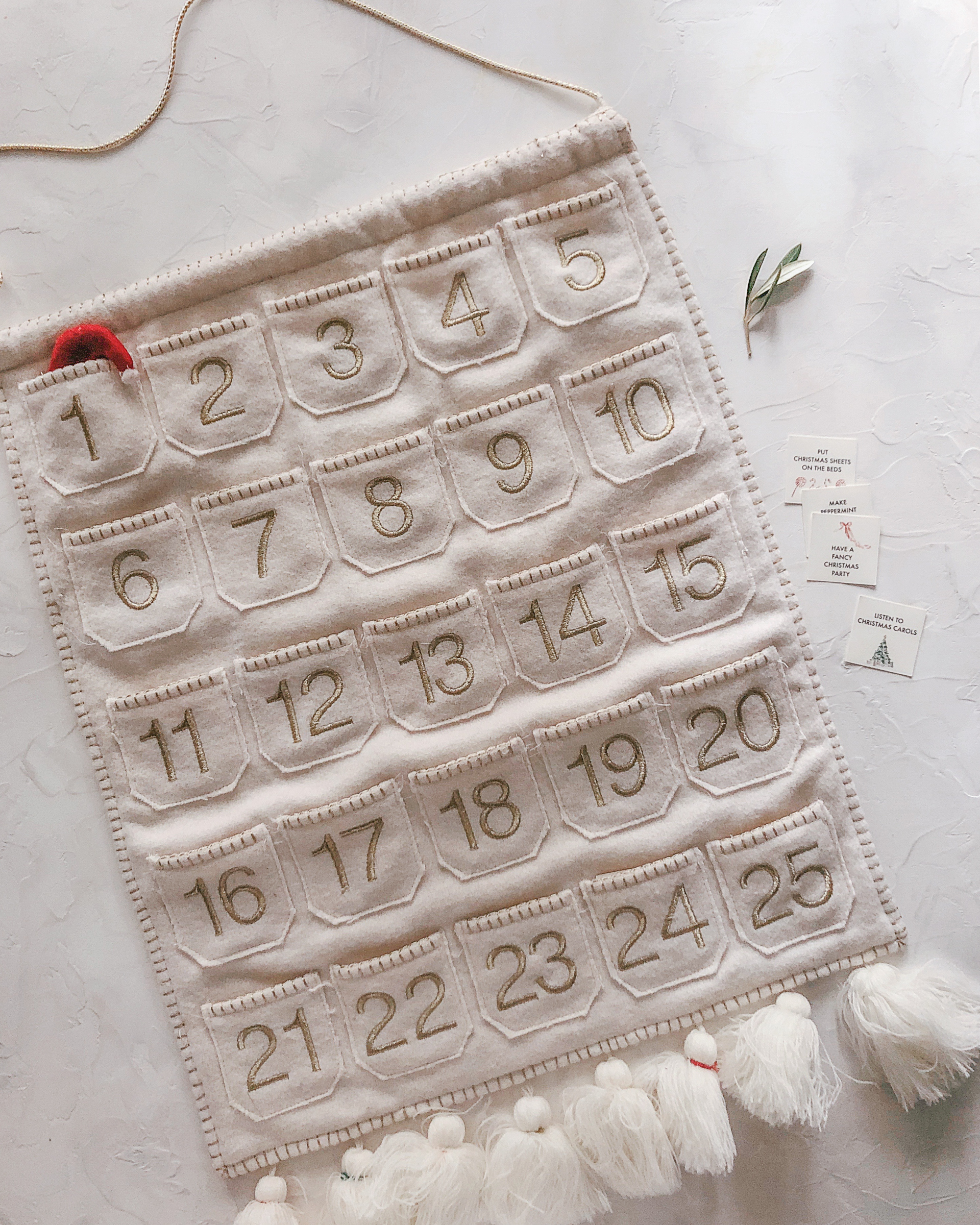
Hi! Hello! Long time, huh? I’ve got a lot I’ve been meaning to share with all of you and a lot that I’m still trying to figure out for myself, but for now I have a quick (and time sensitive!) holiday project that I wanted to share. I’ve made a version of this family activity advent calendar for my family for the past five or so years. We use a felt advent calendar that I picked up from Target and I add tiny cards with all of our favorite holiday traditions, activities, and a few silly activities to keep things fun along the way. We also use a store-bought chocolate advent calendar, but this is a really nice way to spread out holiday-related activities throughout the entire month. My children love checking each envelope daily, and it helps me avoid Christmas burnout. Win win!
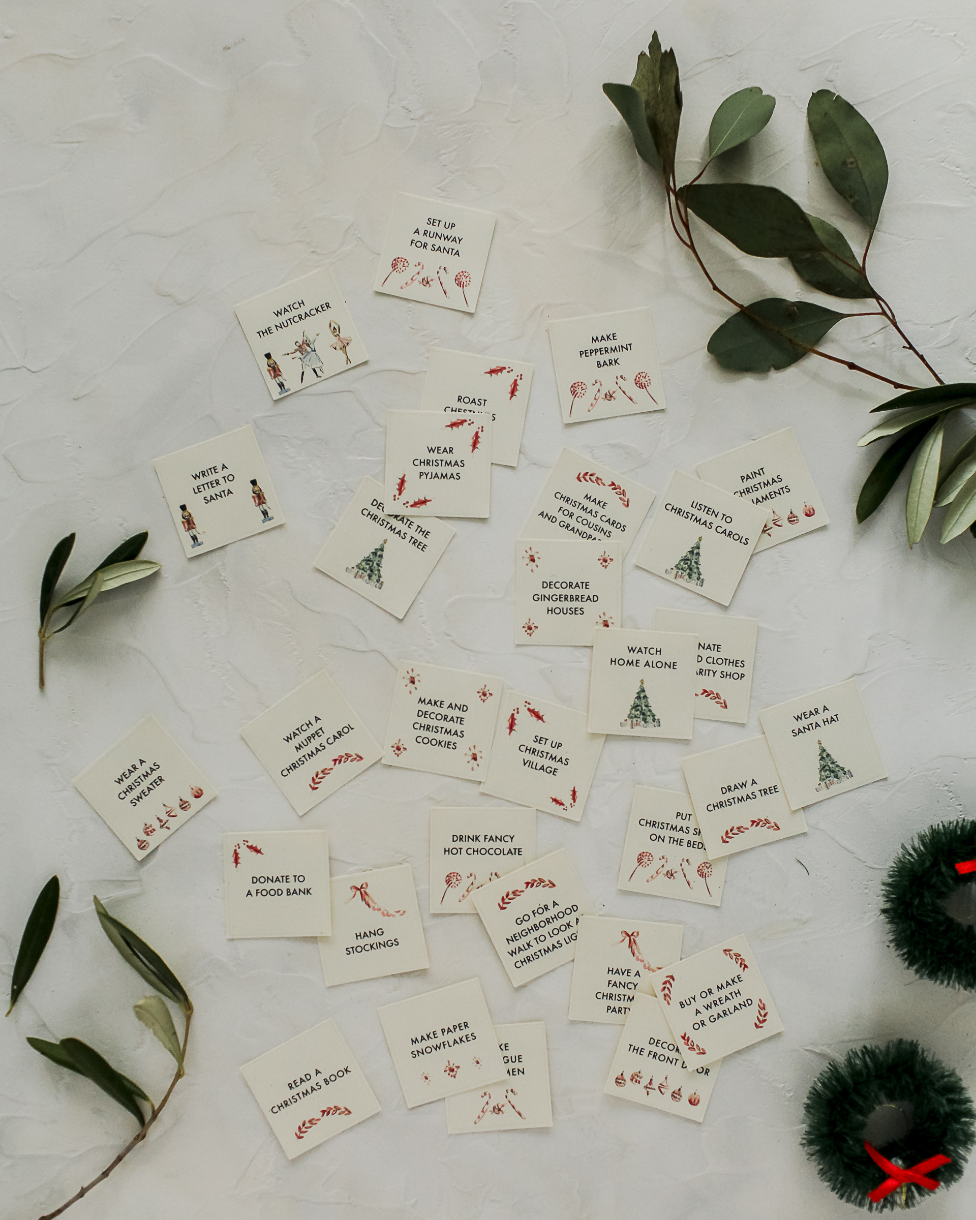
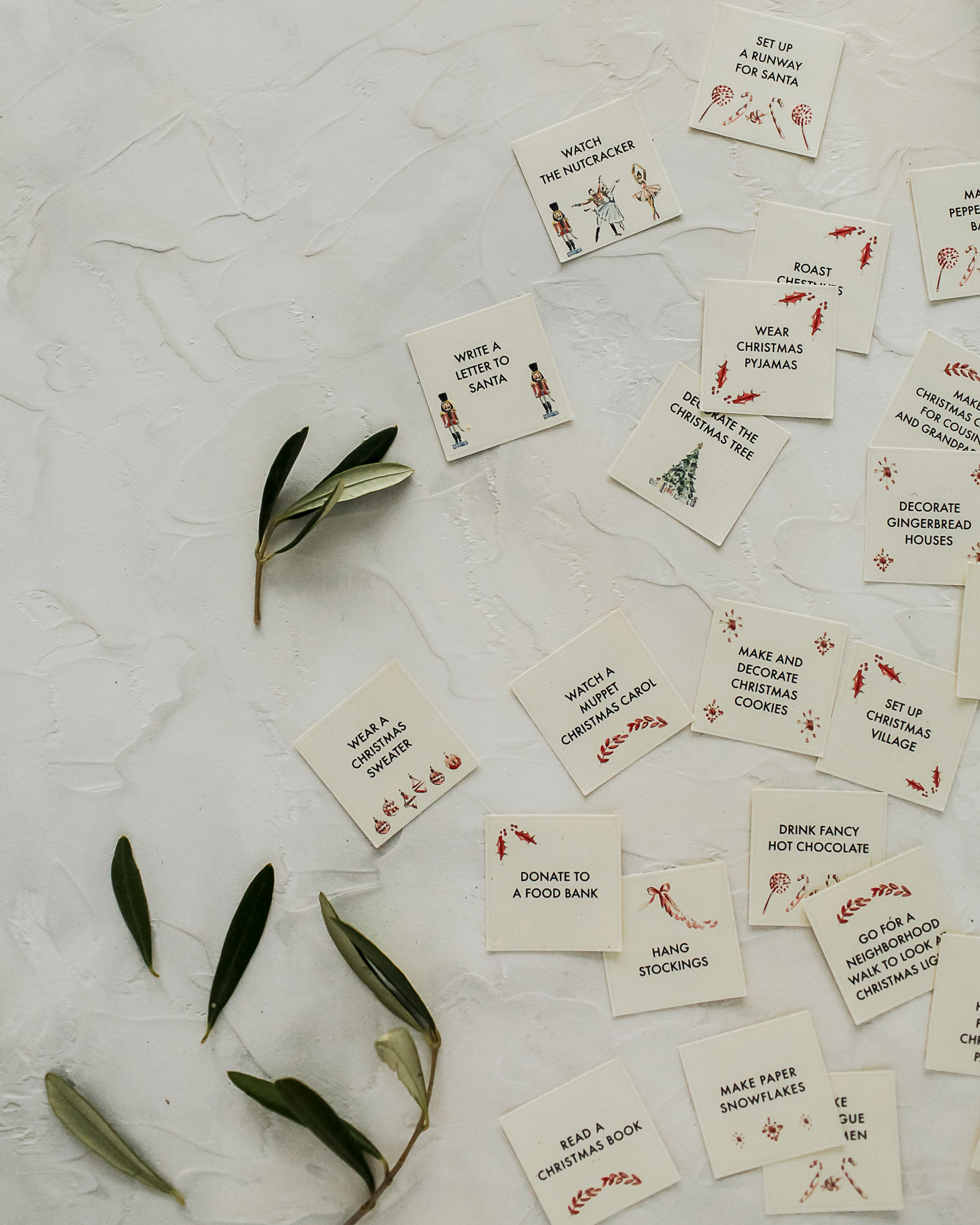
To make a family activity advent calendar of your own, just grab the printable files below and print your preferred version (with or without text) on any light color cardstock paper. After printing, I used my paper trimmer to cut the edges off the paper, then used this one inch square punch to make the individual advent calendar insert cards. You could also totally cut them by hand. There are very light squares around each illustration to help serve as guides for scissors or paper trimmers. Then sort the individual cards into your own reusable advent calendar – you can also save and reuse the insert cards every year!
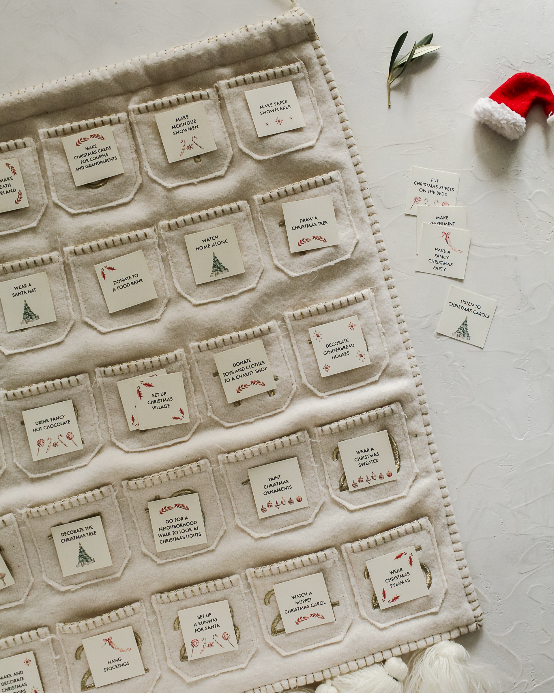
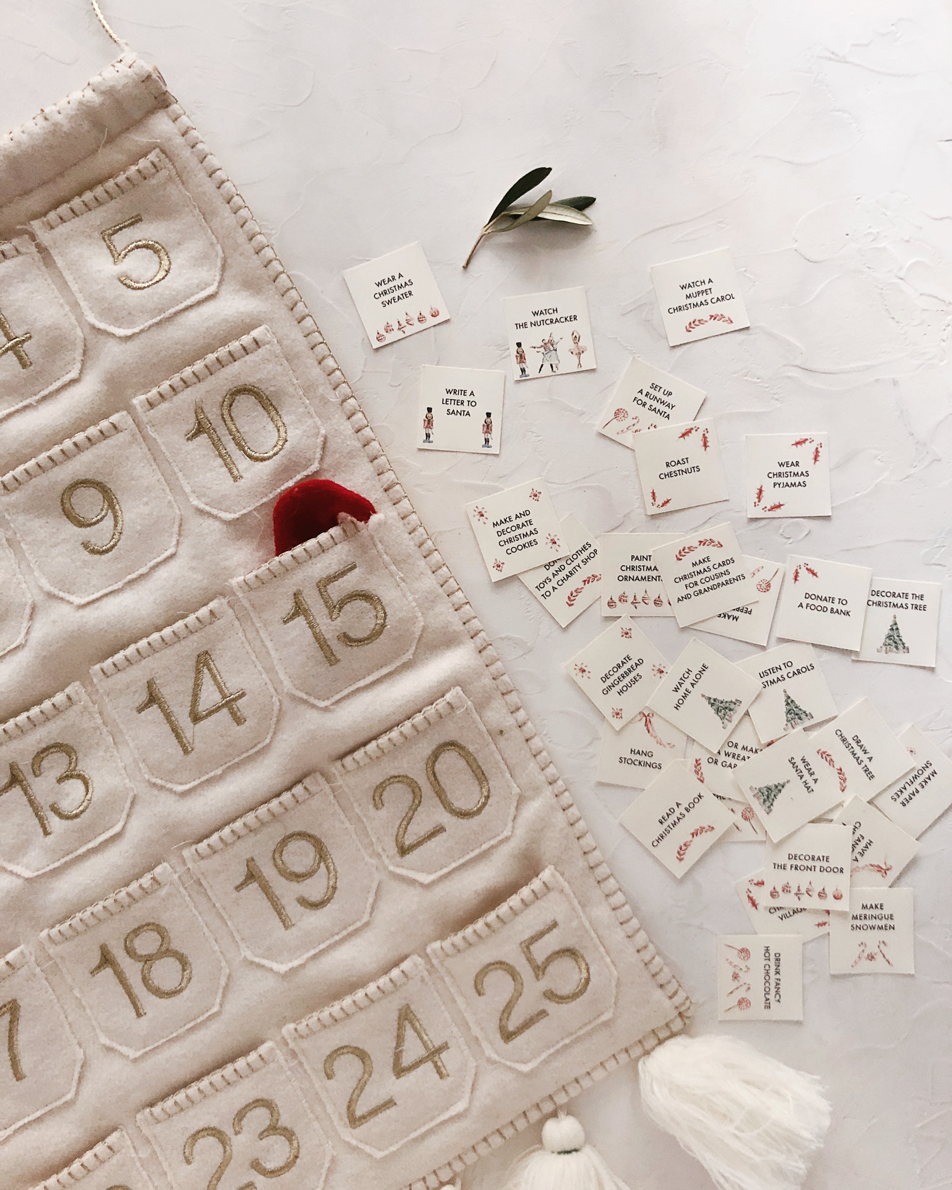
I know some of you will have already started your Christmas decorating and activities over the Thanksgiving weekend, and I’m sure some of you will have your own family traditions to add. I made a version of the printable advent calendar with just the illustrations so you can add your own traditions and activities. Or if you prefer, you can use the version with text and pick your favorite activities and traditions to incorporate – there are 30 cards, so you should have at least five extra if you choose to use the version with text!
Grab the printable files below:
Printable Family Activity Advent Calendar (WITH text)
Printable Family Activity Advent Calendar (NO text)
Illustrations © 2018 Riley Sheehey Printable advent calendar created exclusively for Oh So Beautiful Paper. All artwork is made available for personal use only. By downloading the advent calendar you agree to the terms of use.
Photos by Nole Garey for Oh So Beautiful Paper