St. Patrick’s Day Rainbow and Gold Party Inspiration

Did you grow up celebrating St. Patrick’s Day? My family has a bit of Irish heritage, but with Easter and Passover so close behind the extent of our celebrations usually involved baking a green cake or cupcakes to celebrate. But those are still some of my favorite memories from my childhood, and I’m looking forward to continuing the tradition with my own kids! Personally, I’ve always been a fan of the “pot of gold at the end of the rainbow” theme than traditional shamrocks and monochromatic green. So today I thought I’d round up a bit of St. Patrick’s Day rainbow and gold party inspiration to share with all of you!

St. Patrick's Day Rainbow and Gold Party Inspiration

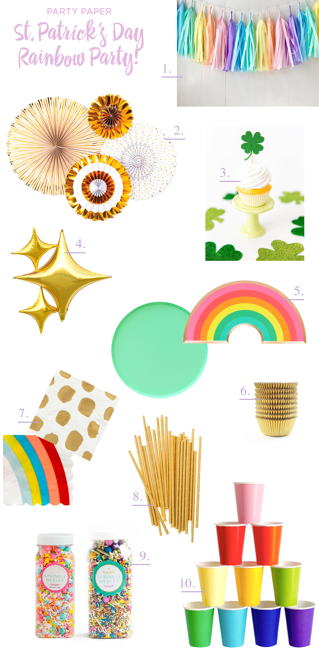
From top right:

1. Pastel rainbow tissue paper tassels are the perfect way to bring rainbow vibes into your St. Patrick’s Day party décor! I also love this set with iridescent mylar strips in the rainbow tassels.

2. Pair the rainbow tassels with gold paper party fans from My Mind’s Eye!

3. Glittery green shamrock cupcake picks are the perfect place to bring the traditional St. Patrick’s Day motif into your party décor! Or you could go edible with these fondant shamrocks. But if shamrocks really aren’t your thing, these rainbow cupcake toppers have a ring back and can double as party favors!

4. These balloons add just the right amount of gold sparkle to any party

5. I’m absolutely obsessed with these new party plates from Oh Happy Day! The colors in this rainbow plate are just perfect, and these round plates come in two sizes and every shade of the rainbow (I’m loving this mint green hue).

6. Gold foil cupcake liners, obviously.

7. This gold dot napkin kind of looks like gold nuggets, don’t you think? And these rainbow napkins are so fun!

8. Kids looooooove party straws! I’m into these gold party straws and these reusable rainbow stainless steel straws

9. Take your cupcakes up a notch with one of these rainbow sprinkle medleys by Sweatapolita via Shop Sweet Lulu

10. Classic party cups in every color of the rainbow!


Are you planning to celebrate St. Patrick’s Day this year? And for those of you that have kids, what are your favorite kids activities for St. Patrick’s Day? Spill all the details in the comments!

p.s. DIY pastel rainbow crepe paper backdrop and rainbow unicorn birthday party inspiration

Behind the Stationery: Dahlia Press

Our next installment of Behind the Stationery bring us to Seattle, Washington to chat with Stephanie Clarke of Dahlia Press. Stephanie shares about how she transitioned from moonlighting as an entrepreneur to investing full-time in Dahlia Press, how sketching on an iPad has expedited her overall process, and how her custom client workflow differs from designing a wholesale line. Here’s Stephanie! —Megan Soh

Behind the Stationery: Stephanie Clarke of Dahlia Press

From Stephanie: I first fell in love with letterpress in a typography class. My instructor was a printer and would make all of the students letterpress flashcards of the typefaces we should all know by heart. Fast forward a couple years and by day I was a Graphic Designer for a retail branding firm designing everything from logos and interior environments to websites and packaging, and by night I was printing on a 1912 Golding Pearl platen press in my basement.
Behind the Stationery: Stephanie Clarke of Dahlia Press

Behind the Stationery: Stephanie Clarke of Dahlia Press

For 6 years, Dahlia Press was a side hustle. Named after the flowers in my front yard, I spent my evenings printing wedding invitations and custom stationery. To say that I started with a formal business plan and a vision for what Dahlia Press would eventually become wouldn’t be entirely correct. I knew that the entrepreneur in me wanted my own business, but I also knew that it was best for me to grow slowly and carefully, trying not to grow too fast to where I couldn’t sustain my full-time job (which I loved), and not too slow that the business wasn’t gaining momentum.
Behind the Stationery: Stephanie Clarke of Dahlia Press

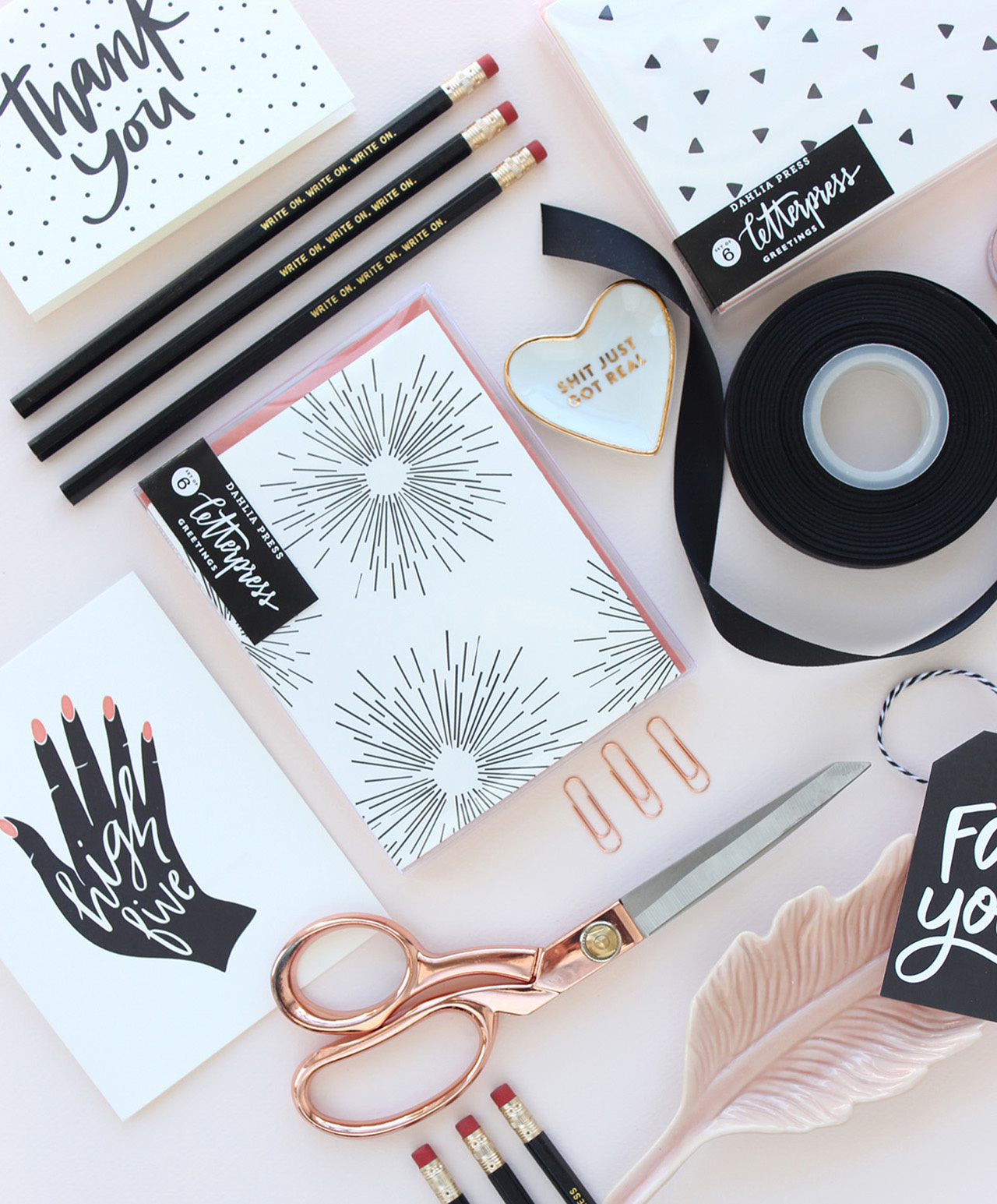
Eventually with hard work and late nights, Dahlia Press grew to a size where I could no longer sustain both jobs. Knowing Dahlia Press needed my full attention, I left my day job to focus on it entirely. It was at this time that we expanded our offerings to include a line of letterpress greeting cards for the retail and wholesale market.
Behind the Stationery: Stephanie Clarke of Dahlia Press

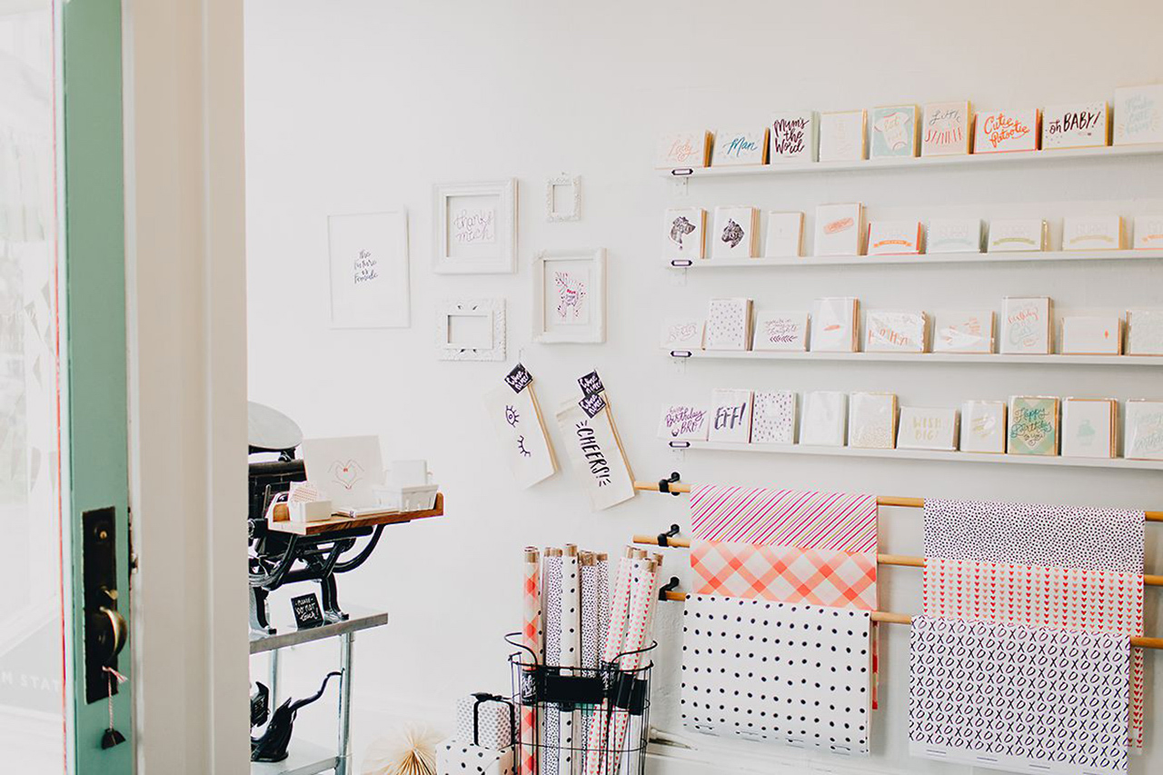
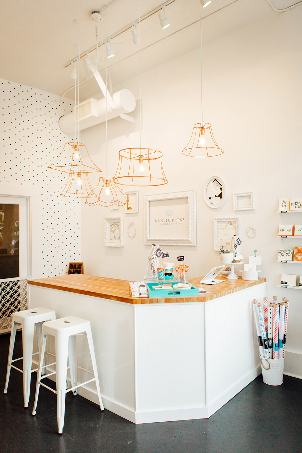
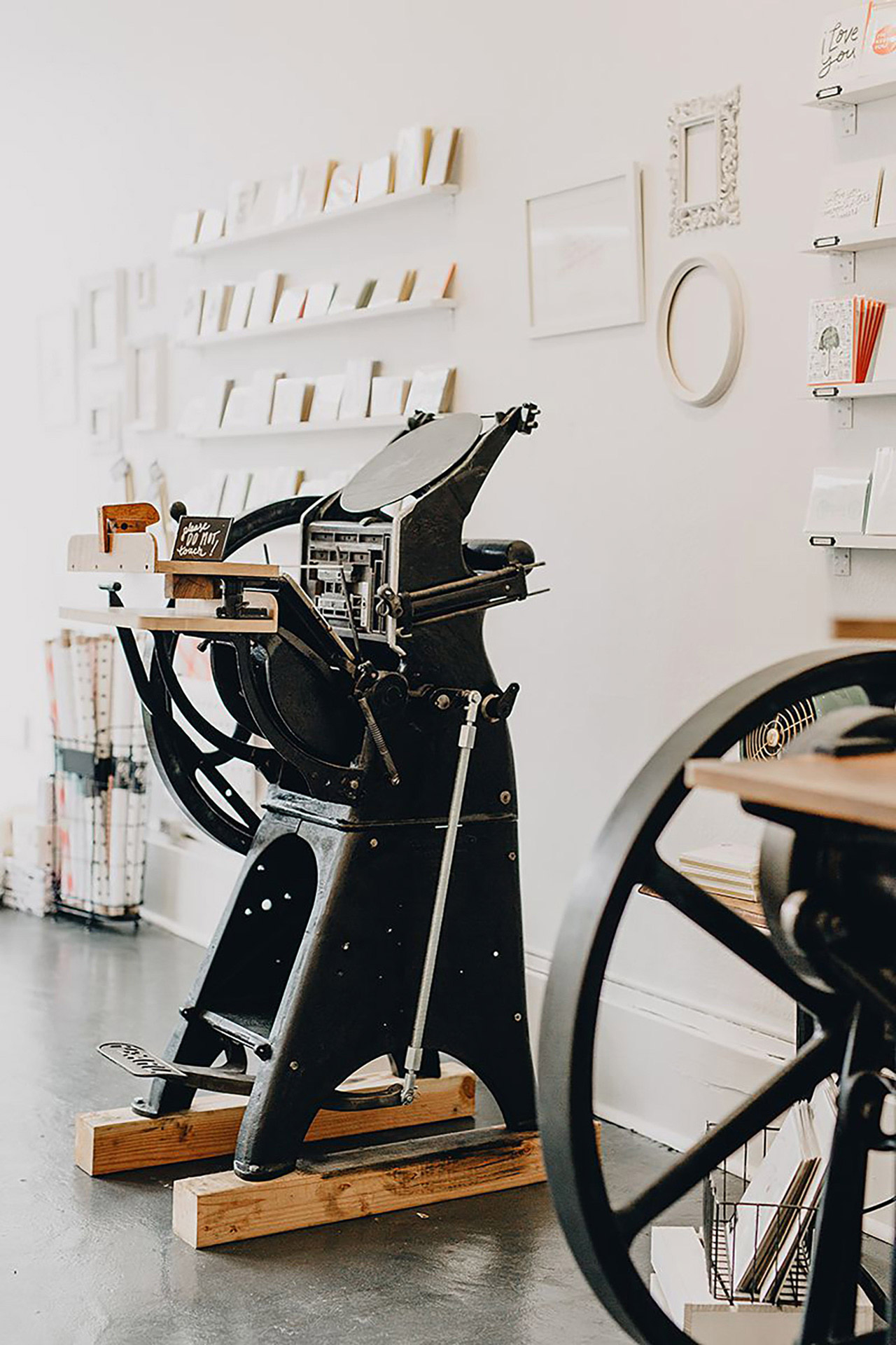
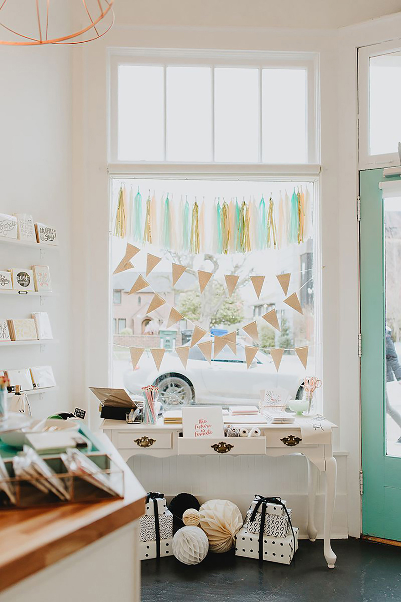
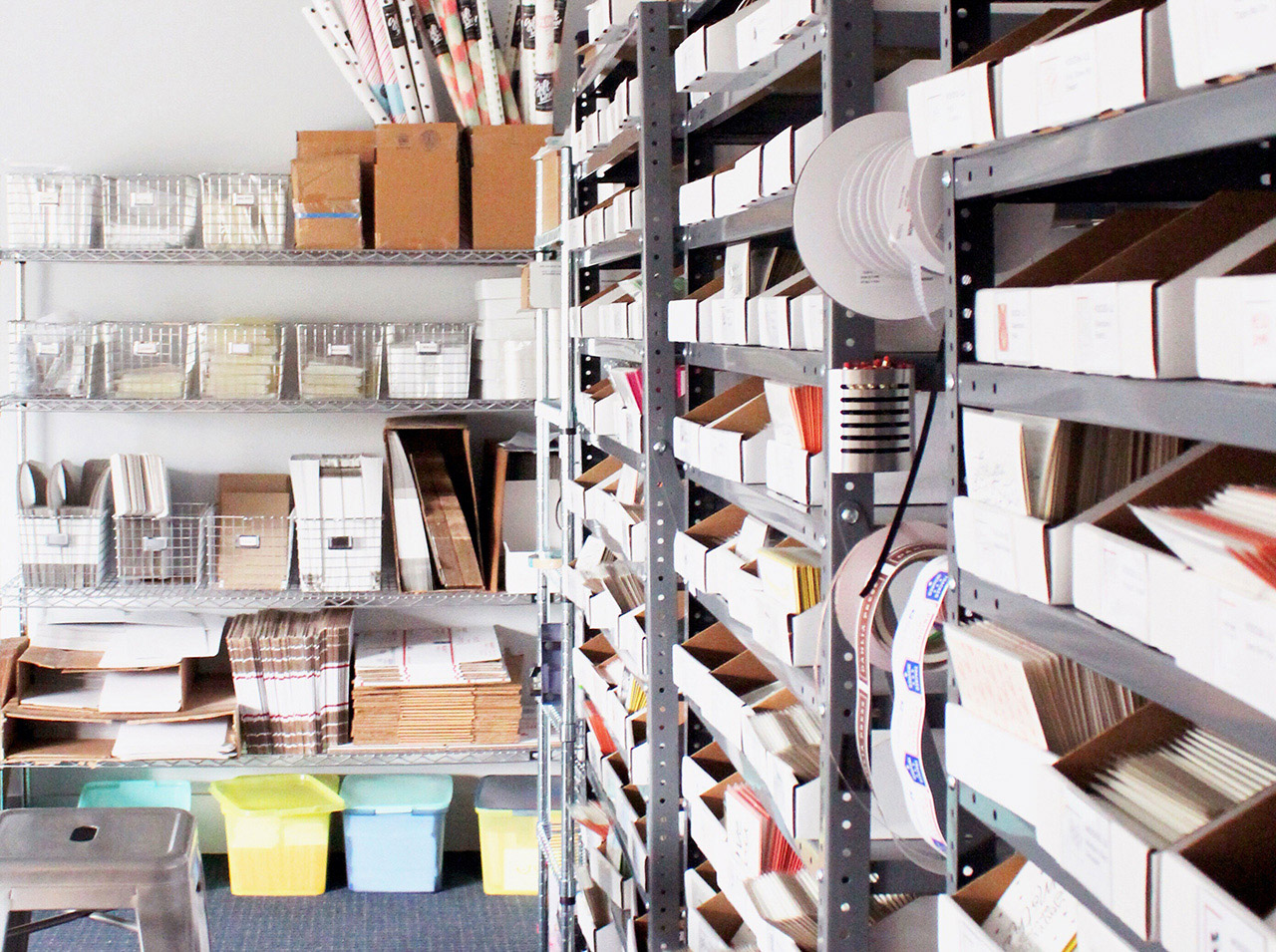
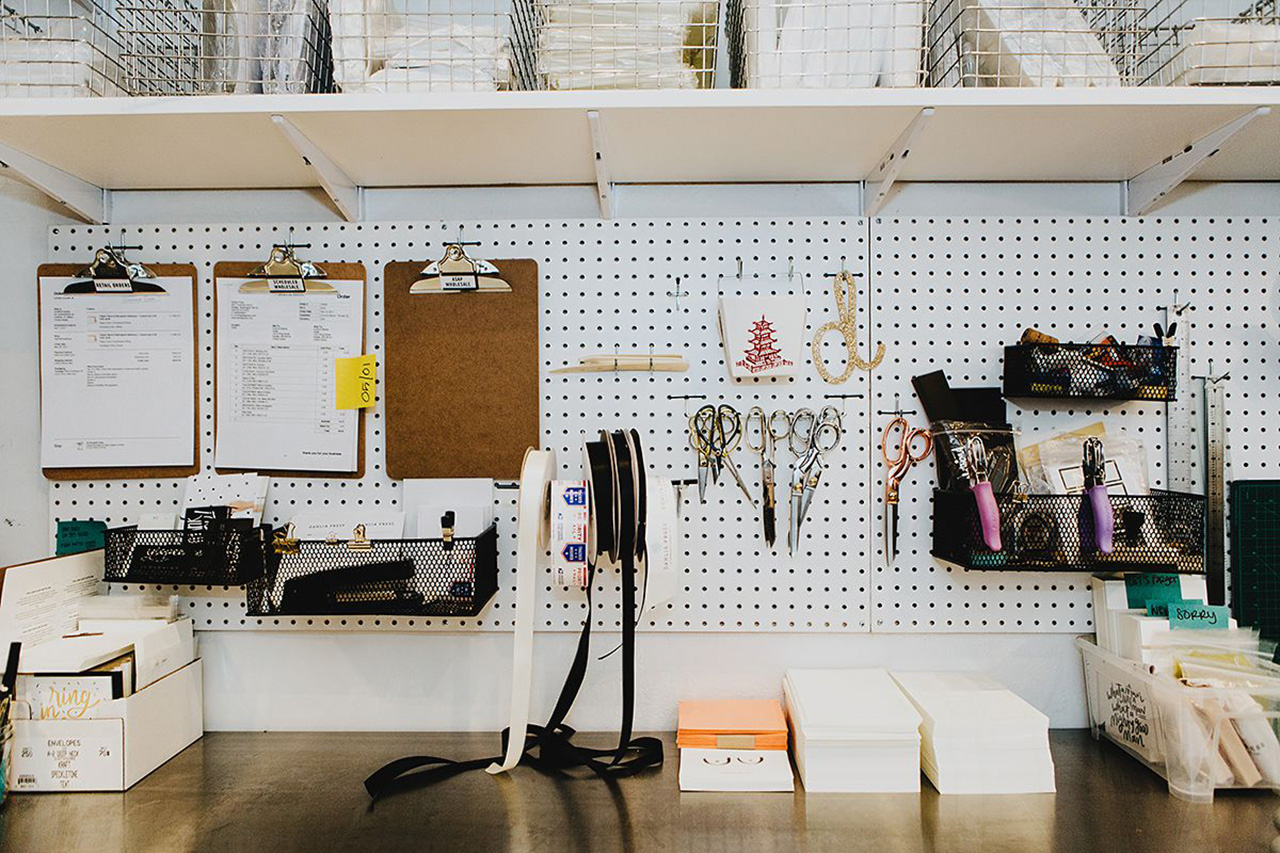
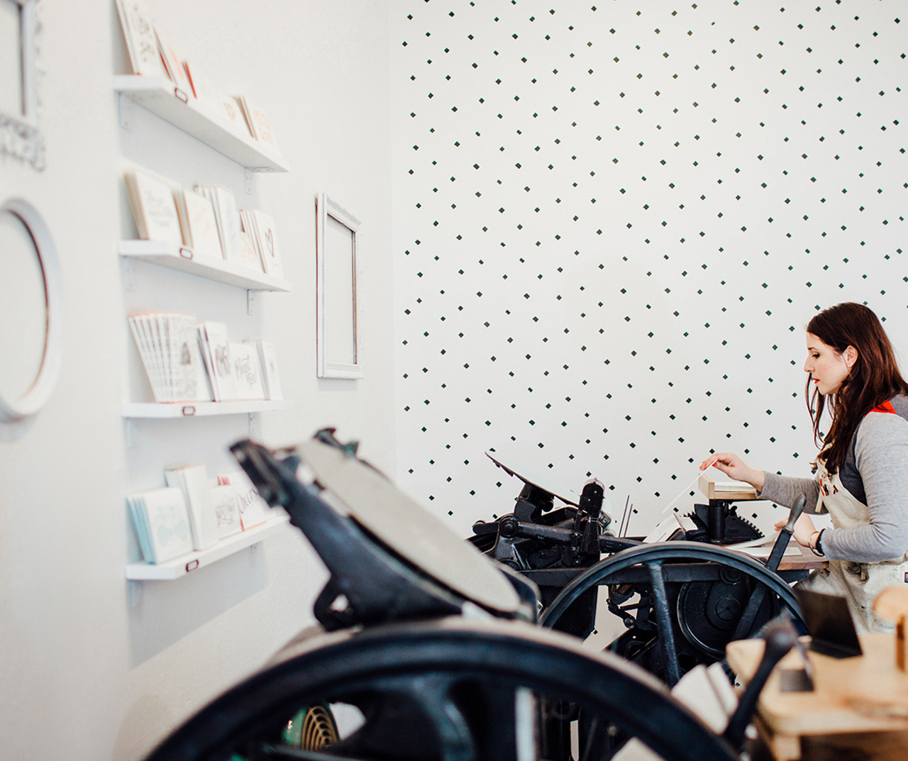
Shortly after we started our wholesale line and prepared to debut at the National Stationery Show, we outgrew the basement area. We were lucky enough to find an amazing brick and mortar space in Seattle’s Portage Bay neighborhood, where we have worked for the past 3 years. Our bright, sun-filled studio houses our three letterpress printing presses, a small retail area with a meeting counter for consultations with custom clients, work desks and a stock/shipping room in the back.
Behind the Stationery: Stephanie Clarke of Dahlia Press

Behind the Stationery: Stephanie Clarke of Dahlia Press

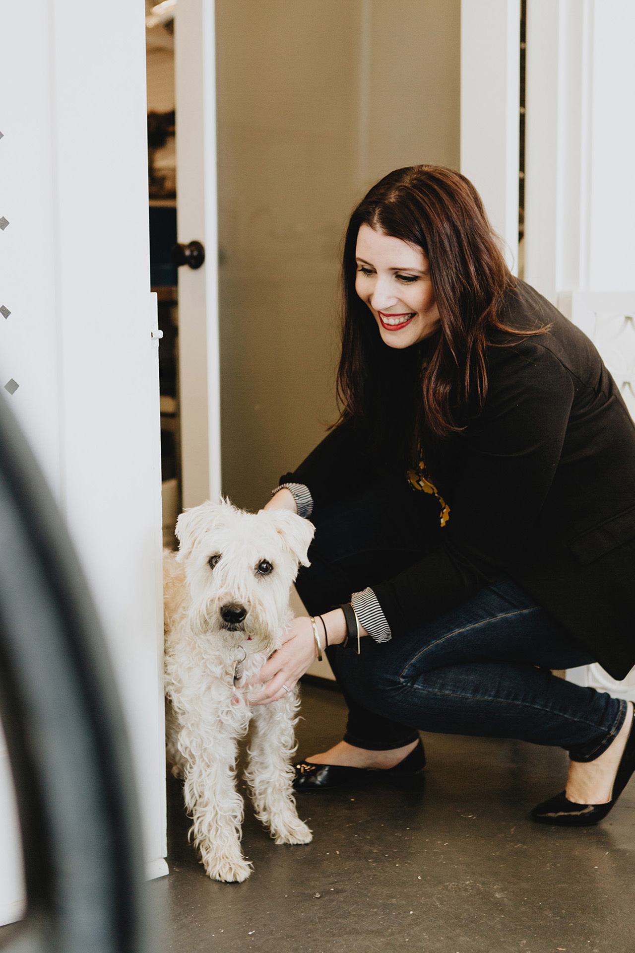
A typical work day starts with coffee and packing up the shop-dog Chloe to head to the studio. Once I arrive, normally around 9:30am, a second cup of coffee is poured and I check in with George (our press operator who also happens to be my older brother) to see what’s on our print list for the day. Emails are answered and I work with our team to fill orders in the back. I try to reserve the afternoon for tackling custom projects or writing quotes and sending invoices.
Behind the Stationery: Stephanie Clarke of Dahlia Press

Behind the Stationery: Stephanie Clarke of Dahlia Press

There’s always an ongoing list of items to do that normally consists of social media photos, mocking up new designs, editing art files, ordering supplies or packaging products. Around 6pm, I close up shop and pack up the dog to head home. Evenings are typically spent tackling whatever administrative tasks didn’t get done throughout the day, but occasionally I’ll use that time to sketch new concepts and ideas. It’s a labor of love, to say the least.
Behind the Stationery: Stephanie Clarke of Dahlia Press

Behind the Stationery: Stephanie Clarke of Dahlia Press

Depending on what I’m working on, the design and production process really varies. The process of designing our greeting card line always starts in a notebook. I’m an avid list maker, so I always have an ongoing list of phrases, ideas, sayings, and concepts jotted down. As much as I try to draw every day, there isn’t always time. If I have an initial idea, I’ll create a quick doodle or sketch in my notebook so I can come back to it later. For years, all of my lettering and illustrations were done on stacks and stacks of tracing paper using my favorite Micron or Tombow brush pens. Once the design was fine-tuned, I would scan it into Illustrator and prepare it for platemaking.
Behind the Stationery: Stephanie Clarke of Dahlia Press

Behind the Stationery: Stephanie Clarke of Dahlia Press

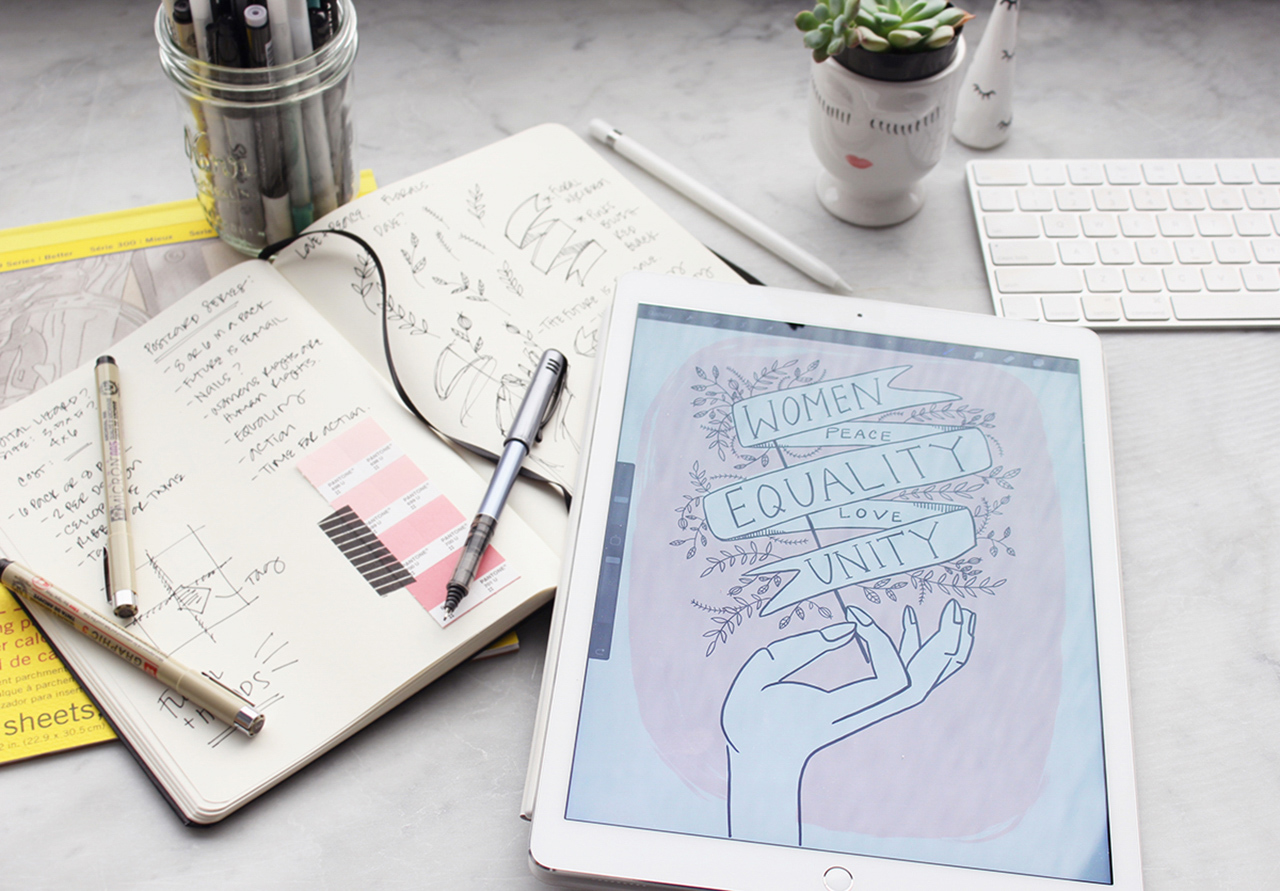
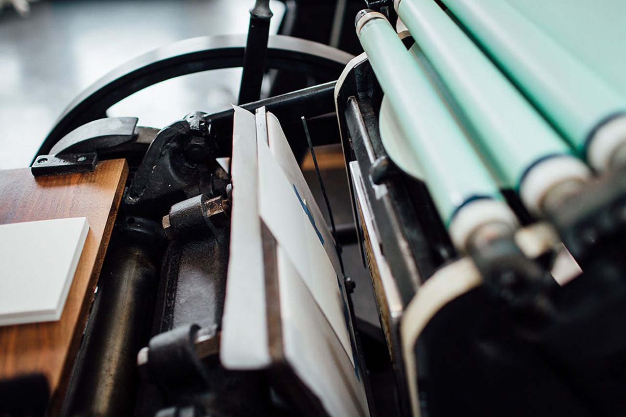
This past year my process changed slightly as I started experimenting with drawing software on my iPad Pro. Today I rarely use pens (although for finer details, it’s still preferred), and the majority of my drawings are done directly on the iPad. I then AirDrop the file to my computer and prep the file for the plate-making process. This change has shaved off hours of time, not to mention ink and paper! Once the plates arrive from the platemakers, we mix ink by hand and prep Ruby (our 1926 Chandler and Price press) for printing. My favorite moment is when that first print comes off the press. It’s so satisfying to see a design come to life and to feel that one of a kind impression.
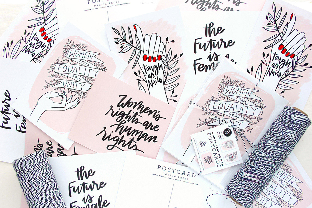
Behind the Stationery: Stephanie Clarke of Dahlia Press

The process of working with our custom clients is a little more extensive. It always starts with a consultation (hopefully in person, but often over the phone too) where I get the all the details of their event and their overall vision. After the administrative details are worked out (quotes and contracts), we pull samples and swatches and start initial sketches of the design concept. Those sketches turn into a digitally mocked-up design, which we send to the client for review. We’ll go through a series of revisions and once the final design is approved, we finalize the art files and prep them for printing.
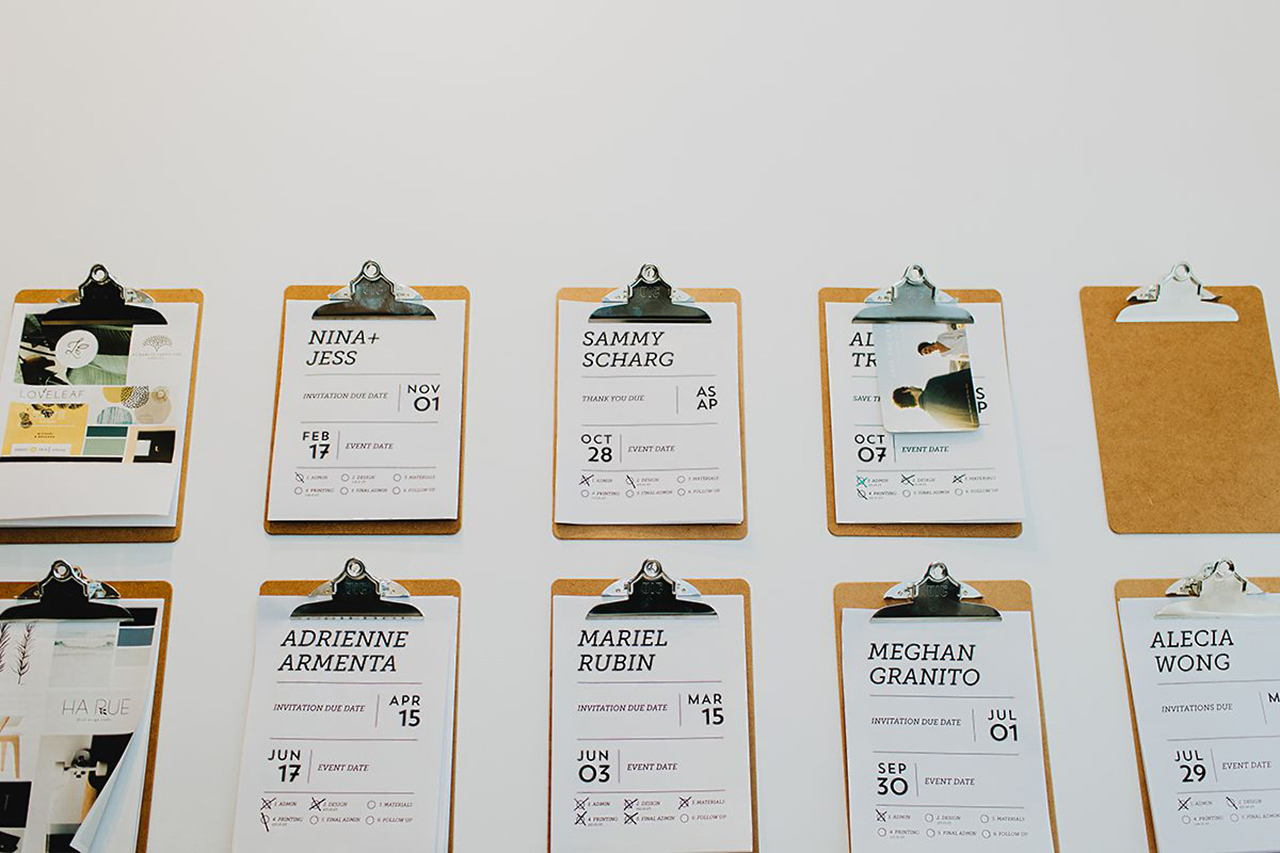
Behind the Stationery: Stephanie Clarke of Dahlia Press

As we print all of our greetings in house, we’ve relied on a list of trusted vendors to help us when it comes to printing our custom projects. They offer additional services such as foil stamping and die cutting, which allows us to expand our list of offerings and frees up our schedule to work on more projects.
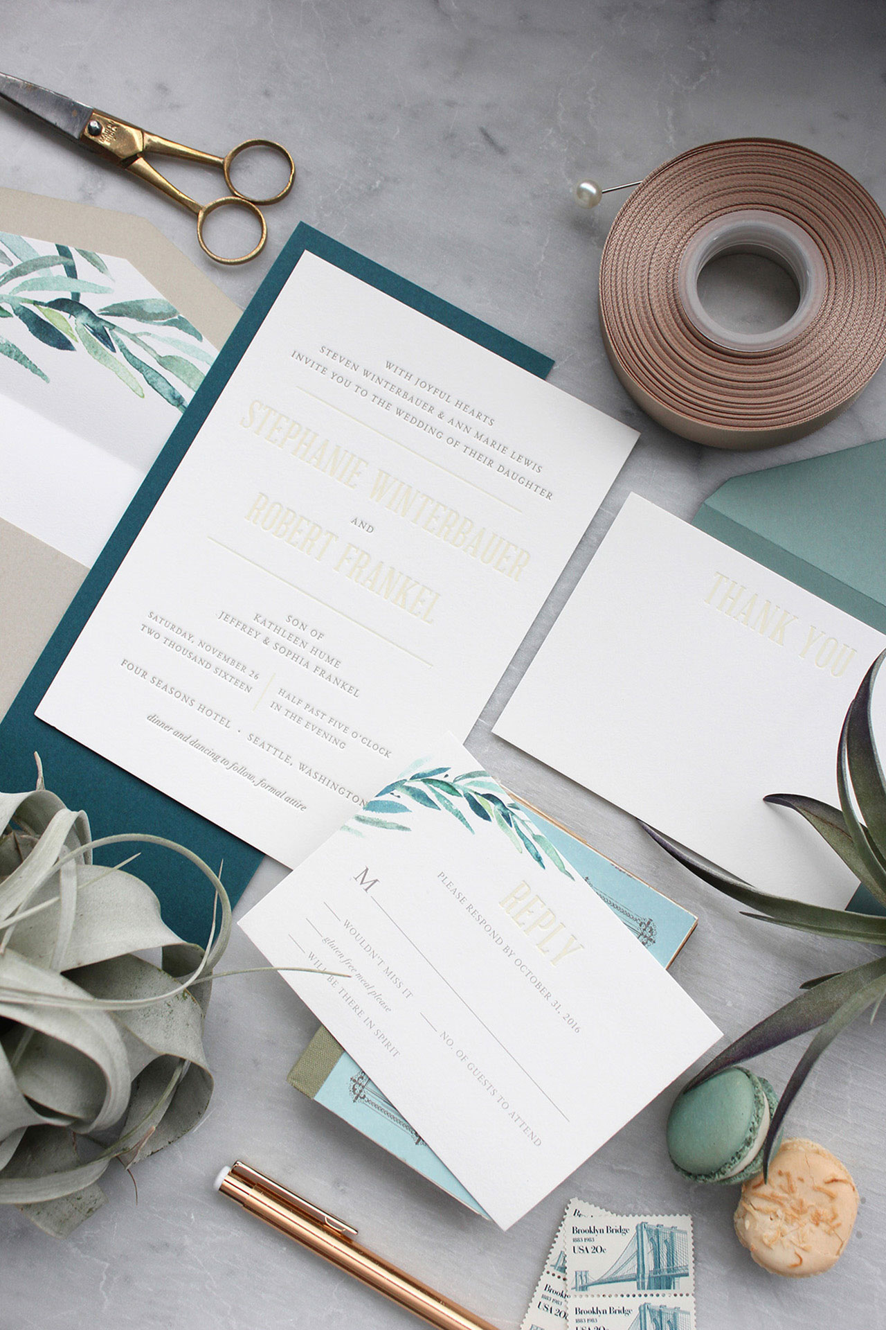
Behind the Stationery: Stephanie Clarke of Dahlia Press

Studio images are by Krista Welch Creative. All other photos are by Dahlia Press.

Want to be featured in the Behind the Stationery column? Reach out to Megan at megan [at] ohsobeautifulpaper [dot] com for more details.
Ten Awesome Engagement Cards

Anyone have a friend or family member that recently became engaged? If so, this round up is for you! Before your friend kicks into high gear on planning the wedding, sit down with a pen and one of these ten awesome engagement cards, and write a note telling your friend just how happy you are for her (or him!). The cards below are all on the sweet and sentimental side – so you really can’t go wrong with any of the cards below! – and I’m thinking we’ll do a round up of funny and snarky engagement cards for our next round up!

Ten Awesome Engagement Cards

From top right:

1. Any Bachelor/Bachelorette fans out there?? Celebrate a recent engagement with this red rose card with gold foil text by illustrator Danielle Kroll for Red Cap Cards

2. The cutest illustrated engagement card with a pop of holographic foil for the engagement ring from Idlewild Co. !

3. A modern, colorblocked watercolor engagement card with playful gold foil dots from Antiquaria

4. Vibrant pink watercolor and a dash of gold foil for this sweet lobster engagement card by E. Frances Paper

5. Mint green and gold are a perfect combination! Loving the painterly design with gold foil text from Ramona & Ruth 

6. So stoked! Truer words have never been spoken in this multi-purpose congratulations card from Australian duo Fox & Fallow 

7. How cute is this pear shaped pop-up honeycomb engagement card from Inklings Paperie??

8. The perfect engagement congratulations card to send to the happy lovebirds from Our Heiday 

9. The sweetest message in beautiful calligraphy text from new stationer Little Well Paper Co. 

10.  I absolutely love the collage vibe of this modern abstract engagement card by Moglea


p.s. Ten more engagement congratulations cards and wedding congratulations cards
Modern & Creative Save the Date Ideas

Any recently engaged couples out there?? Choosing a save the date is probably one of the first decisions you’ll make for your wedding! Save the dates can reveal a lot about your wedding, so it’s important to choose wisely. Will your wedding be casual or formal? Is it in the mountains or by the beach? Your save the dates should reflect the type of wedding you plan to have. And since there aren’t as many rules for save the dates as for the formal invitation, you have more freedom to play around with the design. So have fun and don’t be afraid to think outside the box! Here are a few modern and creative save the date ideas to get you started! – Annie

Wedding Stationery Inspiration: Modern & Creative Save the Date Ideas / Oh So Beautiful Paper

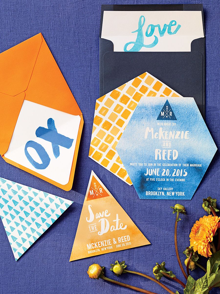
Love the bright splash of color in these modern watercolor save the dates! | Photography: Philip Ficks, Stationery: Swiss Cottage Designs via The Knot

Wedding Stationery Inspiration: Modern & Creative Save the Date Ideas / Oh So Beautiful Paper

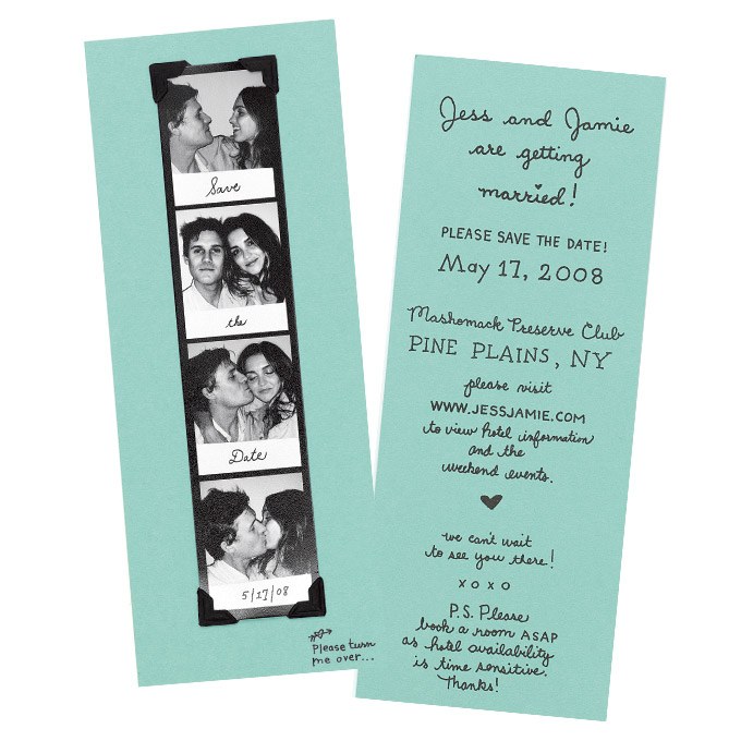
The photo booth strip and handwritten text add a personal touch. | Stationery: Bird and Banner via Brides

Wedding Stationery Inspiration: Modern & Creative Save the Date Ideas / Oh So Beautiful Paper

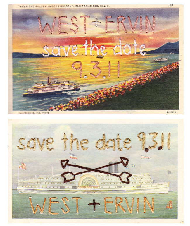
Obsessed with these embroidered vintage postcards! | Embroidery: Sarah West Ervin via Green Wedding Shoes

Wedding Stationery Inspiration: Modern & Creative Save the Date Ideas / Oh So Beautiful Paper

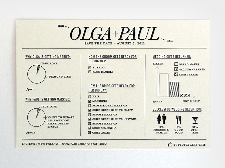
Feel free to play around with unique wording! This infographic save the date makes me wish I was invited. | Stationery: Natalie Grosner via Natalie Grosner

Wedding Stationery Inspiration: Modern & Creative Save the Date Ideas / Oh So Beautiful Paper

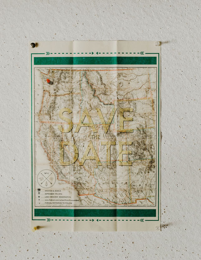
Feeling inspired by the geographic location of your wedding? Go with a map save the date! I’d hang this map save the date on my wall! | Photography: Phil Chester via Green Wedding Shoes

Wedding Stationery Inspiration: Modern & Creative Save the Date Ideas / Oh So Beautiful Paper

How fun is this pinwheel design?! | Photography: Christa-Taylor, Stationery: Tie That Binds via Style Me Pretty

Wedding Stationery Inspiration: Modern & Creative Save the Date Ideas / Oh So Beautiful Paper

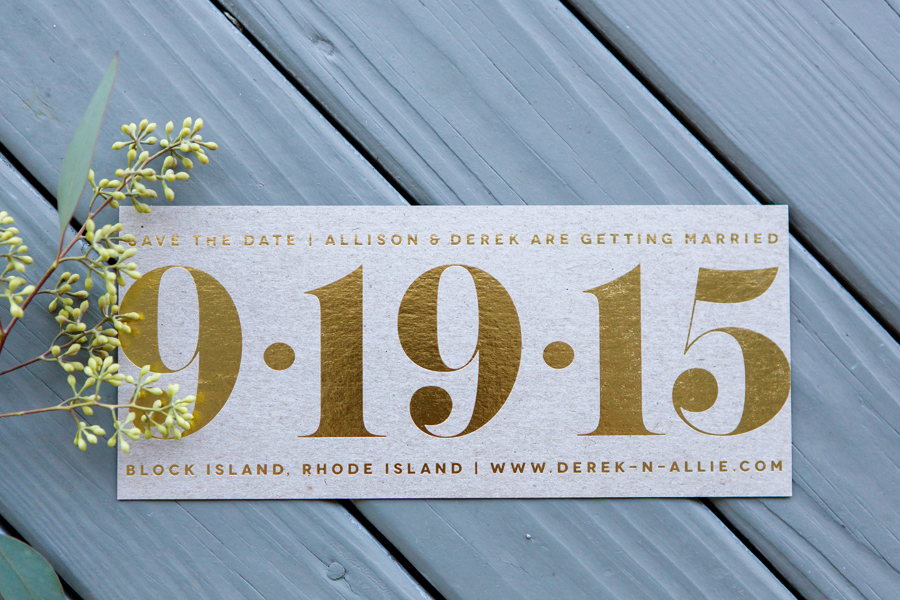
You can never go wrong with gold foil and bold type. | Photography: Ryon:Lockhart Photography, Stationery: Allison Rhodes Designs via Style Me Pretty

Wedding Stationery Inspiration: Modern & Creative Save the Date Ideas / Oh So Beautiful Paper

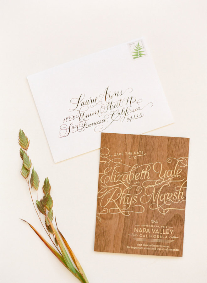
The combination of wood and gold calligraphy is stunning. | Photography: KT Merry Photography, Stationery: Anticipate Invitations, Calligraphy: Curlicue Designs Calligraphy via Style Me Pretty

Wedding Stationery Inspiration: Modern & Creative Save the Date Ideas / Oh So Beautiful Paper

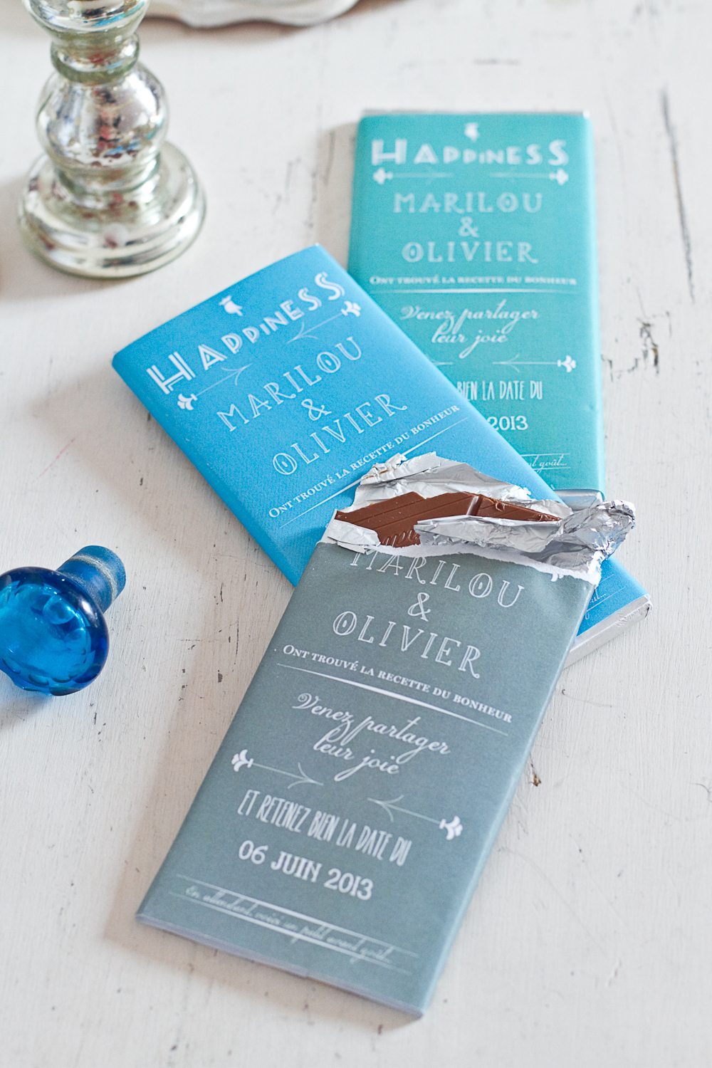
Has anyone ever said no to chocolate? | via Un Beau Jour

Wedding Stationery Inspiration: Modern & Creative Save the Date Ideas / Oh So Beautiful Paper

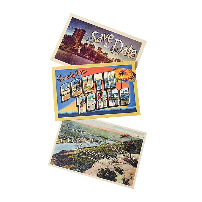
Give your guests a sneak peek at the wedding destination with postcards. You can even order a custom rubber stamp with your details to add all your information on the back. (And you’ll save money on stamps.) | Photography: Patricia Heal via Brides

Wedding Stationery Inspiration: Modern & Creative Save the Date Ideas / Oh So Beautiful Paper

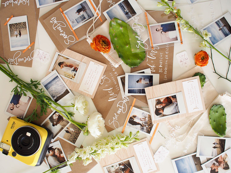
All you need is a Polaroid camera to make these cute DIY save the dates! | Calligraphy: A Fabulous Fete via 100 Layer Cake

Wedding Stationery Inspiration: Modern & Creative Save the Date Ideas / Oh So Beautiful Paper

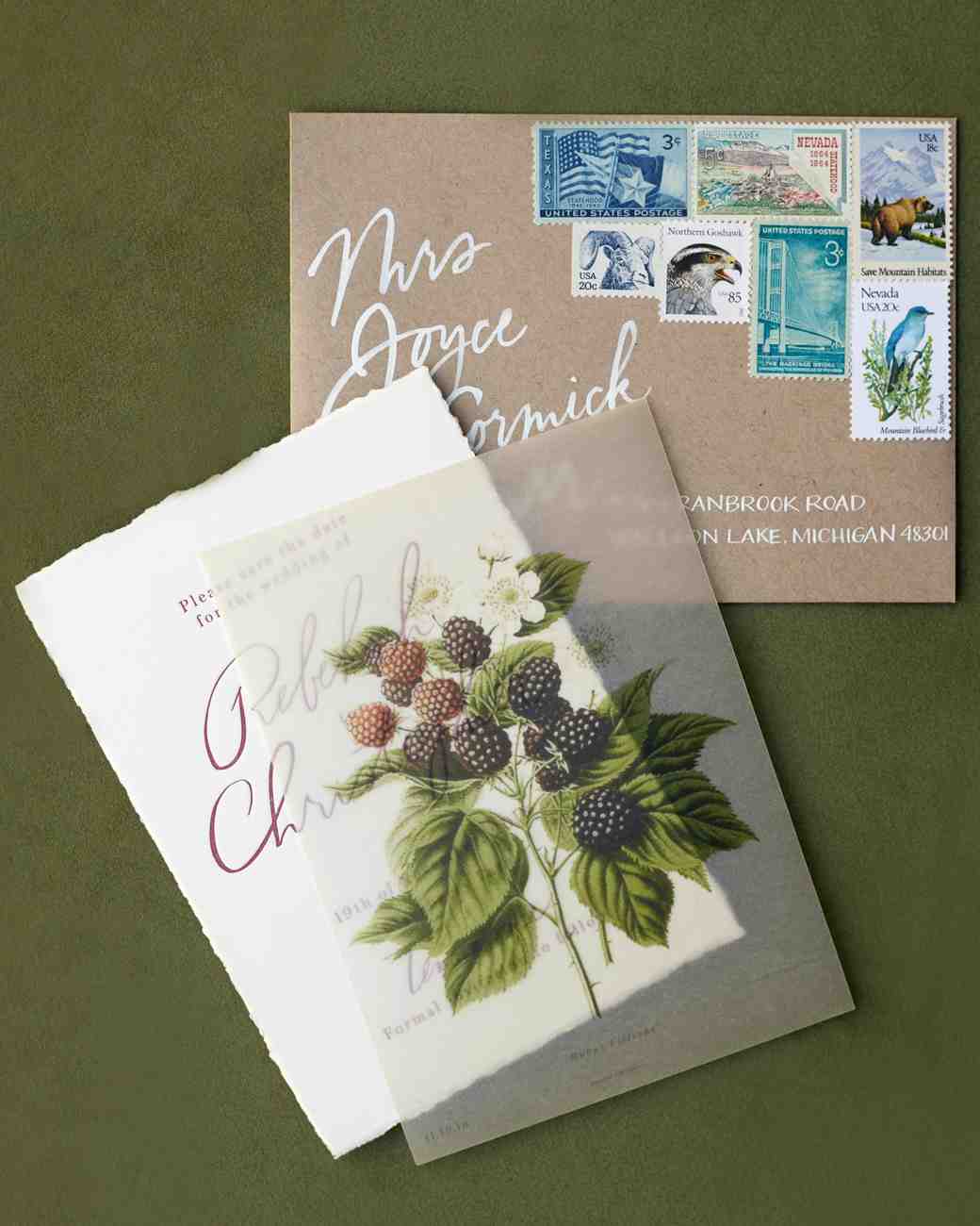
The sheet of vellum adds an elegant touch to an already gorgeous save the date. | Photography: Jose Villa, Stationery: Amber Moon Designs, Calligraphy: Anne Robin via Martha Stewart Weddings

You can find more wedding invitation and save the date inspiration in our real invitations gallery right here!

Black and White Calligraphy and Watercolor Wedding Invitations

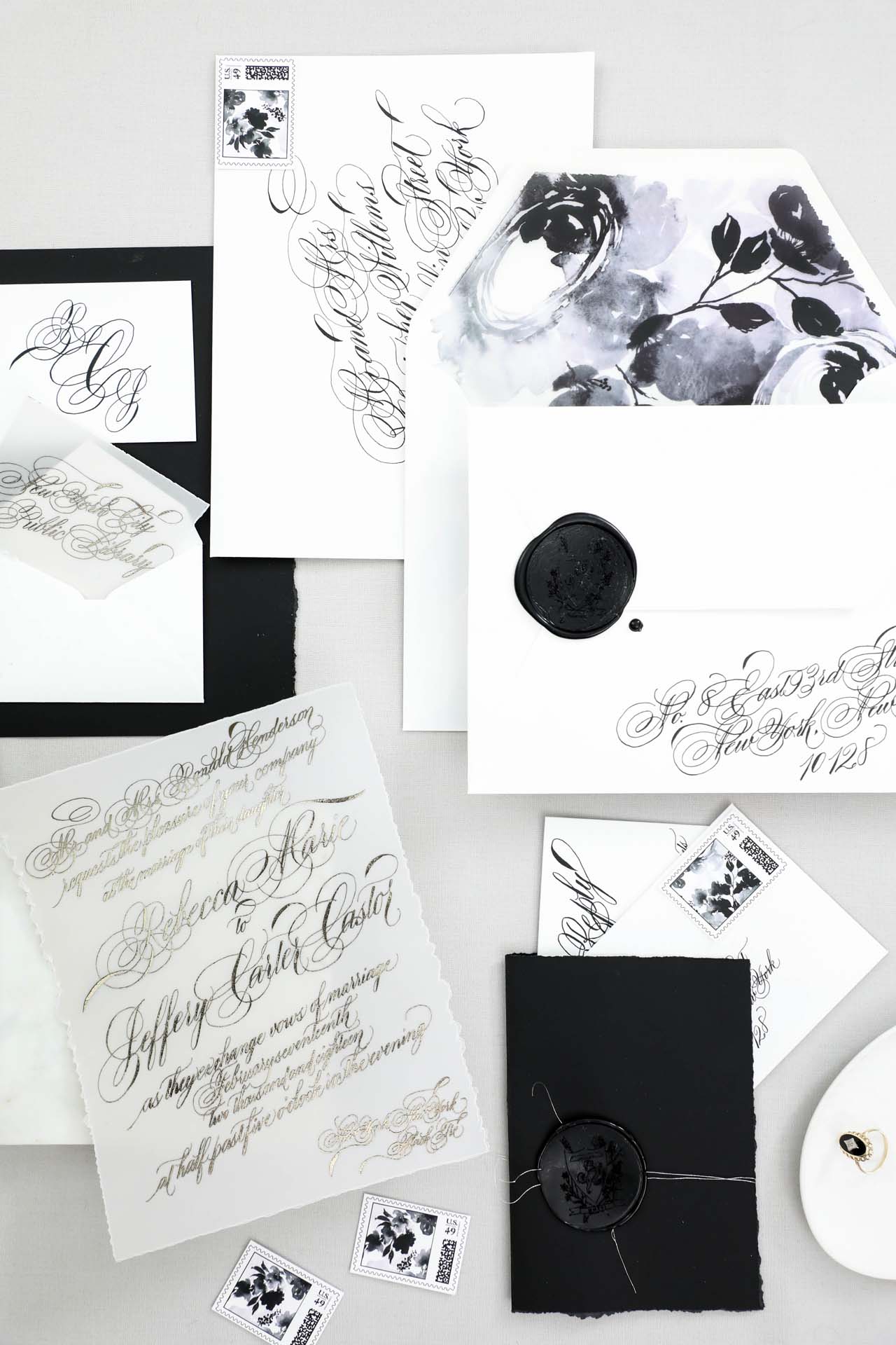
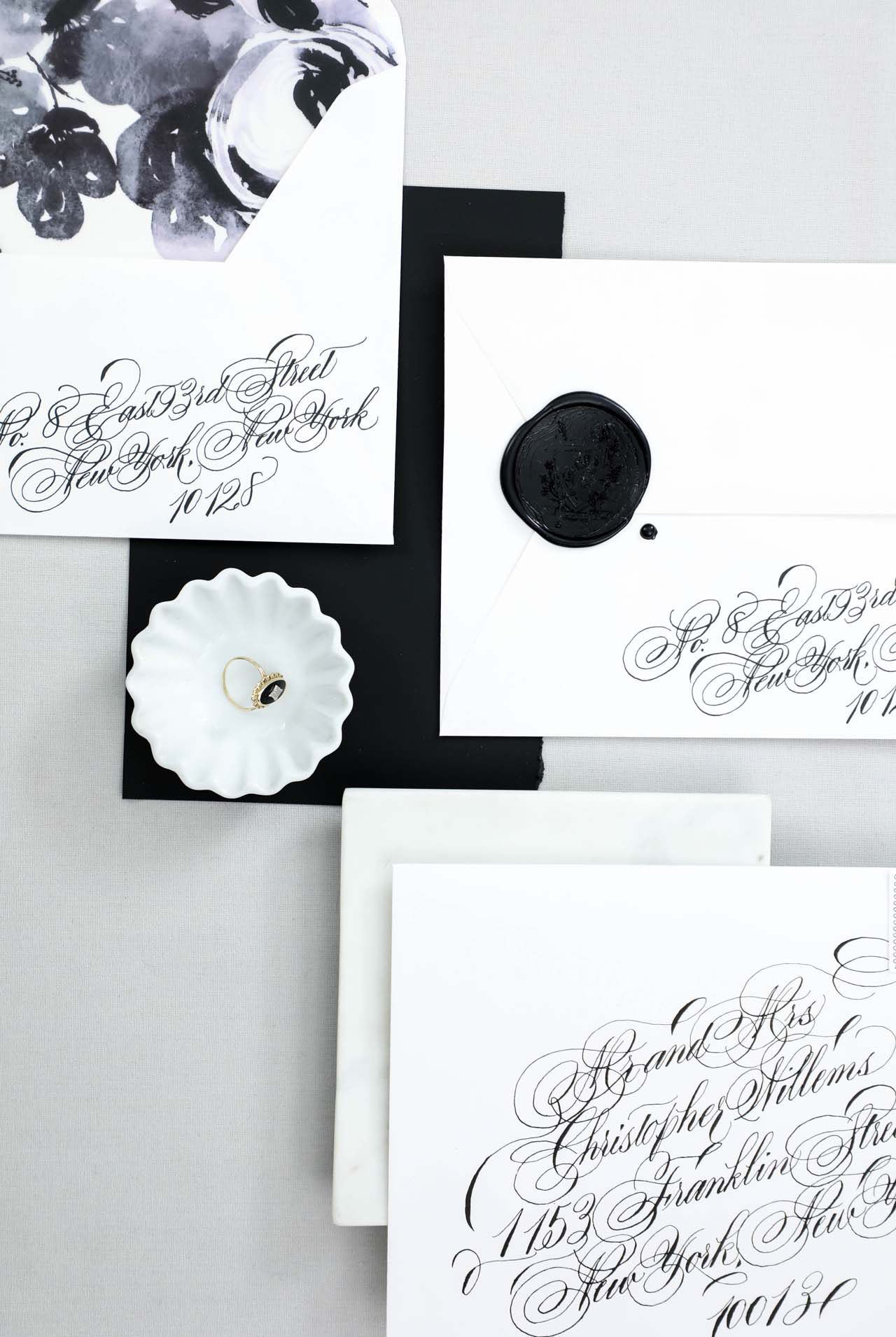
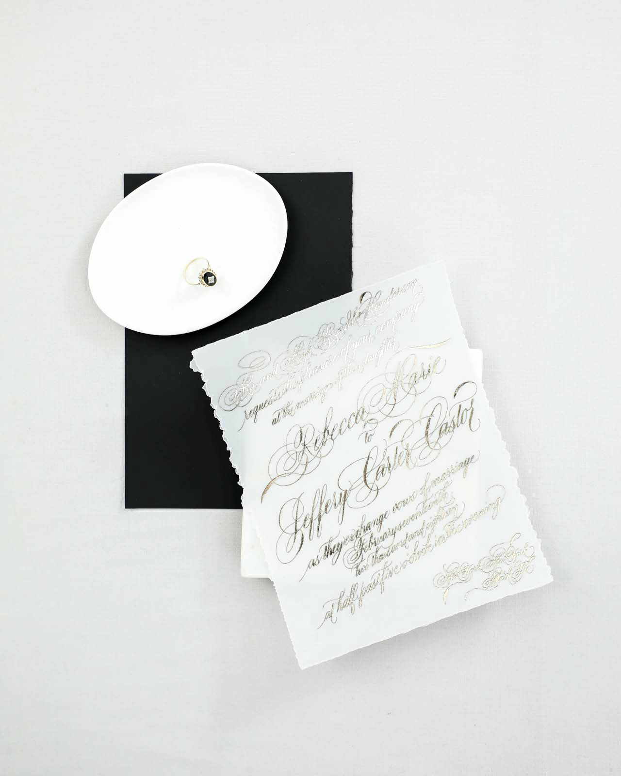
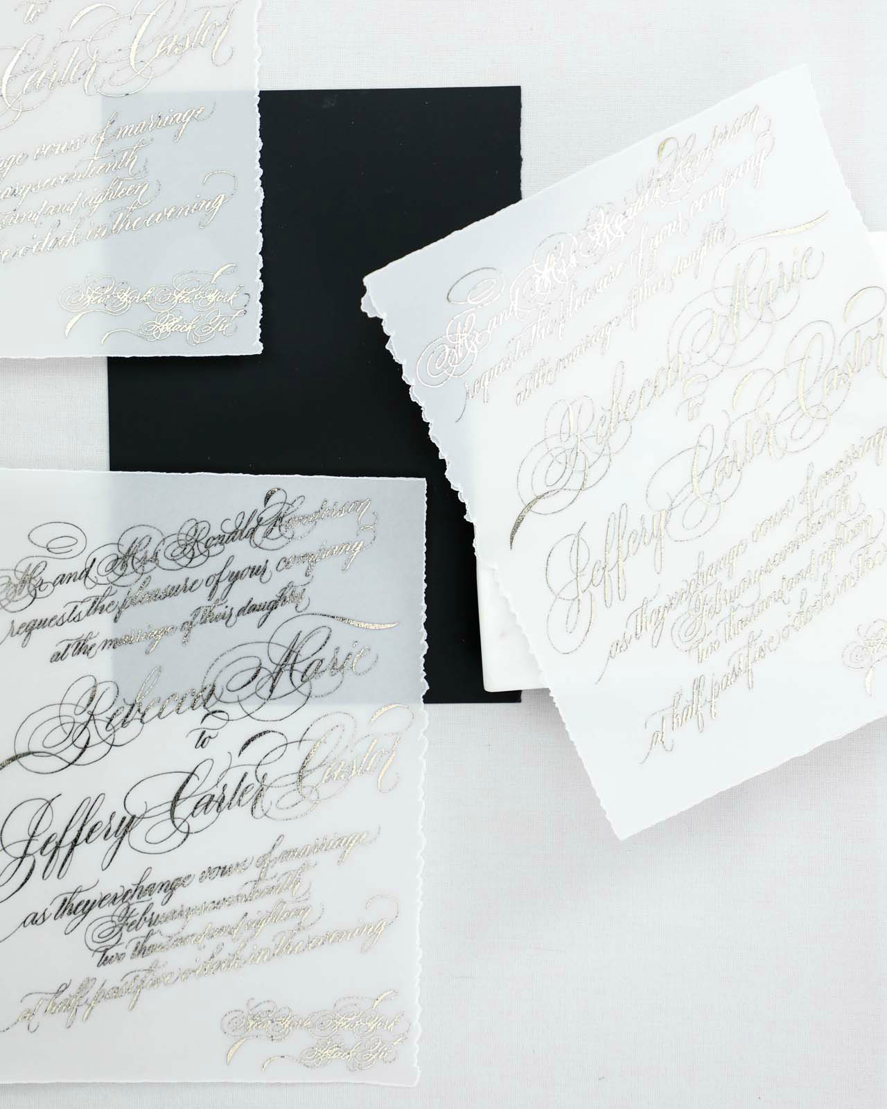
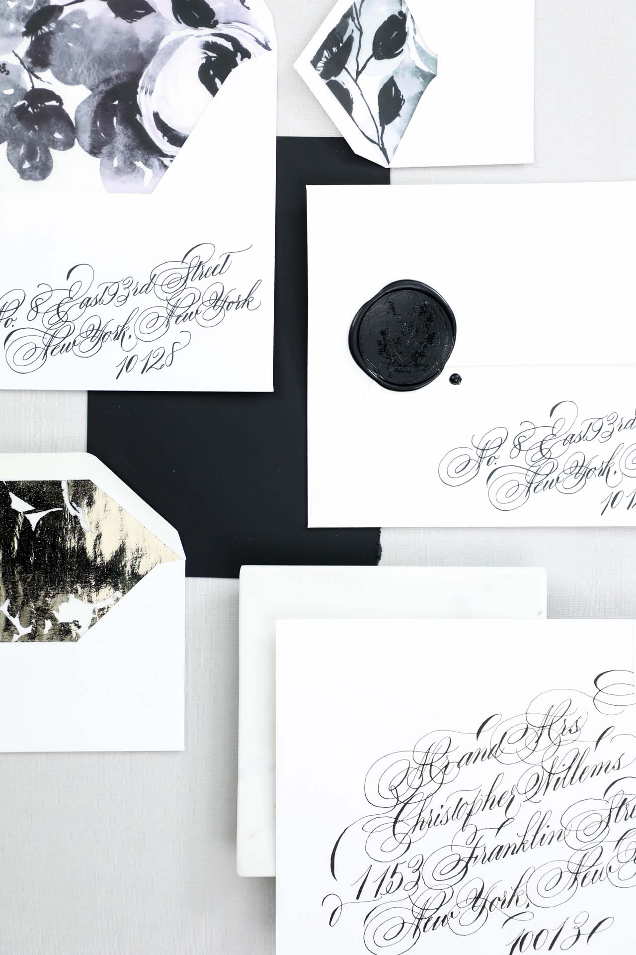
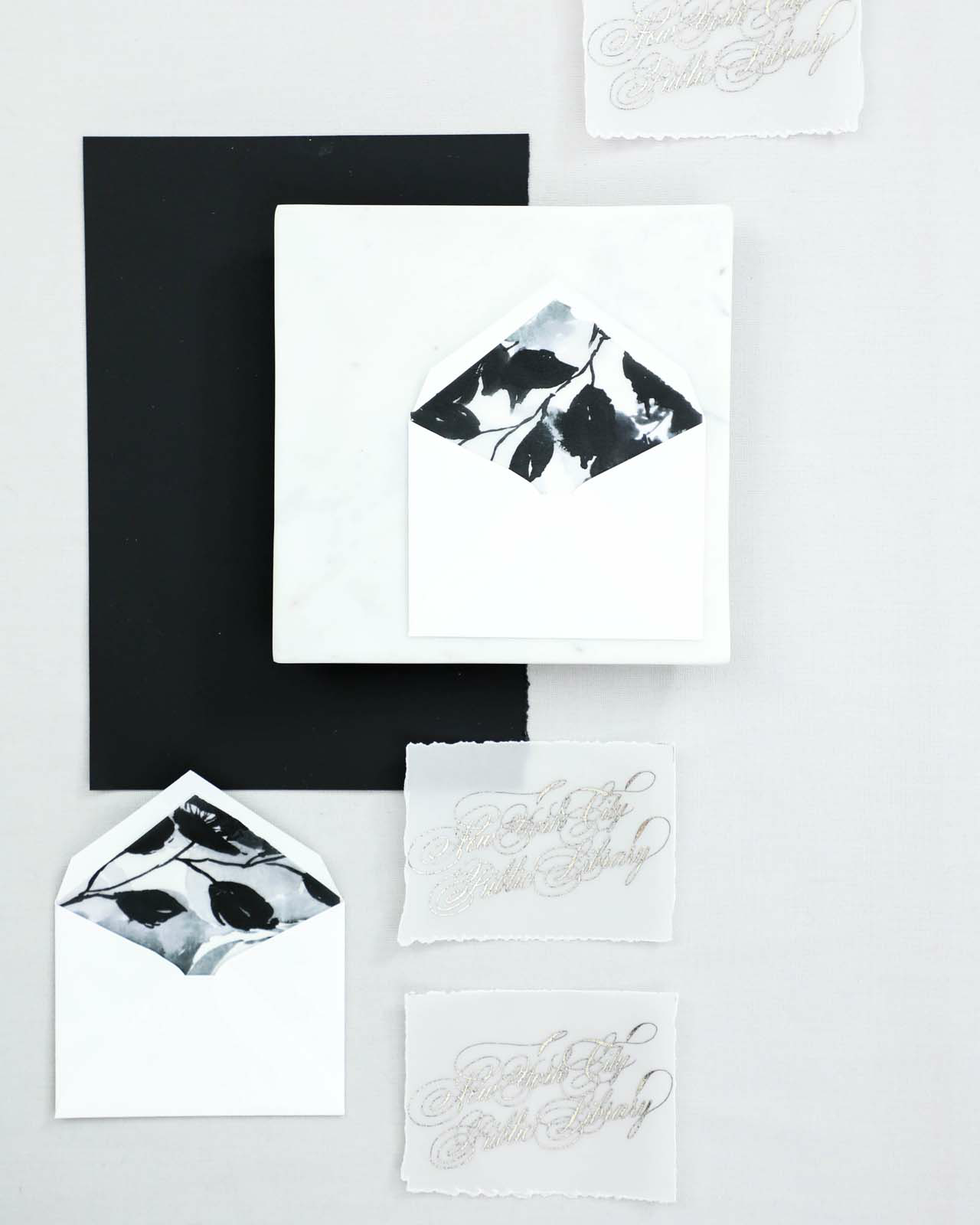
Black and white is a classic combination any time of year – but the high contrast feels especially dramatic in the winter, don’t you think? Victoria of Design House of Moira sent over these black and white calligraphy and watercolor wedding invitations, with flourished calligraphy text in stunning platinum foil on vellum, monochromatic watercolor floral details in the envelope liners, and a super dramatic 2 inch black wax seal. Just gorgeous for a black tie winter wedding!

Black and White Calligraphy and Watercolor Wedding Invitations by Design House of Moira

From Victoria: Winter weddings are often a palette cleanser after the spring and summer filled with pale blushes and French blues. I loved working with Rebecca on her winter wedding, which was held at the New York City Public Library. With hopes for snow on her wedding day, along with the neutral backdrop of the library, she chose a monochromatic palette of black and white with an accent of platinum foil for her wedding day. A true black tie wedding, her bridesmaids were in black gowns and the groomsmen in custom tuxedos.

Black and White Calligraphy and Watercolor Wedding Invitations by Design House of Moira

Black and White Calligraphy and Watercolor Wedding Invitations by Design House of Moira

With each bride we work with, the paper selection is such an important step in our creative process. For Rebecca, we suggested using a heavy weight vellum for her main invitation to reflect the semi-transparency of the snow she loves so much and her engagement ring of onyx and diamonds. Her entire suite was hand calligraphed and printed in platinum and black foil with some serious flourishing and formality throughout. All the calligraphy was designed diagonally across each piece.

Black and White Calligraphy and Watercolor Wedding Invitations by Design House of Moira

Black and White Calligraphy and Watercolor Wedding Invitations by Design House of Moira

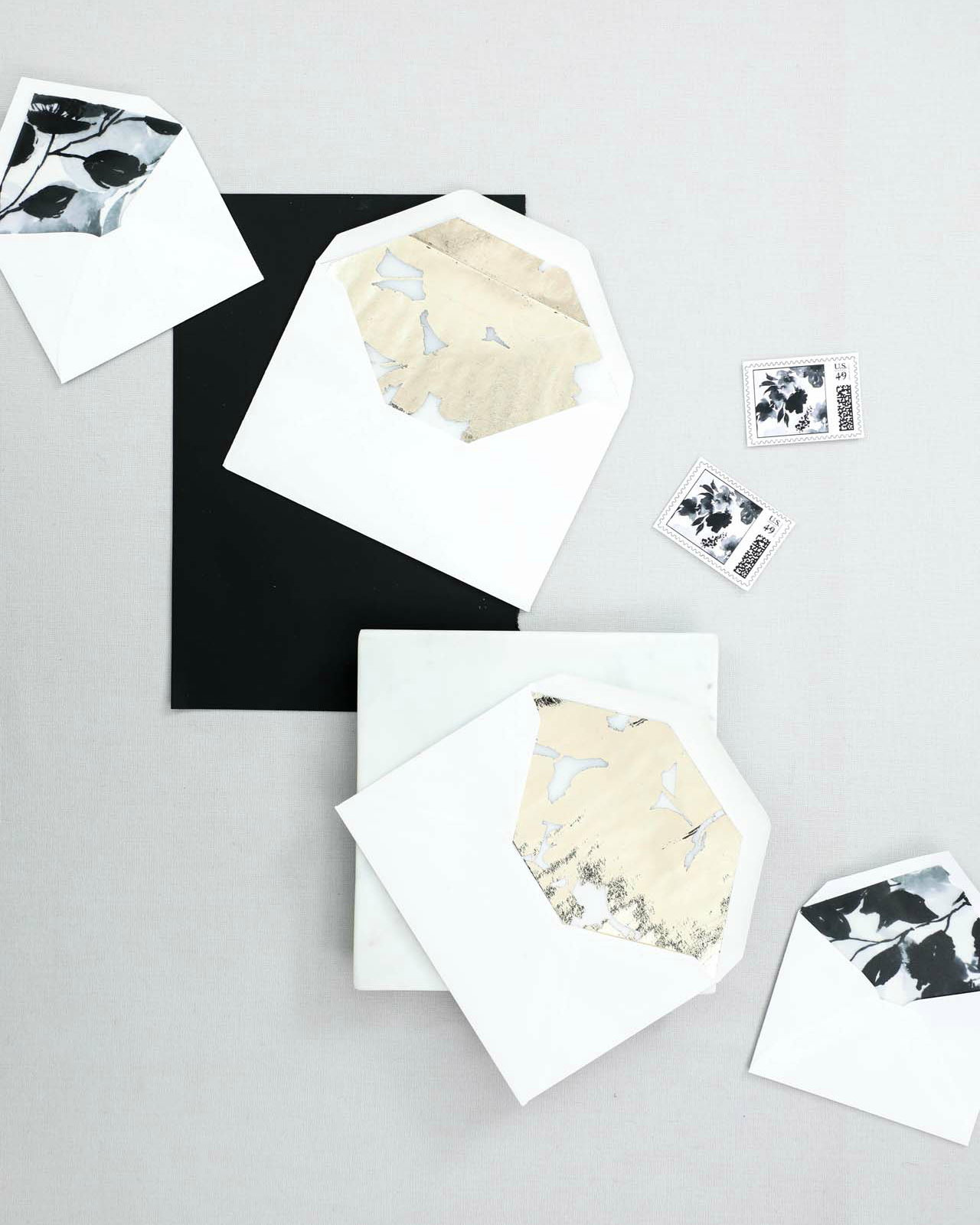
The bride really loved all the artwork we create here at Design House of Moira, but was concerned that she would have to forgo watercolor details for her suite due to her limited color range. We suggested a monochromatic watercolor piece created entirely in black for her and we lined her mailing envelopes with the pattern. Her reply envelopes were lined with a heavy foil pattern created from the positive and negative space of her floral artwork.

Black and White Calligraphy and Watercolor Wedding Invitations by Design House of Moira

Black and White Calligraphy and Watercolor Wedding Invitations by Design House of Moira

The final suite included her invitation printed on vellum, the reply card printed in black foil on cotton paper, and her small reception card, printed in platinum foil on vellum and tucked into a tiny envelope for an added detail. The smaller pieces of the suite were bound in a remarkably smooth paper in the blackest of blacks, tied with metallic thread, and sealed with a custom 2″ black wax seal.

Her envelopes were all lined in her pattern, the back bore her return address in calligraphy and a wax seal sealed the envelope. Each envelope was hand addressed with matching calligraphy in black ink. The suite was finished off with two custom postage stamps designed with her artwork.

Black and White Calligraphy and Watercolor Wedding Invitations by Design House of Moira

Black and White Calligraphy and Watercolor Wedding Invitations by Design House of Moira

Thanks Victoria!

Design & Calligraphy: Design House of Moira
Foil Printing: Viking Printing 

Check out the Designer Rolodex for more tal­ented wed­ding invi­ta­tion design­ers and the real invi­ta­tions gallery for more wedding invitation ideas!

Photo Credits: Design House of Moira