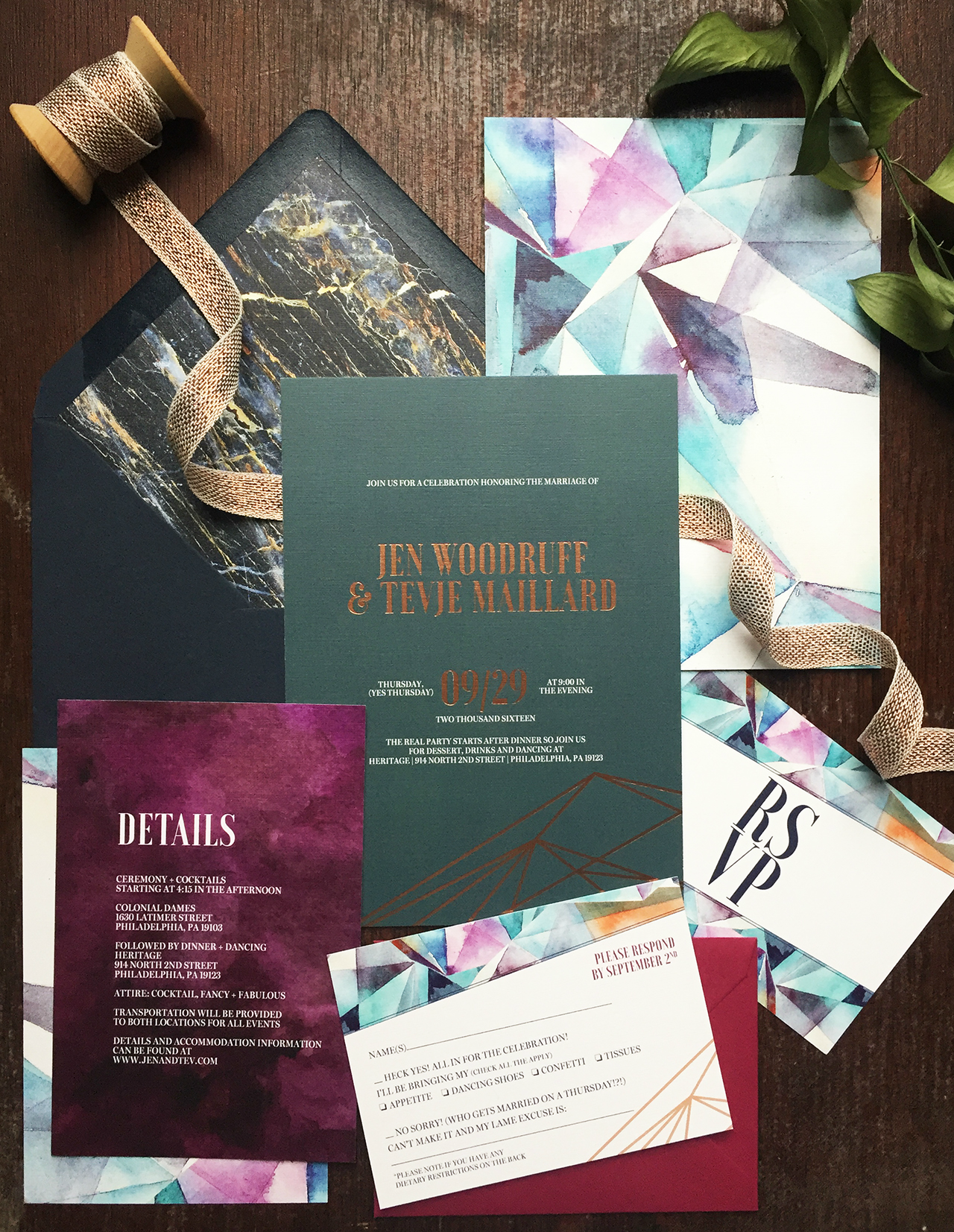
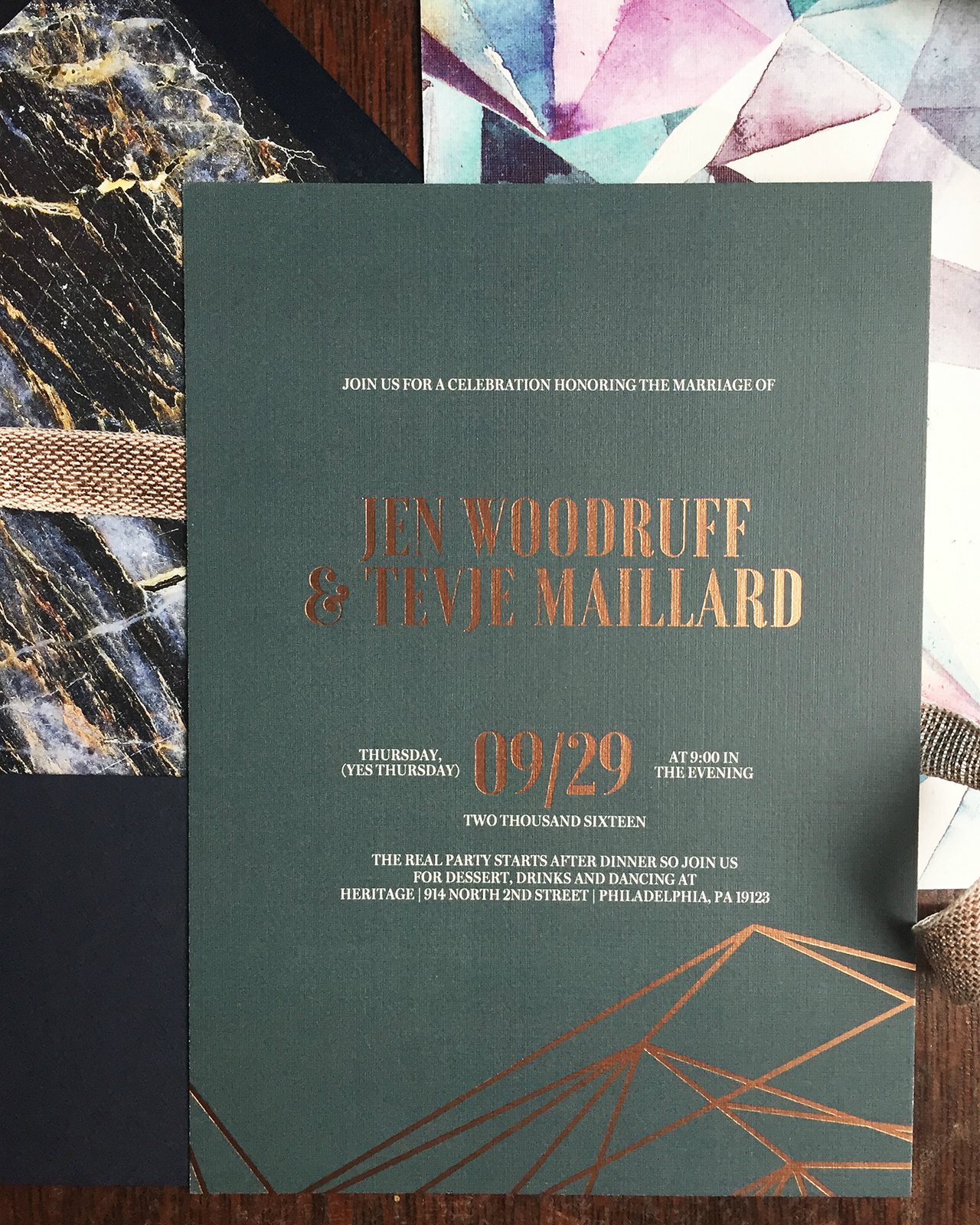
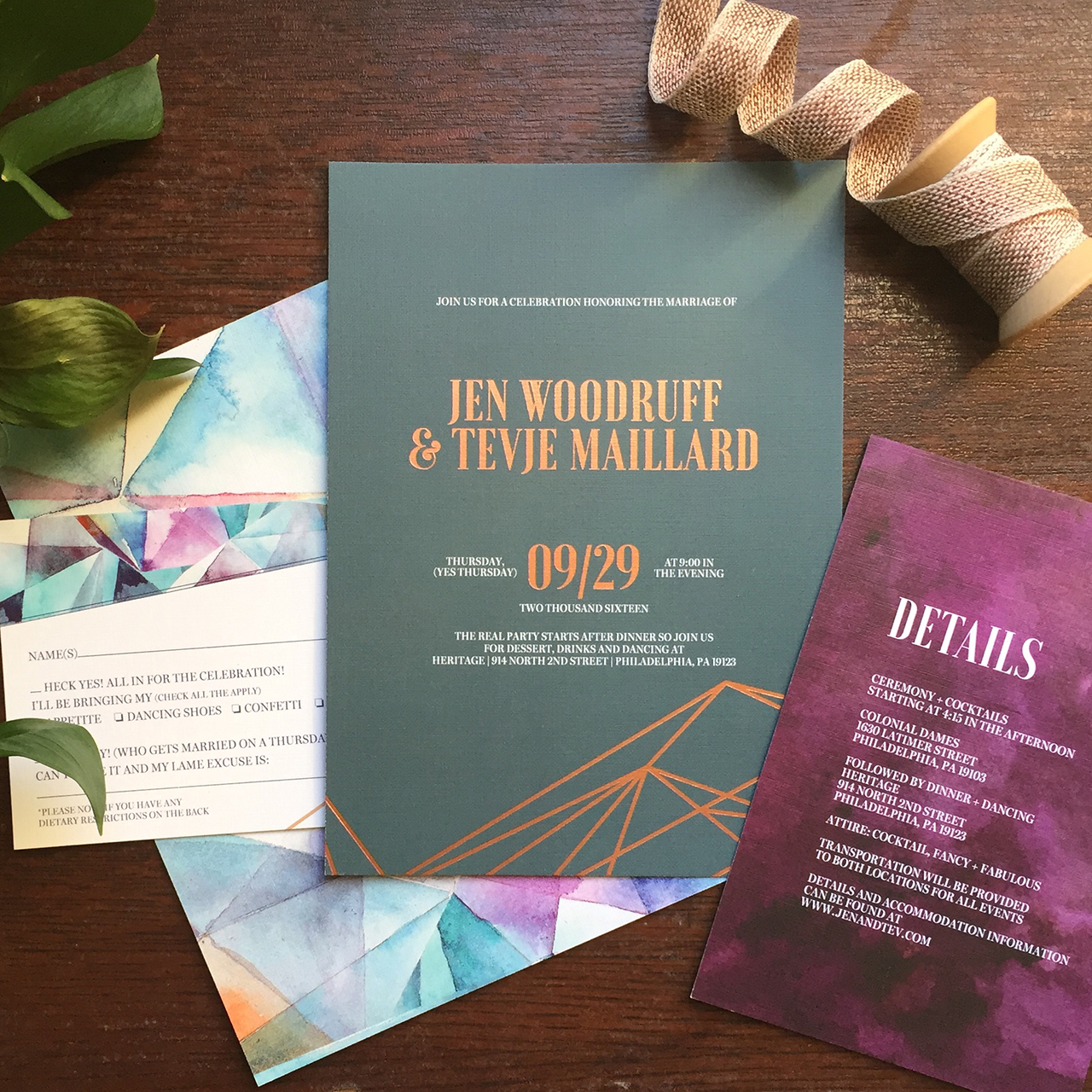
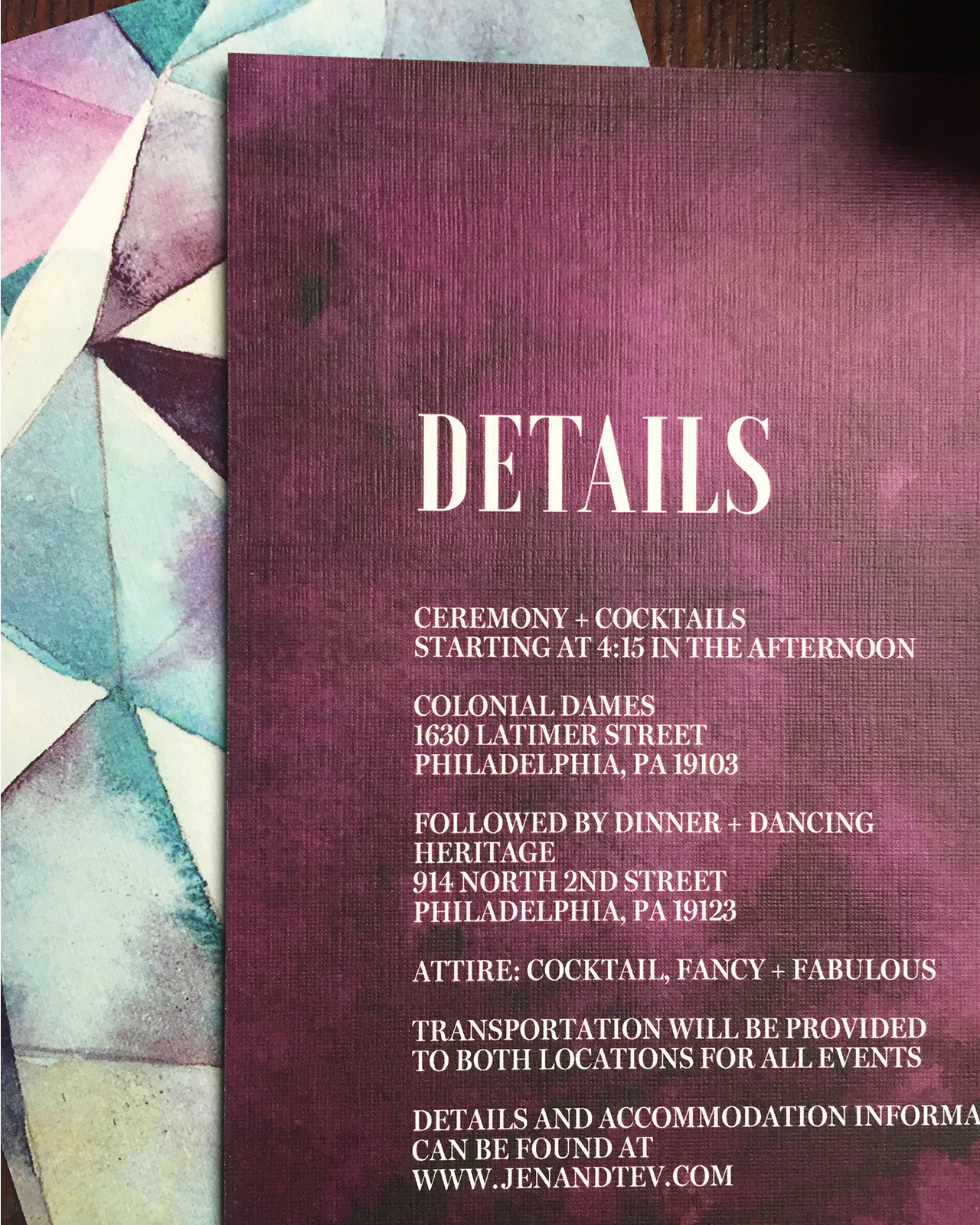
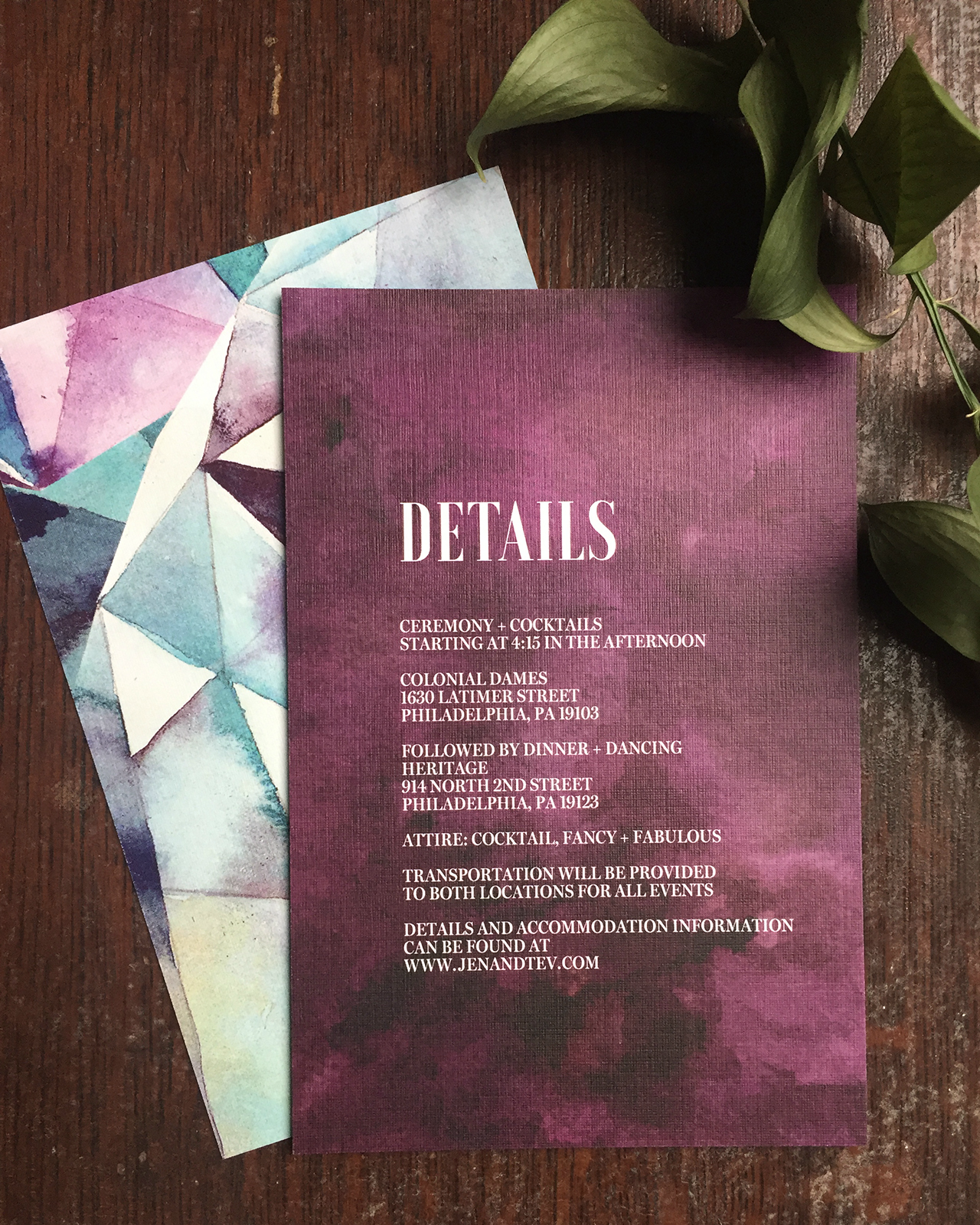
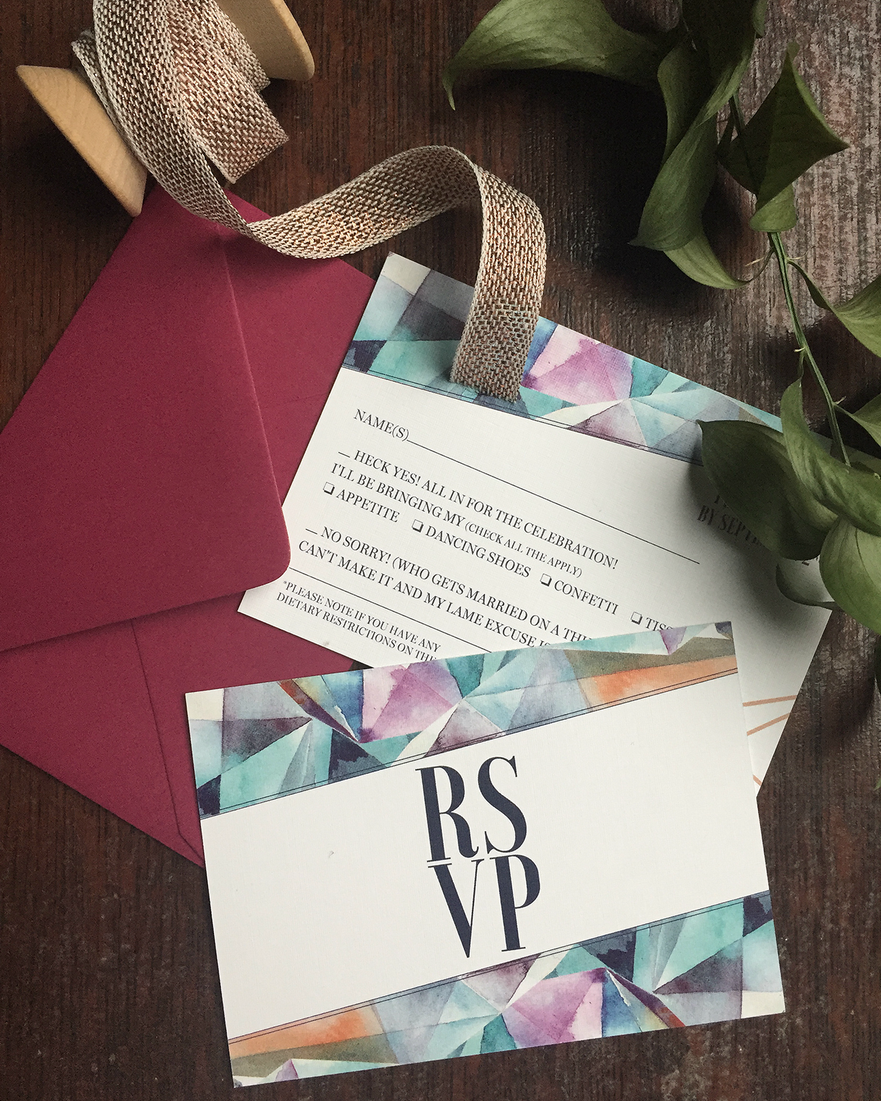
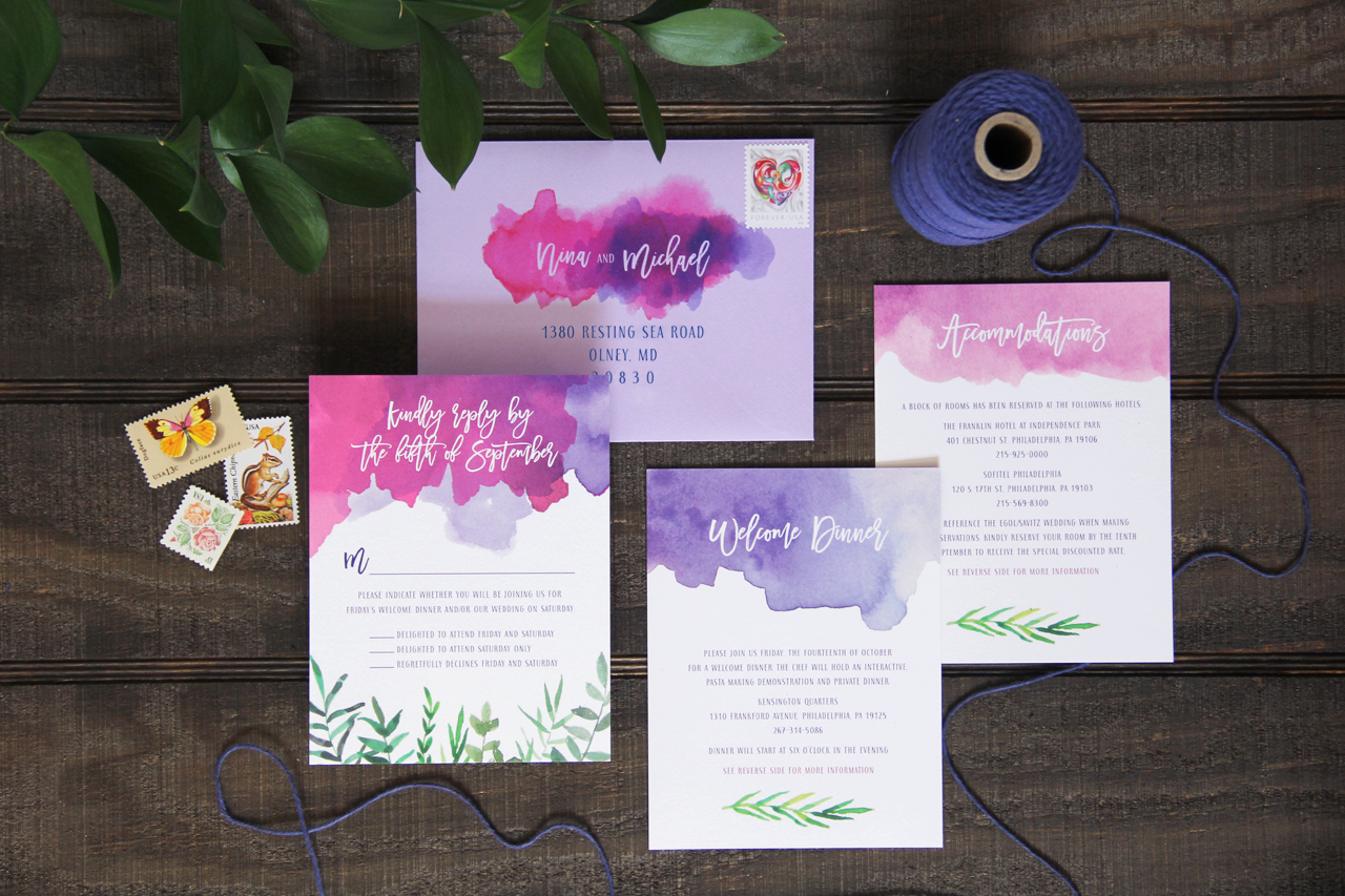
I’m always on board for bold watercolor washes with vibrant colors, and these purple and fuchsia watercolor wedding invitations from Lea Robinson of Lattice Tree Studio are no exception. Lea paired abstract watercolor patterns with festive hand lettering to create this bright invitation suite. We’re loving the depth that the watercolor adds to the suite and the fun envelope liner that ties the whole suite together!
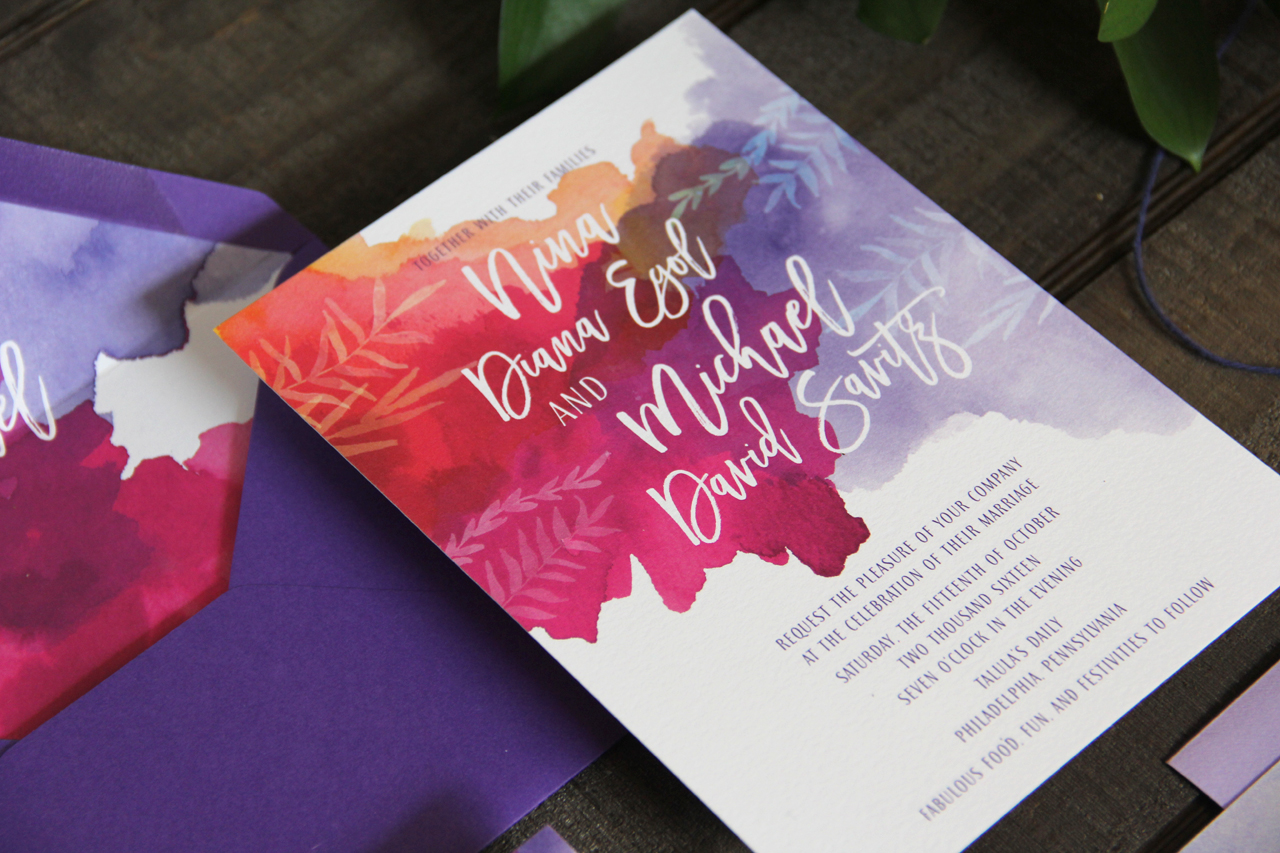
From Lea: Nina and Michael wanted their invitations to reflect their personal style as well as their wedding venue. They were married at a restaurant in Philadelphia, Talula’s Daily, which has a pretty whimsical style. The restaurant has modern meets rustic decor, with beautiful wooden farm dining tables. The couple also wanted to incorporate bold colors in the design. To achieve this look, I hand painted bright watercolor swashes and paired these with some hand painted leafy elements to bring in that natural/rustic feel from the restaurant’s decor. The typefaces (sans serif and script) were carefully chosen to reflect this whimsical style.
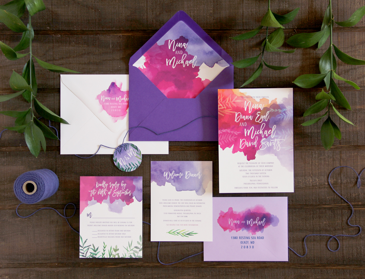
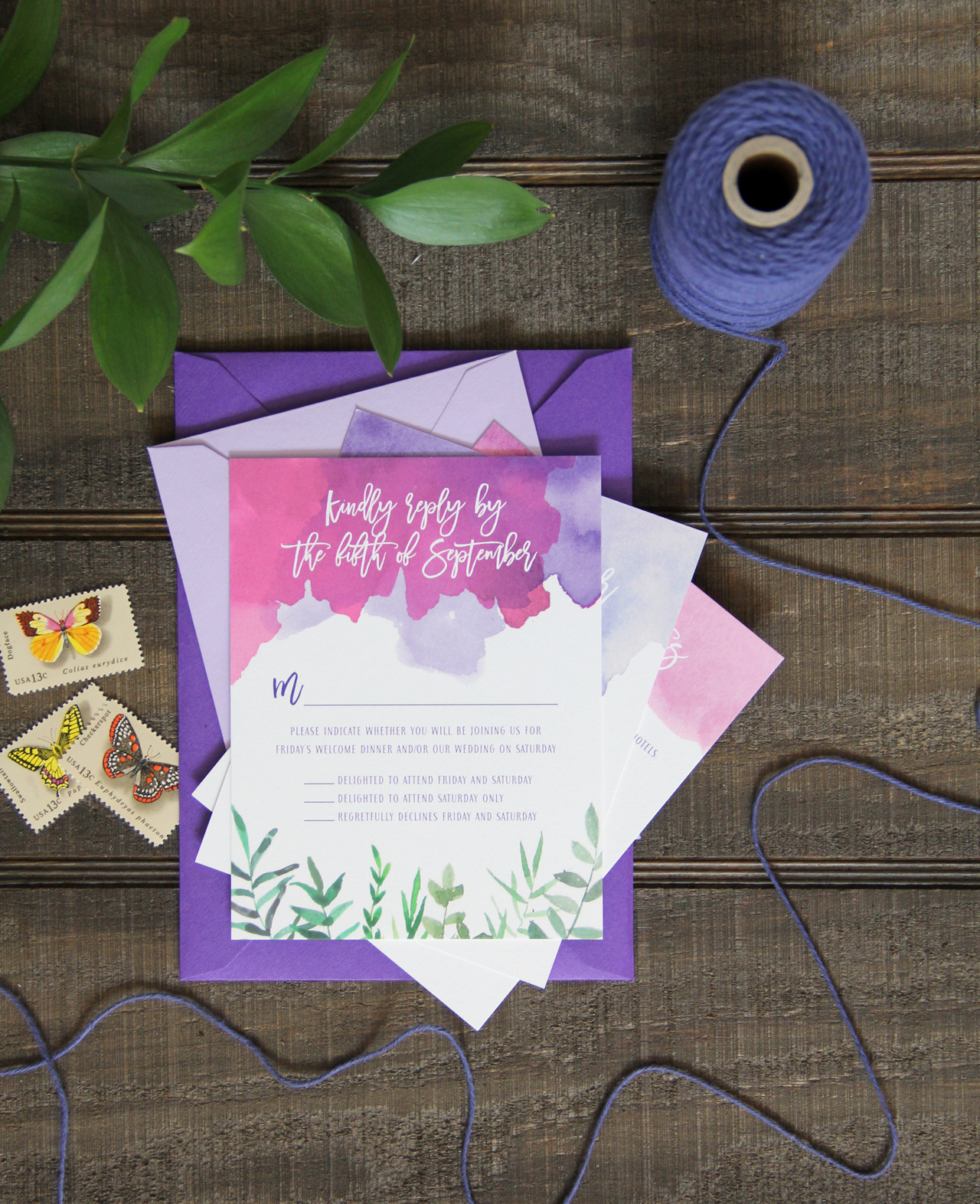
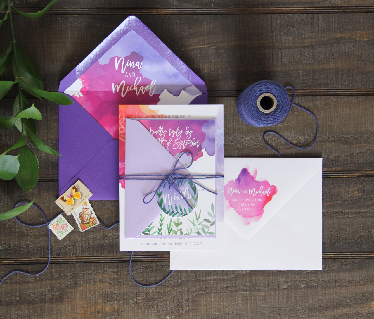
The main invitation is printed front and back, with the couple’s names on the back overlaid on a bright watercolor wash. This watercolor wash is also used for the couple’s return address on the outer envelopes. Their invitation suite uses inner and outer envelopes so we could incorporate envelope liners that would be both functional and add an element of surprise for the guests. I often tell my brides that envelope liners only work when the guests actually have a chance to see the liners. Often times, if the liner is used on an outer envelope, the flap is sealed and when the guest opens the envelope, they rip it at the top seam. This causes them to miss the envelope liner entirely. To avoid this, we used inner and outer envelopes, making the inner envelopes a beautiful deep purple color that would add a pop of color to the suite.
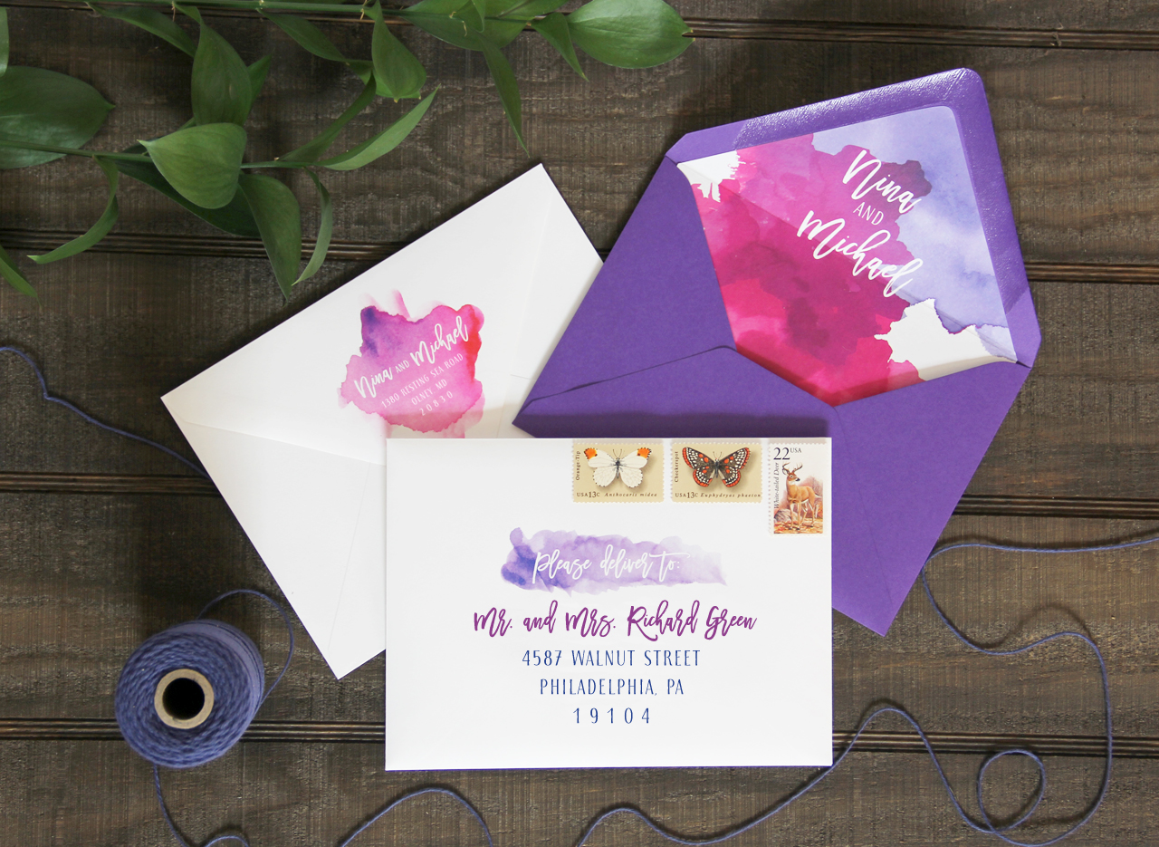
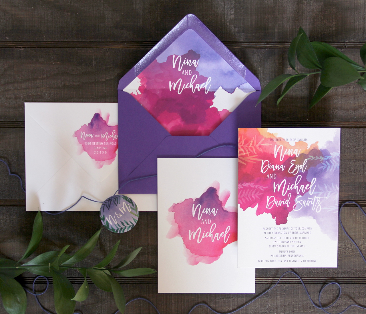
The RSVP cards and the accommodations/welcome dinner cards also utilized different colors of watercolor washes as well as leafy elements. The couple was having a welcome dinner before the wedding day so they wanted to include information about that, as well as the accommodations on one card (printed front and back). To add even more interest to this bright invitation suite, we mix and matched the colors of the envelopes, so the response envelopes were a beautiful lavender. This variation in colors provided a nice contrast to the entire suite.
To complete the suite and to hold all of the pieces together, a tag with the couple’s initials was tied around the entire piece. I hand painted all of the watercolor elements to create a truly one of a kind design for all of my clients.
Thanks Lea!
Design: Lattice Tree Studio
Invitation Printing: Printswell
Envelope Printing: Indigo Ink
Check out the Designer Rolodex for more talÂented wedÂding inviÂtaÂtion designÂers and the real inviÂtaÂtions gallery for more wedding invitation ideas!
Photo Credits: Lea Robinson


