Wedding Stationery Inspiration: Pantone Color of the Year 2017
Happy 2017 everyone! And what better way to kick off the new year than with Pantone’s Color of the Year for 2017: Greenery! How are you feeling about our newest Color of the Year? Are we feeling yay or nay? We tend to favor darker shades of forest green and tropical blue-greens here on OSBP, but this bright and almost citrusy green would be perfect in a spring or summer wedding! – Annie
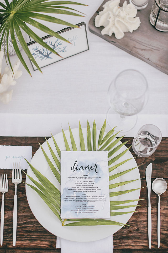
A palm on each plate adds a pop of green to a neutral place setting. | Photography: Max Wanger, Event Design: Bash Please via Bash Please
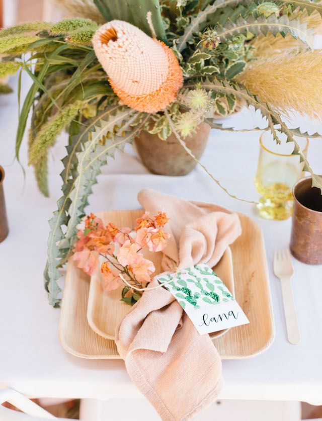
How cute is this watercolor cactus place card? | Photography: Megan Welker, Paper Goods & Calligraphy: Poppy Jack Shop, Event Design: Beijos Events via Green Wedding Shoes
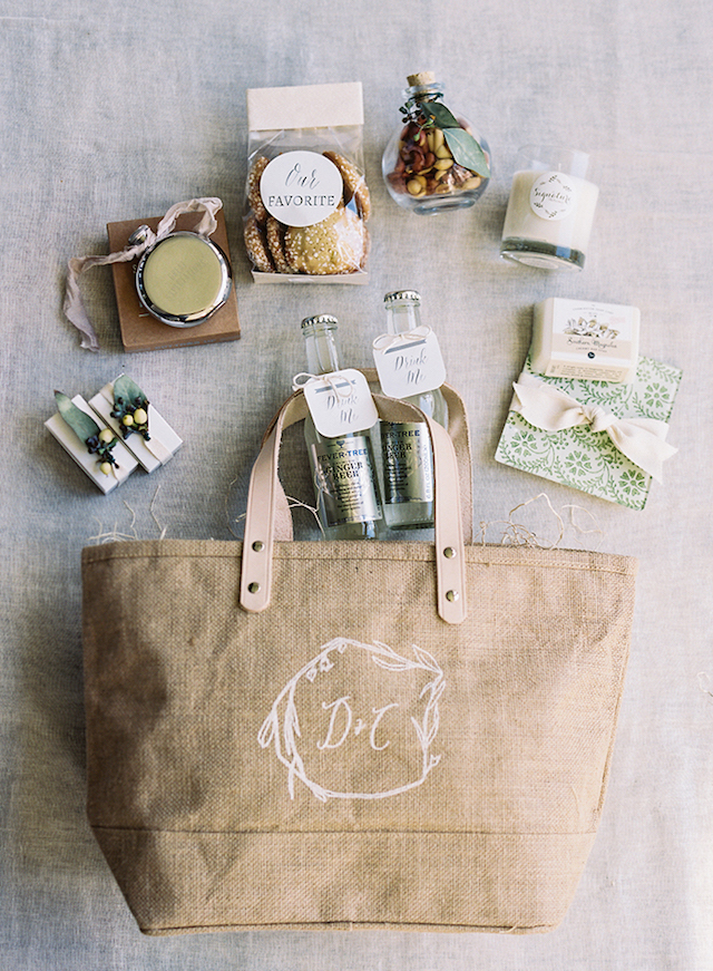
Welcome your guests with a selection of your favorite goodies. Attach tags with a brief description to each item to make it even more personal and fun! | Photography: Eric Kelley, Welcome Bag: A Signature Welcome, Event Decor & Design: Easton Events via Once Wed
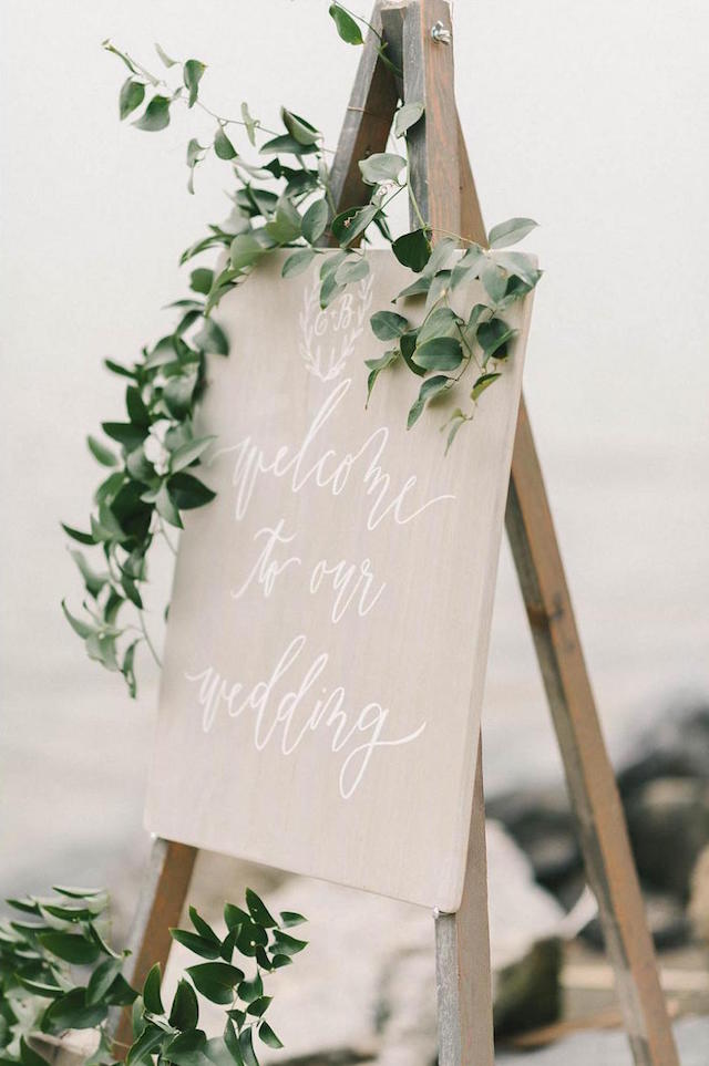
Adorn your signage with greenery. | Photography: Elizabeth Fogarty, Paper Goods: Laura Hooper Calligraphy via Weddings Unveiled
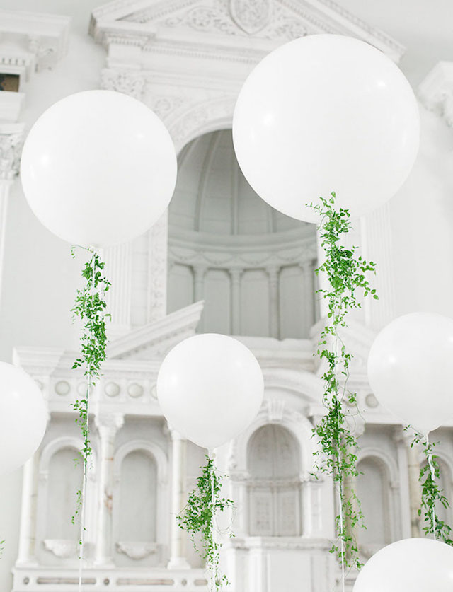
And while you’re at it, add some to your balloon tails, too! | Photography: Luke and Katherine Griffin from Max and Friends, Event Design: Lace & Likes via Green Wedding Shoes
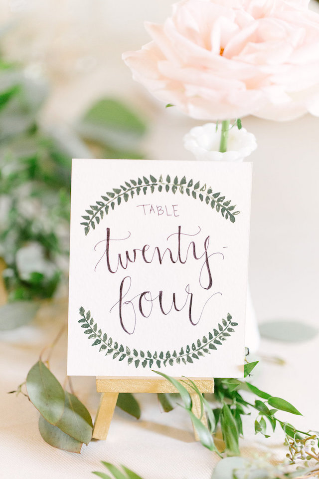
Love this greenery-inspired table number. | Photography: Leigh Elizabeth Photography, Event Planning: Events Held Dear via Style Me Pretty
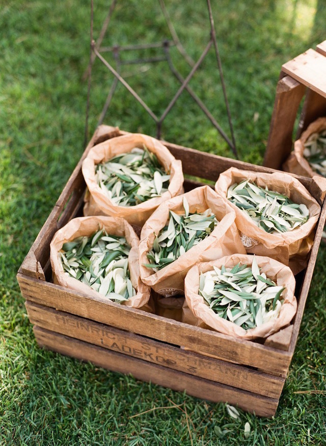
Set out leaves in brown paper bags for the confetti toss. | Photography: Lindsay Madden, Event Coordination: Chic Weddings via Ruffled

Frame your seating chart with a gorgeous garland. | Photography: Gucio Photography, Stationery & Signage: Spread Love Events, Wedding Planning & Design: Spread Love Events via Spread Love Events
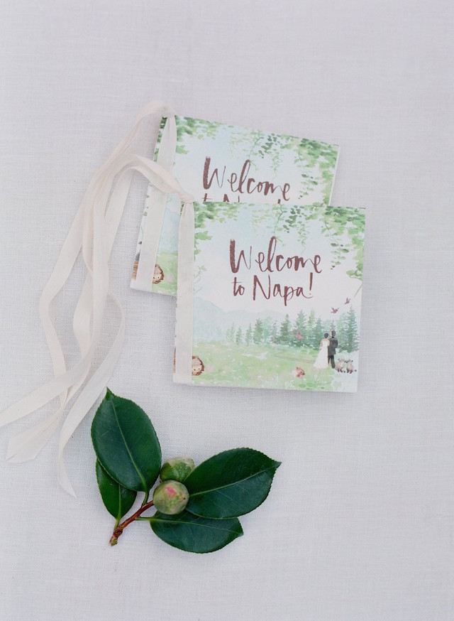
Love these cute welcome books. | Photography: Jose Villa, Stationery: Julie Song Ink, Artwork: Shana Frase, Printing: Wiley Valentine, Calligraphy: Tara Jones Calligraphy via MODwedding
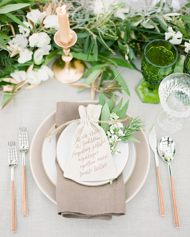
This table setting really embraces the green theme. | Photography: KT Merry via Flutter Magazine
Illustrated Lake Tahoe Inspired Wedding Invitations
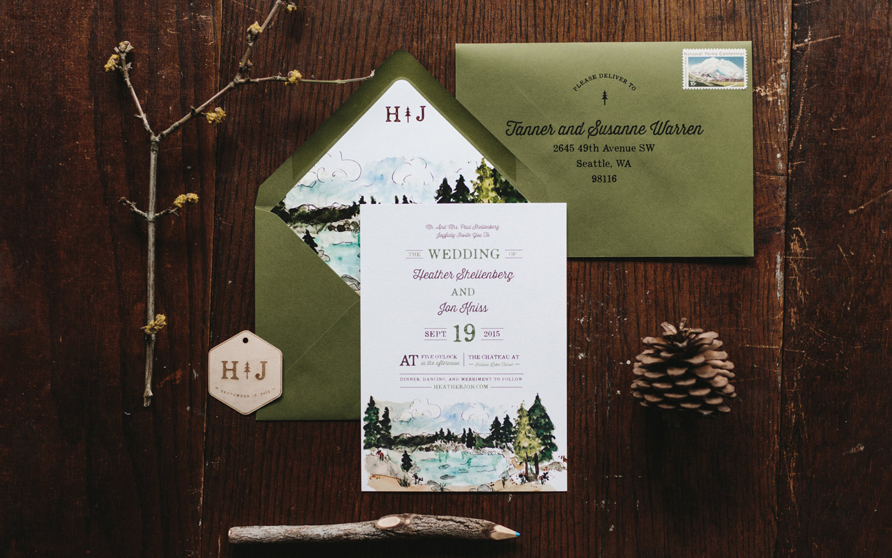
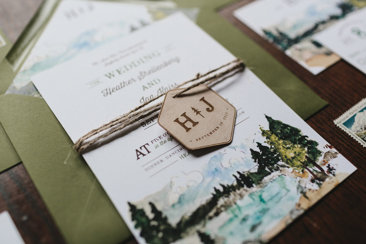
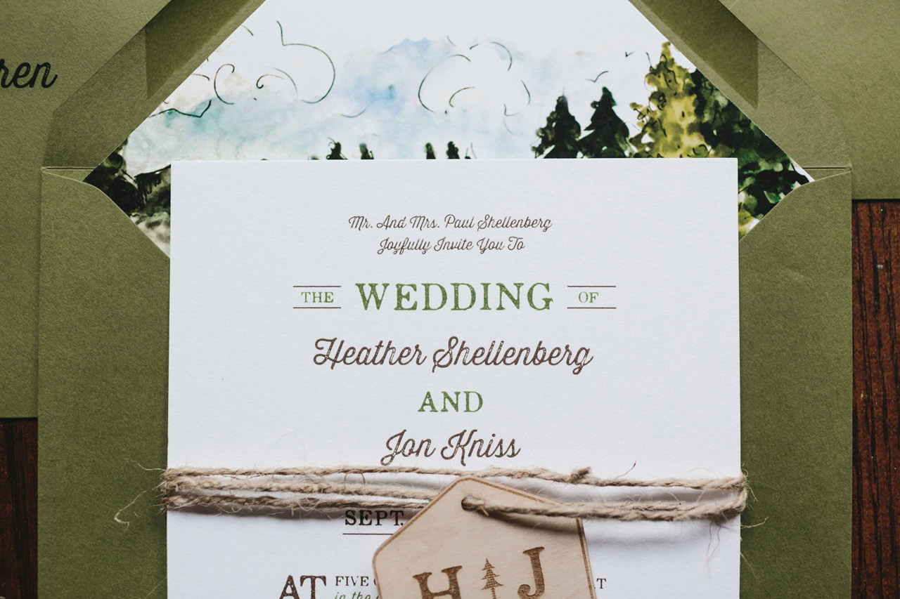
We love the juxtaposition of soft watercolor illustrations with rugged, rustic wedding details! Amanda Franz of Wide Eyes Paper Co. created these illustrated Lake Tahoe inspired wedding invitations, featuring the stunning illustrated scenery of the Lake Tahoe area throughout the invitation suite. We’re also loving those adorable engraved wooden tags featuring the couple’s custom monogram. So fun!
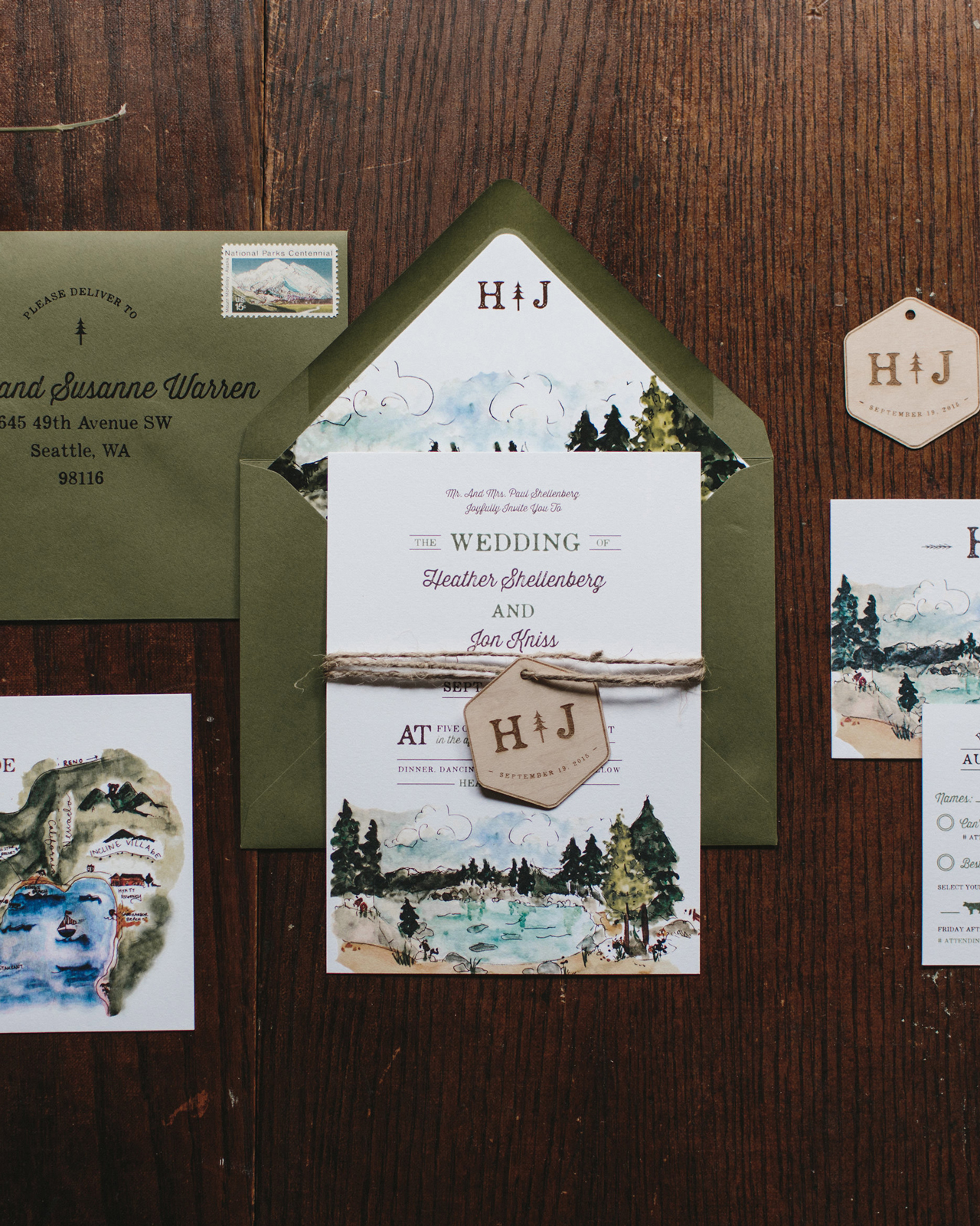
From Amanda: Named after the Lake Tahoe Basin’s most plentiful tree, The Jeffrey Pine suite was created for two lovers getting married in majestic Lake Tahoe. Heather and Jon hired us to create an invitation suite that was both classic and sophisticated with a woodland flare. For a touch of rustic elegance, this set also features a wooded watercolor scene alongside the beautiful shores of Lake Tahoe.
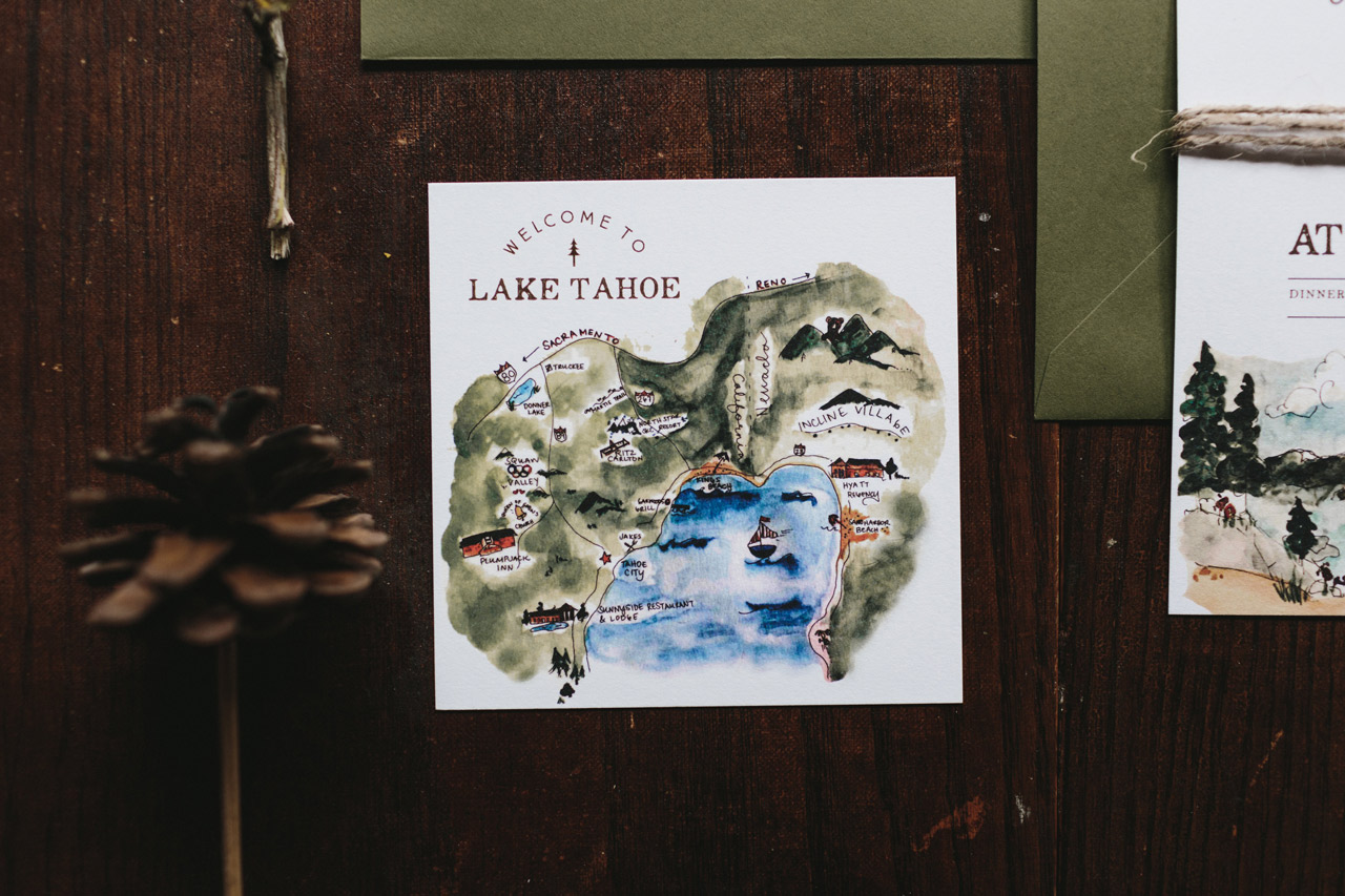
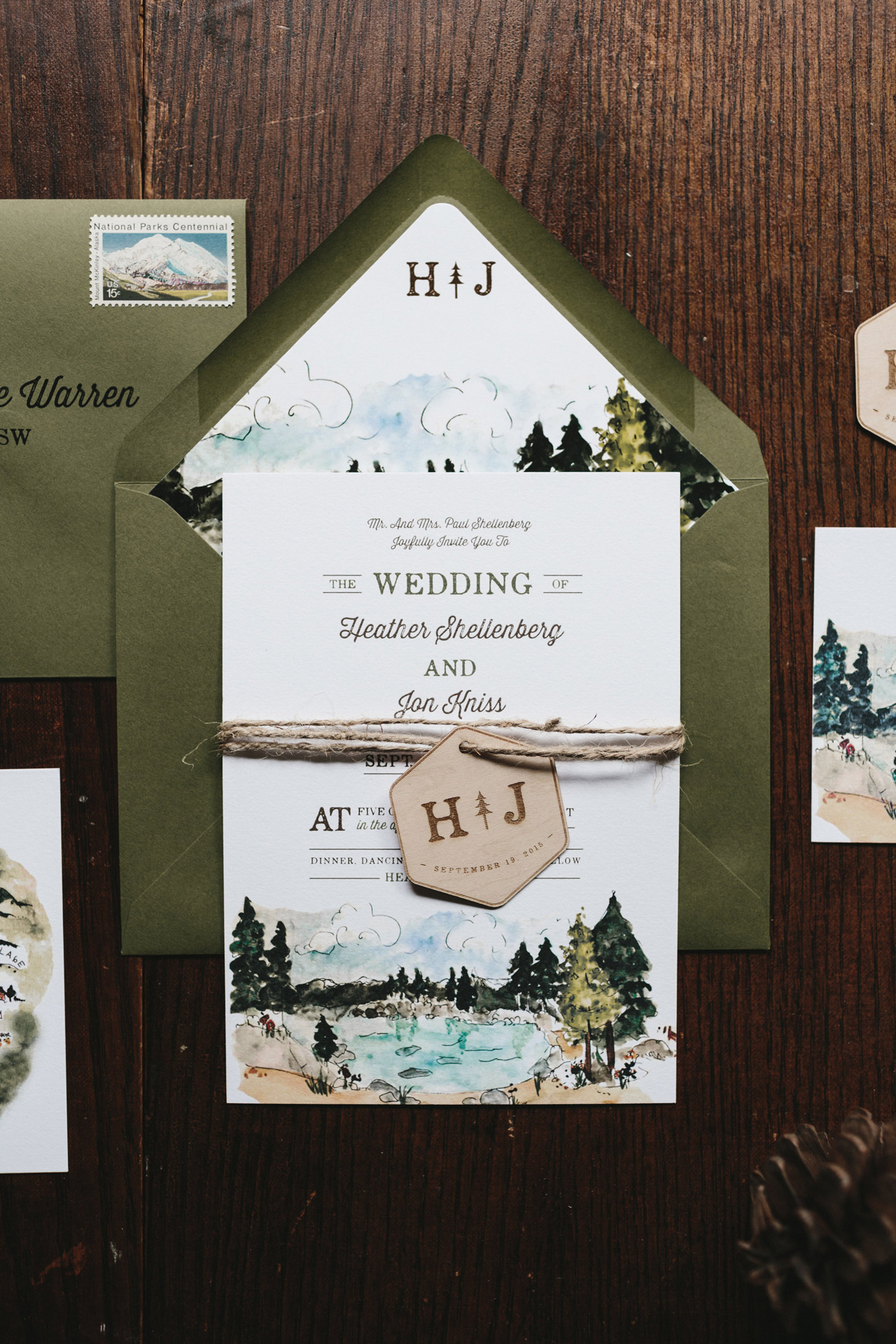
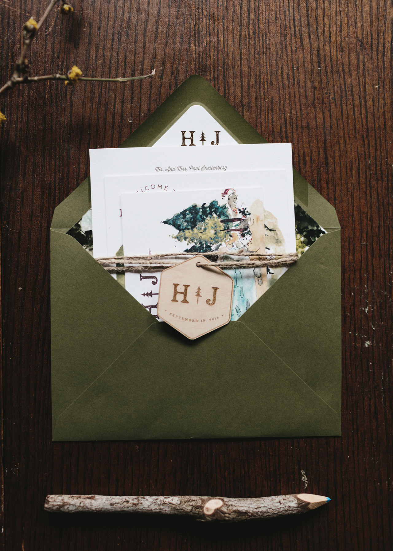
The watercolor scenery was incorporated into various elements of the invitation to create a stunning visual experience. One of our favorite places where we incorporated the watercolor artwork was on the custom envelope liners.
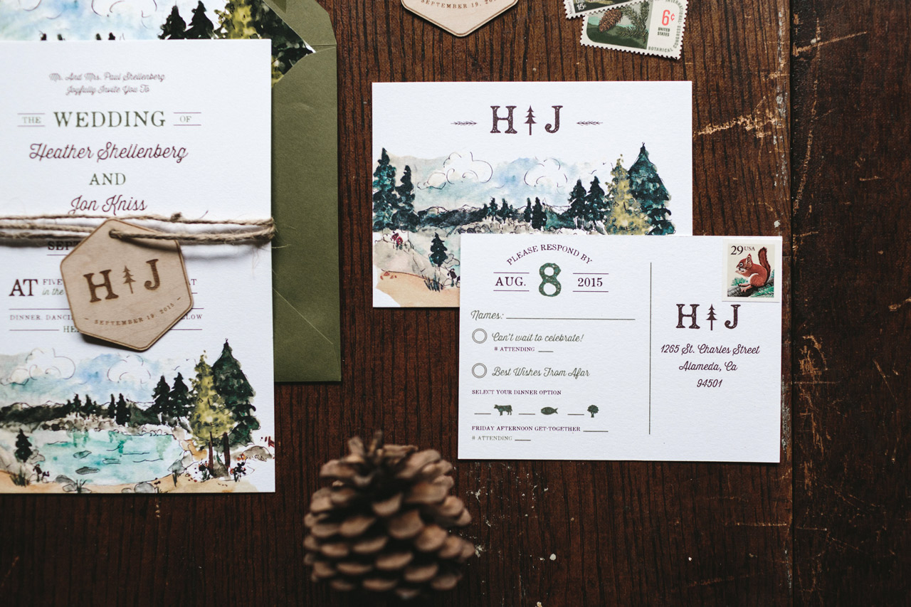
Heather and Jon wanted to go a more informal route, so we designed a postcard style RSVP enclosure. These were great because they did not require an envelope and we printed their return address directly onto the back of the card. The watercolor scenery is also seen on the front of the RSVP card, which was another fun element of surprise.
In addition to the watercolor artwork, we created a custom monogram for the pair that is showcased on our signature wood engraved tags. We also included the custom monogram on the envelope liners to push their aesthetic even further.
Another amazing detail seen in this suite is the colorful watercolor map we illustrated. Maps are such a fun, quirky way to point out special landmarks that hold significance to the couple.
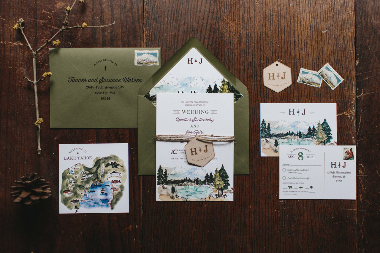
We love how the olive green envelopes play with the lake themed accents in the design. For the final touches, we printed each guest’s name and address onto the envelopes. Their custom monogram is printed on the back flap of the envelope to create a cohesive look and feel.
Thanks Amanda!
Design: Wide Eyes Paper Co.
Printer: Advanced Reprographics
Wide Eyes Paper Co. is a member of the Designer Rolodex – you can see more of Amanda’s work right here or visit the real invitations gallery for more wedding invitation ideas!
Photo Credits: Nicole Mason
January Illustrated Wallpaper!
Happy New Year everyone! Are we feeling excited about 2017? I’m definitely feeling ready to put 2016 behind me and step forward into the first month of a brand new year. So let’s start things off on the right foot with some gorgeous new January illustrated wallpaper from Swiss Cottage Designs and The Good Twin!
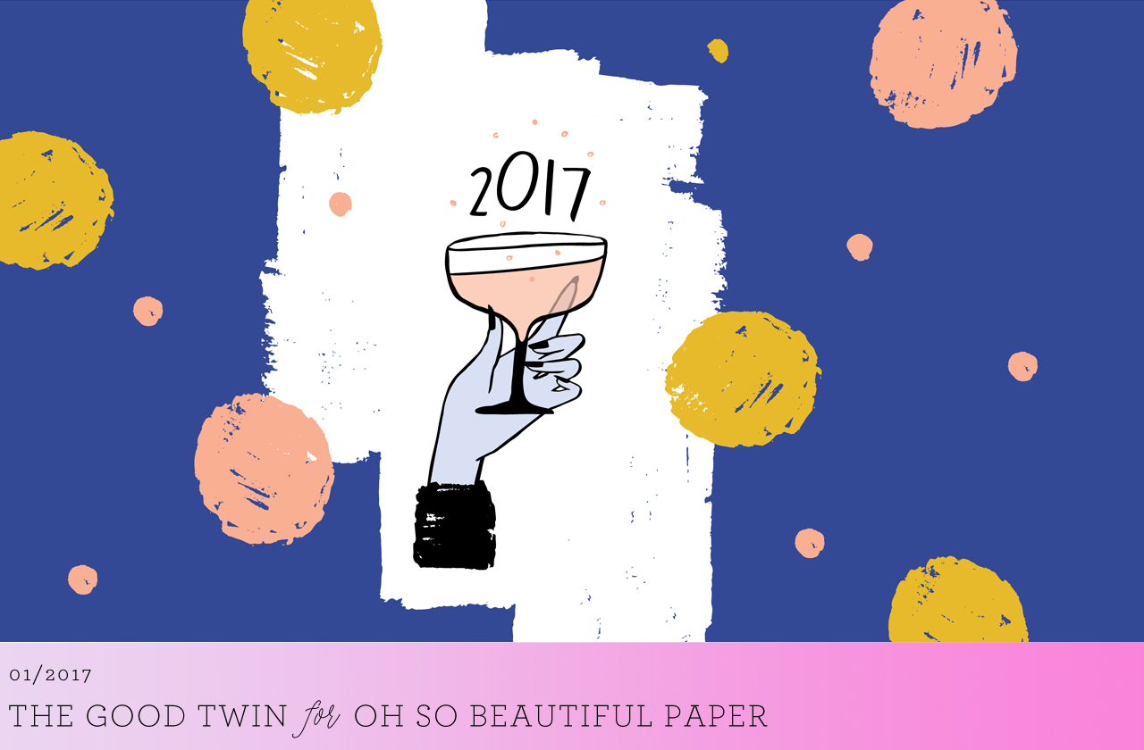
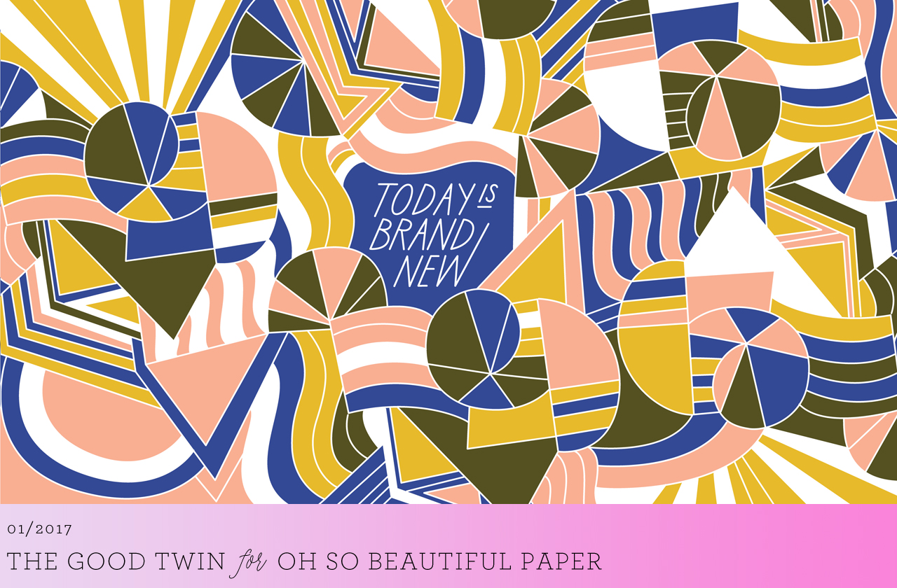
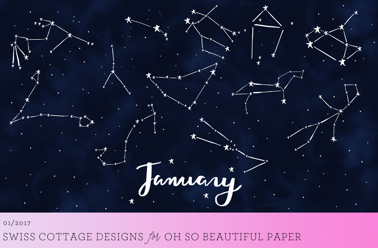
For personal use only. All illustrations by Swiss Cottage Designs and The Good Twin for Oh So Beautiful Paper
If you’re a designer or illustrator interested in contributing your own designs to this column, please email your design to hello(at)ohsobeautifulpaper.com with the subject line “desktop downloads†and image files in both desktop and iPhone retina screen sizes. If it’s a good fit I’ll add it to the post for the following month!
Best of 2016: My Favorites
Today I’m wrapping up my Best of 2016 recap with a few of my personal favorite posts from the year! 2016 was definitely a rollercoaster of a year, and sometimes it has been tough to find the bright and happy moments with so much turbulence around the world. But when I look back at our posts from the year, each one below fills me with happiness and gratitude. I can’t think of a better way to say goodbye to another year (and welcome a new one!). I wish each and every one of you a very merry Christmas, happy Hanukkah, and a wonderful New Year!
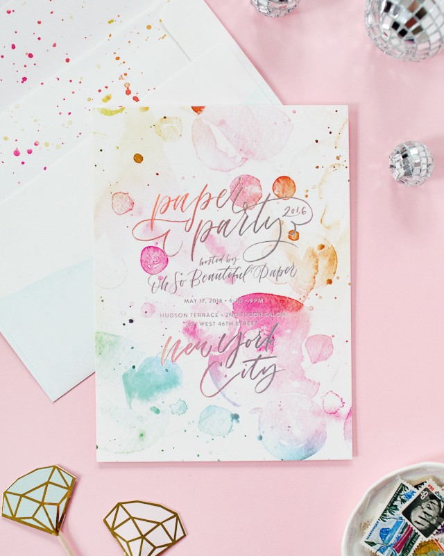
Rainbow watercolor and hologram foil party invitations for Paper Party 2016. Designed by Ashley Buzzy and printed by Bella Figura. The invitations that started my love affair with hologram foil!
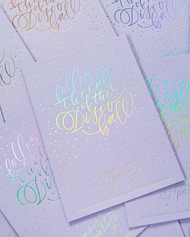
I’m still completely obsessed with the limited edition art print that we made for Paper Party 2016! Designed by Ashley Buzzy, and printed by Mama’s Sauce on Legion Paper lavender Color Plan paper. Hologram foil for life!
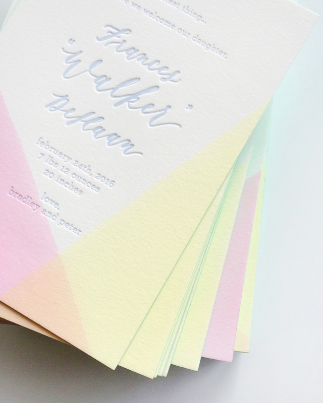
I loved these two-color dip dye baby announcements by Swell Press Paper – with mint green edge painting!
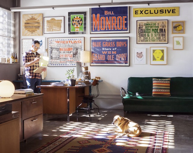
Our Behind the Stationery column continued to be one of my personal favorites – this installment with Hammerpress was a particular highlight from 2016!
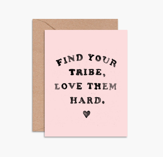
Over in our Brick + Mortar column, Emily talked about why stationery matters in these challenging times. So much yes. Greeting card by Daydream Prints.
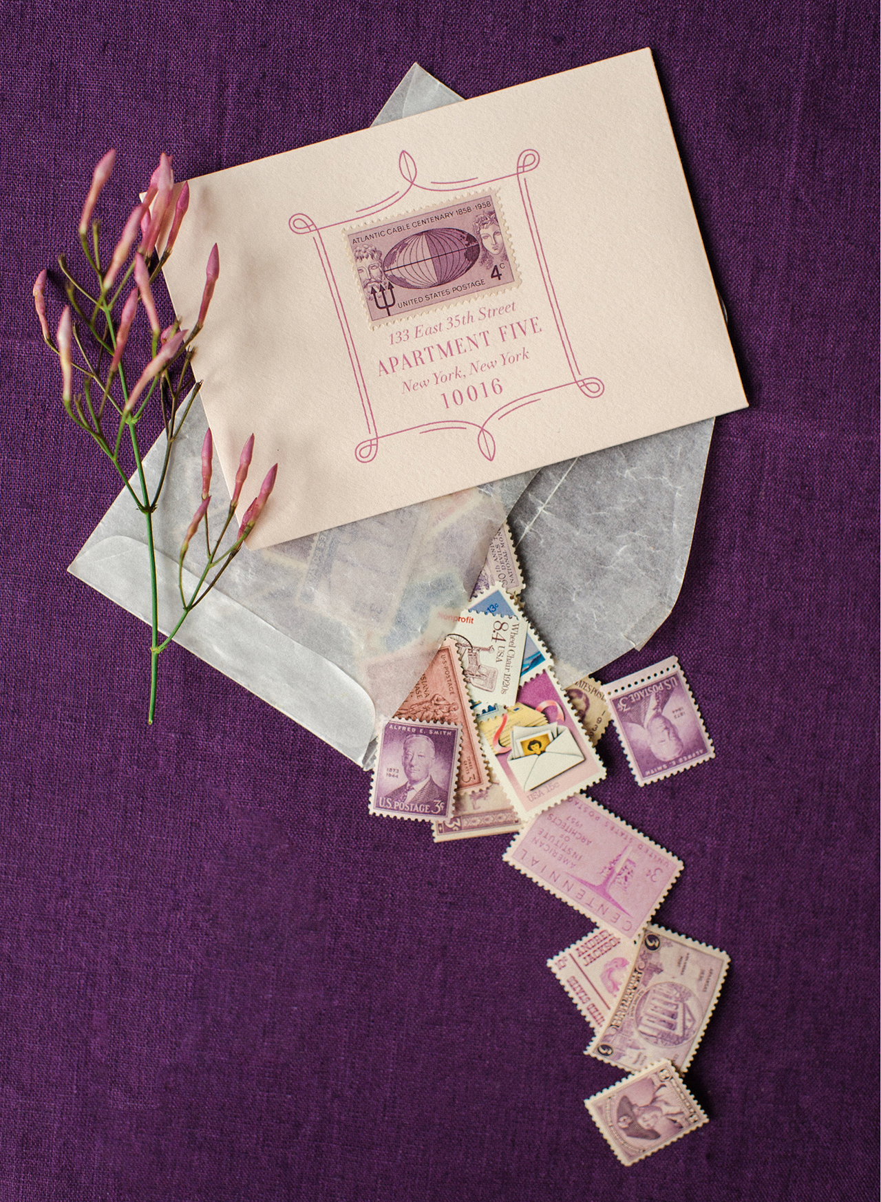
How to Style Stationery for Photography – I learned a ton of new tips and tricks in this guest post by Nichole of Coral Pheasant
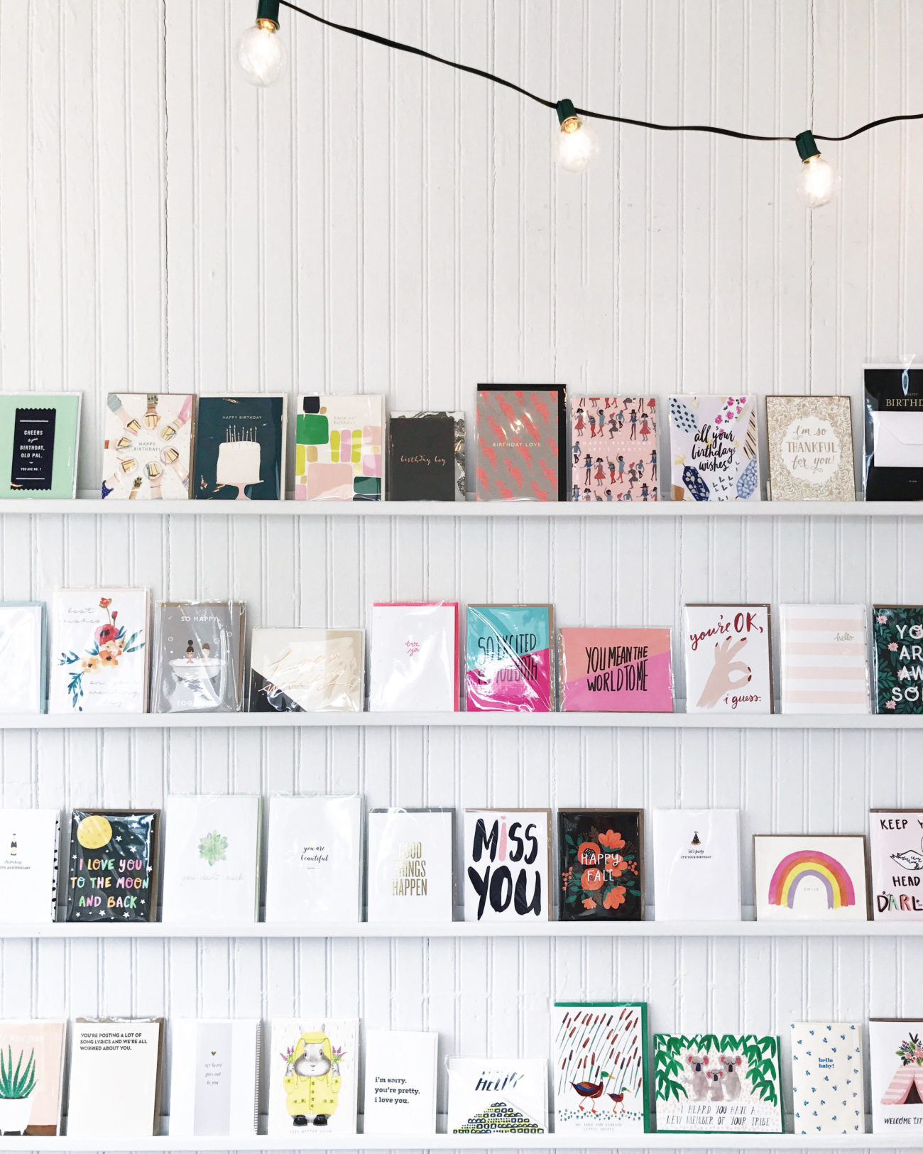
I got to share eleven of my favorite independent stationery and gift boutiques across the country in partnership with Etsy Wholesale!

On the personal side, I got to share our bathroom renovation! This was our first major home renovation, and we did our best to create a bathroom that both honors the age of our home and maximizes storage for a family of four.
If you made it this far, I just want to thank you from the bottom of my heart for supporting Oh So Beautiful Paper this year. I love my job and the fact that I get to do it every single day, I love this blog and the amazing stationery community, and I love all of you for coming here to read our posts! The last couple of years have been incredibly challenging as I’ve tried to learn how to balance motherhood with entrepreneurship and try to figure out how to grow a business in an ever-changing environment. Your comments here and on social media are always a highlight on even the most difficult days. So thank you for supporting, commenting, sharing, and coming back. I may pop in with a couple of quick posts next week, but otherwise we’ll be back in 10 days. See you in 2017, my friends. xoxo
