New York City Inspired Floral Watercolor Wedding Invitations

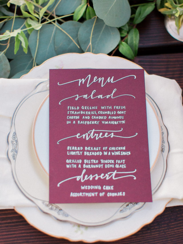
Is there anything more beautiful than New York City in the fall? Central Park practically explodes with gorgeous fall foliage, and all the brownstones decorate their stoops with pumpkins and colorful autumn blooms. Becca of Suite Paperie created these whimsical New York City inspired floral watercolor invitations for a bride and groom tying the knot in the city. The invitations feature a color palette of rich autumn hues like purple and deep green, along with an illustrated map of Manhattan and soft watercolor florals.
New York City Inspired Floral Watercolor Wedding Invitations by Suite Paperie

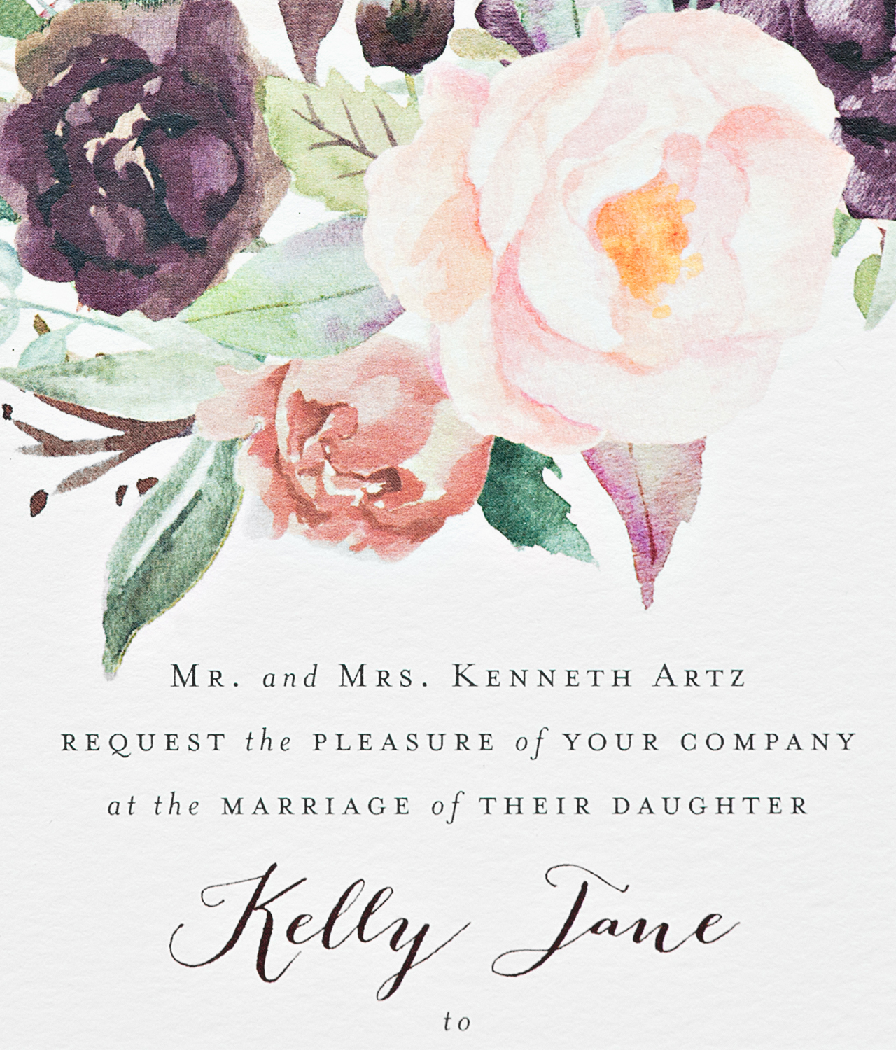
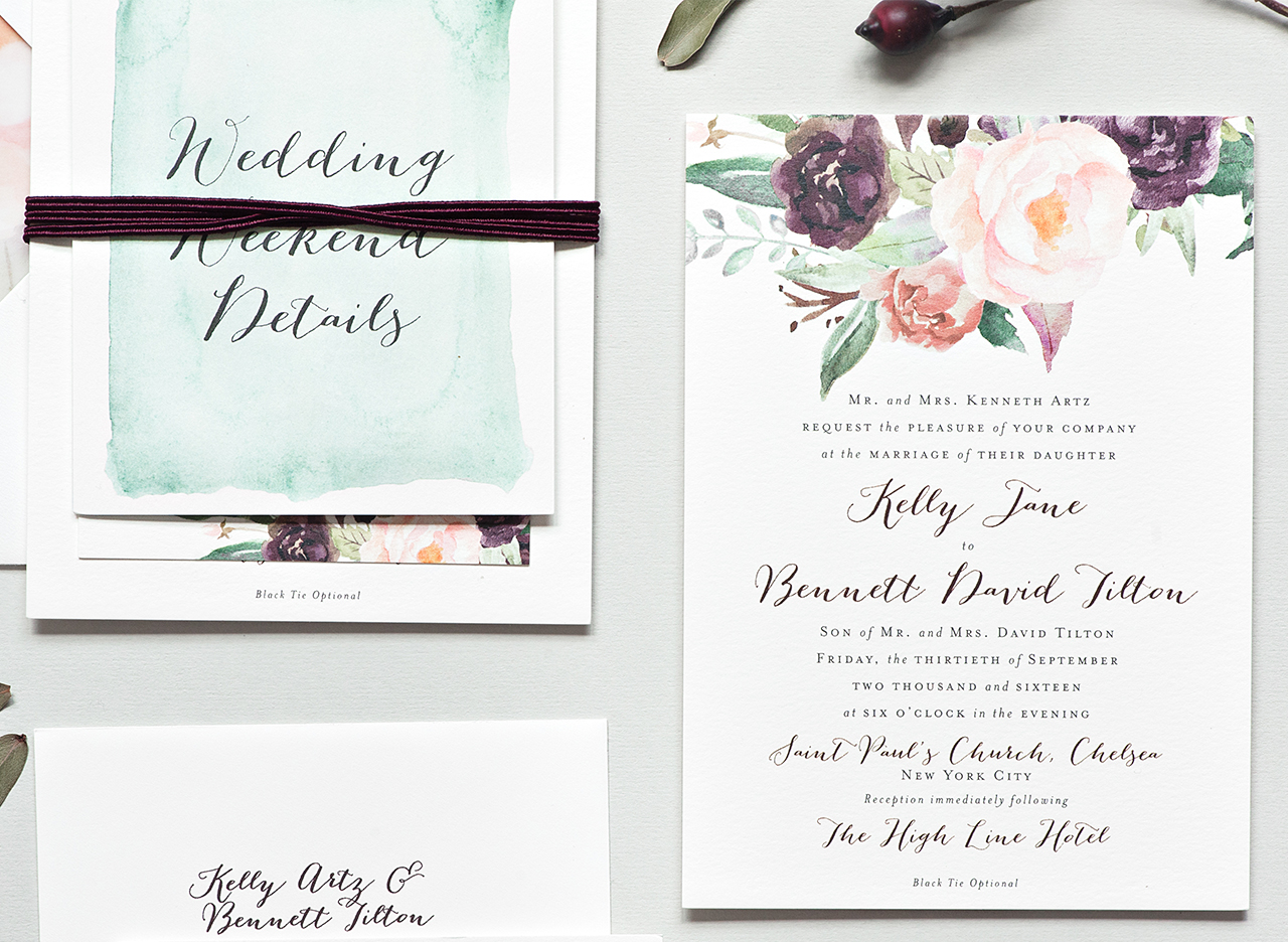
From Becca: Kelly and Bennett wanted to set the perfect early Autumn New York City tone for their mostly out of town guests, and we set out to do just that! Oversized fall blooms were watercolor painted in rich purples, dusty roses, blushes, and deep greens, and paired perfectly with their wine and gray whimsical script and serif lettering on the main piece of their invitation suite. Digitally printed on duplexed soft white cover stock, the invitation was both colorful and luxuriously thick.
New York City Inspired Floral Watercolor Wedding Invitations by Suite Paperie

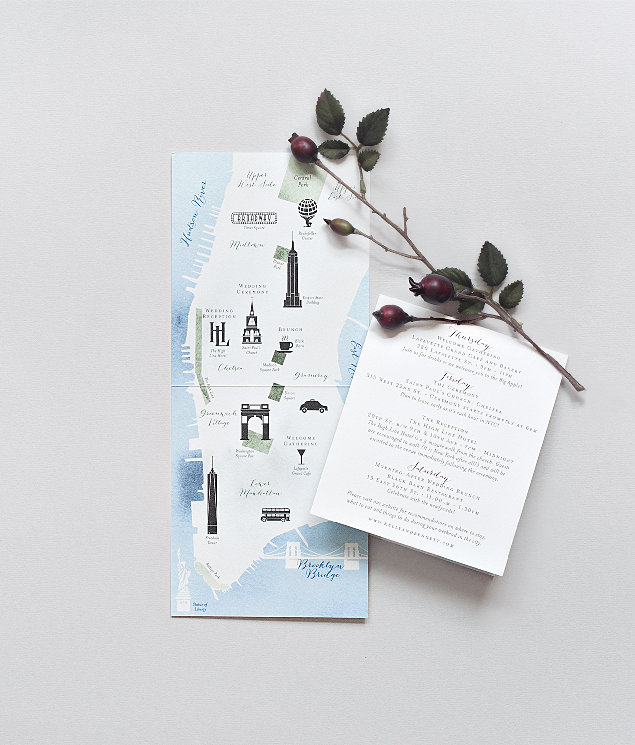
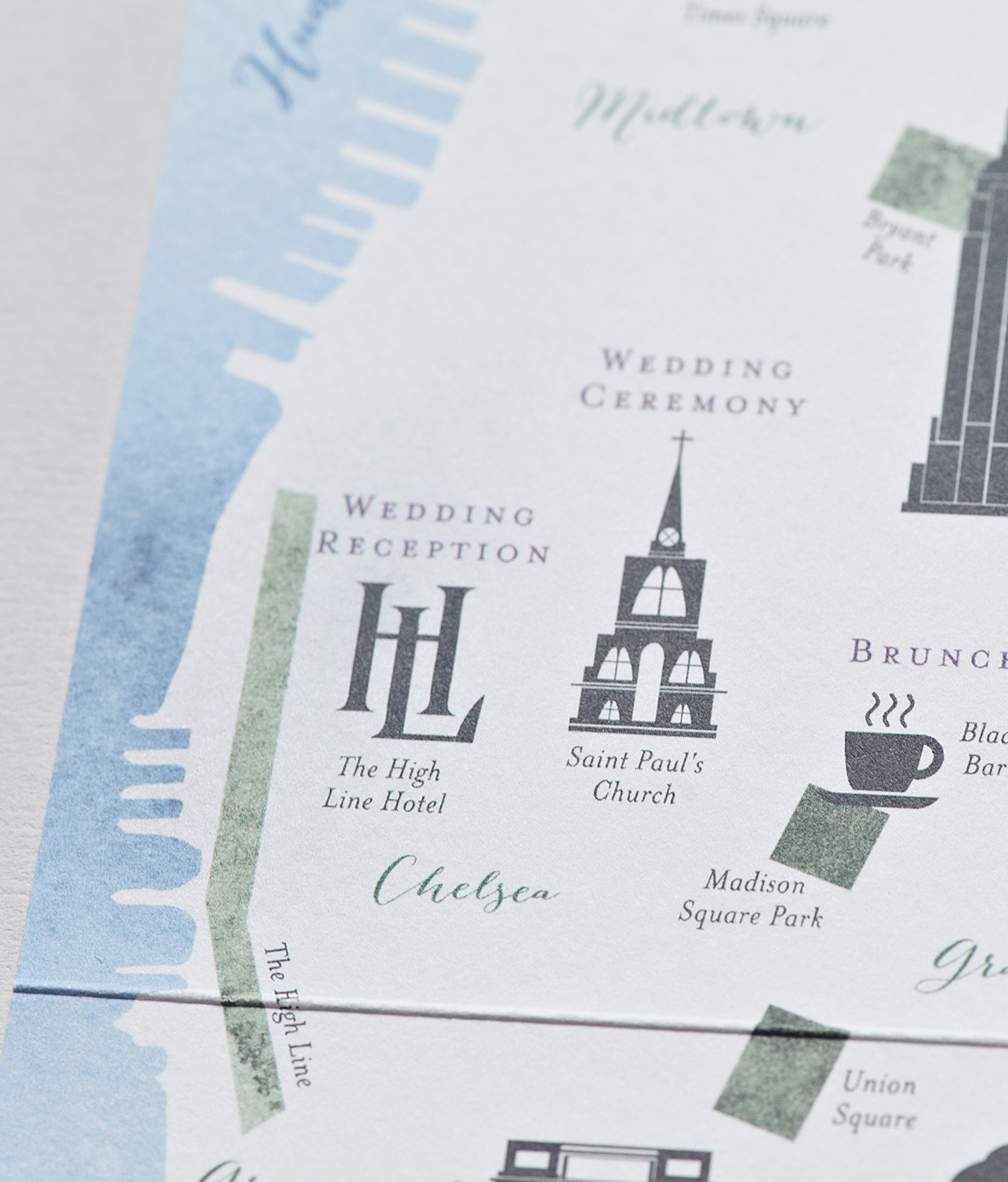
We created a custom map of Manhattan showcasing the neighborhoods and venues for the events throughout the wedding weekend. We also made sure to highlight important landmarks and neighborhoods that had special meaning to the couple, like their favorite place to sit and people watch, Washington Square Park, and where Bennett proposed to Kelly, Greenwich Village.
New York City Inspired Floral Watercolor Wedding Invitations by Suite Paperie

The back of the folded map listed a detailed schedule of the weekend, including welcome drinks and a post-wedding recovery brunch, a NYC must-have! The couple also wanted to include little fun facts and tips about New York City, like leaving plenty of time to get to their ceremony on a Friday afternoon, during rush hour, and encouraging guests to walk from the church to the reception at The High Line Hotel because, well, it’s New York City after all!
New York City Inspired Floral Watercolor Wedding Invitations by Suite Paperie

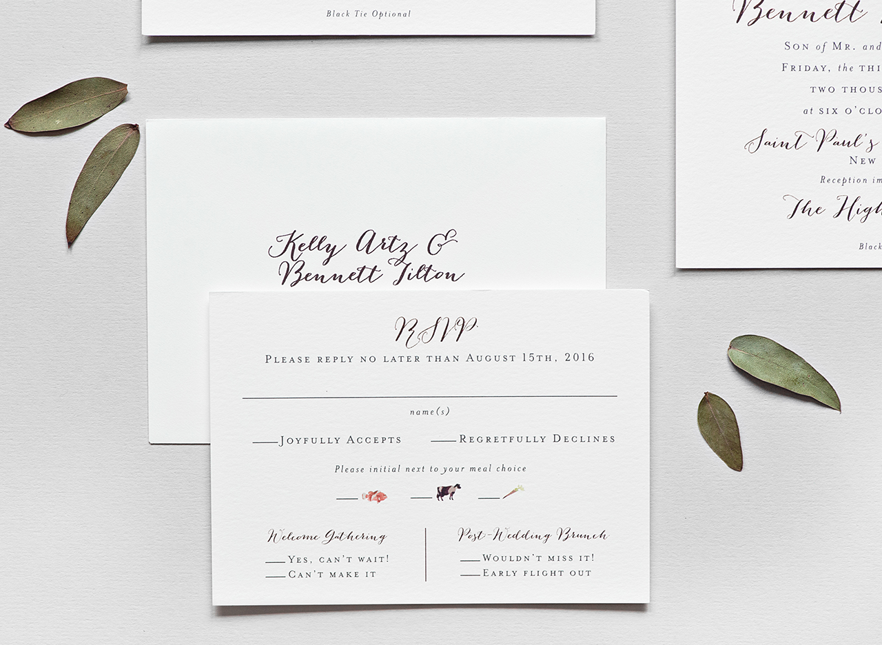
We carried the watercolor look onto the RSVP card and the front of the map insert. On the response card, we created mini watercolor animal silhouettes that served as meal option indicators. Additionally, on the front of the map insert, an oversized wash of minty green watercolor gives the suite a fresh, cheery punch.
New York City Inspired Floral Watercolor Wedding Invitations by Suite Paperie

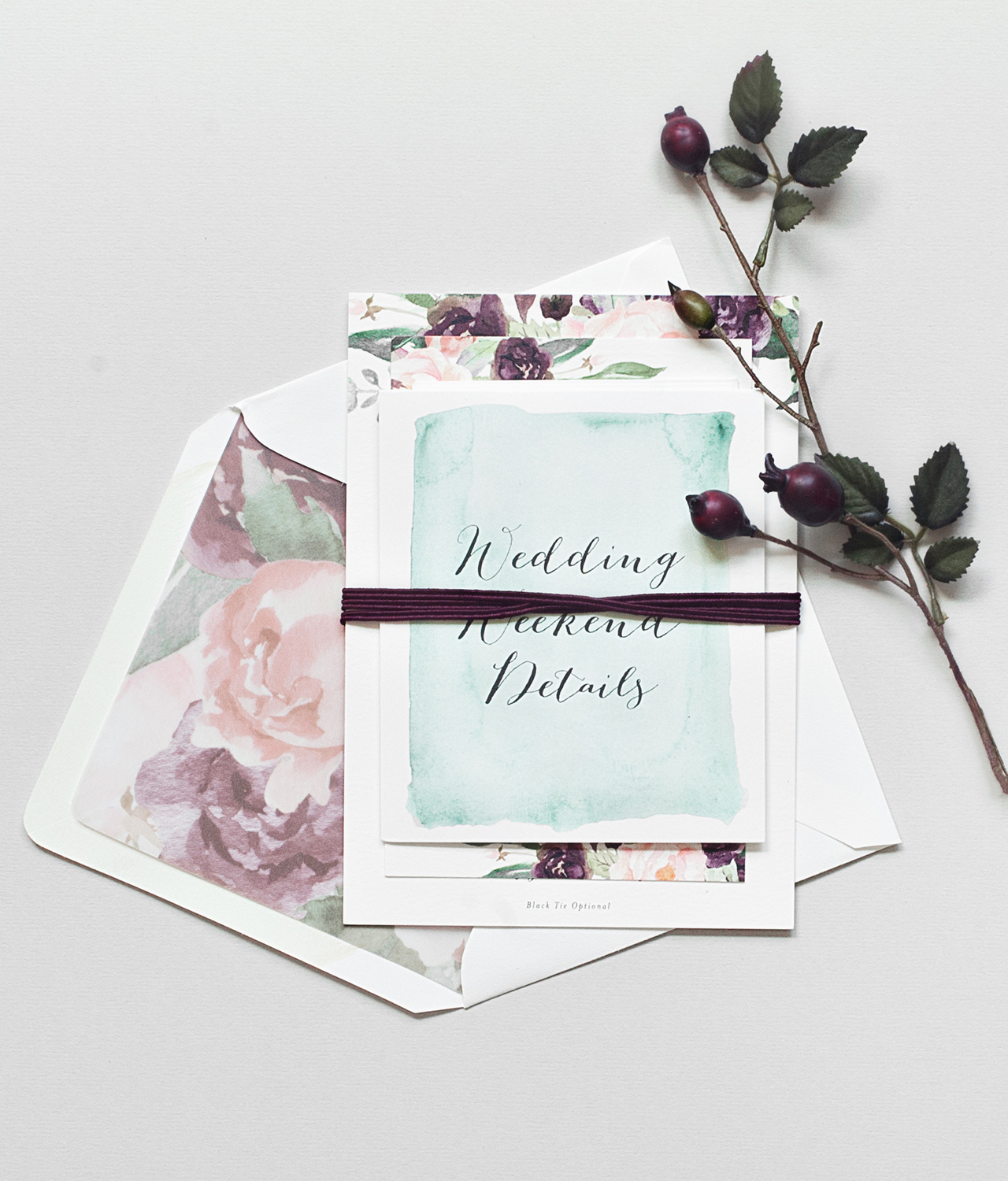
My absolute favorite part of the suite is the envelope liner. We enlarged and layered the watercolor flowers to create a beautiful pattern and then digitally printed them on vellum for a subtle, but cohesive look to the suite. Finally, we wrapped the pieces in a berry colored double-thick cotton twine bringing out the rich colors in the suite.
New York City Inspired Floral Watercolor Wedding Invitations by Suite Paperie

Thanks Becca!

Design: Suite Paperie

Check out the Designer Rolodex for more tal­ented wed­ding invi­ta­tion design­ers and the real invi­ta­tions gallery for more wedding invitation ideas!

Photo Credits: Lindsay Nathanson

Refined Modern Neutral Letterpress Wedding Invitations

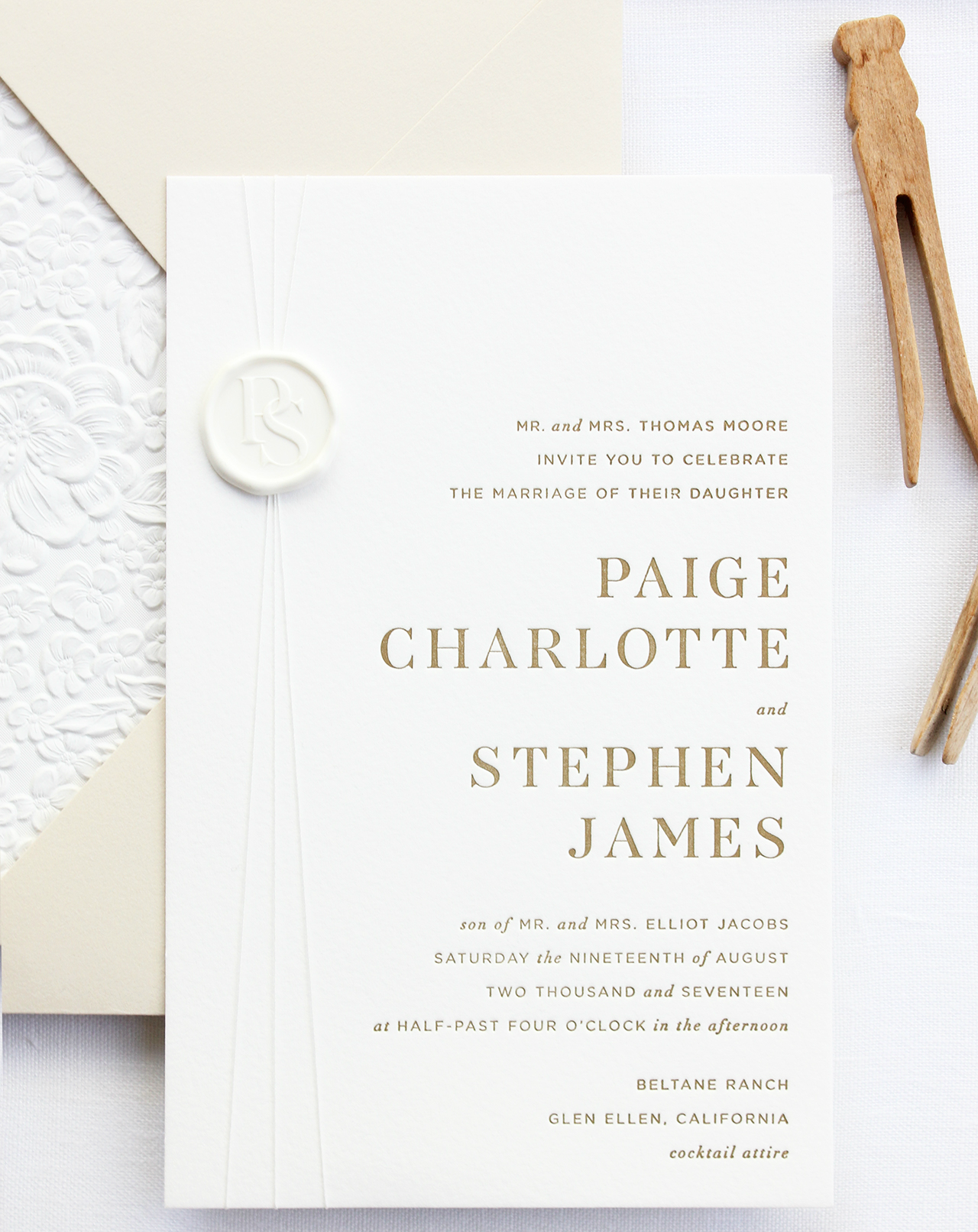
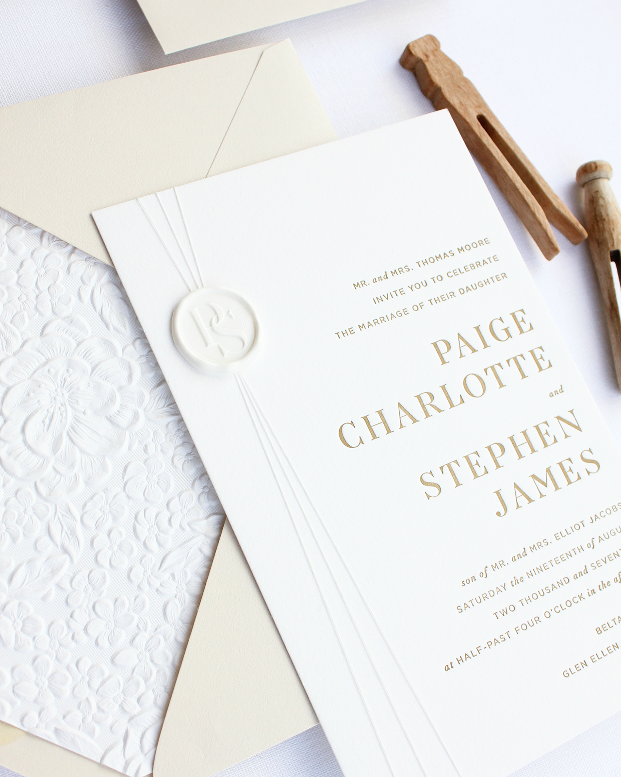
Aaaaaahhhh…. if invitations could be a soothing breath of fresh air, these refined modern neutral letterpress wedding invitations from Alana of Bourne Paper Co. would definitely be it. A clean, minimalist design with classic serif and sans-serif text, luxurious neutrals, and a delicate textured envelope liner? So good. And the silk thread wrap and white wax seal finish are simply sublime!

Refined Modern Neutral Letterpress Wedding Invitations by Bourne Paper Co.

From Alana: This invitation suite was designed to focus on modern typography and a warm, neutral color palette. We wanted the suite to have a very clean and crisp feel paired with unique textures that would stand out even when executed in whites and taupes.

Refined Modern Neutral Letterpress Wedding Invitations by Bourne Paper Co.

The first design decision made was to forego script fonts in favor of clean serif and sans-serif fonts. Italicized accents were added to the type to give the suite a more formal and elegant feel. We also created a modern monogram that was subtly featured throughout the invitation suite.

Refined Modern Neutral Letterpress Wedding Invitations by Bourne Paper Co.

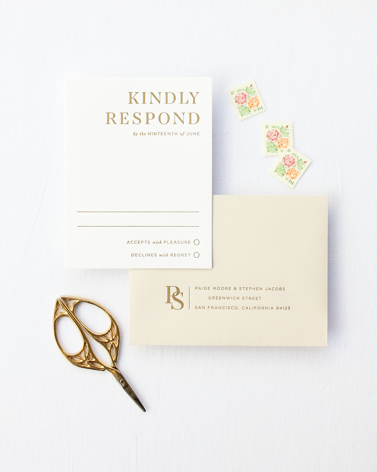
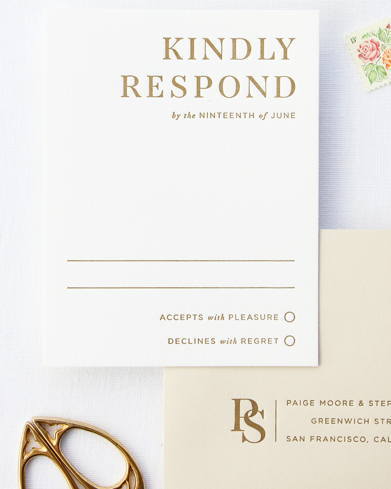
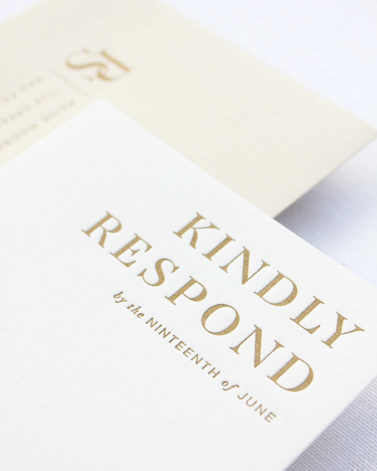
The invitation suite was letterpress printed in a warm, metallic gold ink which reflected with the perfect, subtle shine when held at an angle. For paper, we used Somerset Velvet 300g card stock in Radiant White for a bright look and a soft cotton-like texture. The card stock also allowed us to apply stronger pressure during the printing process, which gave the letterpress text the crisp, clean feel we were going for and ensured the typography maintained its sharp edges and angles.

Refined Modern Neutral Letterpress Wedding Invitations by Bourne Paper Co.

To complete the suite, we finished the invitation with a silk thread wrap and white wax seal which used the couple’s monogram. We selected a warm taupe envelope for both the invitation and response card, something to add a hint of color without straying too far from the neutral theme. The taupe envelopes paired perfectly with the metallic gold ink, which was used to print the couple’s address and monogram onto the response envelope.

Refined Modern Neutral Letterpress Wedding Invitations by Bourne Paper Co.

We finished the invitation with an envelope liner featuring blind embossed cherry blossoms and other delicate florals. We loved the dramatic texture the liner provided and the bright white paper was the perfect compliment to the warm, taupe envelope – it also added just the right touch of florals to maintain the suite’s modern but elegant look.

Refined Modern Neutral Letterpress Wedding Invitations by Bourne Paper Co.

Thanks Alana!

Design: Bourne Paper Co.

Check out the Designer Rolodex for more tal­ented wed­ding invi­ta­tion design­ers and the real invi­ta­tions gallery for more wedding invitation ideas!

Photo Credits: Alana Cutler

2017 Reader Survey!

Oh So Beautiful Paper 2017 Reader Survey

Before we get too far into 2017, I want to hear from you! I have big plans to make 2017 the best year EVER, and I want to make sure that we’re delivering content that you all love and want to read! I’m embedding the survey form below, but you can also click through to take the survey HERE. I want your thoughtful opinions and constructive criticism – so please be honest! I’ll be reading each and every survey response and using them to come up with our content for the year. I can’t wait to read what you have to say!

In the survey you’ll find a bunch of multiple choice and open ended questions about what kind of content you like on Oh So Beautiful Paper: what you’d like to see more of, what we can do to improve, and a few other topics. You can even ask me questions (business or personal) and I’ll answer them in later posts. After more than eight years of blogging, I sometimes forget what I’ve shared or not shared here on the blog, so go ahead and ask me anything!

And as a thank you for taking the survey, you can enter to win a huge prize pack of greeting cards from my personal collection! I’ll choose a total of SIX winners, and each box contains around 20 cards each – so it’s a great chance to win some seriously awesome stationery!!

*Survey and giveaway ends at 11:59pm EST on January 31, 2017!

Happy Weekend!

Happy Friday everyone! This was a fairly quiet week for me, so I don’t have much to report this week. Sending lots of love and positive vibes to you all for a happy three-day weekend! But in the meantime…

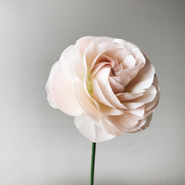
Image by Soil and Stem via Instagram

Image by Soil and Stem via Instagram

…a few links for your weekend!

This week on Oh So Beautiful Paper:

Calligraphy Inspiration: Pirouette Paper

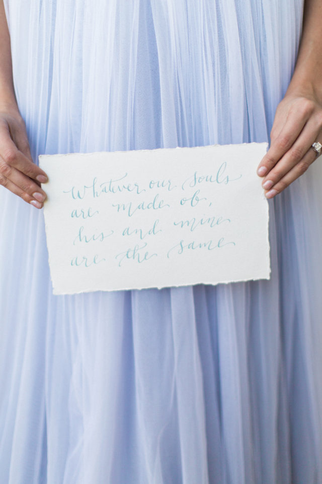
Hello everyone! And hello to 2017! Here we are already skating fast through January. For today’s dose of calligraphy inspiration we’re featuring the beautiful modern calligraphy of Kaylyn of Pirouette Paper. Her collection of lettering work shows how calligraphy instantly makes any event, party, wedding, or festive gathering feel special. I’m pretty partial to the Pirouette Paper handmade party signs, but feel free to share your favorite picks below!  – Jen

Calligraphy Inspiration: Pirouette Paper / Photo Credit: Kristina Adams Photography

Photo: Kristina Adams Photography

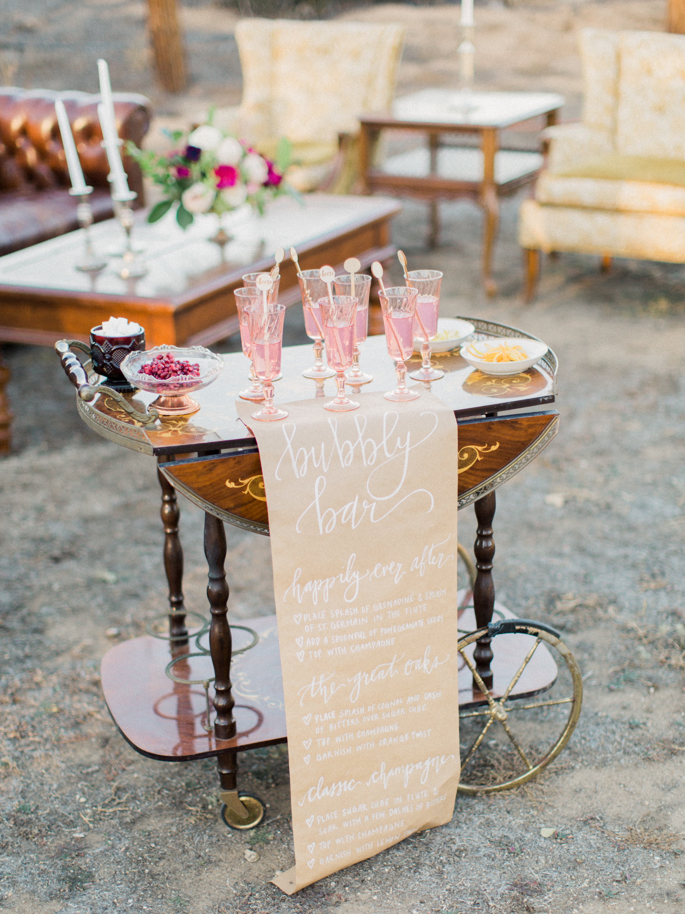
I’ve always loved this idea of using calligraphy on kraft brown paper. It feels modern and not fussy. And in this case, the sign keeps the bubbly bar, with all the antique accents, from looking old-fashioned.

Calligraphy Inspiration: Pirouette Paper / Photo Credit: Mallory Dawn Photography

Photo: Mallory Dawn Photography

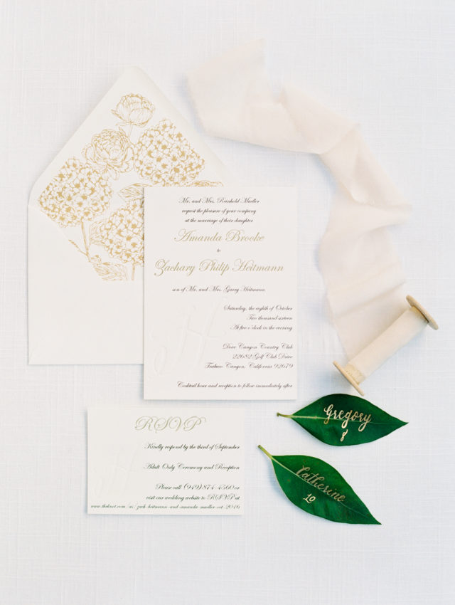
There’s definitely an organic style to Kaylyn’s work. I love her use of botanical elements, like leaves, with gold lettering  for sweet and modern wedding seating tags.

Calligraphy Inspiration: Pirouette Paper / Photo Credit: Savan Photography

Photo: Savan Photography

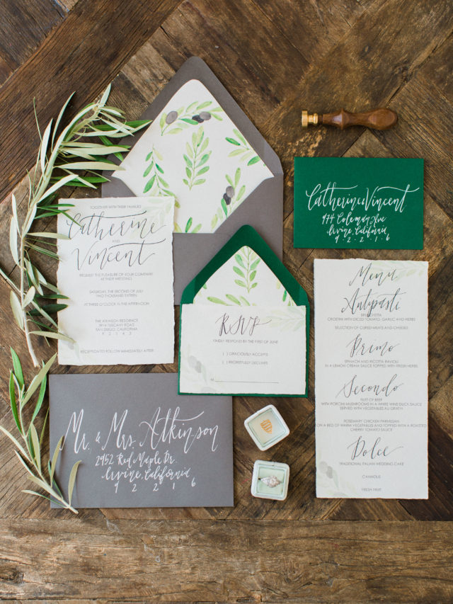
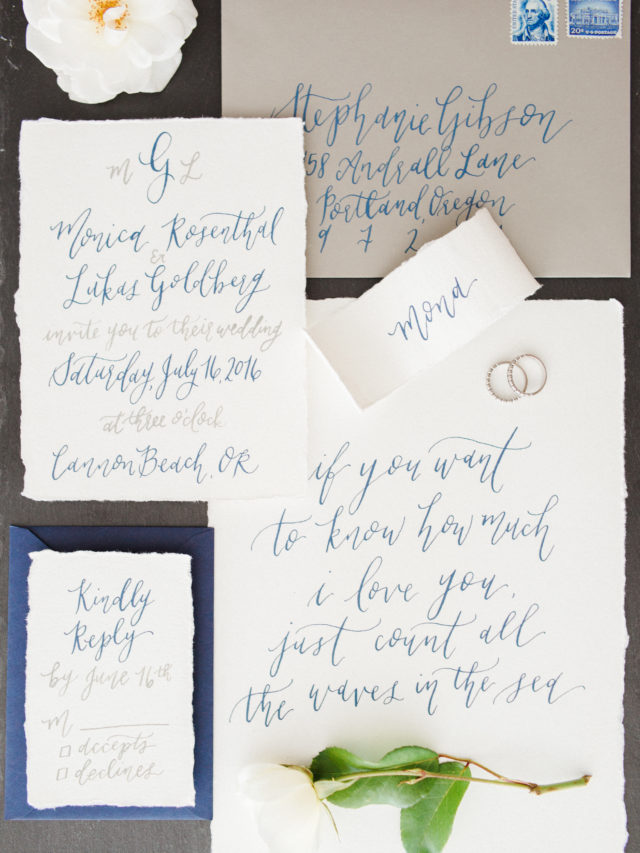
With Pirouette Paper, you’ll find invitation suites that mix  calligraphy with simple type for a beautiful effect.

Calligraphy Inspiration: Pirouette Paper / Photo Credit: Loren Weddings

Photo: Loren Weddings

Here’s the prettiest cocktail menu I ever did see. (I bet Andrew knows how to make all of these fun-sounding cocktails!)

Calligraphy Inspiration: Pirouette Paper / Photo Credit: Mallory Dawn Photography

Photo: Mallory Dawn Photography

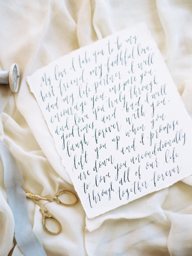
Letter work too pretty to store in a box (in my opinion). I’d frame a sentimental piece like this and hang in my bedroom.

Calligraphy Inspiration: Pirouette Paper / Photo Credit: Mallory Dawn Photography

Photo: Mallory Dawn Photography

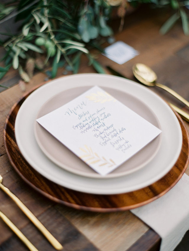
This wedding menu features calligraphy letter work with an embellishment of gold foil. I love how the table features rustic wood chargers and skips the tablecloth to balance the golden accents for a more modern, less fussy-fancy table.

Calligraphy Inspiration: Pirouette Paper / Photo Credit: Mallory Dawn Photography

Photo: Mallory Dawn Photography

Kaylyn says her inspiration comes from her mood when she’s writing. “I love to let anything I’m feeling come through in my writing, whether it’s a more abstract and ethereal font (for those rainy days) or a more straight-forward, curly font if I’m feeling especially fun and youthful,” she says.

Calligraphy Inspiration: Pirouette Paper / Photo Credit: Savan Photography

Photo: Savan Photography

Kaylyn got into calligraphy after a photographer friend of hers asked her to attend a calligraphy class with her. After that fateful class, she decided that it’s what she wants to do. “From there I started building my business while I was finishing up school and working at Disneyland — lots of styled shoots, small commissions, etc.” says Kaylyn. But this past June, she said goodbye to Disney and jumped into full-time doing Pirouette Paper. “Most of the time it doesn’t even feel like work.”

Calligraphy Inspiration: Pirouette Paper / Photo Credit: The Hearts Haven

Photo: The Hearts Haven

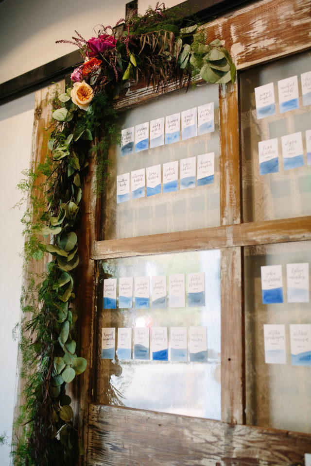
Watercolors and calligraphy name tags mixed with rustic woods and fresh garland — this is one dreamy entrance to the celebration.

Calligraphy Inspiration: Pirouette Paper / Photo Credit: Natalie Schutt Photography

Photo: Natalie Schutt Photography

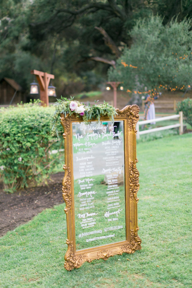
You can turn a vintage mirror into a standout program for the big day with hand-drawn calligraphy.

Calligraphy Inspiration: Pirouette Paper / Photo Credit: Kristina Adams Photography

Photo: Kristina Adams Photography

I hope this peek into the work of Pirouette Paper has been a pretty kickoff to 2017. Here’s wishing the new year is golden!