Aaaaaahhhh…. if invitations could be a soothing breath of fresh air, these refined modern neutral letterpress wedding invitations from Alana of Bourne Paper Co. would definitely be it. A clean, minimalist design with classic serif and sans-serif text, luxurious neutrals, and a delicate textured envelope liner? So good. And the silk thread wrap and white wax seal finish are simply sublime!
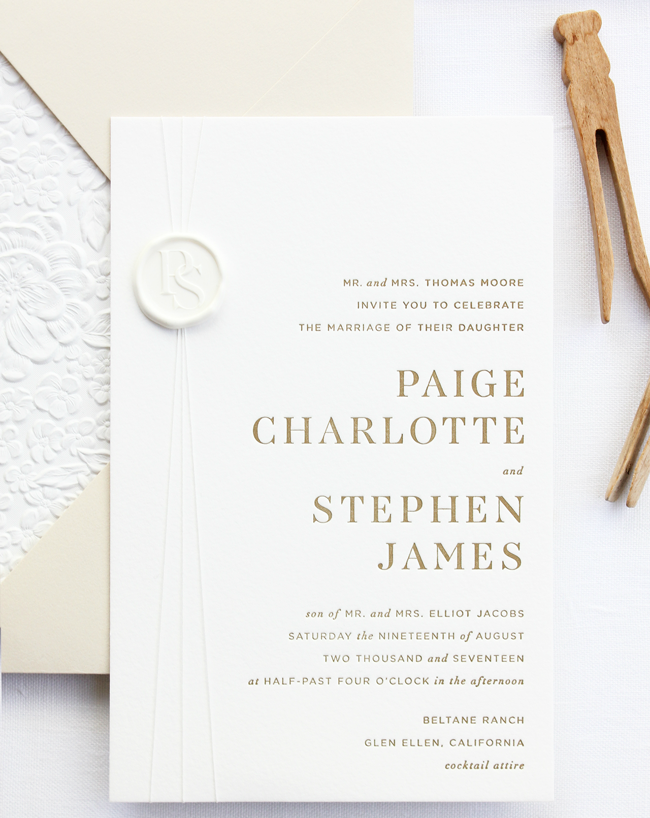
From Alana: This invitation suite was designed to focus on modern typography and a warm, neutral color palette. We wanted the suite to have a very clean and crisp feel paired with unique textures that would stand out even when executed in whites and taupes.
The first design decision made was to forego script fonts in favor of clean serif and sans-serif fonts. Italicized accents were added to the type to give the suite a more formal and elegant feel. We also created a modern monogram that was subtly featured throughout the invitation suite.
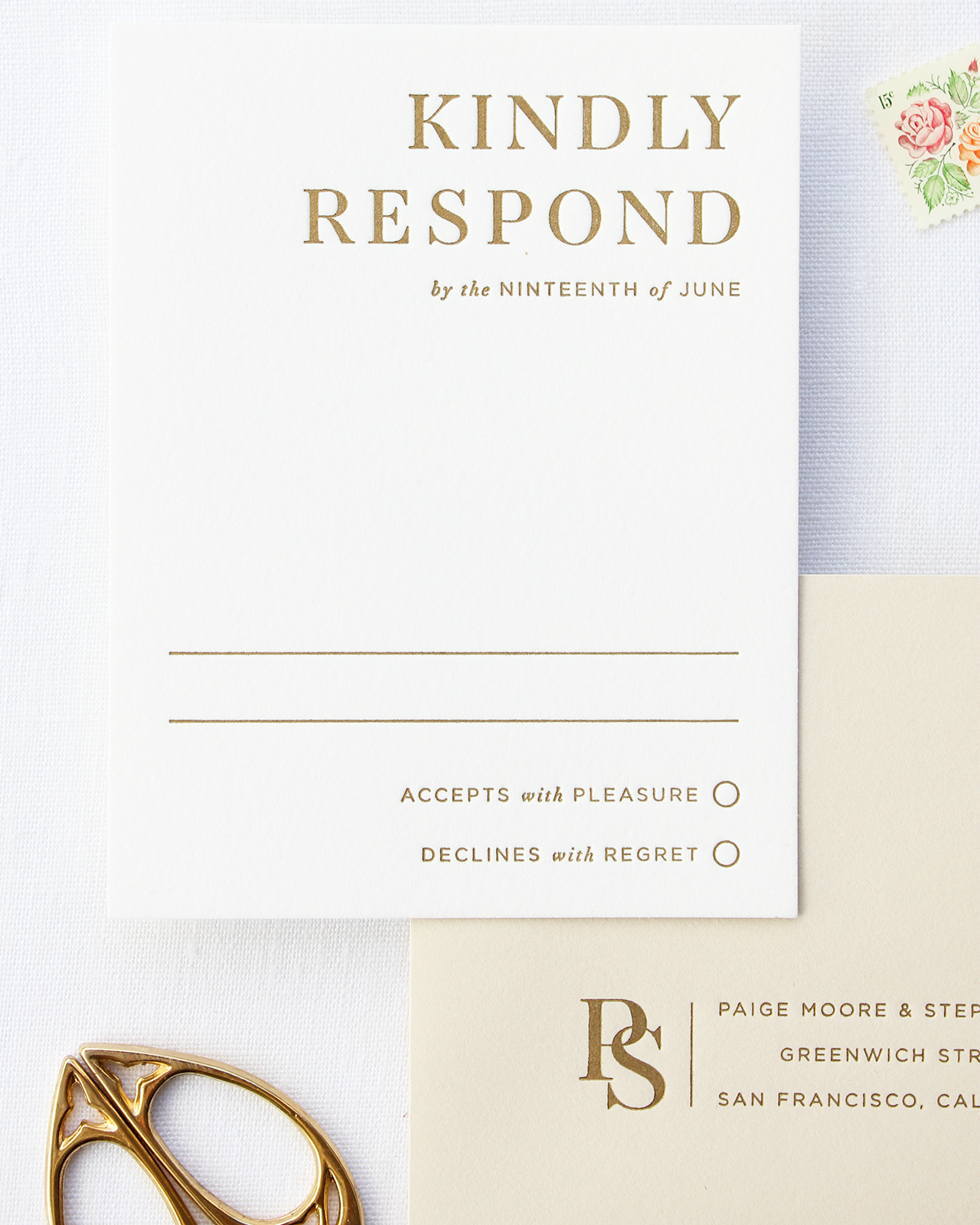
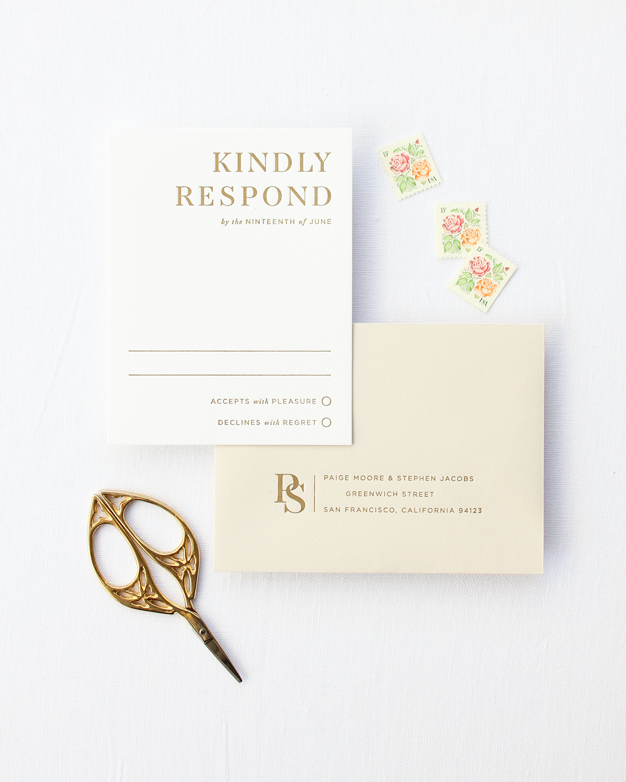
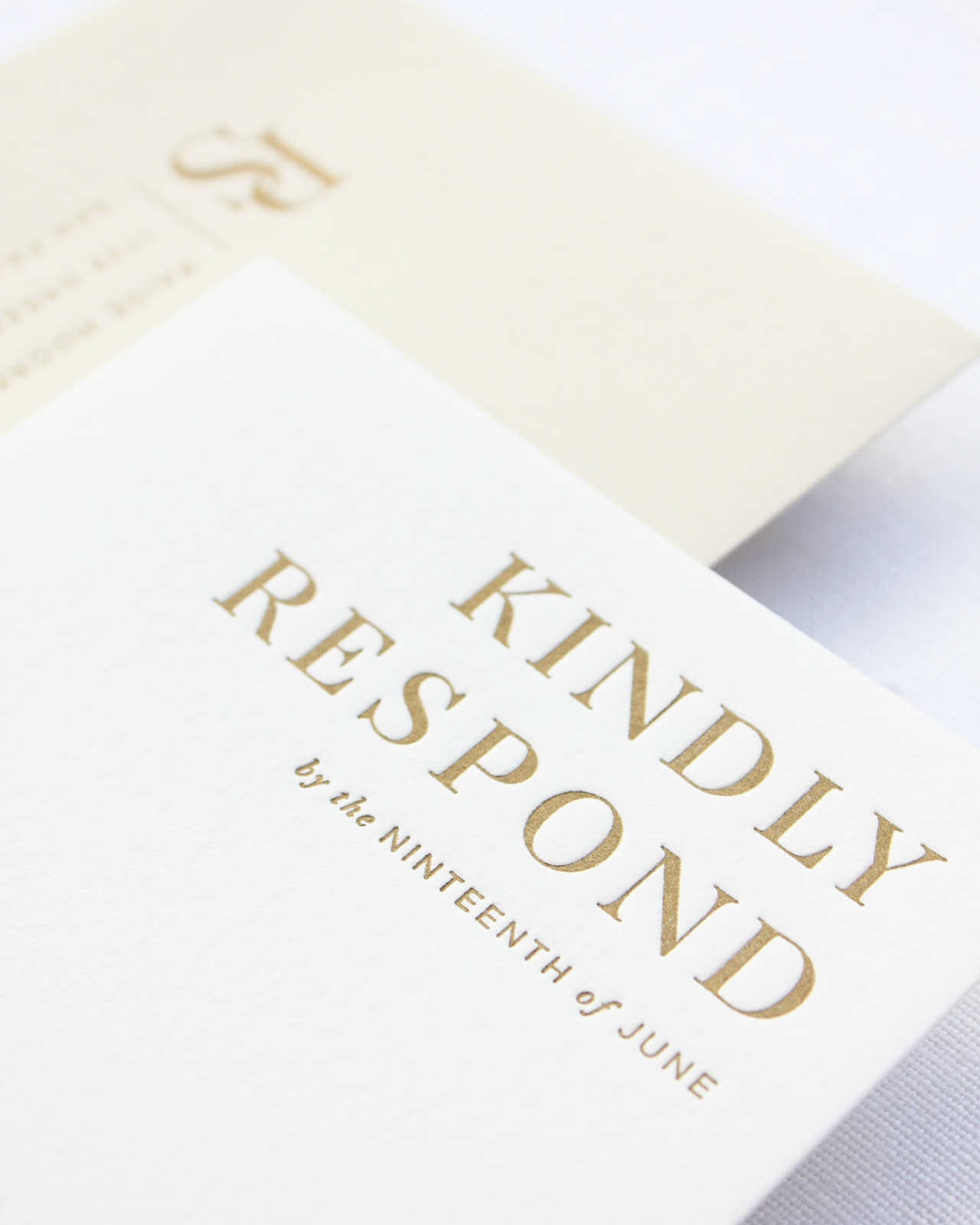
The invitation suite was letterpress printed in a warm, metallic gold ink which reflected with the perfect, subtle shine when held at an angle. For paper, we used Somerset Velvet 300g card stock in Radiant White for a bright look and a soft cotton-like texture. The card stock also allowed us to apply stronger pressure during the printing process, which gave the letterpress text the crisp, clean feel we were going for and ensured the typography maintained its sharp edges and angles.
To complete the suite, we finished the invitation with a silk thread wrap and white wax seal which used the couple’s monogram. We selected a warm taupe envelope for both the invitation and response card, something to add a hint of color without straying too far from the neutral theme. The taupe envelopes paired perfectly with the metallic gold ink, which was used to print the couple’s address and monogram onto the response envelope.
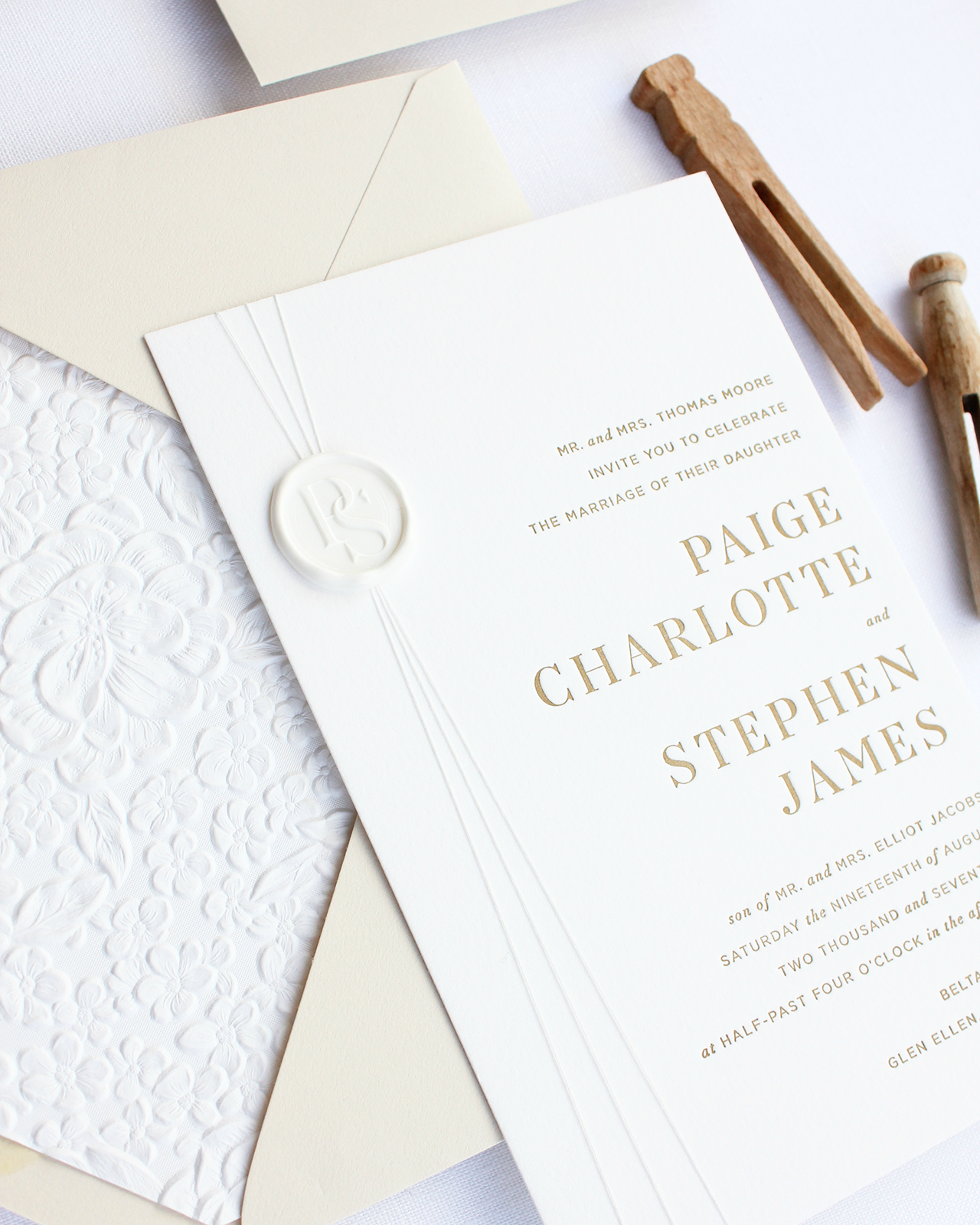
We finished the invitation with an envelope liner featuring blind embossed cherry blossoms and other delicate florals. We loved the dramatic texture the liner provided and the bright white paper was the perfect compliment to the warm, taupe envelope – it also added just the right touch of florals to maintain the suite’s modern but elegant look.

Thanks Alana!
Design: Bourne Paper Co.
Check out the Designer Rolodex for more talÂented wedÂding inviÂtaÂtion designÂers and the real inviÂtaÂtions gallery for more wedding invitation ideas!
Photo Credits: Alana Cutler