Behind the Stationery: anne and kate

Our next Behind the Stationery feature is a bi-coastal duo! Anne & Kate have been dedicated to growing their business full-time for almost a year now, but their friendship began years before they started their business. I’m so excited to have them here to share about their workflow from upstate New York to LA that includes many Facetimes and a unique design process. Take it away, ladies! — Megan Soh
Behind the Stationery: Anne & Kate

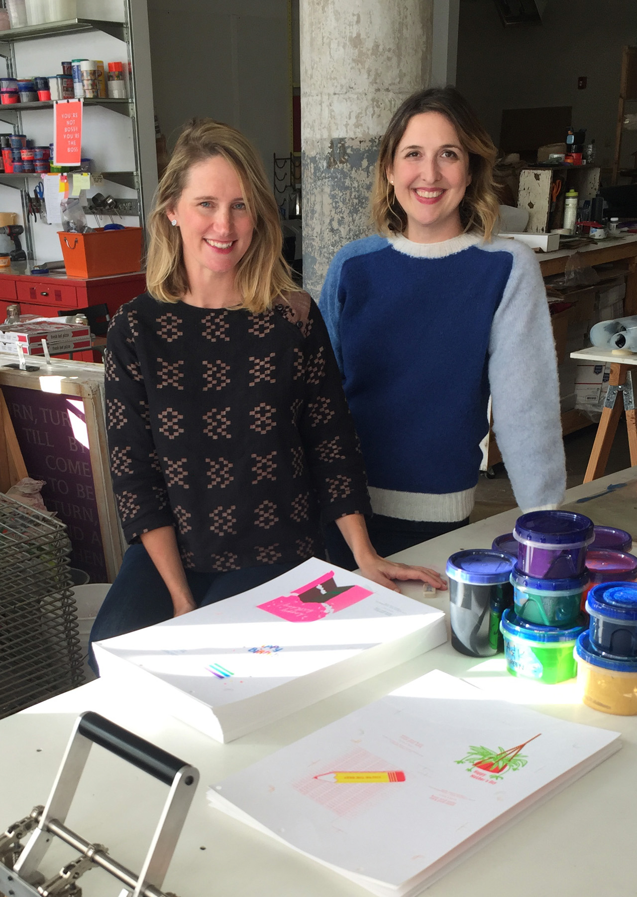
Kate: Before working on anne and kate in a full time capacity, I worked as a freelance graphic designer for small studios and in-house marketing groups.

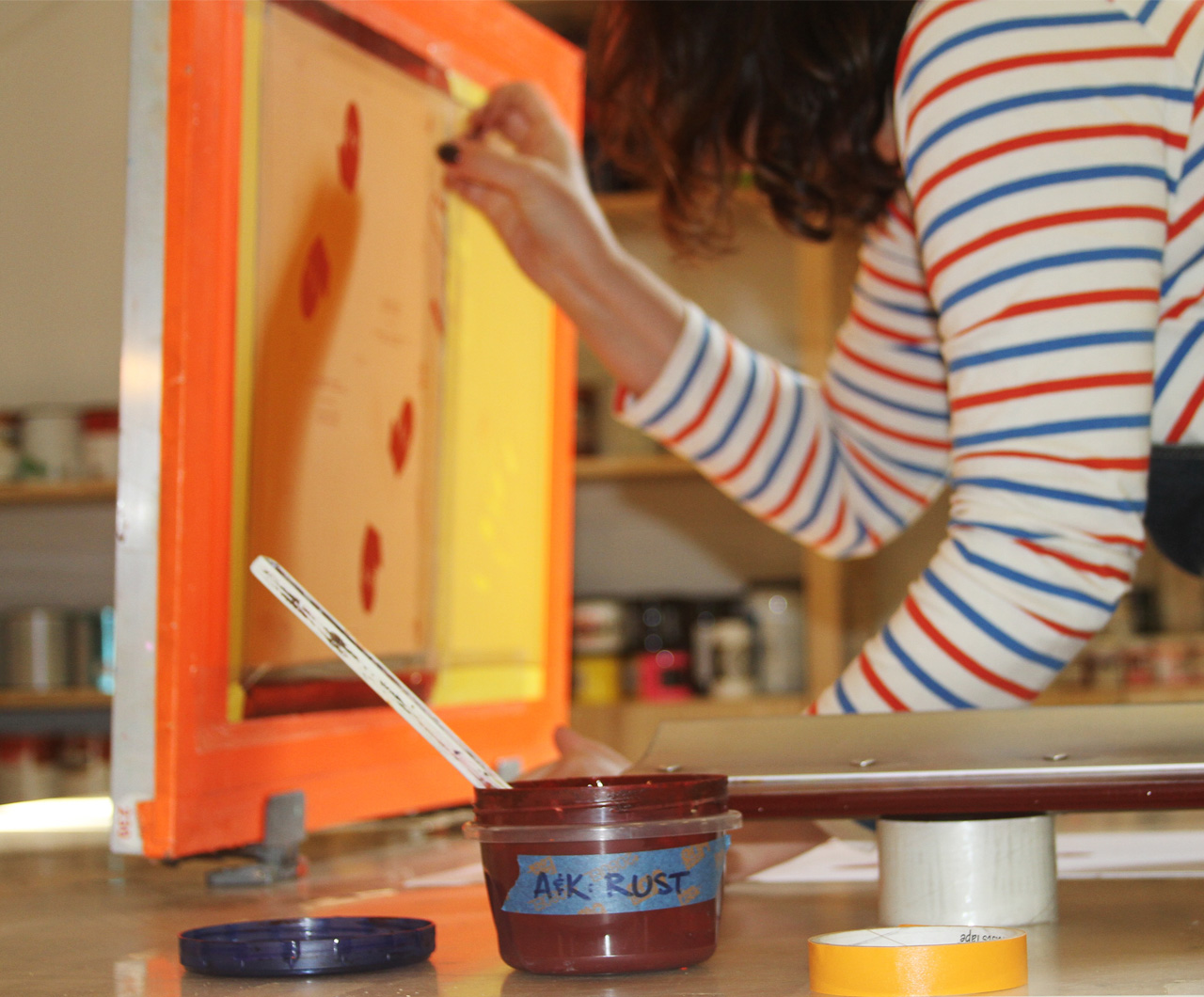
Anne: I am a fine artist and when I am not working on anne and kate, I make paintings and large scale installations. I rely heavily on screen printing to make my artwork so the studio constantly has some printing happening in it. Before I gave anne and kate more of a full time focus I was an adjunct professor of fine art at a number of universities in Philadelphia — teaching painting and screen printing.

We began by collaborating on custom design projects for friends’ weddings. We love designing for clients but wanted to create a cohesive line that was all our own. We were interested in products that helped friends stay in touch beyond coming together for big life events. Throughout our friendship we’ve kept in touch through snail mail, letters, postcards and notes. This inspired us to launch a line of cards at the National Stationery Show in 2016.
Behind the Stationery: Anne & Kate

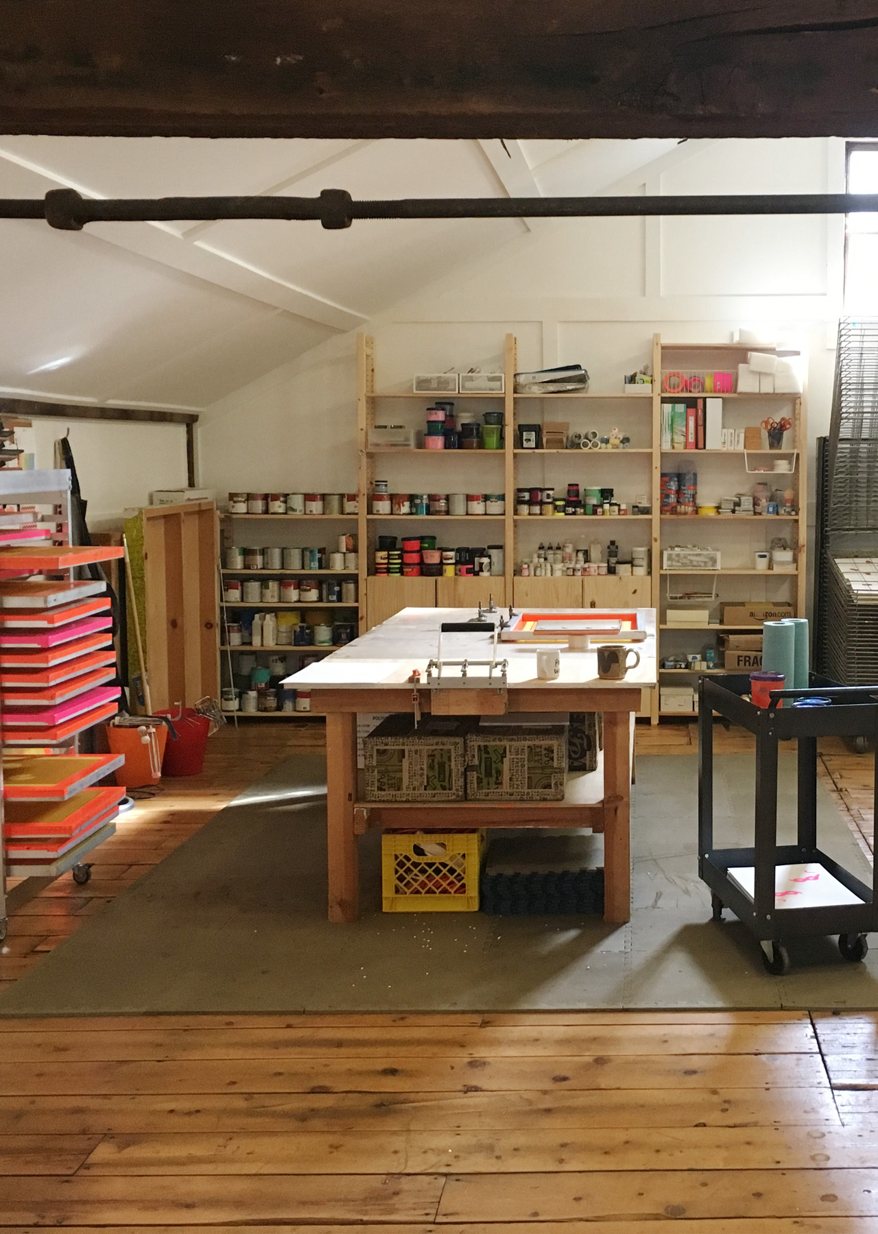
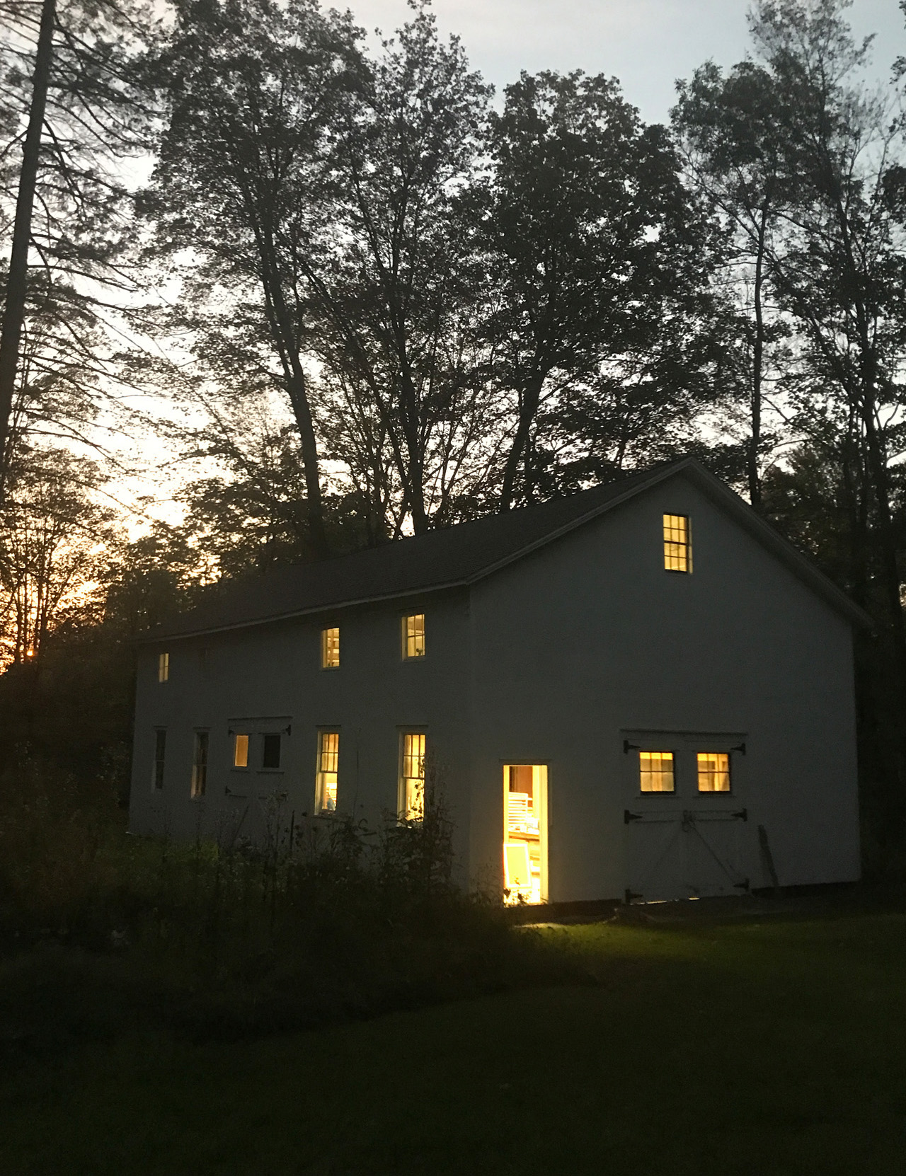
Because we live in two different cities, we have two separate work spaces. Our studio for production and fulfillment is in upstate New York in a tiny town called Valatie, where Anne lives. There is a barn on her property that we use as our studio. Kate lives in LA and works out of her home.
Behind the Stationery: Anne & Kate

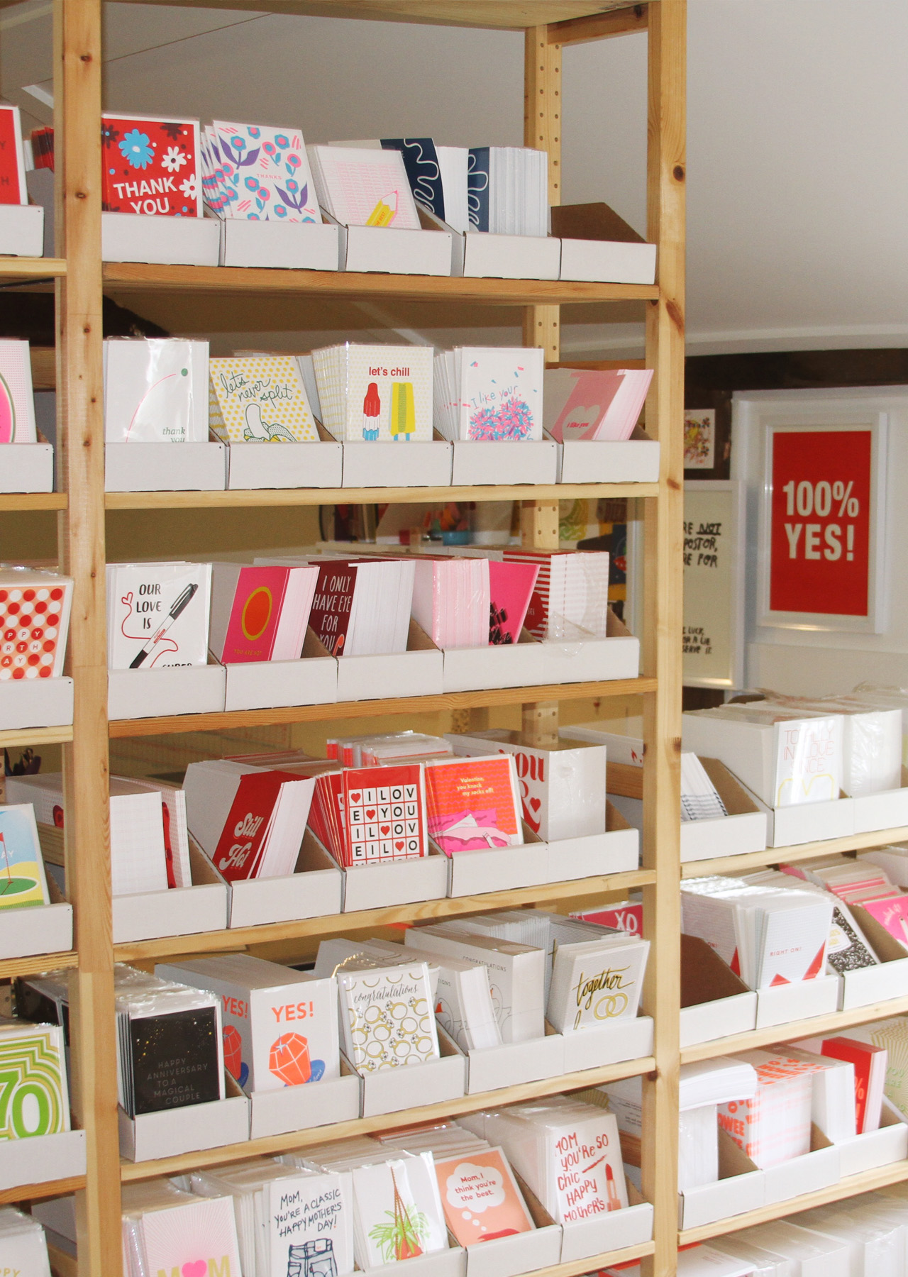
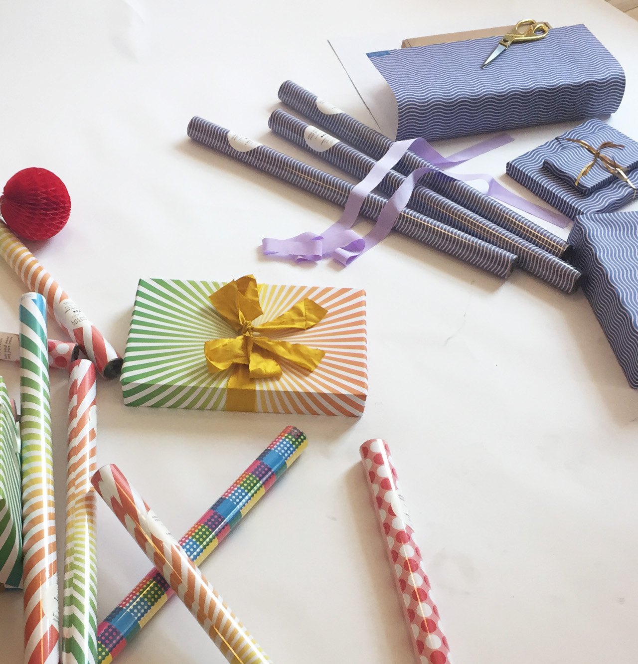
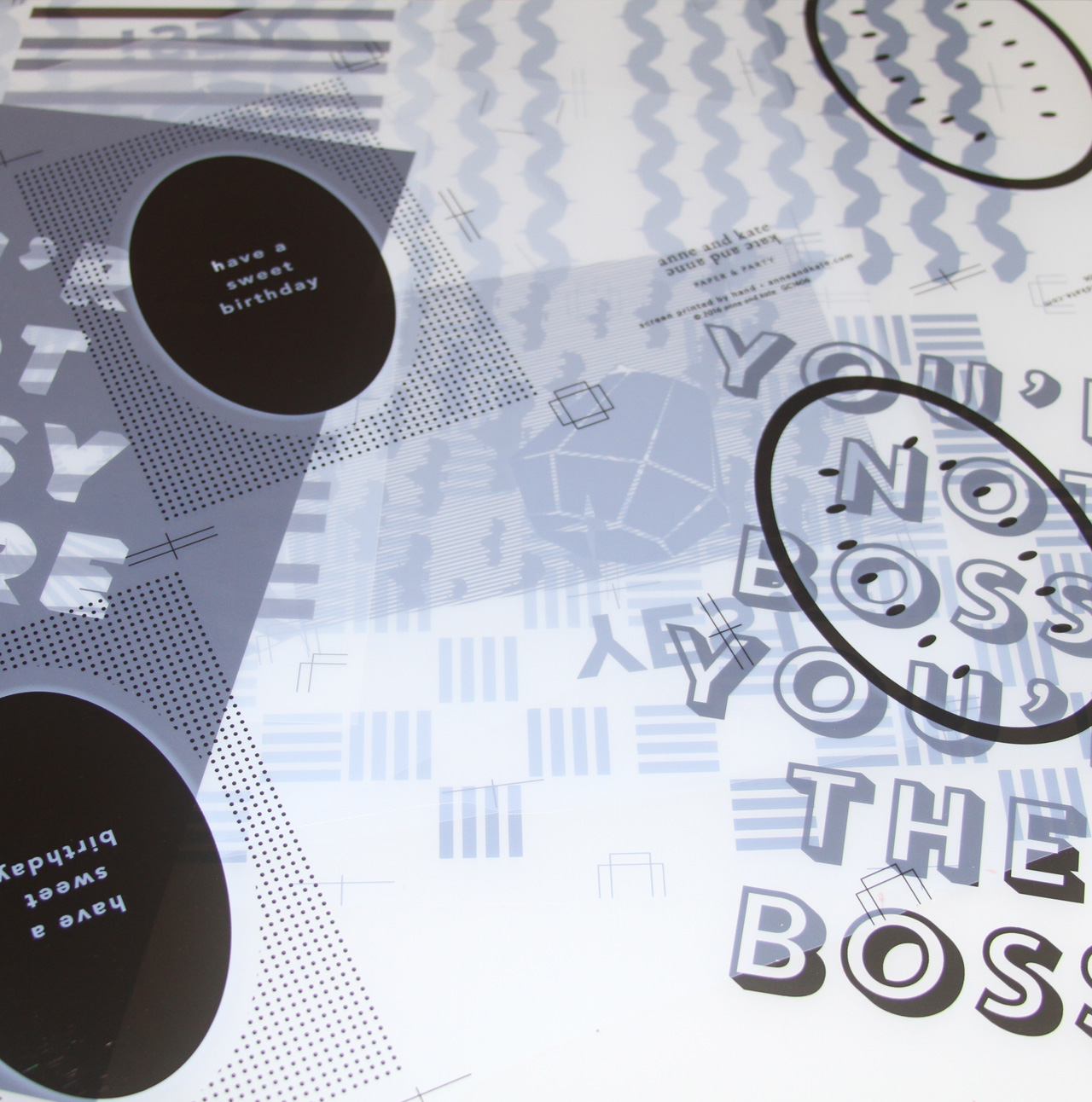
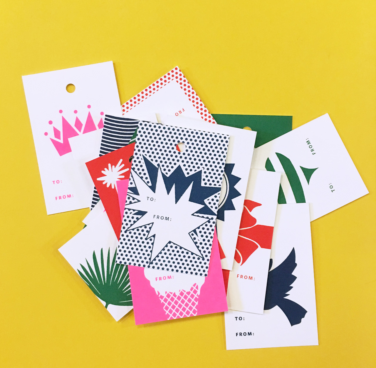
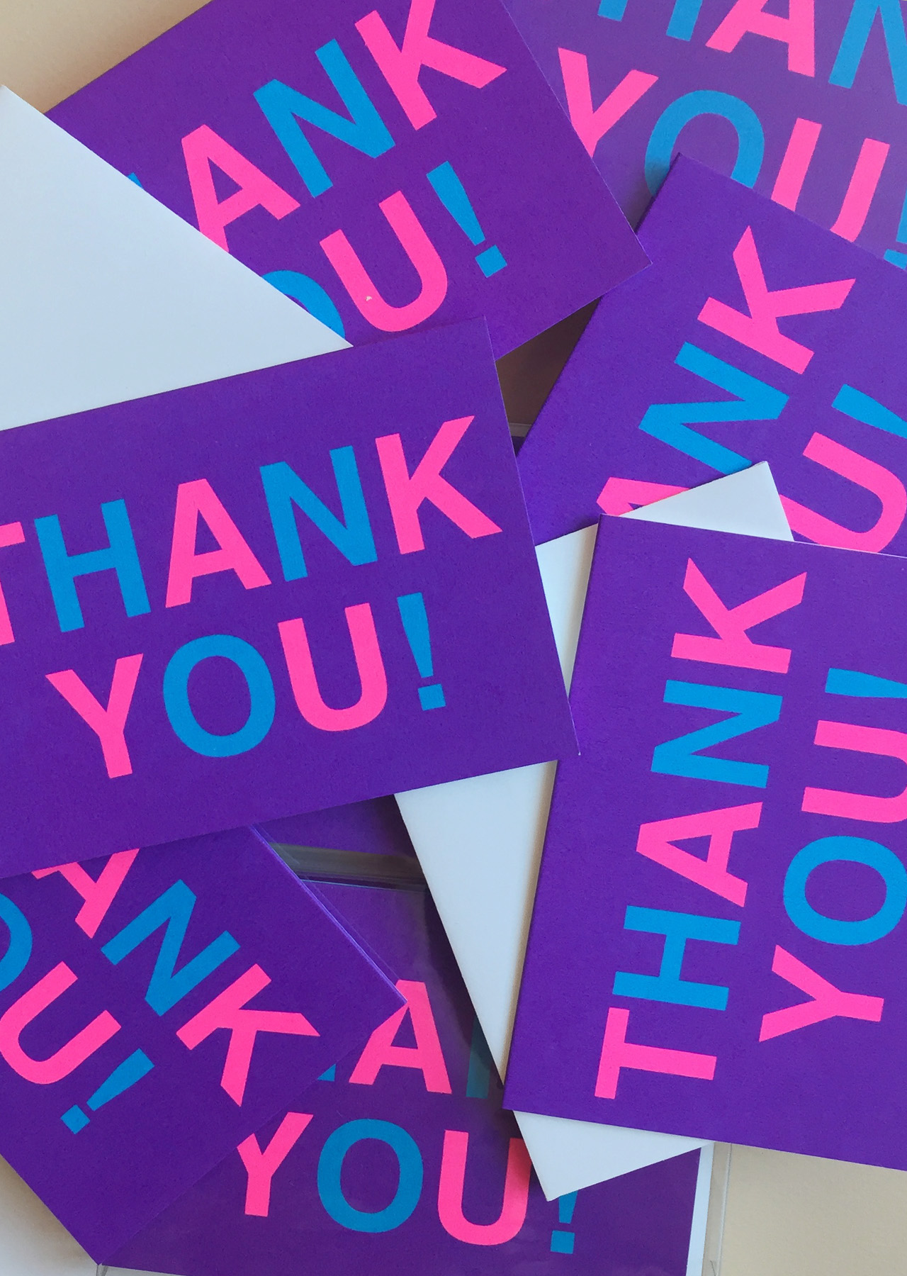
All of our stationery is screen printed. We make greeting cards, thank you notes, postcards, and gift tags. Additionally, we make wrapping paper and other party supplies. Our products are bold — we are both drawn to intense color and we think our color is what helps set us apart from other lines. We make cards that feel fresh and communicate positivity and a sense of exuberance. Screen printing suits our design aesthetic because it is great for crisp graphic imagery and produces a unique flat, juicy, color. Our neon colors wouldn’t be possible with the same density and impact in any other print medium.
Behind the Stationery: Anne & Kate

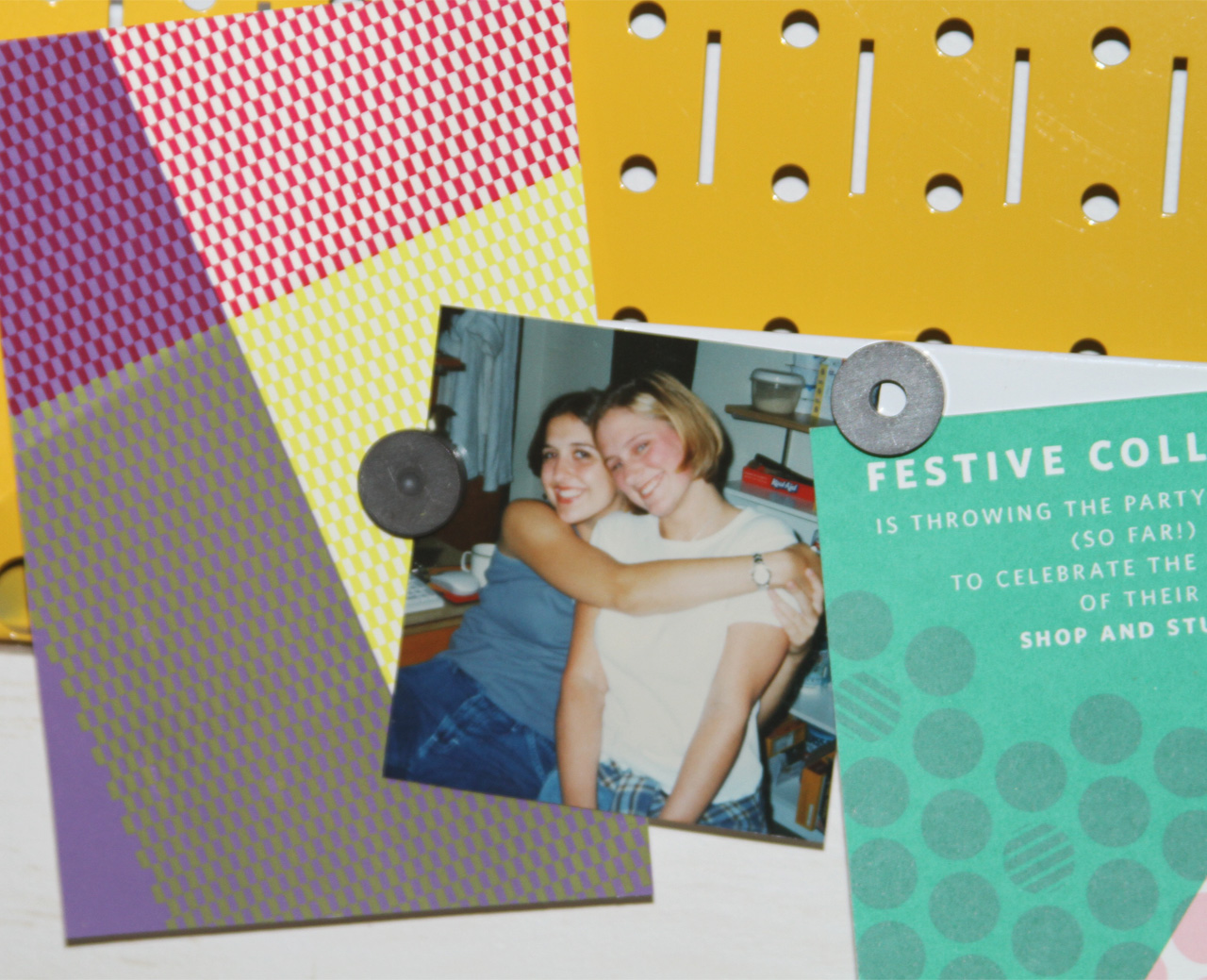
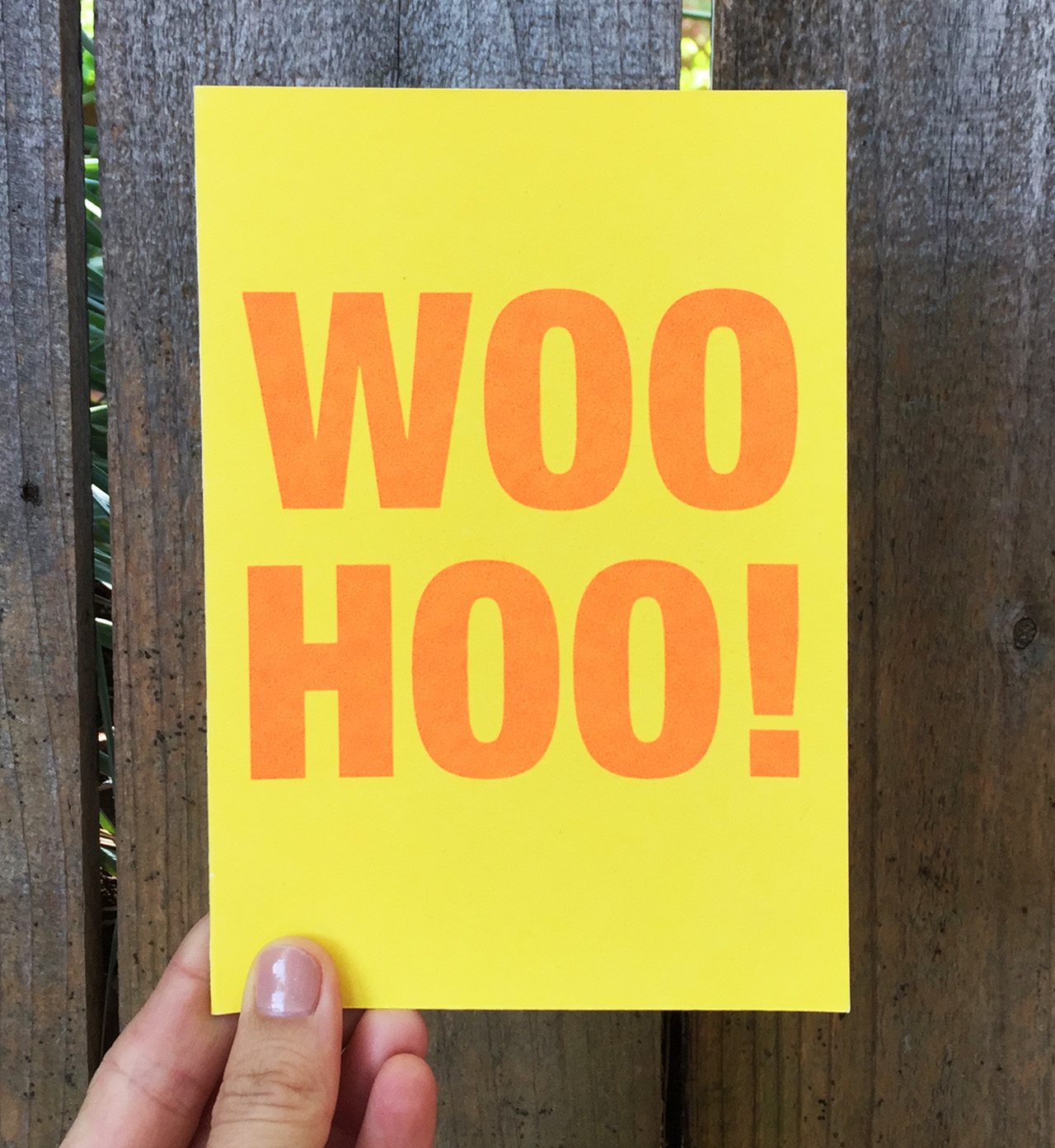
We have a long distance bestie business! We met in college and haven’t lived in the same city since. Because of our personal relationship with stationery and the role it has played helping us keep in touch, celebrate birthdays, life achievements, and provide comfort when things have been hard, our designs tend to gravitate toward cards that celebrate love and friendship. While we have styles for all occasions we always come back to sentiments that are super positive, encouraging, or celebratory. We believe in celebrating life’s important moments – big and small. Showing someone you care by sending them a note or taking the time to wrapping their gift with super special wrapping paper is an amazing gesture. We all need to be shown a little love and care, and we think that should take the form of a neon yellow WOO HOO!
Behind the Stationery: Anne & Kate

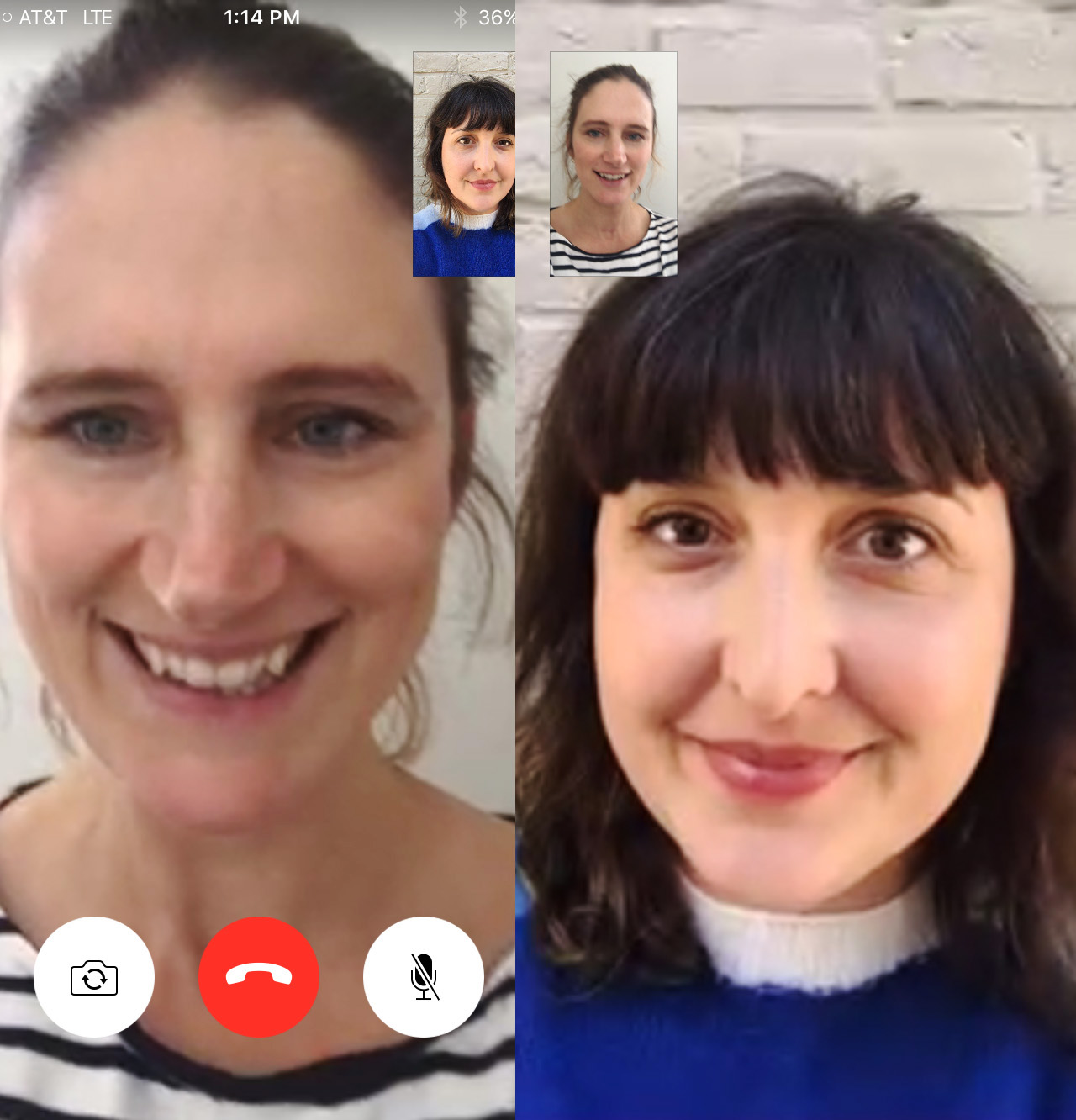
We each maintain independent schedules because we work long distance. We schedule weekly calls to talk about the big stuff and but are in contact daily; our text thread is full of pictures of doodles of new design ideas, screen captures of the designs we are working on on the computer, and notes about the status of orders – all interspersed with random personal messages. Our friendship naturally interjects itself in to our work and vice versa.
Behind the Stationery: Anne & Kate

We have strategically scheduled in-person meetings where we travel to stay with each other. When a work session requires printing, sampling new designs and testing colors, Kate comes to NY. For design sessions and planning, Anne travels to LA.
Behind the Stationery: Anne & Kate

Anne: I manage all the production (in-house and what we outsource) and fulfillment. My days vary based on the volume of orders, design deadlines, and our inventory needs. I try and devote a few hours every morning to packaging inventory to make order fulfillment easier and more efficient. I devote at least two days to printing to keep up on the inventory of the styles we print in-house. I work with our vendors to manage the production of the styles we outsource and manage our part-time studio assistant who helps with packaging and inventory management.
Behind the Stationery: Anne & Kate

Working in a barn adjacent to my house provides for an very easy commute, but I am careful to set office hours to keep me from popping over in the middle of the night to do some work. It’s a real bonus to walk across the lawn to the barn – I just have to been on the look out for bunnies and deer if I do go late at night!
Behind the Stationery: Anne & Kate

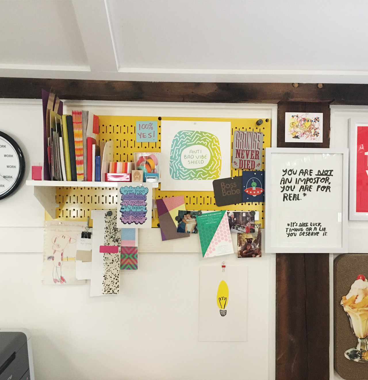
Kate: I manage the wholesale accounts and custom clients, marketing, and accounting. In the morning I respond to inquiries from wholesale accounts, vendors, sales reps, and clients. The rest of my time is divided between accounting, designing, planning, web and social media. We’ve only been at this full-time for about a year so we are just starting to get into a real groove with our calendar. And I’m in the middle of moving from Chicago to LA which is throwing my usual schedule out the window! I have 3 little kids, so I usually finish the day early to pick them up from school. If there’s time-sensitive work to be done I get back to it after they are all asleep.
Behind the Stationery: Anne & Kate

We design collaboratively. We start by brainstorming ideas over the phone, making a master list of styles we need (like new birthday or graduation cards) and then work on sketches individually. We both often start with very loose doodle and sketches on paper, then we then refine them in Illustrator. There is often a lot of overlap in the way we’ve approached the design concept or illustration so it becomes easy to fuse our work into a finished piece. We feel that our work is stronger because we design collaboratively; it brings together our different strengths in color, typography, pattern, and composition.
Behind the Stationery: Anne & Kate

Once we have a design layout nearly resolved, we tackle the color separations. We design with layers and overlap in mind; we use the last stage of the design process to carefully refine how parts of the design interact. We sample the designs by screen printing them at the studio to see what will make the cut to move into production. Once design, color and styles are finalized we prep files for outsourcing or for Anne who puts it into our in-house production schedule.
Behind the Stationery: Anne & Kate

We are always trying to be more efficient in how we work, both in our own spaces and in how we work together. It’s always a struggle to protect the design process – it’s the most fun part of what we do, and the most important – but we manage nearly all of the aspects the business ourselves and it involves so much more than design. There are endless business-related tasks that no one likes to think about!
Behind the Stationery: Anne & Kate

All images courtesy of anne & kate.

Want to be featured in the Behind the Stationery column? Reach out to Megan at megan [at] ohsobeautifulpaper [dot] com for more details.

2017 Gift Guide for Kids!

If you’re on the hunt for creative gift ideas for kids, this guide is for you! I base these guides around things that I think my own kids – Sophie, age 5, and Alice, age 3 – would enjoy, so these picks are mostly geared towards that age range. If you’re looking for ideas for younger kids, check out the gift guides from 2016, 2015, and 2014, there are definitely a bunch of great ideas there! This year, Sophie is really into STEAM (science, technology, engineering, art, and math), so you’ll definitely see that woven throughout this year’s gift ideas. Even though my girls are still pretty young for a lot of things, this is really such a fun age to watch their interests and creativity develop!

Gift Ideas for Kids!

1. I bought a vintage U.S. map puzzle of where all the pieces are shaped like the actual states, and my girls play with it ALL the time (you can find something similar here!). My kindergartener has been really interested in world geography lately, so I’m thinking about adding this World Map Puzzle to our collection!

2. These portable playsets from Sago Mini are the perfect toys to bring along on family trips or when you need something to keep your kids quietly entertained!

3. + 4. Now that Sophie is learning how to read and white, all she wants to do is write and draw in notebooks. We go through about two notebooks a week, no joke. And she isn’t even an angsty teenager yet! She recently picked out a locked diary from her school’s book fair – I think she’d really like this Forest Friends Locked Diary when she runs out of space in the current one! These Stardust Gelly Roll Pens are metallic and sparkly and would make a lovely stocking stuffer!

5. This awesome gadget is called Code-a-pillar – kids can manipulate the pieces to make it go in different directions and reach a particular target. It’s both fun and educational! Win-win.

6. We don’t have a whole lot of room for toys, so I’m always a fan of subscription craft or STEM kits for kids. I just signed my girls up for a subscription from Kiwi Co., which delivers age-appropriate projects straight to your home every month. If subscriptions aren’t your thing, you can also find fun projects on sites like Seedling (this pirate activity looks fun!). And this website has a bunch of awesome-looking science kits for slightly older kids.

7. My girls love building toys: Magnatiles, blocks, Duplos, etc. If your kids also like to build, these Constructibles kits inspired by famous architects look like they’d be a lot of fun!

8. Sophie is really into rocks and crystals these days – this gemstone excavation kit from National Geographic is on our list!

9. My girls love the Hervé Tullet books, and this imaginative Za Za Zoom game based on the books looks like a lot of fun!

10. Magic Tracks!

11. If you’re already well stocked on art supplies, these Aquabeads are a fun creative activity (and don’t require ironing like traditional perler bead kits). 

p.s. Gift ideas for 4 year olds3 year olds, 2 year olds, and 15-month olds

This post contains affiliate links. By clicking on these links, you’ll help support Oh So Beautiful Paper while also purchasing some wonderful gifts. I only recommend products that I truly love and trust that you’ll love, too. My full disclosure policy can be found here.

Navy and Gold Foil Agate-Inspired Wedding Invitations

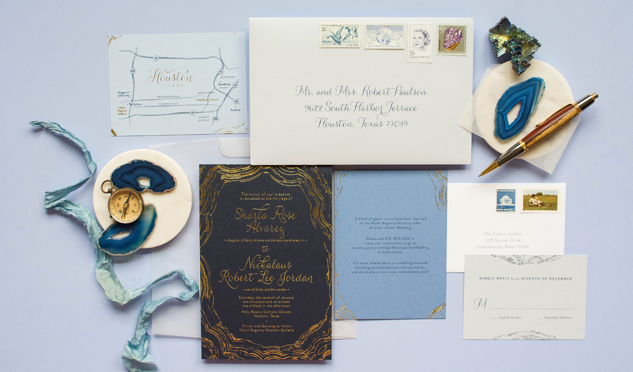
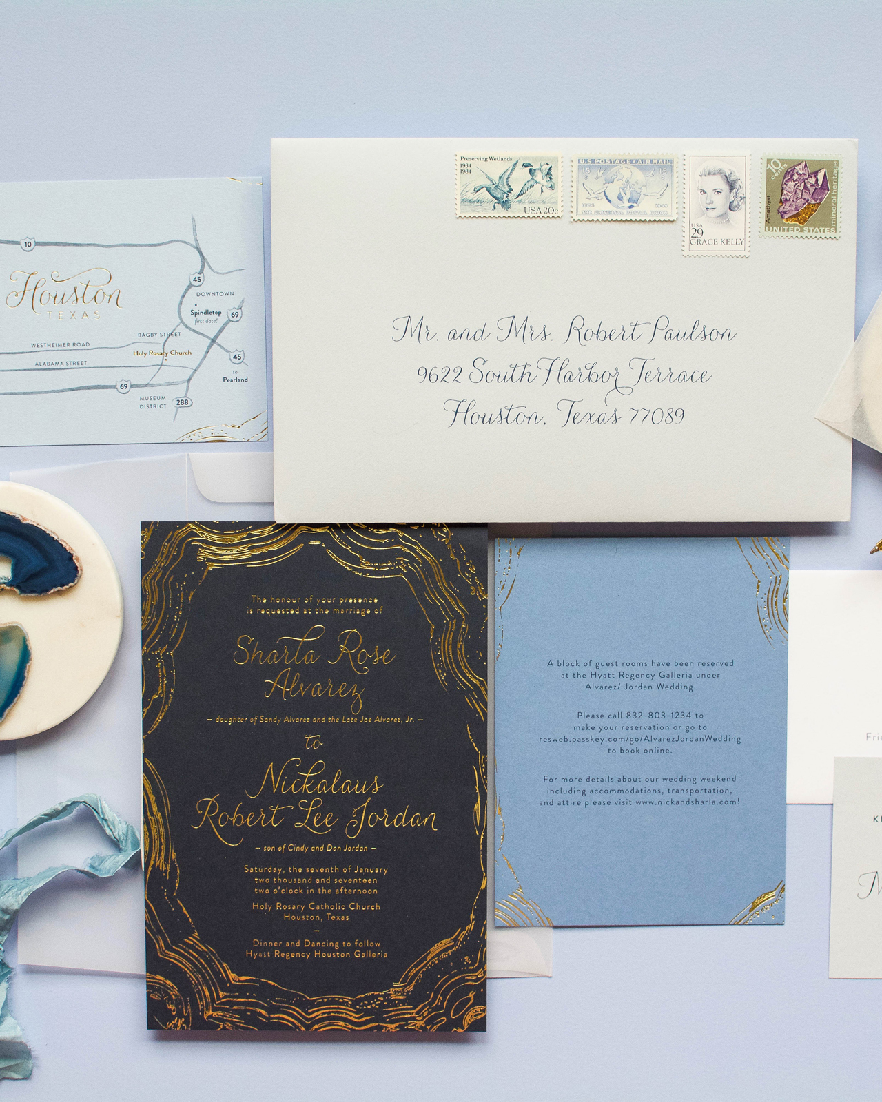
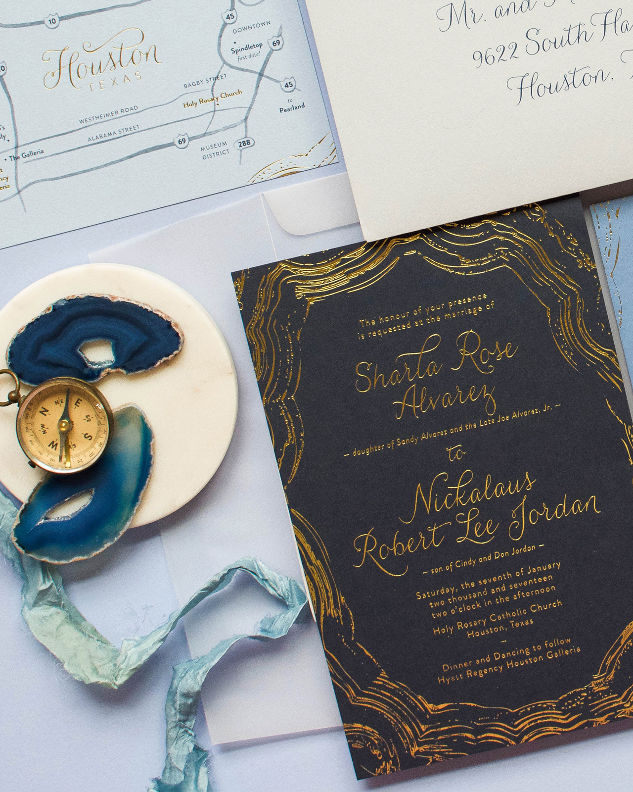
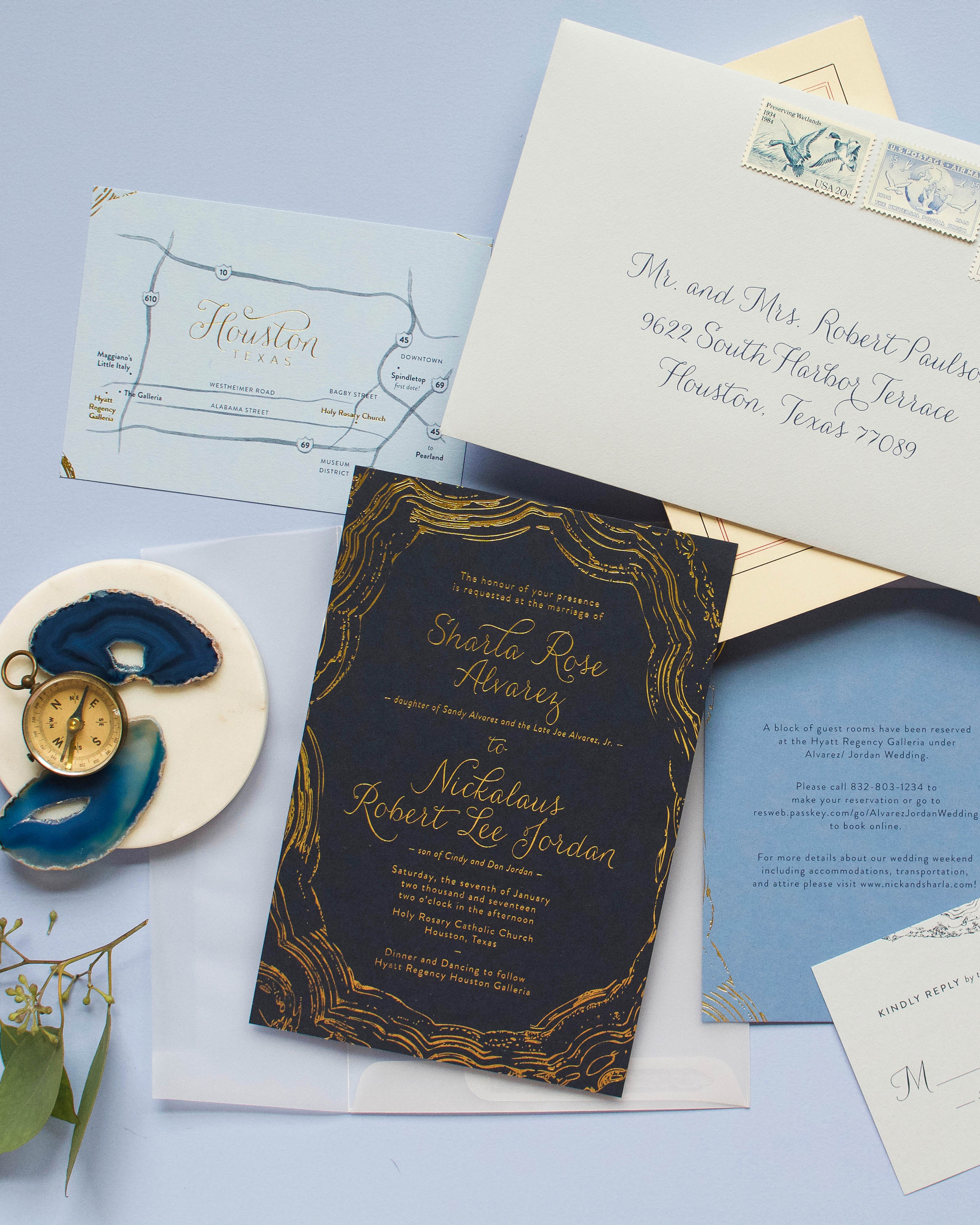
Modern yet classic and geometric yet organic, this wedding invitation suite is full of the very best juxtapositions. Michael Musser of Anticipate Invitations drew inspiration from one of nature’s most beautiful elements when creating these striking navy and gold foil agate-inspired wedding invitations. How beautiful is that gold foil border formed by the agate lines against that gorgeous dark blue paper?! 

Navy and Gold Foil Agate-Inspired Wedding Invitations by Anticipate Invitations

From Michael: Sharla and Nick approached me with their own jumping off point ideas for their wedding stationery design, and I knew they were on to something that could be taken to another level with some carefully well thought-out details.

Navy and Gold Foil Agate-Inspired Wedding Invitations by Anticipate Invitations

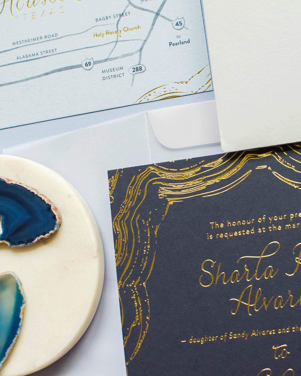
Sharla wanted to bring in something modern and abstract, yet also keep the feeling classic and traditional. She also wanted to use the blue hues and metallic golds she would repeat through her other wedding design elements. After some initial designs that were more geometric in nature, we landed on the more organic, yet graphic lines, of an agate slice. It allowed for the invitation to be fully classic and fully modern at the same time. To lean classic, we kept everything in metallic gold foil and printed on Colorplan paper’s dramatic Imperial Blue. The lines of the stone were pulled from a scan of an actual agate slice, and then edited and filled in as necessary to perfectly frame the invitation’s wording.

Navy and Gold Foil Agate-Inspired Wedding Invitations by Anticipate Invitations

Navy and Gold Foil Agate-Inspired Wedding Invitations by Anticipate Invitations

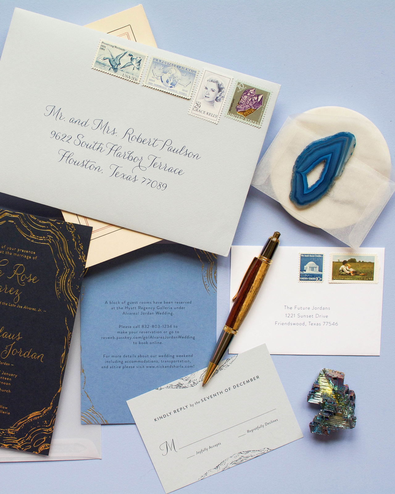
To further mimic the stone, we used graduated shades of blue paper from Colorplan for the remaining details cards, so that when stacked, it would create a beautiful ombré effect. To visually tie the pieces together, the agate lines of the invitation were repeated on all the corners of the smaller cards. When stacked, they formed the complete agate design, but perfectly hid the invitation’s wording.

Navy and Gold Foil Agate-Inspired Wedding Invitations by Anticipate Invitations

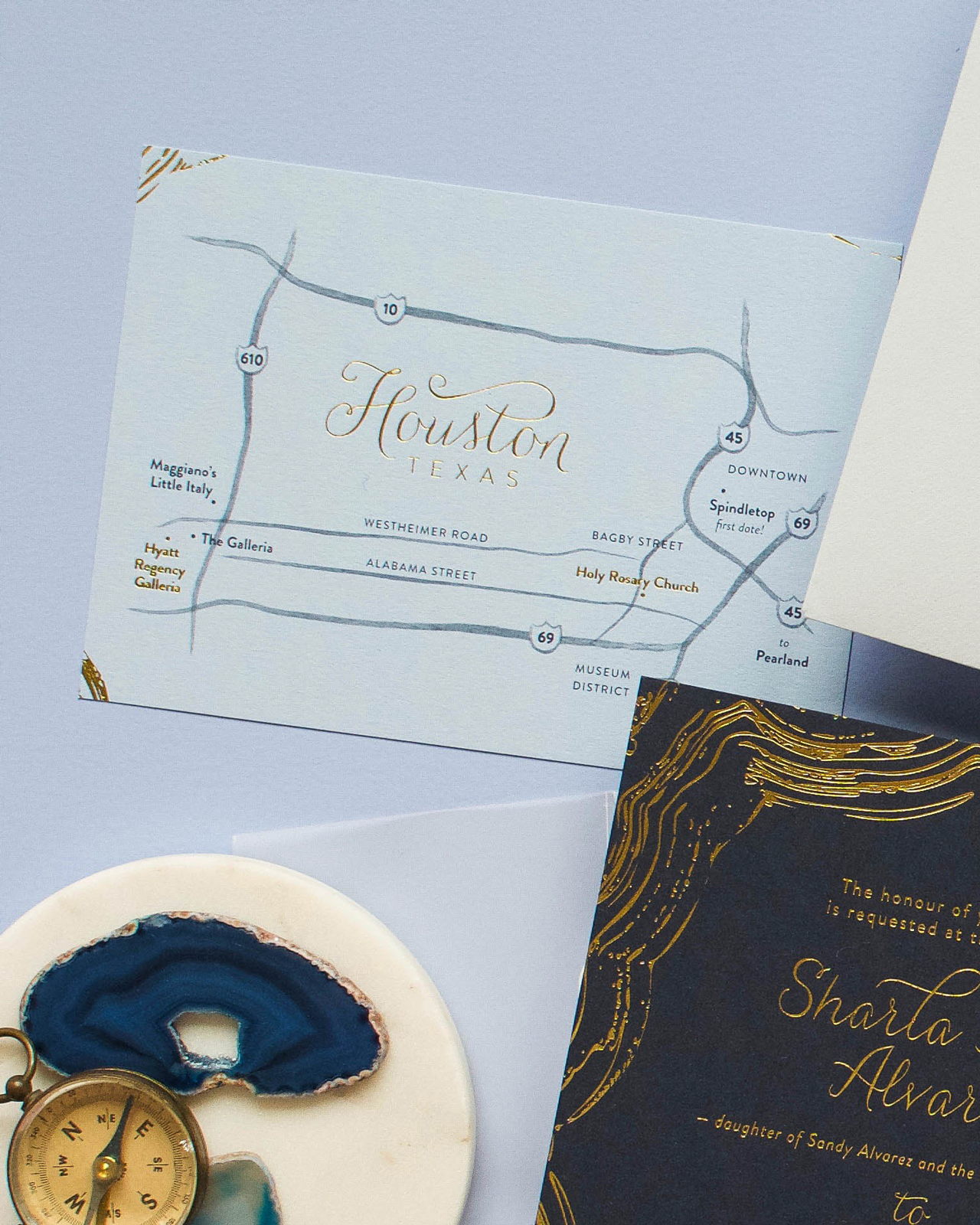
The secondary cards included accommodations, a modern map card that mixed simple watercolor lines and gold foil, and the reply card with envelope.

Navy and Gold Foil Agate-Inspired Wedding Invitations by Anticipate Invitations

The cards were tied together with gold string in a random and layered fashion while framing the monogram that was printed on the back of the top details card.

Navy and Gold Foil Agate-Inspired Wedding Invitations by Anticipate Invitations

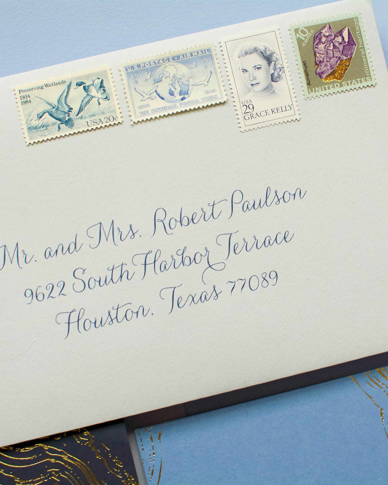
The suite was slipped into a clear vellum envelope, which was then inserted into a light blue outer envelope and lined with metallic gold paper. The envelope’s finishing touch was the set of four vintage postage stamps, that highlighted the blue tones and the geodes.

Navy and Gold Foil Agate-Inspired Wedding Invitations by Anticipate Invitations

Thanks, Michael!

Design: Anticipate Invitations
Printing: Hodgins Engraving
Paper: Colorplan Papers
Planning: Two Be Wed

Check out the Designer Rolodex for more tal­ented wed­ding invi­ta­tion design­ers and the real invi­ta­tions gallery for more wedding invitation ideas!

Photo Credits: Very Robin & Co.

2017 Gift Guide for Creatives

Every year, I try to share a few favorite gift ideas for artists and designers, and this year I thought I’d broaden things a bit to include some gift ideas for all creatives – from aspiring artists to hobbyists to weekend DIYers. There are definitely a few things in this gift guide that I use on a regular basis, along with a few other things that are on my own personal holiday wishlist. So whether you’re looking for the perfect gift for someone who loves dabbling in creative pursuits or maybe just want to forward this on to your significant other to help them in their holiday gift purchases, hopefully there’s a little something for everyone below!

2017 Gift Guide for Creatives

1. Creatives of all types and backgrounds need to photograph their work, and ideally showcase it in the best possible light. Styling boards can seriously elevate the quality of those photos, but they’re definitely an investment. I’m a big fan of the double-sided styling surfaces from Erickson Woodworks and the plaster surfaces of One Stone West

2. I’ve been wanting to try weaving, and the colors in these weaving and roving packs from fiber artist Maryanne Moodie are just gorgeous. Just don’t forget the loom!

3. + 4. If someone is just starting out in a creative field, they might not have the resources to invest in beautiful styling props. I love these silk table runners from Tono & Co – they look absolutely stunning in styled shoots and can even double as a background for product photos. Ribbons also make the most beautiful styling props in photos, and I love these new ribbons with black edges from Angela Liguori!

5. Small dishes, like these gorgeous ring dishes from Suite One Studio, are great for holding ephemera on a desk – or even as props for styled photos!

6. Zojirushi mugs are the perfect way to keep beverages hot or cold throughout the day. Give one for hot beverages, and another to have ice cold water available throughout the day – it’s important to stay hydrated!

7. This adorable zipper pouch from Ban.do is the perfect way to organize pens, pencils, and paint brushes. 

8. + 9. Watercolor supplies make a lovely gift for an aspiring artist. I’m a big fan of this Koi travel watercolor palette for beginner artists, and Jenna from Mon Voir sells kits with professional level supplies that are great for intermediate artists and hobbyists. Don’t forget a pad of high quality watercolor paper. My favorite is Stonehenge by Legion Paper

10. These zippered pouches are a great way to stay organized! They’re basically modern trapper keepers, with tons of pockets both inside and outside, and can even fit up to a 13″ Macbook Pro! Plus, they come in some seriously fantastic colors. 

11. Houseplants are a great gift for someone who works from home. Check your local hardware store, or even Home Depot and Lowe’s for great deals on low-maintenance plants. These googly eye planters totally crack me up – I’d love to have a set for my home office!

12. It took me the longest time to invest in a quality paper trimmer – and it always drove me nuts when I needed to cut something in a straight line for a project! I have this hefty bypass paper trimmer and love it. Of course, this wouldn’t cut it for a professional stationer, but for DIY projects at home it’s absolutely fantastic. 

13. I have this Silhouette CAMEO and use it all the time for DIY projects (like these DIY Matisse-inspired pumpkins!). You can use it to cut out vinyl decals, create custom fabric transfers, and even create custom cut paper pieces!

*Also, creative classes and workshops make a wonderful gift for creatives! You can do some research to find local workshops in your area, or check out online workshops if that isn’t an option. I highly recommend the Modern Calligraphy Summit for aspiring calligraphers, and these online floral workshops from Nicole of Soil + Stem look amazing! If you’re in the DC area, my friend Michele teaches calligraphy and brush lettering workshops – and we’ve got lots of fun workshops planned at Common Room Studio in December and 2018!

Classic Ocean-Inspired Wedding Invitations

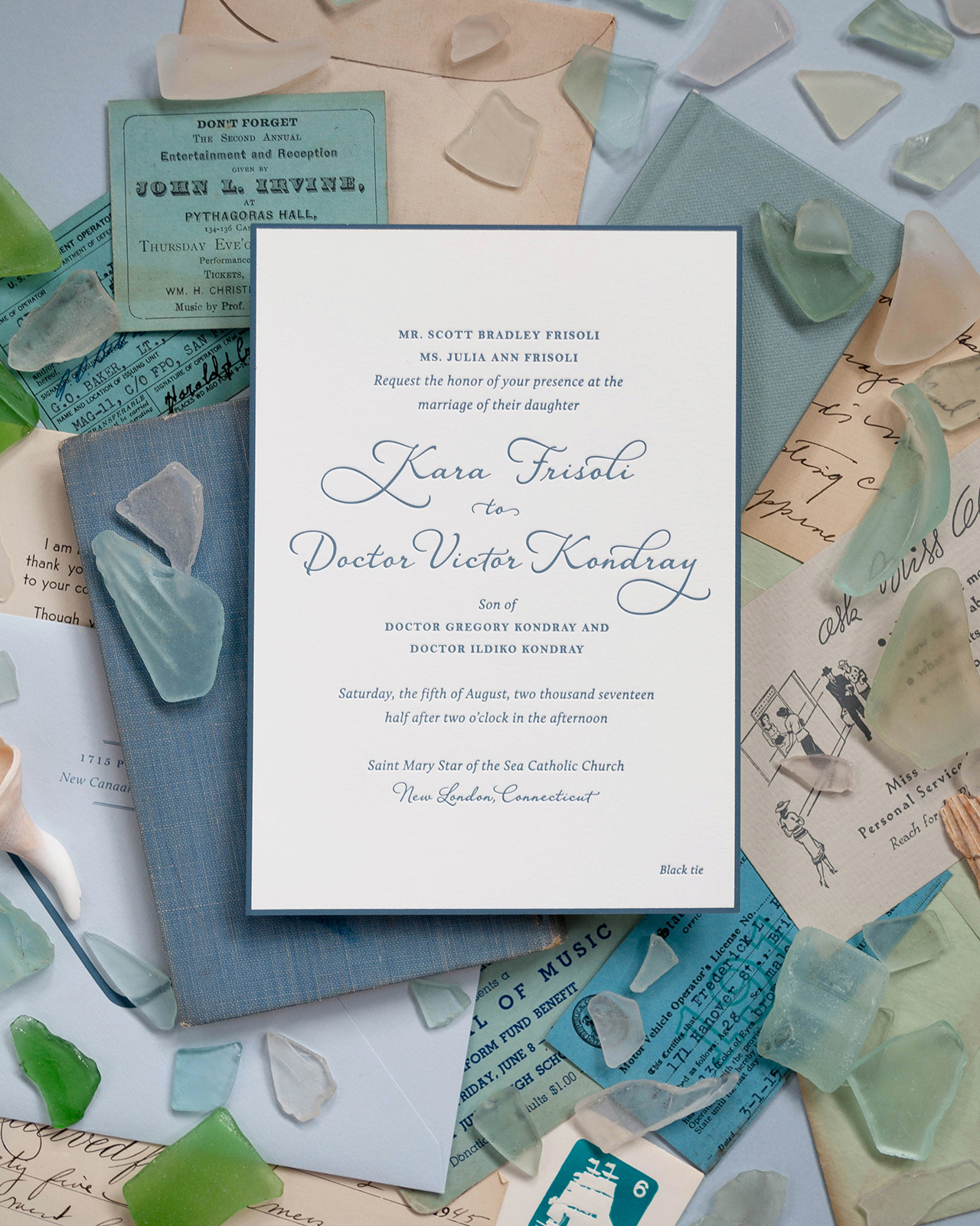
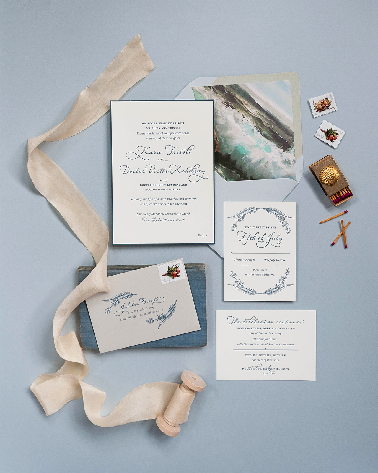
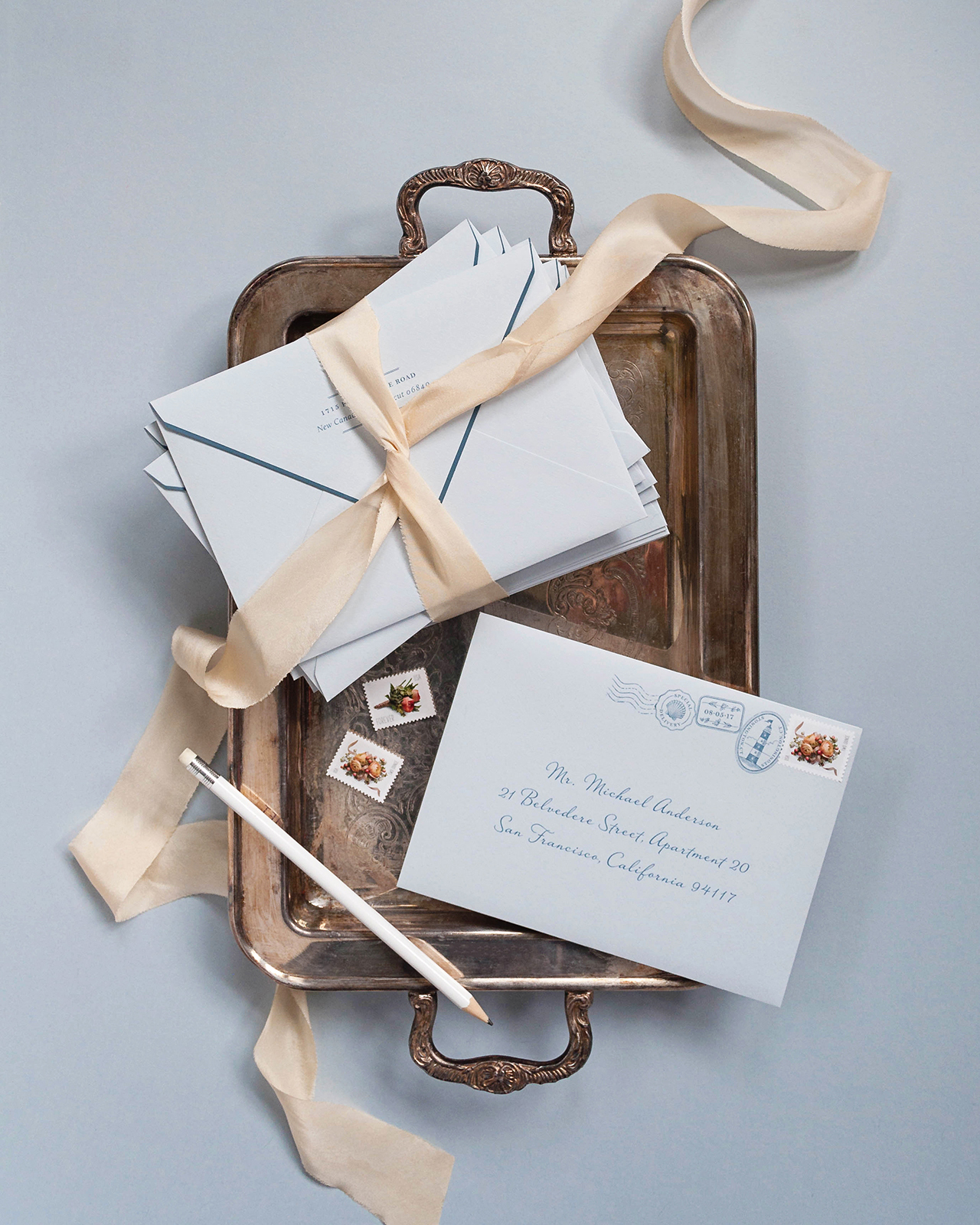
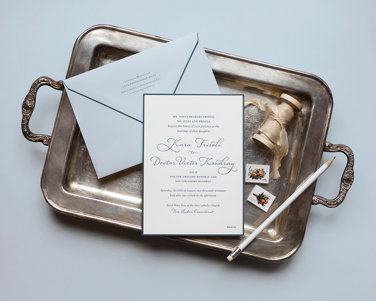
Imagine a Downton Abbey era garden party by the ocean. Sounds pretty awesome, right? Well, that’s exactly what Nichole of Coral Pheasant had in mind when creating these classic ocean-inspired wedding invitations! The entire suite is letterpress printed in a restrained slate blue, with classic typography and the most gorgeous envelope liner of painted waves crashing on the shore. So beautiful!

Classic Ocean-Inspired Wedding Invitations by Coral Pheasant

From NicholeKara and Victor were married by the sea this past August in Groton, Connecticut. Kara grew up spending her summers on the Connecticut shoreline and her love of the ocean and its energy greatly guided the direction of her wedding invitations. The grandeur of the Branford House is what drew them to the venue, but it was important to Kara and Victor that their wedding was formal and sophisticated – and by no means stuffy. A Downton Abbey era garden party by the ocean with clean lines and classic colors.

Classic Ocean-Inspired Wedding Invitations by Coral Pheasant

Kara shared with me that she wanted her guests to leave their wedding thinking “Wow! That wedding was beautiful, comfortable and fun. And the food was awesome!” While I couldn’t ensure the delicious food, I was totally game to get her guests excited about her wedding – and that’s just what their paper story did!

Classic Ocean-Inspired Wedding Invitations by Coral Pheasant

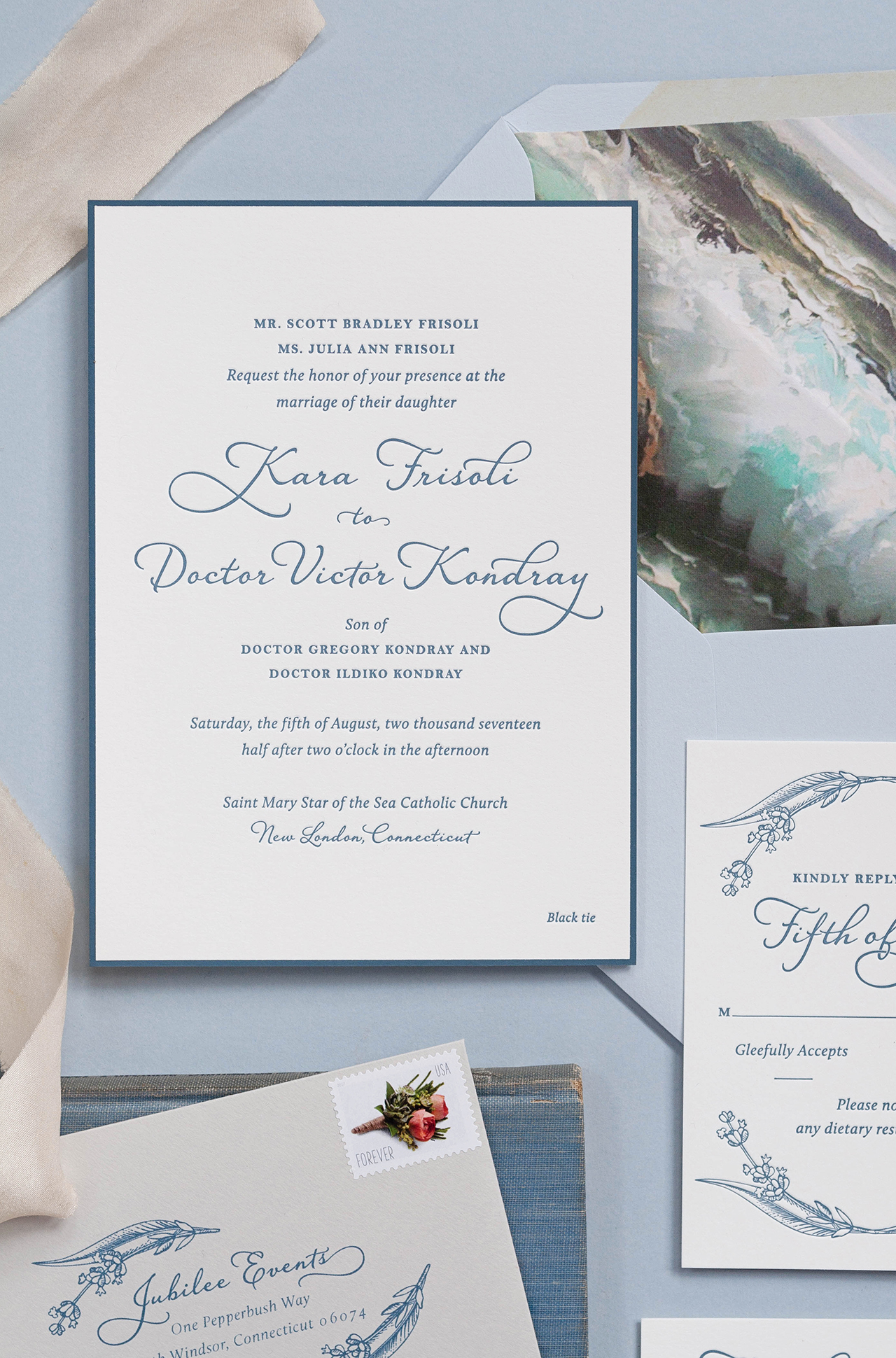
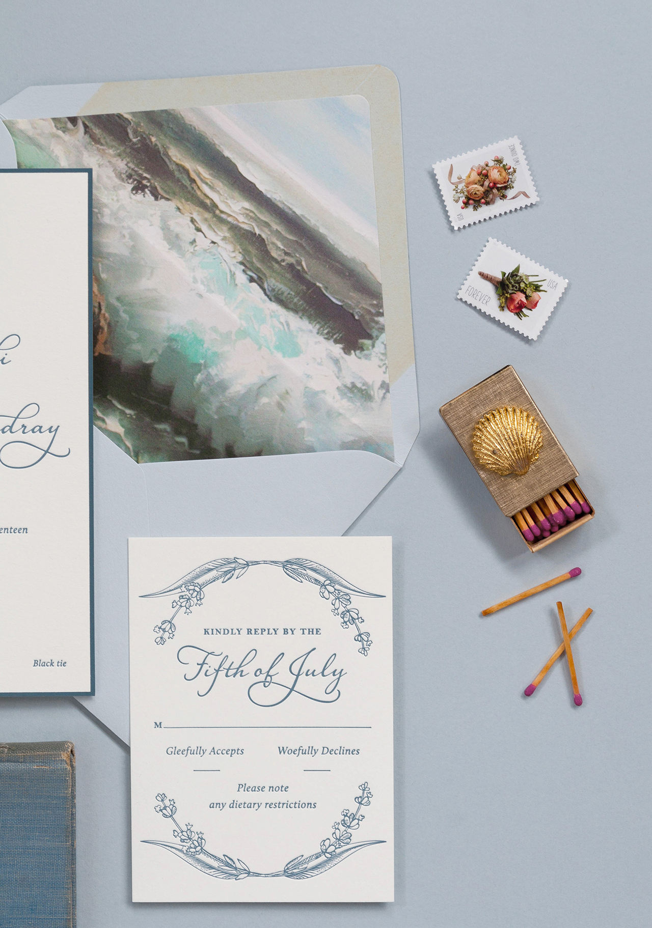
The typography of the invitation was classic and very considered, balancing a serif font with a charming script. The suite was letterpress printed in slate blue on 110# Crane’s Lettra and the main invitation and outer envelope flap were edged in the same slate blue, adding a restrained graphic pop. The envelope liner of painted waves crashing on the shore is a nod to Kara’s love of the ocean and the venue’s seaside location.

Classic Ocean-Inspired Wedding Invitations by Coral Pheasant

Additional, subtle color was layered in through colored envelopes: a light dusty blue for the outer envelope and a soft grey for the reply envelope. Illustrations of lavender sprigs and the printed stamps on the outer envelope add just the right touch of gaiety making this suite extra sweet. If you look closely, you’ll see that the printed stamps relate back to the ocean with illustrations of a shell and a lighthouse, along with their wedding date bordered by lavender sprigs.

Classic Ocean-Inspired Wedding Invitations by Coral Pheasant

Classic Ocean-Inspired Wedding Invitations by Coral Pheasant

Thanks Nichole!

Stationery Design and Styling: Coral Pheasant

Coral Pheasant is a member of the Designer Rolodex – you can see more of Nichole’s beautiful work right here or visit the real wedding invitations gallery for more invitation inspiration!

Photo Credits: Coral Pheasant