Ashley + Jonathan’s Seagrass-Inspired Beach Wedding Invitations

You might remember these beautiful letterpress blind impression wedding invitations from Sarah at Ten Lines Pica that I had the pleasure of featuring last summer.  Well, today Sarah is back with a sophisticated approach to beach wedding invitations.  I particularly love the subtle palm frond pattern and the way Sarah incorporated natural grass stalks in lieu of a belly band – such a great idea!

From Sarah: Ashley and Jonathan had a laid back beach wedding.  I love using natural elements, especially for outdoor events.  An abstract blind deboss palm frond was a nice way to subtly reference the tropical location in a unique way.  I’m based in Miami and design quite a few beach wedding invitations, so it’s fun to find new ways to convey this theme.

I collected the grass stalks on a walk around the grounds of my building; it’s a really economical alternative to a wrap!  And it looks just like the beach grass that grows wild on the dunes here in southern Florida.

Thanks so much Sarah!

Check out the Designer Rolodex for more tal­ented wed­ding invi­ta­tion design­ers and the real invi­ta­tions gallery for more wedding invitation ideas!

Photo Credits: Ten Lines Pica

Annette + Florian’s Illustrated Floral Wedding Invitations

Happy Monday everyone!  I hope you had a great weekend!  We’re starting the week off with a gorgeous set of illustrated wedding invitations from German designer and illustrator Laura Rosendorfer.  Laura created these invitations for a nature-loving couple getting married a bit later this summer.  The groom hails from coastal northern Germany and the wedding will take place at a lake near the bride’s childhood home, so Laura filled the invitations with whimsical illustrations of boats, flowers, and hearts.  So sweet!

From Laura: Annette and Florian will be married at a lake, so we wanted there to be some elements of boats and water in the invitations.  Annette and Florian are very fond of nature and down to earth; they love clean lines, but also love cheerful colors.  When Annette told me she would have big arrangements of colorful fuchsia and pink peonies at the wedding, the whole invitation set came together quite easily.

Annette had set her heart on having a whimsical illustration of flowers, so I paired the peonies and snowballs with a cute boat, cheerful bunting, and of course hearts.  We chose four vibrant colors – fuchsia and pink from the peonies along with green and blue – and paired it with a lot of white space and dark brown lines to contrast the whimsical illustrations and give it some elegance and softness.

A heart is also the focal point of the invitation – I die cut a heart in every invitation using a small machine at home.  The rsvp card is visible through the heart; if you take it out, there is another little heart to be seen.

We chose mostly eco-friendly materials, like the beautiful brown recycled kraft paper for the envelopes and paper bands around the invitation set.  The invitations were printed using a combination of digital, offset, and screen printing methods.  The envelope liners and the map postcard with the detailed schedule on the back were offset printed on white paper.

I really loved all the small details, like the die cut hearts or the initials on the envelope liners – all of which makes a wedding invitation suite extra special.

Thanks Laura!

Check out the Designer Rolodex for more tal­ented wed­ding invi­ta­tion design­ers and the real invi­ta­tions gallery for more wedding invitation ideas!

Photo Credits: Laura Rosendorfer

{happy weekend!}

Ah… the first week back after vacation is always a doozy, isn’t it?  But even after racing to catch up from a week away, I’m so very glad to be back home.  This weekend we’ll be watching the Stanley Cup playoffs and starting to make plans for the future nursery room.  Yay!  But in the meantime…

Photo Credit: Scout’s Honor Co.

…a few links for your weekend!

This week on Oh So Beautiful Paper:

That’s it for me this week!  Cocktail Fridays will be back this afternoon – and we have a special cocktail just in time for Cinco de Mayo, so check back a bit later for the recipe!  I hope you all have a wonderful weekend, and I’ll see you back here on Monday!  xoxo

DIY Western Reception Wedding Details, Part I

The details are part of the fun of creating an event – be it a wedding, dinner party or bridal shower.  Those details make the event special, unique, and totally you!  Remember the Western Save the Date & Invitation DIY we did a few months ago?  It was one of our favorite tutorials… so we decided to expand on the theme and offer up some ideas for how to embellish a Western reception. – Bailey and Emma of Antiquaria

Western Wedding Detail Ideas and Inspiration

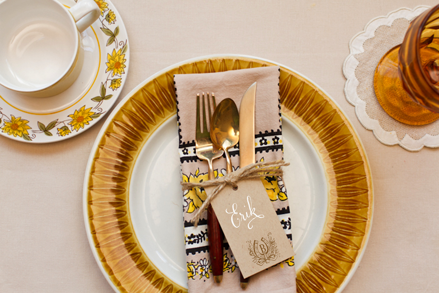
A simply set, color appropriate place setting is ready for your guest as they approach the table.  Kraft tags tied around the napkin, are embellished with a monogram and serve as place cards for this casual, fun fete.

Western Wedding Detail Ideas and Inspiration - Place Cards

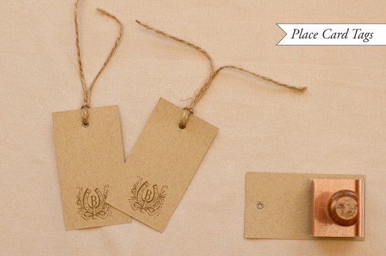
To make the place card yags: Ink your monogram stamp (we used our Vintage Horseshoe Initial Monogram) and center it on the bottom of a kraft paper gift tag (or manilla shipping tag).  Press stamp down moderately and remove from surface.  Set aside to dry.  Once dry, write your guests’ names on the tag.  We love the way that the opaque white calligraphy ink looks on kraft paper.  Next, cut about 2 feet of rustic twine and wrap it around a pressed napkin.  Tie in a knot, thread the tag on to one loose in, and then tie the twine in a bow.

Western Wedding Detail Ideas and Inspiration

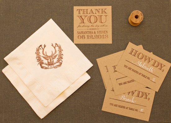
A collection of goodies for the reception.  They all look so cute together!

Western Wedding Detail Ideas and Inspiration

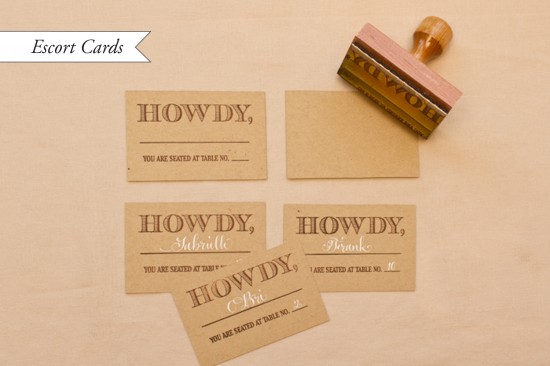
How to make the stamped escort cards: Our escort card stamps are some of our new faves in the shop.  For this western themed card, cut kraft paper into 3.75″ x 2.5″ inch rectangles.  Ink your stamp (we used our Howdy Escort Card Stamp) and center over the card.  Press down moderately, using the handle as the main point of pressure.  Remove stamp and let dry.  Once you have your final seating arrangement, fill in the cards accordingly.  We repeated the white ink for the names to have continuity throughout the event.

p.s.  Ed Note: Confused by the difference between escort cards and place cards?  Escort cards are typically displayed together at a central location near the reception entrance and include the guest’s name and table number, guiding your guest to the appropriate table where they can then find their seat.  A place card with the guest name then sits at the individual table place setting, indicating an assigned seat where a guest should sit at their table.

Western Wedding Detail Ideas and Inspiration

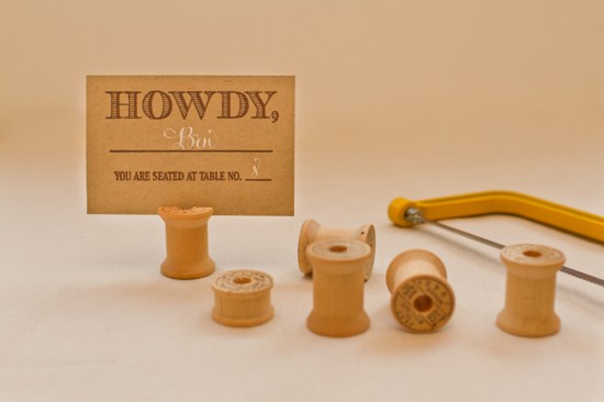
We racked our brains to figure out a cute and unique way to display all those howdy escort cards to no avail… until we stumbled across Emma’s mother’s vintage wooden spool and bobbin collection.  Perfect!

Western Wedding Detail Ideas and Inspiration - Wood Spool Escort Card Display

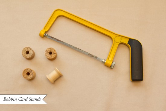
Bobbin Card Stands: Troll the internet or thrift stores for vintage wooden spools or bobbins (bobbins will be smaller).  Once you acquire the number that you need, you’re ready to start converting them into escort card holders.  Lightly draw a pencil line across the diameter of the top of the spool. With a small hand saw, saw down about an eighth to a quarter inch (so that the card can slide in).  Now your ready to set them all up and put them to work directing your guests to their tables!

We’ll be back with more Western wedding detail ideas in our next post!

Materials:

Vintage Horseshoe Initial Monogram Stamp

Howdy Escort Card Stamp

Stamp Pad (in Chestnut)

Metal Eyelet Gift Tags in Kraft

Rustic Twine

White Calligraphy Ink

Kraft Card Stock

Ruler and x-acto blade

Wooden Spools and Bobbins

Hand Saw

Photo Credits: Intertwyned for Antiquaria

Erin + Blake’s Gold Foil and Letterpress Wedding Invitations

The resurgence of metallics – and gold foil in particular – has been one of my favorite design trends over the last couple of years.  I love the subtle way gold foil text is paired with a letterpress blind impression (no ink) pattern in these wedding invitations from Courtney Callahan Paper.  Modern, fresh, and sophisticated all at the same time!

Gold-Foil-Blind-Impression-Letterpress-Wedding-Invitations-Courtney-Callahan-Paper (9)

From Courtney:  Erin and Blake are a modern couple with a keen sense of style, and they each had opinions on how they wanted their invitation suite to look.  For the blind impression pattern, we decided to mimic the circles used in the logo of their wedding venue, the Palladium; this element was carried throughout each piece of the suite and the materials used on their wedding day.

Gold-Foil-Blind-Impression-Letterpress-Wedding-Invitations-Courtney-Callahan-Paper (6)

Printed on Crane’s Lettra in pearl, the invitation suite was produced using metallic gold foil stamping and a letterpress blind emboss.  The suite included an invitation with hot pink edge painting, along with a reception card and response card with a custom monogram detail.  Inner envelopes were lined in hot pink to match the edge painting on the invitation.

Gold-Foil-Blind-Impression-Letterpress-Wedding-Invitations-Courtney-Callahan-Paper (2) Gold-Foil-Blind-Impression-Letterpress-Wedding-Invitations-Courtney-Callahan-Paper (3)

Gold-Foil-Blind-Impression-Letterpress-Wedding-Invitations-Courtney-Callahan-Paper (1)

Gold-Foil-Blind-Impression-Letterpress-Wedding-Invitations-Courtney-Callahan-Paper (7)

Thanks Courtney!

Design: Courtney Callahan Paper

Letterpress Printing: Accucolor

Check out the Designer Rolodex for more tal­ented wed­ding invi­ta­tion design­ers and the real invi­ta­tions gallery for more wedding invitation ideas!

Photo Credits: Jennifer Kathryn Photography