{happy weekend!}

It’s Mother’s Day weekend!  Do any of you have fun plans to celebrate – either with your moms or your own children?  Between preparations for the Stationery Show and baby-related projects our to do list is a mile long (and growing…), so I’m looking forward to having some time this weekend to catch up on everything.  But in the meantime…

…a few links for your weekend!

This week on Oh So Beautiful Paper:

I hope you all have a wonderful weekend, and I’ll see you back here on Monday!  xoxo

Photo Credit: Staci Kennelly

Beckett’s Camping Field Manual Birthday Party Invitations

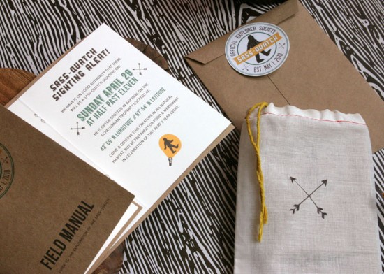
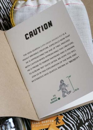
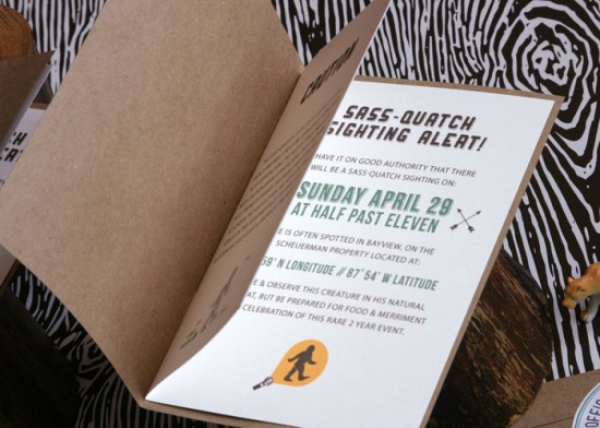
These birthday party invitations from Tara at Cracked Designs are so fun and creative!  Created for her son Beckett’s 2nd birthday party, Tara created a complete invitation field manual booklet inspired by old school camping manuals and Boy Scout merit badges.  Such a great idea for a birthday party theme!

From Tara: My husband and I often refer to our son Beckett as “Sass-quatch,” mostly because he’s had a case of the terrible twos ever since he turned one. When brainstorming for Beckett’s 2nd birthday party, I knew that a play on the name of the mythical “Sasquatch” turned “Sass-quatch” theme would be perfect for our little monster.


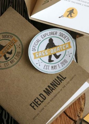
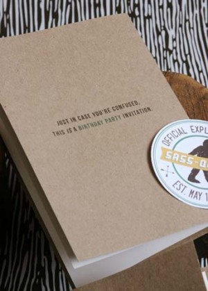
I’ve always loved vintage camping & Boy Scout images, and thought it would be really unique to plan a party with the idea of having an “Exploration of the Sass-Quatch” as the concept for the party invitations.  I wanted the invitation suite to feel very old school and earthy, with an overall camping vibe.  I turned the invitation into a booklet, complete with an “Official Sass-quatch Explorer Society” logo that drew inspiration from vintage girl and boy scout merit badges.

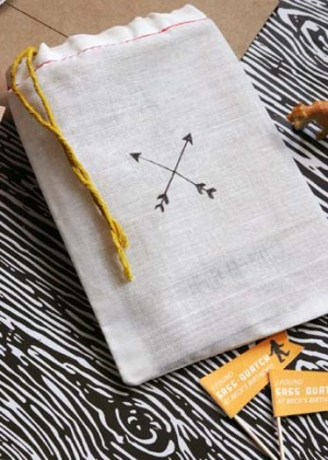
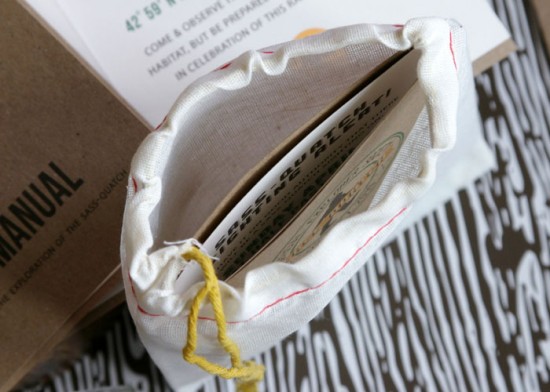
I had fun coming up with all the text for the invites, and wanted to make it feel like the guests were reading their very own Sass-quatch guidebook.  I printed out the cover of the invitation on heavyweight kraft paper.  Each invitation booklet was assembled and placed in a drawstring cotton muslin pouch with hand-drawn arrows, then placed in a kraft paper envelope and sealed with a round sticker.


For the actual party, we turned our house into a full on forest, complete with cardboard trees and a giant sass-quatch cut out hiding amongst the trees. Guests created their own little terrariums in vintage glass jars.  I kept the theme from the invitations running strong in all of the elements of the party, so everyone got the full sass-quatch exploration experience!

Thanks Tara!

Photo Credits: Cracked Designs

Rena + Michael’s Semi-Formal Handkerchief Wedding Invitations

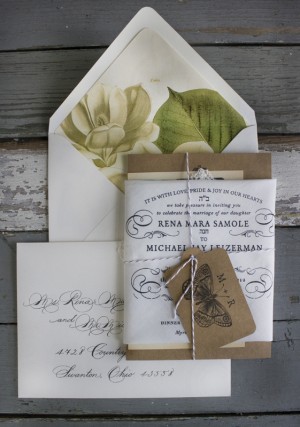
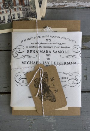
I’ll always be a fan of handkerchief wedding invitations, and for this semi-formal wedding they really couldn’t be more perfect!  Created by the team at Lucky Luxe Couture Correspondence, Rena and Michael’s invitation suite combines a classic black and white handkerchief invitation with a letterpress chipboard reception card and vintage rsvp postcard.  Just gorgeous!

From Erin at Lucky Luxe Couture Correspondence: Rena is an attorney who left the big city life in Chicago to be with Michael and his 2 boys on their Ohio farm where they truly live farm to table, raising their own food.  They are having a semi-formal wedding at a stately club, but the rest of the weekend is going to be at their home on a beautiful rustic 25 acre gentleman’s farm.  They want the weekend celebrations to be casual and gracious — a family style gathering.  The suite combines screen printed handkerchiefs, letterpress on cotton paper, vintage botanical illustrations for envelope liners, address calligraphy by Holland Wilson, and vintage postcards bundled with twine.


Thanks so much Erin!

Design and Printing: Lucky Luxe Couture Correspondence

Calligraphy: Holland Wilson

Lucky Luxe Couture Correspondence is a member of the Designer Rolodex – you can see more of their beautiful work right here or visit the real invi­ta­tions gallery for more wedding invitation ideas!

Photo Credits: Lucky Luxe Couture Correspondence

Nick + Lindsey’s Creative Wedding and Rehearsal Dinner Invitations

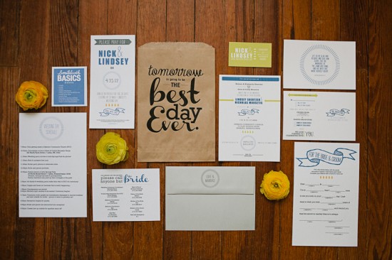
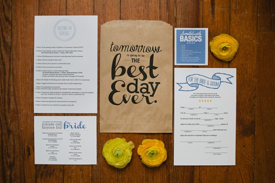
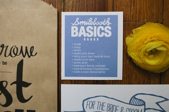
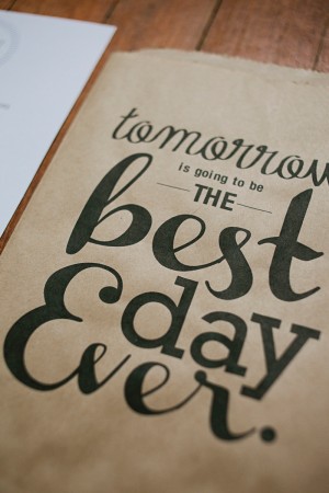
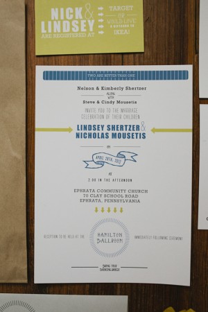
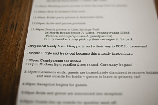
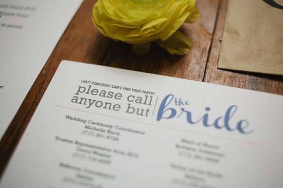
Multi-talented photographer Brooke Courtney created the wedding invitations for her brother-in-law’s recent wedding – including some of the most adorable rehearsal dinner invitations I’ve ever seen!  The bride and groom wanted to keep things clean and modern, with a focus on text and contrast.  In addition to the main invitation, Brooke created a “Best Day Ever” rehearsal dinner kit with photobooth tips and a list of phone numbers to make sure nobody bothered the bride on the wedding day.  Genius!

From Brooke: Nick + Lindsey asked me to create all of their paper goods using their blue and yellow color scheme, with their only other instructions being “No flowers.  Nothing girly.  Nothing swirly.”  Ha!  They kept using the words “text” and “contrasty” when describing what they wanted everything to look like.  I feel as though I matched their wedding invitation suite to their photos really well – clean and simple.

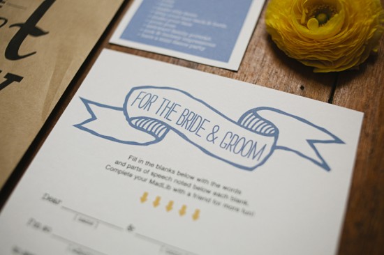
I made Rehearsal Dinner Kits, including a wedding day schedule, bride + groom mad lib, Smilebooth basics and tips, and a list of phone numbers that people might need on the wedding day.  The “Best Day Ever” kits are my favorite thing I created for their wedding weekend.


You can purchase a printable version of the “Best Day Ever” PDF that Brooke used on the paper bags in her Etsy shop right here!

Thanks so much Brooke!  Check out Nick and Lindsey’s wedding photos right here for more inspiration from this fabulous wedding!

Check out the Designer Rolodex for more tal­ented wed­ding invi­ta­tion design­ers and the real invi­ta­tions gallery for more wedding invitation ideas!

Photo Credits: Brooke Courtney

Stationery Show Sneak Peek: Belle + Union

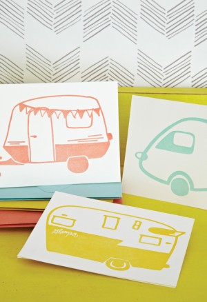
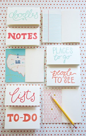
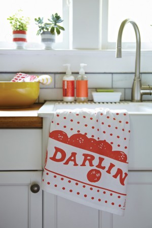
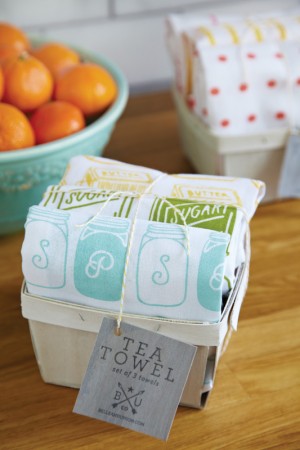
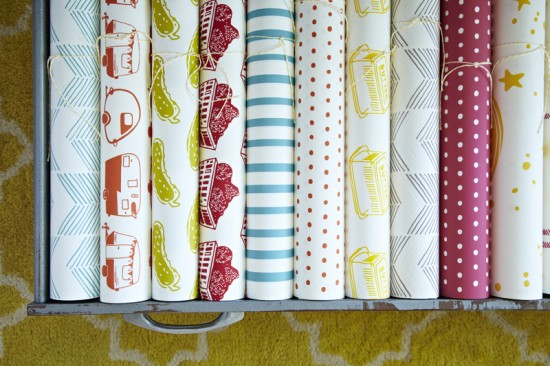
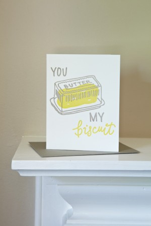
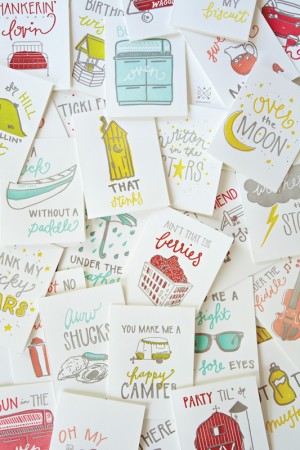
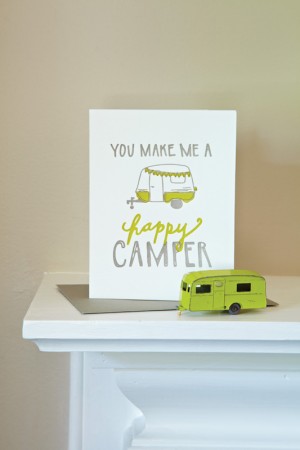
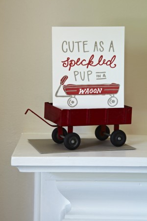
The next National Stationery Show sneak peek comes from one my most highly anticipated debuts at the show – Belle & Union!  Formerly known as Lowcountry Press, I’ve been a big fan of designer Meg Sutton’s work for a while now (remember these awesome wedding invitations?) and I can’t wait to see the new 2012 collection at the show!


From Meg: Belle & Union was established in 2011 with the purchase and restoration of an 1897 Curtis & Mitchell Printing Press and a dream to make writings, wrappings, and wares with our own unique sensibility.  All of our products start with pen to paper, with each having its own unique hand lettered text and hand rendered illustrations.  Our 2012 collection is inspired by Americanisms, little phrases of sentiments from ages past and present, and represented across our line of greeting cards, boxed notes, jotters, note pads, recipe cards, tea towels and gift wrap.


Thanks Meg!

p.s. I love the sweet story behind Belle & Union’s new name.  Meg does all the design, but her husband does most of the printing – and they wanted a name that reflected the both of them.  He’s a Northerner from Pennsylvania, while Meg is a Southerner from Texas, but it was the South that brought them together.  They love how union has many meanings, representing both their union in life and love and their work, and thus Belle & Union Co. was formed!

Photo Credits: Mary Britton Senseney