Tara + Rich’s Colorful Palm Springs Wedding Invitations

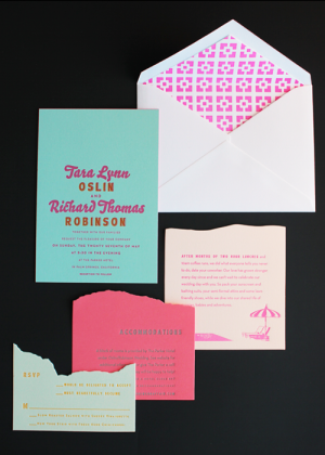
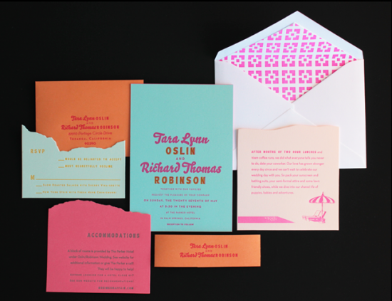
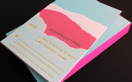
If you thought last week’s oversize map wedding invitations from Ladyfingers Letterpress were cool, wait until you see these Palm Springs invitations!  Inspired (naturally) by the wedding venue, the entire invitation suite is just bursting with color – from cool aqua to bright neon pink – and Arley-Rose and Morgan used color and die-cutting to create an awesome layered landscape effect.  Love!
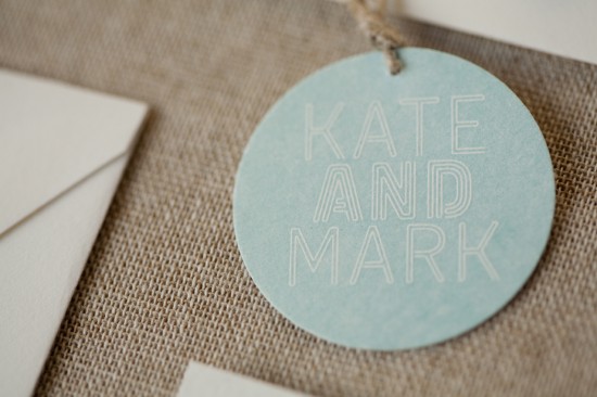
 

From Arley-Rose and Morgan: We worked with Tara and Rich all winter on these super sunny and poolside-inspired invitations.  The couple sent over vintage postcards and designs from the ’50s that featured Palm Springs as inspiration.  Arley hand drew the pool lounge chairs and umbrellas from the wedding location.  The envelope liners feature the iconic brick work of the walls lining the hotel grounds.

For the main invitation, we letterpress printed a two color design in neon pink and bright orange on Crane’s aqua 100% cotton 134 lb paper.  We then duplexed it (yes, we are a bit fanatical about details) to a second sheet of aqua paper, cut them down, and edge painted them in neon pink.

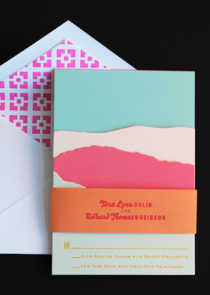
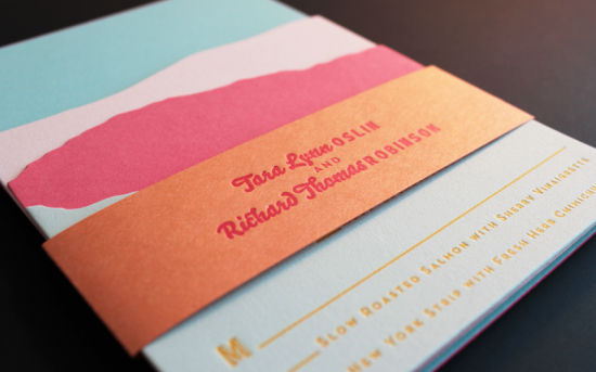
For the enclosures, we looked to the landscape of Palm Springs.  We were able to create a layered look using colorful 100% cotton paper and die cutting – incorporating all the information in a way that reflected the layers of foliage and mountains that are characteristic of the arid Palm Springs environment.

All of the pieces were stacked together and wrapped with a orange belly band, and we tucked the rsvp envelope in the back behind the invitation.  Palm Springs has been at the top of our vacation list since working on this project!

Thanks Arley-Rose and Morgan!

Ladyfingers Letterpress is a member of the Designer Rolodex – check out more of their beautiful work right here or visit the real invi­ta­tions gallery for more wedding invitation ideas!
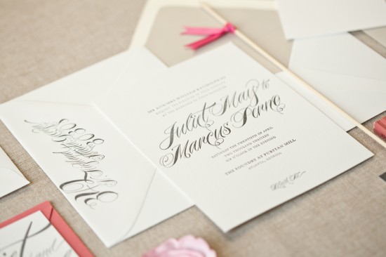
Photo Credits: Ladyfingers Letterpress
Edge Painted Business Cards from Antiquaria

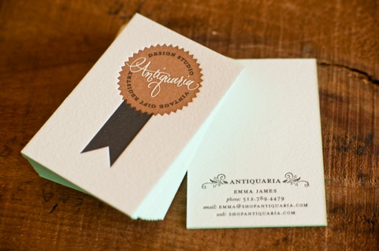
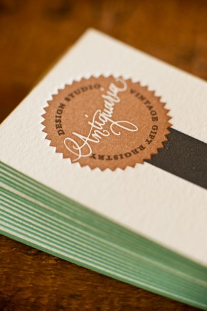
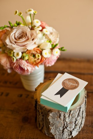
You already know Bailey and Emma, the lovely and talented ladies behind Antiquaria, from their regular DIY tutorials here on Oh So Beautiful Paper – not to mention their custom wedding invitations and vintage shop.  Bailey and Emma recently redesigned their business cards, and I’m loving the beautiful knockout calligraphy logo and soft aqua edge painting!

From Bailey and Emma: We wanted to make something unique while keeping in line with our brand image.  The cards were letterpress printed in black and copper on super thick cotton paper.  We then added the edge painting ourselves because, after all, who doesn’t love a pop of color?


Thanks ladies!

Antiquaria is a member of the Designer Rolodex – check out more of their beautiful work right here!  For DIY inspiration, you can also see their DIY tutorials here.

Photo Credits: Kelly James of Studio Austin Weddings

Modern Wedding Invitations from Alee + Press

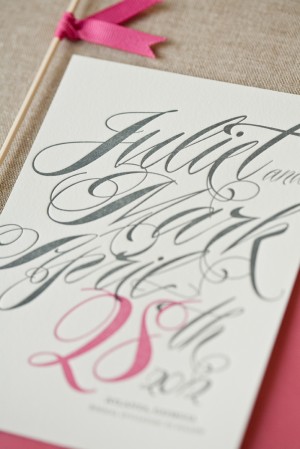
I’m a longtime fan of Alee & Press, so I was thrilled when Amanda from Alee & Press sent over some of her latest wedding invitation designs.  Amanda creates seriously beautiful and sophisticated (and eco-friendly!) typography-driven letterpress invitations and announcements.  Here are a few of my favorites…

Alee & Press will be exhibiting at this year’s National Stationery Show (Booth 2071!) – and these invitations are part of a new 2012 wedding collection making their debut at the show.  So exciting!


You can check out more beautiful invitations from Alee & Press right here!  Amanda also tells me that her Atlanta studio is located close to a key lime pie factory, which just sounds like the perfect way to keep creative energy flowing.  Thanks Amanda!

Photo Credits: Alee & Press

Megan + Kevin’s Illustrated Family Crest Wedding Invitations

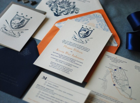
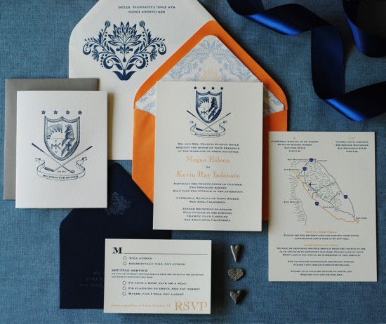
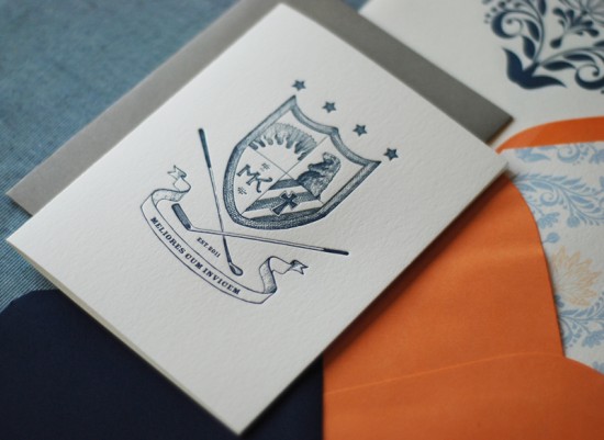
I love the idea of having a family crest – and there’s nothing to say that you can’t develop your own crest to pass down to future children and grandchildren.  That’s exactly what bride and groom Megan and Kevin decided to do for their wedding invitations!  They worked with Richele from Richie Designs to design the invitation suite, which includes a custom family crest created by illustrator Serena Chang.  So cool!

From Richele:  Megan and Kevin wanted to develop a custom family crest.  Each item in the illustration has special meaning for them, and the Latin term means “better together.”  We worked with illustrator Serena Chang to develop the family crest.  We chose to digitally print the invitation due to time constraints, while the thank you cards and envelopes were letterpress printed.

We brought Megan’s orange and blue color palette into play by using formal outer, inner, and rsvp envelopes.  The outer envelope was white with a letterpress printed fleur pattern, while the inner envelope was orange with a custom envelope liner.  Finally, the rsvp envelope was navy blue – a color used throughout the invitation suite – and was letterpress printed with silver ink.

Thanks Richele!

Design and Printing: Richie Designs

Illustration: Serena Chang

Richie Designs is a member of the Designer Rolodex – you can check out more of Richele’s work right here or visit the real invi­ta­tions gallery for more wedding invitation ideas!

Photo Credits: Richie Designs

Aaron + Harper’s Fingerprint Heart Wedding Invitations

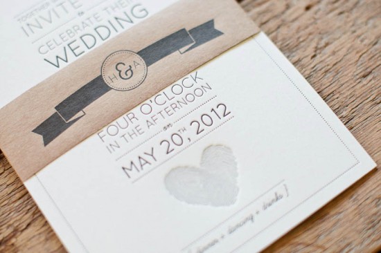
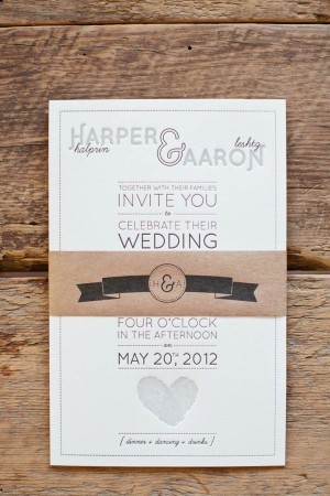
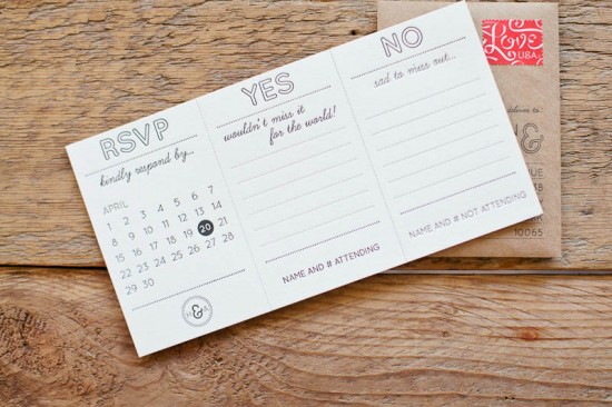
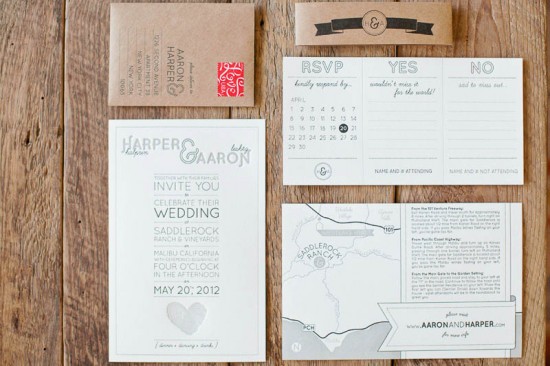
Happy Monday everyone – I hope you all had a good weekend!  Fingerprints are such a sweet detail to incorporate into wedding invitations, so I was thrilled when husband-to-be Aaron Leshtz sent over the gorgeous invitations that he and his fiancée, Harper, designed for their upcoming wedding.  I’m also loving the playful RSVP card and fun kraft paper accents!

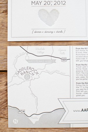
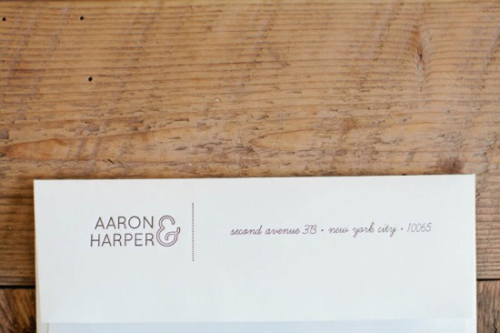
From Aaron and Harper: We designed our own wedding invitation suite.  We’re both architects and wanted to put together a clean, modern invitation suite that also had some playful elements (the “learning curve” font, overlapping fingerprints, etc.).  We’ve always loved brown kraft paper and the way it contrasts with crisp white paper, so we made sure to use it as an accent material in the suite.


For the fingerprints, we individually scanned our ring fingers and then traced the prints in AutoCAD (nerds, I know).  We overlayed the two fingerprints to create the heart and are using is as a graphic thread to tie together elements of the wedding.

Our wedding invitations were letterpress printed by Norman’s Printery in Wyckoff, New Jersey.  It is a 2-color design printed on cotton Lettra #110, ecru paper.

Thanks Aaron and Harper!

Design: Aaron Leshtz

Letterpress Printing: Norman’s Printery
Check out the Designer Rolodex for more tal­ented wed­ding invi­ta­tion design­ers and the real invi­ta­tions gallery for more wedding invitation ideas!

Photo Credits: Aaron Young Photography