Happy Tuesday everyone! Today I’m so excited to introduce a brand new column (and something that I’ve wanted to do for a long, long time): Behind the Stationery! Every month we’ll be giving you a peek behind the scenes of some familiar faces – the stories behind how they came to be stationers, a little bit about how they manage work and life, and of course a peek into their creative processes. Today we’re kicking everything off with a company with a long history here on OSBP (they were featured in my very first week of posting in 2008!) – Sycamore Street Press! –Nole
As a stationery obsessed girl in digital world, there are so many companies I follow and admire wondering how they do it all. How did they start their business? What’s their design process like? To me, the behind-the-scenes is the heartbeat of small business so I’m extremely excited to bring you this new column on Oh So Beautiful Paper highlighting the stories of different stationers, starting with Sycamore Street Press. Take it away, Eva! – Megan
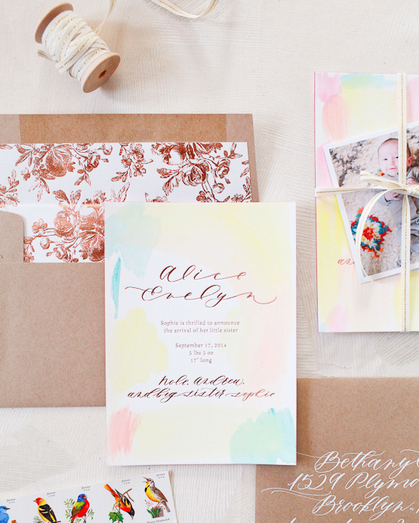
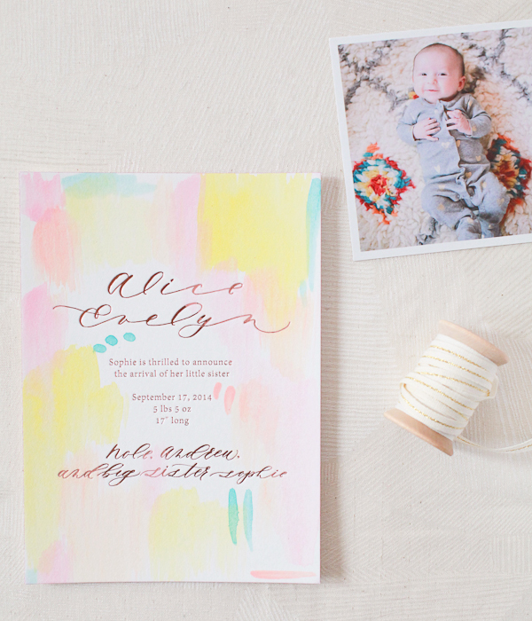
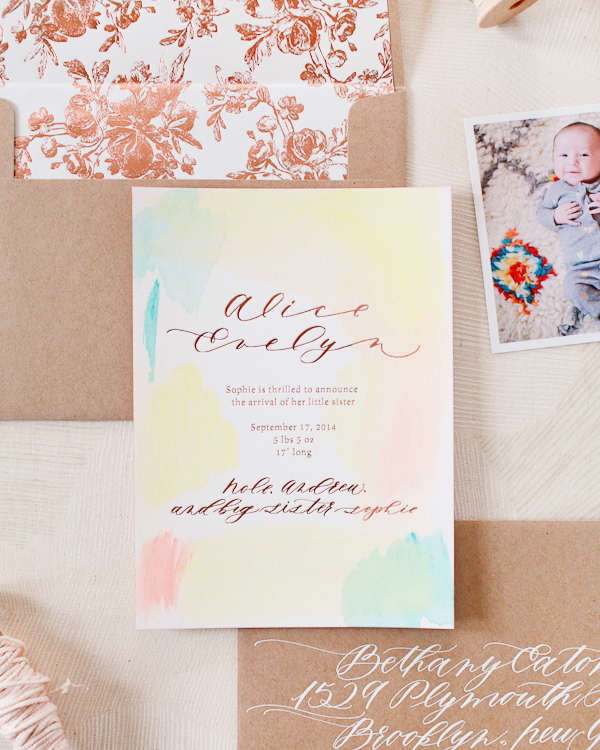
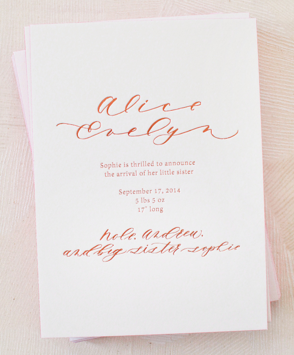
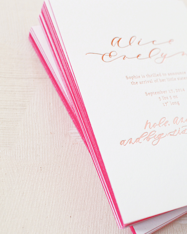
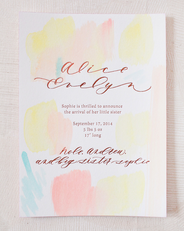
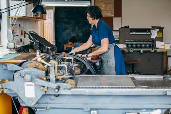
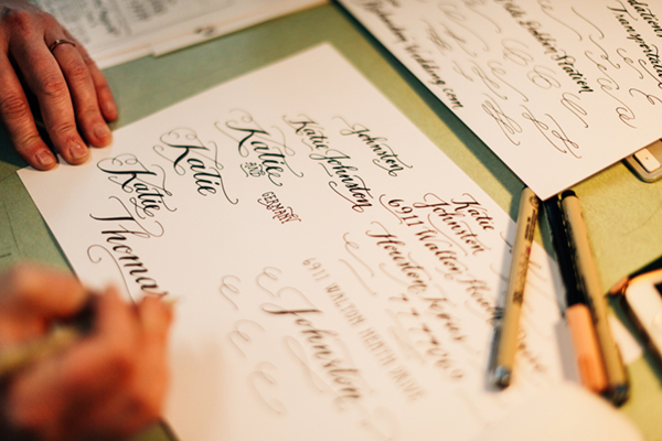
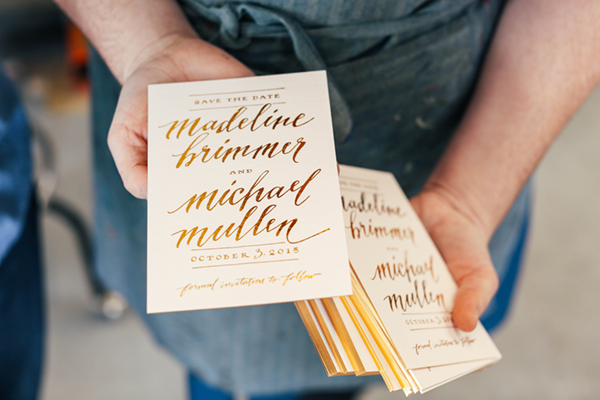
 Photo by Jessica Peterson
Hello. I’m Eva Jorgensen, founder and creative director at Sycamore Street Press. Back in 2007, I moved a hand cranked Vandercook letterpress into our dining room and launched the company. By 2009, my husband Kirk joined me full-time, and it’s been the family business ever since. Our goal is to somehow, in our small way, help people to live a simple, beautiful, quality life through the goods we create.
Our stationery is sold in Anthropologie, West Elm, Paper Source, hundreds of independent boutiques around the world, and on sycamorestreetpress.com. I also teach an online class called Stationery Business 100: Starting Strong.
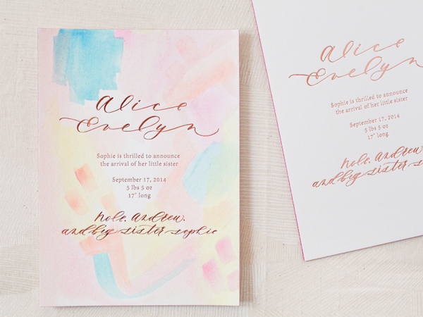
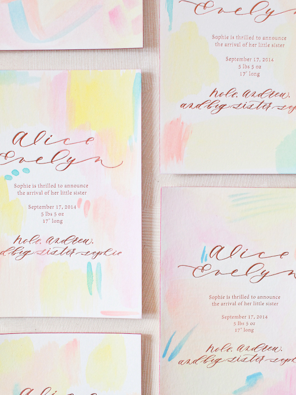
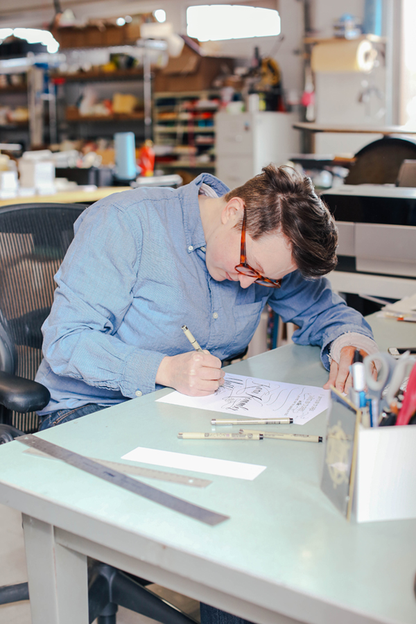
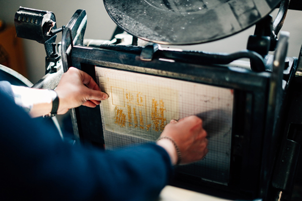
 Photo by Jessica Peterson
We’re up in the mountains of Utah in a small town called Heber City. We love it up here away from pollution and crime with beautiful scenery and wild animals at our doorstep. We’re only about an hour away from Salt Lake City, so we still have access to just about anything we might need.
We used to have a separate studio space, but when our first child was born we decided to move the business back home to make it easier to juggle the business and the baby. Four years later (and a second child along the way) we’re still here and it’s working well for us. To give us the best of both worlds, we will soon be joining a shared studio space called Hinterland to use for photo shoots, workshops, events, etc.

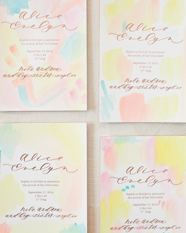
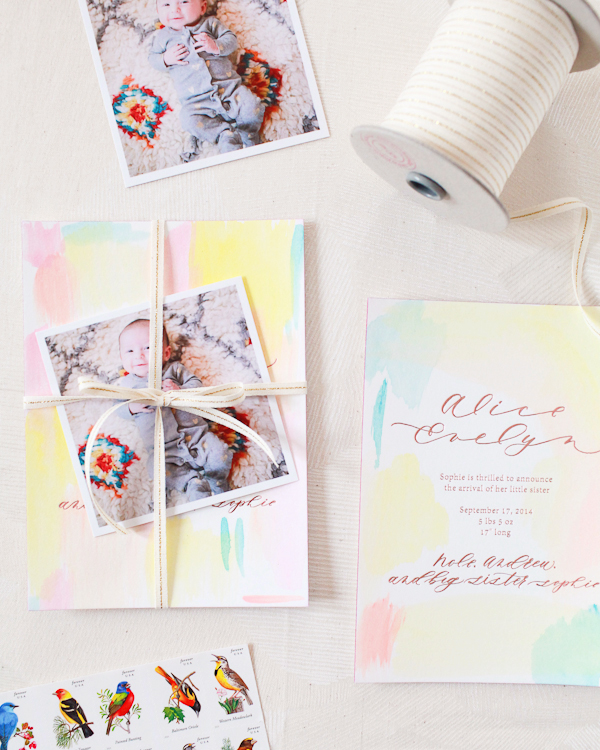
Photo by Jessica Peterson
I went to school for a BFA and MFA in art with an emphasis in printmaking, so it wasn’t much of a leap to start designing and printing letterpress cards. The business side of things, however, was a big leap! I wish I had taken some business classes in school. That said, my dad is an entrepreneur and gave me a lot of great advice about going that route. As for Kirk, he got his master’s degree in Slavic linguistics. While he was working on that, he was helping me at shows on weekends. Although he loved speaking and teaching Russian, he was really drawn to the idea of doing something more hands on and building a family business.
Kirk and I love working together. When we were a young couple, we took a backpacking trip around Europe. One of the highlights was working on an organic family-run farm in Denmark. We loved how the couple worked together to take care of the kids and household and provide a living. Kirk and I decided then and there that that’s what we wanted for ourselves. We’re fortunate that Sycamore Street Press has allowed us to do that.
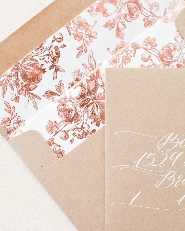
 Photo courtesy of Eva Jorgensen
For the first 5 years of our business, we printed every single Sycamore Street Press product on our hand-cranked letterpress, but we got to a point where we couldn’t keep up with orders. At the same time, I wanted to try and branch out creatively. I love letterpress, but using it exclusively came with limitations, such as only printing in 1 or 2 colors per item. We decided to start partnering with a few other local print shops; they’ve been able to help us handle the workload and fulfill bigger orders while also opening up the possibilities in terms of medium. Now I can go where my inspiration leads me to choose whichever printing method seems best to execute my idea – from a simple letterpress print in one color with a beautiful impression to a 4 color process offset print to capture the nuances of my ink washes, overlaid with foil stamped typography. For an upcoming project, we’re looking into screen printing. Each process has unique strengths that can be used to our advantage depending on the design. This doesn’t have to be the way for everyone, but it’s working well for us.
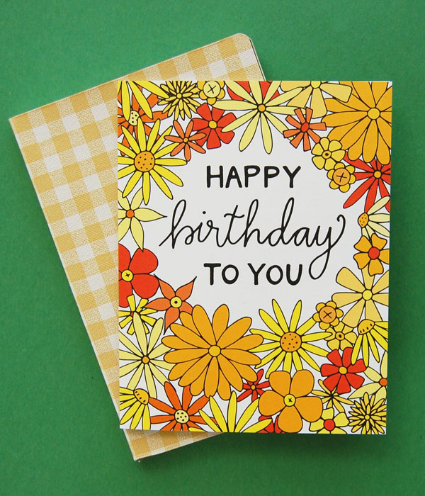
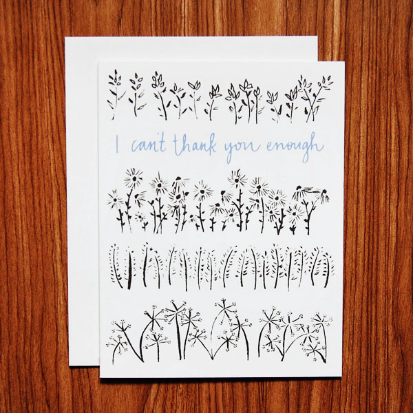
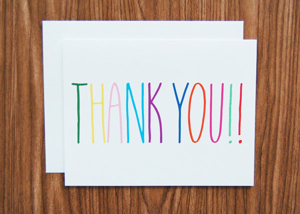
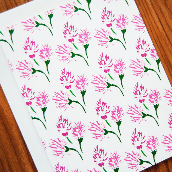
 Photos courtesy of Sycamore Street Press
I am constantly looking for inspiration — travel, film, fashion, art, decor, folk art, and vintage books are all things I look to. I actually make a point to go outside the world of paper and stationery for inspiration because I think it helps me have a fresh approach. Recently, I’ve been intrigued by the idea of the West – the character and history of this region where I live. I’m reading Angle of Repose by Wallace Stegner and plan on going back and reading all the Willa Cather books I loved in high school and college. And really, I only have to look around the high mountain valley where we live to feel inspired.
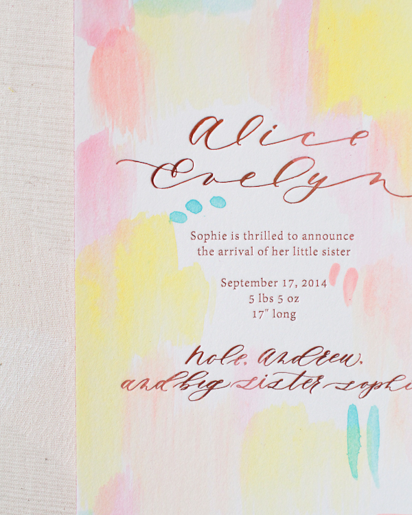
 Photo by Jessica Peterson
It’s true that it can be difficult to balance running your own business with having a family (or just a life in general!), but we find it really rewarding. It’s been so important for us to learn when to say no, especially since the kids came along. Sometimes you have to cut a lot of good things out of your life in order to make room for the best things. And of course it can be difficult not knowing exactly how much money will be coming in each month, but somehow it always works out one way or another. Our faith and trust in God has always brought us together and guided us through hard times where we wondered if we should throw in the towel.

Photo by Jessica Peterson
For the most part, we have our separate duties. Kirk is over wholesale accounts, retail sales, and operations. I’m over design and marketing. We work together on big picture stuff. It took us a year or two after Kirk joined me full-time to really get that sorted out, but now we’ve got it under control for the most part. (Neither of us likes finances! We have a bookkeeper and an accountant to help with that.).


Photos by Jessica Peterson
A lesson we’ve learned in working with loved ones is to make sure that you are hiring or going into business with someone because they are well-suited for the job, not just because they are family. Kirk is a natural at operations and working with accounts. His brother Karl does our shipping and has a really organized kind of brain that a shipping manager needs. A bookkeeper needs to be level-headed and completely trustworthy, and our sister-in-law Kate is both of those things. Our design assistant, Natalie Fielding, isn’t a family member, but she has the skills necessary and works well with the team. And she’s a part of the Sycamore family now! – Eva Jorgensen
 Photo courtesy of Sycamore Street Press
Interested in participating in the Behind the Stationery? Please email [email protected].
 Photos by
 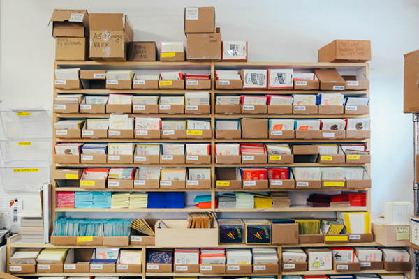 Â Photo by
 Photo by 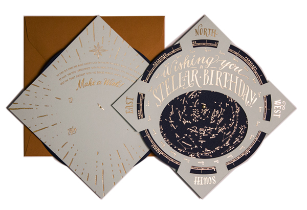
 Photos by
 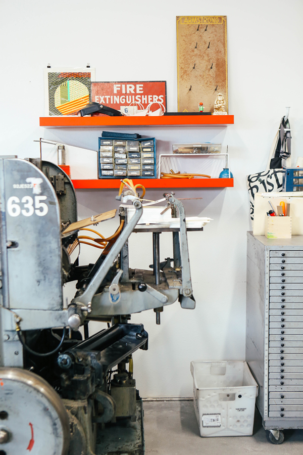 Photo byÂ
Photo by 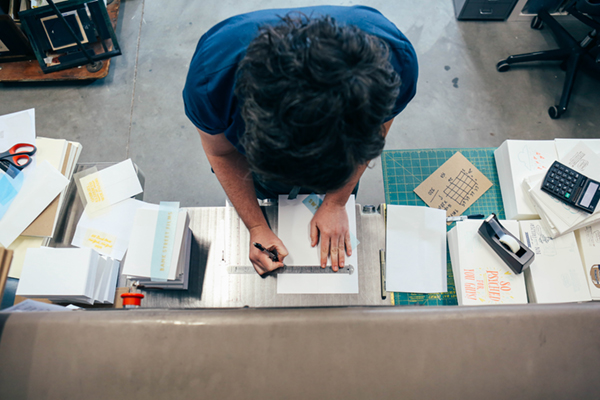
 Photos byÂ
Photos by