The National Stationery Show is right around the corner and I’m here with London-based designer, Katie Leamon, who’s sharing about balancing designing versus managing staff as her business has grown to be an extension of her family. Katie takes us through her business’ journey, explaining everything from her sketching process to her first debut, straddling studio spaces and more. –Megan

Welcome to our little world at Katie Leamon. Firstly, can I say a big thank you to Nole and Megan for sharing our story. I’m Katie, creative director at the company – we are a family run card and stationery business based in London, UK.

The company grew organically from relatively humble beginnings as I spent my weekends and evenings sketching ideas, building a website and pulling together designs alongside a full time job in fashion. It wasn’t until Spring 2011 that I had a collection together and was ready to launch myself into the world of stationery design and production more seriously.

I was fortunate enough to be accepted to compete in Liberty of London’s Open Call Day – a day which will remain one of the most significant of my career, and one so filled with fear and elation in equal measure! My brand had been born and the summer of 2011 I launched into the world of trade shows by exhibiting at Pulse London, and landed a few incredible new stockists including high profile stores Paperchase and Selfridges.


Before long, I needed another pair of hands and my mum and sister began helping to pack cards and fulfill orders to allow more time to design and drive the business forward. Since then we have gone on to build a production studio in the garden of my family home in the Essex countryside just outside of London, where they both continue to run our production studio. I am still in London where I work from another studio in an old train depot. There are four of us here including my partner, Ruairi, who joined the company a couple of years ago to help me with sales and business development. Being spread across two studios sometimes poses a logistical problem, but generally speaking it works really well and allows us to concentrate on our roles. I think if the production was being done around me I would never get anything done as I still love being hands on with the cards and wouldn’t leave the warehouse!

I was sharing a studio with my brother for the first couple of years and he was a huge inspiration in helping me find my method that we still use today. Our rubber stamp technique was born the Autumn of 2010. We brought a stamp making kit made a series of hand made stamps which, although I don’t make the stamps anymore, the process remains the same and each card is individually hand printed. This is something that I think helps to stand us apart and maintain the tangible, personal touch that goes into our products.

Photo by Laura Hutchinson

Our style is quite minimal with a muted colour palette and simple typographical and illustrative designs. I combine this playful nature with repetitive geometric patterns, which adds a bit of structure to our collections. I keep a close eye on trends and like to know whats happening in fashion, architecture, and interior design trends as they tend to filter down to the stationery world – and it’s good to be ahead of the game in such a competitive industry with so many amazing brands. They key is to adopt trends but make them your own, with your stamp on them to ensure the integrity and heart of the brand is always prevalent.


Photo by Laura Hutchinson
A typical day for me starts by checking emails and updating our Instagram account whilst making a smoothie. Ruairi and I walk to work most days and spend the journey catching up with things for the day ahead. Once everyone is else in at about 9 – 9:30am we run through various ideas and projects that are going on at the time. We also catch up with the production team every morning – Facetime has been incredible at easing the distance between the studios. I go out there once a week, but we are able to catch up with them multiple times a day and visually see samples and deal with issues, which has proved really helpful. There are generally four people out in Essex including my mum and sister, and another four of us in London.

Georgia was my first full-time intern and deals with all our marketing and press as well as helping out with everything in between! Olivia is the latest person to join us full time and she helps Ruairi with wholesale accounts and manages production demands. Our team is incredible; they are an extension of the family, and all invaluable in helping to run the company. We have had a steady growth since I started out in 2010, and it’s lovely to have people to share the highs and lows with. I’m very lucky to be doing something I love for a living and sharing what I do with my partner and my family is such a bonus!

Photo by Laura Hutchinson
For me personally, it can be difficult to juggle my design time and the responsibilities that come from running your own business. There is endless paperwork, forms and logistics that need to be organized, not to mention the managing of everyone in the team and ensuring they are all working as well as possible. I am in the process of restructuring the way I work and making time to get away from my computer to design. It’s a constant battle – one in which I am taking steps to improve but is probably my biggest challenge.

The time I do take to design and brainstorm is lovely. I love to get away from my desk with a sketchbook and pencil and start jotting down ideas, whether its phrases I want to add to a card, people I want to collaborate with, new products I want to explore, or new colours of things that are selling well. My sketchbook has everything in it; it’s a bible of everything going on in my mind and I’d be lost without it. I scan drawings in, send things off for colour matching, print ideas out, and collage them together to see if an idea has any legs to grow. More often than not, I visualize the end product and work backwards to make that come alive. I piece it all together by sourcing the right stock, getting the right shade, and ensuring a very fine detail comes out as I want. I’m a perfectionist, so getting it quite right can sometimes take some time, but it’s worth it. I love nothing more than the day new samples arrive on our doorstep and I get to see my designs come to life.
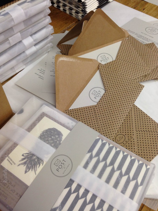
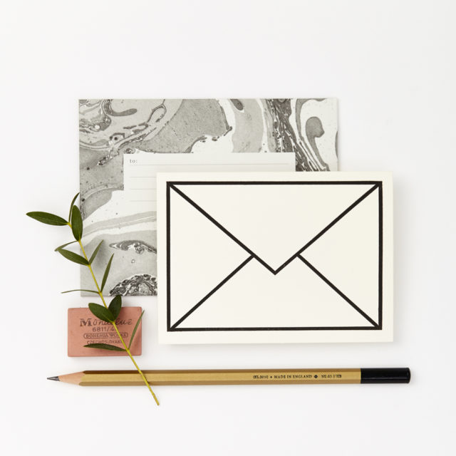
Photo by Laura Hutchinson

My goal is to create beautiful stationery that people buy and almost don’t want to use, to ignite excitement in our customers when a beautiful package arrives, and to make things I would not only use but am also proud of. As a company, I am incredibly proud of how far we have come and that we continue to savor and pay homage to the beauty of hand printed, hand written letter, all the while having a wonderful working life with close family and friends.
Thanks again to Nole and Megan for having us! See you in New York!
Photos by Katie Leamon except where noted.
Interested in being featured in this column? Reach out to Megan [at] ohsobeautifulpaper [dot] com.