Black and Gold Foil Art Deco Birthday Party Invitations

Black paper and gold foil were just MEANT for gorgeous 1920s-inspired designs! Alison of One + Only Paper created these black and gold foil Art Deco birthday party invitations for a surprise (!!!) 50th birthday party. Alison channeled Baz Luhrmann’s edition of The Great Gatsby with Art Deco-inspired monograms, wax seals, and festive watercolor illustrations. So fun!

Black and Gold Foil Art Deco Birthday Party Invitations by One and Only Paper

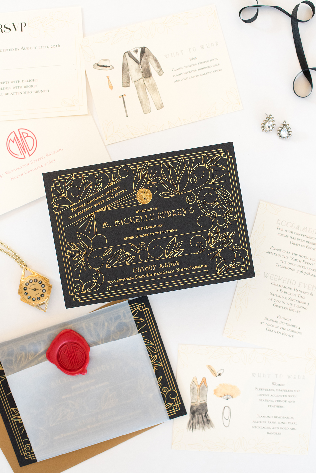
From Alison: I was so excited to be contacted for the most fabulous surprise birthday party, taking place over the course of a weekend at a mansion in North Carolina. The theme was the Great Gatsby, the Baz Luhrmann edition, and no corner was to be cut in creating a weekend of surprise and delight. Guests were to be transported back in time with this fun weekend, and we knew that the invitation would have to be the first indication that this was going to be the party of the century.

Black and Gold Foil Art Deco Birthday Party Invitations by One and Only Paper

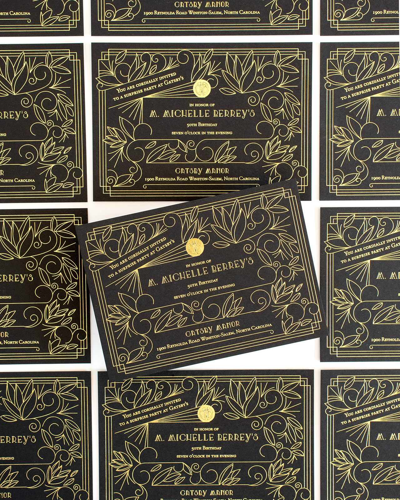
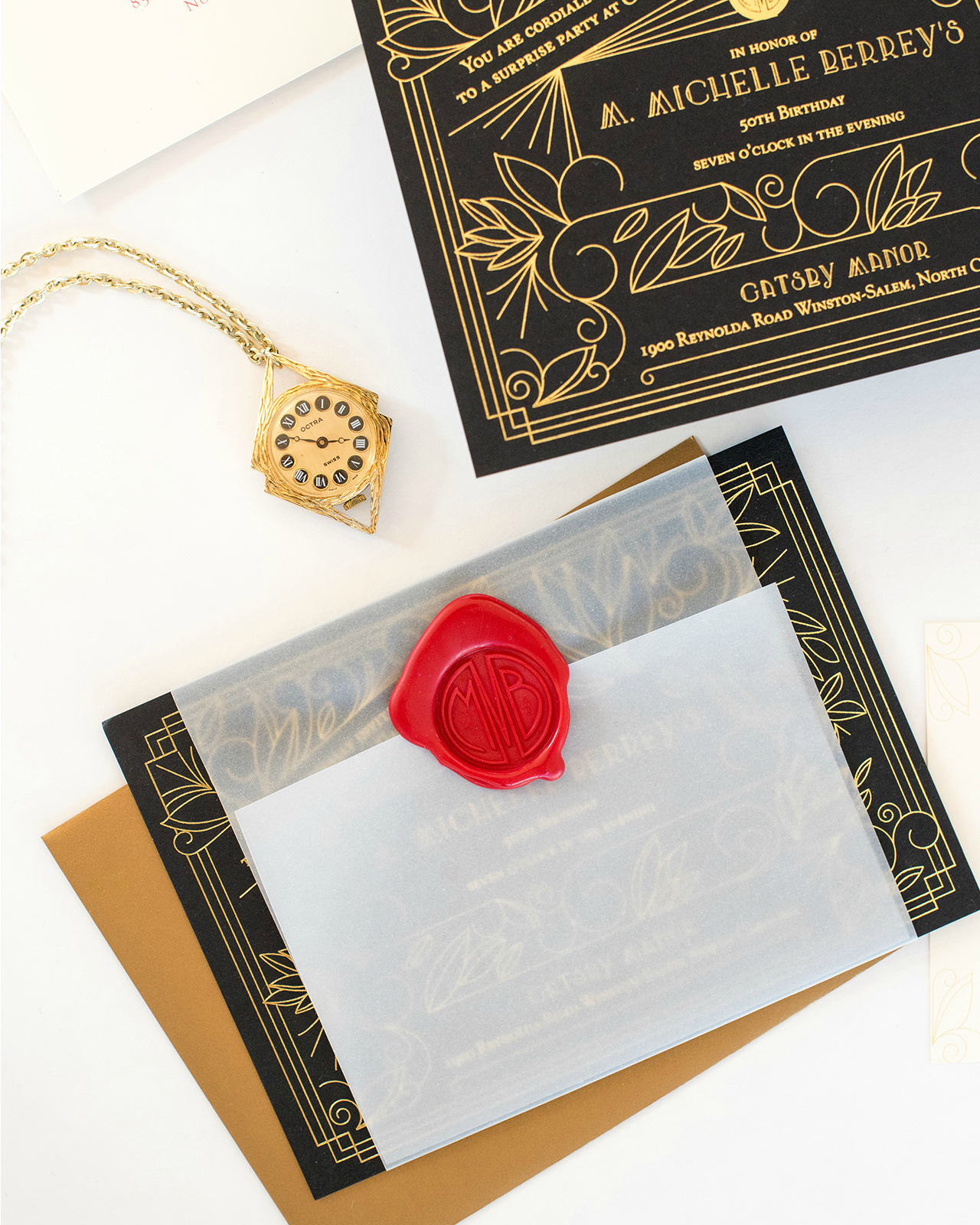
The standout piece of the suite was the invitation, we went with a thick black card stock, and gold foil printing, to ensure that guests knew that this was going to be a party unlike any other. For the design, I wanted it to feel like a jazz era invitation, without going too cliche, so I created a feminine and Art Deco inspired line drawing, and kept the typography simpler, in order to not feel too cartoonish.

Black and Gold Foil Art Deco Birthday Party Invitations by One and Only Paper

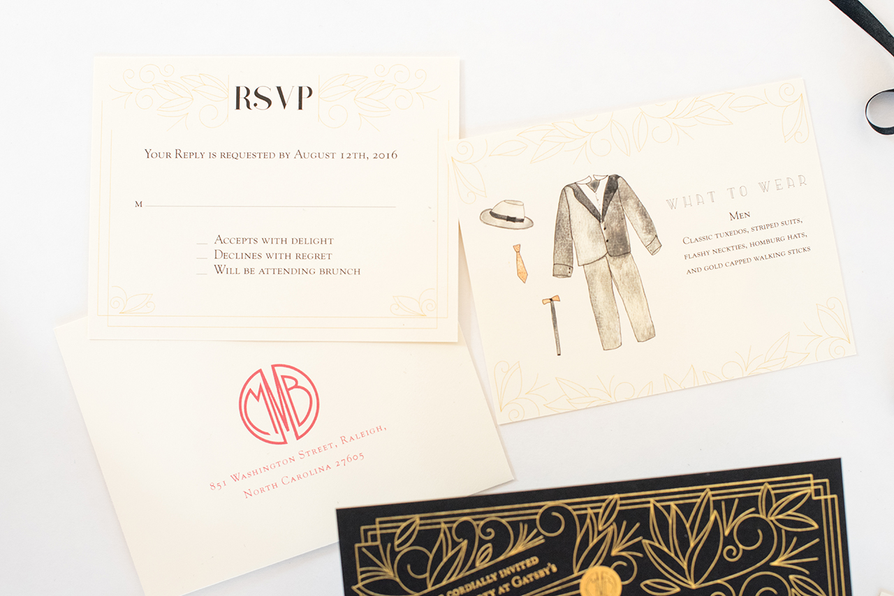
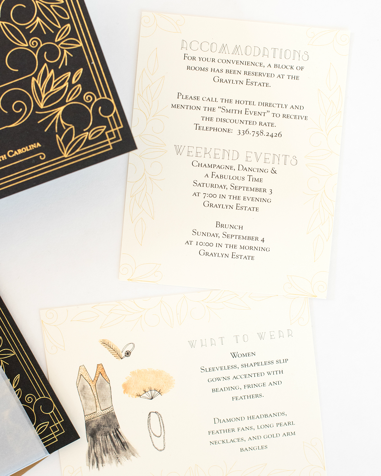
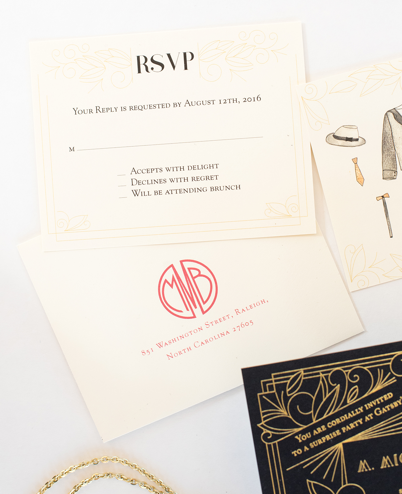
The secondary pieces were flat printed on cream paper, and we kept everything small, reminiscent of smaller ‘calling cards’ that people who lived in the 1920s may have used. I created watercolor illustrations to help guests know what the dress code may be, and used pieces from the invitation drawing to carry the intricate design throughout the suite.

Black and Gold Foil Art Deco Birthday Party Invitations by One and Only Paper

Black and Gold Foil Art Deco Birthday Party Invitations by One and Only Paper

We finished the suite by wrapping it in a smooth vellum belly band, and sealing it with an oversize wax seal. It added the perfect touch of red, and was another old school accent.

Black and Gold Foil Art Deco Birthday Party Invitations by One and Only Paper

Overall, this suite was fun and gave a vintage feel, while keeping one foot in the 21st century. I loved creating an over the top invitation for such a fun surprise party; it was different from my usual wedding fare, and gave me a chance to flex some creative muscles!

Black and Gold Foil Art Deco Birthday Party Invitations by One and Only Paper

Thanks Alison!

Design: One and Only Paper

Planning: Kelley Ann Ward

Calligraphy: Quietude Co.

One and Only Paper is a member of the Designer Rolodex – you can see more of their work right here!

Photo Credits: Mikkel Paige

Stationery A-Z: Copper Foil

We’ve often waxed poetic about our love of gold, holographic, and rose gold foil on wedding invitations and greeting cards, but today we thought we’d sing the praises of copper foil! Copper has a striking beauty all its own (case in point: this stunning skirt from Proenza Schouler or this sleek light fixture from Anthropologie), and is quickly making a home for itself in the stationery world. I’m especially loving the use of copper on dark backgrounds (so modern!). Here is a collection of some recent favorites:

Trendspotting: Copper Foil

From top left:

1. A copper foil cocktail on gorgeous blush pink paper from Fox & Fallow

2. Fun striped copper foil party plates from Bash Party Goods!

3. The combination of hand lettering and copper foil in this birthday card from Hello!Lucky is the perfect balance of elegance and fun

4. If you’re behind on your Valentine’s day greetings (or missed all three of our earlier posts), might you consider this simple, yet direct, message from The Social Type.

5. The copper is the whiskey…get it? This clever usage comes courtesy of Idlewild Co.

6. Stunning metallic cotton ribbon from Angela Liguori

7. Toss some of this copper confetti from Knot & Bow into a greeting card for a fun surprise – or sprinkle it on a table at your next party!

8. I’ve been a fan of printmaker Katharine Watson’s work for awhile now and I love that she moved in the foil space.

9. Meg from Moglea always comes up with the most amazing color stories and combinations, so it’s not surprising that she was an early adopter of this metallic trend.

10. Now, this is what I’m talking about: copper foil on gray paper is so fresh. Add some illustrated flowers and you’ve got yourself a winner. By Kelsey Garrity Riley for Red Cap Cards.

What’s your favorite metallic foil these days? Classic silver or modern gold? Are you loving copper foil, or feeling all things holographic? Let us know in the comments below!


Copper and Burgundy Star-Inspired Baby Shower Invitations

Happy Monday everyone! Before we jump into today’s post, just a quick announcement for those of you looking forward to the upcoming Modern Calligraphy Summit 2.0 – there’s a FREE video series from some of the instructors going on now through February 8! You’ll meet all seven instructors, including Katherine of Script Merchant, Lauren of A Fabulous Fete, Jenna of Mon Voir, and Karla of Written Word Calligraphy. They’ll share their preferred tools for traditional calligraphy, modern calligraphy, and brush lettering, along with their inspiring stories about how they got started, and changed their lives, with calligraphy. Find all the details here – you won’t want to miss it!

Okay, onto today’s gorgeous baby shower invitations! Fresh, delicate, and adorable; these refined copper star inspired baby shower invitations are nothing short of darling! Alana of Bourne Paper Co. is expecting a baby girl later this year and had the amazing joy of designing her own baby shower invitations. The twinkly star motif that she wove through the invitation design and elegant copper and burgundy color palette are perfect for a mid-winter baby shower.

Refined Copper and Burgundy Star Inspired Baby Shower Invitations by Bourne Paper Co.

From Alana: As a designer, personal celebrations are special not only because they’re milestones but because they’re the perfect excuse to create pretty paper! I’m expecting my first child (a baby girl) this spring. When my family offered to host a baby shower, I was immediately given full reign over the invitations. I knew I wanted something that was seasonal and modern, but not overly feminine. Since my shower took place during the winter, I decided on a color palette of copper and burgundy.

Refined Copper and Burgundy Star Inspired Baby Shower Invitations by Bourne Paper Co.

Refined Copper and Burgundy Star Inspired Baby Shower Invitations by Bourne Paper Co.

My invitation design was centered around a delicate star motif paired with modern typography. The invitations were printed using copper foil on a pure white card stock. I opted for a 200lb. card stock to give the invitation a more substantial feel. Having used a lot of matte gold, silver and rose gold in my recent greeting card collection it was fun to create a project that used bright copper – it has such a vibrant shine to it.

Refined Copper and Burgundy Star Inspired Baby Shower Invitations by Bourne Paper Co.

I paired the invitations with a rich burgundy envelope which also featured the copper foil star motif. I distributed the stars throughout both the envelope front and flap, something I hoped would make them stand out when they arrived in my guests’ mailboxes. Elegant copper calligraphy from Nancy Hopkins Lettering  completed the invitations. I thought her beautifully flourished calligraphy was the perfect compliment to the simple, clean type used on the invitation. Not to mention, she was able to create a perfect color match with the copper foil.

Refined Copper and Burgundy Star Inspired Baby Shower Invitations by Bourne Paper Co.

In addition to the invitations, I created matching thank you cards. I opted for flat notecards which used the same copper star motif and burgundy envelopes as the invitations. Overall, I was pleased with how beautifully the delicate stars seemed to shine in copper foil and hope to turn this motif into a new greeting card collection in the future.

Refined Copper and Burgundy Star Inspired Baby Shower Invitations by Bourne Paper Co.

Thanks Alana!

Design: Bourne Paper Co.

Calligraphy: Nancy Hopkins Lettering

Bourne Paper Co. is a member of the Designer Rolodex – you can see more of their beautiful work right here or visit the real invi­ta­tions gallery for more wedding invitation ideas!

Photo Credits: Bourne Paper Co.

Happy Weekend

Three Potato Four via Instagram

Image from Three Potato Four via Instagram

Hi everyone! I haven’t written one of these Friday posts in a while… mostly because I honestly don’t know what to say most of these days. I know you come here for the general inspiration and some happy sparkle in the middle of the day, and many of you don’t want any political discussion on this platform. But I can’t just pretend that everything is light and happy given our current circumstances. So I’m going to change up this Friday round up post to share a few of the more serious stories and links from the week, along with some of the things bringing me joy during the week. We’ll see how it goes!

Some of the many reasons why the immigration ban will not help make us more safe.

What you need to know about the terror threat from foreigners

Over 100,000 visas have been revoked due to the ban.

We said Never Again in 1945. We have to mean it.

Maybe it’s because I live in DC, but I find this endlessly fascinating: How the National Mall evolved over 200 years to become what it is today

From a couple of weeks ago: How the White House transitions from one president to another in five hours

Such a cute idea: DIY Valentine Balloon Surprise Box

I desperately want a set of these iridescent mini bowls

I seriously can’t get over the gorgeousness of this embroidered jacket (or this one!)

Loving these new blue, gray, and black bamboo papers from Bella Figura

Congrats to BerinMade on their beautiful new website!

Feeling frustrated by your political representatives? Run for office!


And this week on Oh So Beautiful Paper:

Brand new illustrated desktop and phone wallpapers for February!

Printable Valentine’s Day envelope liners

Beautiful custom calligraphy Valentines from Betsy Dunlap

And some Valentine’s Day cards for friends!

Bilingual wedding invitations with a gorgeous illustrated envelope liner


Bilingual Wedding Invitations with a Beautiful Illustrated Envelope Liner

Bilingual invitations can be tough, especially when you want to keep the design modern and simple. Do you go with a double sided layout with a different language on each side? Or print separate invitations in each language and mail them to the appropriate guest? Today we’re sharing these clean and modern bilingual wedding invitations with a beautiful illustrated envelope liner from Designer Rolodex member Melissa from Atheneum Creative. Doesn’t the illustrated envelope liner serve as the perfect complement to the crisp type-driven design and letterpress printing of the invitation?!

Bilingual Wedding Invitations with a Beautiful Illustrated Envelope Liner by Atheneum Creative

From Melissa: Jamie and Pascal came to us in need of a bilingual wedding invitation, but wanted to keep the design simple and clean. Bilingual invitations can sometimes get too wordy, too busy and too complicated, so keeping the design simple is always a challenge. We talked about all the options… run the two different languages with one on the front and one on the back, simply create two different invitation sets, or work to try and fit it all on the front – which was the direction we took in the end.

Bilingual Wedding Invitations with a Beautiful Illustrated Envelope Liner by Atheneum Creative

Bilingual Wedding Invitations with a Beautiful Illustrated Envelope Liner by Atheneum Creative

Bilingual Wedding Invitations with a Beautiful Illustrated Envelope Liner by Atheneum Creative

Keeping all the information on the front, with the exception of the reply card, allowed us stay within the budget and utilize both letterpress printing and foil printing. We the invitation and ceremony card were both letterpress printed, while the accommodations card featured white foil on dark gray paper and the reply card was digitally printed.

Bilingual Wedding Invitations with a Beautiful Illustrated Envelope Liner by Atheneum Creative

Bilingual Wedding Invitations with a Beautiful Illustrated Envelope Liner by Atheneum Creative

We decided to keep the entire wedding invitation suite in shades of gray to allow the envelope liner to really pop when guests opened the envelope. The couple wanted something very meaningful for the envelope liner: a custom illustration of the church they were getting married in. It was a church that has a lot of history with the couple and family. Once the pen illustration was complete, we adjusted the colors in the illustration to be very saturated and bold. We increased the blacks and the contrast while keeping the blues and greens very vibrant.

Bilingual Wedding Invitations with a Beautiful Illustrated Envelope Liner by Atheneum Creative

Bilingual Wedding Invitations with a Beautiful Illustrated Envelope Liner by Atheneum Creative

Thanks Melissa!

Design: Atheneum Creative

Illustration: Alice Holleman

Atheneum Creative is a member of the Designer Rolodex – see more of their beautiful work here or visit the real invi­ta­tions gallery for more wedding invitation ideas!

Photo Credits: Chelsea Davis Photography