Happy Weekend!

Happy Friday everyone! Guess what?? If you’re in the DC area, we’re doing a special pop up with our friends Brief Assembly this Saturday from 2-5 pm! We’ll have some of our Liquorary vintage glassware and barware for sale, and I’ll even be there with some of our #OSBPxMonVoir art prints! Plus, we’ll have some brand new (!!) curated cocktail kits with our favorite syrups and bitters! (they make excellent holiday gifts, just FYI 😉) It would be so fun to meet you in person, and you can knock all of your holiday shopping out in one spot! If you can’t make the pop up in person, you can grab your own art print right here and our curated cocktail kits right here, but I really hope you’ll stop by if you’re in the area! Details are below – see you there! But in the meantime…

OSBP x Liquorary x Brief Assembly Pop-Up!

…a few links for your weekend!

Loving this sweater – especially in pale lavender and that deep teal green!

Great ideas for using paper flowers in your wedding

I’m totally doing this next year: DIY ornament advent calendar

A geology birthday party! SUCH a great idea!

An historical way of looking at trickle-down economics

Attacks on hospitals led to the Geneva Conventions 153 years ago. It is the original war crime. Since 2011, the Syrian regime has conducted more than 450 attacks on Syrian hospitals, including NICUs, nurseries, and emergency medicine.


This week on Oh So Beautiful Paper:

Gift Guides! We’ve done four gift guides so far: Home + Style Gift Ideas, Gift Guide for Creatives, Gift Ideas for Kids, and Cocktail + Entertaining Gifts. 

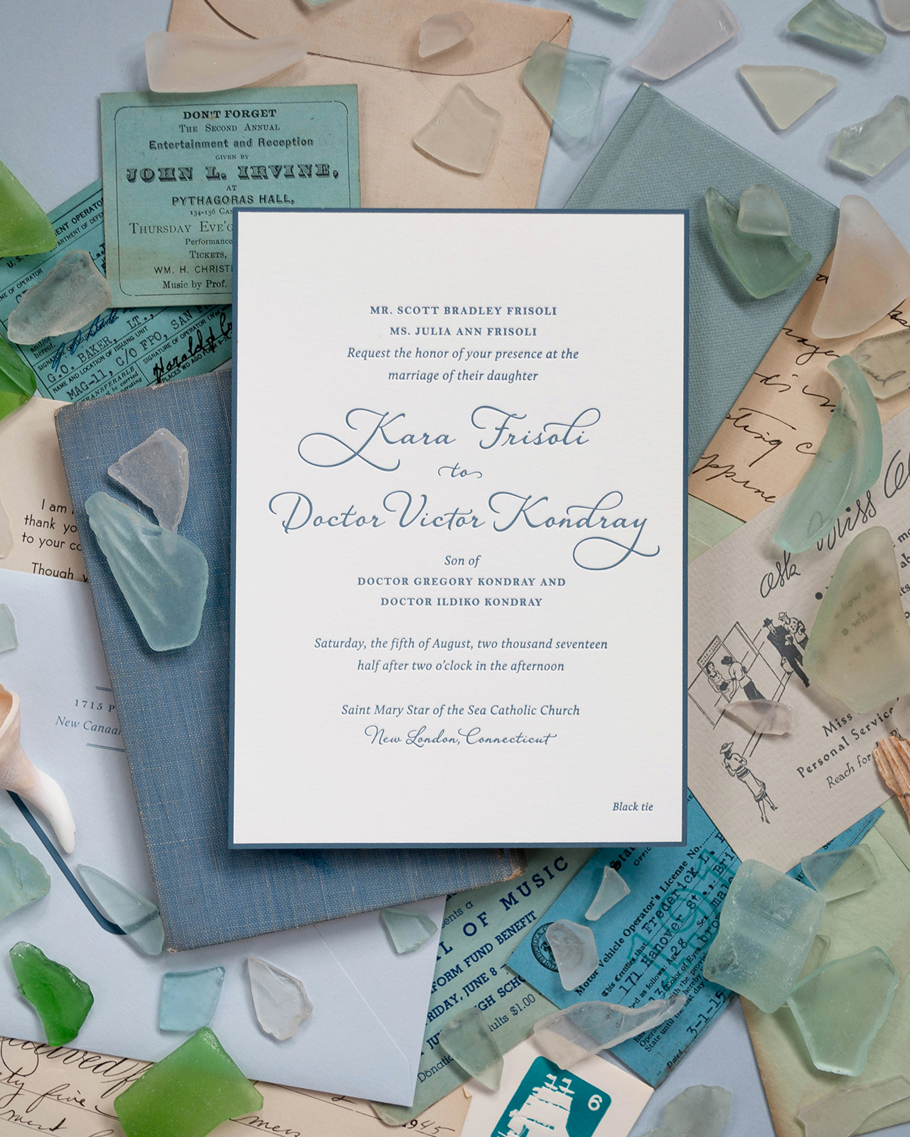
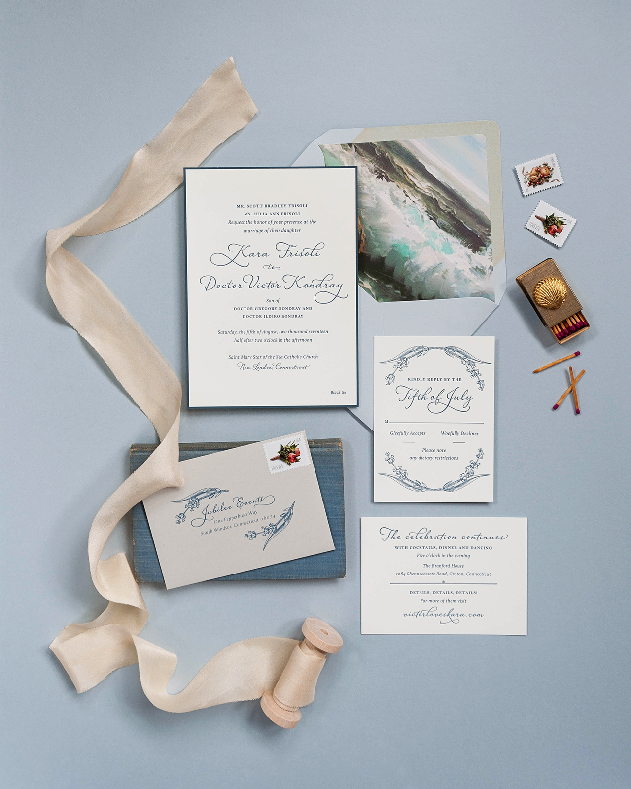
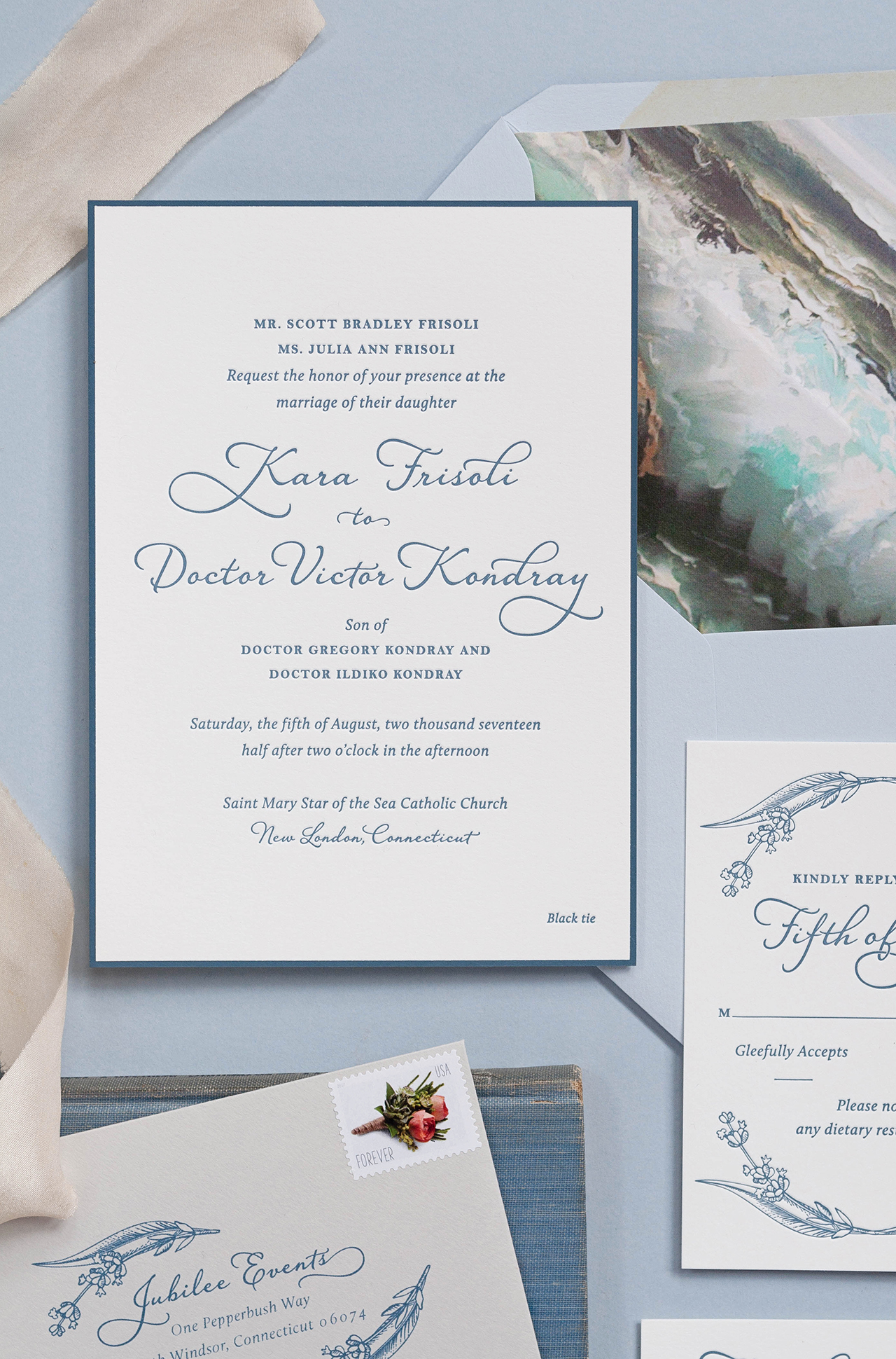
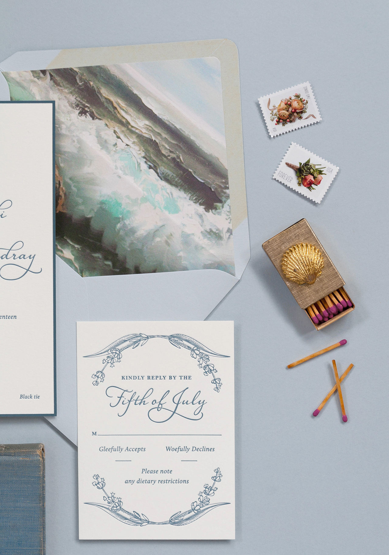
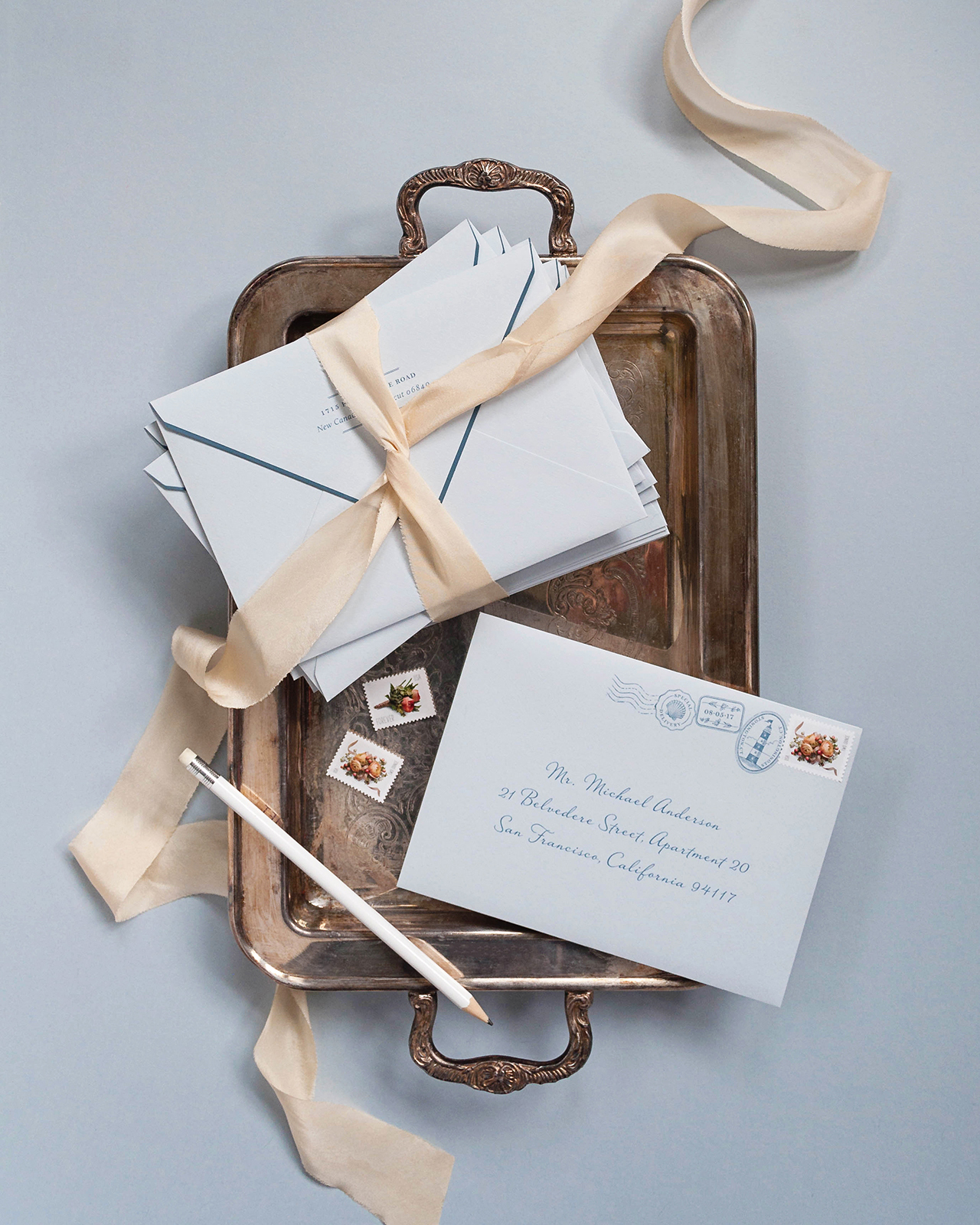
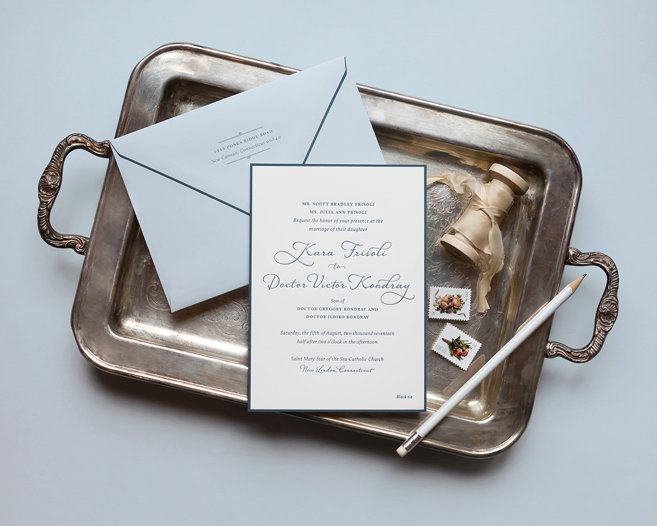
Gorgeous and classic ocean-inspired wedding invitations

Navy and gold foil agate-inspired wedding invitations

Behind the Stationery with bi-coastal stationery duo Anne + Kate

A thank you card round up to help prepare for post-holiday thank you cards!


That’s it for me this week! I hope you have a fantastic weekend and I’ll see you back here on Monday! xoxo

Navy and Gold Foil Agate-Inspired Wedding Invitations

Modern yet classic and geometric yet organic, this wedding invitation suite is full of the very best juxtapositions. Michael Musser of Anticipate Invitations drew inspiration from one of nature’s most beautiful elements when creating these striking navy and gold foil agate-inspired wedding invitations. How beautiful is that gold foil border formed by the agate lines against that gorgeous dark blue paper?! 

Navy and Gold Foil Agate-Inspired Wedding Invitations by Anticipate Invitations

From Michael: Sharla and Nick approached me with their own jumping off point ideas for their wedding stationery design, and I knew they were on to something that could be taken to another level with some carefully well thought-out details.

Navy and Gold Foil Agate-Inspired Wedding Invitations by Anticipate Invitations

Sharla wanted to bring in something modern and abstract, yet also keep the feeling classic and traditional. She also wanted to use the blue hues and metallic golds she would repeat through her other wedding design elements. After some initial designs that were more geometric in nature, we landed on the more organic, yet graphic lines, of an agate slice. It allowed for the invitation to be fully classic and fully modern at the same time. To lean classic, we kept everything in metallic gold foil and printed on Colorplan paper’s dramatic Imperial Blue. The lines of the stone were pulled from a scan of an actual agate slice, and then edited and filled in as necessary to perfectly frame the invitation’s wording.

Navy and Gold Foil Agate-Inspired Wedding Invitations by Anticipate Invitations

Navy and Gold Foil Agate-Inspired Wedding Invitations by Anticipate Invitations

To further mimic the stone, we used graduated shades of blue paper from Colorplan for the remaining details cards, so that when stacked, it would create a beautiful ombré effect. To visually tie the pieces together, the agate lines of the invitation were repeated on all the corners of the smaller cards. When stacked, they formed the complete agate design, but perfectly hid the invitation’s wording.

Navy and Gold Foil Agate-Inspired Wedding Invitations by Anticipate Invitations

The secondary cards included accommodations, a modern map card that mixed simple watercolor lines and gold foil, and the reply card with envelope.

Navy and Gold Foil Agate-Inspired Wedding Invitations by Anticipate Invitations

The cards were tied together with gold string in a random and layered fashion while framing the monogram that was printed on the back of the top details card.

Navy and Gold Foil Agate-Inspired Wedding Invitations by Anticipate Invitations

The suite was slipped into a clear vellum envelope, which was then inserted into a light blue outer envelope and lined with metallic gold paper. The envelope’s finishing touch was the set of four vintage postage stamps, that highlighted the blue tones and the geodes.

Navy and Gold Foil Agate-Inspired Wedding Invitations by Anticipate Invitations

Thanks, Michael!

Design: Anticipate Invitations
Printing: Hodgins Engraving
Paper: Colorplan Papers
Planning: Two Be Wed

Check out the Designer Rolodex for more tal­ented wed­ding invi­ta­tion design­ers and the real invi­ta­tions gallery for more wedding invitation ideas!

Photo Credits: Very Robin & Co.

Classic Ocean-Inspired Wedding Invitations

Imagine a Downton Abbey era garden party by the ocean. Sounds pretty awesome, right? Well, that’s exactly what Nichole of Coral Pheasant had in mind when creating these classic ocean-inspired wedding invitations! The entire suite is letterpress printed in a restrained slate blue, with classic typography and the most gorgeous envelope liner of painted waves crashing on the shore. So beautiful!

Classic Ocean-Inspired Wedding Invitations by Coral Pheasant

From NicholeKara and Victor were married by the sea this past August in Groton, Connecticut. Kara grew up spending her summers on the Connecticut shoreline and her love of the ocean and its energy greatly guided the direction of her wedding invitations. The grandeur of the Branford House is what drew them to the venue, but it was important to Kara and Victor that their wedding was formal and sophisticated – and by no means stuffy. A Downton Abbey era garden party by the ocean with clean lines and classic colors.

Classic Ocean-Inspired Wedding Invitations by Coral Pheasant

Kara shared with me that she wanted her guests to leave their wedding thinking “Wow! That wedding was beautiful, comfortable and fun. And the food was awesome!” While I couldn’t ensure the delicious food, I was totally game to get her guests excited about her wedding – and that’s just what their paper story did!

Classic Ocean-Inspired Wedding Invitations by Coral Pheasant

The typography of the invitation was classic and very considered, balancing a serif font with a charming script. The suite was letterpress printed in slate blue on 110# Crane’s Lettra and the main invitation and outer envelope flap were edged in the same slate blue, adding a restrained graphic pop. The envelope liner of painted waves crashing on the shore is a nod to Kara’s love of the ocean and the venue’s seaside location.

Classic Ocean-Inspired Wedding Invitations by Coral Pheasant

Additional, subtle color was layered in through colored envelopes: a light dusty blue for the outer envelope and a soft grey for the reply envelope. Illustrations of lavender sprigs and the printed stamps on the outer envelope add just the right touch of gaiety making this suite extra sweet. If you look closely, you’ll see that the printed stamps relate back to the ocean with illustrations of a shell and a lighthouse, along with their wedding date bordered by lavender sprigs.

Classic Ocean-Inspired Wedding Invitations by Coral Pheasant

Classic Ocean-Inspired Wedding Invitations by Coral Pheasant

Thanks Nichole!

Stationery Design and Styling: Coral Pheasant

Coral Pheasant is a member of the Designer Rolodex – you can see more of Nichole’s beautiful work right here or visit the real wedding invitations gallery for more invitation inspiration!

Photo Credits: Coral Pheasant

Happy Weekend!

Happy Friday everyone! Last weekend, I hosted Jenna of Mon Voir at Common Room Studio to celebrate her new book, Everyday Watercolor. We had 60 people at the studio over Saturday and Sunday, and it felt so great to finally share the space with people! If you’re in the DC area, we have two really exciting workshops coming up over the next few weeks: an ornament painting workshop with Talia of The White Hearth on Small Business Saturday, and a holiday table styling workshop with Wld Wst on December 16 that we’re calling Architecture of a Table. I’m so excited for both workshops – they’re going to be so fun! But in the meantime…

Black Lamb Studio / Plant Lady

Illustration by Black Lamb Studio via #dailydoseofpaper

…a few links for your weekend!

The world’s most perfect pink coat (and it’s only $160!)

Thinking about giving this DIY holiday greenery chandelier a try

Sign up for the Antiquaria holiday card exchange!

Gimme this rainbow stripe sequin skirt

Still trying to wrap my head around this proposed idea for countering global warming

I may have completely lost my mind, but I really want these glitter duck boots for winter

MAKE: Breakfast pot pies (yum!)


This week on Oh So Beautiful Paper:

Loving these quirky camp-theme wedding invitations

How to find the perfect vintage rug for your space

We rounded up some favorite Thanksgiving cards

Gorgeous calligraphy from Pink + Peach

Looking for some fall cocktail inspiration? Try the Jägerita!


That’s it for me this week! I hope you have a wonderful weekend, and I’ll see you back here on Monday! xoxo

Calligraphy Inspiration: Pink + Peach

Hey everyone! My 6-year-old daughter isn’t the only fan of pink in our house — I love pink. My fall coat is a coral pink hue, in fact. And when I stumbled on the work of Natalie Garrigan of Pink + Peach, I was tickled pink. I think you will be, too. Here’s a sweet dose of calligraphy inspiration. Enjoy! Jen

Calligraphy by Pink + Peach

Photo Credit: Tetiana Photography

Yes to everything in this photo. The modern organic style of the calligraphy, the choice of berries and blooms for the place cards, and of course, the pink sofa.

Pink + Peach Copper Place Cards

Calligraphy by Pink + Peach

Photo Credit: Sue Blue Events

Natalie is a self-taught calligrapher based out of Seattle. She just picked up calligraphy about 2 years ago (wow!). She went full-time with Pink + Peach about a year ago.

Calligraphy by Pink + Peach

How do you get this good at calligraphy in such a short time? Practice, of course. Natalie shares: “My lettering style is ever evolving, as I feel I am still trying to perfect my style. That’s my favorite aspect about my job — I’m always learning!”

Calligraphy by Pink + Peach

Natalie finds inspiration from fonts and she focuses on letter flow. She explains: “If I don’t like how my ‘h’ flows into an ‘r’ or ‘k’ into an ‘s’, I’ll rework the letters until I’ve found an aesthetic flow. In my mind, flow is queen.”

Calligraphy by Pink + Peach

Calligraphy by Pink + Peach

Photo Credits: Dawn Photography

Here’s a peek at table settings just perfect for fall. The calligraphy place cards add the special finishing touch. The place cards above feature Natalie’s lettering work on broken ceramic tiles.

Calligraphy by Pink + Peach

These pretty place cards show off her calligraphy on vellum with edges burned by hand.

Calligraphy by Pink + Peach

Black calligraphy on white envelopes is a timeless classic – but Natalie’s calligraphy style and use of vellum envelopes makes everything feel modern.

Calligraphy by Pink + Peach

Natalie loves to work her calligraphy magic on non-paper materials. Her favorites are leather and marble. Of leather, she shares: “It responds to ink beautifully and can be manipulated into whatever your vision is. Tiles are a close second because of their elegance.”

Calligraphy by Pink + Peach

Photo Credit: Jason Lucas Photography

And with that cozy fall imagery, I’ll leave you. Thanks so much to Natalie of Pink + Peach for sharing a peek into her work and process!