{happy weekend!}

Wow, this has been a FULL week – but between the launch of United With Love and a fantastic week here on Oh So Beautiful Paper, it’s been a GREAT week.  But I’m also super excited for the weekend; tonight we’re going up to Baltimore to see Wolf Parade!  Later this weekend I’m planning to swing by the Book Arts Fair at Pyramid Atlantic in Silver Spring and re-tackle the great office clean-out of 2010.  But in the meantime…

{photo by Genevieve Leiper, from Jamie + Chad’s wedding}

…a few links for your weekend!

…and just in case you missed it, a summary of this week’s posts:

And just for this week, a quick round-up of this week’s posts on United With Love:

I hope you all have a wonderful weekend.  I’ll be back next week with more calendars, wedding invitations, and a new holiday card giveaway!  See you all back here on Monday!

Jenya + André’s Illustrated Chandelier Wedding Invitations

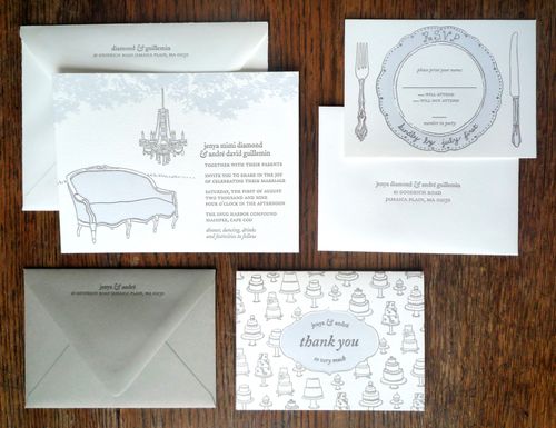
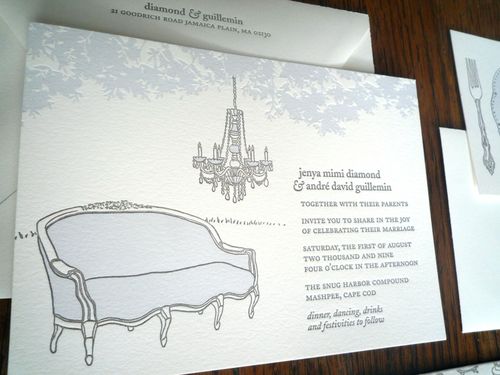
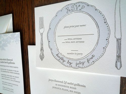
As you may have noticed, I adore wedding invitations that incorporate hand-illustrated details – and today’s real invitations are no exception.  These letterpress invitations were inspired by the chandelier in a summer house on Cape Cod that the bride, Jenya, shares with freelance designer Nina Max Daly, who designed these beautiful invitations.  This design has such a wonderful and personal story behind it, I’ll turn things over to Nina…

From Nina:  My lifelong friend Jenya and her now husband André decided to get married this past summer on a small compound of cottages on Cape Cod that our families have been renting together for over 20 years. Jenya is also a graphic designer so I presumed she’d want to do her invitation herself, but she was way too overwhelmed with planning a huge wedding on her own to do it, and asked me. I was honored.

Chandelier-Wedding-Invitation

When I first spoke to Jenya about the invitation she had little idea of what she wanted.  She said the wedding would be ‘very casual and very elegant’ with lots of really good food.  She said that she wanted lots of re-purposing and collaboration.  All of the serving dishes would be from our houses, rather than use rental serveware.  The flowers would be what was growing on the property, hydrangeas,  the vases collected from various family members.  My mom would make the wedding cake.

Chandelier-Wedding-Invitation2

Over the dance floor, she planned to hang the chandelier that my mom found in someone’s trash and which now hung in the tiny sun room of the Cape house that Jenya, my sister Anna, and I share each summer (and now also with one kid and two husbands).  She thought we could bring couches out from the houses and put them around the dance floor so people would feel comfortable either lounging or dancing late into the night.

Chandelier-Wedding-Invitation3

The chandelier image really resonated with me, as did the idea of the couches and re-purposed dishes. So I went with it.  I love to draw, so I started drawing, a couch like the one in our Cape house, a chandelier like ours, some of my favorite old dishes and silverware.  For color, I chose a lighter shade of hydrangea blue.

Chandelier-Save-the-Date

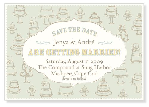
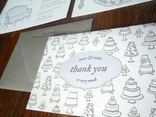
Jenya needed her save the date card in a hurry so she went with a cake repeat e-card design that I had already made. I re-used the cake design for the thank you card. When my mom saw the design for the thank you card, she was inspired to make several small cakes, like those on the card rather than one big wedding cake.

Chandelier-Wedding-Invitation4

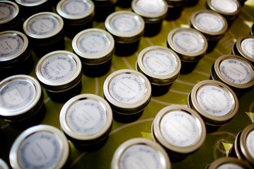
André’s good friend Deb is a letterpress printer and owns Smudge Ink.  Deb and Jenya printed the invitations together on a weekend. After the invitations had gone out, Jenya re-purposed several of the designs to use as signage, table cards and gift labels for the wedding favors, little jars of raspberry jam that Jenya’s mom mad with the raspberries we grew. The project came out beautifully and the entire wedding as well as the invitation was a true collaboration.

Wedding-Favor-Jar-Label

Seriously, how cool are these invitations?  I love the dinner plate RSVP card, not to mention all the other illustrated details from the mini wedding cakes to the couch and chandelier.  Such an incredibly sweet design, with a wonderful and personal meaning to match.  Thanks Nina!

{image credits: invitation photos by nina max daly, favor jar photos by channing johnson}

{woodgrain + country-inspired letterpress invitations}

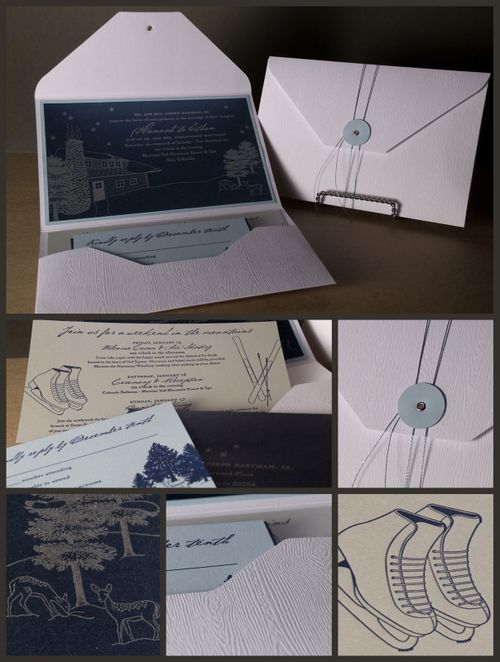
So it turns out that some of you have already used the embossed woodgrain paper from Gmund – excellent!  Spark Stationery sent over photos of this letterpress pocket invitation that they printed for an upcoming winter wedding:

Spark-stationery-woodgrain-letterpress-pocket-invitations

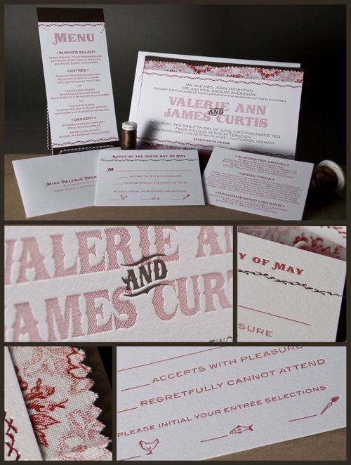
I love the way the woodgrain texture complements the silver and blue palette of the invitations.  And since I was poking around on the Spark Stationery blog, I couldn't help but also include these country-inspired wedding invitations:

Spark-stationery-country-inspired-letterpress-pocket-invitations

These gorgeous invitations feature fabric and stitching details – and I'm completely in love with the faux-cross-stitched detail in the font used for the names.  Very cool. 

{images via Spark Stationery}

Letterpress Engagement Book

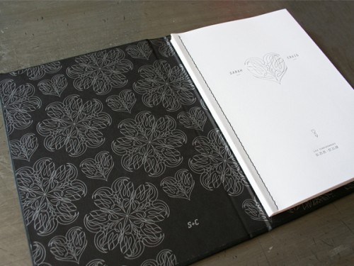
Studio on Fire, a letterpress studio based in Minneapolis, recently launched a blog called Beast Pieces to share photos of recent projects – and it has quickly become one of my daily addictions.  Studio on Fire produces some truly amazing work, from wedding invitations to business collateral and, now, this lovely letterpress engagement book:

Studio-On-Fire-Letterpress-Engagement-Book

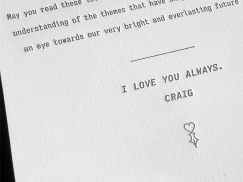
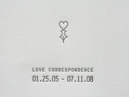
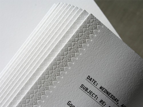
The groom behind this incredibly sweet gesture worked with Studio on Fire to create a small letterpress book comprised of various emails between the couple over the past four years, collected, bound and side sewn together.

Studio-On-Fire-Letterpress-Engagement-Book

Here are the production details from Studio on Fire: The gut of the book is digitally printed in black text.  The pages have a single hit of blind letterpress on the french folded edge.  The pages are side sewn together and tuck into a custom hard bound book cover with black book cloth.  We printed a custom liner on the cover interior with silver ink on black paper.  The cover of the book and the title page are also letterpress printed in silver ink.  The paper is 100 percent cotton Crane Lettra 80 lb text.

Studio-On-Fire-Letterpress-Engagement-Book

Studio-On-Fire-Letterpress-Engagement-Book

Studio-On-Fire-Letterpress-Engagement-Book

I know most of you are already engaged, but I think the concept behind this gorgeous book could easily be applied to other wedding elements, like the guestbook.  E-mails and love notes (or at least the portions that you’d be willing to share with guests) could be complied and used to create a custom guest book either via an online printing service like Blurb or by working with a bookbinder on Etsy – like Elvie Studio, Grimm, and Brooklyn Bookbinder.  In the meantime, don’t forget to head on over to Beast Pieces for more photos of this engagement book as well as other recent projects from Studio on Fire.

{images via Beast Pieces}

p.s. For all of you fol­low­ing along over the past cou­ple of weeks — I had my French test yes­ter­day, and I passed!  I’m def­i­nitely breath­ing a huge sigh of relief today.  Thank you all so much for your good luck wishes, and to Kathryn and Chelsea for giv­ing me some extra study­ing time.  I’m on my way out to LA right now for my nephew’s Bar Mitz­vah, but I’ll be back in full swing on Mon­day — and I’ve got some fab­u­lous invi­ta­tions that I can’t wait to share with all of you!

Laurel + Jedd’s Creative and Elegant Wedding Invitations

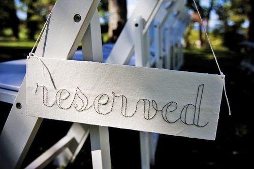
I’ve been holding out on all of you – I hope you’ll forgive me.  But I am so excited about these real invitations that I wanted to save them until today – the best for last, right?  Anyway, I first fell in love with Laurel & Jedd’s wedding after seeing the hand-stitched signs that Laurel created:

I asked Laurel if she’d be willing to share the paper ephemera from her wedding, and she very kindly obliged.  Here’s what Laurel had to say about her invitations:

Creating my invitation suite was, I’m ashamed to say, probably the most important part of my wedding.  I just really, really wanted these to be perfect and elegant and appeal to all of our guests – from my creative friends to some of our elderly relatives – and I wanted to make sure each piece obviously fit into my style.

Laurel’s invitation suite included a stand-alone invitation, rsvp postcard, information card with directions and accommodation information, and a reception card, all of which were assembled using red & white baker’s twine in a glassine envelope:

Invite+Envelope
{the main invitation and a fully assembled package}

The invitation suite used a primary color palette of creams and soft browns, with red accents in the baker’s twine and labels:

I don’t think I could have created an invitation with any other kind of color grouping – it just wouldn’t have been me.  Glassine envelopes are all over my business‘ packaging – I feel like they are an interesting way to tie printed items together – so I leaned naturally toward including those.  I love creams and browns and neutrals and I felt like the pop of red introduced a little vintage country into the design.
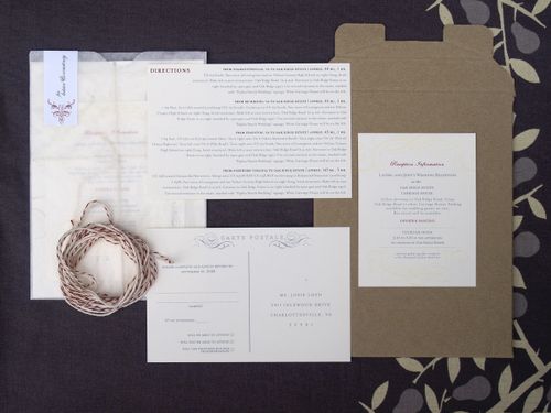
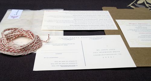
InviteSuite-Full

InviteSuite
{the additional elements from Laurel’s invitation suite}
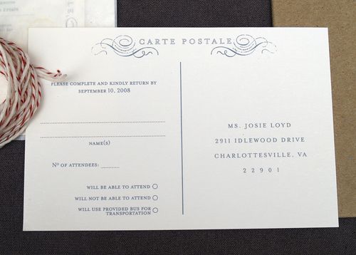
RSVP
{the rsvp postcard}

InfoCard

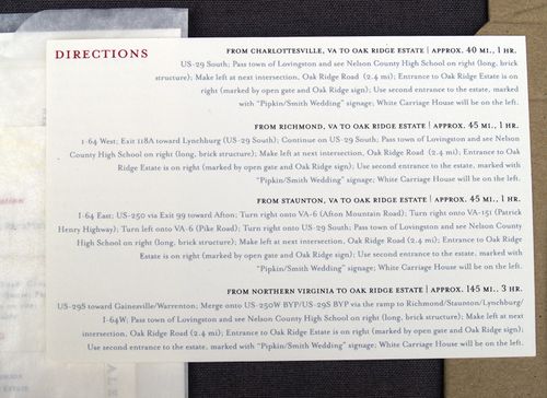
Directions
{the double-sided enclosure provided guests with accommodation information on one side and directions on the other}

ReceptionInfoCard
{the reception card enclosure}

GlassineEnvelope
{the fully assembled invitation, ready for mailing}

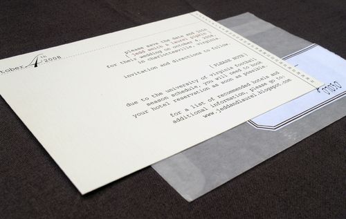
Laurel also created and printed her own Save the Dates, also enclosed in a glassine envelope, and thank-you cards:
SavetheDate
{the Save the Date card}

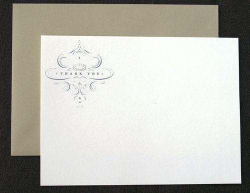
ThankYou
{thank you cards}

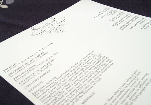
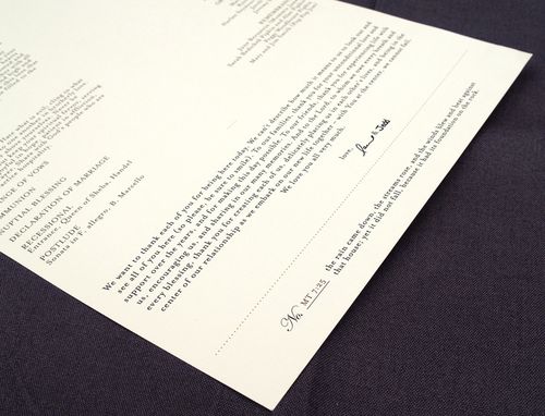
For her ceremony programs, Laurel incorporated the design graphic from the thank-you cards and printed each program on a long single sheet of linen texture paper:

ProgramTop

ProgramBottom

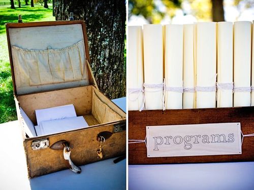
Guests found their programs behind more hand-stitched signs:

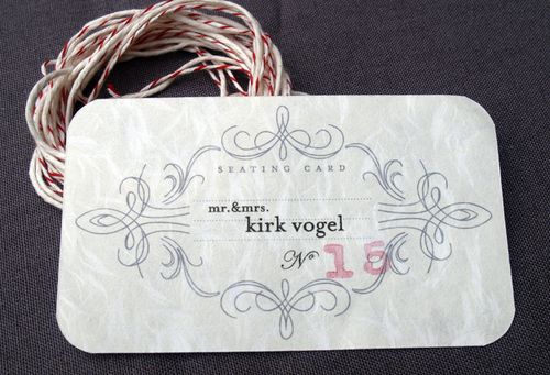
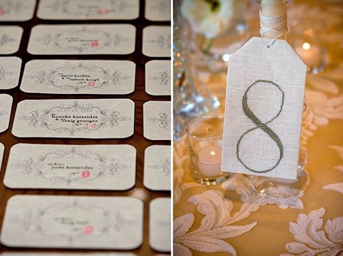
For the reception, Laurel printed the guests’ escort cards on obanai tissue paper:

EscortCard2
{the table number was hand-stamped on each escort card}

Escort and Table
{photo by Rob Garland Photographers via snippet & ink}

Here’s a bit more from Laurel about the inspiration behind her designs:

I started an inspiration folder for the printed materials I think about 5 minutes after Jedd proposed!  I love the idea of found paper and not having anything be “matchy matchy” (I think that might have been the theme of my wedding – NO matchy matchy!).  Though it’s hard to get your style just right since each piece still has to fit together!
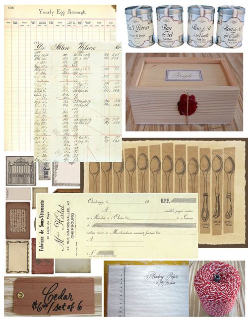
Inspiration copy
{Laurel’s invitation inspiration board}

I pulled so much inspiration from Minhee and Truman‘s wedding invitation suite and, oddly enough, home items – like the details found on the ends of silverware, the softness and textures of fabric and wallpaper design.


{Minhee and Truman’s invitations via MS Weddings}


I also love old office supplies and found inspiration for the labels and the font there.  The colors are, well, just me.


{wooden tags via Bell’occhio}

Some of my happiest accidents – like figuring out how to print the escort cards on obanai paper with the hand-stamped numbers, and the program design – happened really quickly.  Sometimes when you just have to make a decision or else, the best design is produced!

Thanks so much Laurel, for sharing your invitations and design inspiration with us!  And it’s so true, sometimes just taking a deep breath and letting things go is the best way to find the right design.  If you haven’t already seen them, definitely head on over to snippet & ink for more photos from Laurel & Jedd’s absolutely gorgeous wedding!

{except where otherwise noted, all photographs by me}