Elias + Nancy’s Watercolor Letterpress Wedding Invitations by Oh Happy Day

I credit Jordan Ferney for my obsession with watercolor and letterpress.  If you’re not already familiar with Jordan, she’s the writer of one of my very favorite blogs, Oh Happy Day (she always has the most creative ideas!) and a fabulously talented letterpress printer.  Jordan started experimenting with watercolor and letterpress last year, beginning with these business cards and her family holiday cards, and I’ve been hooked ever since.  Jordan sent over these amazing wedding invitations that she created for a destination wedding in Greece earlier this year.  The complete suite includes a bilingual invitation, accordion booklet with travel and accommodation information, along with ceremony programs and menus for the reception – and each element was watercolored by hand!
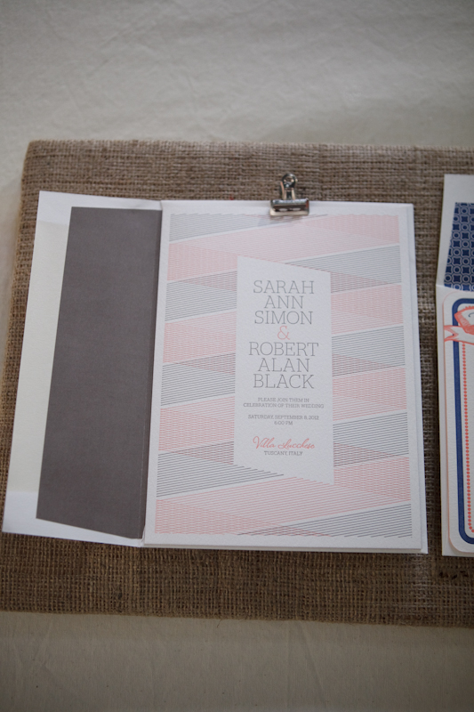
From Jordan:  The invitations were watercolored individually by hand before being letterpress printed in a very light grey ink.  The English and the invitation and the Greek invitation were then duplexed together with one language on the front and another on the back.

The accommodations and travel information were listed in an accordion booklet.  The booklet cover was letterpress printed then duplexed with a letterpress striped paper.  The inside was watercolored by hand, scored, and then it was all sewn together with metallic silver thread.


The complete invitation suite was tied together in silver thread.  The outer envelopes were also letterpress printed and watercolored, and addresses were calligraphed by Emilie Friday before being mailed to guests.   The menus and wedding program were also hand watercolored and printed with a dark grey ink.

Thanks Jordan!  For more from Elias and Nancy’s wedding in Greece, check out their feature on Martha Stewart Weddings right here!

Check out the Designer Rolodex for more tal­ented wed­ding invi­ta­tion design­ers and the real invi­ta­tions gallery for more wedding invitation ideas!

Photo Credits: Alexis Birkmeyer for Oh Happy Day

Wood + Foil NASCAR Invitations from Lettered Olive

I’m used to gushing over the beautiful wedding invitations from the ladies of Lettered Olive, but today they’re sharing something a bit different – NASCAR invitations!  These gorgeous mixed media invitations were created for a celebratory party for the NASCAR Sprint Cup.  Inspired by the industrial event space in Chicago, these invitations combine wood, etched metal, and beautiful metallic foils.

From Christine at Lettered Olive: We recently worked with NASCAR to create an invitation for a celebratory evening kicking off the Chase for the NASCAR Sprint Cup.  This event was at a fabulous space in Chicago called Salvage One.  The space is industrial, with wood beams, brick walls, and exposed metal.  We just loved the space and found it so inspiring!  So we created the invitation for a “Legendary” evening (the dinner entertainment was John Legend!).

The invitation was metallic blue and silver foil on wood, backed with etched metal.  The great thing about this job is that it allowed us to get in touch with our “masculine side” – this invitation was all about clean lines, the mixed materials, and total sophistication.  To add another luxe element to the invitation, we foil stamped the envelope and created a teal velvet envelope flap to mimic the amazing vintage velvet sofas at the venue.

So amazing!  Thanks ladies!

Lettered Olive is a mem­ber of the Designer Rolodex – you can see more of their beau­ti­ful work right here!

Photo Credits: Melanie Mauer for Lettered Olive

p.s. I have an awesome giveaway coming up a bit later, so check back soon!


Cassie + Ariel’s Navy and White Calligraphy Letterpress Wedding Invitations

I haven’t been able to get these gorgeous navy and white wedding invitations out of my mind since spotting them on the Parrott Design Studio blog last week.  Sarah from Parrott Design Studio incorporated the bride’s favorite vintage wallpaper into the suite, using a scanned, resized version of the wallpaper pattern as backing for the super thick invitations.  The invitation suite also includes a double-sided RSVP postcard and an enclosure card pointing guests to Cassie and Ariel’s wedding website.

Betsy Dunlap provided lovely calligraphy accents for the invitation suite, including the names of the bride and groom, their initials, and rsvp card lettering.  Betsy also addressed 250 deep navy envelopes in a beautiful silver ink.  Simply stunning!

I love that Sarah used strips of fabric and custom wax seals to hold the assembled invitation suite together!

Check out more details on the invitations right here!

Design and Letterpress Printing: Parrott Design Studio

Calligraphy: Betsy Dunlap

Parrott Design Studio is a mem­ber of the Designer Rolodex – you can see more of Sarah’s beau­ti­ful work right here!

Photo Credits: Parrott Design Studio

Sarah + Michael’s Vintage-Inspired Wedding Invitations

Alexandra from The Aerialist Press sent over these elegant vintage-inspired wedding invitations, and they seemed like the perfect way to help end the week!  Alexandra was inspired by the concept of the 1902s Great Gatsby era and wanted to give her clients a design that is classic yet a little bit playful.

From Alexandra: This invitation suite was inspired by the novel The Great Gatsby and the era in which Fitzgerald’s story took place. The couple really wanted a suite that was simultaneously classic and vintage with a playful edge.

I like to think of the ’20s in Long Island as sort of decadent, theatrical and elegant with a twist.  When creating the suite we really wanted to capture that feeling as well as the wildness of Jay Gatsby’s parties as detailed so sharply in the book and his abiding infatuation and love for Daisy.  The bellyband ended up being our favorite part and really finished off the whole look.

The suite was printed on 110lb Pearl White Crane Lettra paper, the inks are metallic silver and black and we used the Engravers Shaded, Burgues, and Mrs. Eaves fonts (I can’t resist listing these since I’m a not-so-shy type nerd).  The envelope liner stock was sourced from Papermojo.

Thanks Alexandra!

The Aerialist Press is a mem­ber of the Designer Rolodex – you can see more of Alexandra’s beau­ti­ful work right here!

Photo Credits: The Aerialist Press

National Stationery Show 2011 – Part 4

As promised, I’m back with more from this year’s National Stationery Show, with beautiful images from photographer Brian Tropiano.  I’ve been running around the show trying to catch up with old favorites and check out the work of new exhibitors, so the last couple days have just flown by!  First up, a first time exhibitor that is a familiar face around here – Dingbat Press!  Adrienne from Dingbat Press did an amazing job with her booth; each wall is covered with silver leaf!  I’m loving Adrienne’s letterpress initial note cards and funny chess greeting cards.

Dingbat Press

Smock is no stranger to the Stationery Show, but their sister company Bella Figura was also exhibited for the first time at this year’s show.  There was a lot of color going on in the joint booth, from greeting cards to gift wrap to gift boxes to calendars to wedding invitations.  So fun!

Smock and Bella Figura

The Ladies of Letterpress booth is a bit of a doozy – with TEN designer/printers exhibiting in a shared booth.  It’s a lot to take in all at once, but there’s so much amazing work from a group of seriously talented stationers.  This year participating printers included Thomas Printers, Anemone Letterpress, Cleanwash Letterpress, Heartfish Press, Ink Petals, Wildhorse Press, Dandy Lion Press, Studio SloMo, Lulabelle, and Paper Lovely.

Ink Petals

Paper Lovely

Lulabelle

Dandy Lion Press

Heartfish Press

Thomas Printers | Studio SloMo

Gorgeous wedding invitations from Studio SloMo

Cleanwash Letterpress

Anemone Letterpress

Wildhorse Press

Sigh, I love that balloon print from Wildhorse Press

Photo Credits: Brian Tropiano for Oh So Beautiful Paper, please do not repost without permission

*Smock, Bella Figura, Thomas Printers, and Dingbat Press are sponsors of Oh So Beautiful Paper; for more on my edi­to­r­ial poli­cies please click here.