Nick + Lindsey’s Creative Wedding and Rehearsal Dinner Invitations

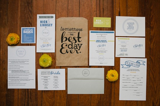
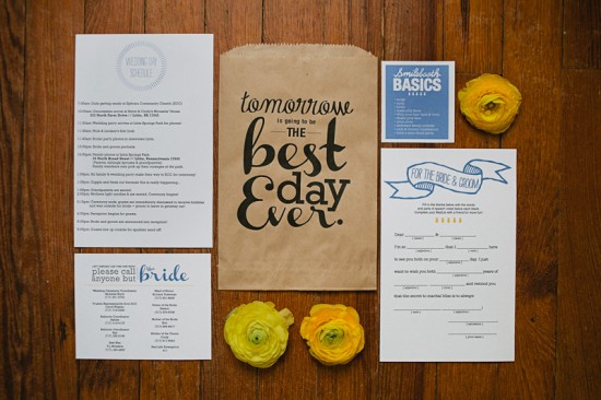
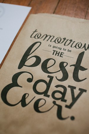
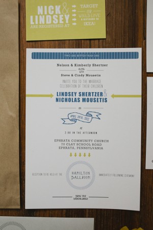
Multi-talented photographer Brooke Courtney created the wedding invitations for her brother-in-law’s recent wedding – including some of the most adorable rehearsal dinner invitations I’ve ever seen!  The bride and groom wanted to keep things clean and modern, with a focus on text and contrast.  In addition to the main invitation, Brooke created a “Best Day Ever” rehearsal dinner kit with photobooth tips and a list of phone numbers to make sure nobody bothered the bride on the wedding day.  Genius!

From Brooke: Nick + Lindsey asked me to create all of their paper goods using their blue and yellow color scheme, with their only other instructions being “No flowers.  Nothing girly.  Nothing swirly.”  Ha!  They kept using the words “text” and “contrasty” when describing what they wanted everything to look like.  I feel as though I matched their wedding invitation suite to their photos really well – clean and simple.

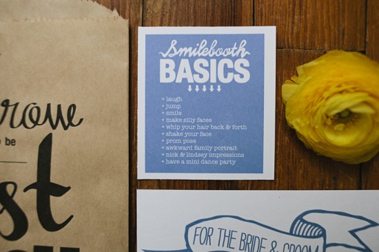
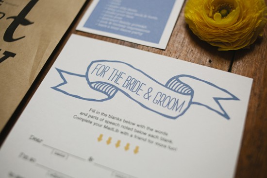
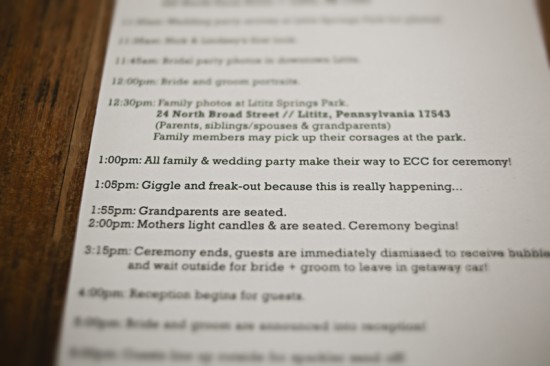
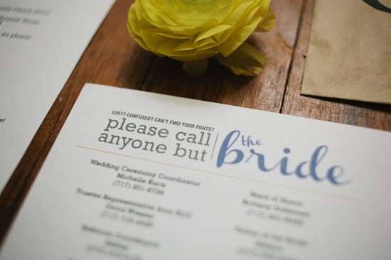
I made Rehearsal Dinner Kits, including a wedding day schedule, bride + groom mad lib, Smilebooth basics and tips, and a list of phone numbers that people might need on the wedding day.  The “Best Day Ever” kits are my favorite thing I created for their wedding weekend.


You can purchase a printable version of the “Best Day Ever” PDF that Brooke used on the paper bags in her Etsy shop right here!

Thanks so much Brooke!  Check out Nick and Lindsey’s wedding photos right here for more inspiration from this fabulous wedding!

Check out the Designer Rolodex for more tal­ented wed­ding invi­ta­tion design­ers and the real invi­ta­tions gallery for more wedding invitation ideas!

Photo Credits: Brooke Courtney

Stationery Show Sneak Peek: Belle + Union

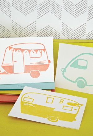
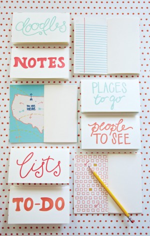
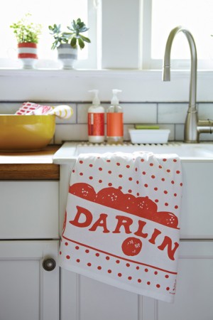
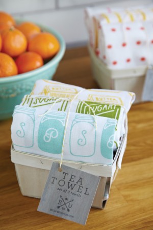
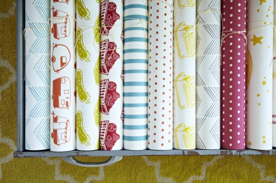
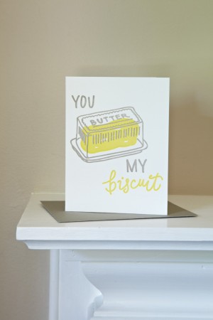
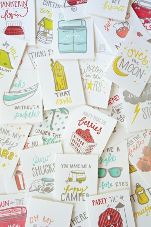
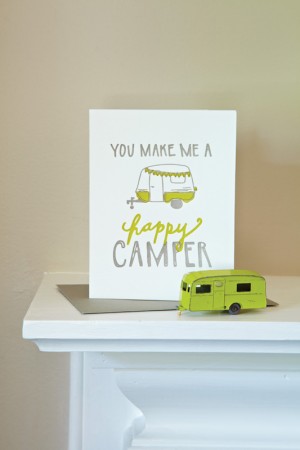
The next National Stationery Show sneak peek comes from one my most highly anticipated debuts at the show – Belle & Union!  Formerly known as Lowcountry Press, I’ve been a big fan of designer Meg Sutton’s work for a while now (remember these awesome wedding invitations?) and I can’t wait to see the new 2012 collection at the show!


From Meg: Belle & Union was established in 2011 with the purchase and restoration of an 1897 Curtis & Mitchell Printing Press and a dream to make writings, wrappings, and wares with our own unique sensibility.  All of our products start with pen to paper, with each having its own unique hand lettered text and hand rendered illustrations.  Our 2012 collection is inspired by Americanisms, little phrases of sentiments from ages past and present, and represented across our line of greeting cards, boxed notes, jotters, note pads, recipe cards, tea towels and gift wrap.


Thanks Meg!

p.s. I love the sweet story behind Belle & Union’s new name.  Meg does all the design, but her husband does most of the printing – and they wanted a name that reflected the both of them.  He’s a Northerner from Pennsylvania, while Meg is a Southerner from Texas, but it was the South that brought them together.  They love how union has many meanings, representing both their union in life and love and their work, and thus Belle & Union Co. was formed!

Photo Credits: Mary Britton Senseney

Ashley + Jonathan’s Seagrass-Inspired Beach Wedding Invitations

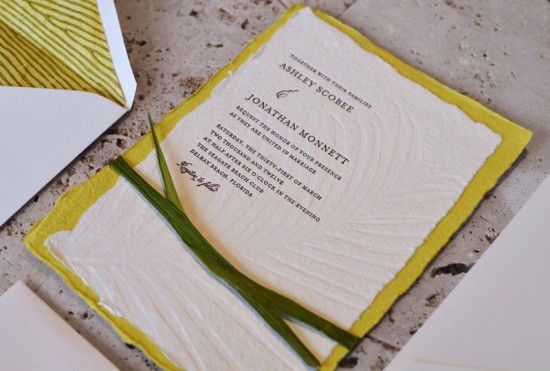
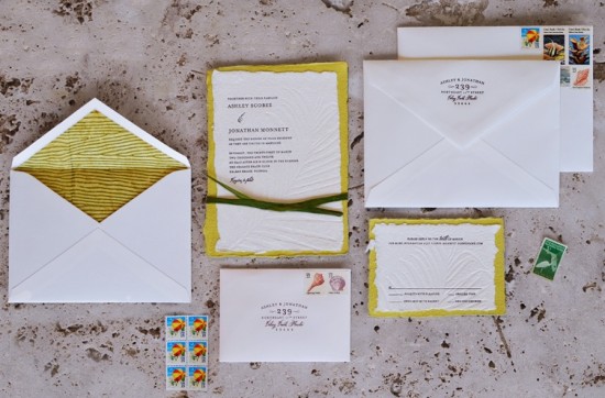
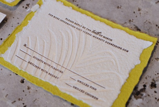
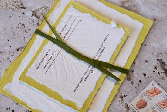
You might remember these beautiful letterpress blind impression wedding invitations from Sarah at Ten Lines Pica that I had the pleasure of featuring last summer.  Well, today Sarah is back with a sophisticated approach to beach wedding invitations.  I particularly love the subtle palm frond pattern and the way Sarah incorporated natural grass stalks in lieu of a belly band – such a great idea!

From Sarah: Ashley and Jonathan had a laid back beach wedding.  I love using natural elements, especially for outdoor events.  An abstract blind deboss palm frond was a nice way to subtly reference the tropical location in a unique way.  I’m based in Miami and design quite a few beach wedding invitations, so it’s fun to find new ways to convey this theme.

I collected the grass stalks on a walk around the grounds of my building; it’s a really economical alternative to a wrap!  And it looks just like the beach grass that grows wild on the dunes here in southern Florida.

Thanks so much Sarah!

Check out the Designer Rolodex for more tal­ented wed­ding invi­ta­tion design­ers and the real invi­ta­tions gallery for more wedding invitation ideas!

Photo Credits: Ten Lines Pica

Annette + Florian’s Illustrated Floral Wedding Invitations

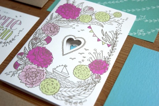
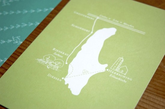
Happy Monday everyone!  I hope you had a great weekend!  We’re starting the week off with a gorgeous set of illustrated wedding invitations from German designer and illustrator Laura Rosendorfer.  Laura created these invitations for a nature-loving couple getting married a bit later this summer.  The groom hails from coastal northern Germany and the wedding will take place at a lake near the bride’s childhood home, so Laura filled the invitations with whimsical illustrations of boats, flowers, and hearts.  So sweet!

From Laura: Annette and Florian will be married at a lake, so we wanted there to be some elements of boats and water in the invitations.  Annette and Florian are very fond of nature and down to earth; they love clean lines, but also love cheerful colors.  When Annette told me she would have big arrangements of colorful fuchsia and pink peonies at the wedding, the whole invitation set came together quite easily.

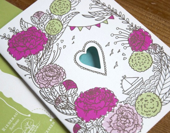
Annette had set her heart on having a whimsical illustration of flowers, so I paired the peonies and snowballs with a cute boat, cheerful bunting, and of course hearts.  We chose four vibrant colors – fuchsia and pink from the peonies along with green and blue – and paired it with a lot of white space and dark brown lines to contrast the whimsical illustrations and give it some elegance and softness.

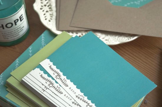
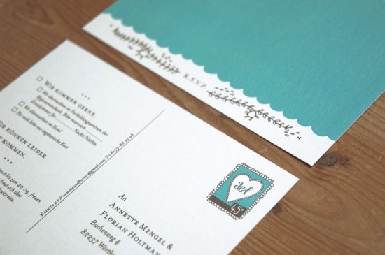
A heart is also the focal point of the invitation – I die cut a heart in every invitation using a small machine at home.  The rsvp card is visible through the heart; if you take it out, there is another little heart to be seen.

We chose mostly eco-friendly materials, like the beautiful brown recycled kraft paper for the envelopes and paper bands around the invitation set.  The invitations were printed using a combination of digital, offset, and screen printing methods.  The envelope liners and the map postcard with the detailed schedule on the back were offset printed on white paper.

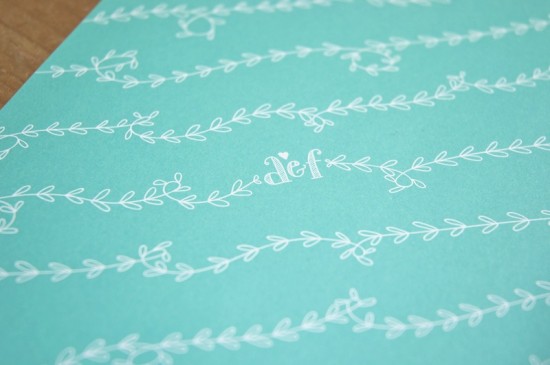
I really loved all the small details, like the die cut hearts or the initials on the envelope liners – all of which makes a wedding invitation suite extra special.

Thanks Laura!

Check out the Designer Rolodex for more tal­ented wed­ding invi­ta­tion design­ers and the real invi­ta­tions gallery for more wedding invitation ideas!

Photo Credits: Laura Rosendorfer

{happy weekend!}

Ah… the first week back after vacation is always a doozy, isn’t it?  But even after racing to catch up from a week away, I’m so very glad to be back home.  This weekend we’ll be watching the Stanley Cup playoffs and starting to make plans for the future nursery room.  Yay!  But in the meantime…

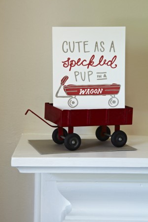
Photo Credit: Scout’s Honor Co.

…a few links for your weekend!

This week on Oh So Beautiful Paper:

That’s it for me this week!  Cocktail Fridays will be back this afternoon – and we have a special cocktail just in time for Cinco de Mayo, so check back a bit later for the recipe!  I hope you all have a wonderful weekend, and I’ll see you back here on Monday!  xoxo