Holly + Blake’s Antique Book-Inspired Wedding Invitations

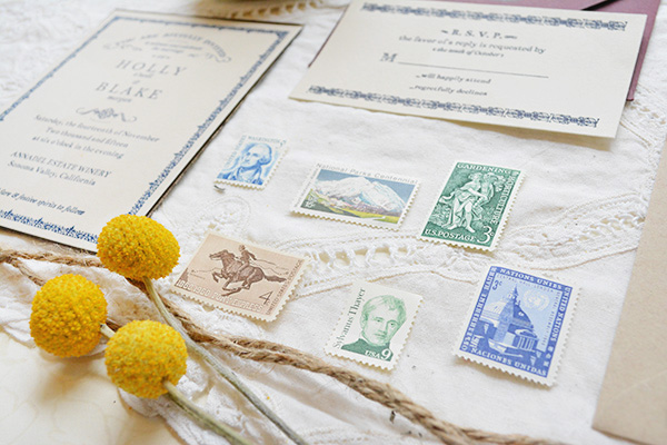
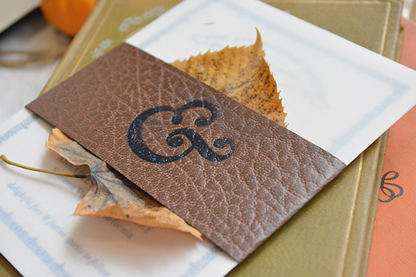
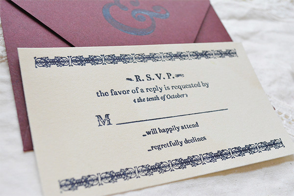
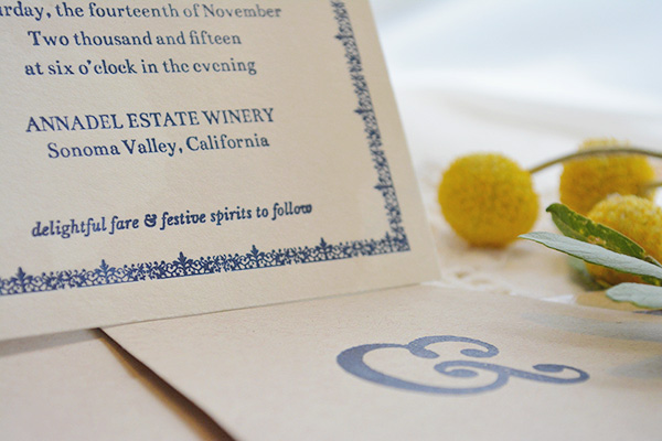
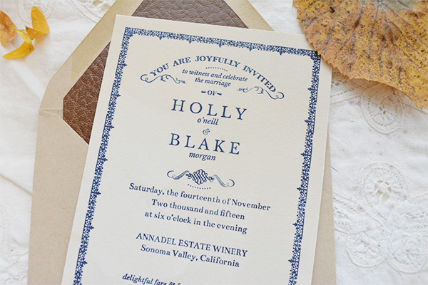
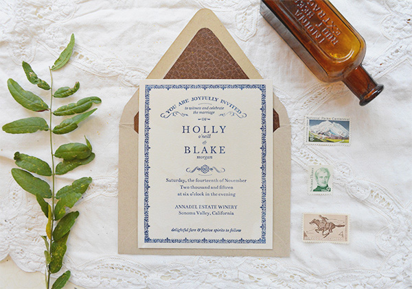
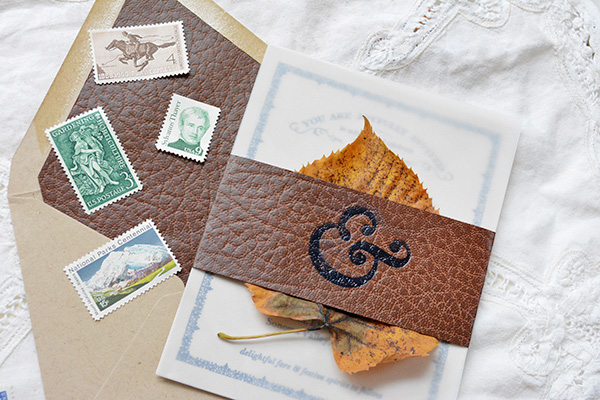
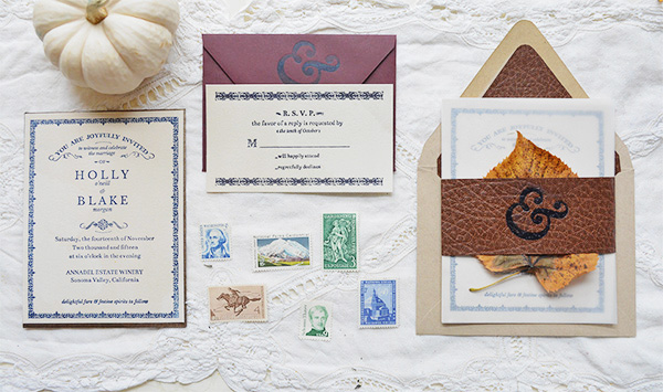
As an avid reader, I can definitely appreciate these wedding invitations from Emily at Flyaway Paperworks inspired by the title page of a well-loved book. Emily used a dark inky blue for the invitation details and even incorporated a faux leather envelope liner and belly band reminiscent of an antique book cover!
Autumn-Literary-Wedding-Invitations-Flyaway-Paperworks-OSBP9

From Emily: I’ve always adored the look of vintage books, and the elegant simplicity of all of the typefaces and characters (especially those gorgeous ampersands and borders!). So I was thrilled to design this autumnal suite, inspired by the title page of a well-loved, favorite book.
Autumn-Literary-Wedding-Invitations-Flyaway-Paperworks-OSBP8

Autumn-Literary-Wedding-Invitations-Flyaway-Paperworks-OSBP7

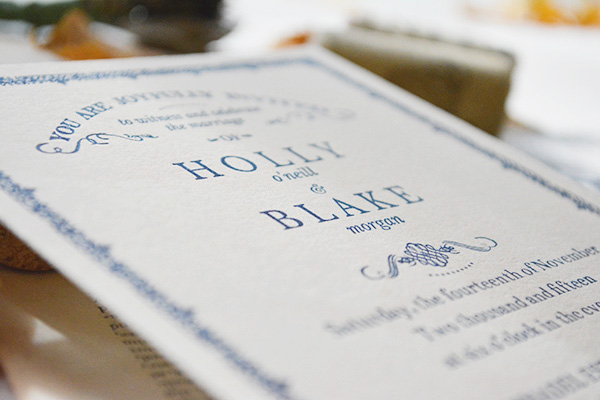
The invitation and RSVP card were printed onto hand-dyed Crane Lettra 110 Pearl White Paper with inky blue letterpress ink. One of my favorite parts of this suite is the faux-leather envelope liner and belly band, reminiscent of an old book cover, to add texture and earthy color. To top it all off, we used vintage postage stamps in the colors of Holly and Blake’s fall palette.
Autumn-Literary-Wedding-Invitations-Flyaway-Paperworks-OSBP

Autumn-Literary-Wedding-Invitations-Flyaway-Paperworks-OSBP2

Autumn-Literary-Wedding-Invitations-Flyaway-Paperworks-OSBP4

Autumn-Literary-Wedding-Invitations-Flyaway-Paperworks-OSBP5

Autumn-Literary-Wedding-Invitations-Flyaway-Paperworks-OSBP6

Autumn-Literary-Wedding-Invitations-Flyaway-Paperworks-OSBP3

 Thanks Emily!

Check out the Designer Rolodex for more tal­ented wed­ding invi­ta­tion design­ers and the real invi­ta­tions gallery for more wedding invitation ideas!

Photo Credits: Flyaway Paperworks

Happy Weekend!

Happy Friday everyone! I’m going to be honest – we’ve had a rough week over here. Sophie is going through some typical two year old tantrums (we’ve started referring to her as our “twonager” since it’s a nice little preview of what she’ll be like as a teenager), and when you combine that with a needy newborn you get two very tired parents. I know this is just a phase, but I feel like I could sleep for about a week straight if given the opportunity! For now I’ll just settle for (hopefully) a few extra minutes this weekend, but in the meantime…

Thuss-Farrell-Paper-to-Petal-Instagram

Photo by the incredibly talented Thuss & Farrell

…a few links for your weekend:

This week on Oh So Beautiful Paper:

Check back soon for this week’s cocktail! I hope you all have a wonderful weekend, and I’ll see you back here next week! xoxo

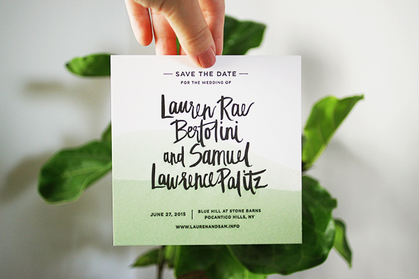
Lauren + Samuel’s Dip Dyed Save the Dates

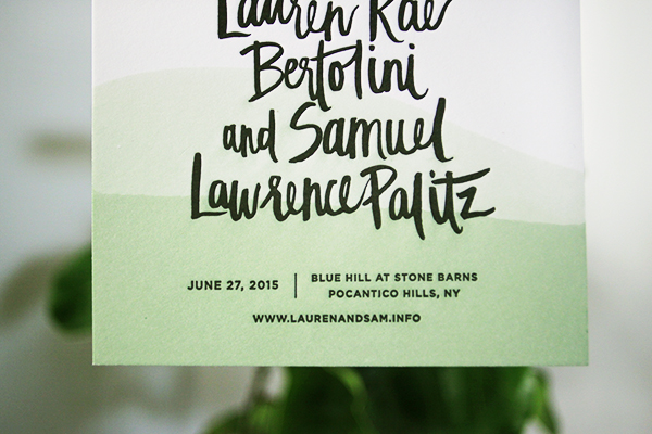
Dip dyeing is one of my favorite techniques – the results are stunning and each individual piece is completely unique! These save the dates from Alex of Goodheart Design combine green dip dye with crisp black and white letterpress. Love!

Dip-Dye-Hand-Lettered-Save-the-Dates-Goodheart-Design-OSBP

From Alex: Lauren came to me with two requirements for her save the date: brush lettering and dip-dye. How could I say no to that?!

Dip-Dye-Hand-Lettered-Save-the-Dates-Goodheart-Design-OSBP3Dip-Dye-Hand-Lettered-Save-the-Dates-Goodheart-Design-OSBP2

She wanted all black and white with some ‘lush’ green dip-dye. Czar Press letterpress printed them on extra thick paper so I could individually dip-dye each one without them warping. I had such a fun time not only designing the save the dates but also dip-dying each one! It’s so nice to be able to design outside of the computer sometimes.

Dip-Dye-Hand-Lettered-Save-the-Dates-Goodheart-Design-OSBP4

Thanks Alex!

Design + Dip-Dyeing: Goodheart Design

Letterpress Printing: Czar Press

Check out the Designer Rolodex for more tal­ented wed­ding invi­ta­tion design­ers and the real invi­ta­tions gallery for more wedding invitation ideas!

Photo Credits: Goodheart Design

Julissa + Christopher’s Vintage-Inspired Champagne Foil Wedding Invitations

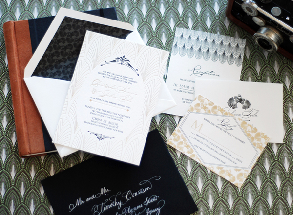
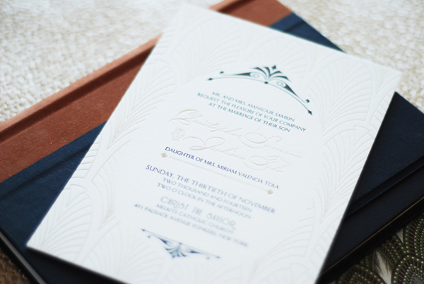
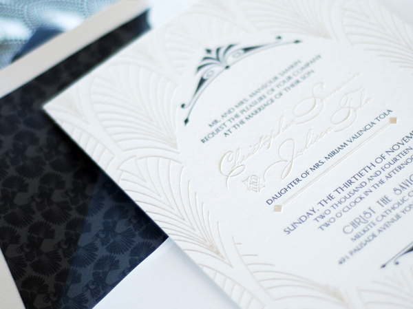
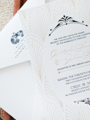
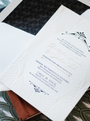
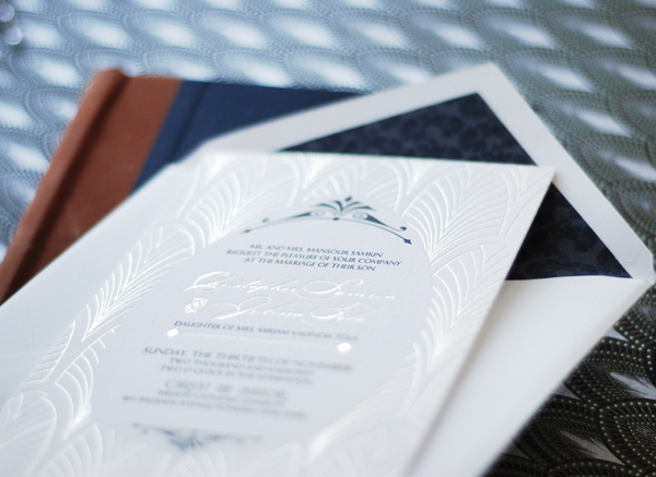
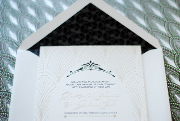
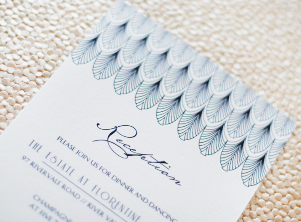
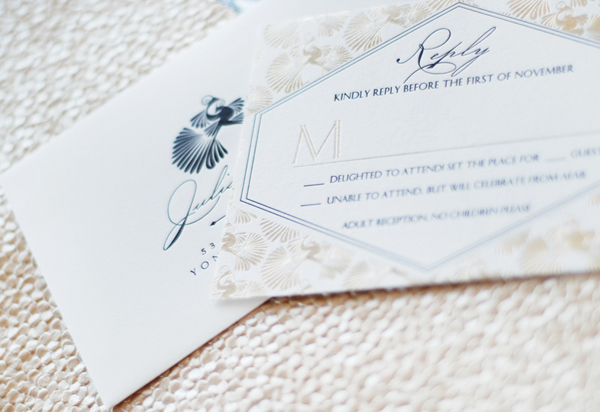
So we’re all pretty familiar with shiny gold foil by now, yes? But what about matte metallic foils – like the subtle champagne foil on these vintage-inspired wedding invitations from Nicole at Umama? Nicole worked with the talented team at Boxcar Press to print these invitations, pairing the subtle matte metallic foil with crisp black and white. Such a great combination!

Vintage-Inspired-Matte-Metallic-Foil-Wedding-Invitations-Umama-Boxcar-Press-OSBP

From Nicole: I wanted to create a pattern that would combine romance and elegance and could be used throughout the wedding invitation suite. I went with a classic deco scallop for the invitation and a set of nestled peacocks that repeated from the reply card to the envelope liner.

Vintage-Inspired-Matte-Metallic-Foil-Wedding-Invitations-Umama-Boxcar-Press-OSBP7

While reviewing swatches from Boxcar Press, we absolutely fell in love with the tawny foil. It was more subtle than the gold foil, and really lent itself to the softness that Julissa was looking for. It mimics the color of champagne, and brings to mind the decadence of the evening, and the cause for celebration.

Vintage-Inspired-Matte-Metallic-Foil-Wedding-Invitations-Umama-Boxcar-Press-OSBP13

Vintage-Inspired-Matte-Metallic-Foil-Wedding-Invitations-Umama-Boxcar-Press-OSBP6Vintage-Inspired-Matte-Metallic-Foil-Wedding-Invitations-Umama-Boxcar-Press-OSBP5

The invitation suite was printed on Crane Lettra 220 Pearl White paper with tawny foil and black letterpress. A coordinating liner was also custom designed and printed in two shades of black. Mary from Boxcar Press was the keen eye that helped to pull all the details together seamlessly from design to print. The end result was breathtaking!

Vintage-Inspired-Matte-Metallic-Foil-Wedding-Invitations-Umama-Boxcar-Press-OSBP3

Vintage-Inspired-Matte-Metallic-Foil-Wedding-Invitations-Umama-Boxcar-Press-OSBP10

Vintage-Inspired-Matte-Metallic-Foil-Wedding-Invitations-Umama-Boxcar-Press-OSBP11

Vintage-Inspired-Matte-Metallic-Foil-Wedding-Invitations-Umama-Boxcar-Press-OSBP8

Thanks Nicole!

Design: Umama

Letterpress and Foil Printing: Boxcar Press

Check out the Designer Rolodex for more tal­ented wed­ding invi­ta­tion design­ers and the real invi­ta­tions gallery for more wedding invitation ideas!

Photo Credits: Umama


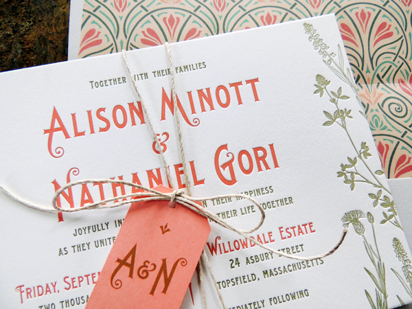
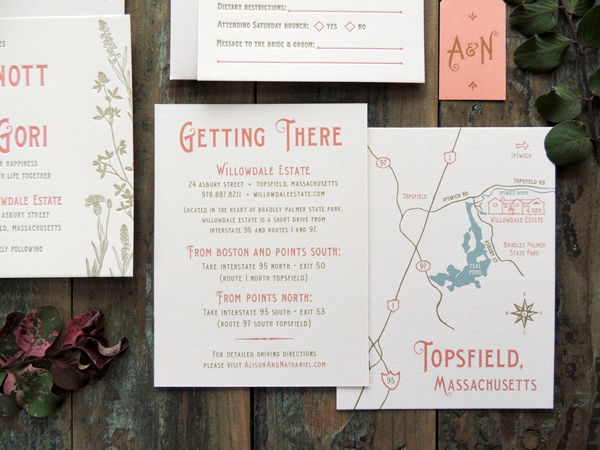
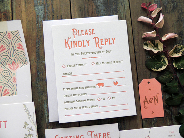
Alison + Nathaniel’s Art Nouveau Garden Wedding Invitations

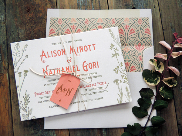
These beautiful wedding invitations from Brynne at Harken Press mix botanical details with Art Nouveau elements for a garden wedding at a private estate. I’m particularly in love with that gorgeous envelope liner and pops of coral!

Art-Nouveau-Garden-Wedding-Invitations-Harken-Press-OSBP

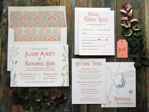
From Brynne: I worked with Alison and Nathaniel to create wedding stationery that complements their charming garden ceremony at a private estate in Topsfield, Massachusetts. They wanted to include outdoors elements but also highlight the cottage-style architecture of the historic mansion estate. My goal was to balance the natural and rustic botanical elements with an elegant Art Nouveau look.

Art-Nouveau-Garden-Wedding-Invitations-Harken-Press-OSBP2

Art-Nouveau-Garden-Wedding-Invitations-Harken-Press-OSBP3

The invitation and reply card were letterpress printed, while the guest info card with hand drawn map on the backside were digital printed.

Art-Nouveau-Garden-Wedding-Invitations-Harken-Press-OSBP5

Art-Nouveau-Garden-Wedding-Invitations-Harken-Press-OSBP4

Thanks Brynne!

Check out the Designer Rolodex for more tal­ented wed­ding invi­ta­tion design­ers and the real invi­ta­tions gallery for more wedding invitation ideas!

Photo Credits: Harken Press