Well Said Type 160 + desktop download!

Hiya! It’s Ashley from Fine Day Press with my last post of the week. It’s been SO much fun guest blogging! I’ll be back with more of our Wedding Invitation 101 series very soon, but in the meantime, here’s my spin on the weekly Well Said Type column!

Fine-Day-Press-Well-Said-Type

This week’s post is also available as a digital download, hooray!

DESKTOP | iPhone


Wedding Invitation 101: Where to Start

Happy Monday everyone! I’ll be away for a couple of weeks to catch up on some personal things, but I’m leaving you in EXCELLENT hands while I’m away! Ashley from Fine Day Press graciously agreed to fill in for me this week, and we’re kicking things off with the first installment in a series of posts about wedding invitations! It’s a wonderful primer for anyone feeling overwhelmed by the world of wedding invitations and save the dates. Welcome Ashley!! –Nole

Invitation-101-Where-to-Start-Title

Hey there! Ashley Austin from Fine Day Press here. Nole has kindly invited me to guest blog this week, and I’m super-duper excited to be here sharing some fun posts with you all! Today we’re kicking off a weekly series all about wedding invitations called Wedding Invitation 101. Invitations are a big part of what I do over at Fine Day Press, in addition to greeting cards, calendars and other paper goodies. Over the years, I’ve learned a few tricks to streamline the process, and I’m sharing them with you here.

WHERE TO START

Your wedding invitations are often the first thing your guests will see; it should represent the spirit of the day and set the tone. It’s never too early in the planning process to start envisioning your dream invitations!

Will your wedding be a formal affair or is it more of a barefoot-on-the-beach event? Think about your style as a couple – does gold foil on navy stock suit your style, or will you go for a more romantic vibe with something hand-illustrated?

Maybe you’ve determined your wedding location, chosen your dress, flowers or even selected your color palette… All of these details can inspire your invitation suite.  But even if you haven’t figured those biggies out, you can still start dreaming up your perfect paper pairing.

FIRST STOP: GET INSPIRED!

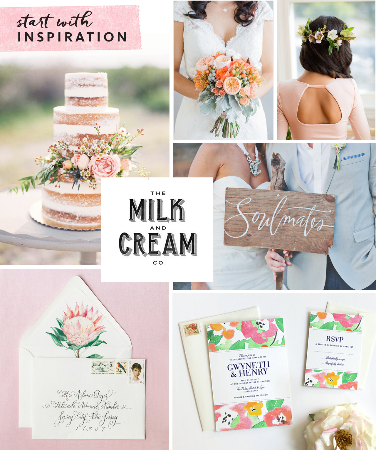
Collecting inspiration is a great way to kick off the process. This could be as simple as making a folder on your computer to save images as you’re browsing wedding blogs, clipping things out of magazines, or creating a Pinterest board specifically for invitation ideas (my personal favorite!). Below is an inspiration board I’ve created for example:
Invitation-101-Where-to-Start-1

Clockwise from top center: Bouquet via Southbound Bride; Hairstyle via Refinery29;  Soulmates painted sign Julie Song Ink; Invitation by Fine Day Press; Envelope & liner by Lana’s Shop; Naked cake via Wedding Sparrow; Milk & Cream type via Pinterest

Don’t just collect examples of invitations – think about colors, textures, ribbons, flowers, anything that might inspire you – like a throw pillow that’s the perfect shade of coral or the lace detail on the back of a dress.

Start researching stationery shops (whether brick & mortar or online) to identify a few you might like to work with. Found a stationer you like? Most stationery companies allow you to order a sample, so that you can see the paper and quality in person before committing to a bigger purchase. Local shops will have samples on hand for you to touch and feel.

CUSTOM OR READY-MADE?

There are as many ready-made invitation styles out there as there are brides-to-be, and finding an existing design can be a great option. Your selected design can often be customized with your colors and typography choice, among other details.

If you love being part of the creative process, or have a very specific design idea for your suite, a custom design may be for you. Crafting a custom design typically takes longer and may involve an initial meeting, moodboard development (this is where that inspiration you’ve collected comes in handy), and multiple rounds of design development. Budget will come into play here as well, as creating a from-scratch design requires significantly more hands-on time and pricing usually reflects this.

TO SAVE OR NOT TO SAVE

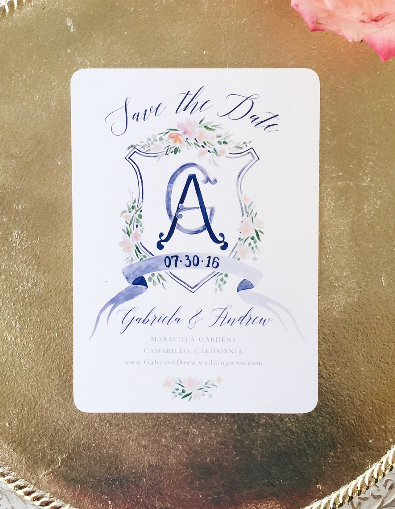
Sending out a Save the Date is a great way to give everyone on your list a heads up on your plans, and set the tone for the invitation to follow. Save the Dates are a great opportunity to do a less formal version of your invitation – for example, a magnet, a balloon or even a temporary tattoo are fun ideas! If you are having a destination wedding in a far-flung locale, a Save the Date is a must, in order to give your guests sufficient time to plan their travels.
Invitation-101-Where-to-Start-2

A beautiful printed Save the Date from Designer Rolodex member Sable & Gray

Are mailed Save the Dates a must-do? Not necessarily! If you are getting out your invitations super early, you could skip it. Or perhaps your wedding is small enough that word of mouth is sufficient until the invitations are sent. Some folks may prefer to send a digital Save the Date. This can also serve to direct guests to your wedding website. Keep in mind, though, that less digitally-savvy relatives (hi, Grams!) may feel left out with this option.

We’ll cover invitation timing in greater detail in a future installment of this series!
Happy Weekend!

Happy Friday everyone! I hope you all had an excellent first week of August! This week was a bit of a whirlwind for me, so I’m looking forward to a (hopefully) relaxing weekend. We went blackberry picking last weekend, but it was SO hot and the girls ran out of steam after about 15 minutes, so I’m thinking we’ll just hang poolside this weekend (if the weather cooperates). But in the meantime…

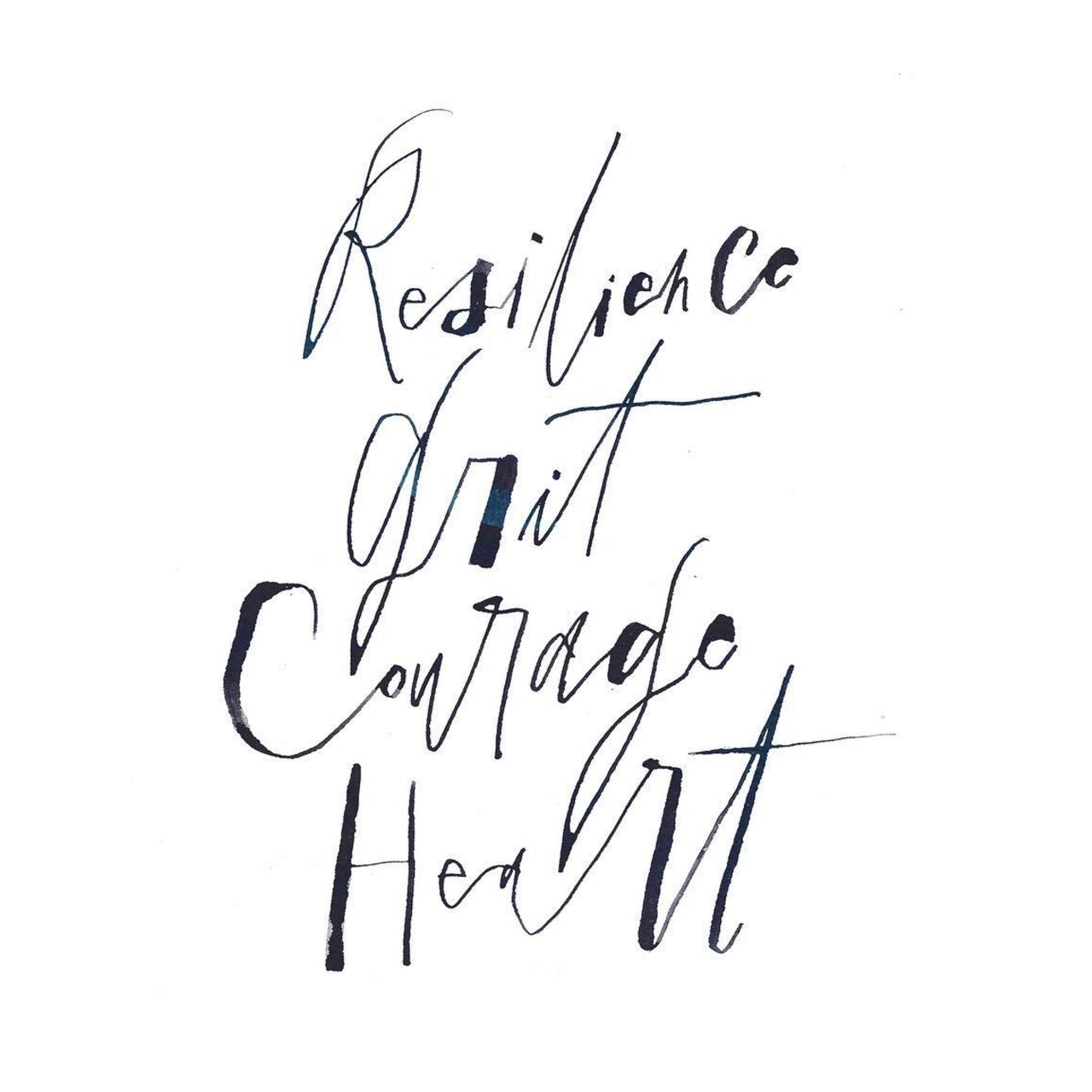
Rachelle Sartini Garner Calligraphy / OSBP

Image by Rachelle Sartini Garner Calligraphy via Instagram

…a few links for your weekend!

This week on Oh So Beautiful Paper – we were almost entirely dedicated to recaps from the 2016 National Stationery Show!

That’s it for me this week! We’ll be back later this afternoon with this week’s cocktail recipe – we have a brand new recipe theme for this month that I’m excited to share with all of you! Have a fantastic weekend, and I’ll see you back here next week! xoxo

The 2016 National Stationery Show, Part 13

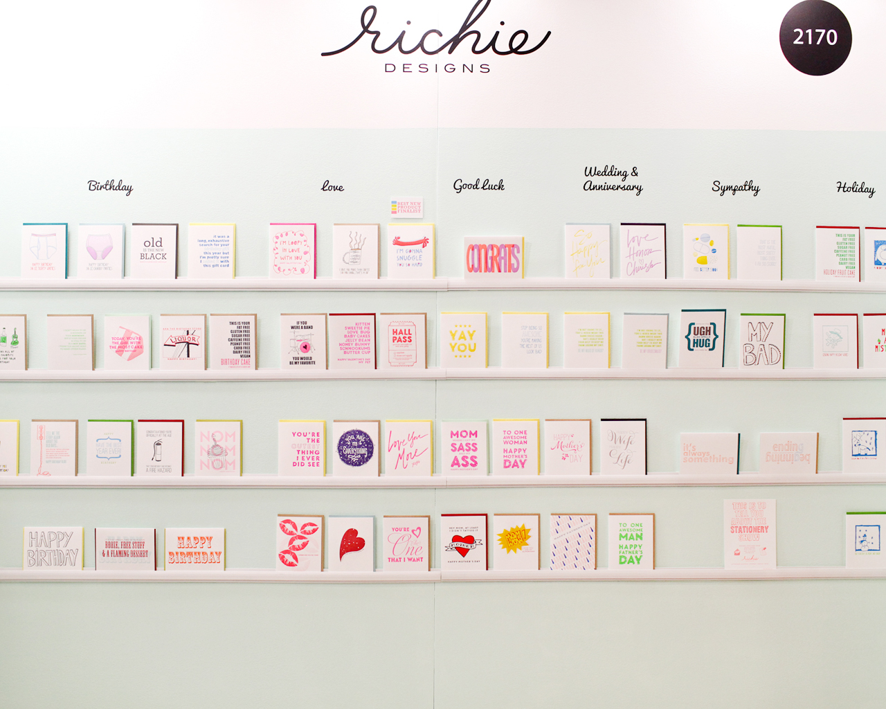
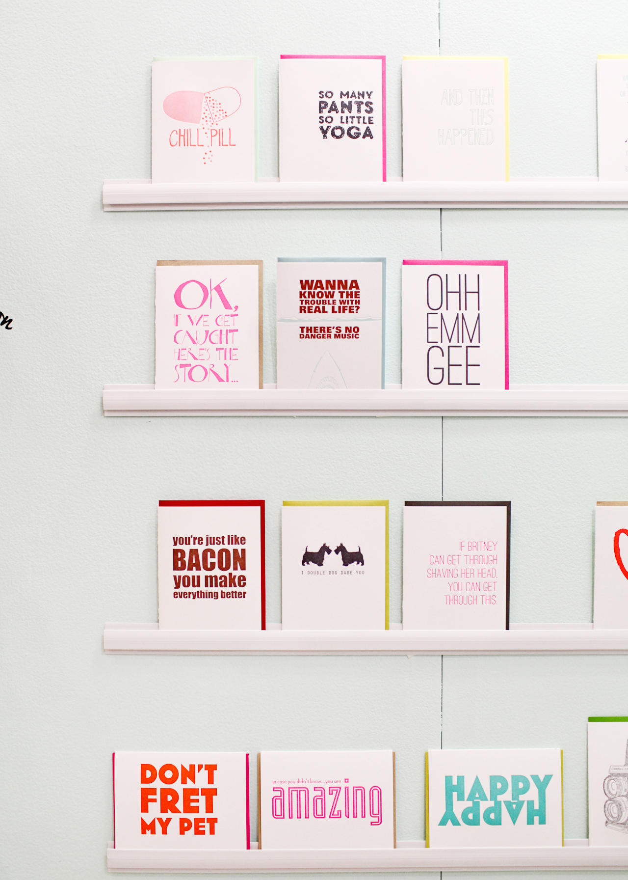
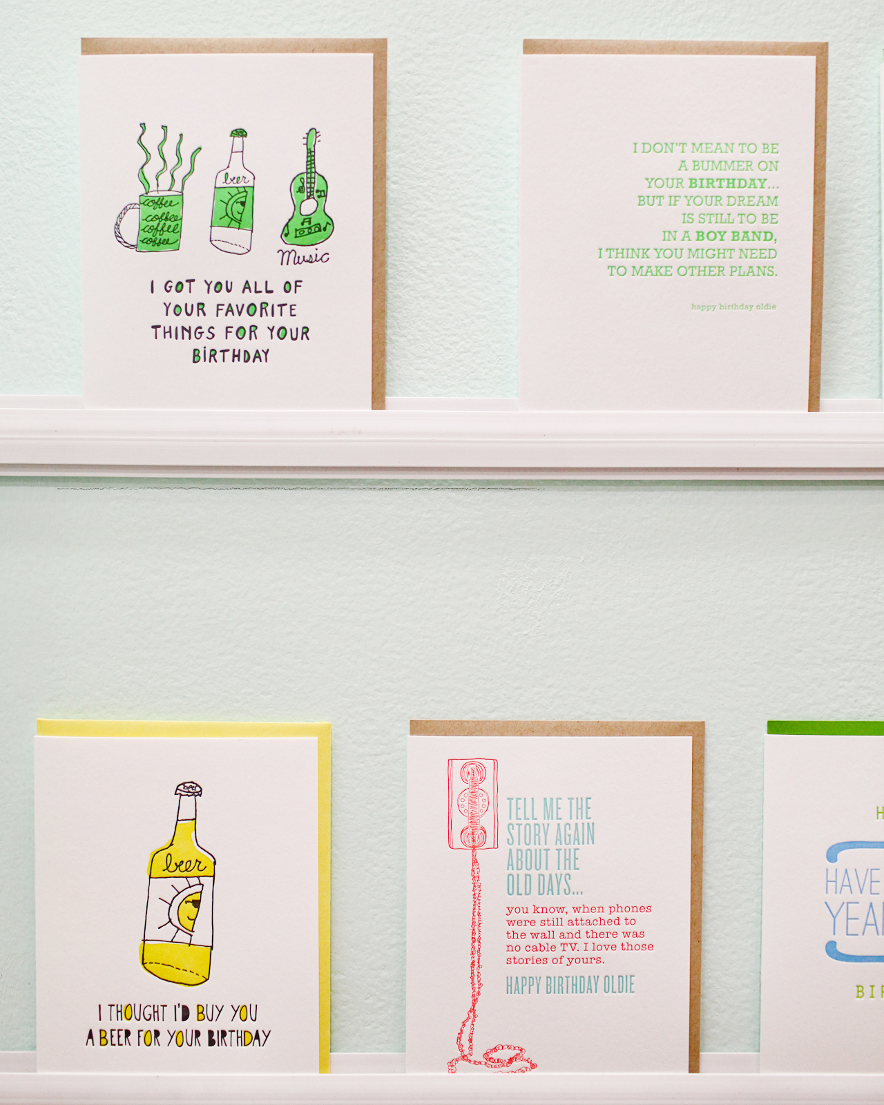
Today we’re in for another double header recap from the 2016 National Stationery Show – and this time we’re all about letterpress exhibitors! With a total of sixteen exhibitors over the two posts, you’re in for some serious letterpress printed eye candy. This first installment includes Richie Designs, Inclosed Letterpress Co., Dahlia Press, Huckleberry Letterpress Co., Chez Gagné, My Darlin’, Violet Press, and Paper Bandit Press. Let’s get right to it!

NSS 2016: Richie Designs / Oh So Beautiful Paper

NSS 2016: Richie Designs / Oh So Beautiful Paper

NSS 2016: Richie Designs / Oh So Beautiful Paper

Continue reading

Watercolor Crest Wedding Invitations

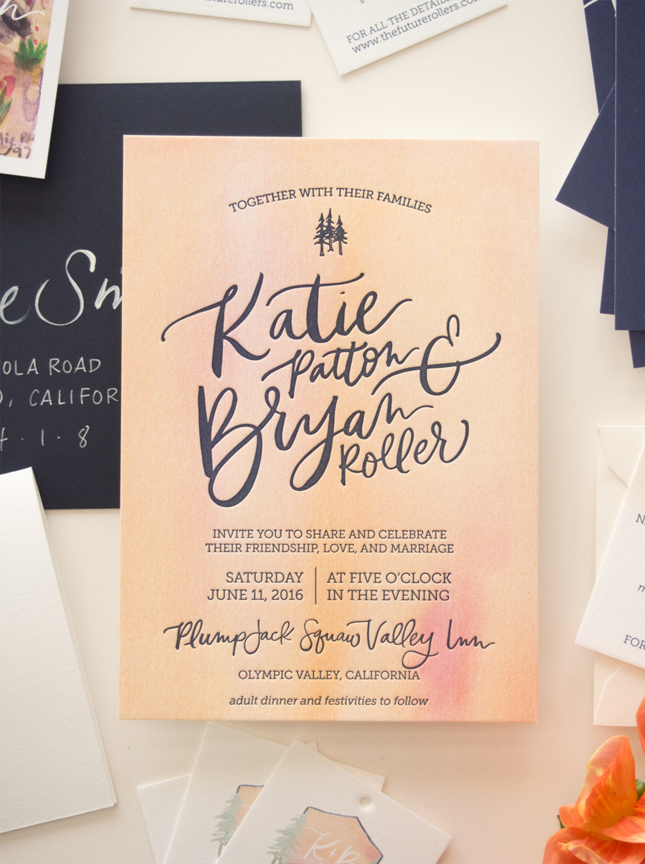
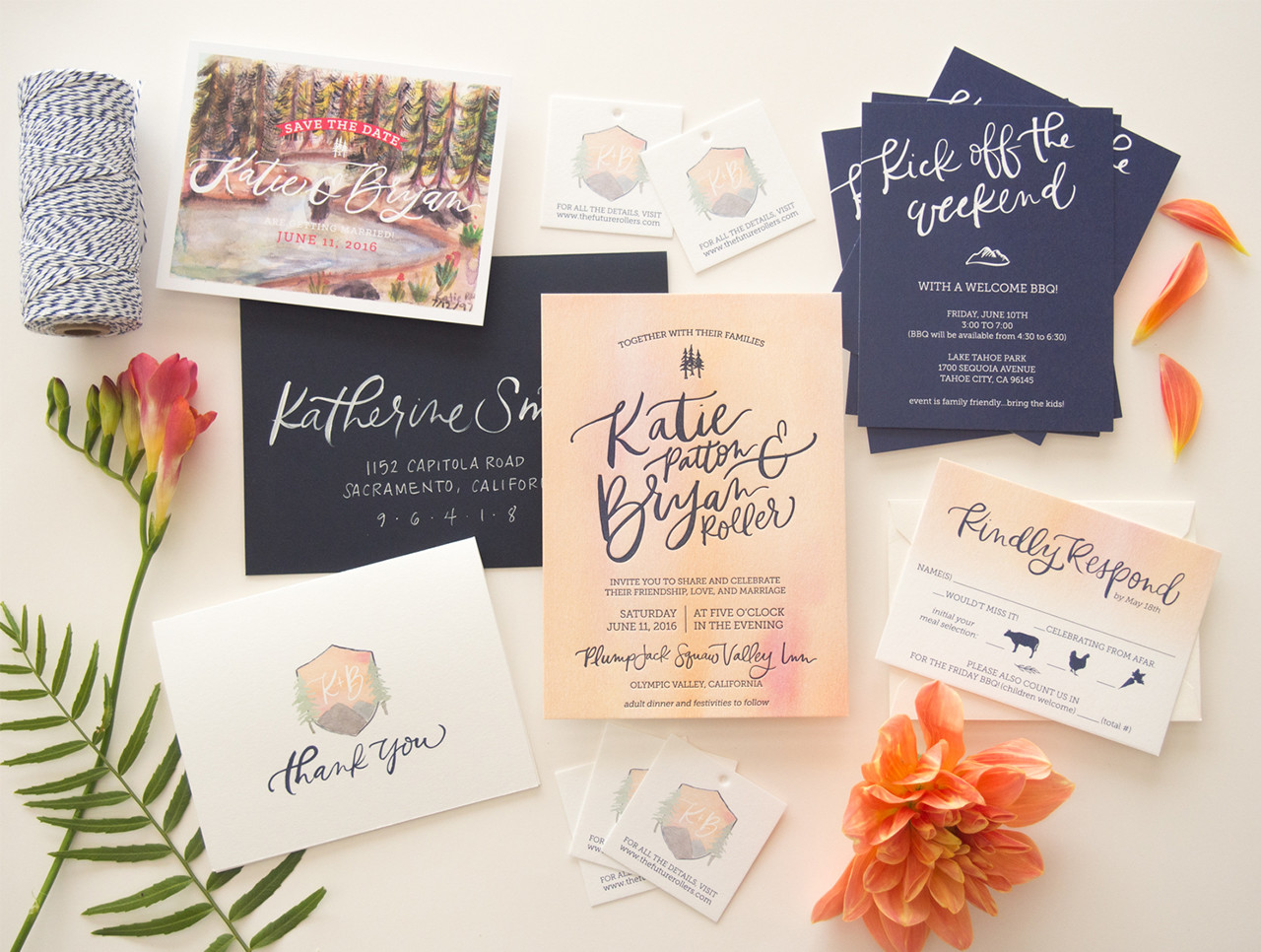
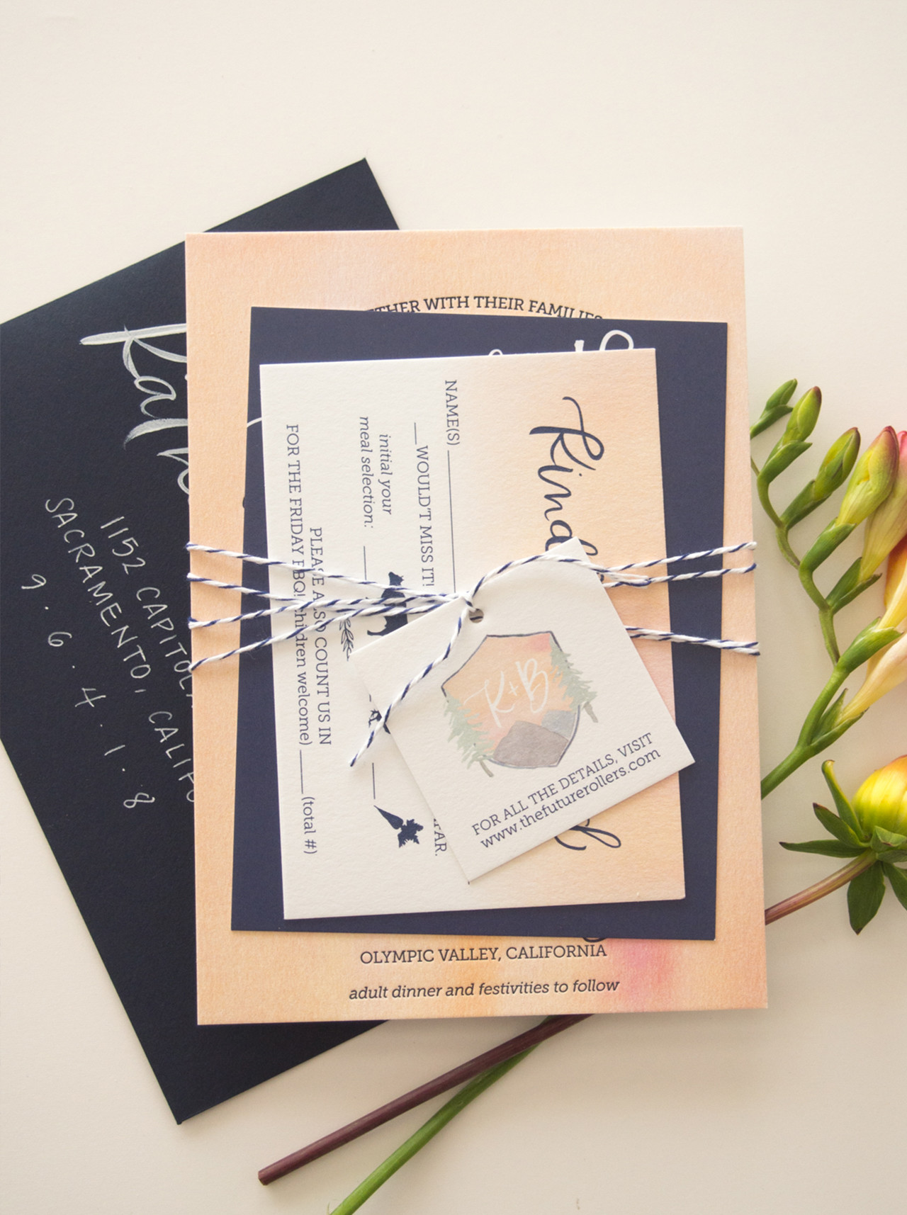
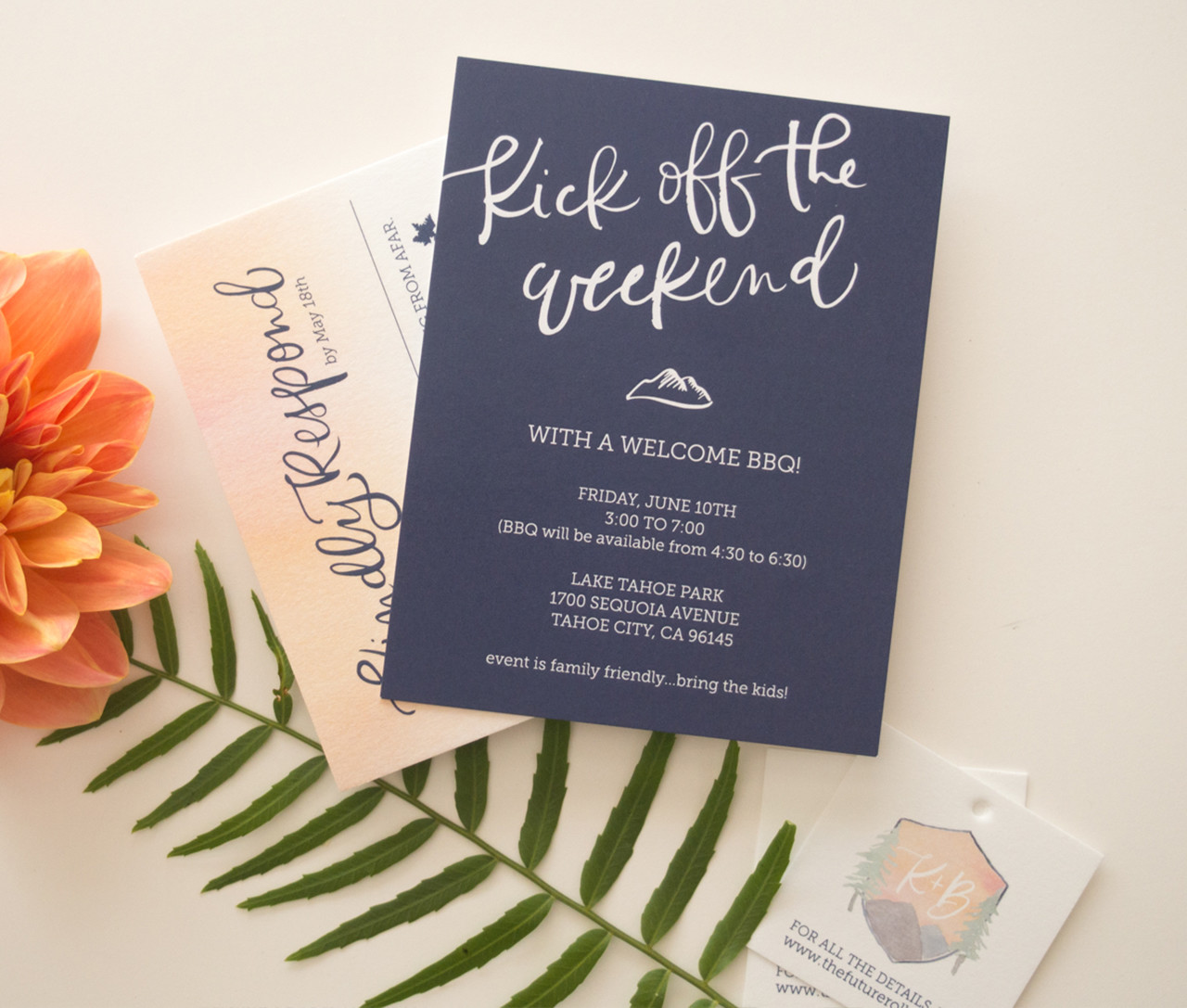
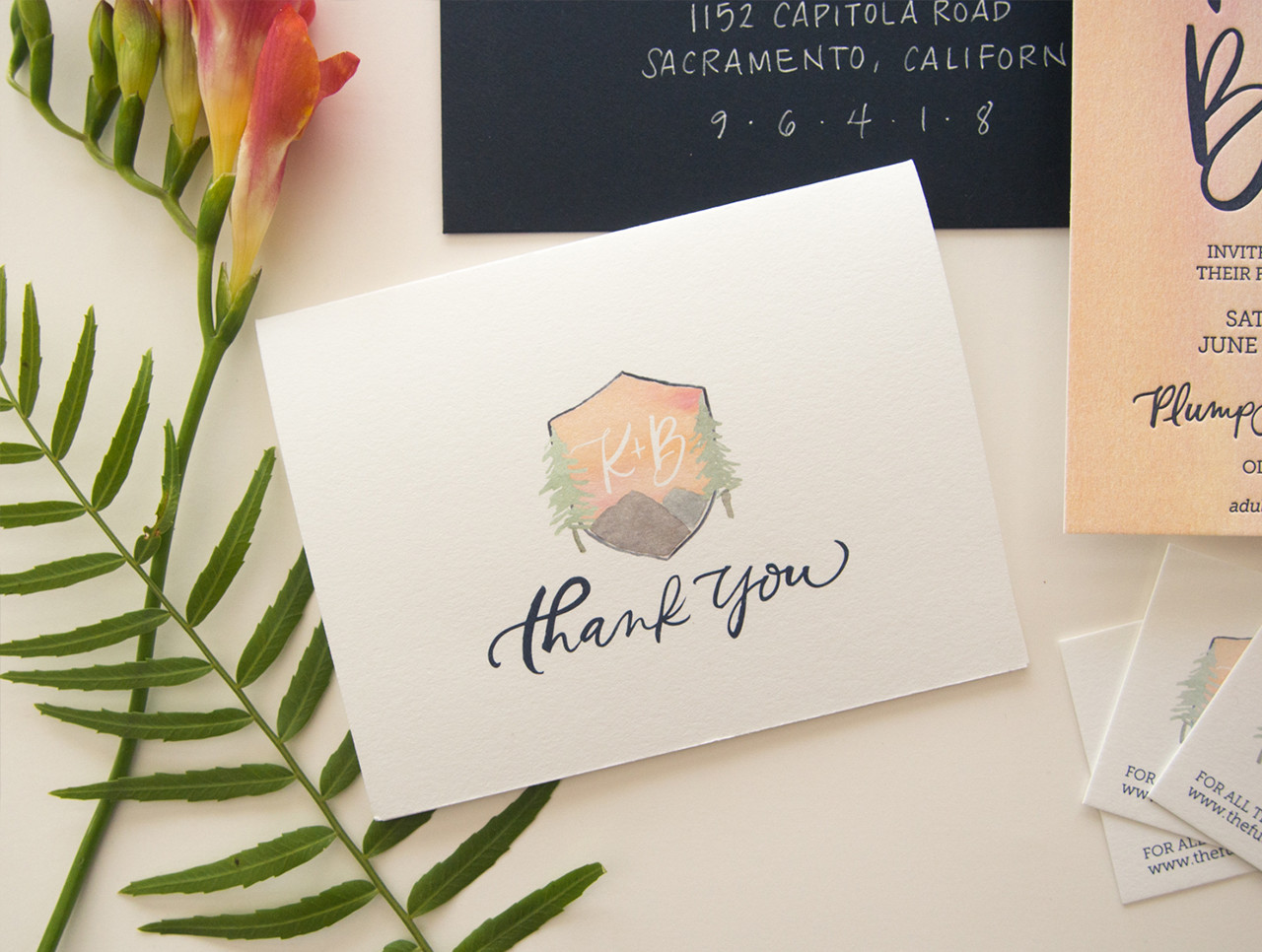
These stunning watercolor crest wedding invitations from Kim of Bright Room Studio feature one of my absolute favorite color combinations: peach, pink, and navy blue! Kim was inspired by a bouquet of brightly colored flowers to create the vibrant watercolor background, but it also reminds me of a sunset at the wedding location of Lake Tahoe! Add in a custom watercolor crest and you’ve got one seriously pretty invitation suite!

Watercolor Crest Wedding Invitations by Bright Room Studio / Oh So Beautiful Paper

From Kim: Katie was a color-loving bride getting married in beautiful Lake Tahoe. The first thing she shared with me was an inspiration photo of a stunning bouquet of bright, vibrant flowers and I knew it was going to be fun to design this wedding invitation suite.

Watercolor Crest Wedding Invitations by Bright Room Studio / Oh So Beautiful Paper

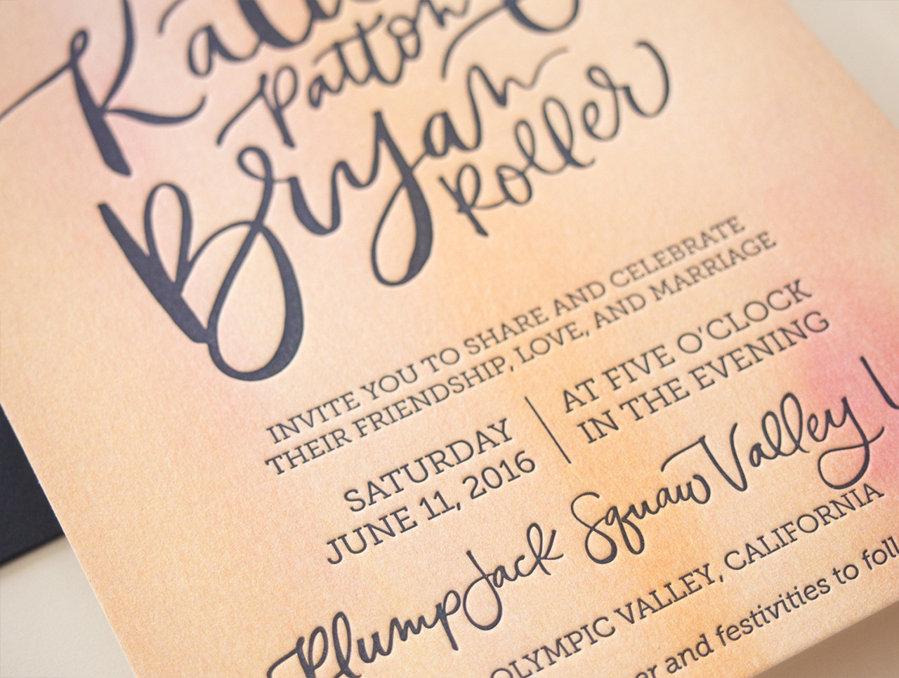
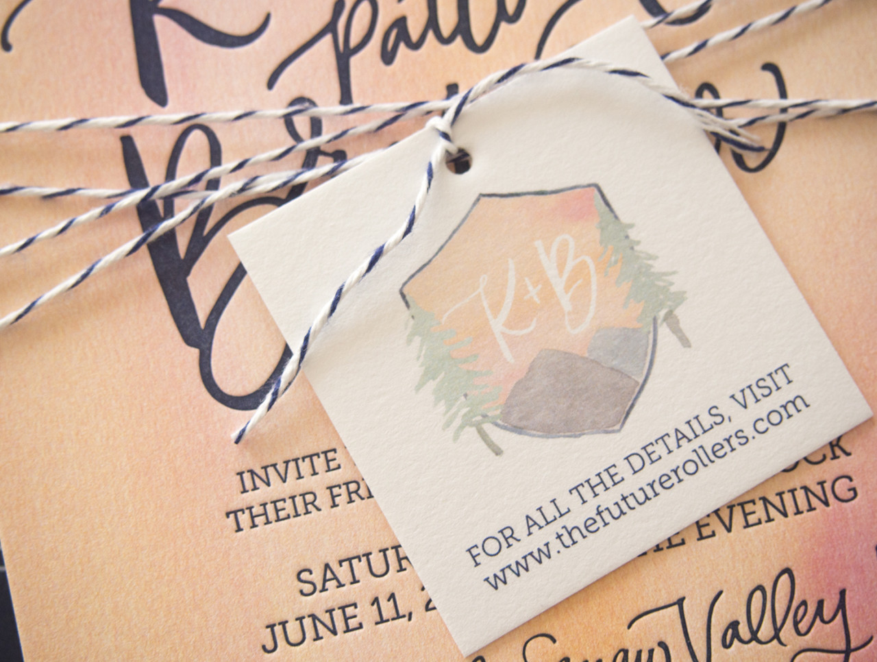
In the first round of design options, one design had this great watercolor background and another used the hand-painted crest and she just couldn’t decide, so we brought both together! The three little trees gave the invitation a hint of Tahoe-vibe and the watercolor perfectly evoked a mountain sunset. The watercolor crest with the mountains and trees was the perfect accent to this simple and bold invitation.

Watercolor Crest Wedding Invitations by Bright Room Studio / Oh So Beautiful Paper

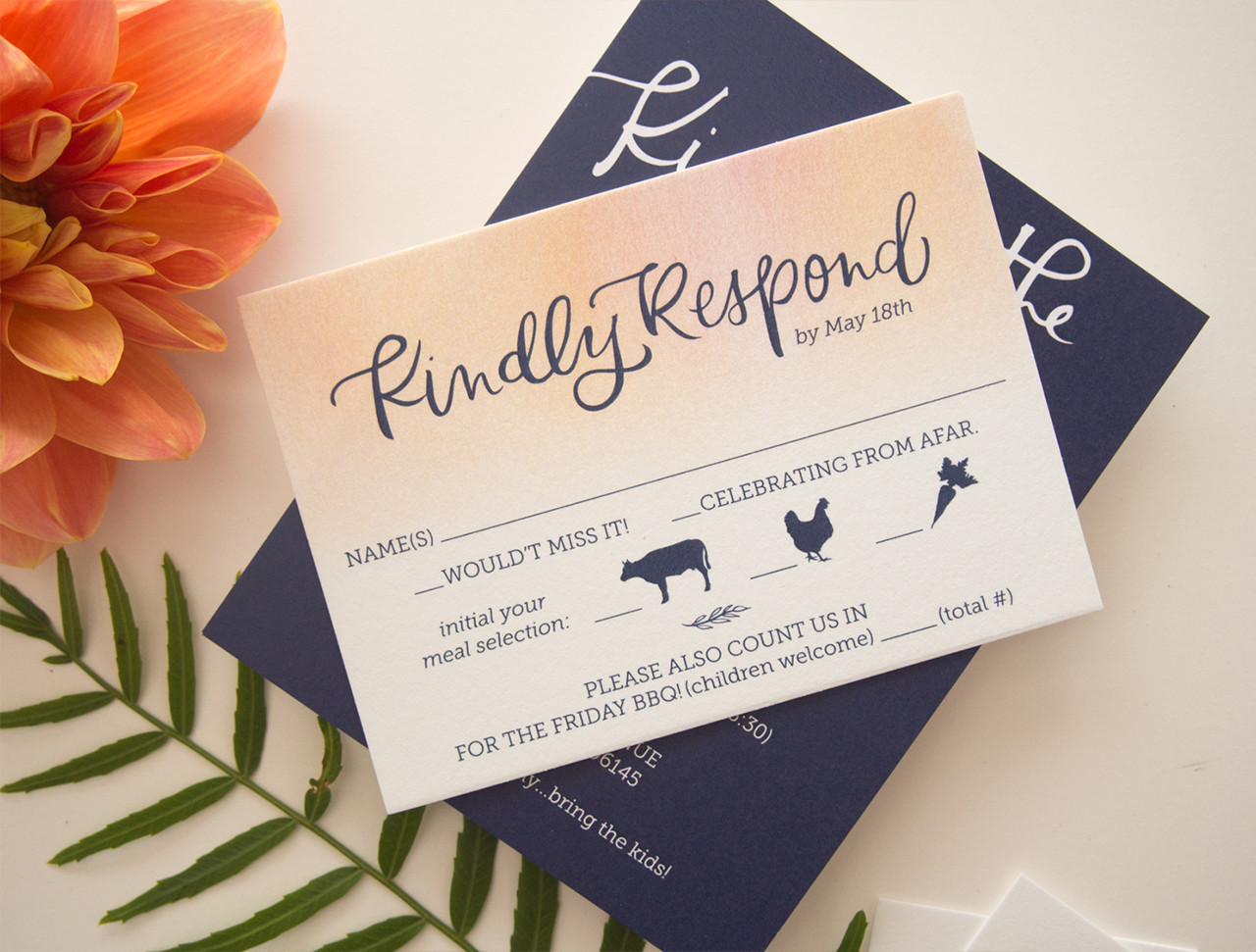
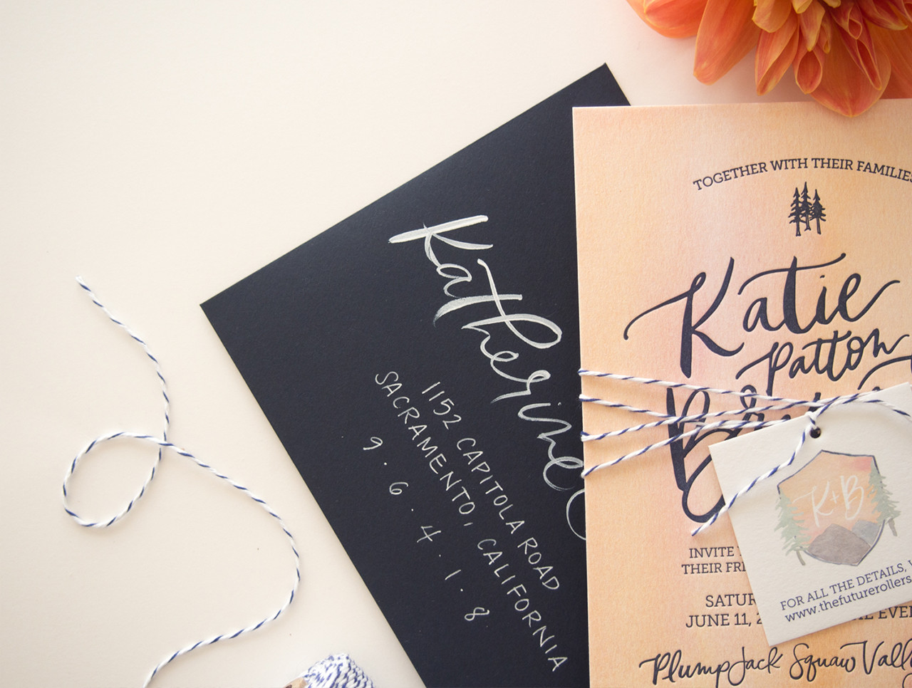
We digitally printed the watercolor background then letterpress printed the text in a deep navy. We then digitally printed the other pieces with more watercolor accents and a navy background on the weekend events card for some contrast. The watercolor crest then became a perfect element to use for other aspects of their wedding, like fun thank you cards and a tag that bound the entire suite together in the envelope. Everything was tied together with fun brushy hand-written text, which we then used on the envelope addressing as well.

Watercolor Crest Wedding Invitations by Bright Room Studio / Oh So Beautiful Paper

Watercolor Crest Wedding Invitations by Bright Room Studio / Oh So Beautiful Paper

Watercolor Crest Wedding Invitations by Bright Room Studio / Oh So Beautiful Paper

With lots of brides requesting lovely neutral invitations these days, it was a refreshing and fun project to work on a design with so much color. I love how it came together!

Watercolor Crest Wedding Invitations by Bright Room Studio / Oh So Beautiful Paper

Watercolor Crest Wedding Invitations by Bright Room Studio / Oh So Beautiful Paper

Watercolor Crest Wedding Invitations by Bright Room Studio / Oh So Beautiful Paper

Thanks Kim!

Design: Bright Room Studio

Bright Room Studio is a member of the Designer Rolodex  – you can see more of Kim’s beautiful work right here or visit the real invi­ta­tions gallery for more wedding invitation ideas!

Photo Credits: Bright Room Studio