How to Style Stationery for Photography

Hi kids, it’s Nichole from Coral Pheasant bringing you some tips on how to style stationery like a boss. Beautifully styled stationery images are important details when telling the full wedding day story. And for submitting them for publication on sites like Oh So Beautiful Paper!

How to Style Stationery for Photography / Coral Pheasant for Oh So Beautiful Paper

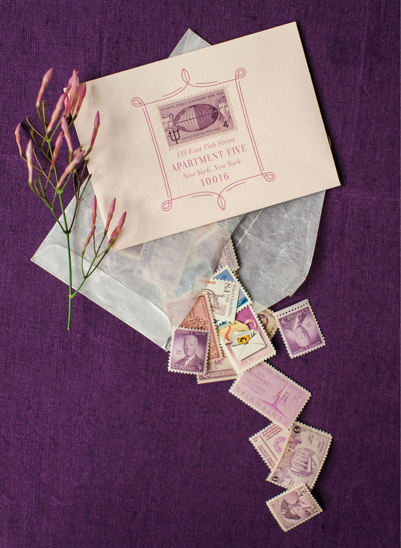
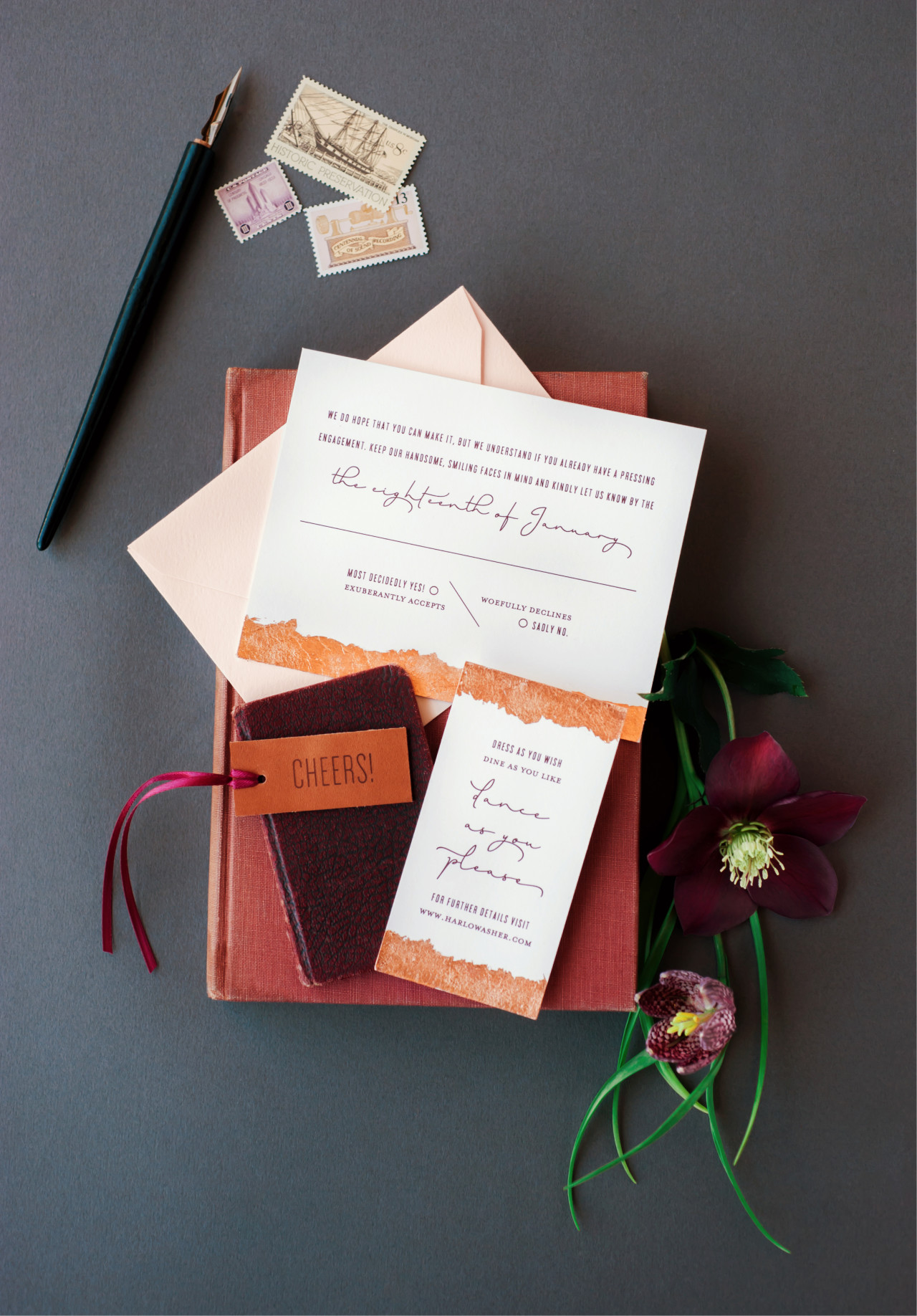
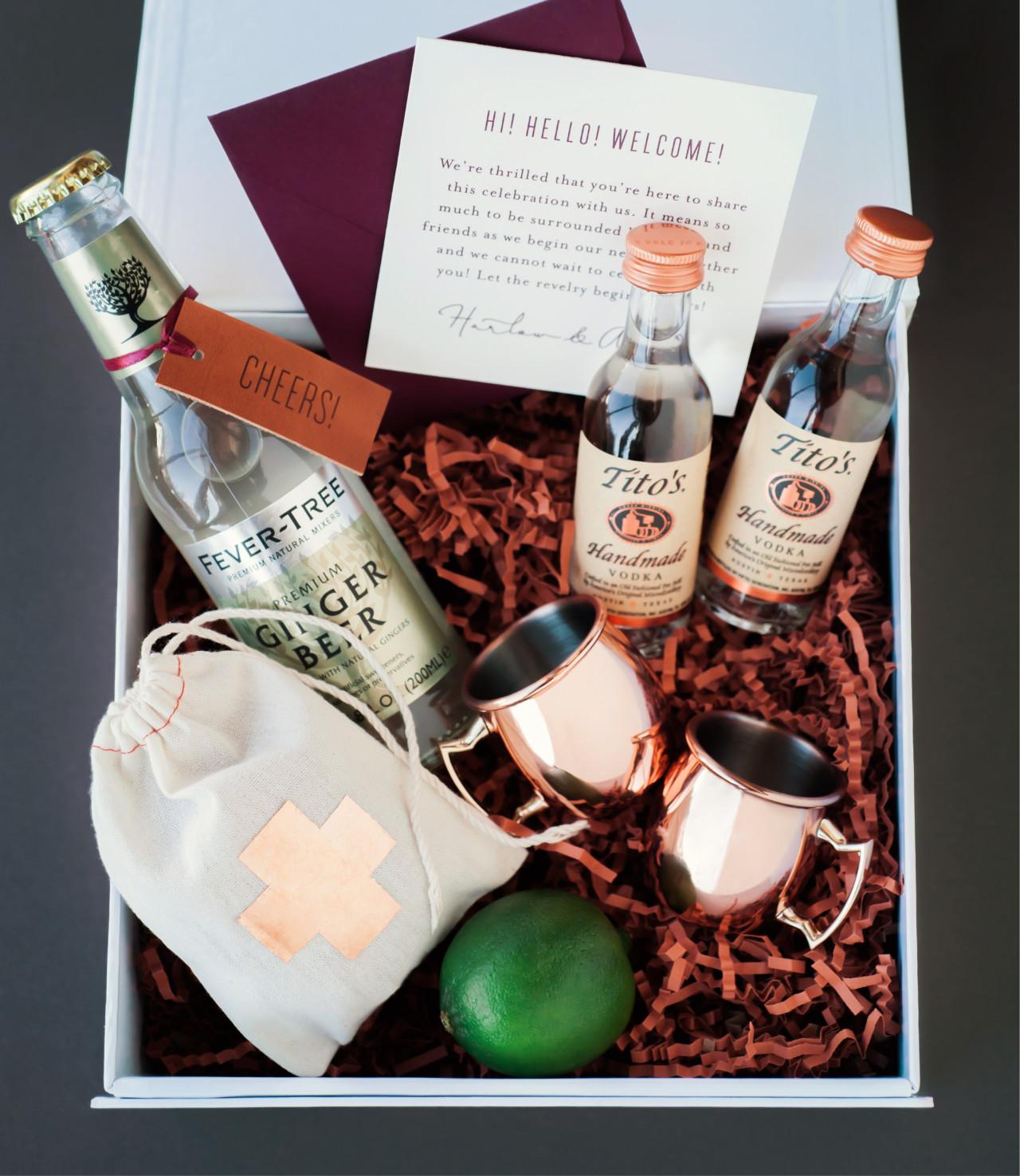
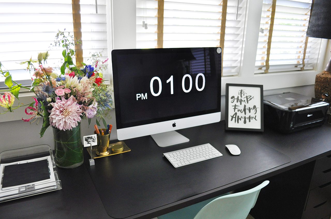
Photo by Kat Harris Photography

The first, most essential tip is to plan. Planning is vital for the smooth running of a photo shoot – and will ensure that you have a road map in place to capture the most significant details. The day before the shoot, I gather all the invitation components (multiple sets are very helpful to have), a variety of backgrounds and styling props. I have a dedicated space in my studio where I keep most of my props so they are all within arm’s reach. Having them close by gives me lots of options. Options are major key!

With everything gathered, I start to lay out compositions. My goal is to tell the whole paper story through a series of images. I  start big picture, laying out the main pieces of the suite. This typically includes the invitation, reply card, coordinating envelopes and any enclosures. When you compose an image, consider why you are taking the photograph. What is the story? What are you trying to convey? Is the print method stunning? Maybe the colors are unique or the design is out-of-the-box.

I experiment adding and subtracting different props until I arrive at a configuration that I am happy with – both a vertical and a horizontal layout – and take quick pictures using my iPhone. I then move on to smaller vignettes where I highlight details of the suite. None of these arrangements are 100% perfect, they are simply there to reference for the actual photo shoot. Think of them as a rough draft. Once I’ve got all the compositions planned out, I upload the photos to my computer and create a visual shot list.

How to Style Stationery for Photography / Coral Pheasant for Oh So Beautiful Paper

I find this to be immensely helpful! I personally do not excel at doing multiple things at once – like talking and styling – and having a visual cheat sheet keeps me on track. I’ve already been super thoughtful about the arrangements in the quiet of my studio the day prior. This allows me to obsess over the details of spacing and alignment on the day of the shoot. And of course there is always room to free style because you’ve done your homework and you have a solid sense of what you want to accomplish that day.

On to the actual styling! Below are some essential “tools” for getting started.
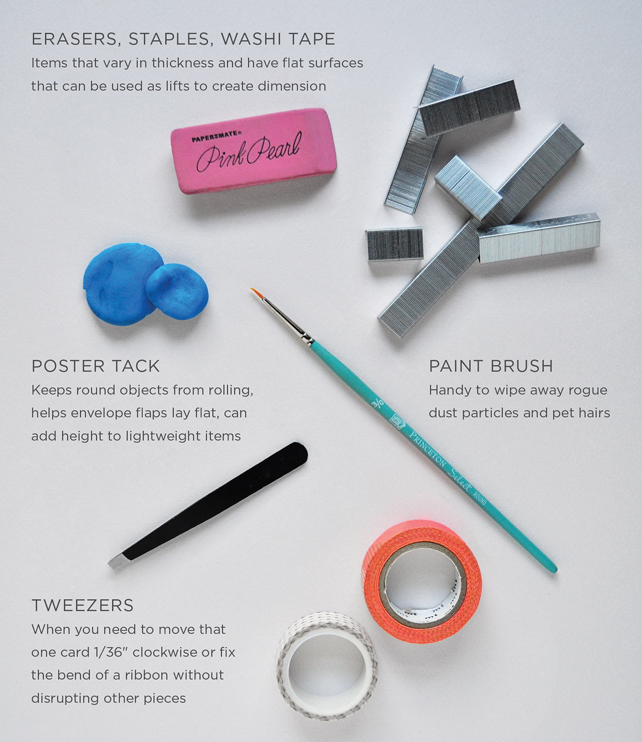
How to Style Stationery for Photography / Coral Pheasant for Oh So Beautiful Paper

SUGGESTED TOOLS

• Erasers, staples, washi tape
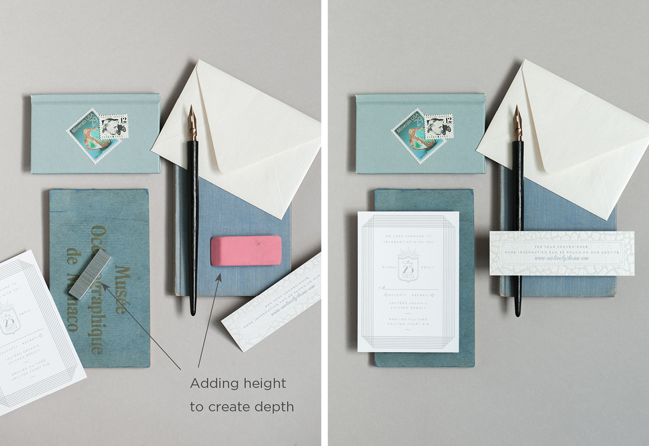
Stationery photos are more interesting when items are on different levels. Flat cards on a flat background = boring. You need to vary the height of the cards to create depth. Items that vary in thickness and have large flat surfaces are what you’re looking for. Staples are great because they are cheap and can be broken into different lengths. Erasers and rolls of washi tape work well, too, and are taller than staples giving you a mix of heights.

• Poster tack
This pliable tack keeps round objects from rolling, helps envelope flaps lay flat and can be used to add additional height to lightweight items.

• Paint brushes
Paint brushes are great for wiping away rogue dust particles and pet hairs. (I should mention that I have 2 dogs. Pet hair is a constant at my studio!)

• Tweezers
You have everything laid out just so when you notice one card is not quite straight. Ugh! Tweezers (or the pointed end of your paint brush) can be used to delicately move that one card 1/36″ to get it perfect without disrupting the other pieces. Anal retentive, OCD who me??

• Backdrops
Get creative! I keep a mix of different colored, large sheet papers on hand. You could also get sheets of plywood and paint them to coordinate with your paper story. Or you could be baller and get yourself styling boards from Heirloom Bindery.

• Foam core
White foam core can be used as a reflector to bounce light onto your layout and to soften harsh shadows.

• Diffuser
Another way to soften strong shadows. I have one similar to this that can be used as a reflector and a diffuser.

How to Style Stationery for Photography / Coral Pheasant for Oh So Beautiful Paper

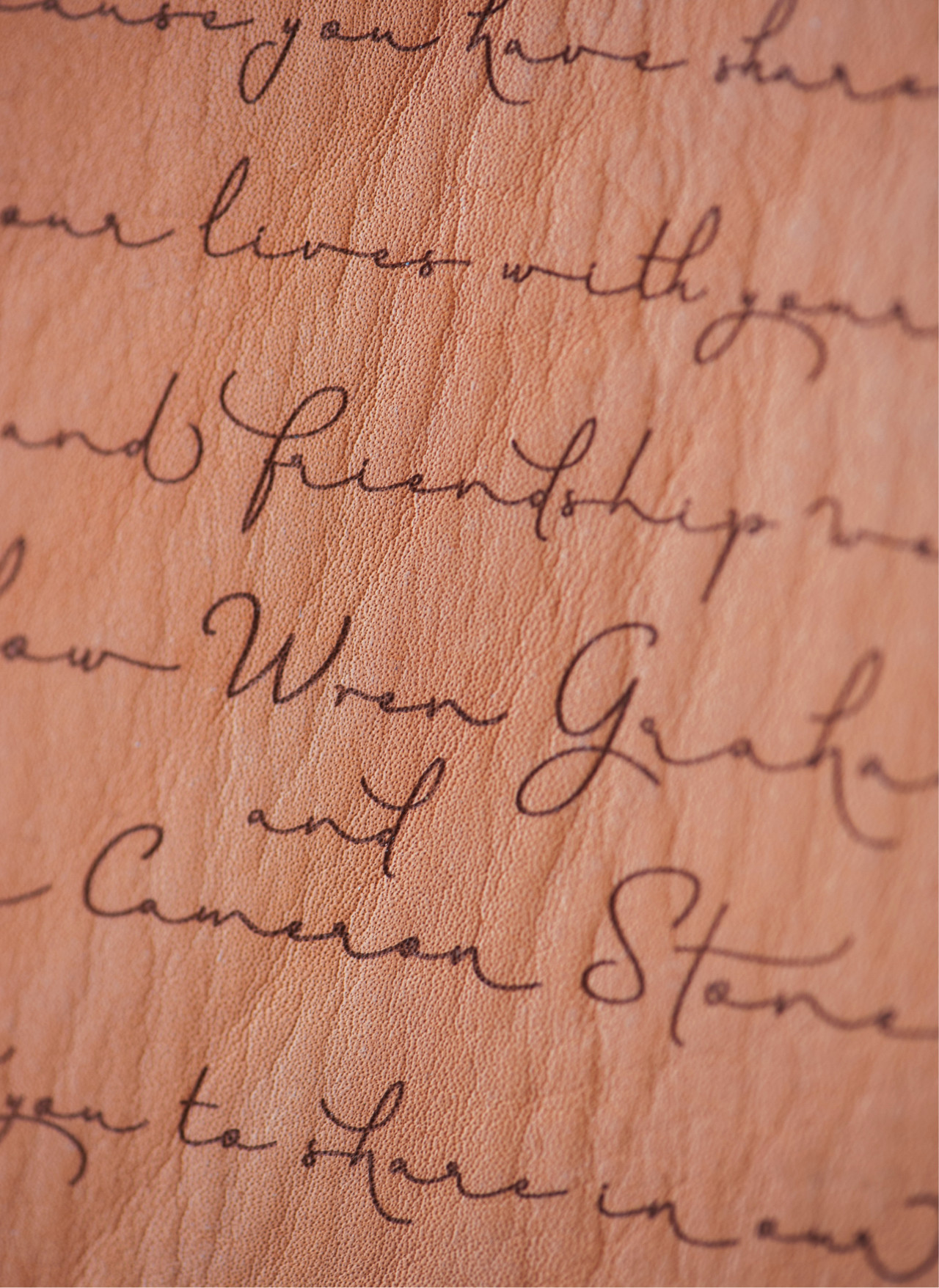
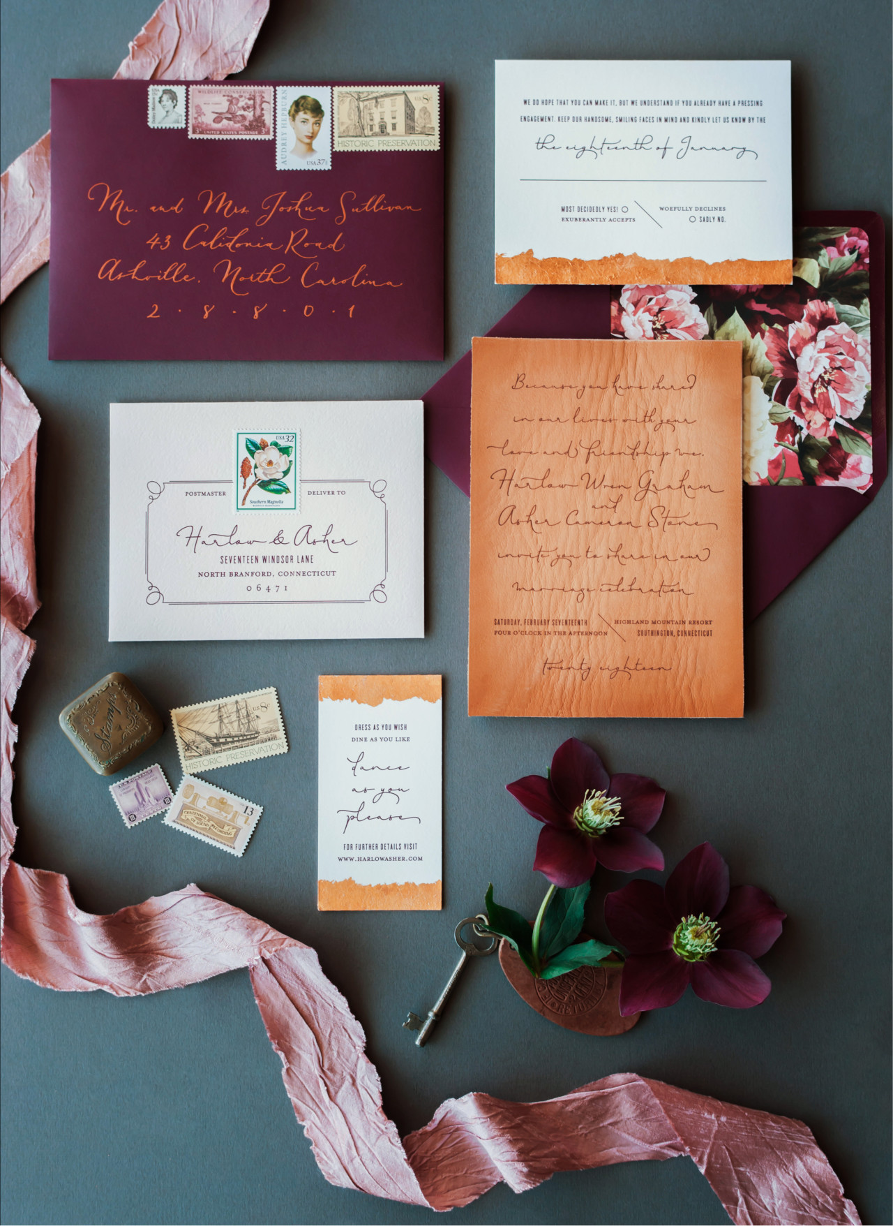
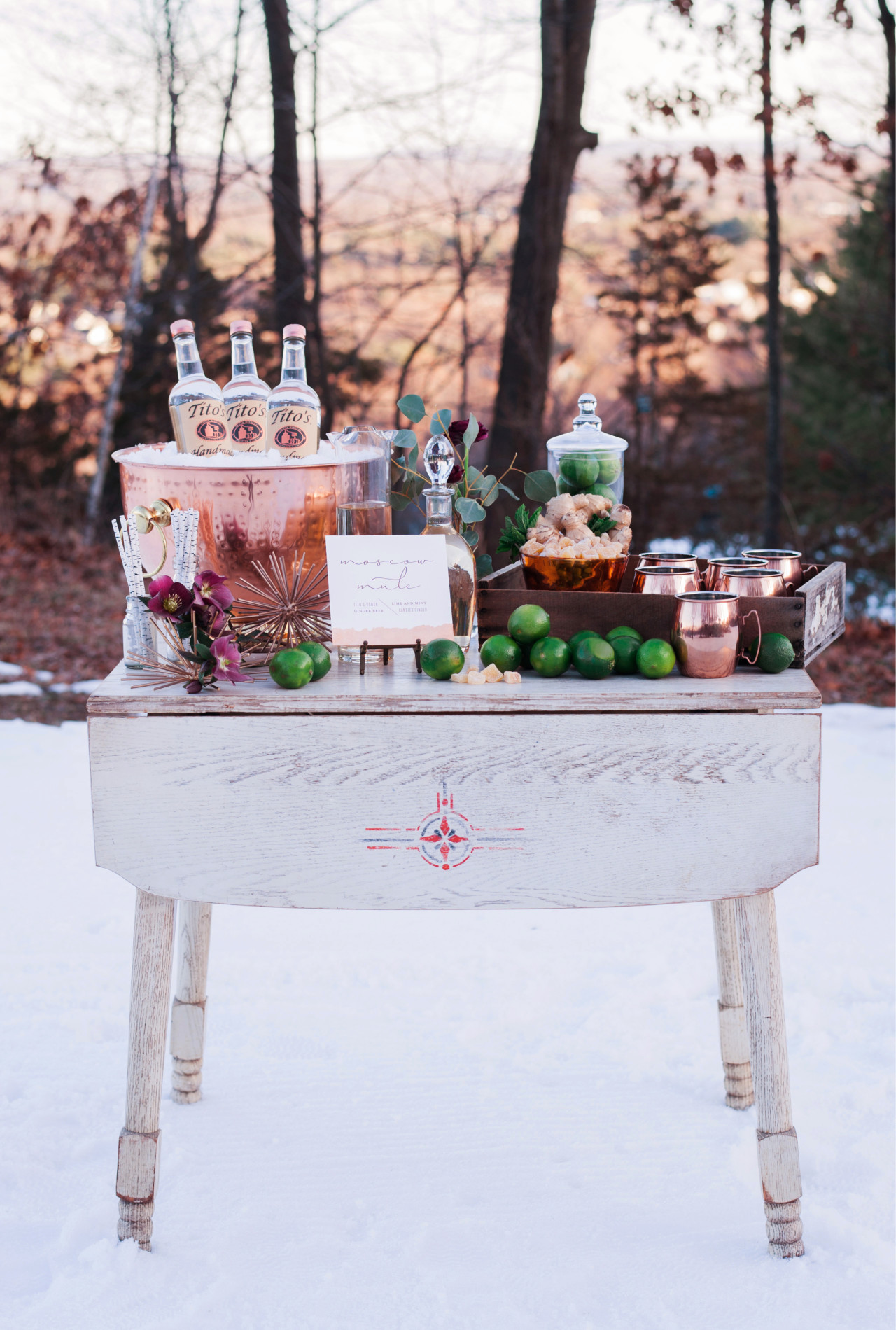
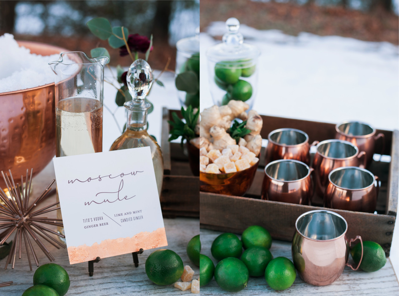
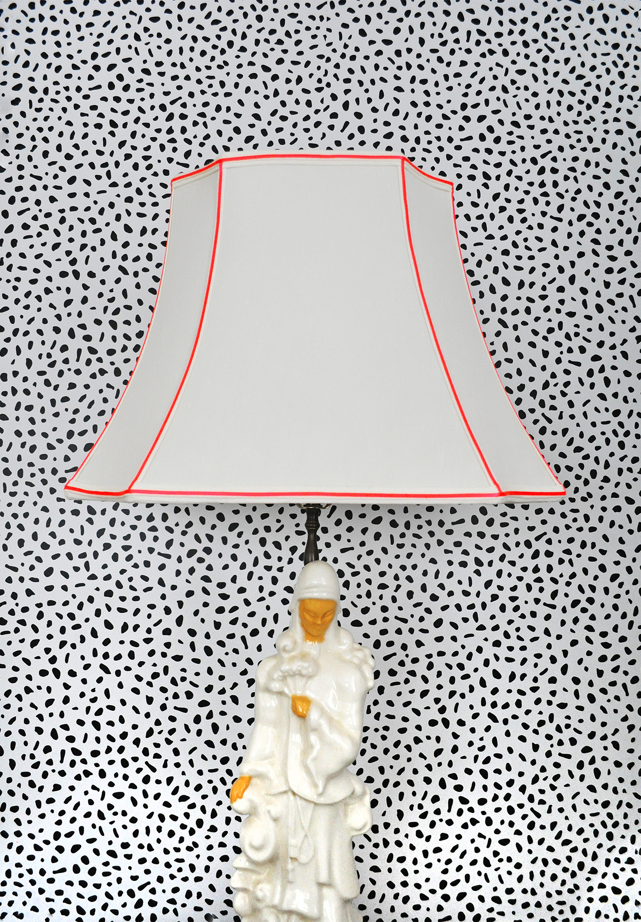
Photos by Charlotte Jenks Lewis

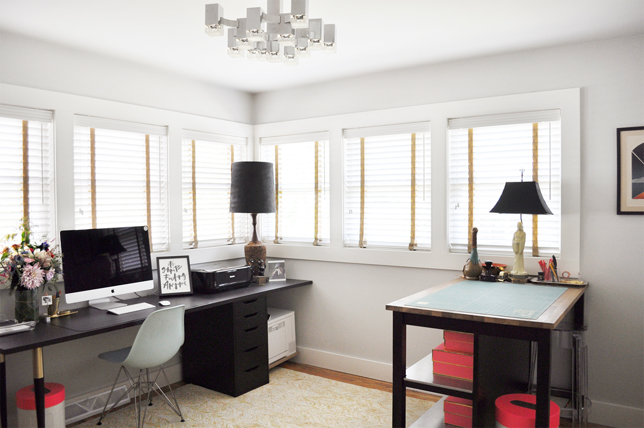
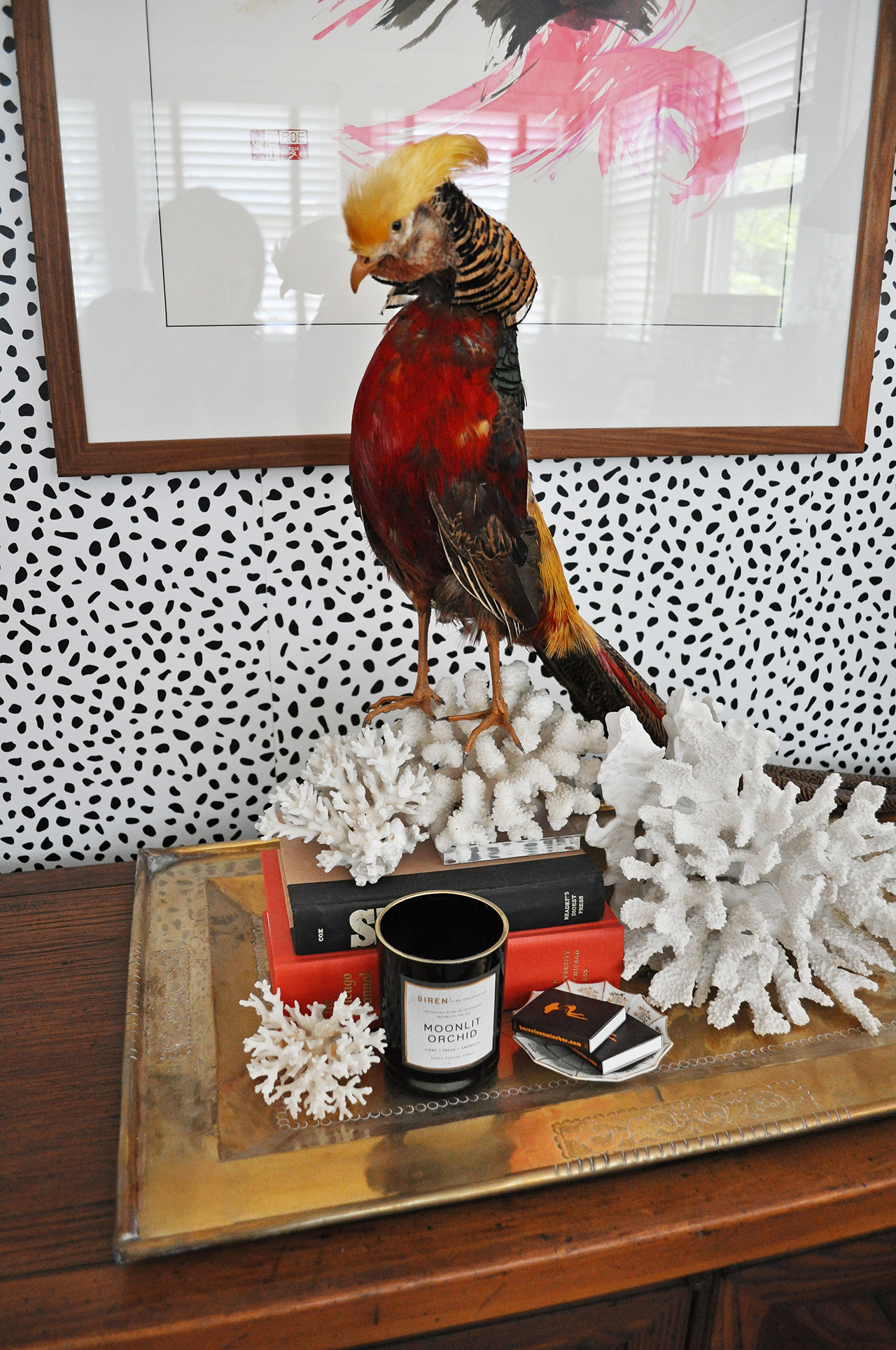
In the beginning I mentioned props – and how having them is major key when styling stationery photos. I am constantly collecting items to add to my prop closet. Having a variety of items on hand makes it so much easier to style. Some will work, some will be a flop, but it’s all good because you will have options! Look for items that are smaller in scale. You want a mix of sizes but you also want to mindful of how their proportions relate to the paper. Consider items with great color, patina and texture.

How to Style Stationery for Photography / Coral Pheasant for Oh So Beautiful Paper

How to Style Stationery for Photography / Coral Pheasant for Oh So Beautiful Paper

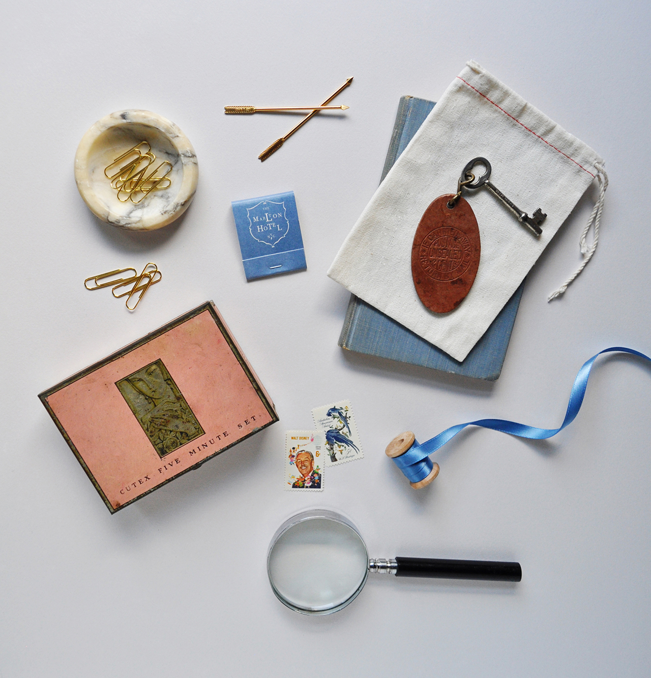
Having multiples of things, once again, gives you options. Are you noticing a constant here? Hint: OPTIONS.  A particular pair of scissors might be too small for your setup or not the right color, but you’re not stressed, you have OPTIONS!

How to Style Stationery for Photography / Coral Pheasant for Oh So Beautiful Paper

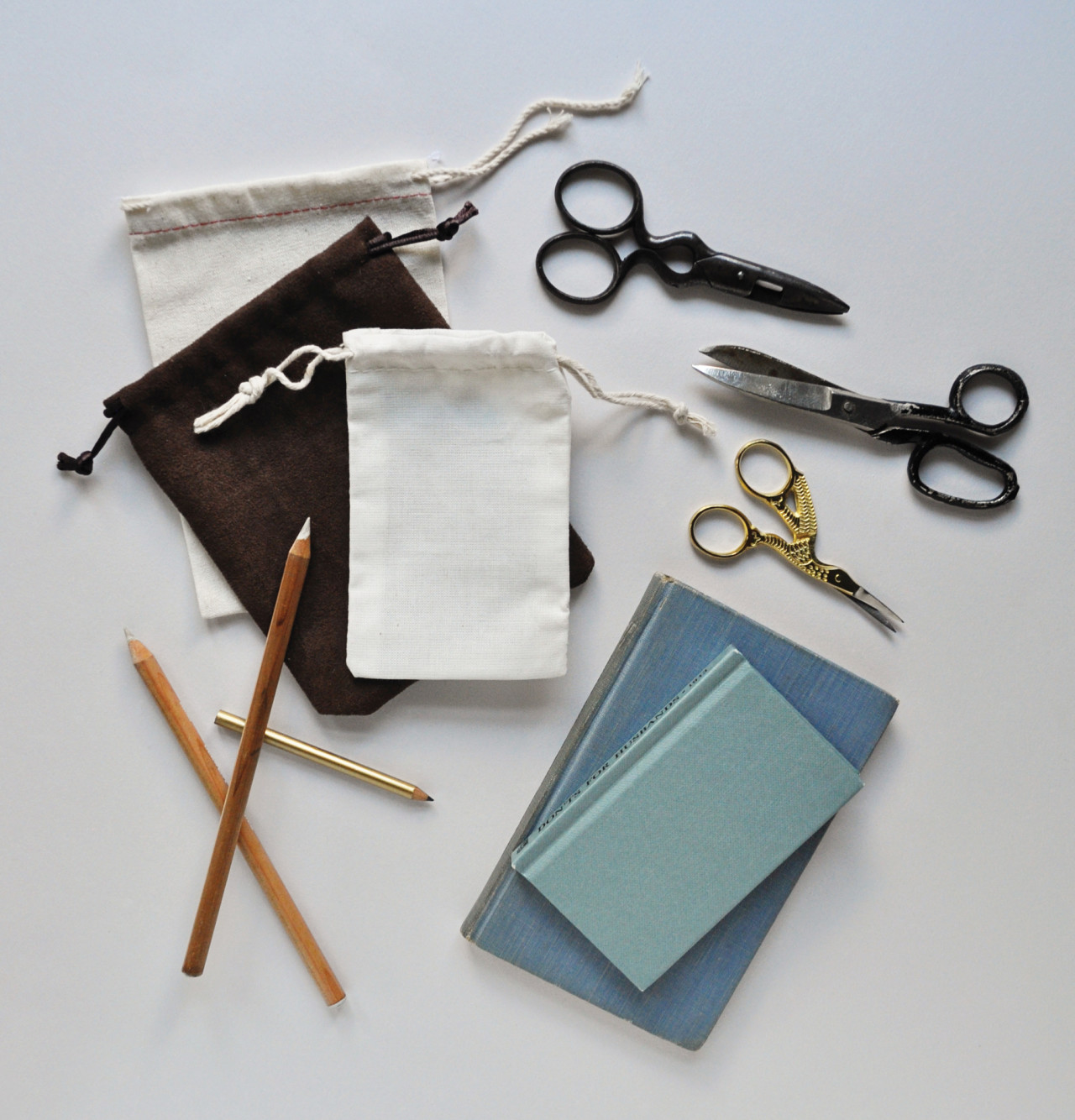
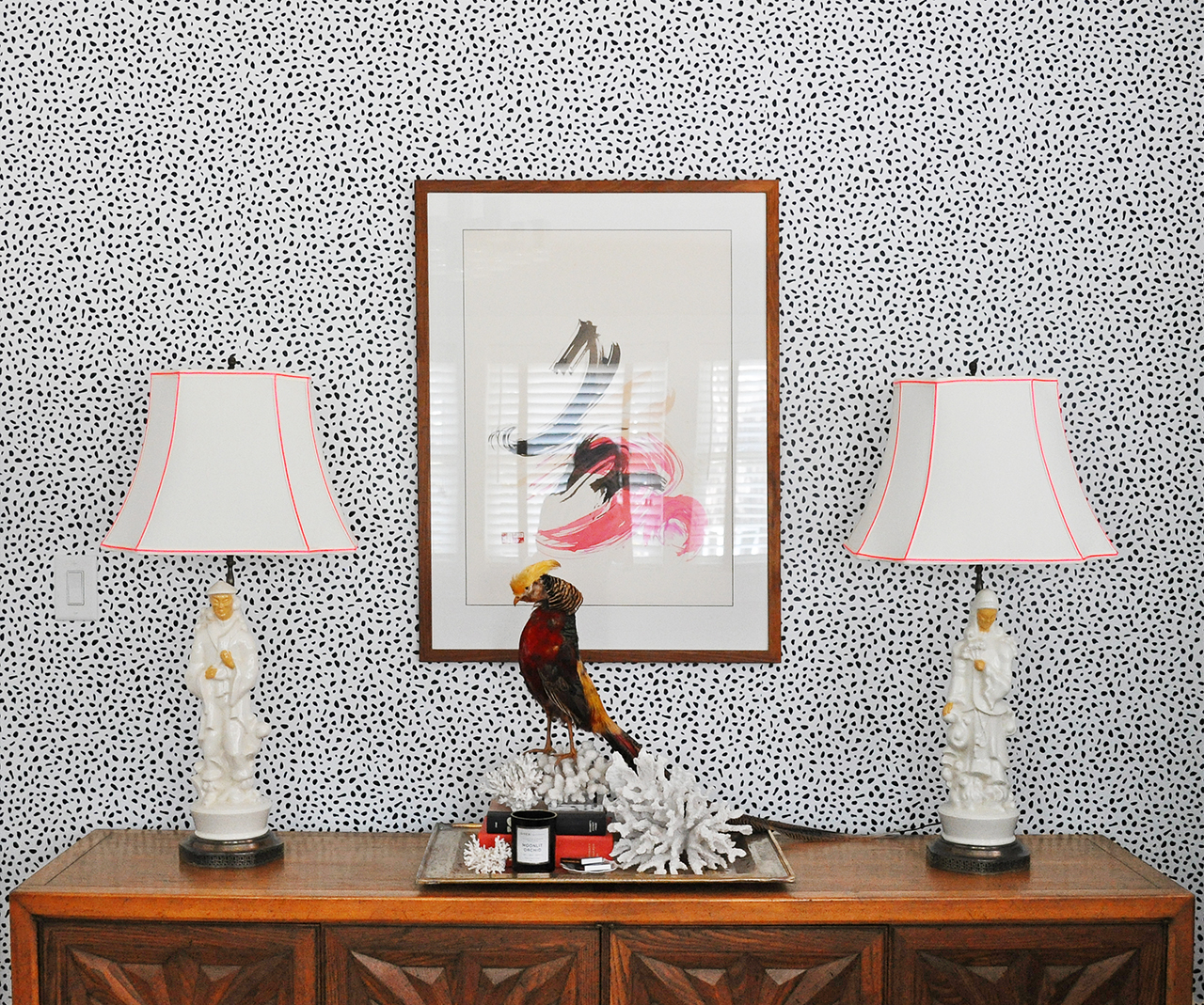
Petite dishes are great for corralling other smaller props. They help to give those small things a sense of place and also add dimension and texture to the overall image.How to Style Stationery for Photography / Coral Pheasant for Oh So Beautiful Paper How to Style Stationery for Photography / Coral Pheasant for Oh So Beautiful Paper

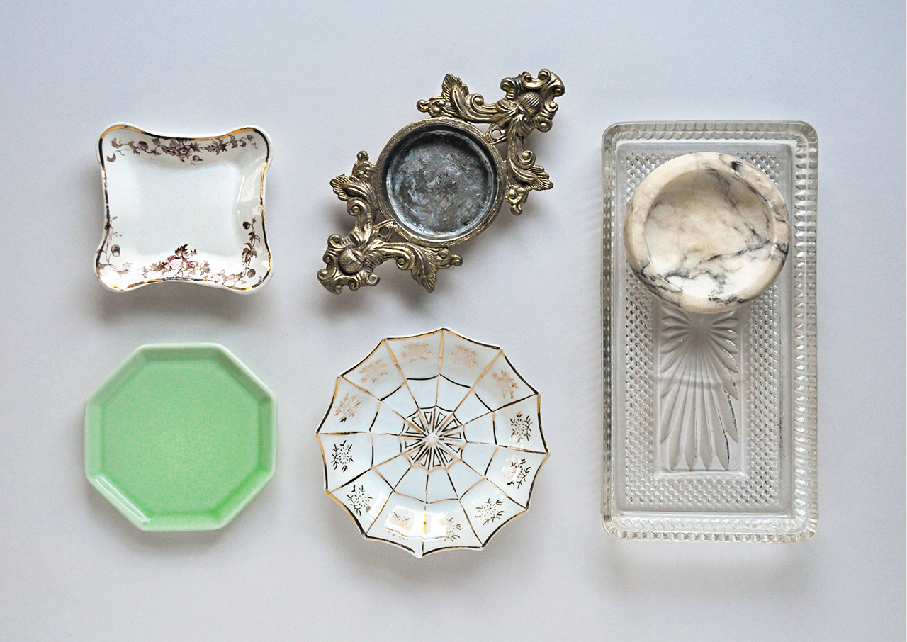
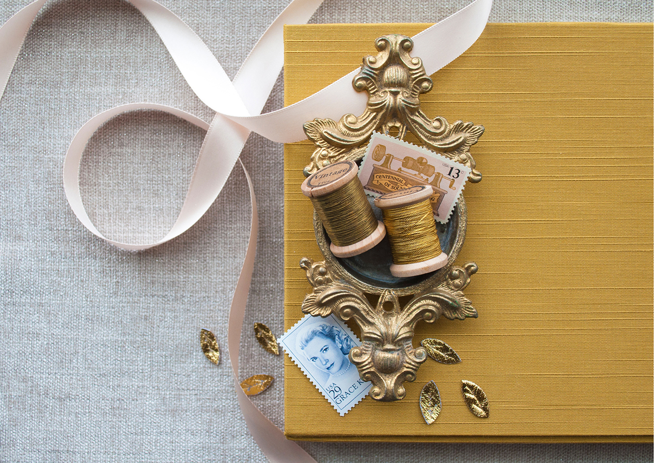
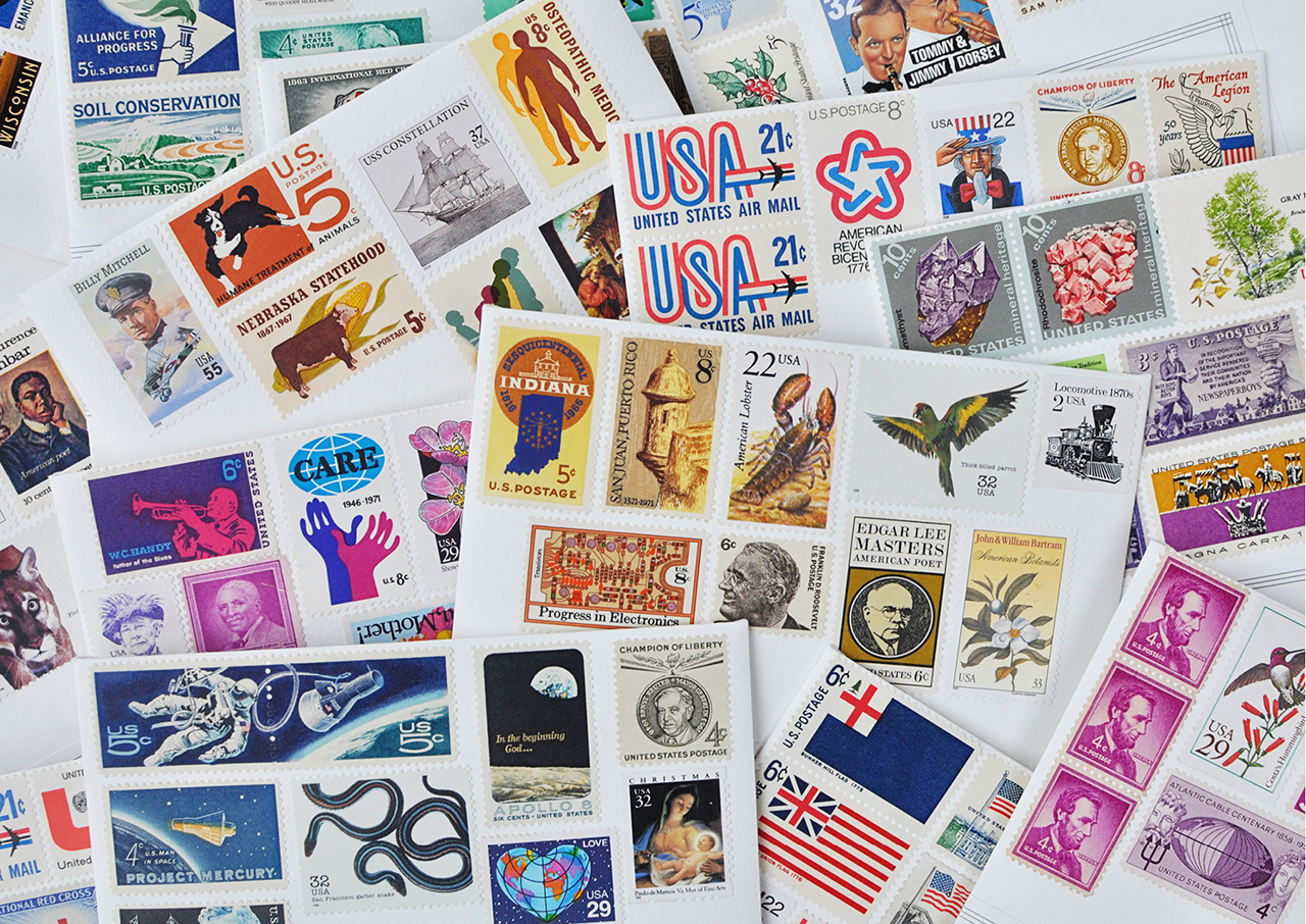
I use vintage postage a LOT when styling. As in Every. Single. Time. They’re mini pieces of art and bring delightful color to the composition. Nole did an awesome write-up about vintage postage and where to find it. I strongly encourage you to give that a read if you are on the hunt!

How to Style Stationery for Photography / Coral Pheasant for Oh So Beautiful Paper

I also like adding bits of vintage paper ephemera when styling. The dog-eared edges, interesting typography, and varying colors are yet another way to add interest to your composition.

How to Style Stationery for Photography / Coral Pheasant for Oh So Beautiful Paper

How to Style Stationery for Photography / Coral Pheasant for Oh So Beautiful Paper

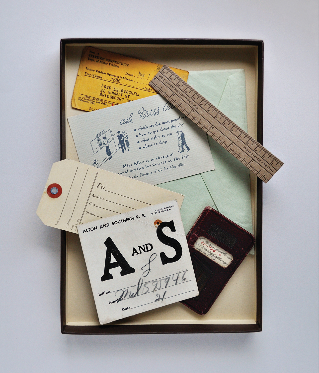
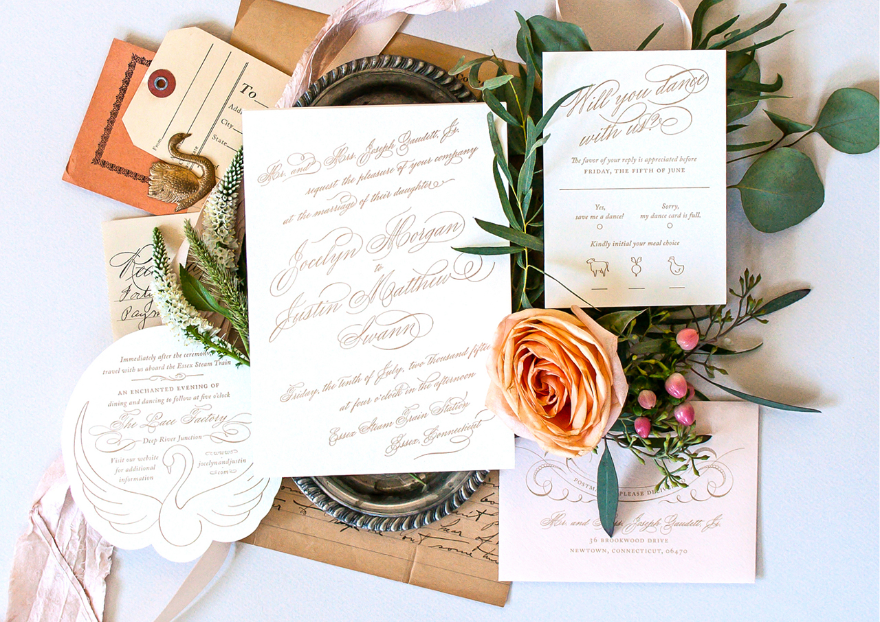
I think it goes without saying that bringing natural elements to your styling sesh can be a real game changer. But I just said it. So there, take note.

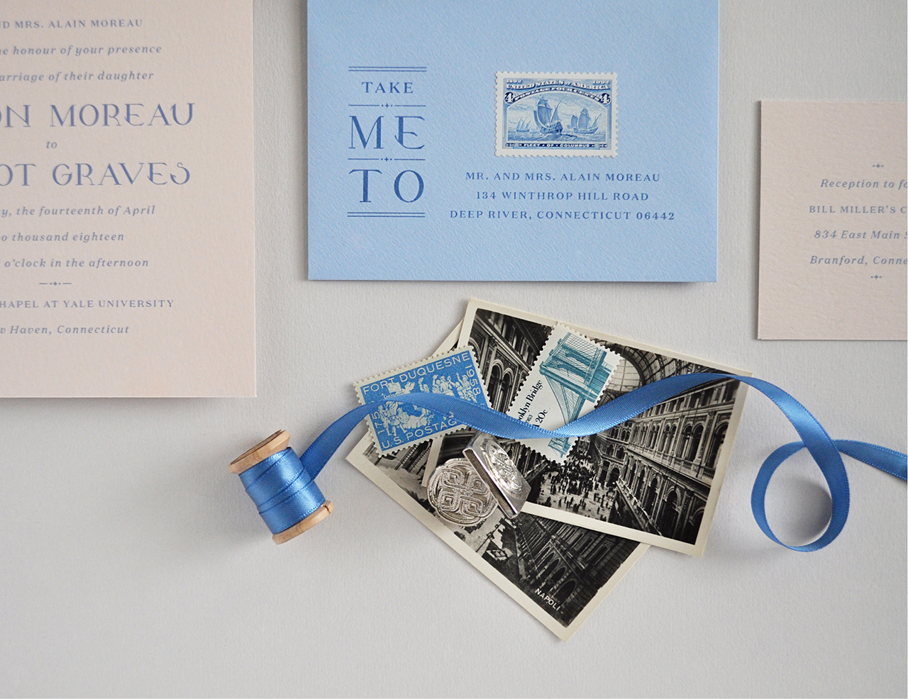
You’re now equipped with the tools and the props and you’ve got your beautifully designed stationery. That doesn’t automatically spell success. You must also be thoughtful how you compose your image.

COMPOSITION TIPS

• Balance
Your image should be balanced. I don’t mean that the composition needs to be symmetrical, but the selection of props should relate to one another and not compete. And remember, your goal here is for your stationery shine!

• Negative space
Be mindful of the spacing between each element and how they relate to each other. Is it even? Is everything straight? It’s much harder to retouch these things in post-processing!

• Alignment
If there is too much going on, it will feel cluttered and your eye won’t know where to land. Consider carving out negative space.

How to Style Stationery for Photography / Coral Pheasant for Oh So Beautiful Paper

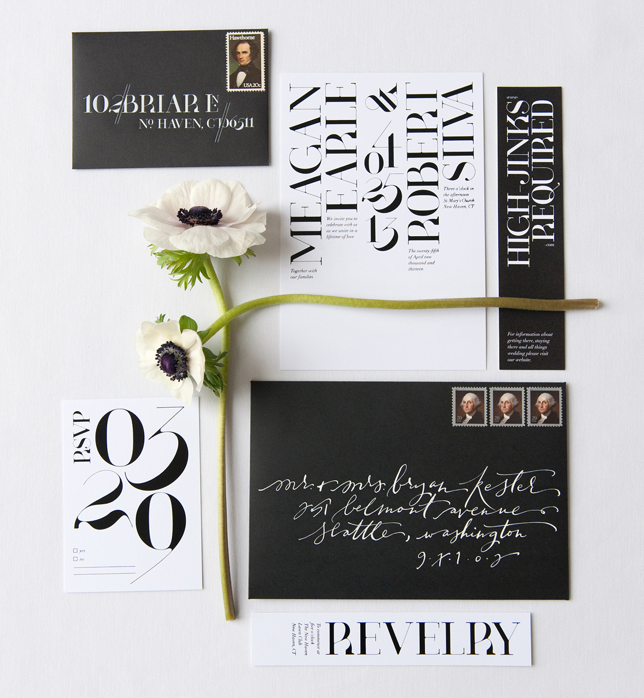
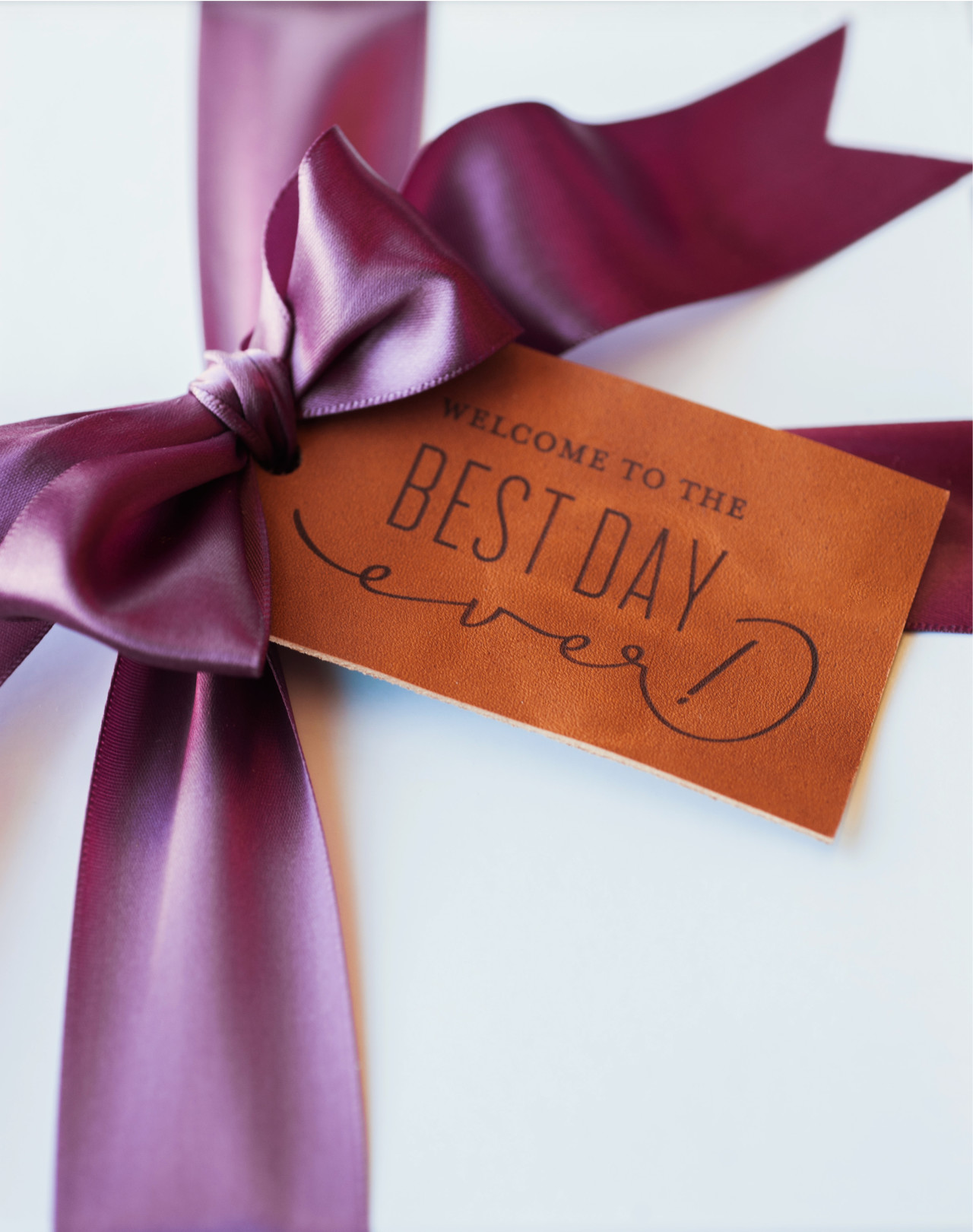
Photo by Carla Ten Eyck Photography

That’s a wrap! I would love to hear some of your tried and true tips for perfect paper pics!

Photo and Styling Credits: Coral Pheasant (except where noted)Save

Wedding Invitation 101, Part 2: Timing is Everything (aka When to Send Wedding Invitations)

Invitation-101-Timing-Is-Everything-Title

Hi guys, Ashley from Fine Day Press here! Welcome back to our Invitation 101 series, all about wedding invitations. Today’s post is all about timing: when to gather inspiration, when to order your wedding invitations and save the dates, when to send wedding invitations, and more!

Wedding planning the one time in life where we combine an incredibly joyful event with the complicated logistics of running a small army! I recommend keeping the invitation process stress-free by allowing yourself lots of time. This is also super helpful for your guests so they can make travel plans and other necessary arrangements to be there on your big day.


A YEAR IN ADVANCE

Start thinking about your invitations as early as possible in your wedding planning process. This could be a year or more in advance. Last-minute invitations would not be fun, not to mention the rush charges alone could blow your budget.

You can begin by envisioning your dream invitations with an inspiration board and identifying a few possible stationers to work with – see my first post for more details on getting started.


6-9 MONTHS IN ADVANCE

If you’re mailing a Save the Date, especially for a destination wedding, this is the time to get those in the mail. Our previous post covered Save the Dates in more detail.

If you’re working with a local paper shop, this is a great time to schedule an appointment to review the ins and outs of their ordering process and timeline. If you’re working with an online stationer, go ahead and order a few samples to get an idea of the products and papers you might like to use.


WHEN TO ORDER

For ready-made invitations, I recommend ordering your invitations 3 months in advance for local weddings or 6 months in advance for destination weddings. This will allow time for design, proofing, production, assembly, and mailing your invitations, while providing ample notice for your guests.

If you’ve decided to go the custom invitation route, this will usually add anywhere from 3 to 6 weeks on to your invitation process, so it’s important to consider this from the get-go and factor this in to your timeframe.

We’ve created a handy cheat sheet of important dates! Click here to download a printable PDF.


PRINTING & PRODUCTION

For digital printing, also known as flat printing, you can expect a production time of up to 2 weeks. Letterpress or specialty printing typically takes 3 weeks. Production can usually be expedited, but there is usually a charge associated with this. We’ll cover print and production methods in more detail in the next installment of this series.


CALLIGRAPHY

Planning to have beautiful calligraphy on your envelopes? Calligraphers generally require 2 to 3 weeks for addressing envelopes. Your stationer may be able to provide blank envelopes in advance so that this can get started while the invitations are printing.


WHEN TO SEND

A general rule is to send out invitations 6 to 8 weeks before the wedding. If it’s a destination wedding, at least 3 months ahead is the standard to allow time for travel plans.

Don’t forget to save a few days (or at least a weekend afternoon) for assembly. This could be as simple as putting the invitations in the envelopes and adding postage to the envelopes. but may require additional steps if such as assembling liners into envelopes (note: many stationers can assemble liners for you and may offer invitation assembly as well) or stamping a return address if you chose an address stamp instead of a printed return address.

This is the time to call in your troops. Grab your besties and ‘maids to lend  a hand; bribe them with pizza and wine post-project. Or this is could be a for you and your fiancé/ée to tackle together – put on some Netflix and make it a date night. Finally, tack on a few more days for mailing. International invitations can take anywhere from 6-10 days to arrive. We’ll cover mailing and postage in a later post.


AFTER THE BIG DAY

Once your wedding is over and you’ve had a blissful, relaxing honeymoon, it’s time to send out thank you notes to guests and loved ones! If you like, you can keep your thank you notes in the same design theme as your invitations and usually get them printed at a lower cost than your invitations – At Fine Day Press, we offer returning clients a 10% discount on day-of and thank you note orders – I’m willing to bet other stationers might do the same.

Stay tuned for our next Invitation 101 post; it will cover one of my favorite topics – printing methods.

Copper and Leather Wedding Invitation Inspiration

Ear­lier this year I teamed up with a tal­ented mix of folks to bring to life a rich, rein­vented rus­tic vision dreamed up by Amy Cham­pagne Events and cap­tured by Char­lotte Jenks Lewis. Collaborating with other creatives is a wonderful opportunity to explore new ideas, to challenge yourself, and to foster and build new relationships. This particular styled shoot was no exception. Inspired by vin­tage ski lodges and the clas­sic cop­per cups of Moscow Mule fame, I got to work cre­at­ing some copper and leather wedding invitation inspiration. –Nichole of Coral Pheasant

Copper and Leather Wedding Invitation Inspiration by Coral Pheasant / Photo: Charlotte Jenks Lewis / Oh So Beautiful Paper

Copper and Leather Wedding Invitation Inspiration by Coral Pheasant / Photo: Charlotte Jenks Lewis / Oh So Beautiful Paper

The wedding invitation suite features a mix of con­trast­ing col­ors and tex­tures. The invi­ta­tion is laser etched script text on a sheet of cognac leather, the enclo­sure cards are accented with cop­per leaf detail­ing, and the outer enve­lope and liner bring in rich berry tones. The escort cards and several welcome and gift tags also feature laser etched text on cognac leather and were paired with deep cranberry red and burgundy ribbon.

Copper and Leather Wedding Invitation Inspiration by Coral Pheasant / Photo: Charlotte Jenks Lewis / Oh So Beautiful Paper

Copper and Leather Wedding Invitation Inspiration by Coral Pheasant / Photo: Charlotte Jenks Lewis / Oh So Beautiful Paper

Copper and Leather Wedding Invitation Inspiration by Coral Pheasant / Photo: Charlotte Jenks Lewis / Oh So Beautiful Paper

Sara from Ink Revival adorned the cranberry red enve­lope with her gor­geous cal­lig­ra­phy in cop­per ink. She was able to match the font used in the suite to create a cohesive look.

Copper and Leather Wedding Invitation Inspiration by Coral Pheasant / Photo: Charlotte Jenks Lewis / Oh So Beautiful Paper

Copper and Leather Wedding Invitation Inspiration by Coral Pheasant / Photo: Charlotte Jenks Lewis / Oh So Beautiful Paper

Copper and Leather Wedding Invitation Inspiration by Coral Pheasant / Photo: Charlotte Jenks Lewis / Oh So Beautiful Paper

One of my favorite ele­ments from the paper story is the wel­come box for wedding guests, a preview of a Moscow Mule station at the wedding reception. The welcome box fea­tures mini cop­per Moscow Mule cups and all the ingre­di­ents needed to make Moscow Mules — mini vodka bottles, ginger beer, and limes – and then a bit of relief if too many Mules are consumed!

Copper and Leather Wedding Invitation Inspiration by Coral Pheasant / Photo: Charlotte Jenks Lewis / Oh So Beautiful Paper

Copper and Leather Wedding Invitation Inspiration by Coral Pheasant / Photo: Charlotte Jenks Lewis / Oh So Beautiful Paper

Copper and Leather Wedding Invitation Inspiration by Coral Pheasant / Photo: Charlotte Jenks Lewis / Oh So Beautiful Paper

Ed Note: Coral Pheasant is a member of the Designer Rolodex – you can see more of Nichole’s beautiful work right here or visit the real wedding invitations gallery for more invitation inspiration!

Photo Credits: Charlotte Jenks Lewis

Behind the Stationery: Coral Pheasant

Hello! My name is Nichole and I am the Chief Dreamer and designer at Coral Pheasant on the Connecticut shoreline. I am delighted to be guest blogging on my favorite stationery spot on the web this week, and I’m excited to share some of my work and behind the scenes with you. I’m a paper nerd with a penchant for beautiful typography, gorgeous patterns and thick, luxurious stock. Custom invitations are my specialty. I adore clients who respect etiquette and tradition, appreciate the rules, and break them just a bit to create a hip, on-trend, thoughtful and highly personalized stationery suites.

Behind the Stationery: Coral Pheasant / Oh So Beautiful Paper

Art has been in my blood for as long as I can remember and my parents encouraged my pursuits wholeheartedly. One of my earliest memories of creating was building my dollhouse with my father. Everything on that miniature house was handcrafted from laying the chimney brick by little brick, to wallpapering the walls, to building the furniture. I delighted in working with my hands to make sure the tiniest of details was perfect. In college, I pursued my love of design by enrolling in a Fine Arts program and graduating with a Bachelor of Fine Arts degree.  It was during those four years that I became infatuated with typography and knew I had found my calling.

Behind the Stationery: Coral Pheasant / Oh So Beautiful Paper

The vendors that we hired for our wedding quickly became friends and I was invited to collaborate with them on editorial shoots. My involvement in these creative projects and their support was the kick in the pants I needed to formally develop my stationery business. For the next two years I worked both my corporate job and my own business. In 2012, I attended the Engage! Luxury Wedding Conference and had the great fortune of meeting Sarah Haywood, one of Britain’s top wedding planners. It was this serendipitous encounter that led to our collaboration on the redesign of her 240-page Wedding Bible and her Wedding Bible Planner. Meeting Sarah and landing the job gave me the confidence to dedicate myself full time to my business. Two weeks after returning home from the conference I resigned from my job and began the crazy, rewarding, challenging, wonderful journey of being an entrepreneur.

Behind the Stationery: Coral Pheasant / Oh So Beautiful Paper

When thinking of a name for my business I was sitting on the couch in our apartment’s living room and looking around the space. Sitting on a credenza that was a vignette I had styled that was composed of a tall cylindrical vase filled with pheasant feathers and a piece of coral. (I’ve long had a thing for what I like to call “animal ephemera”). I put the two words together and really liked how they sounded. After doing a quick internet search I confirmed that the URL was available (not an easy feat to find one that’s not been taken!) and knew I had a winner. For a while there, I always associated the word coral with the petrified piece that was the original inspiration. It wasn’t until I stared at the clothes hanging in my closet that I realized I owned multiple coral-colored things and a light bulb went on. Of course coral was also a color! It’s funny how something can be so obvious and yet so elusive.

Behind the Stationery: Coral Pheasant / Oh So Beautiful Paper

My design process begins with learning as much as I can about the couple I’m working with. I want to know what they love to eat, how they spend their vacations, where they shop and what makes their house a home. Learning what they love in their day-to-day life – and what they don’t! – helps tremendously in understanding the vision for their wedding day.

Behind the Stationery: Coral Pheasant / Oh So Beautiful Paper

My design process is also heavily inspired by vintage finds and studying beautifully curated interiors. In my questionnaire I ask my clients what the most treasured piece of furniture or art is in their home. This speaks volumes to me! I love the history behind objects and the visual storytelling that develops as these treasured pieces find their way into homes. The layering of unexpected items, their textures and patinas and patterns. It parallels the design of my stationery. I always seek to have each item in a suite coordinate with the whole but never “match.”  I like to vary the sizes of the cards and the colors of the envelopes and I strive to create an element of discovery. This element might be a charming detail tucked into the envelope liner or the unexpected placement of the stamp on an RSVP envelope.

Behind the Stationery: Coral Pheasant / Oh So Beautiful Paper

Working for yourself certainly has its rewards and challenges. One of the rewards is realizing my world got so much bigger. When I was working for a company, that was my world. I went to work, did my job and came home. I loved the people I worked with and they were essentially my “network.” For the most part we were all similar in age, doing similar things. When I started working for myself, I crossed paths with so many new people, with a multitude of talents, from wildly diverse backgrounds. It was – and is – wonderful to connect with people who are different from me. Each person brings a new perspective and can challenge you to see things in a new light. On the flip side, being a company of one can be lonely. I loved the people I worked with at my past job. There was definitely a social aspect to work where we all had lunch together and it was easy to bounce ideas around. I also had others to hold me accountable for tasks and projects. When you work for yourself, you have to make a concerted effort to network and you’re the one steering the ship.

Behind the Stationery: Coral Pheasant / Oh So Beautiful Paper

I hope you enjoyed learning a little bit about this gal behind the paper!

Photo Credits: Coral Pheasant

Happy Weekend!

Happy Friday everyone! I hope you all enjoyed Ashley’s wonderful guest posts this week! I absolutely loved all of her posts! Nichole from Coral Pheasant will be joining us next week, and she has some seriously beautiful posts planned that you won’t want to miss! But in the meantime…

Maybelle Imasa via Instagram / Oh So Beautiful Paper

Image by Maybelle Imasa via Instagram

…a few links for your weekend:

This week on Oh So Beautiful Paper:

That’s it for us this week! We’ll be back later this afternoon with this week’s cocktail recipe – so check back for that! Have a fantastic weekend, and we’ll see you back here next week! xoxo