Julie + Bo’s Hand Painted Wedding Invitations

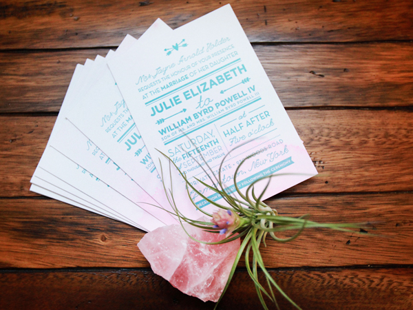
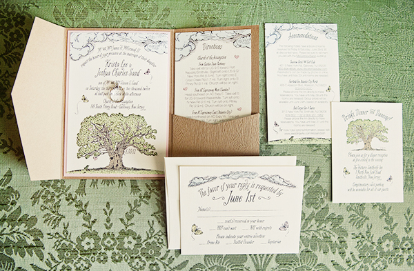
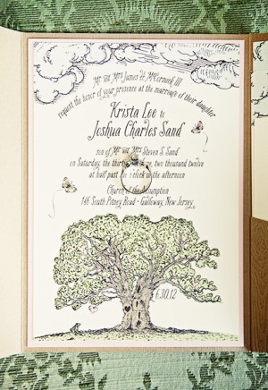
Happy Monday everyone! We’re starting the week with some beautiful wedding invitations from Meghan of And Here We Are! Inspired by the bride’s love of all things ombré, Meghan combined watercolor (hand painted on more than 200 sheets of paper!) and letterpress printing into a seriously gorgeous wedding invitation.

Pink-Aqua-Ombre-Wedding-Invitations-And-Here-We-Are2

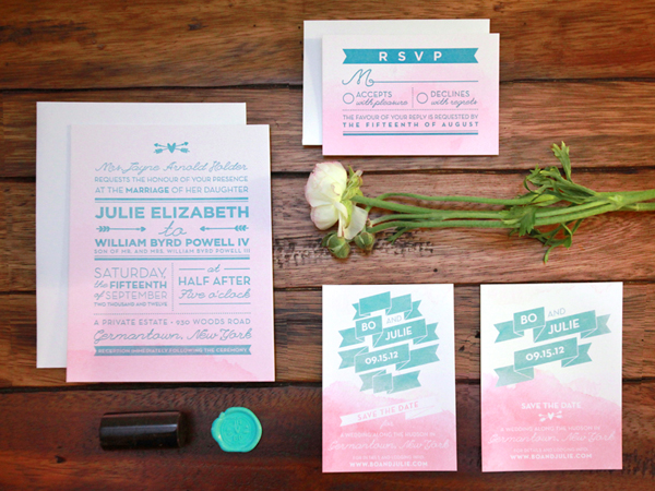
From Meghan: Julie and Bo’s upstate New York wedding had a bohemian, outdoorsy, and slightly vintage vibe with a color scheme of peach and robin’s egg blue. It was really important that their invitations felt unique and hand made, so when Julie showed me her Pinterest board full of ombrés, I knew I just had to try a hand-painted watercolor ombre paper with blue letterpress printed elements.

Pink-Aqua-Ombre-Wedding-Invitations-And-Here-We-Are

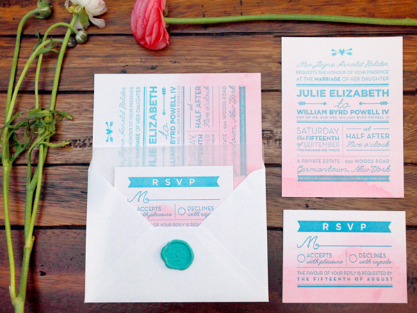
I painted over 200 individual pages of extra-thick cotton paper, then letterpress printed and trimmed them to size. The invitation was inspired by a mix of vintage and modern design, with some hand drawn components. Elements like the ribbon motif, the crossed-arrow heart, and 1920s-inspired double lines and angles, along with a mix of script and sans-serif typefaces came together to form the final design.

Pink-Aqua-Ombre-Wedding-Invitations-And-Here-We-Are4

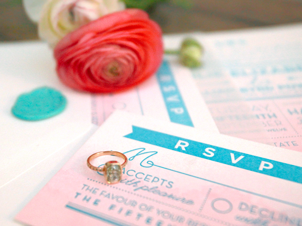
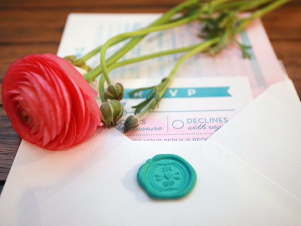
I also created a Julie and Bo ‘logomark,’ which we used on the save the dates, programs and wedding website, and also translated into a rubber stamp and wax seal. That artwork was later used on matchbooks, favors and cups at the wedding.

Pink-Aqua-Ombre-Wedding-Invitations-And-Here-We-Are3

Pink-Aqua-Ombre-Wedding-Invitations-And-Here-We-Are6

Thanks Meghan!

Check out the Designer Rolodex for more tal­ented wed­ding invi­ta­tion design­ers and the real invi­ta­tions gallery for more wedding invitation ideas!

Photo Credits: Julie Holder

Happy Weekend!

Happy Friday everyone! Do you all have fun plans for this beautiful fall weekend? We’re heading to upstate New York to visit my husband’s family for a few pre-Halloween festivities. It’s a long drive, but I know Sophie will be happy to see her grandparents and cousins! I’m heading out to make our final preparations for the trip, but in the meantime…

OSBP-Fall-Dahlias

Photo by me via Instagram

…a few links for your weekend!

This week on Oh So Beautiful Paper:

Finally, I made a little announcement on Instagram last week that I thought I’d share here as well. I’m looking to add some DIY contributors to the OSBP team! If you’re interested in contributing, click here for more details on how to apply!

Check back soon for this week’s cocktail! I hope you all have a wonderful weekend, and I’ll see you back here next week! xoxo

Nina’s Colorful Hot Pink + Turquoise Birth Announcements

As a busy working parent, I can totally relate to being behind the curve on sending out important announcements: we still haven’t sent out moving announcements after nearly 7 months in our “new” house! It may have taken these parents a while to send out the announcements for their second daughter, Nina, but they made up for the delay with these beautiful announcements from the team at Noteworthy Paper & Press. I’m loving all the bright pops of color, from the turquoise flourishes to the hot pink envelope liners!

Hot-Pink-Aqua-Letterpress-Birth-Announcements-Noteworthy-Paper-and-Press

From Taylor at Noteworthy Paper & Press: We printed these belated birth announcements earlier in the summer for Pam and Tony, who welcomed a second baby girl into their busy lives last October. Both mom and dad work full time, so the announcement took a back seat as they settled into being a family of four. The couple’s only requirement was that the card be bright and fun and they loved the idea of using the current “chalkboard art” trend as inspiration.

Hot-Pink-Aqua-Letterpress-Birth-Announcements-Noteworthy-Paper-and-Press4

Hot-Pink-Aqua-Letterpress-Birth-Announcements-Noteworthy-Paper-and-Press5

Hot-Pink-Aqua-Letterpress-Birth-Announcements-Noteworthy-Paper-and-Press3

Thanks Taylor!

Photo Credits: Noteworthy Paper & Press

Krista + Josh’s Whimsical Woodland Wedding Invitations

High school sweethearts Krista and Josh love nature, so it made total sense for Krista to draw her inspiration from the great outdoors while designing the invitations for her wedding last summer. Krista incorporated a tree, clouds, and a whimsical script font into the design, which was enclosed in a woodgrain pocket folder. Ironically, Krista and Josh had to cancel their southern New Jersey reception at the last minute due to the derecho that pummeled the East Coast last summer – you’ll definitely want to click the link below for the incredible story!

Woodland-Fairy-Tale-Wedding-Invitations-Kake-Stationery

From Krista: My husband Josh and I love the great outdoors. We camp. We hike. We got engaged on a mountain. We basically grew up in the woods, in the same small square-mile town in New Jersey: Tree City USA aka Wenonah. So naturally, the first thing that came to mind was: a tree. Little did we know that our reception would be cancelled due to a power outage from downed trees of a high wind derecho storm the night before, but that’s a whole other story.

Woodland-Fairy-Tale-Wedding-Invitations-Kake-Stationery2 Woodland-Fairy-Tale-Wedding-Invitations-Kake-Stationery3

I started with the tree and then incorporated the butterflies, hearts, clouds, and little frog prince… and a lot of color. Next came the very important part of finding a hand-script font to match, which in the end, really made our little fairytale-land come to life. Once the actual invitation design was complete, I was able to carry the look and feel to the rest of the suite: the directions, accommodations, reception and reply cards, and envelopes.

Woodland-Fairy-Tale-Wedding-Invitations-Kake-Stationery4

Woodland-Fairy-Tale-Wedding-Invitations-Kake-Stationery5

I knew from the start that I would use a natural white linen card stock, since it’s my favorite paper and has that rustic vibe. But then, I had my O-M-G moment when I found the most perfect pocket fold card stock – textured woodgrain! The final touch was tying it off with a natural green raffia ribbon and a pink paper butterfly.

Woodland-Fairy-Tale-Wedding-Invitations-Kake-Stationery8

Beautiful! Thanks Krista!

Invitation Design: Kake Stationery

Script Font: Bookeyed Suzanne

Check out the Designer Rolodex for more tal­ented wed­ding invi­ta­tion design­ers and the real invi­ta­tions gallery for more wedding invitation ideas!

Photo Credits: Kake Stationery

Happy Weekend!

Happy Friday everyone! We’re looking forward to a beautiful fall weekend here in DC, which is a welcome change after what felt like an eternity of rain last weekend. My dad and step-mom are coming to visit this weekend, so we’re looking forward to taking them to pick pumpkins at our favorite farm and checking out the fall foliage at the National Arboretum (now that the ridiculous shutdown is finally, thankfully, over). Yay! But in the meantime…

Gray-Pumpkins-Doug-McMillen

Photo Credit: Doug McMillen

…a few links for your weekend!

This week on Oh So Beautiful Paper:

Check back soon for this week’s cocktail! I hope you all have a wonderful weekend, and I’ll see you back here next week! xoxo