Behind the Stationery: Worthwhile Paper

Today’s installment of Behind the Stationery takes us to Michigan with Kristen Drozdowski of Worthwhile Paper! The beginnings of Worthwhile Paper started by happenstance when they had some extra space screen printing a poster. I’m excited for Kristen to share her unique story about how she dreamt of her business name (and it stuck!), details into her screen printing design process, what inspires her art, and her goals for 2018. Take it away, Kristen! —Megan Soh

Behind the Stationery: Worthwhile Paper

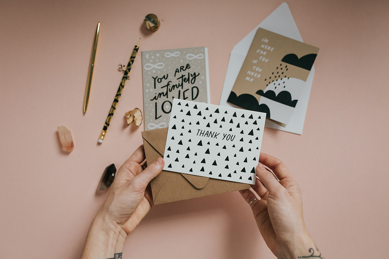
From Kristen: Starting Worthwhile Paper happened organically for me like a story of cause and effect. I first discovered my passion for making cards and smaller prints almost by accident — by using the extra space on a screen when printing a poster. There were a few inches left in the layout of a poster my husband and I were screen printing so I squeezed some little positive sayings on the side and we cut them into postcards. We took them to one of our first local craft fairs and the little positive cards went over well, but more importantly I found myself connecting with the shoppers more over the positive cards than anything else. It made me feel happy and human to make connections like that, which sparked my idea of making more cards.
Behind the Stationery: Worthwhile Paper

Shortly after, I had this dream that I had my own card line and was telling someone in my dream that it was called Worthwhile Paper. I woke up thinking it was such a dorky name, but a little later when I sat down to name my business it just held on. There is this very real idea that sometimes the things that require more thought or work are the most worthwhile things, like climbing a mountain and getting to the top, doing a really long yoga practice to get to the other side of your sense of self, or going through all of the work it takes to screen print cards! It continues to fuel my work. One of my favorite things about Worthwhile Paper is that it is a business that I get to do with my husband. It has been such an adventure for us, a designer and printer love story, and he has been supportive in so many ways along the journey – always encouraging me and helping me feel empowered as a business owner.
Behind the Stationery: Worthwhile Paper

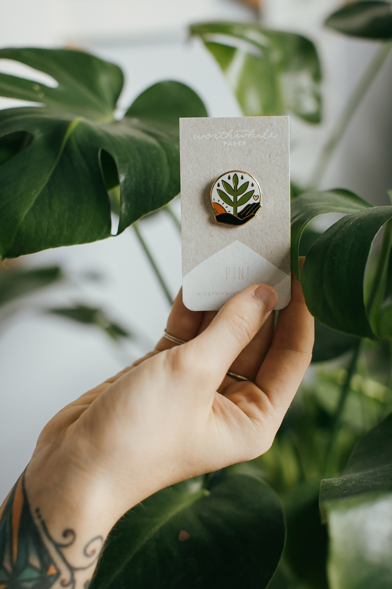
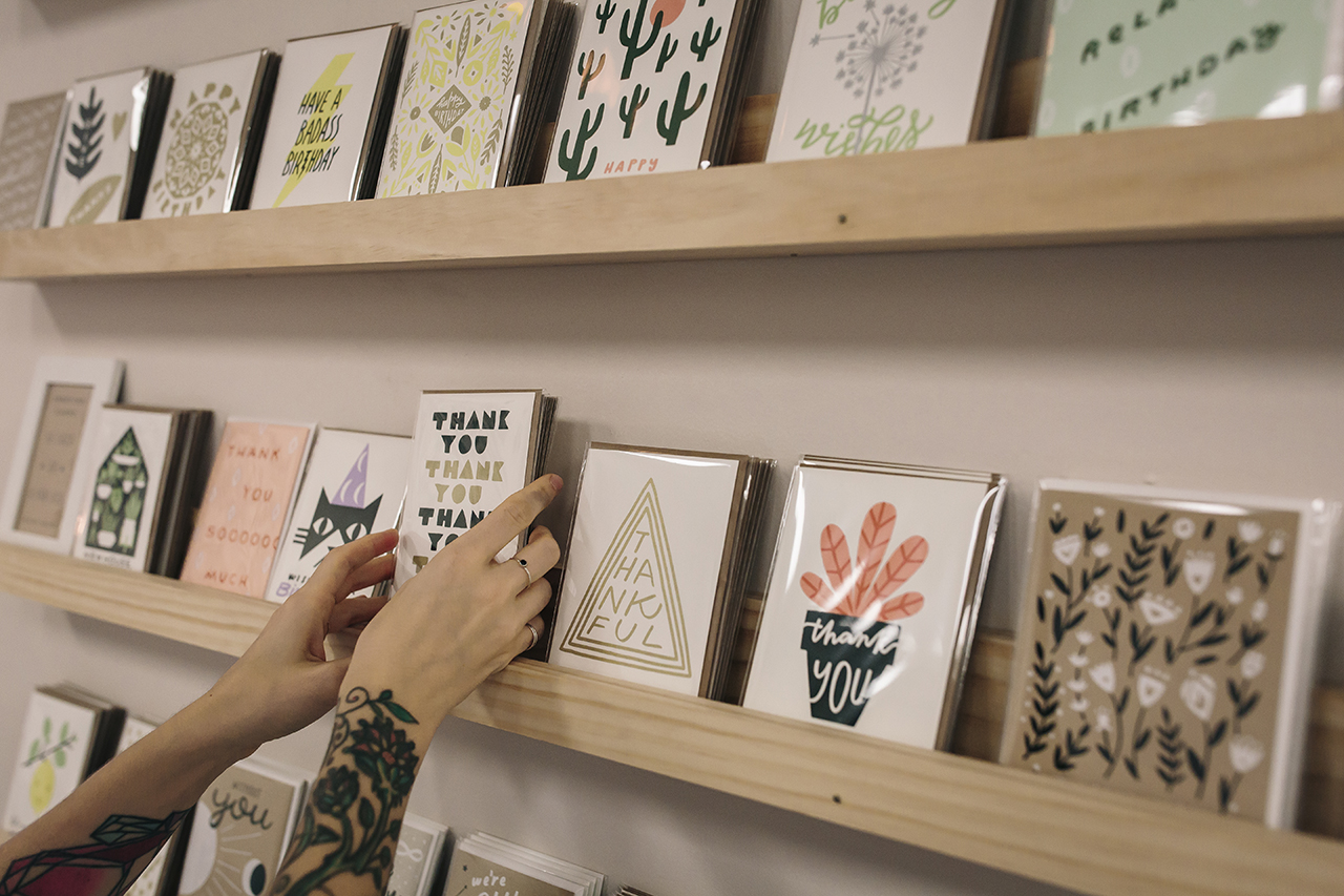
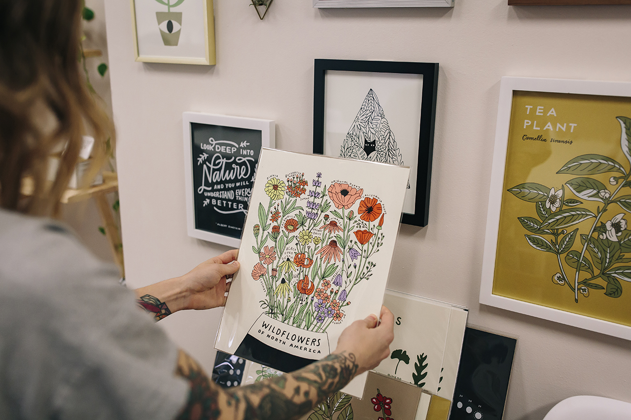
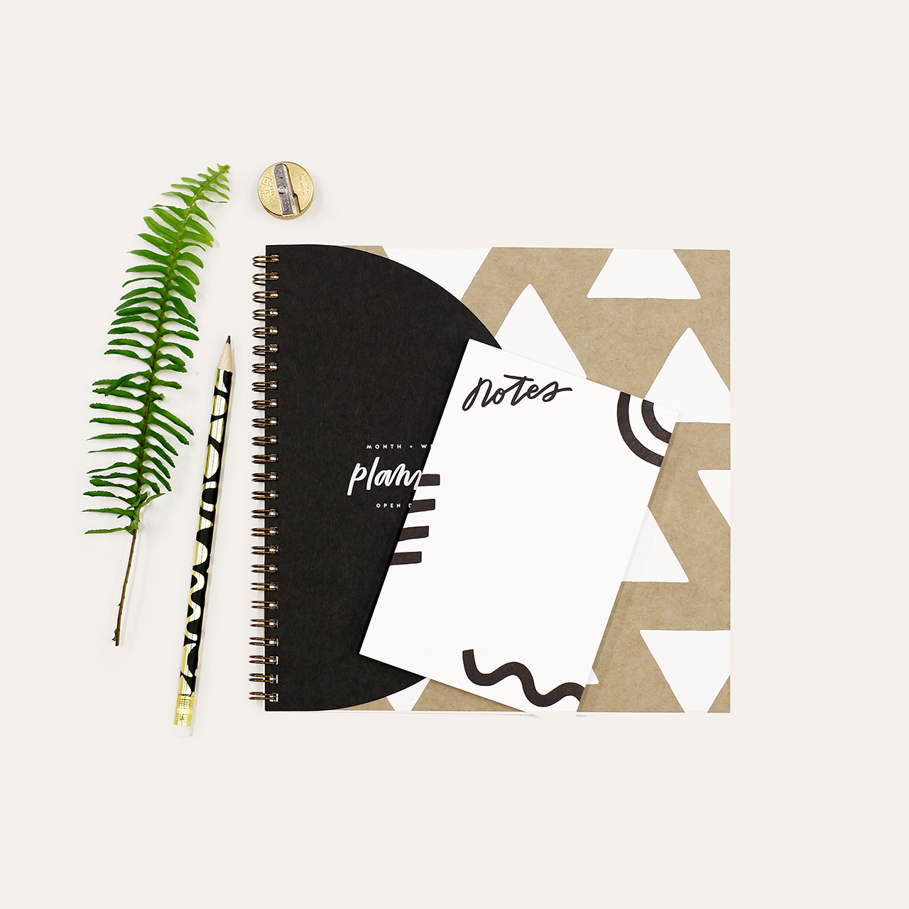
Worthwhile Paper is a collection of lively screen printed paper goods for lovers of nature, magic and meaningful design. We are a wife + husband team who love to create beautiful print work to share with others. Everything we make is drawn and lettered by hand and screen printed with earth-friendly papers and inks. Featuring a unique blend of nature and minimalism, our designs carry a goal to truly bring some positivity and love into the world through meaningful connections – whether that is a personal reconnection to nature or a connection between two people.
Behind the Stationery: Worthwhile Paper

My love for the design and print world feels like it was always here, but really took root for me in college. I was always incorporating hand drawn lettering and designs into my work and I learned how to screen print. Finding this path was more of a process of elimination and discovery than anything else – I had so many interests when it came to what I wanted to do with my design background and I tried to explore them all. At one point, I had two part-time jobs (both in the design industry) and on the side I was taking on freelance design jobs, doing calligraphy for wedding invitations, designing gig posters, and exploring more with personal side projects. But as my schedule shifted after becoming a mom I became stressed in keeping up with everything and I slowly and intentionally started dropping away from the types of work I was offering starting from my least favorite, and eventually dedicated myself to pursue Worthwhile passionately and fully.
Behind the Stationery: Worthwhile Paper

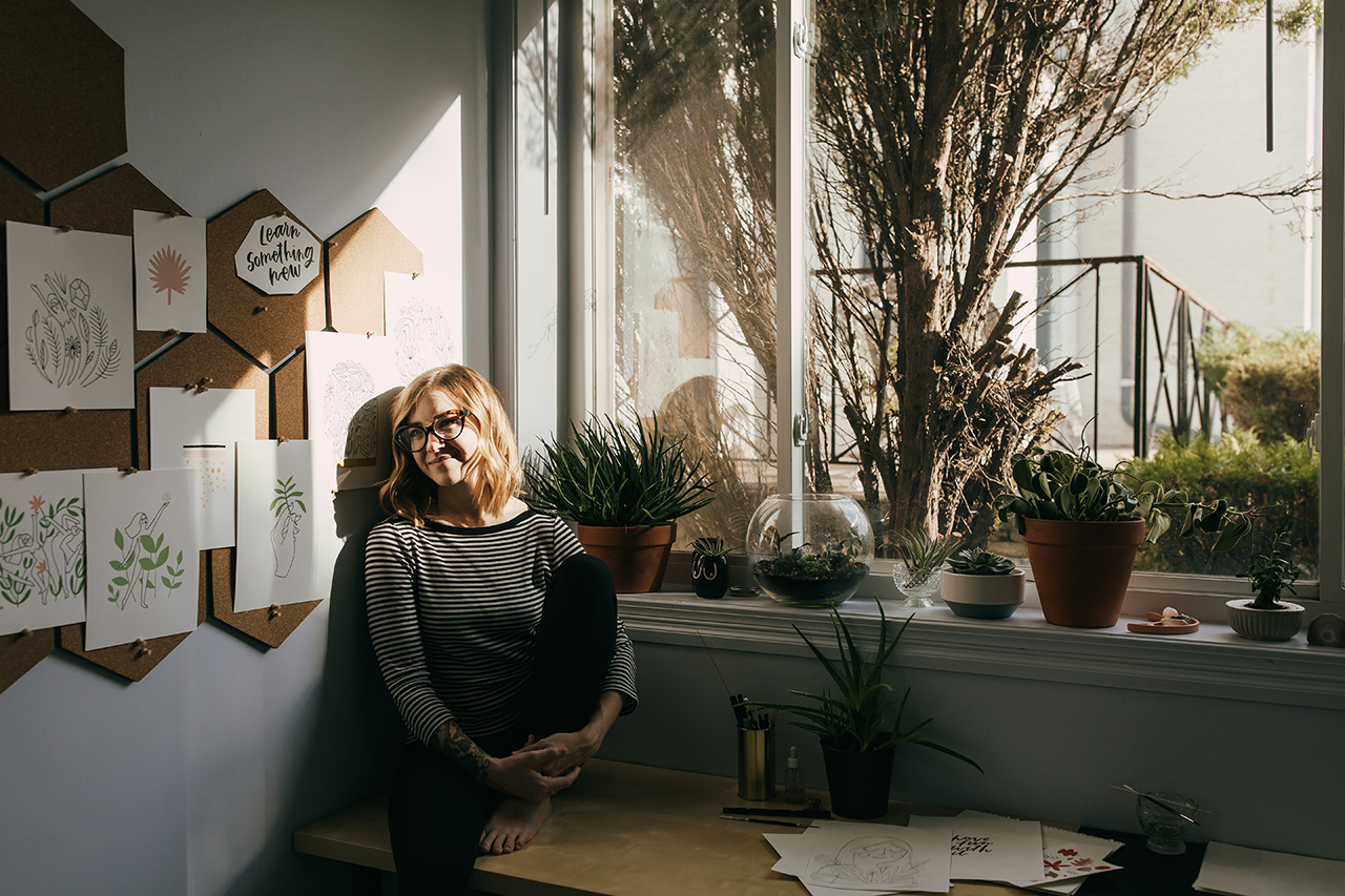
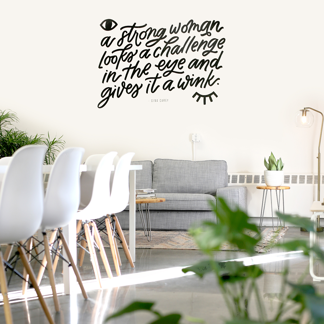
Last summer I made the exciting jump to move Worthwhile out of our house and into its own separate space. I found this amazing building nestled in between houses hiding behind pine trees and a wooden fence — so, not quite a store front but not totally hidden either. I walked inside this place and immediately felt at home. Sprinkled with windows with natural light pouring in and the perfect shade of warm white paint on the walls, it was practically made for us, and at this point I am still in denial that I actually get to work here. Inside lives my drawing studio, office, our wholesale inventory and shipping area, and a large area in the middle that during non-working hours we call “The Guest Room” – our workshop space.
Behind the Stationery: Worthwhile Paper

We have been hosting a variety of creative workshops here including my own design and lettering workshops as well as other crafty events for beginners like weaving, macrame, and terrariums. We’ve been having open shop events and appointment based shopping hangouts with local customers too, and it has been so fun to be able to have a physical space to bring people together. It excites me! Where we print is not a far trek — just down the road is VGKids, the screen printing shop my husband co-owns. They screen print a variety of wonderful things but their specialty is large scale art posters and tee shirts. We print all of our own things there when a press opens up or on the weekends.
Behind the Stationery: Worthwhile Paper

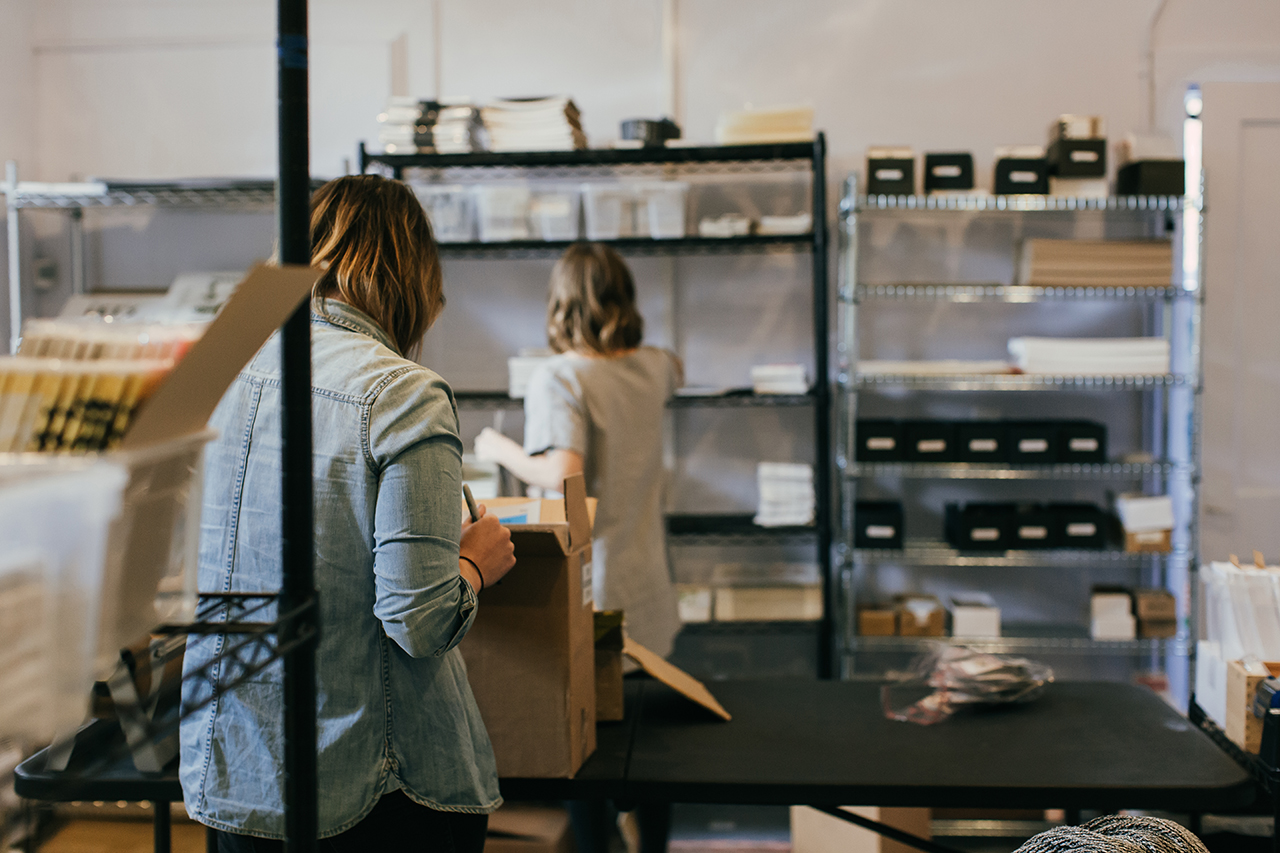
During the day at the studio I am usually either drawing, finishing designs on my computer, making layouts, attending to emails, bookkeeping, taking styled photos for social media, and making tea (and then forgetting about it until it’s too cold). I have a few super amazing women working for me too, to help with managing our wholesale accounts, updating spread sheets, pulling orders and packaging our items. I am so grateful to have a team, I couldn’t keep up at this point without them.
Behind the Stationery: Worthwhile Paper

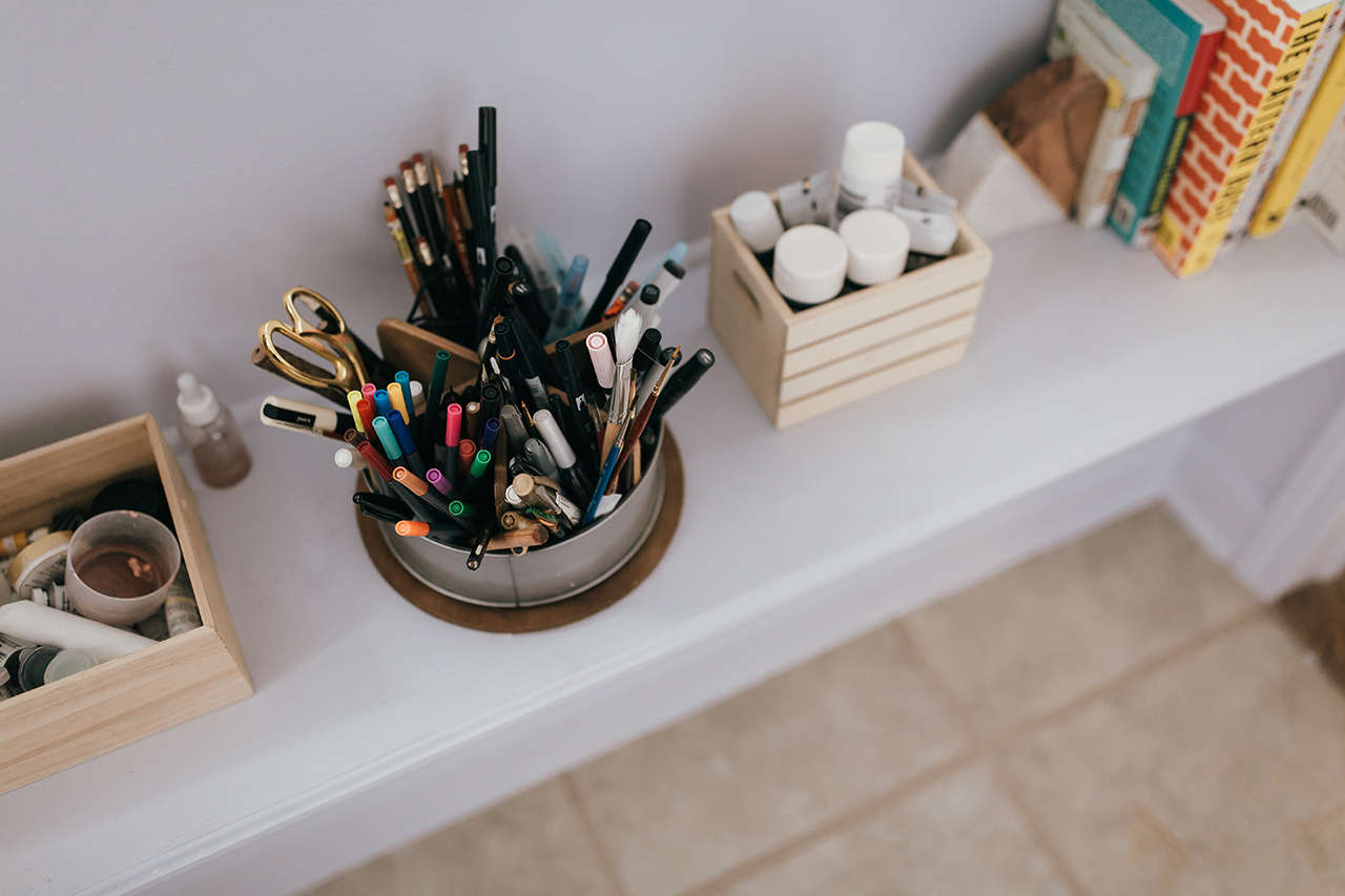
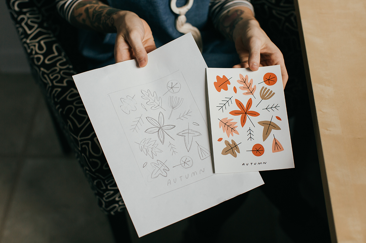
I am always thinking of ideas. Sometimes when I start a design, it feels like the end of a process instead of a beginning because the idea may have been living in my head for a whole year or so! If you spied on my phone and went through the notes app, you would find hundreds of one line ideas or phrases that pop into my head that I jot down there. (I’m guilty as ever for using my phone instead of a notebook, don’t send the paper police). Once I’ve reached the point where I want to start bringing some ideas to life, I will start with small, very fast thumbnail sketches. This allows me to get the ideas of how I want a design layout to be quickly without judgement about details.
Behind the Stationery: Worthwhile Paper

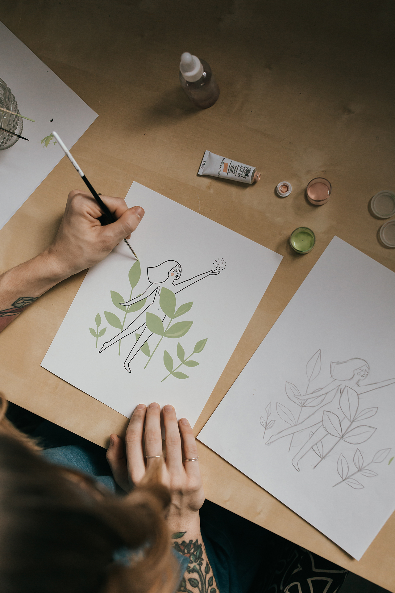
Then, I work up toward a more finalized design in pencil, using a light tablet to trace over and make revised copies until I get to an original that I draw either with black ink or a combination of black and colored gouache paint. Sometimes if I am working with multiple colors I like to make separate layers because that is how my screen printing brain works, and then I scan everything in, make the final layouts and choose ink colors via the Photoshop Pantone matching system, which is how we determine our screen printing inks.

My design process is usually a very fun and fulfilling challenge. Lately, bringing a collection together has become more slow and organic rather than strategic. For the collection of art prints that will come out soon for spring, I started by simply sitting down and drawing what I liked and wanted to explore. After I had a substantial amount of work, I laid it all out in front of me and chose what I wanted to keep and what I wanted to make out of it. To start, I usually draw from multiple points of inspiration. This ranges from inspiration from nature to deep inspiration that stems from feelings, or sometimes it’s more obvious inspiration from my existing work (maybe I tried something once and want to expand upon it, or there is a certain color palette I want to use more, or a theme/direction I want to pursue further). All in all, the inspiration that I find the most meaningful are my day to day interactions and emotions.
Behind the Stationery: Worthwhile Paper

Phrases in my cards may have started as something I said out loud, wrote in a note once to someone, or something I wrote in my journal. It is really important to me that my approach as an artist who makes material things for sale isn’t centered around what I think will make me the most money or based on the most popular on-trend thing. When I am designing, I want it to feel real, so I always ask myself things like, “Who in my life would I send this card to right now? Where in my house would I hang this print? What would I use this notebook for?”. If the answer is nothing or nobody, than I scrap the idea. If I don’t want to use it, how can I assume anyone else will? It’s an easy game of “do I like this or do I not?”.

If I am being honest, the fact that anything I make resonates with anyone and makes them smile or feel happy truly feels like a gift. Sometimes I can’t believe that this is what I get to do for a living, and I am excited to continue growing and learning.
Behind the Stationery: Worthwhile Paper

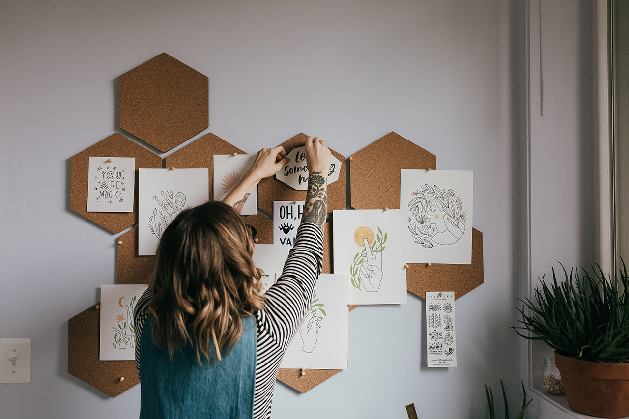
The business end of this is fun and all, but I live for the times I am able to turn away from my computer and phone and just zone into the creative abyss in my plant-filled studio where engaging with technology is not allowed (unless you count my light tablet for tracing). I almost never even have a light on because the window light is my best friend. One of my struggles is wishing I had more time to just make art for art’s sake and explore creativity. It is so hard to break away from the mindset of making art that gets turned into a product. I have this deep desire to just make to simply make, to explore and use making as a way to learn things about myself and dig deep, but part of me feels this fear of not even knowing how to anymore.
Behind the Stationery: Worthwhile Paper

I know that even if I lived in a cave in the middle of nowhere I would find a way to make something and share it with someone. Maybe the desire to share is just something we have as humans, and it’s not all that bad. Nevertheless, I am really feeling a nudge to create more space for exploration and fun in the new year. I’ve been getting back into painting and I just installed a mini screen printing setup in the corner of my drawing studio. (Since we print in larger quantities of our products right now with legitimate professional equipment, I haven’t printed something by myself in years). In 2018, I’m looking forward to getting messy, and reuniting myself with the roots of my love for screen printing, and of course continuing to find inspiration for my card and print designs.
Behind the Stationery: Worthwhile Paper

Photos by Heather Nash Photography.

Want to be featured in the Behind the Stationery column? Reach out to Megan at megan [at] ohsobeautifulpaper [dot] com for more details.

Classic Neutral Italian Destination Wedding Invitations

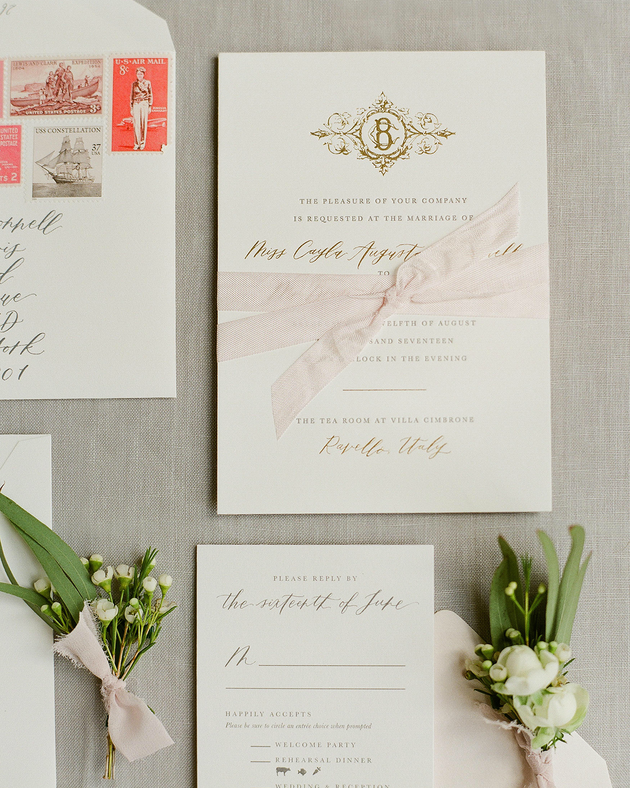
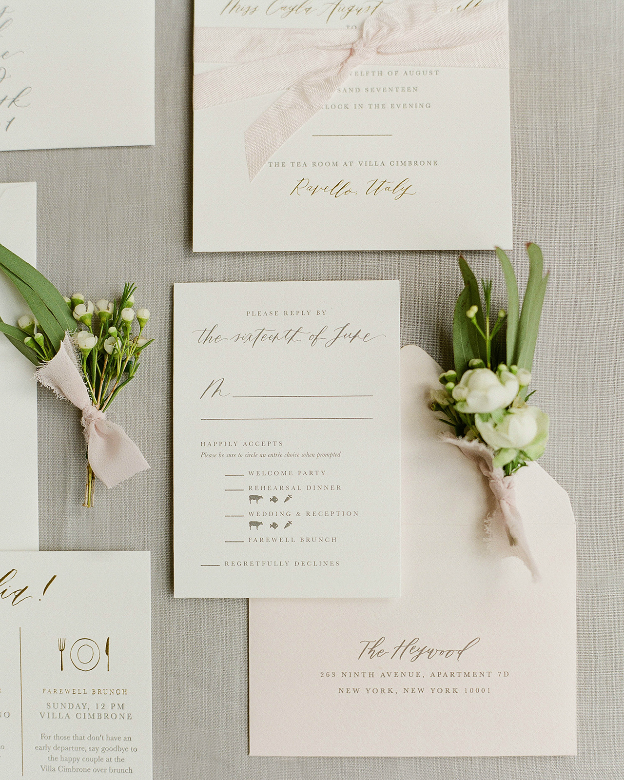
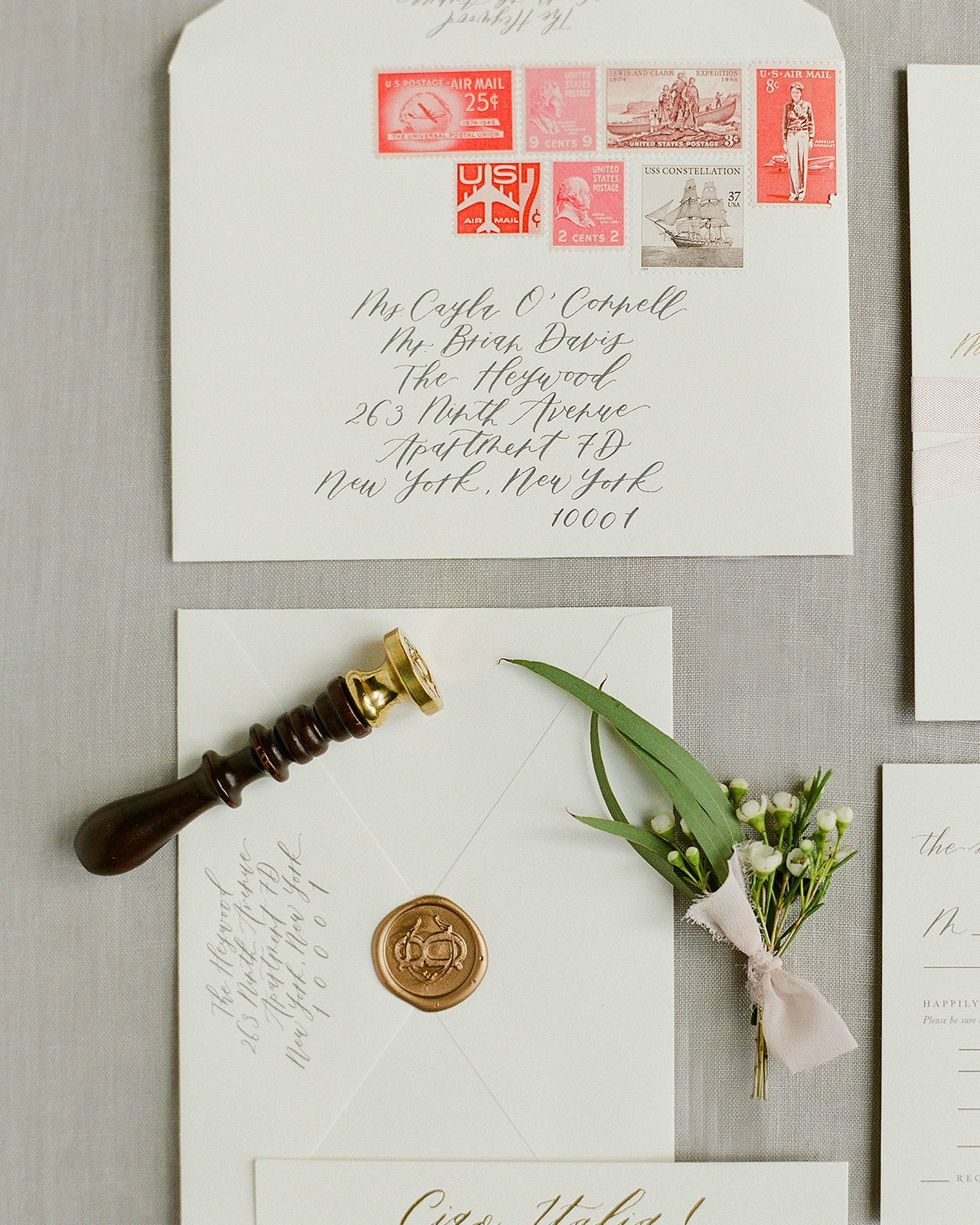
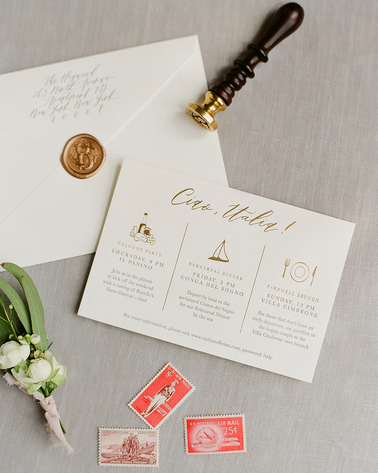
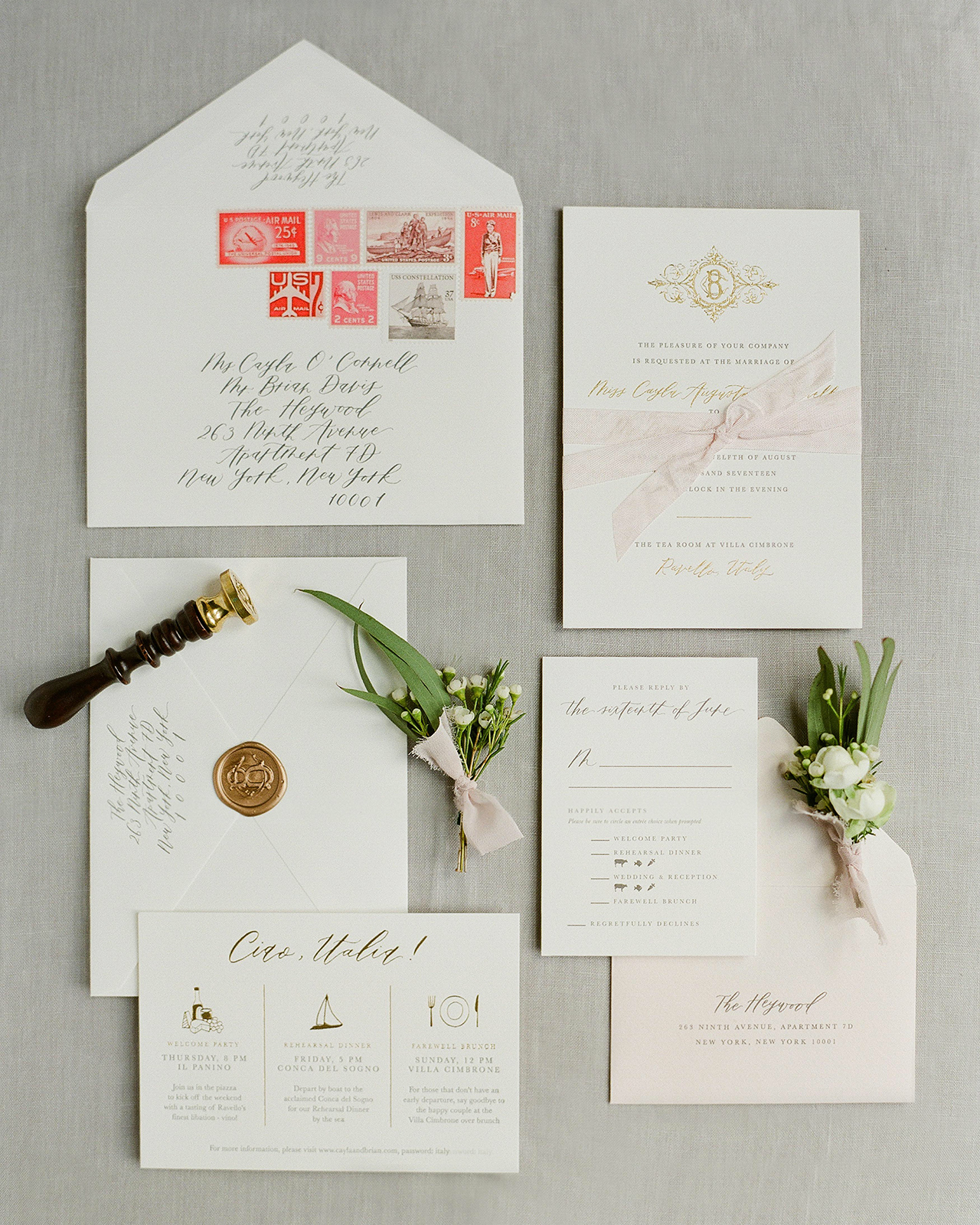
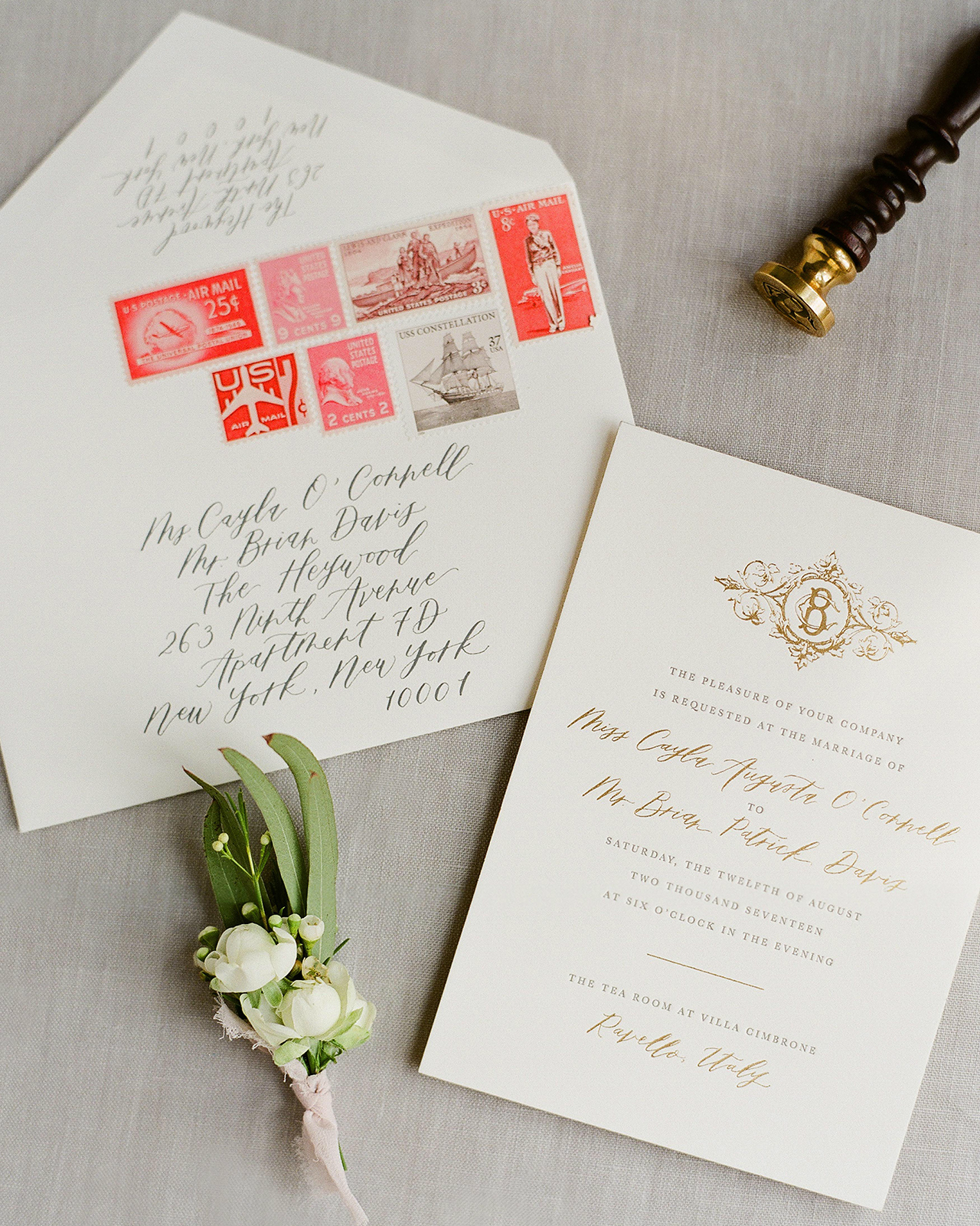
The invitations from Rachel Kim of Fourteen-Forty include all the goodies: hand calligraphy, a wax seal, gorgeous vintage stamps, and spot illustrations. The classic and clean neutral palette with pops of blush and gold is the perfect choice for these Italian destination wedding invitations. Clean, classic, and executed to perfection!

Classic Neutral Italian Destination Wedding Invitations by Fourteen Forty

From Rachel: Cayla and Brian celebrated the end of summer with their friends and family by planning a destination wedding in Ravello, Italy just above the Amalfi Coast. Ocean views and traditional Italian architecture made this wedding one of the most beautiful weddings we’ve ever seen!

Classic Neutral Italian Destination Wedding Invitations by Fourteen Forty

Classic Neutral Italian Destination Wedding Invitations by Fourteen Forty

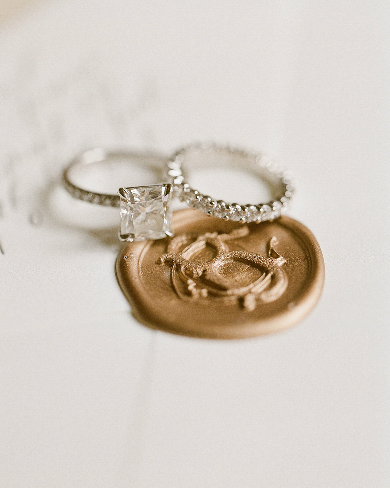
Cayla and Brian wanted to keep a neutral palette with touches of blush and gold here and there. After their very first meeting us, it was clear that their invitations would include all of our favorites: hand calligraphy, a wax seal, and vintage stamps. In keeping with the elegance of their venue, we went with a double thick letterpress invitation complete with gold edge painting for a little something special. To top it off, we designed a beautiful monogram using their first initials and tied all the pieces together with a blush ribbon. We like to think that any type of wrap whether it’s made of vellum, string or a bellyband makes guests feel like they’re unwrapping a present!

Classic Neutral Italian Destination Wedding Invitations by Fourteen Forty

Classic Neutral Italian Destination Wedding Invitations by Fourteen Forty

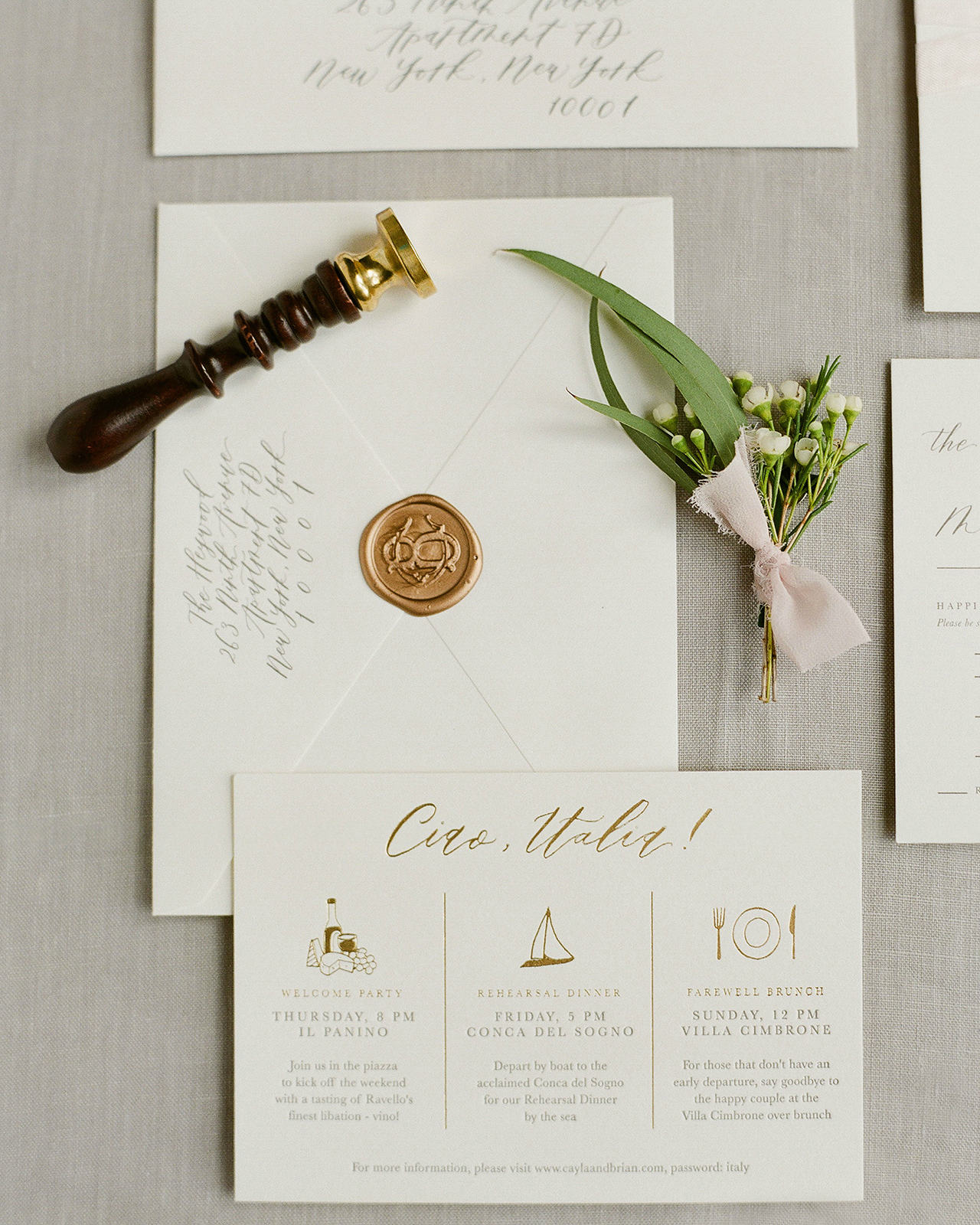
For their main envelope, we sourced a variety of travel inspired vintage stamps in shades of pink, red and burgundy. In addition to charcoal ink calligraphy, we sealed every invitation in our classic gold wax. As much as we love all the other colors we offer, you can’t go wrong with a gold seal!

Classic Neutral Italian Destination Wedding Invitations by Fourteen Forty

Classic Neutral Italian Destination Wedding Invitations by Fourteen Forty

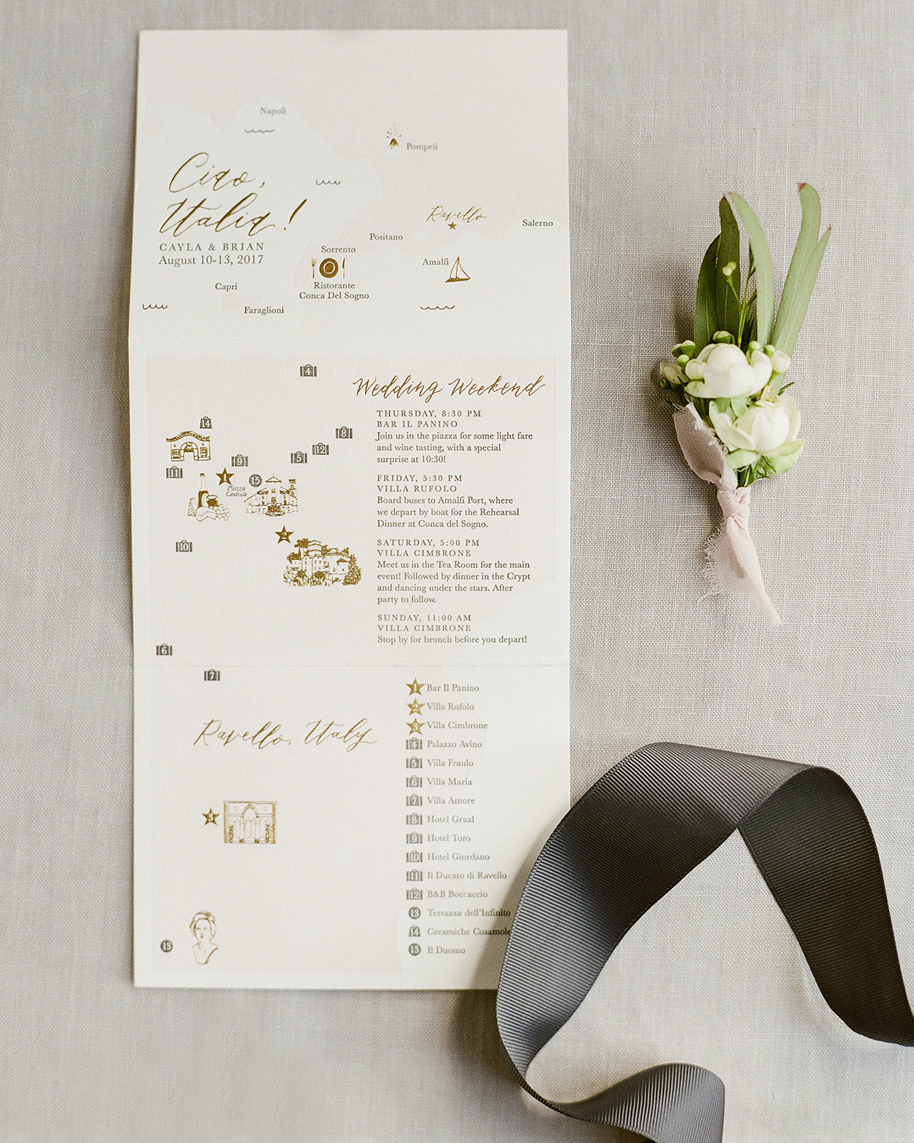
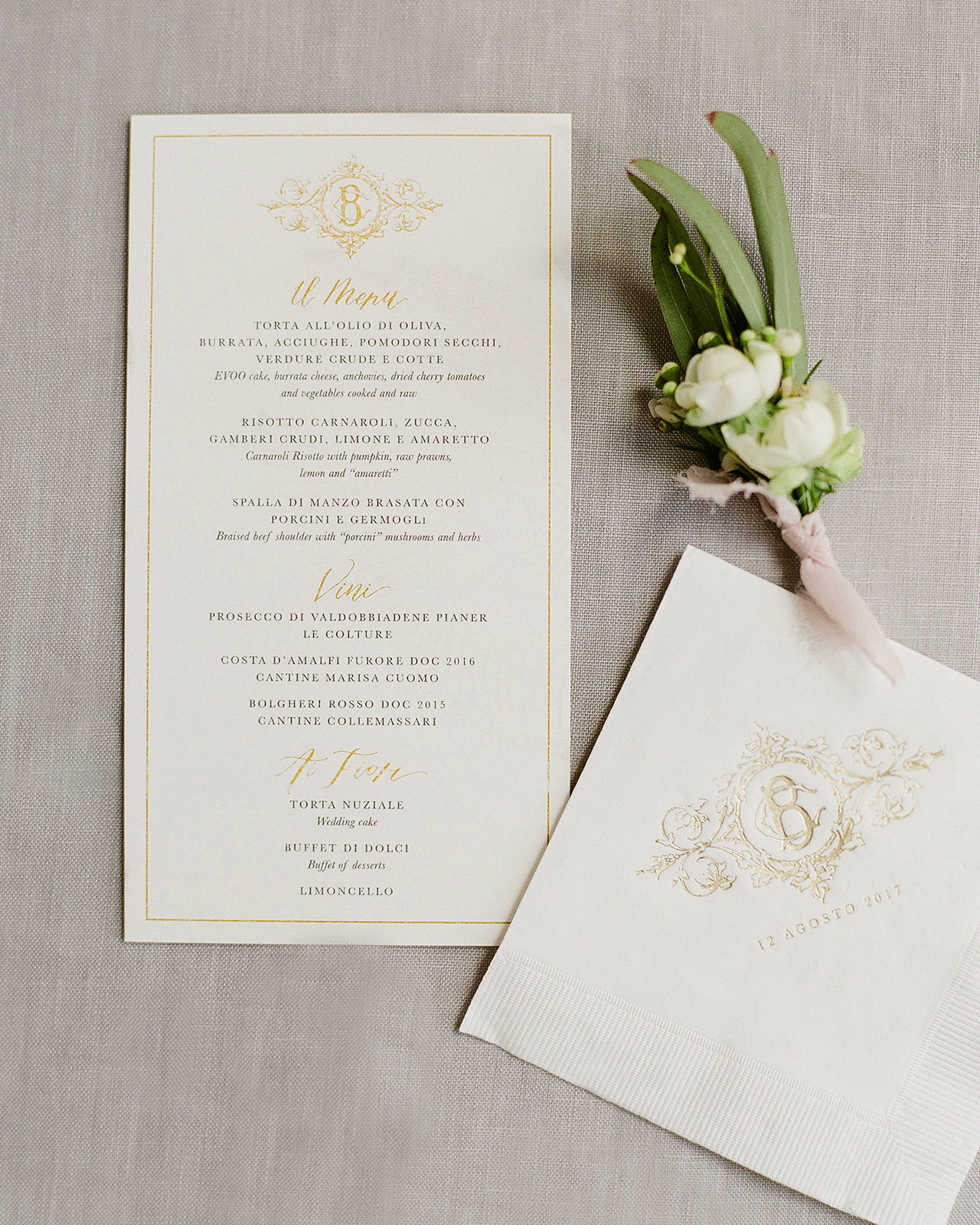
Day-of pieces like menus, programs, napkins, matches and welcome notes are opportunities to have a little more fun, especially for a more classic wedding. We always recommend a map and events card to our clients getting married abroad. They’re a great way to get your guests excited about the trip ahead! Cayla and Brian fell in love with our accordions and so we designed two different maps; one that gave guests a general idea of where Ravello is and another that combined the weekend events, transportation details, and hotel options.

Classic Neutral Italian Destination Wedding Invitations by Fourteen Forty

Classic Neutral Italian Destination Wedding Invitations by Fourteen Forty

Thanks Rachel!

Design: Fourteen-Forty
Planning: Exclusive Italy Weddings
Calligraphy: Papersoul

Check out the Designer Rolodex for more tal­ented wed­ding invi­ta­tion design­ers and the real invi­ta­tions gallery for more wedding invitation ideas!

Photo Credits: Greg Finck

Happy Weekend!

Happy Friday everyone! We made it through the first FULL week of the year! Before I get to this week’s links, if you haven’t already – please take a couple minutes to fill out our 2018 Reader Survey! We use the survey to help determine our content for the year (and beyond!), so your input is enormously helpful. And after you complete the survey, leave a comment on this post to enter to win a pack of stationery from me! Yay! But in the meantime…

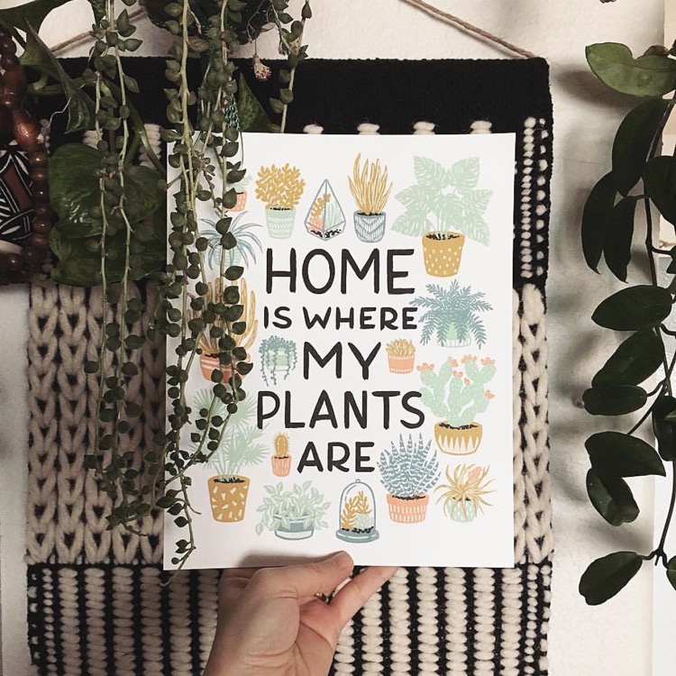
Home is Where My Plants Are / Wild Hart Paper

Image from Ms. Vintage Nicole via Wild Hart Paper in #dailydoseofpaper

…a few links for your weekend!

Serena Williams on marriage and being a new mom. My favorite line: “I think sometimes women limit themselves. I’m not sure why we think that way, but I know that we’re sometimes taught to not dream as big as men, not to believe we can be a president or a CEO, when in the same household, a male child is told he can be anything he wants. I’m so glad I had a daughter. I want to teach her that there are no limits.”

Totally obsessed with this gorgeous tassel chandelier

Feeling the love for neutral vintage rugs

10 of the world’s most beautiful road trips (who wants to go with me?)

These blush pink dining chairs are so pretty – I wish I needed new chairs!

Interesting: Facebook says it will start showing more content from friends and family, less content from brands and advertisers. What do you think? Is this a move in the right direction?

This modern cut glass decanter would look so lovely on any bar cart

The holidays may be over, but that won’t stop me from enjoying this mulled latte (it sounds delicious!)


This week on Oh So Beautiful Paper:

Glamorous mixed metals wedding invitations

Behind the Stationery with Baltic Club

Did you sign up for the Blueprint Model 2018? Let me know!

Beautiful first birthday party invitations inspired by The Little Prince

So much inspiring calligraphy from Hello Maurelle

Don’t forget to take our 2018 Reader Survey!


That’s it for me this week! I hope you have a wonderful weekend, and I’ll see you back here next week! xoxo

Behind the Stationery: Baltic Club

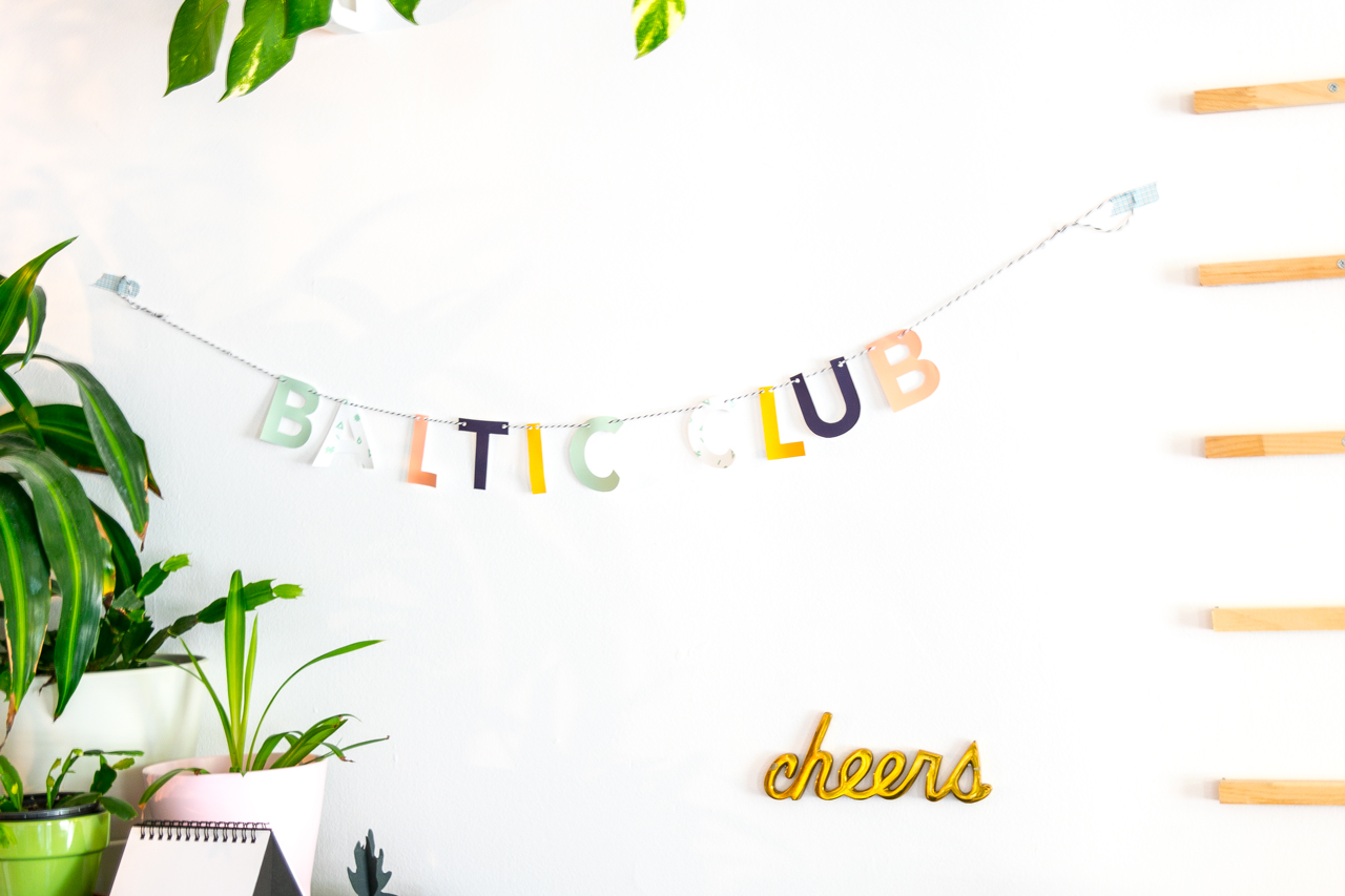
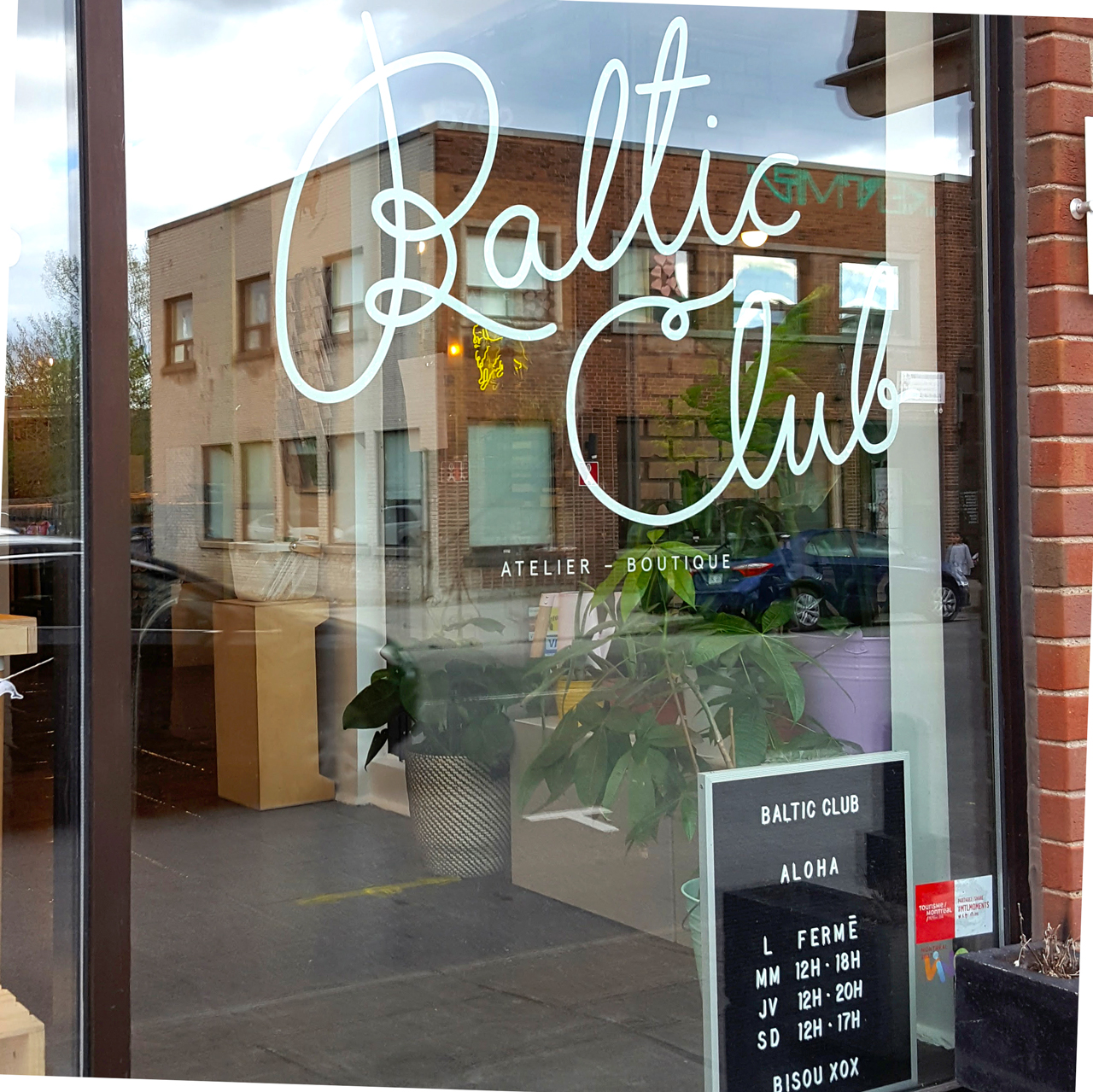
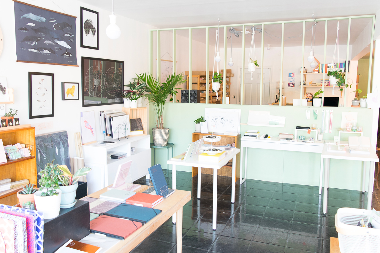
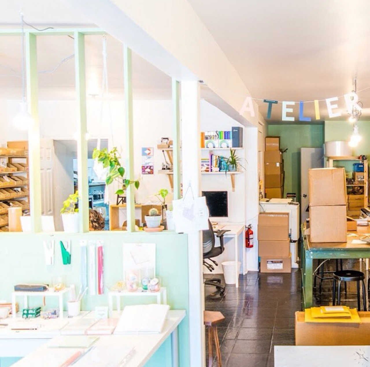
Happy 2018! We’re kicking off the new year with the duo Baltic Club based in one of my favorite neighborhoods in Montreal, Canada! Melanie and Brice transitioned from advertising into the stationery world and, since they began in 2014, they’re now to be the only fully vertically integrated stationery design studio in Eastern Canada. Their colorful studio is split into 3 areas: a workshop, retail shop, and back studio. Here to share their behind the stationery story is Brice! — Megan Soh

Behind the Stationery: Baltic Club

From Brice: Melanie and I met in 2013 in Montreal, Canada, in an advertising agency where she was Art Director and me, the Production Manager. We instantly connected because we share the exact same universe deep in our souls, plus Melanie is the funniest and talented person I’ve ever met in my life. Even in the first few weeks, we already shared about creating something but at this time, it was a more around a puff cream specialty gourmet bakery. A couple of months later, I had to quit my job and left Canada for personal reasons and, in a total upsurge of YOLO, Melanie quit her job too in order to join me and travel across Europe.

Behind the Stationery: Baltic Club

Behind the Stationery: Baltic Club

When we came back in Montreal, we had no job and no money so we founded our own design agency named Glasgow Studio, in which we had a lot of fun. Baltic Club was only a side project at this time but we enjoyed the freedom it brought us compared to the branding deadlined projects of the agency. We gave ourselves 12 months to turn Baltic Club into our main activity and stop all the rest. We succeeded in a bit less than 12 months and learned so much along the way.

Behind the Stationery: Baltic Club

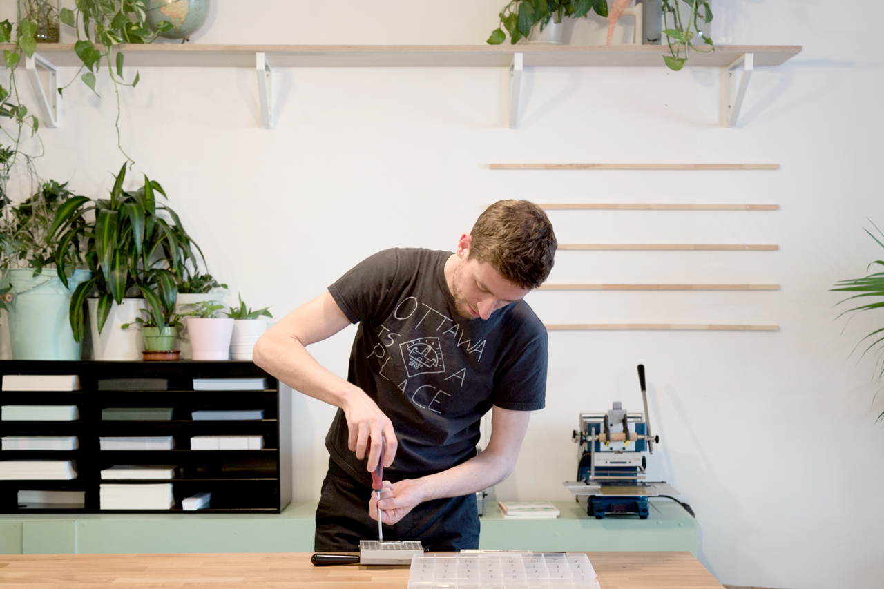
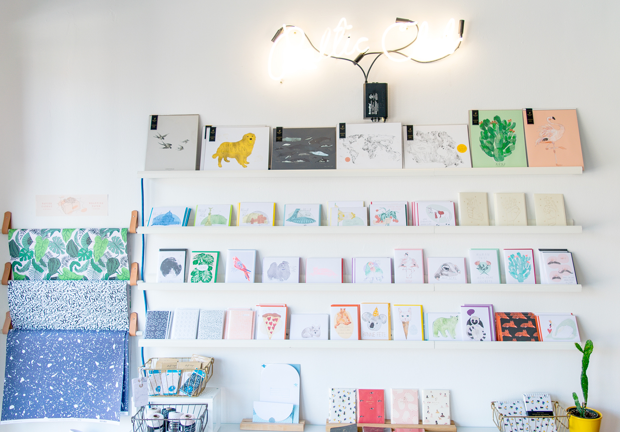
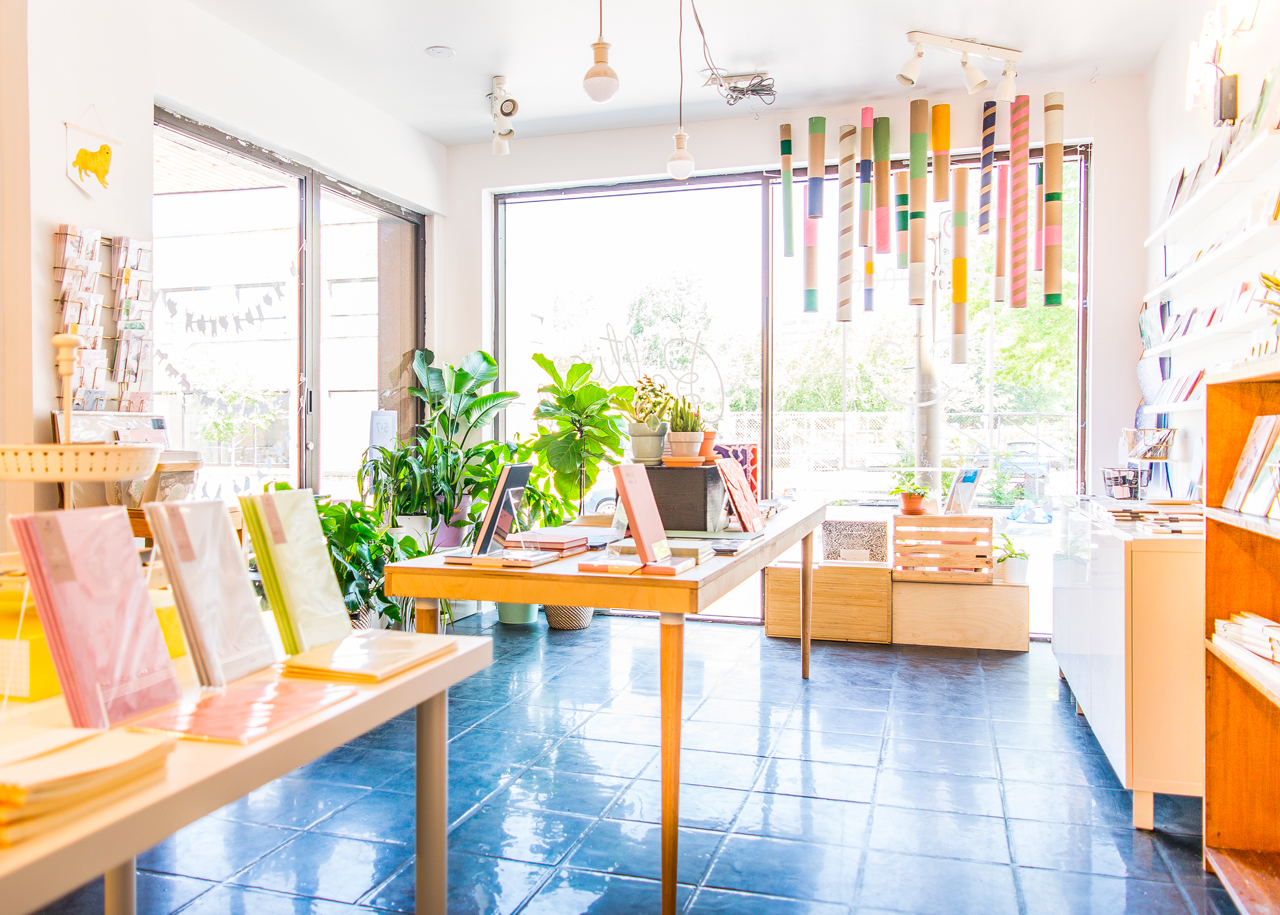
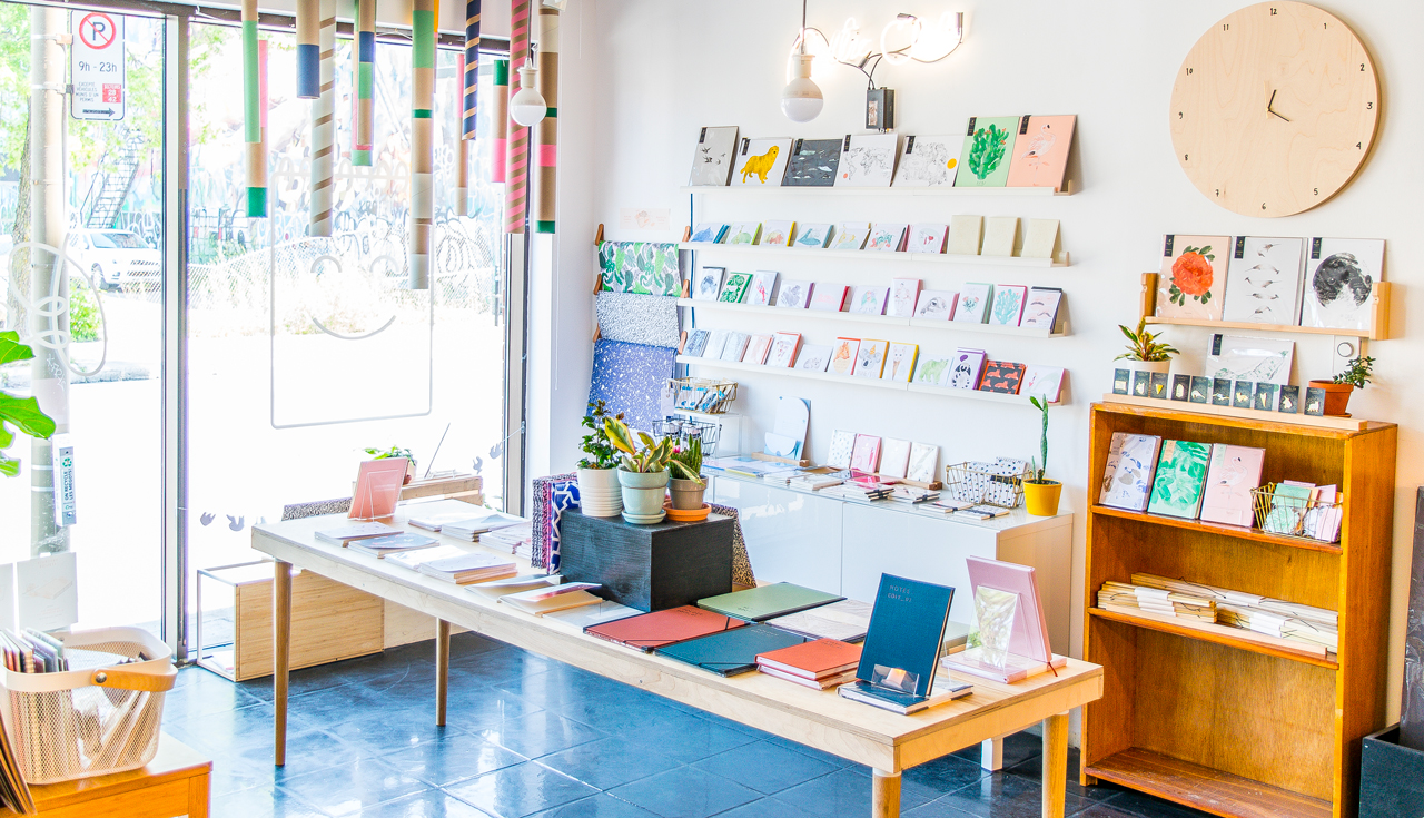
We’re based in Montreal — a beautiful laid back metropole of Eastern Canada and our workshop is located in the heart of a very trendy area named the “Mile-End”. Since the time when we worked from the living room table of our apartment, we’ve moved 5 times in 3 years until we found the beautiful space where we are today. A vast back-store allows us to stock paper and host our homemade photoshoot studio.

Behind the Stationery: Baltic Club

The front part is divided into 2 open spaces: the workshop itself and the shop where the public can visit and interact with us and purchase our freshest products 7 days a week. We chose to sell our products almost exclusively with complementary items like pens or paper clips. The selection is made in a way that we have a unique selection of items that you can’t see anywhere else in town. Of course, Melanie did all the setup and the decoration, making this place gorgeous and so pleasant to work in.

Behind the Stationery: Baltic Club

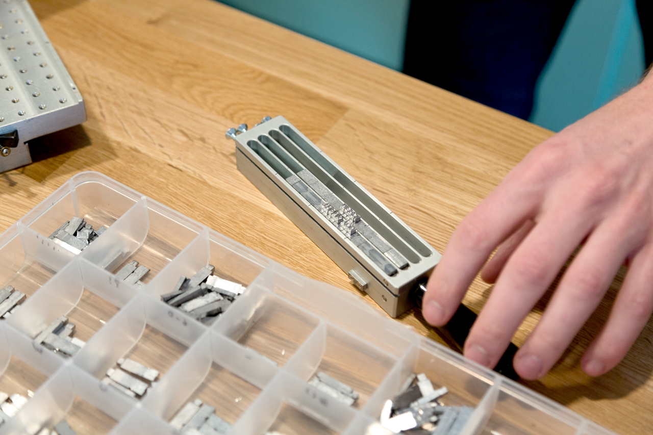
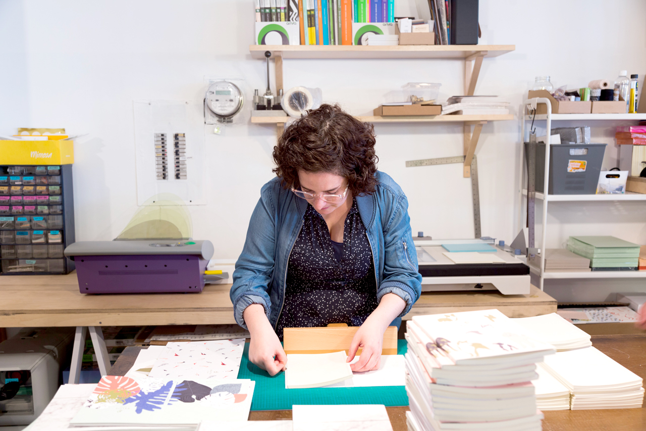
Our approach has always been to grow by ourselves so we began to buy our own equipment early on in our history. For instance, we recently had the opportunity to acquire a Risograph to explore new countries in terms of printing processes along with inkjet, numeric or offset printing we already use on a daily basis. “Charlene”, our hot foil stamping machine, “Billy” the corner cutter, or “Gordon”, our industrial blades are fantastic additions that allow us to create with even more fun, inspiration and flexibility. Oh, yes, we give names to our machines because we believe that they all have their own personality. Some of them even have eyes drawn on. Today, a lot of design companies, even stationery ones, come and see us in order to make their production. We are proud to be the the only stationery company in Eastern Canada capable of designing, printing, binding, packaging, selling our own products…at the same place!

Behind the Stationery: Baltic Club

Melanie and I are both as much into production methods as we are in design, hence we just can’t prevent ourselves from trying new printing or binding techniques as well as design orientations with the care of keeping an harmonious unicity.

Behind the Stationery: Baltic Club

We work a lot. We don’t feel like it’s really “working”, but we work from early in the morning to late at night. It’s more like living the life we always wanted to dream, enjoying each moment with excitement and dedication. In the morning, we concentrate more on the global picture and marketing moves before we reach the workshop for the opening to take care of our employees and support them in their tasks. We also pretend to be productive (ha!) but we need to be a bit more isolated for that. Phone calls, emails, basic design tasks, production follow ups are our 9 to 5 occupations. When everything turns calmer at the end of the day, we dive into administrative work and the most important design matters, sometimes until 10 or 11 without even noticing it. And, as a “mind purifier,” we fantasize about new projects we could invest our passion in, all along the way.

Behind the Stationery: Baltic Club

Nature documentaries are an infinite source of inspiration. We find them so interesting and always mind blowing! We also found out that when we add a touch of edginess and humour to the roughness and sincerity of what surrounds us, we usually obtain poetry, softness and strength at the same time. Our creative process often begins with a concept, emerged from this massive source of wonder that Melanie turns into something magical in just a couple of hours.

Behind the Stationery: Baltic Club

It is very rare that we come back on a design because we don’t like it and, for the vast majority of them, we use them on multiple supports. The most complicated things we face today is definitely the lack of focus due to multitasking and the cash flow management to support our self-generated growth. Having employees is a huge challenge too but since last summer, we are lucky to have a legendary team with us, relieving us from a significant pain.

If we had to sum up the meaning of Baltic Club’s sprit, we could say that our plan is to create even more each day and try to inspire with the willingness to becoming better humans at the same time.

Behind the Stationery: Baltic Club

All photos courtesy of Baltic Club.

Want to be featured in the Behind the Stationery column? Reach out to Megan at megan [at] ohsobeautifulpaper [dot] com for more details.
Best of 2017: DIY

For our next look back at favorite posts in 2017, I’m recapping some favorite DIY projects from the year! 2017 was a bit of a transition year for me; up until now I’ve always focused on smaller scale DIY projects since I photographed everything in my home office – which presented quite a few space and logistical challenges! Now that I have Common Room Studio, I’m excited to move towards larger party inspiration posts in addition to smaller DIY projects. Here are a few favorite projects from the year!

DIY Hologram Foil Ornaments

Photo Credit: Meghan Marie Photography

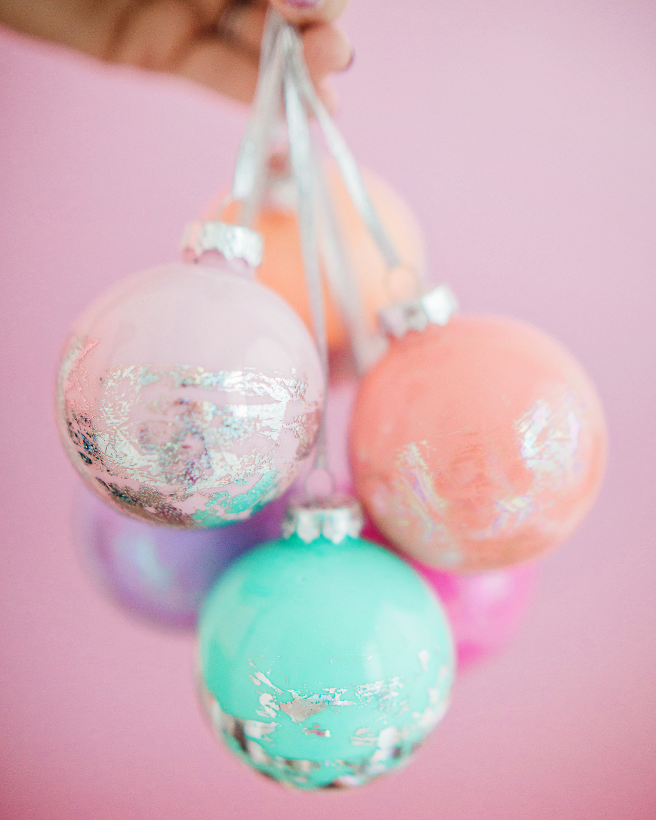
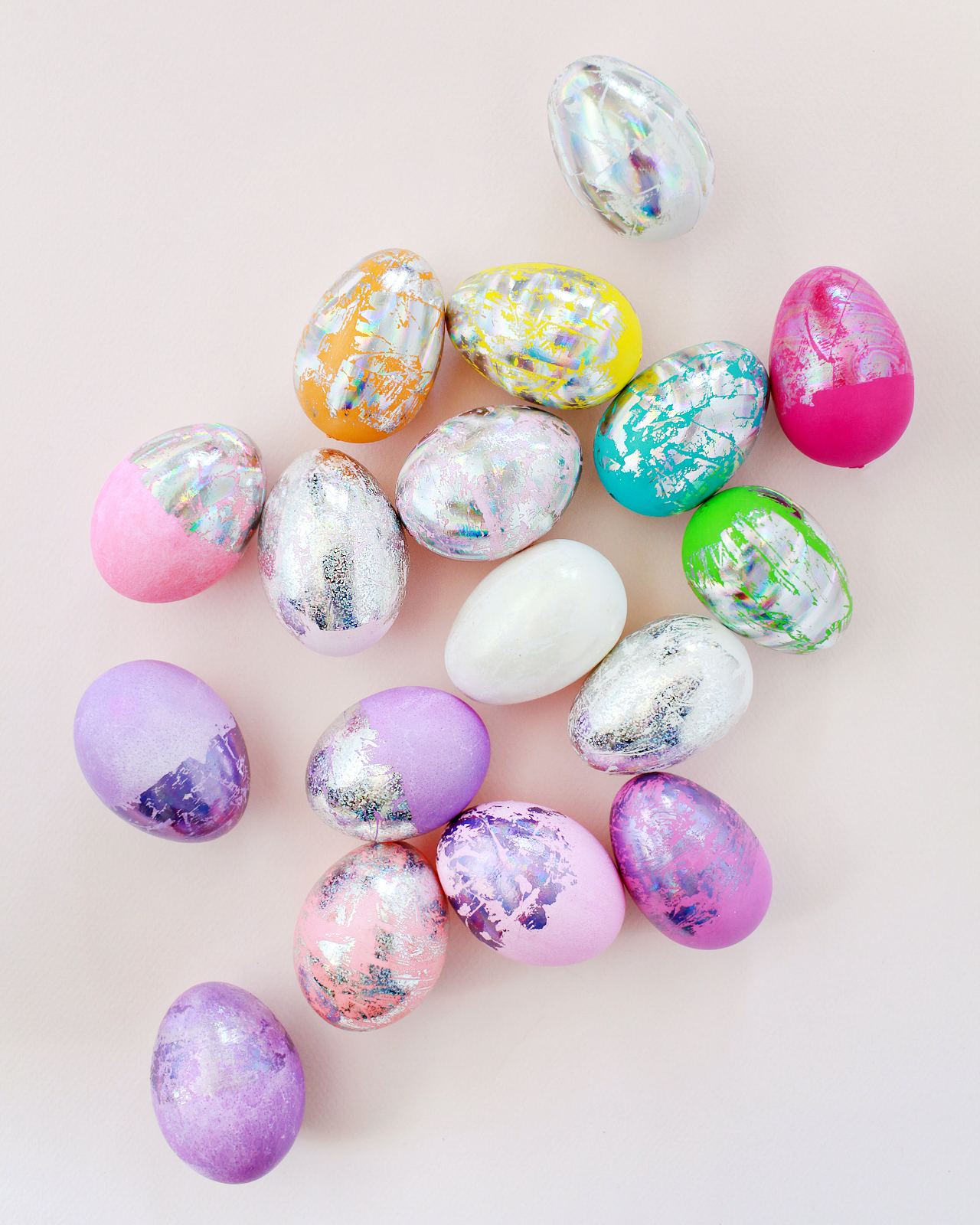
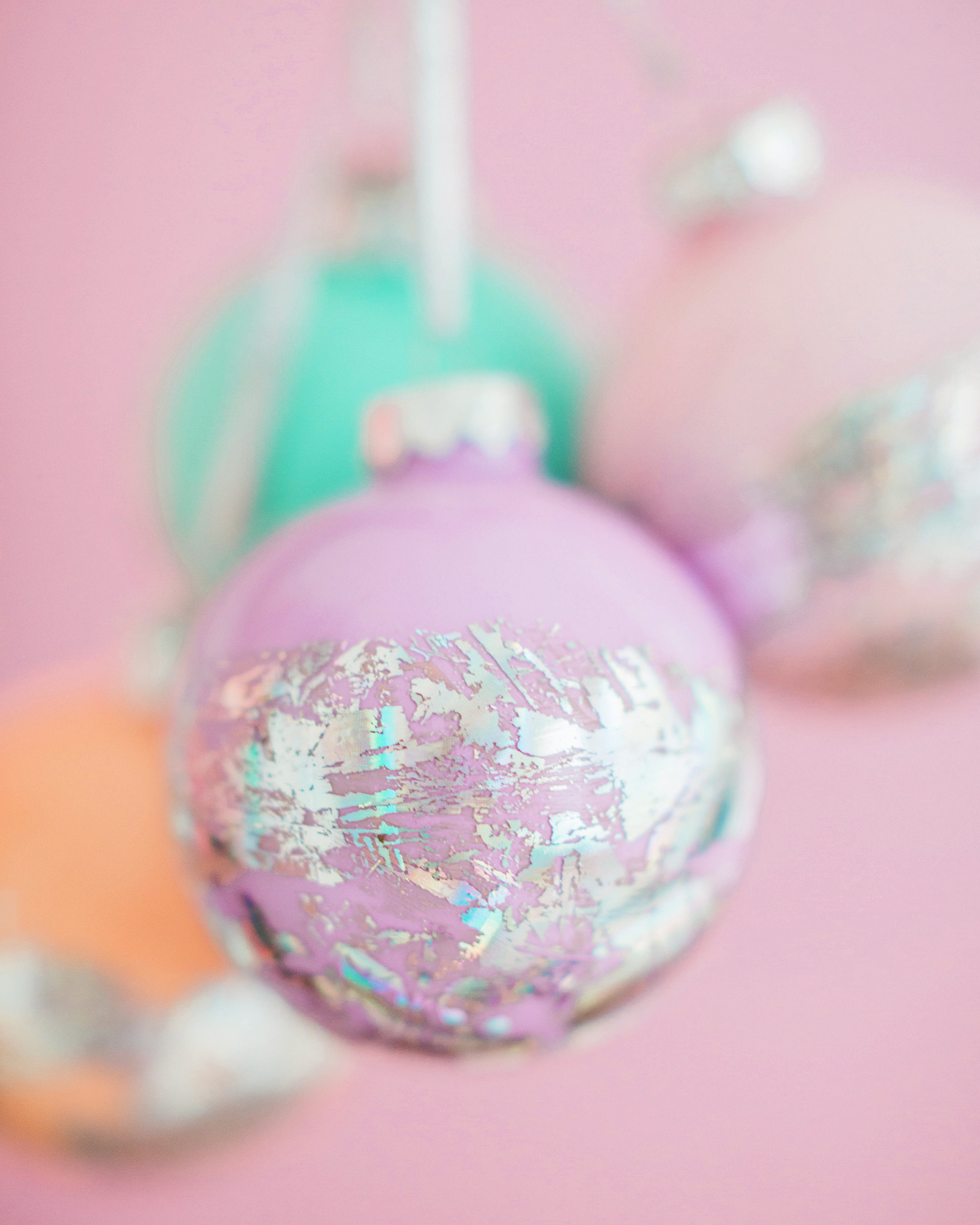
2017 was the year that I discovered the magic of nail transfer foils! I used them to make hologram Easter eggs back in March and hologram  Christmas ornaments just a few weeks ago. I have a few more ideas for ways to use these versatile little foils, so you’ll definitely see them pop up in a project or two in 2018!

DIY Hologram Foil Easter Eggs

DIY Hologram Foil Easter Eggs

DIY Hologram Foil Ornaments

DIY Hologram Foil Ornaments

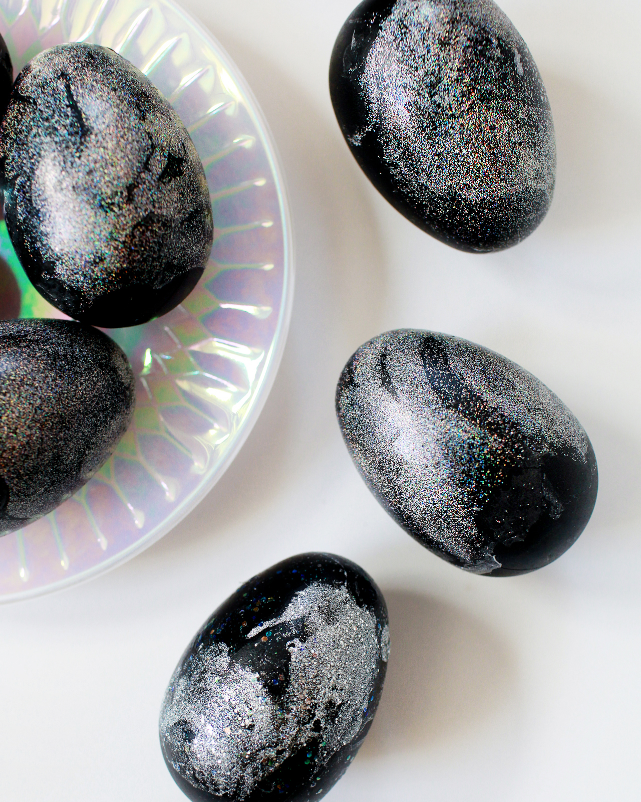
These DIY galaxy Easter eggs are so sparkly! My girls absolutely LOVED them. Nail polish marbling FTW.

DIY Hologram Galaxy Easter Eggs

DIY Hologram Galaxy Easter Eggs

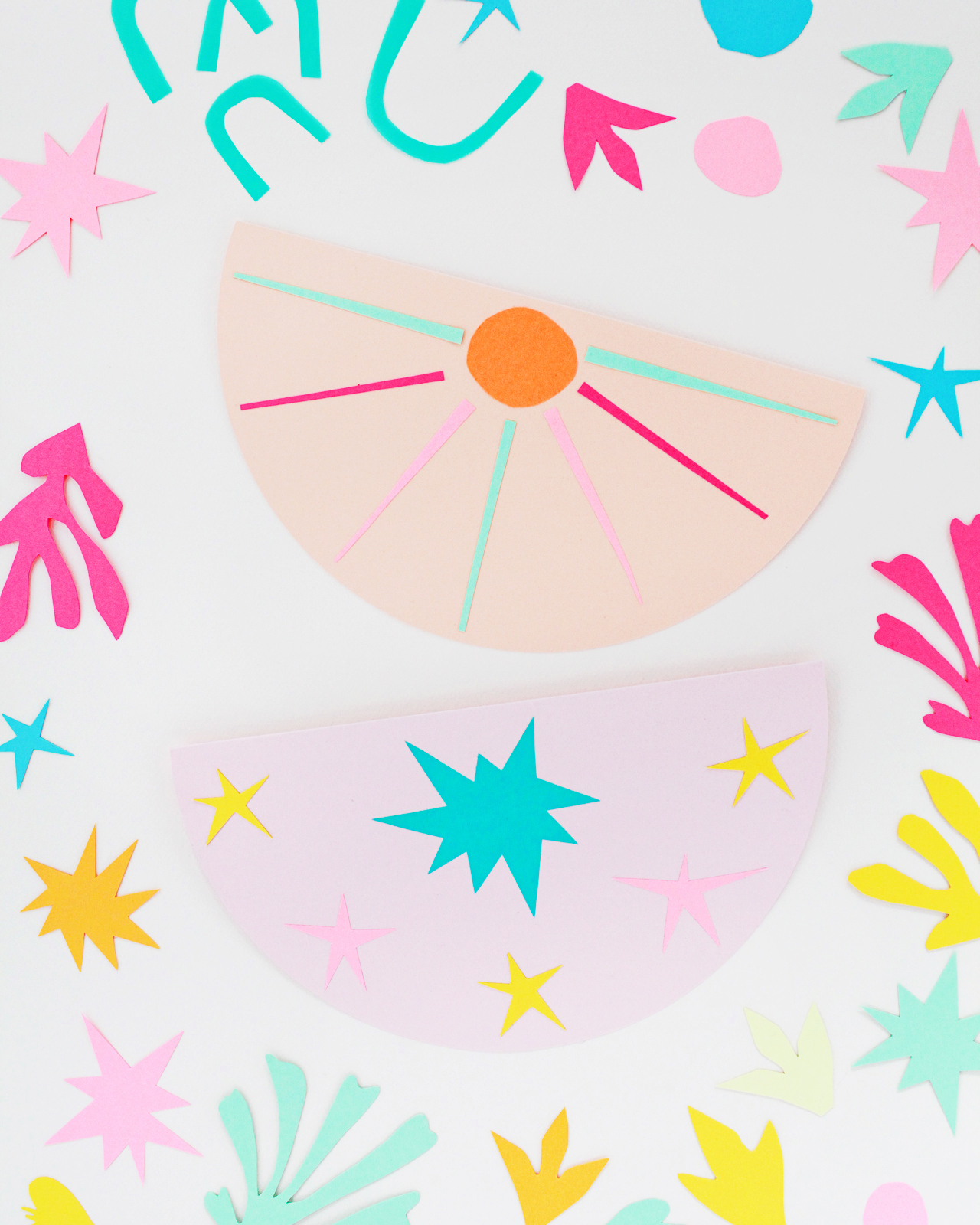
Matisse’s paper cuts inspired a few DIY projects throughout the year, and they ended up being some of my favorite projects to date! Our first Matisse-inspired project of the year involved a colorful paper garland to help celebrate the 50th anniversary of Fiskars Original Orange-handled Scissors in September!

DIY Matisse-Inspired Paper Garland

DIY Matisse-Inspired Paper Garland

DIY Matisse-inspired Garland

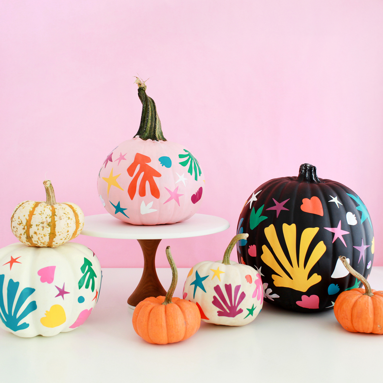
And then I made Matisse-inspired pumpkins in October! They were so cute! I originally thought black and white pumpkins would work best, but that pink painted pumpkin was easily my favorite of the bunch.

DIY Matisse-Inspired Pumpkins

DIY Matisse-inspired Pumpkins

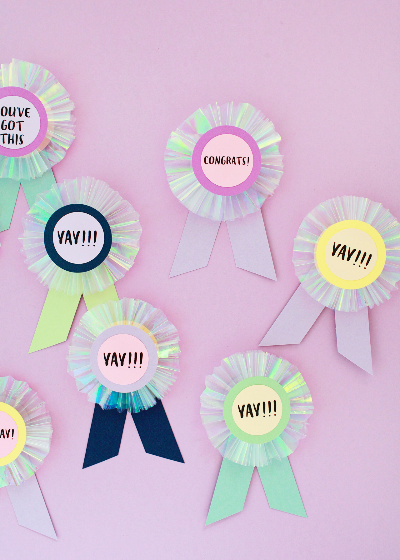
This next project is a personal fave – DIY iridescent paper prize ribbons that I made for my daughter’s preschool graduation! These ribbons are such a fun and easy way to celebrate a milestone event, or even to help cheer up a friend or co-worker. 

DIY Iridescent and Pastel Paper Prize Ribbons

DIY Iridescent Paper Prize Ribbons

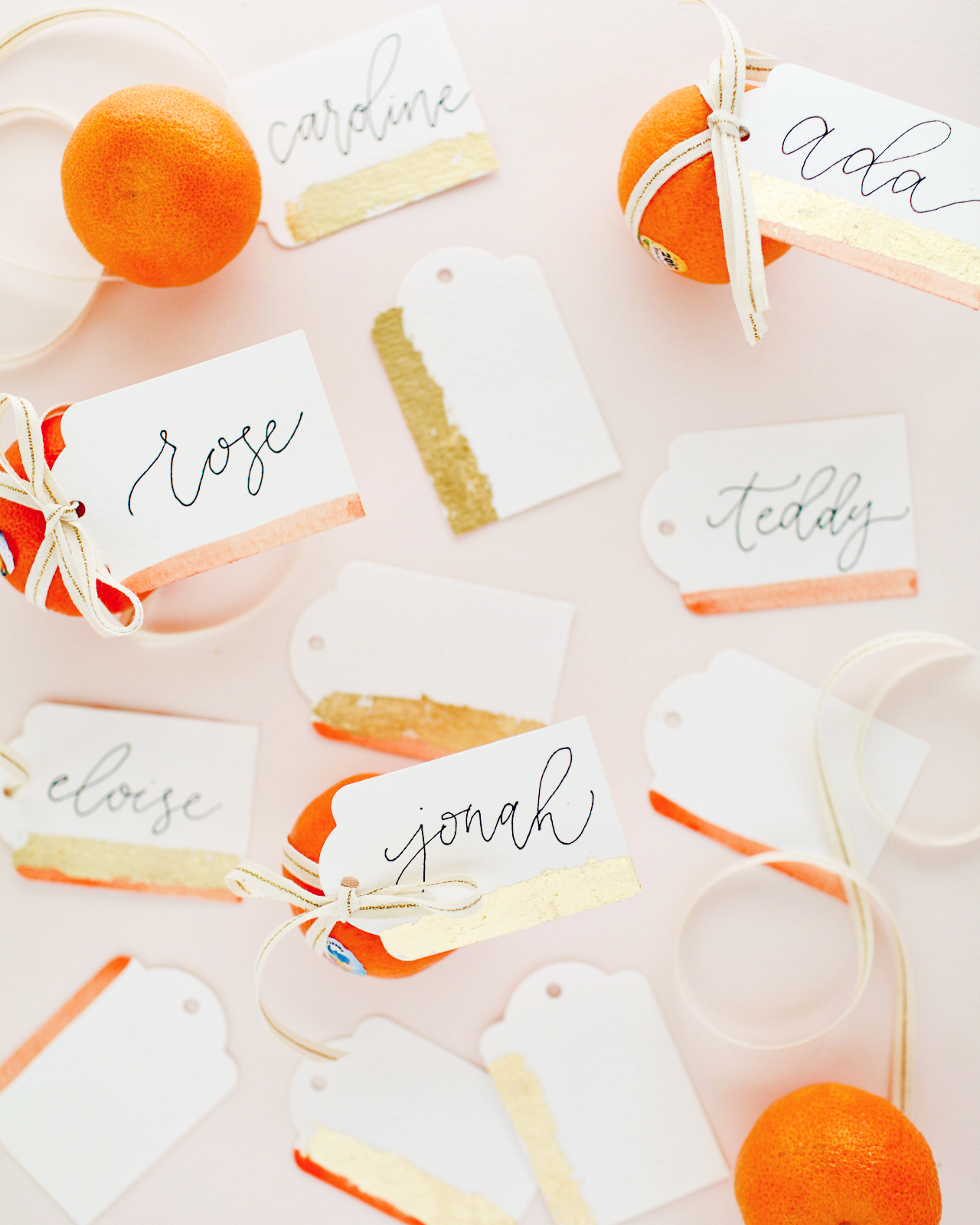
Some of my favorite projects are also the most simple. These DIY watercolor and gold leaf gift tags involve just a quick stripe of watercolor paint and some gold leaf, but I love the understated beauty of the final result!

DIY Watercolor and Gold Leaf Gift Tags

DIY Watercolor and Gold Leaf Gift Tags

If you’re looking for more DIY ideas, you can check out our DIY archive right here!