Alexandra + Trace’s Watercolor Gold Foil Wedding Invitations

I stumbled upon these gorgeous invitations by Leslie of Lilly & Louise over the weekend and just couldn’t resist sharing them here with you! Leslie created these invitations for a black tie wedding at a former mansion right here in DC – combining watercolor with gold foil and hand-torn paper to reflect the romantic setting of their venue. Aren’t these gorgeous?!

Watercolor-Gold-Foil-Wedding-Invitations-Lilly-Louise-OSBP3

Watercolor-Gold-Foil-Wedding-Invitations-Lilly-Louise-OSBP4Watercolor-Gold-Foil-Wedding-Invitations-Lilly-Louise-OSBP5

Watercolor-Gold-Foil-Wedding-Invitations-Lilly-Louise-OSBP

Watercolor-Gold-Foil-Wedding-Invitations-Lilly-Louise-OSBP2

Design: Lilly & Louise

Photo Credits: Cara Robbins

Seasonal Stationery: 2015 Calendars, Part 2

I’m moving a wee bit slow on calendar round ups this year – something about having both a toddler and newborn will do that to a person! But I wanted to get at least one more calendar round up post on the books before we move into full on holiday mode, and of course you can always check out the full 2015 calendar round up right here!

2015 Calendar round Up by Oh So Beautiful Paper

1. This moon calendar from A Little Lark comes in silver, gold, and copper (my personal favorite)

2. Travel-inspired vibes in this monthly calendar from Ferme à Papier

3. Graphic hand lettering in Avril Loreti’s annual tea towel calendar

4. Classic gray and gold foil perfection from Sugar Paper

5. Food photography at its finest in this monthly calendar from Whimsy & Spice

6. A seasonal calendar with beautiful botanical illustrations from Paper Lovely

7. I love this sweet illustrated desk calendar from Katie Daisy

You can check out the full 2015 calendar round up right here!

Harley’s Modern Black and White Baby Announcements

Designer Blake Eagle worked with the talented folks at Mama’s Sauce to create these letterpress and gold foil birth announcements for her son Harley. Blake incorporated design elements inspired by the traditional birth certificate and standardized forms along with astrological symbols – all wrapped up with thin gold wire. So cool!

Modern-Black-White-Birth-Announcement-Blake-Eagle-OSBP8

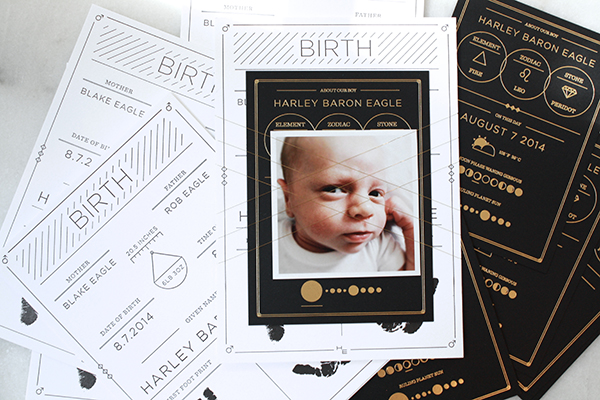
From Blake: My husband and I decided to go all out and design a multi-piece announcement suite for our soon-to-arrive little guy. We were very much inspired by the birth certificate, astrological symbols, and standardized charts like the periodic table. We wanted to design something that was sophisticated, but also whimsical. The idea was to redesign elements of the birth certificate, but focus on personalizing all of the small details.

Modern-Black-White-Birth-Announcement-Blake-Eagle-OSBP

Modern-Black-White-Birth-Announcement-Blake-Eagle-OSBP7

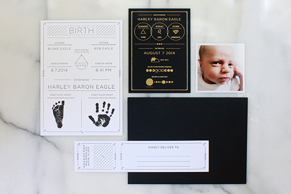
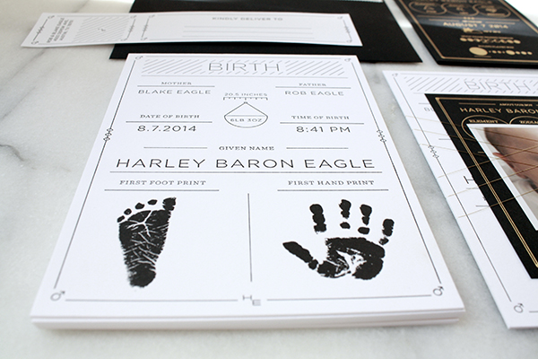
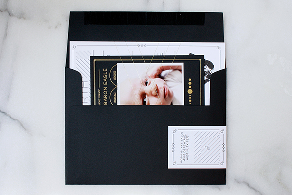
In the beginning we wanted to keep everything black and white and very minimalistic, but we became obsessed with the idea of adding a foiled element to the suite. After finishing the larger card with the birth details, which was letterpress printed on 220# Crane Lettra, we decided to add a smaller gold foil piece.

Modern-Black-White-Birth-Announcement-Blake-Eagle-OSBP6

Modern-Black-White-Birth-Announcement-Blake-Eagle-OSBP5

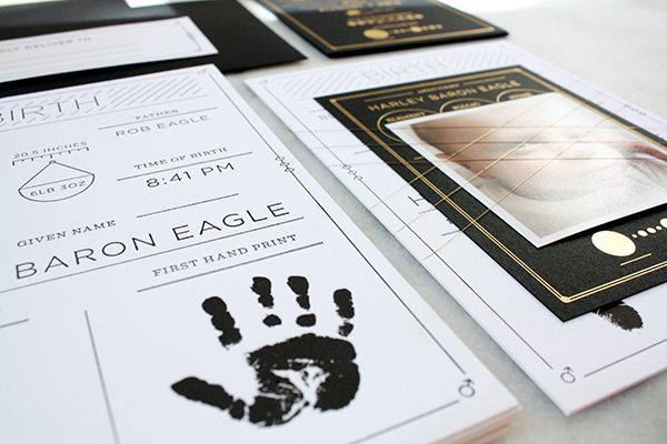
Keeping with the theme, we included things like Harley’s astrological sign and element into the design, as well as the weather and moon phase as a sort of homage to the day he was born. To wrap it up (literally…) we used a very thin wire to hold everything together and tie in the gold from the smaller card to the rest of the suite. It was then all placed in a black envelope complete with a letterpress printed address wrap and personalized stamp.

Modern-Black-White-Birth-Announcement-Blake-Eagle-OSBP2

Design: Blake Eagle

Letterpress and Foil Printing: Mama’s Sauce

Photo Credits: Blake Eagle

Happy Weekend!

Happy Friday everyone! I’m going to be honest – we’ve had a rough week over here. Sophie is going through some typical two year old tantrums (we’ve started referring to her as our “twonager” since it’s a nice little preview of what she’ll be like as a teenager), and when you combine that with a needy newborn you get two very tired parents. I know this is just a phase, but I feel like I could sleep for about a week straight if given the opportunity! For now I’ll just settle for (hopefully) a few extra minutes this weekend, but in the meantime…

Thuss-Farrell-Paper-to-Petal-Instagram

Photo by the incredibly talented Thuss & Farrell

…a few links for your weekend:

This week on Oh So Beautiful Paper:

Check back soon for this week’s cocktail! I hope you all have a wonderful weekend, and I’ll see you back here next week! xoxo

Julissa + Christopher’s Vintage-Inspired Champagne Foil Wedding Invitations

So we’re all pretty familiar with shiny gold foil by now, yes? But what about matte metallic foils – like the subtle champagne foil on these vintage-inspired wedding invitations from Nicole at Umama? Nicole worked with the talented team at Boxcar Press to print these invitations, pairing the subtle matte metallic foil with crisp black and white. Such a great combination!

Vintage-Inspired-Matte-Metallic-Foil-Wedding-Invitations-Umama-Boxcar-Press-OSBP

From Nicole: I wanted to create a pattern that would combine romance and elegance and could be used throughout the wedding invitation suite. I went with a classic deco scallop for the invitation and a set of nestled peacocks that repeated from the reply card to the envelope liner.

Vintage-Inspired-Matte-Metallic-Foil-Wedding-Invitations-Umama-Boxcar-Press-OSBP7

While reviewing swatches from Boxcar Press, we absolutely fell in love with the tawny foil. It was more subtle than the gold foil, and really lent itself to the softness that Julissa was looking for. It mimics the color of champagne, and brings to mind the decadence of the evening, and the cause for celebration.

Vintage-Inspired-Matte-Metallic-Foil-Wedding-Invitations-Umama-Boxcar-Press-OSBP13

Vintage-Inspired-Matte-Metallic-Foil-Wedding-Invitations-Umama-Boxcar-Press-OSBP6Vintage-Inspired-Matte-Metallic-Foil-Wedding-Invitations-Umama-Boxcar-Press-OSBP5

The invitation suite was printed on Crane Lettra 220 Pearl White paper with tawny foil and black letterpress. A coordinating liner was also custom designed and printed in two shades of black. Mary from Boxcar Press was the keen eye that helped to pull all the details together seamlessly from design to print. The end result was breathtaking!

Vintage-Inspired-Matte-Metallic-Foil-Wedding-Invitations-Umama-Boxcar-Press-OSBP3

Vintage-Inspired-Matte-Metallic-Foil-Wedding-Invitations-Umama-Boxcar-Press-OSBP10

Vintage-Inspired-Matte-Metallic-Foil-Wedding-Invitations-Umama-Boxcar-Press-OSBP11

Vintage-Inspired-Matte-Metallic-Foil-Wedding-Invitations-Umama-Boxcar-Press-OSBP8

Thanks Nicole!

Design: Umama

Letterpress and Foil Printing: Boxcar Press

Check out the Designer Rolodex for more tal­ented wed­ding invi­ta­tion design­ers and the real invi­ta­tions gallery for more wedding invitation ideas!

Photo Credits: Umama