Crane Stationery, A Tour – Part 3

As promised, I’m back with a third installment of our tour of Crane & Co stationery.  After visiting the platemaking and printing facilities at Crane Personalized Design Services, we moved over to the Crane Stationery Division, located in a separate building in Dalton.  This is where all of the non-custom stationery orders are filled, from boxed stationery sets to holiday cards to designs in the Crane Studio Collection, as well as where envelopes and packaging materials are assembled.

Crane Stationery Tour Crane Stationery Tour

Crane Stationery Tour

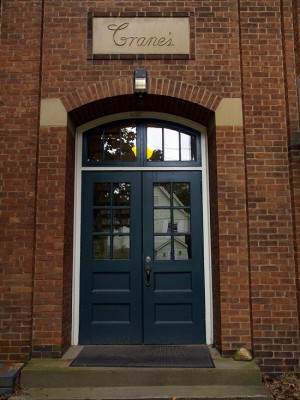
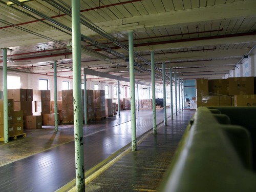
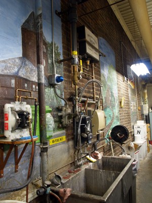
{I love that so many of these buildings date back to the 1800s – the building architecture alone is completely fascinating}

Crane Stationery Tour

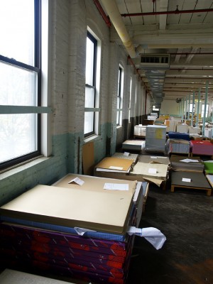
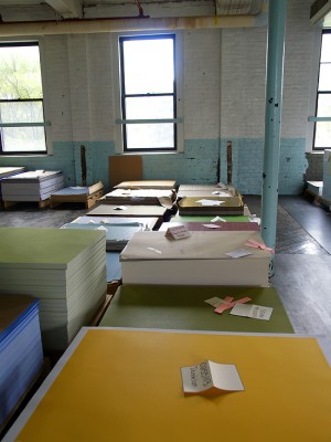
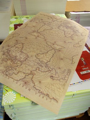
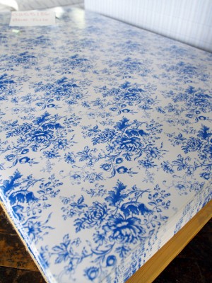
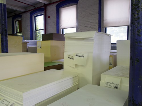
Our first stop in this building was a large warehouse room, where Crane keeps all of the different sheets of paper used as envelope liners for stationery and wedding invitations:

Crane Stationery Tour

Crane Stationery Tour Crane Stationery Tour

{so many lovely envelope liner sheets!}

Crane Stationery Tour Crane Stationery Tour

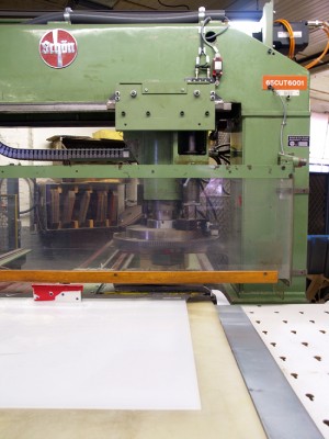
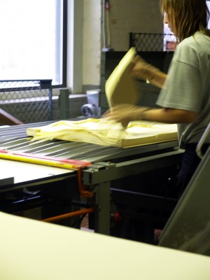
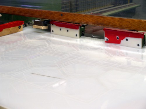
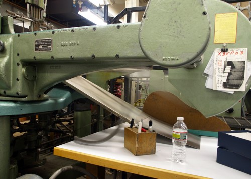
From there, we went to the envelope room – with the biggest paper cutting machine I’ve ever seen!

Crane Stationery Tour

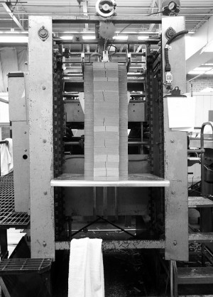
{stacks of paper waiting to be cut down to size}

Crane Stationery Tour Crane Stationery Tour

Crane Stationery Tour

{if you look closely, you should be able to see the outline of the envelope template above}

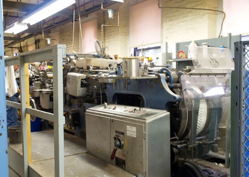
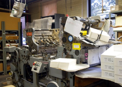
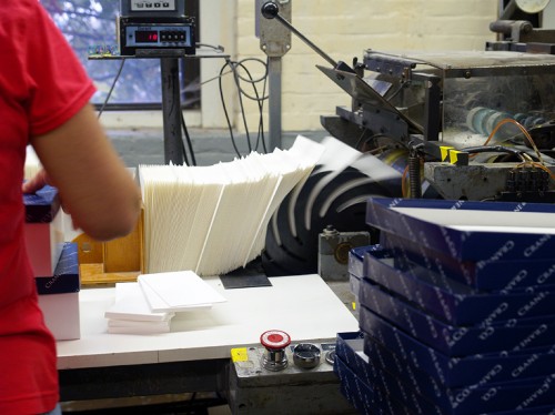
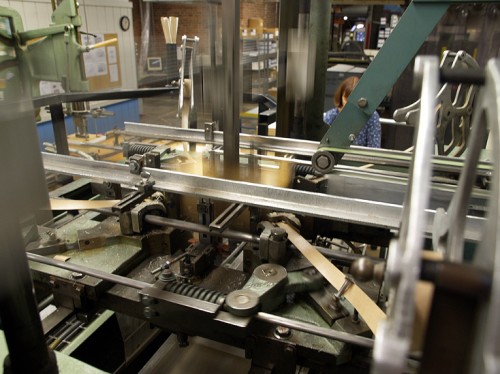
In the next room, another huge machine – this one takes the envelope-size paper and folds it into actual envelopes.  The envelope machines are truly enormous, I think each one was about 25-30 feet in length!

Crane Stationery Tour

Crane Stationery Tour

Crane Stationery Tour

Crane Stationery Tour

Crane Stationery Tour

{finished envelopes coming out of the machine and being counted}

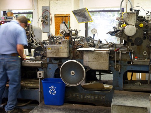
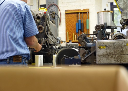
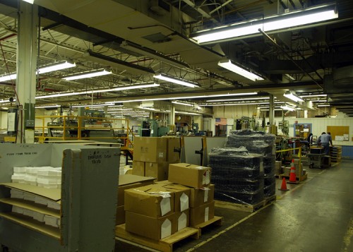
From there, we went into a larger room, similar to the printing floor at Crane Personalized Design Services.  In this room, all of Crane’s boxed stationery sets and stationery collections are assembled and packaged for delivery.

Crane Stationery Tour

Crane Stationery Tour Crane Stationery Tour

{a cool installation and painting on the wall as you enter the main room}

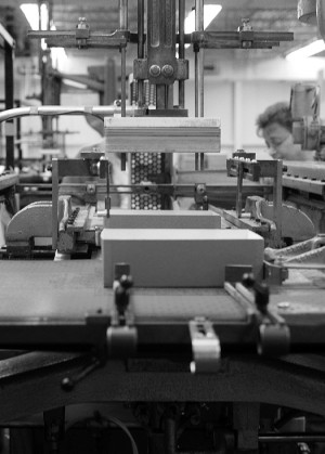
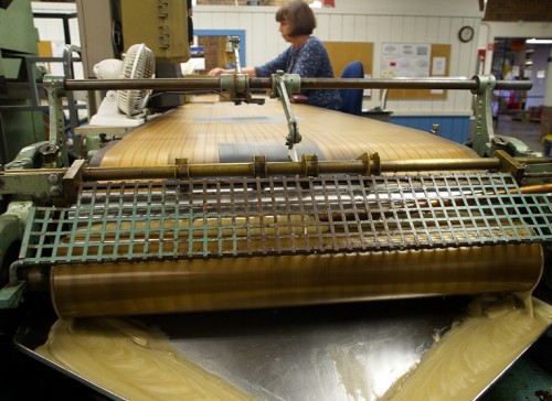
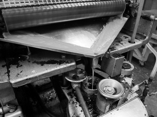
Most of us probably don’t think much about the actual stationery packaging, but Crane makes all of its own boxes.  The box machine (I’m sure the machine has a formal name, but I didn’t catch it) is probably the biggest machine that we encountered during the entire tour!

Crane Stationery Tour Crane Stationery Tour

Crane Stationery Tour

Crane Stationery Tour

Crane Stationery Tour

{that’s all glue above!}

Crane Stationery Tour

I tried to capture the entire process, but static images just can’t really give you the full effect – luckily the folks at Crane have captured the process on video!

After gawking at the box machine for a few minutes, we moved on to another room where hand borderers create the colorful borders on personalized stationery and writing notes.  I took photos of a hand bordering demonstration at the National Stationery Show, which you can see here – it’s truly an amazing skill.  Again, Crane has helpfully provided a video of the process:

Up next, the final stop on our Crane & Co. tour – the museum!

{all photos by me | video courtesy of Crane & Co.}

Lis + Jay’s Pulp Novel Wedding Invitations

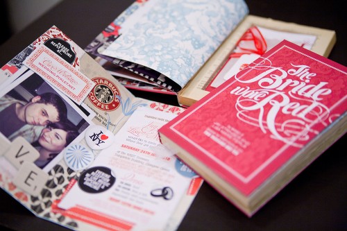
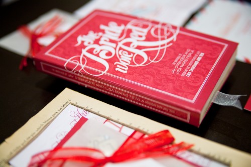
These wedding invitations are just so cool and different – well, they just make me happy.  Lyndsay from It’s a Date Design created this pulp novel invitation suite for the wedding of her friends Lis and Jay, which she made out of re-purposed Mills and Boon books.  This project turned out to be quite an international affair – with the invitations traveling from Lyndsay’s design studio in Melbourne, Australia all the way to Lis + Jay in Glasgow, Scotland!

Pulp-Romance-Novel-Wedding-Invitations

From Lyndsay: This project was a labour of love for my dear friend Lisa-Marie to celebrate her marriage to Jay – both are talented writers and avid music fans, so when it came to thinking about the format for their wedding invitation, a pulp novel seemed like the perfect solution!

Pulp-Romance-Novel-Wedding-Invitations

I commissioned good friend Dale Harris of Studio Ink to design a custom type creation for the “front cover” of the book, based on hours of research into the pulp novella genre and lots of Old Hollywood movie posters!

Pulp-Romance-Novel-Wedding-Invitations

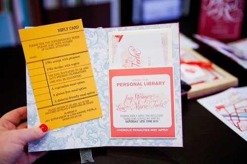
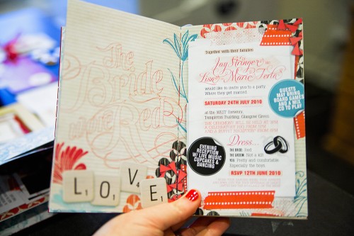
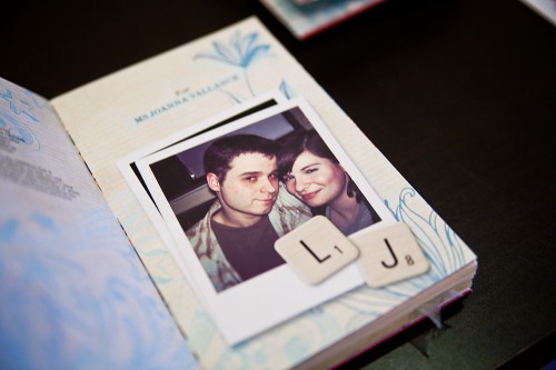
The cover opened to reveal the invitation to Lis and Jay’s nuptials, as well as a short story/scrapbook of how the couple met, and closed with a little library-inspired pocket and library card inside the back cover, which guests could fill out and return to the couple with their attendance plans.

Pulp-Romance-Novel-Wedding-Invitations

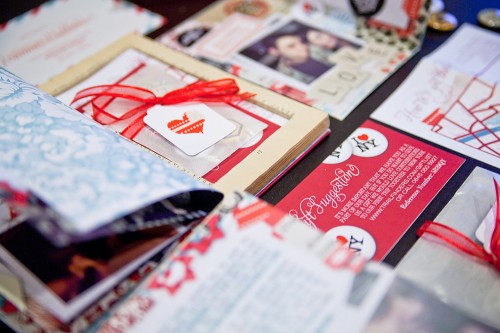
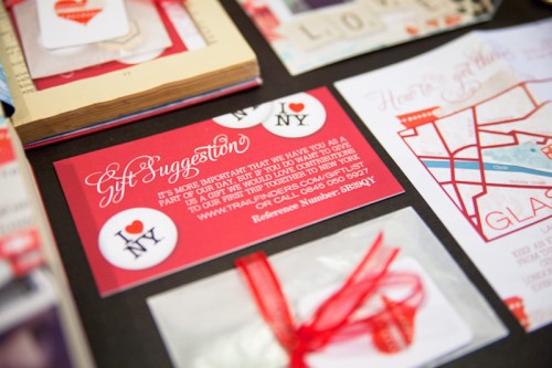
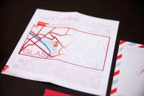
Below the invitation was a hidden compartment which housed a little button badge pack with gift tag, registry information and fold-out map.

Pulp-Romance-Novel-Wedding-Invitations

Pulp-Romance-Novel-Wedding-Invitations

Each invitation was re purposed out of vintage romance novels (many a Mills and Boon was harmed, I’m afraid!) which were stuck together page by page to form the hollowed out secret section and rebound with the couple’s custom artwork.

Pulp-Romance-Novel-Wedding-Invitations

Pulp-Romance-Novel-Wedding-Invitations

The dedication page was made out to each guest in receipt of an invitation, and each book included a beautiful silk ribbon bookmark. The great thing about this suite, apart from being completely “Lis and Jay”, is that I imagine many went straight to the bookshelf for keeps – a lovely memento of a beautiful day.

Pulp-Romance-Novel-Wedding-Invitations

Thank you so much Lyndsay – these are fantastic!  Check out a bit more, including some work-in-progress photos, over at Lyndsay’s blog!

{image credits: it’s a date design}

Sailor Tattoo-Inspired Wedding Invitations

Happy Friday everyone!  Before we start to head off for the weekend, I have a fantastic (and definitely unique) wedding invitation suite to share, this time from Diane Faye!  Diane designed this invitation suite for recent clients Jessica and Jared – all around the central inspiration of a sailor tattoo!

Sailor Tattoo Wedding Invitations

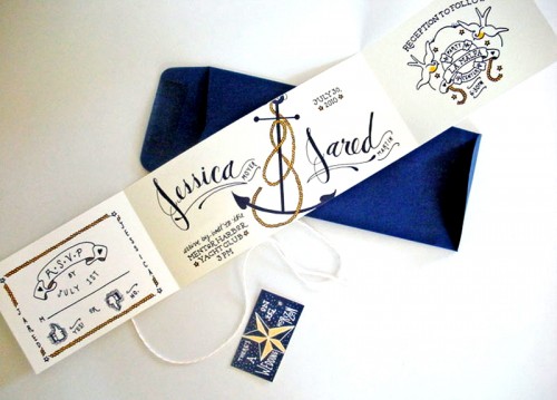
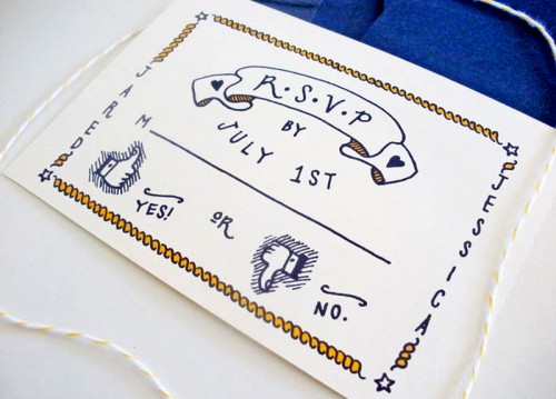
Diane sketched out all the entire design herself, from the names of the bride and groom to the nautical elements: The couple really loved my tattoo invitations but wanted their wedding invitations to revolve more around a sailing theme.  So with a little research and a few rounds of sketching, I created the custom lettering of their names, a fun anchor with the rope forming the ampersand, and an accompanying rsvp card and reception card.

Sailor Tattoo Wedding Invitations

Sailor Tattoo Wedding Invitations

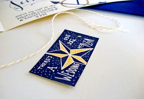
The tag and phrase “there’s a wedding on the horizon” came from a sketch I did quite some time ago, but worked so well for Jessica and Jared’s invitation project.  So I sketched out a few tags and they chose the nautical star – fitting for a sailor theme.

Sailor Tattoo Wedding Invitations

Sailor Tattoo Wedding Invitation

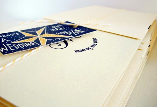
With the yellow baker’s twine from Divine Twine it all came together into a wonderful package that the couple loves – and is one my favorite invitations to date!

Gorgeous!  I love how the hand lettering and tattoo details come together for a playful take on a sailing/nautical theme – so much fun!  You can check out more of Diane’s tattoo-inspired wedding invitations right here.  Thanks Diane!

{image credits: faye & co.}
NSS Bound – Pie Bird Press

Less than a week before the Stationery Show!  I've been having so much fun following all the twitter updates as stationers prepare for this year's show.  Another studio heading back to this year's show is Pie Bird Press (Booth #2049 for those of you going to the show), which sent over a few photos of some new cards making their official debut next week:

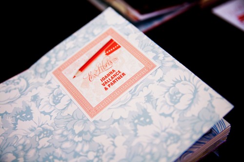
Pie-Bird-Press1
Pie-Bird-Press4
Pie-Bird-Press5

I'm compiling a list of booths to visit – so if you're a stationer or designer exhibiting at this year's show, please e-mail me with your booth number!

{image credits: pie bird press}
Business Card Ideas and Inspiration #2

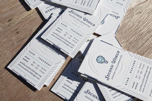
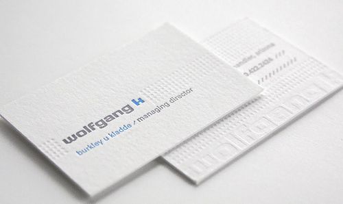
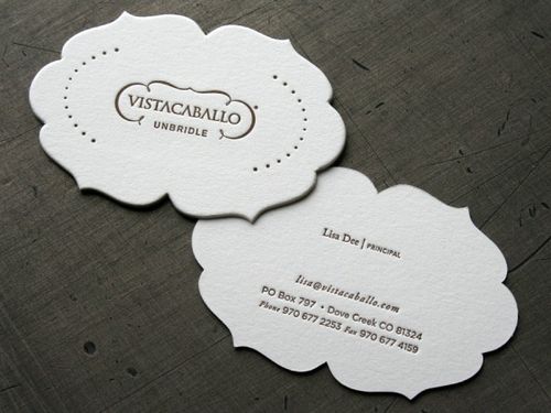
I'm overdue for new business cards, so I've been looking around for layout ideas.  Last year, I went with a one-sided horizontal layout, but this year I'm thinking I'd like to mix things up a bit.  I really love the vertical layout of these business cards from Second World Design Collaborative and Papered Together:

Vertical-letterpress-business-cards{via FPO}

Vertical-letterpress-business-card{via vandelay design}

I also really like the idea of double-sided business cards, like these from Ink + Wit (printed by Boxcar Press) and Thinktopia (printed by Studio on Fire):

Ink-wit-double-sided-letterpress-business-cards{via ink + wit}

Double-sided-letterpress-business-cards{via beast pieces}

I've got a few more business card photos over on my tumblr page.  I'm thinking about a combination of vertical and horizontal layouts on double-sided cards.  I'll be sure to share photos a bit later on!

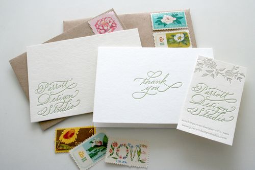
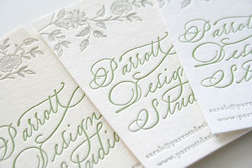
UPDATE: So I just saw that Sarah from Parrott Design Studio also recently printed new letterpress business cards for herself, using her new calligraphy logo by Grace Edmands – and I'm in love.  Such a gorgeous card, from the vertical layout, to the calligraphy, to the floral border at the top:

Calligraphy-business-collateral

Calligraphy-vertical-business-cards


{images from their respective sources}