Wedding Invitations — Brown Sugar Design

I’ve been a huge fan of Brown Sugar Design since I came across their portfolio while researching for my own wedding last year.  Husband and wife design team Whitney and Jonathan create beautiful (and completely custom) wedding invitations, using just about every printing method possible.

Whitney and Jonathan were kind enough to send over a few photos from their portfolio, so let’s get right to it:

Brown-sugar-design-blue-brown-letterpress-wedding-invitation-suite

Brown-sugar-design-letterpress-blue-brown-pocket-wedding-invitation
{allie + paul}

Brown-sugar-design-orange-letterpress-wedding-invitation-suite

Brown-sugar-design-orange-letterpress-wedding-invitation-detail

Brown-sugar-design-orange-letterpress-wedding-invitation-enclosures

Brown-sugar-design-orange-letterpress-wedding-invitation-program
{jill + nick – love the gorgeous orange + chartreuse in this letterpress invitation design}

Brown-sugar-design-gray-yellow-teal-wedding-invitation-invite

Brown-sugar-design-gray-yellow-teal-wedding-invitation-rsvp

Brown-sugar-design-gray-yellow-teal-wedding-invitation-suite
{missy + garrett – featuring a fabulously bold yellow, gray + teal color palette}

Brown-sugar-design-green-botanical-wedding-invitation-suite

Brown-sugar-design-green-botanical-wedding-invitation-invite

Brown-sugar-design-green-botanical-wedding-invitation-suite2
{sonya + michael}

This invitation, which incorporates a vintage map as a key design element, is one of my favorites from the Brown Sugar Design portfolio:

Brown-sugar-design-map-wedding-invitation-band

Brown-sugar-design-map-wedding-invitation-suite

Brown-sugar-design-map-wedding-invitation-passport

Brown-sugar-design-map-wedding-invitation-reception

Brown-sugar-design-map-wedding-invitation-enclosures

Brown-sugar-design-map-wedding-invitation-enclosures2

Brown-sugar-design-map-wedding-invitation-wishcards
{linnea + paul – they used these post cards as “wishing cards” so that each guest could write a wish for the bride + groom’s new life together}

I’ve got one more invitation suite from Brown Sugar Design to share with you a bit later today.  In the meantime, you can check out more from the Brown Sugar Design portfolio right here.

{photos via Brown Sugar Design}

Lovely Liberty Prints

I’ve been searching for some pretty liberty print tops and dresses to wear this summer.  I think I finally found what I’ve been looking for, so I thought I’d pass the word along in case anyone else is looking for the same thing:

Liberty-print-dress

Liberty-print-dress2

Liberty-print-top

Liberty-print-top2

So, so cute.  These and lots more all from Nadinoo.

{images via Nadinoo}

Wine Cork Place Card Holders

Have all my lovely bride readers checked out the handmade weddings series on Etsy?  If you haven't yet, you totally should – it's full of useful information, ideas, and other resources for planning a handmade wedding.  Like these wine cork placecard holders, for example:

Such a cute idea!  Available from Corky Creations right here.


{images via Corky Creations}

{fabric + buttons}

Darci from With This Ring just completed a fabulous DIY series featuring the most adorable purple floral fabric and buttons.  I'm particularly smitten with this project for DIY fabric-enclosed invitations, and this project for DIY favor boxes:

So pretty!  I love, love those invitations.  Definitely check out the full tutorials – including a few other DIY projects – over at With This Ring.

{images via With This Ring}

Jamie + Ben’s Kraft Paper Desert Wedding Invitations

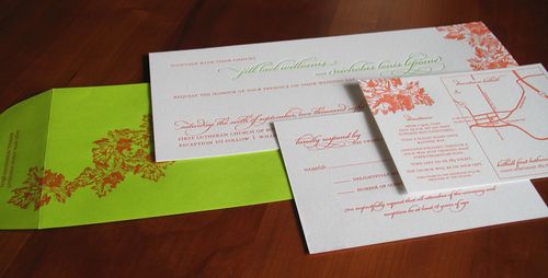
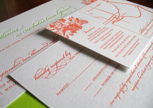
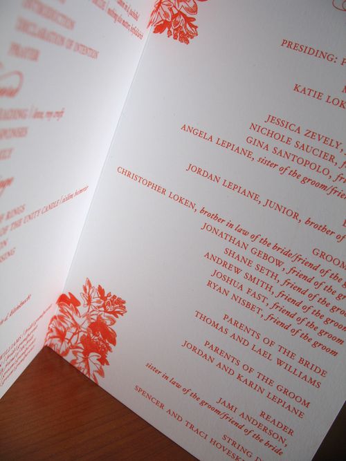
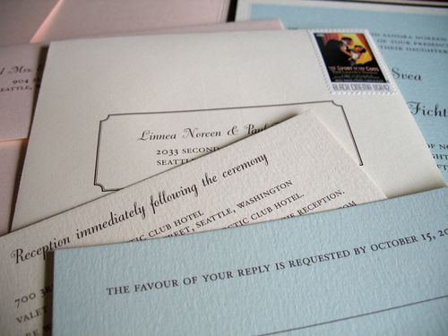
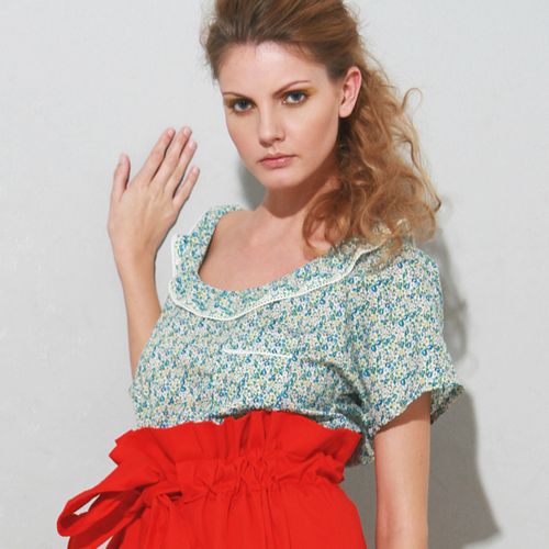
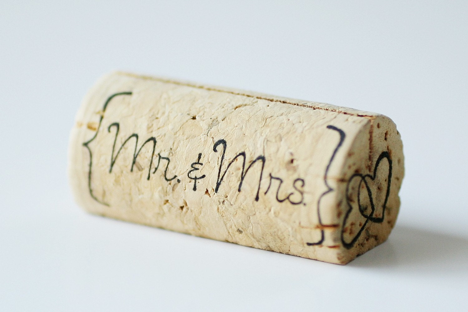
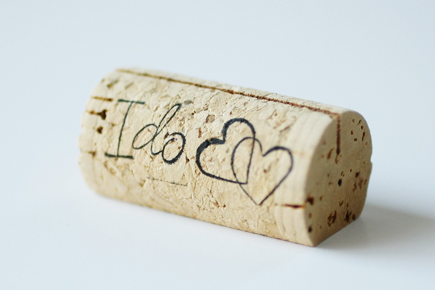
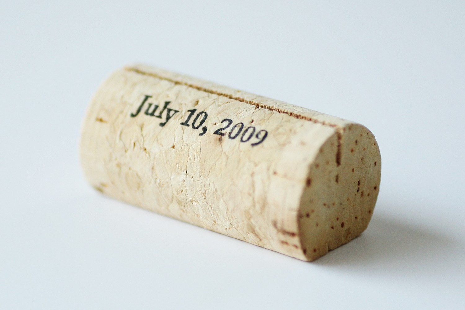
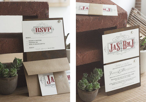
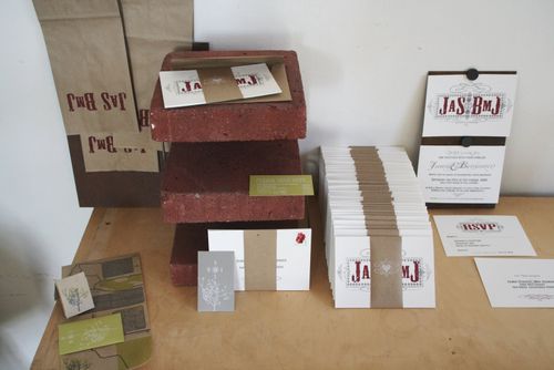
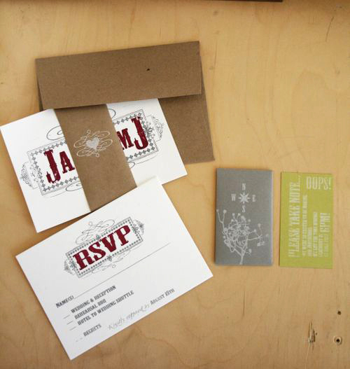
I love, love the invitations from Jaime (and her husband Ben) of A Desert Fete.  When I first saw Jamie and Ben’s invitations, I was completely struck by how they totally embodied their Joshua Tree wedding and reflected Jamie and Ben’s architectural and musical influences.  Jamie designed and printed the invitations herself using her trusty Gocco and a home printer.  The invitation suite included a main invitation, printed front and back, an RSVP postcard (both printed on heavy weight museum board), and map enclosure, all of which were bound together using artists tape.  Jaime was kind enough to send over a bit about the design and inspiration process (during her Spring Break no less!), so I’m turning it over to her!

From Jamie: So much of our wedding’s style came from my husband’s request to have red roses.  I am not sure why he was so sure of this, he has never shown a particular preference for roses.  He mentioned something about ‘desert rose.’  I think this must be a music reference…

Desertfete

When we chose our desert location I immediately thought of succulents and a crisp modern aesthetic, but the roses took us down a kind of rustic western/vintage cowboy road.  Ben is a musician and our love for music is a huge part of our lives.  Part of the allure of Joshua Tree for us (where we were married) is around the legend of late musician Gram Parson’s, whose style was very rock & roll/cowboy meets… glam?

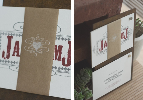
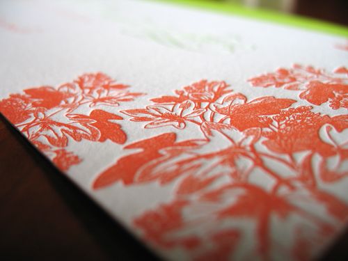
With this in mind we then poured through graphic design books and ultimately fell in love with the style of Hatch Show Print.  I started with that idea and then added romantic flourishes.  (I did most of the designing in Adobe Illustrator, a skill I have picked up while studying architecture.)  We became Gocco crazy, and loved the vintage-esque patina that resulted in our lack of experience.  It was perfect.

Desertfete3

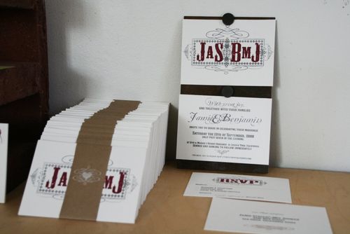
For the main cards we used large sheets of museum board (cut to size by kinko’s machines).  We didn’t want to try and Gocco the maps as our inability to do good detail meant they might not communicate as well, but we wanted them to look intentionally different rather than just as an after thought.  I had previously found a roll (like, hundreds of feet long roll) of really really thin paper, like super thin crate paper the same color as kraft paper (At an industrial salvage store. FOR A DOLLAR). We used our regular canon printer and printed the maps I made in illustrator onto the kraft paper, then folded them up (like a map) and stuck them into a mini envelope.

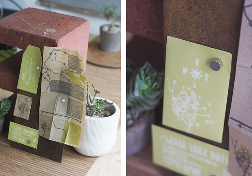
We wanted the whole set to feel like a little object, so we banded all the cards and the mini envelope together with artist tape that is used on the backs of canvases and is self adhesive when you wet it.   We kept it really simple, this was especially important to Ben, every time I tried too complicate something, or add more elements and extras, he would reign me in on the concept of simplicity.

Adesertfete3

If either one of us had made these without the other ones input the designs would have been wildly different, so it is pretty neat to see the result of a true collaboration.  That and the influence of place, again they would have been so different but for a different venue, I think really made these what they are.

Sigh.  I love how element of the invitations, from the colors to the paper choice to the printing method, is so perfectly suited for Jaime and Ben’s wedding.  Thank you so much, Jaime, for sharing your invitations with us (and for putting up with all of my pestering over the past few months)!

{all images by Jaime/A Desert Fete}