Happy Monday everyone! Before we jump into today’s post, just a quick announcement for those of you looking forward to the upcoming Modern Calligraphy Summit 2.0 – there’s a FREE video series from some of the instructors going on now through February 8! You’ll meet all seven instructors, including Katherine of Script Merchant, Lauren of A Fabulous Fete, Jenna of Mon Voir, and Karla of Written Word Calligraphy. They’ll share their preferred tools for traditional calligraphy, modern calligraphy, and brush lettering, along with their inspiring stories about how they got started, and changed their lives, with calligraphy. Find all the details here – you won’t want to miss it!
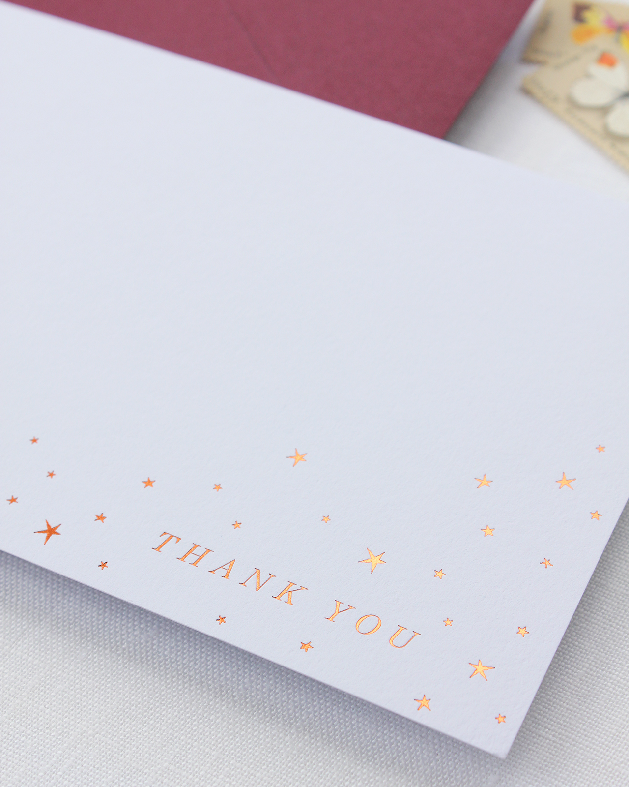
Okay, onto today’s gorgeous baby shower invitations! Fresh, delicate, and adorable; these refined copper star inspired baby shower invitations are nothing short of darling! Alana of Bourne Paper Co. is expecting a baby girl later this year and had the amazing joy of designing her own baby shower invitations. The twinkly star motif that she wove through the invitation design and elegant copper and burgundy color palette are perfect for a mid-winter baby shower.
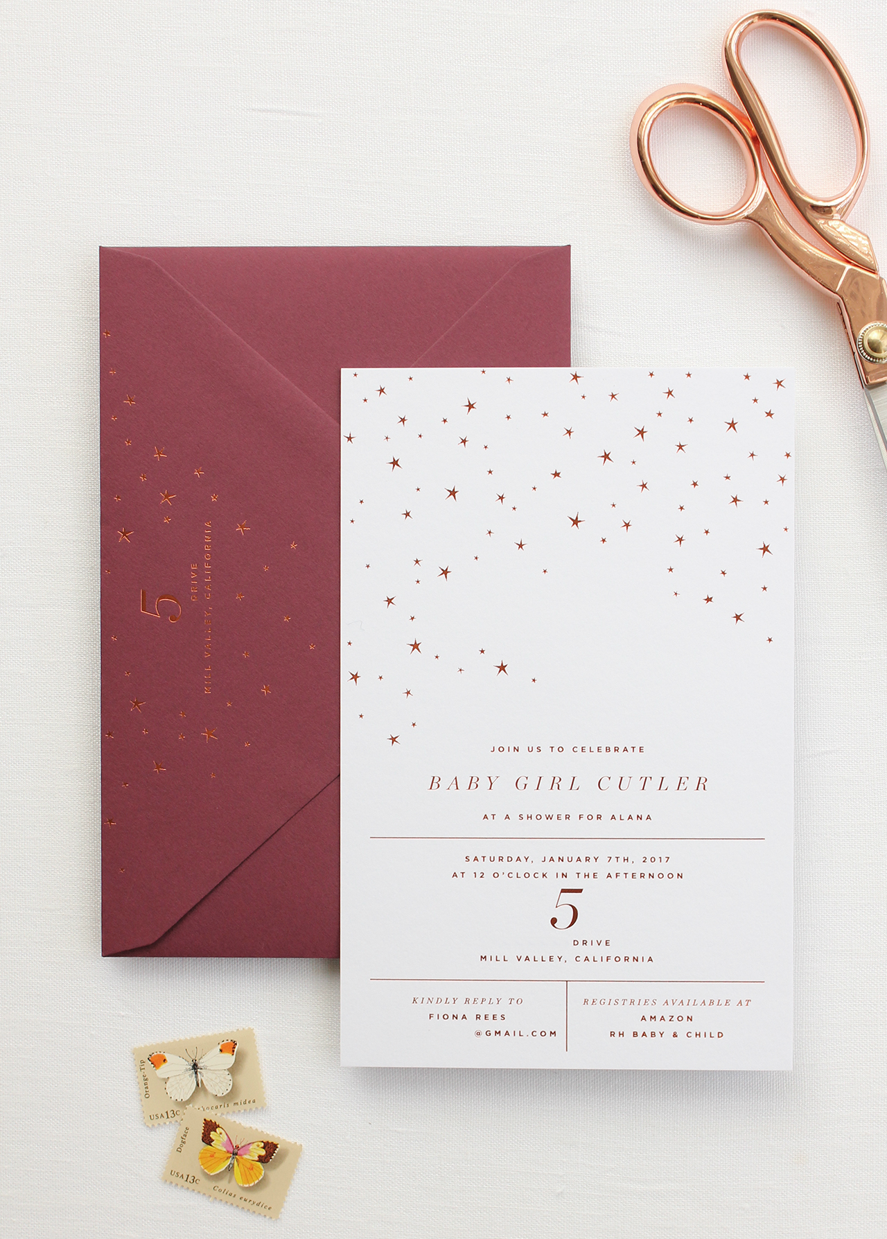
From Alana: As a designer, personal celebrations are special not only because they’re milestones but because they’re the perfect excuse to create pretty paper! I’m expecting my first child (a baby girl) this spring. When my family offered to host a baby shower, I was immediately given full reign over the invitations. I knew I wanted something that was seasonal and modern, but not overly feminine. Since my shower took place during the winter, I decided on a color palette of copper and burgundy.

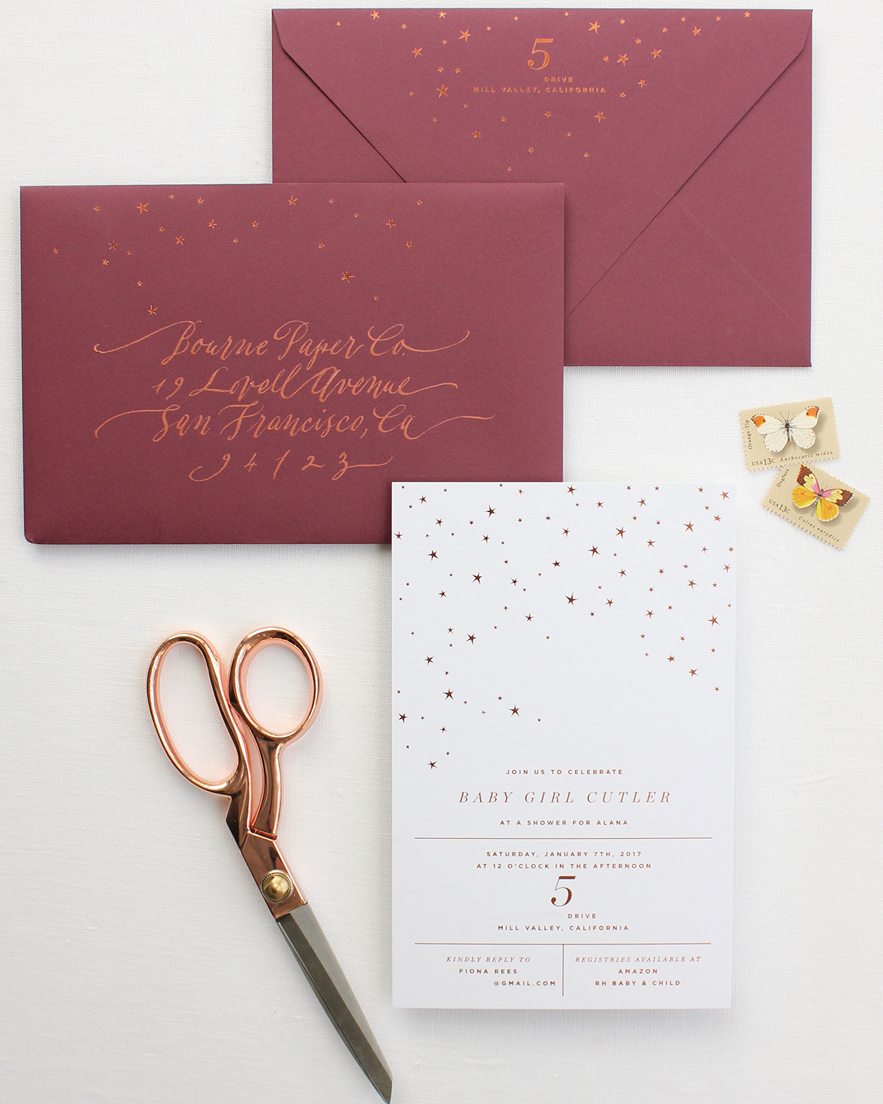
My invitation design was centered around a delicate star motif paired with modern typography. The invitations were printed using copper foil on a pure white card stock. I opted for a 200lb. card stock to give the invitation a more substantial feel. Having used a lot of matte gold, silver and rose gold in my recent greeting card collection it was fun to create a project that used bright copper – it has such a vibrant shine to it.
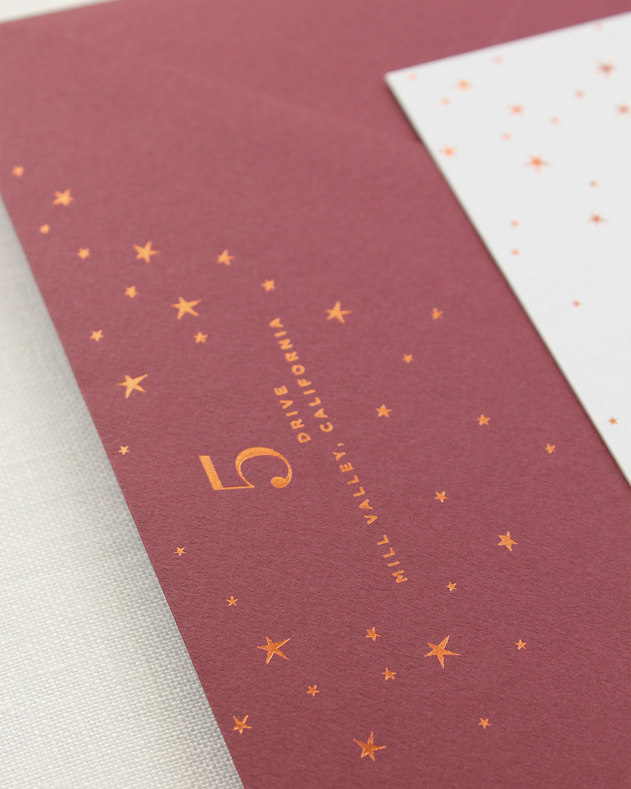
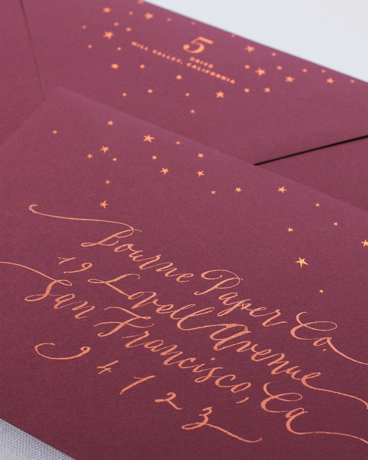
I paired the invitations with a rich burgundy envelope which also featured the copper foil star motif. I distributed the stars throughout both the envelope front and flap, something I hoped would make them stand out when they arrived in my guests’ mailboxes. Elegant copper calligraphy from Nancy Hopkins Lettering  completed the invitations. I thought her beautifully flourished calligraphy was the perfect compliment to the simple, clean type used on the invitation. Not to mention, she was able to create a perfect color match with the copper foil.
In addition to the invitations, I created matching thank you cards. I opted for flat notecards which used the same copper star motif and burgundy envelopes as the invitations. Overall, I was pleased with how beautifully the delicate stars seemed to shine in copper foil and hope to turn this motif into a new greeting card collection in the future.
Thanks Alana!
Design: Bourne Paper Co.
Calligraphy: Nancy Hopkins Lettering
Bourne Paper Co. is a member of the Designer Rolodex – you can see more of their beautiful work right here or visit the real inviÂtaÂtions gallery for more wedding invitation ideas!
Photo Credits: Bourne Paper Co.


 From top right: