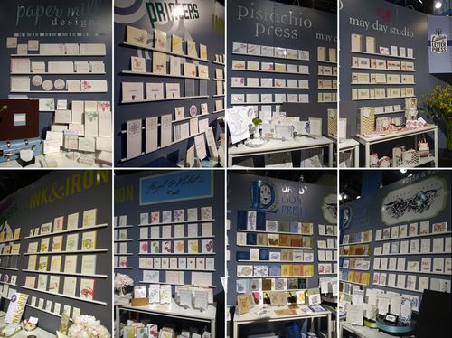
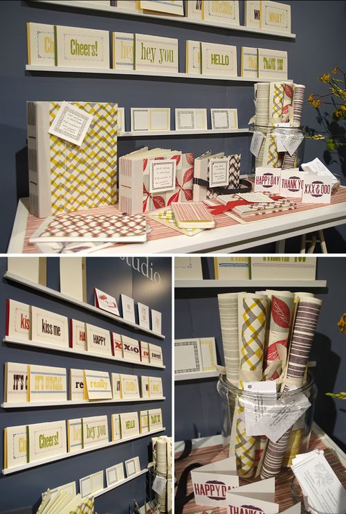
Happy Friday everyone!  This has been an incredibly full week for me; if you follow me on twitter you may know that I spent most of the weekend and the earlier part of this week up in New Jersey and New York, working on a project with my Dad and seeing some of my fellow bloggers in town for Bridal Market.  On Tuesday, I attended a taping of the Martha Show – and if you’ll allow me to geek out for a quick second, the bloggers in attendance got to take a photo with Martha and Darcy Miller at the end of the show (that’s me in the red sweater on the right)!

So much fun! Â Now that I’m back at home and the weekend is almost here, I’m looking forward to relaxing and enjoying the cooler weather here in DC. Â But in the meantime…
…a few links for your weekend!
- Completely in love with these beautiful quilts
- A surprisingly chic Halloween wedding
- Love all the details from this party that Allison planned for her son’s 4th birthday
- A useful article for any freelancer about financial record-keeping
- The most beautiful shade of blue
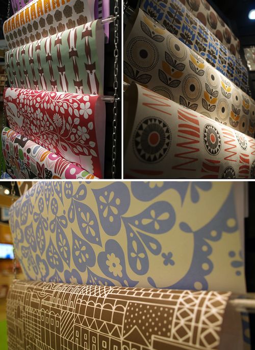
- Gorgeous hand-printed wallpaper
…and just in case you missed it, a quick round-up of this week’s posts:
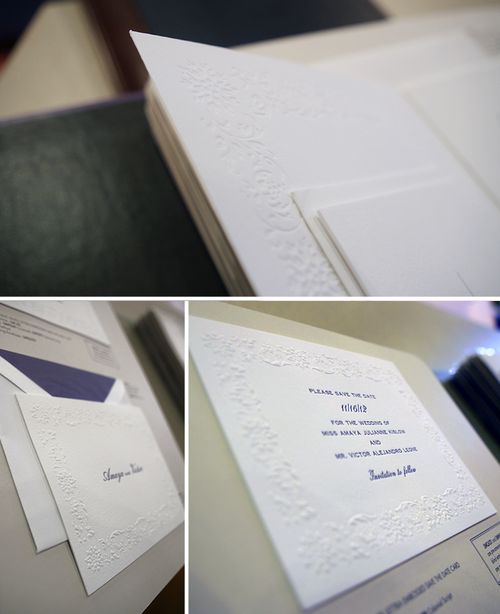
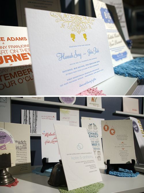
- Some Halloween invitation inspiration
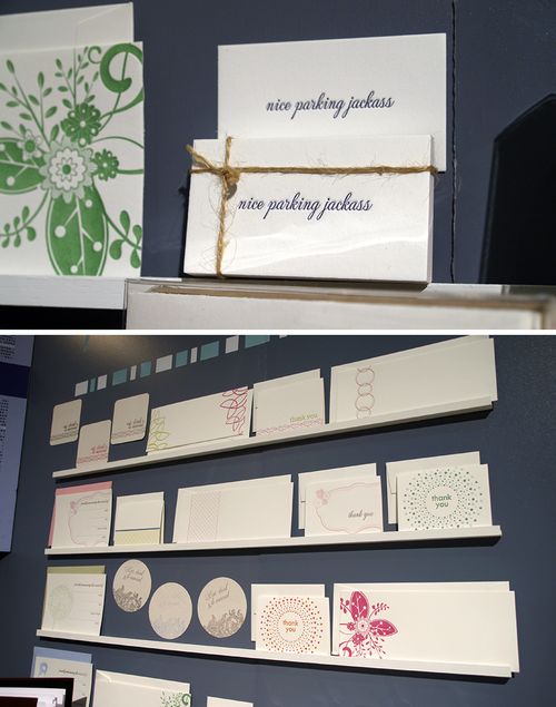
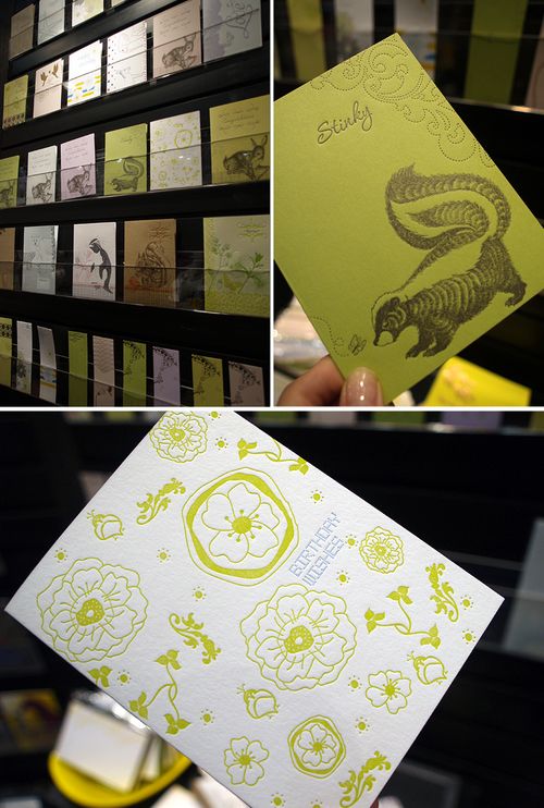
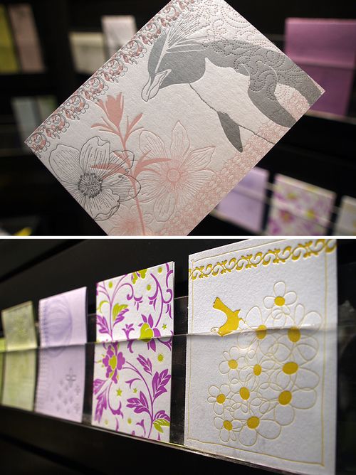
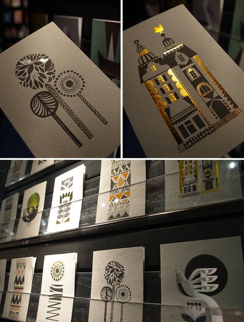
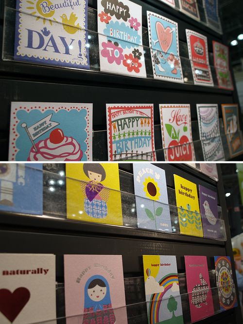
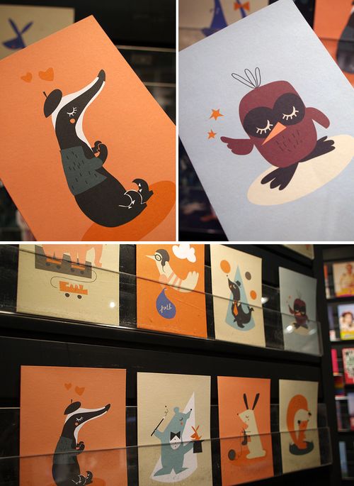
- A few funny greeting cards from Richie Design
- I’m still gaga for these red + aqua mid-century modern wedding invitations from The Indigo Bunting
- Beautiful beach-inspired wedding invitations from Petit Bureau
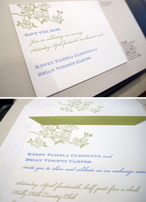
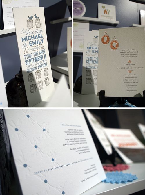
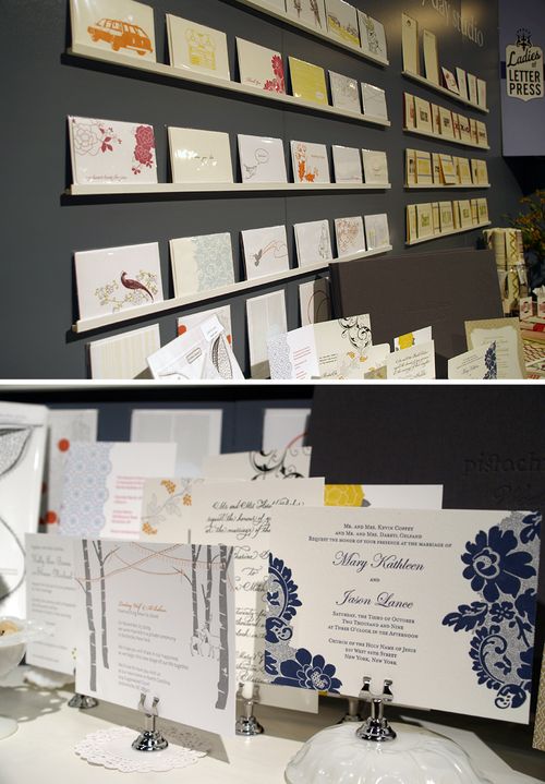
- Dan + Barbara’s modern foil stamp wedding invitations
- Gorgeous black and white calligraphy
- From Wiley Valentine, the adorable Piper’s baby announcements and nursery
That’s it for me this week! Â I hope you all have a wonderful weekend, and I’ll see you all back here on Monday!
{image courtesy of martha stewart living omnimedia}


