OSBP at Home: Our Backyard Makeover

This post was sponsored, and paid for, by SunTrust Mortgage. All opinions are my own. Thank you for supporting the sponsors that make Oh So Beautiful Paper possible!

We’ve been doing lots of home projects recently, but I haven’t shared much of our progress – mostly because I feel a huge amount of self-imposed pressure to make everything “perfect” before I share it. Between the Instagram highlight reel and Pinterest aspiration, it feels like every image should be perfectly finished and styled when I share it publicly. But that’s just silly! I love it when home bloggers share the not-so-pretty progress posts along with the finished product. Plus it’s fun to get a peek behind the curtain and know that our lives aren’t 100% perfectly curated. Besides, my house will never be perfect. As much as I love my home, it’s a tight squeeze for four people, there are kid toys everywhere, not enough storage, and I wish we got about 200% more natural light than is even remotely possible for a 1920s row house. But we’ve done a lot of work on our home, and I’m really proud of how far we’ve come. So today I’m partnering with SunTrust Mortgage to share one of my favorite spaces in our home: our backyard!
OSBP At Home: A Backyard Update

How we found the hidden potential in our home's back yard! Photo Credit: Yetta Reid Photography

How we found the hidden potential in our home's back yard! Photo Credit: Yetta Reid Photography

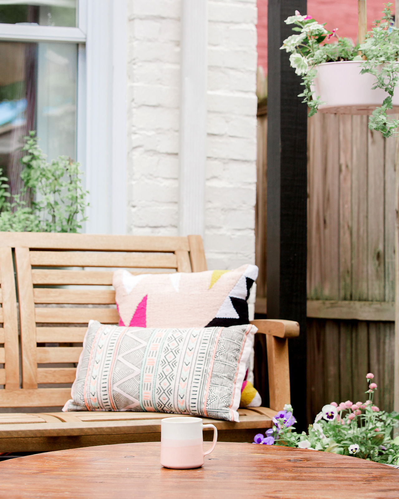
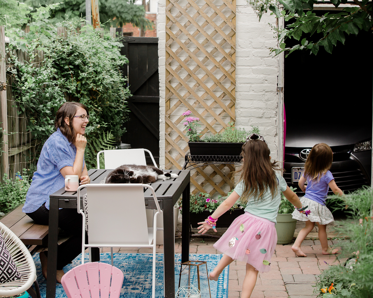
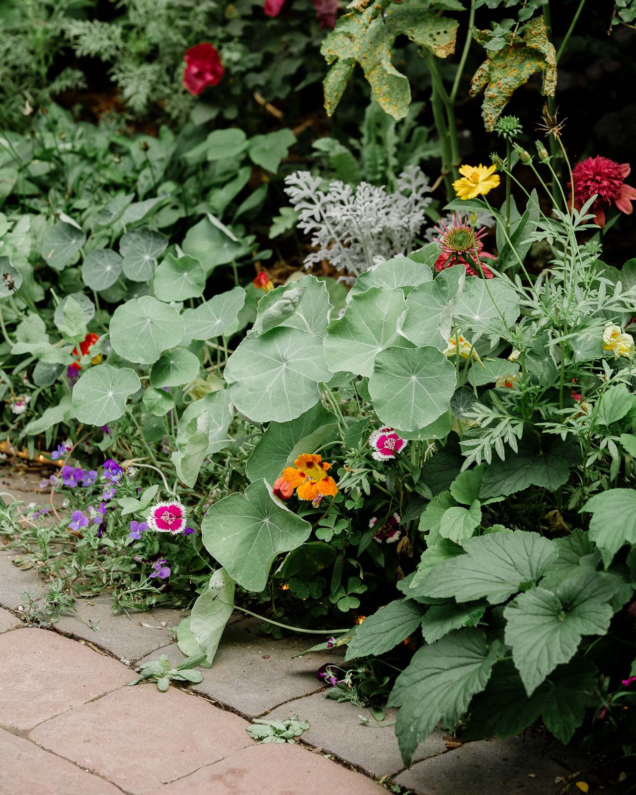
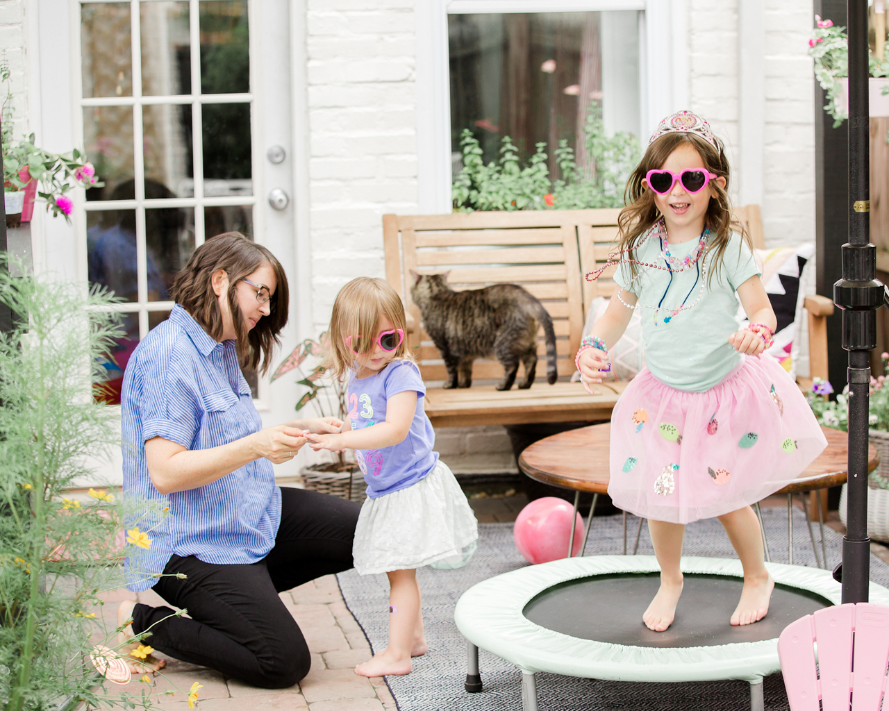
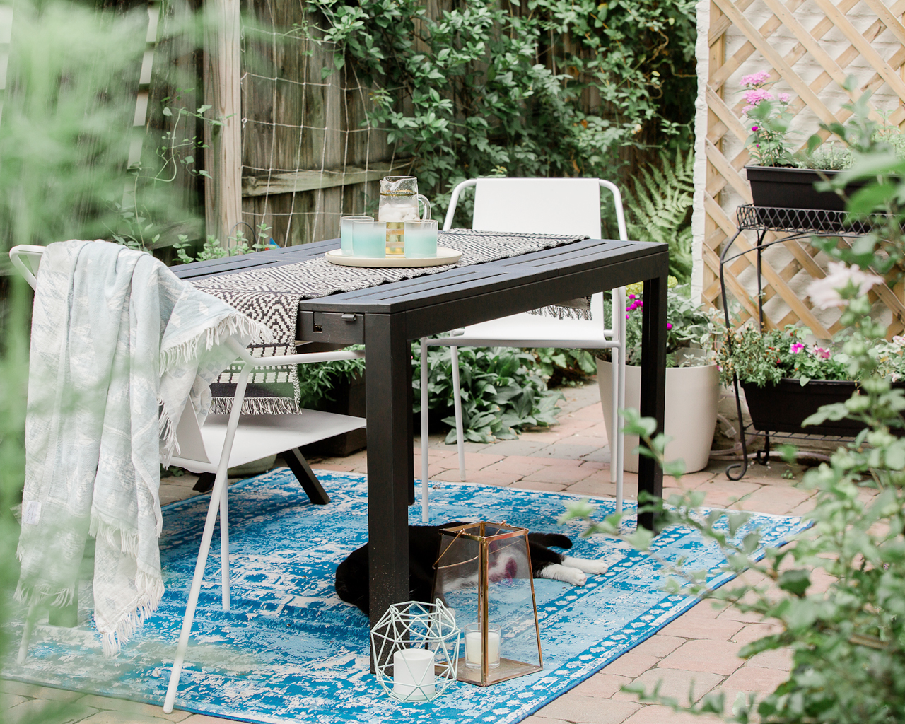
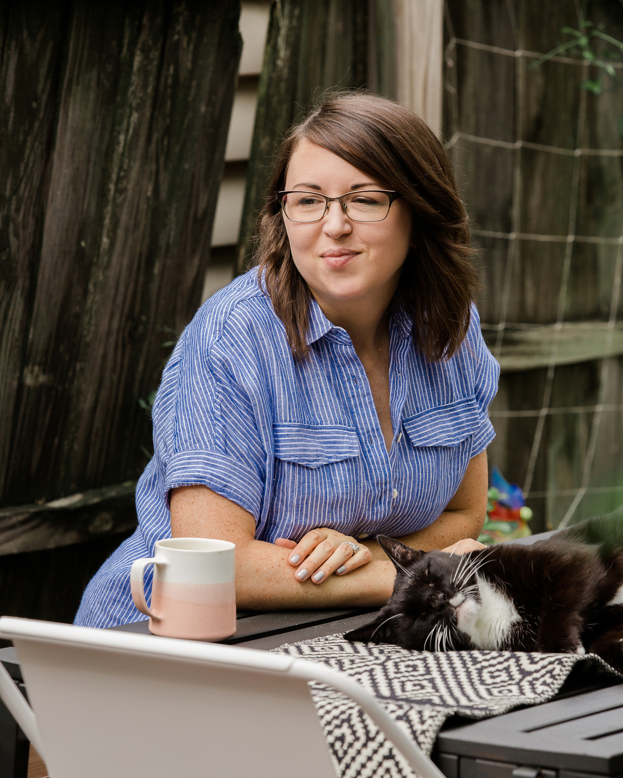
The funny part is that a backyard wasn’t even on our list of must-haves when we bought our home, but has turned out to be a saving grace when it comes to our two very young children. There is enough room to hang out and entertain, space for our girls to play, and a couple of small gardening areas that have become my own personal happy place. And even though we aren’t 100% done with the space, we love spending time together as a family out here!
How we found the hidden potential in our home's back yard! Photo Credit: Yetta Reid Photography

Owning a home is a huge financial and personal milestone. I remember feeling just so overwhelmed when we first started looking for homes, from the mortgage pre-approval process to writing an offer to the home inspection process. We put in several offers on other homes just to be seriously outbid, and many of the homes that were theoretically within our budget would have required major work that we just couldn’t afford. Knowing our budget limitations ahead of time really helped us stay on track. SunTrust Mortgage has a team of experts that are committed to helping future homeowners find a mortgage that fits their life. SunTrust provides the resources and tools to help inform borrowers who aspire to become homeowners or are looking for their next home. Understanding the process helps build confidence! Click here for more information and to download your guide to buying a home!
How we found the hidden potential in our home's back yard! Photo Credit: Yetta Reid Photography

How we found the hidden potential in our home's back yard! Photo Credit: Yetta Reid Photography

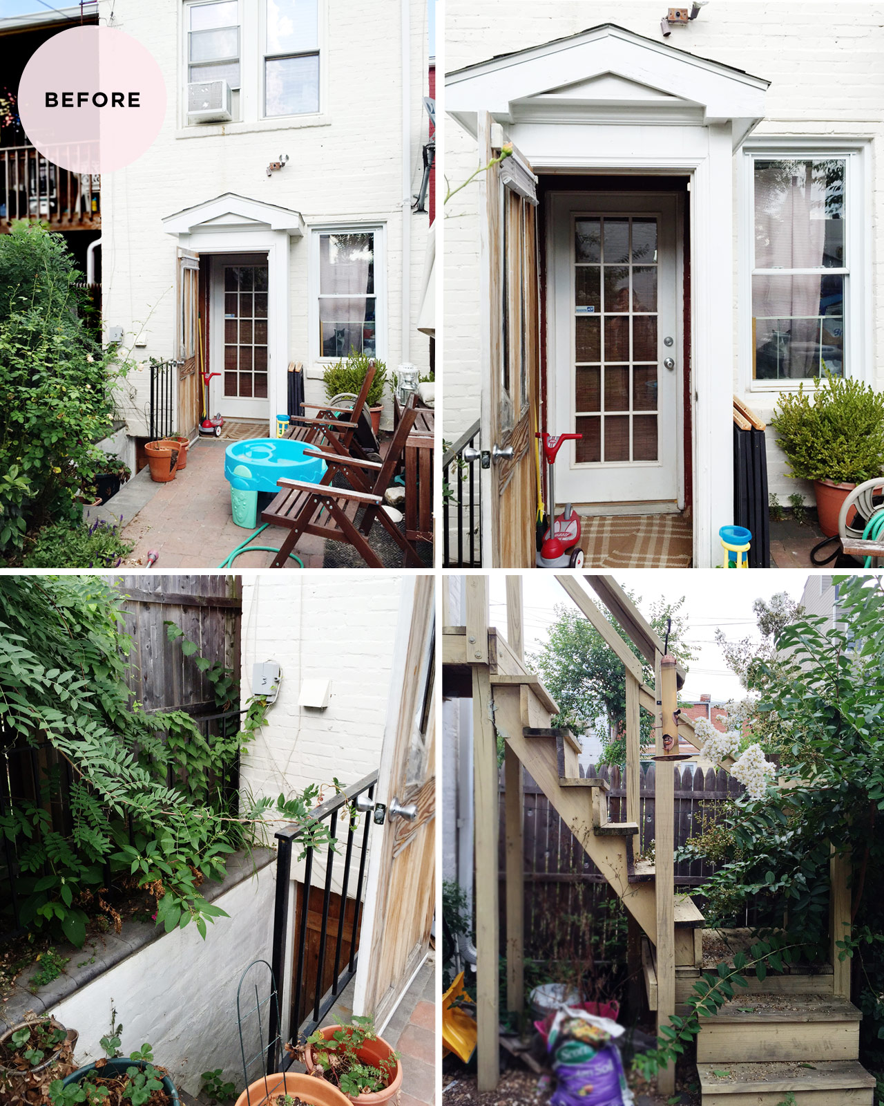
When we first started looking to buy a home, our “must-have” list was actually pretty simple: all we wanted was to find a single family home with at least two bedrooms and stay in our beloved (but very competitive) Capitol Hill neighborhood. Beyond that, we had to be really flexible! We had a very strict budget, so we quickly discovered that we needed to let go any dreams of a third bedroom, along with central air conditioning, or a finished basement. When we saw our current home for the first time, it met our very minimal must-have list, so we put in an offer right away. The interior had been updated a little bit, there were two nice size bedrooms, a good size kitchen (by DC standards), and it kept us in our neighborhood! The interior design wasn’t exactly our style, but the location made it totally worth it to look beyond the current aesthetics to see the potential in our little home. Plus, it came a major bonus hadn’t been on our list: a backyard (with a garage!). The backyard looked a little different back then, so we had to use our imagination a bit to envision all of its potential. Here’s a little before and after for you!
OSBP At Home: Backyard Before

The before: A dark rear entrance cover that leaked and was unfinished on the inside, and made it really difficult to use the outdoor space effectively. No gate on the stairs to our unfinished basement (hence all the potted plants to block my kids from falling down there). And some super scary, dangerous stairs up to the unfinished attic above our garage that took up a ton of space.
OSBP At Home: Backyard After

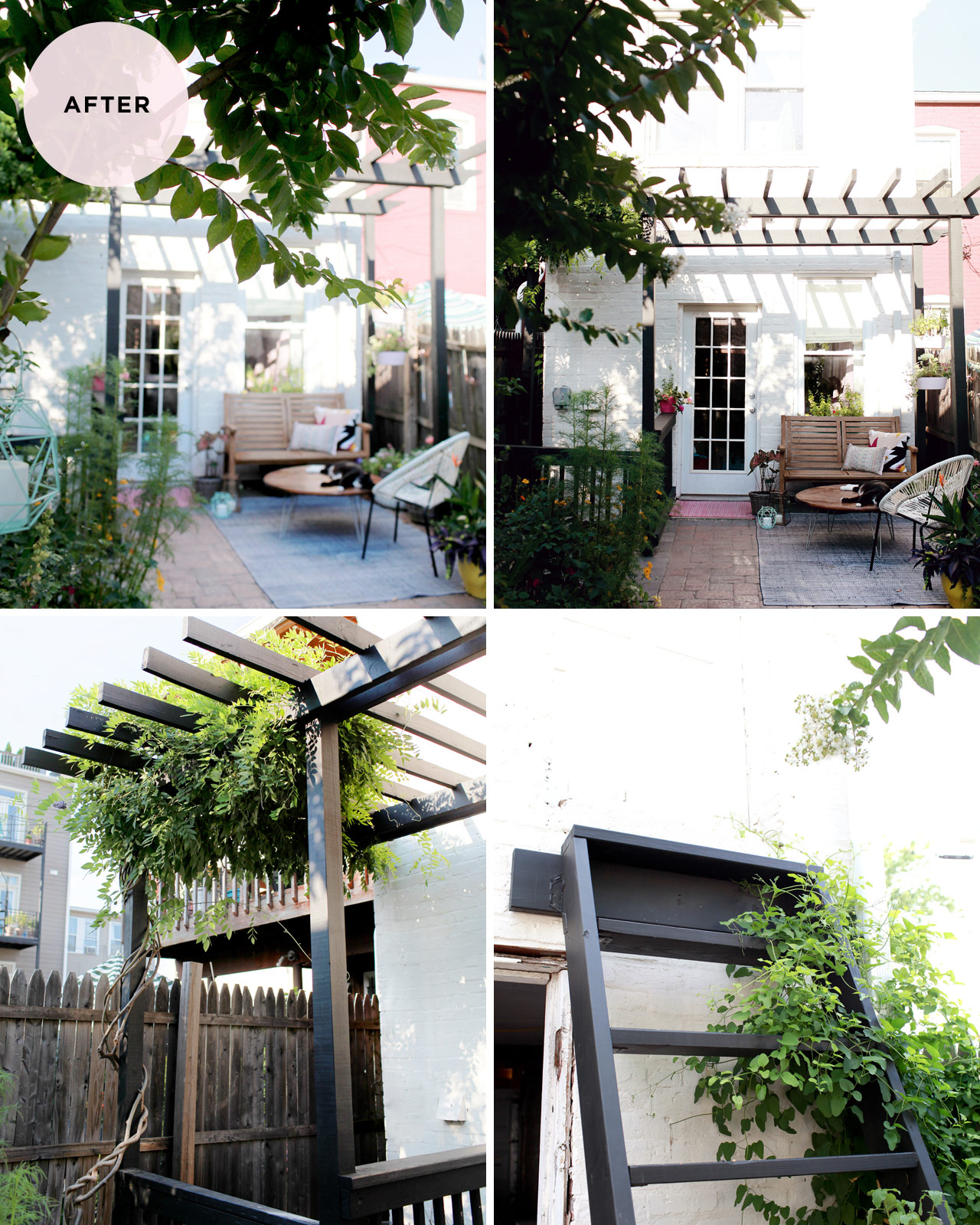
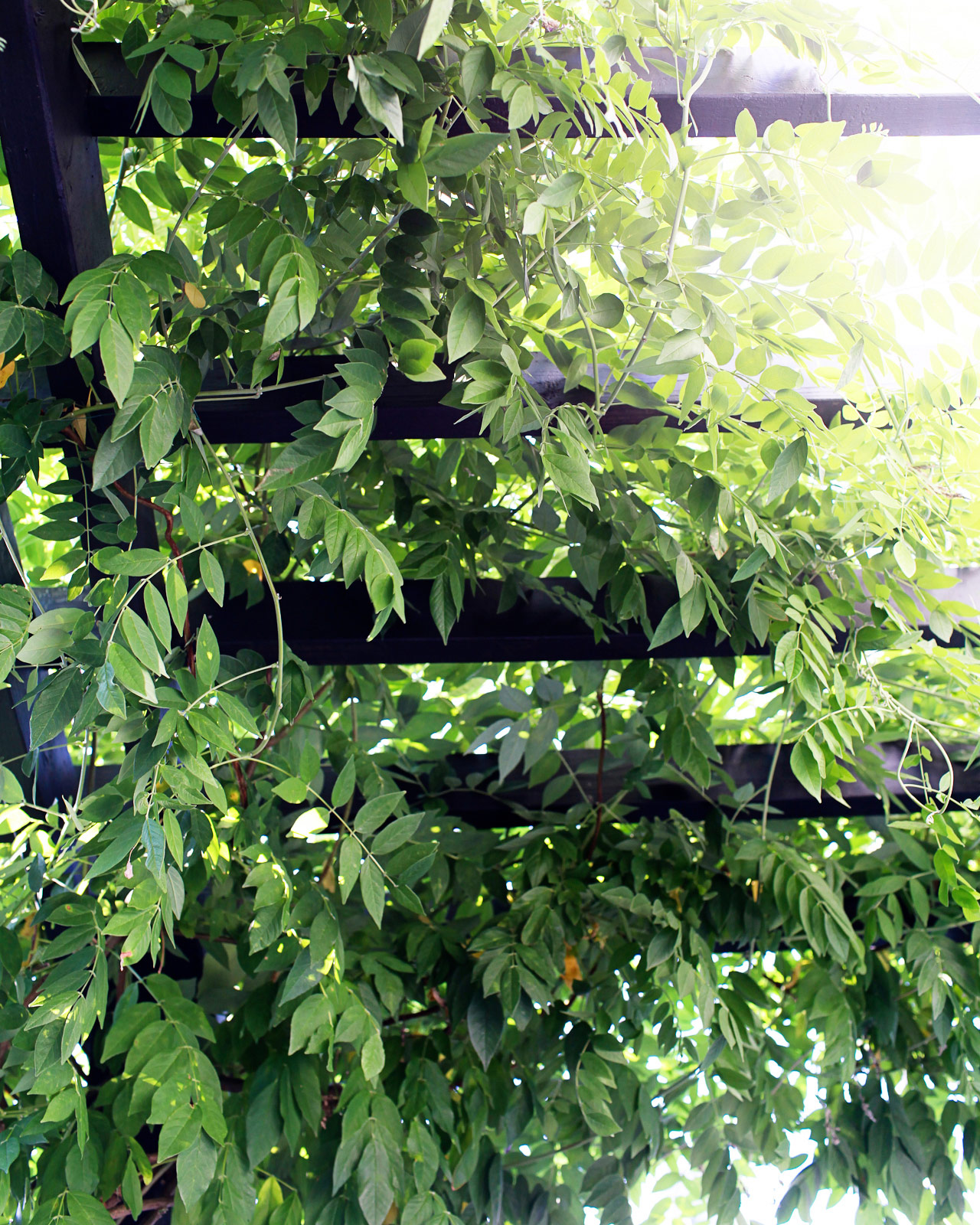
After: Goodbye entrance cover, hello wisteria-covered pergola! And yay for a gate blocking the basement stairs! We also removed the scary stairs and replaced it with a wood ladder, although we still need to add a hand rail along the sides.
How we found the hidden potential in our home's back yard!

We originally bought our home in Spring 2013 – so we’ve been here just over four years! During those four years, we’ve tried to tackle one big home project each year. Each project has given us an opportunity to add more of our style to our home and build on the potential we saw at the very beginning. Our first year in the home, we added built-in bookcases to our living room to give us some much-needed storage. The second year, we had Alice – so no home projects! In 2015, we embarked on our bathroom renovation. In 2016, we removed a weird little structure over our rear entrance and built a pergola in its place, which has dramatically improved our ability to use the space. And earlier this year, we finally had central air conditioning installed in our home! Yay! It’s definitely the biggest investment we’ve made so far in our home, but it’s soooooo worth it to finally have a temperature controlled home in the hot and humid DC summers! A kitchen renovation is next on my list if we can figure out a way to swing it.
How we found the hidden potential in our home's back yard! Photo Credit: Yetta Reid Photography

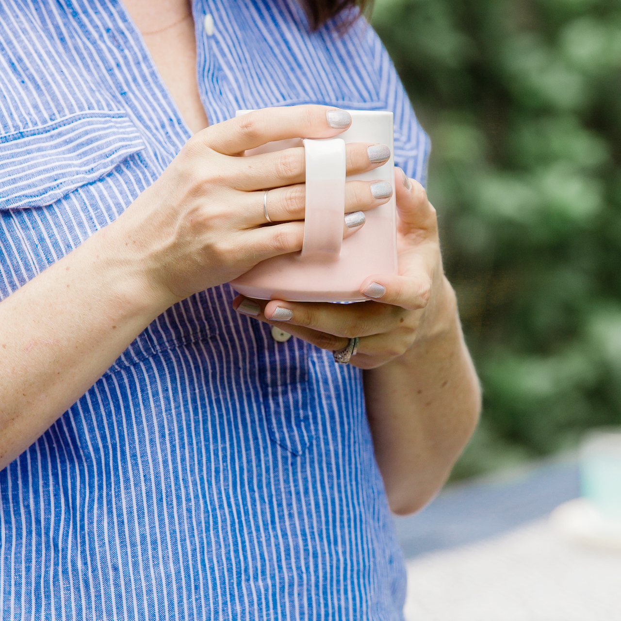
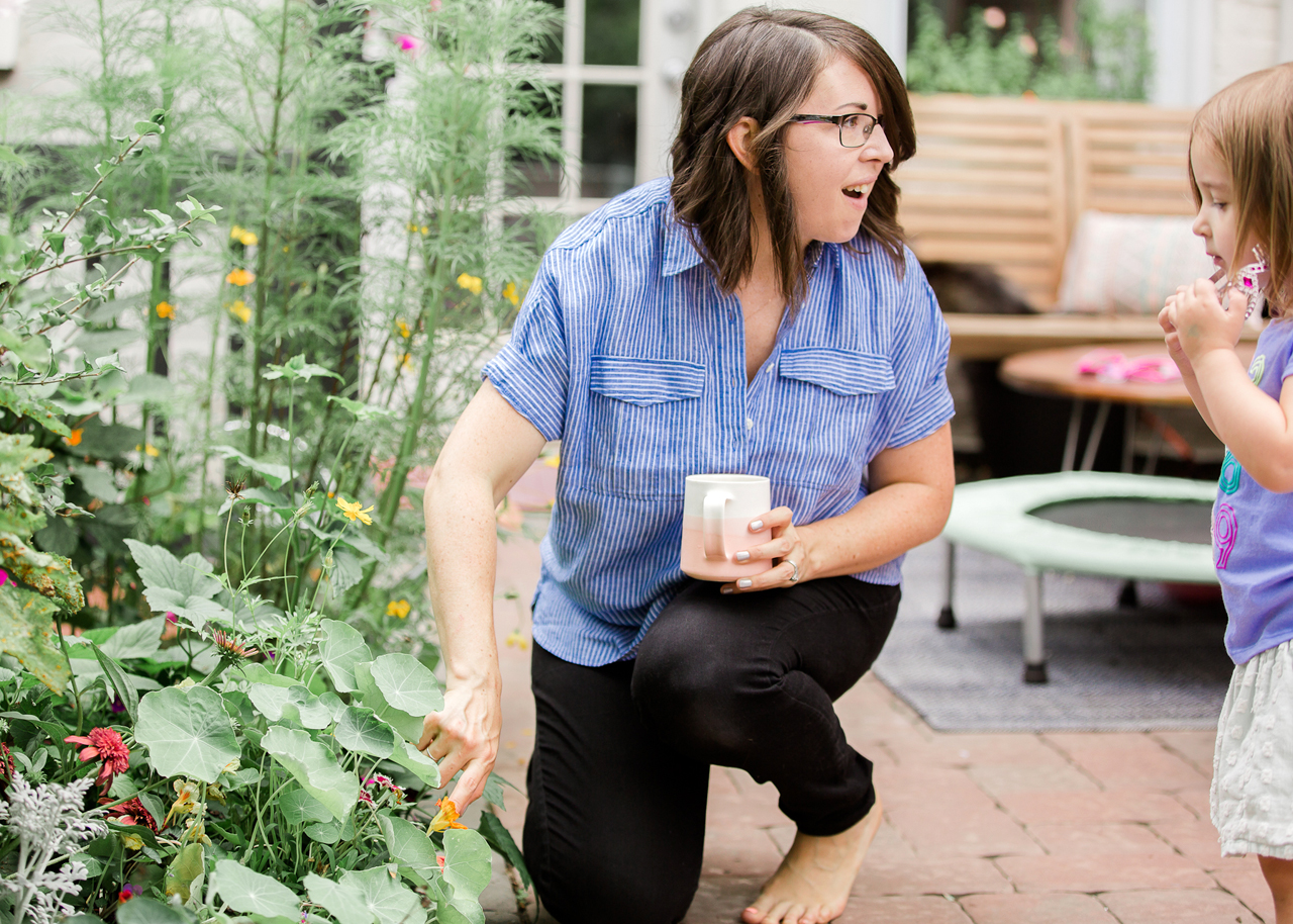
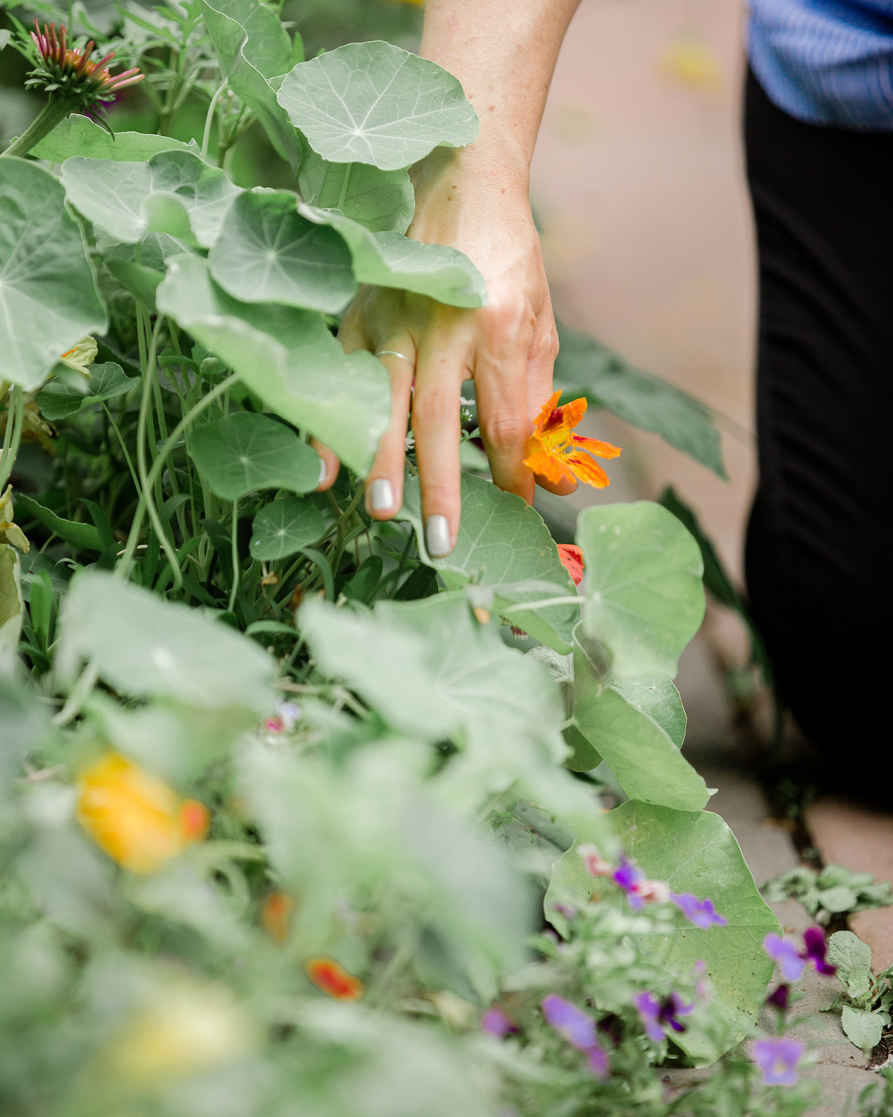
Back to the backyard! We spend a lot more time out here since we added the pergola last year, and it’s so wonderful to have a space for the girls to play while we drink our morning coffee or run around in the sprinkler on hot summer days. We even hosted the girls’ birthday party in our backyard last year! We keep a bucket of chalk by the back door, a mini trampoline and water table outside during the warm months, and frequently bring a play tent outside to turn the backyard into their mobile playroom. We also love watching for birds (we spotted a cardinal last week!) or looking through the garden for our resident preying mantis.
How we found the hidden potential in our home's back yard! Photo Credit: Yetta Reid Photography

How we found the hidden potential in our home's back yard! Photo Credit: Yetta Reid Photography

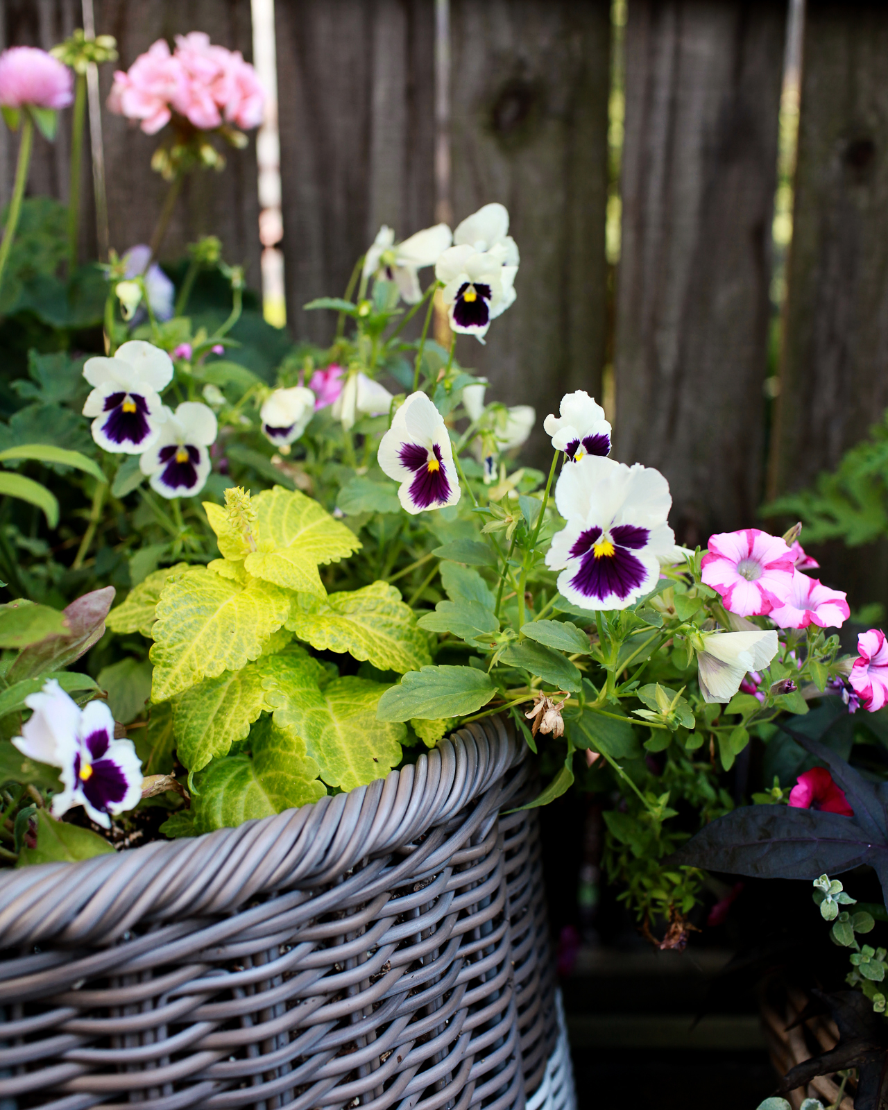
Even with all the progress in the backyard, we still aren’t 100% done out here. One of our boundary fences (which we share with our neighbor on the southern edge of our property) is rotting and needs to be replaced. I’d also love to add some sort of door to the garage – maybe a sliding barn door that we could use to close off the garage when we have company? We’ll get there eventually. In the meantime, you can usually find me out here tending to the flowers or hanging out with my girls.
How we found the hidden potential in our home's back yard! Photo Credit: Yetta Reid Photography

How we found the hidden potential in our home's back yard!

How we found the hidden potential in our home's back yard!

How we found the hidden potential in our home's back yard! Photo Credit: Yetta Reid Photography

How we found the hidden potential in our home's back yard! Photo Credit: Yetta Reid Photography

Photo Credits: before/after photos by Nole Garey, all other images by Yetta Reid Photography

This post was sponsored, and paid for, by SunTrust Mortgage. All opinions are my own. At SunTrust Mortgage, we make it a priority to learn all about your unique circumstances. Confidence starts with a conversation. Talk with a SunTrust Mortgage expert today.  

SunTrust Mortgage Disclosure

Stationery A-Z: Love and Romance Greeting Cards

If you are one of those people who often declares “every day is Valentine’s Day” then this roundup is for you. Love IS grand and there is no need to hold all that emotion for only one day a year. Whether you just started dating or you’ve been married for years, a little romance can go a long way. A beautifully designed card and a thoughtful message is an easy (and cheap) way to show someone that you’re smitten, enamored or downright swooning for them. And who wouldn’t want that?! –Shauna

Love and Romance Card Round Up

From top right:

1. Vampires may be passè, but a Bloody Mary is always a good choice for both brunch and professing your undying love. From Wild Hart Paper.

2. For when nothing else but a horizontal cartoon dog will do. Illustrated by Alice Bowsher for Wrap Magazine.

3. Apparently these hot for each other lattes drop their sleeves on the reverse side of this card. Rawr! From E. Frances Paper.

4. Remember that Buster Poindexter song “Hot Hot Hot”? Yeah, this card is kinda like that. From My Darlin.

5. Add a line about coffee to this agenda and you’ve got a close to perfect day. From Ashkahn

6. This anatomically correct(ish) heart from Hammerpress is a winner and a lover. 

7. They’re the apple of your eye, so why not let them know with this honeycomb enhanced card from Inklings Paperie?

8. Mysticism, rites of passage and love go together like naive illustrations, clever messaging and Great Lakes Goods.

9. Pucker up! This smooch-y number comes courtesy of Canadian-based Paperole. Illustrated by Maxime Francout.

10. Say it with neon pink or don’t say it at all. The neon pink liner is an extra bang for your buck. From Los Angeles-based Sugar Paper.

11. Me-ow! Enough said. From Huckleberry Press

12. Sometimes, the quickest way to the heart is also the simplest. This modern calligraphy comes courtesy of Evermore Paper Co.

Navy and White Modern Eclectic Wedding Invitations

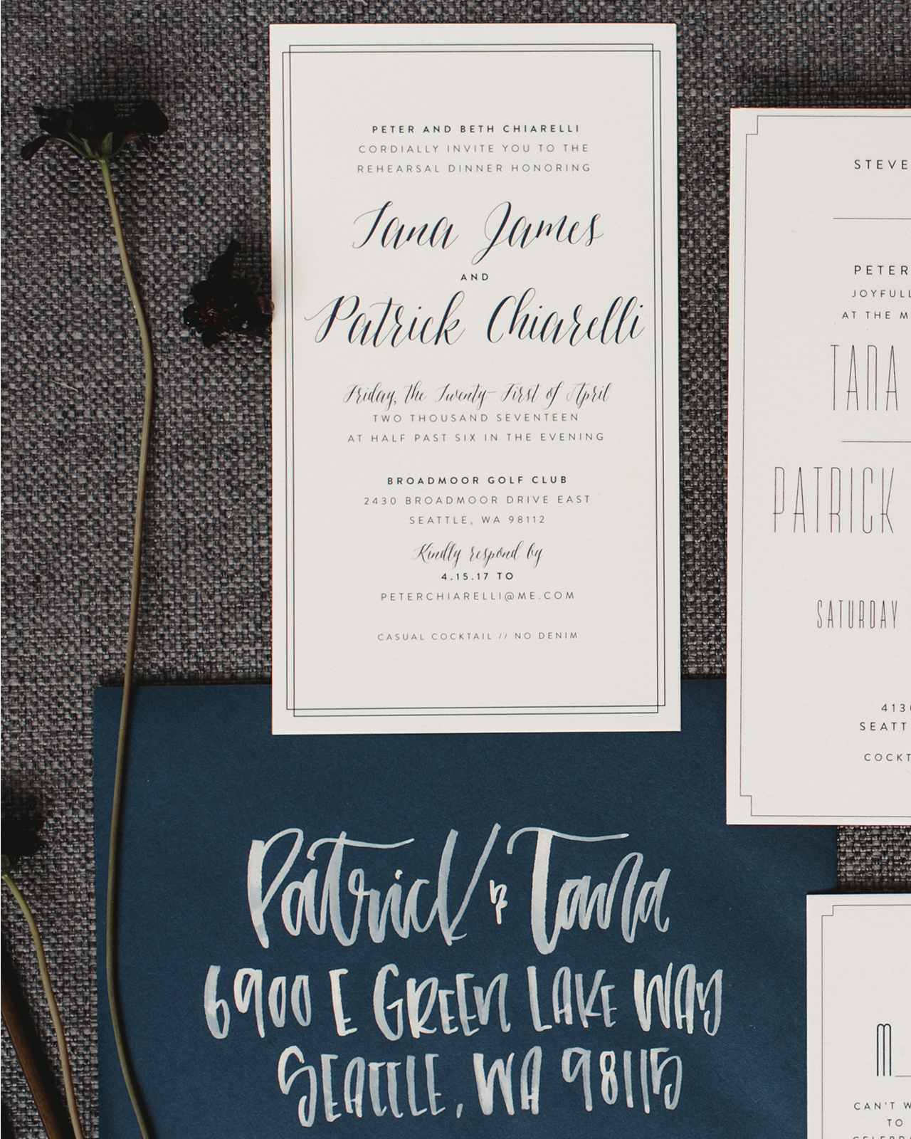
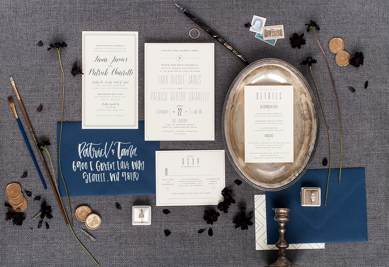
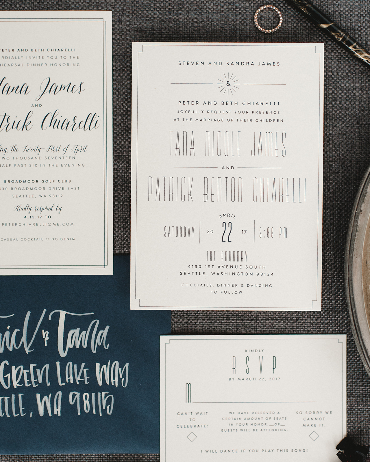
These navy and white modern eclectic wedding invitations from Camille of Robinson Paperie combine clean, modern lines inspired by the wedding venue SoDo Park with playful brush lettering on the envelopes! I love the way Camille translated the industrial cement floors and exposed air ducts into an elegant invitation design. The white brush lettering on navy envelopes and gold wax seals are the perfect finishing touches for this suite!

Navy and White Modern Eclectic Wedding Invitations by Robinson Paperie

From Camille: I actually had the pleasure of knowing the bride and groom before I started working with them. We all attended the same college and that is where Patrick and Tana met for the first time many years ago! We started Patrick and Tana’s design process by trying to incorporate the look and feel of their wedding venue, SoDo Park. A downtown Seattle venue known for its modern eclectic style, cement floors, and high vaulted ceilings with exposed ducting. It is a lovely venue that doesn’t need a lot of extra decor to feel dark and romantic but modern and elegant at the same time.

Navy and White Modern Eclectic Wedding Invitations by Robinson Paperie

I knew that I had to make something bold and beautiful, but also not let it feel like it was overpowering you with too much color or too many soft touches. Their wedding was in the spring, but aside from the time of year, the bride didn’t want to do anything with the traditional florals and watercolor she had been seeing.

Navy and White Modern Eclectic Wedding Invitations by Robinson Paperie

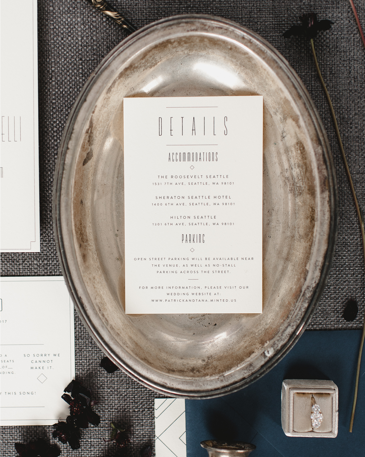
So we went on ahead with using the venue as inspiration. With its traditional finishes we stuck with clean lines, lots of white space and one of my favorite fonts of all times, Valencia. Everything was digitally printed on Crane Lettra’s Ecru White. The matte finish of the suite, mixed with a bold geometric pattern of the response card really captured the overall theme and feeling the couple was going for.

Navy and White Modern Eclectic Wedding Invitations by Robinson Paperie

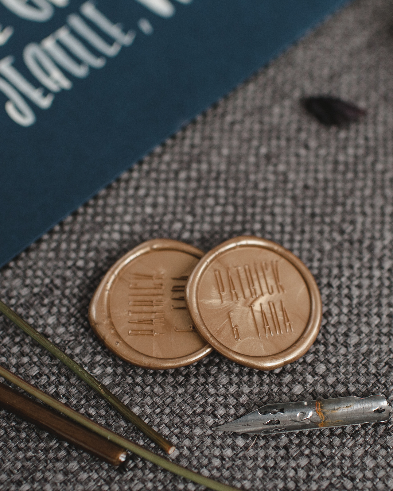
The navy guest envelope was finished with a cream brush lettering and an antique gold wax seal which added a touch of whimsy to the whole suite. We also added a rehearsal dinner invitation that mimicked the invitation suite. Overall, the bride and groom were very pleased with how everything came together and felt like it captured their look and feel perfectly!

Navy and White Modern Eclectic Wedding Invitations by Robinson Paperie

Thanks Camille!

Stationery and Hand Lettering: Robinson Paperie
Printer: Nikko Media
Florals and Styling: Cozbi Jean
Jewelry: Rachel Brooks Jewelry
Wax Seals: Waxseals.com
Ring boxes: The Mrs. Box

Check out the Designer Rolodex for more tal­ented wed­ding invi­ta­tion design­ers and the real invi­ta­tions gallery for more wedding invitation ideas!

Photo Credits: Carina Skrobecki

Happy Weekend!

Happy Friday everyone! Are you ready for the weekend? I am! Maybe it’s the heat, but this has been an extra exhausting week for me. But I think it must be the heat, because even my 4 year-old didn’t want to get out of bed this morning! On our way to camp this morning she said she was glad it was Friday so she could sleep in tomorrow. Ha! Totally my kid. Whereever you are, I hope you’re staying cool in this heat! But in the meantime…

Jennifer Vallez Illustration

Illustration by Jennifer Vallez via Instagram

…a few links for your weekend!

As the Senate debates the latest version of the Republican “health care” bill, I thought this was interesting: an analysis of the problems in our health care system. I’m personally in favor of a single payer system like Medicare for All.

This DIY “like” sticker piñata is just too cute!

Loving the colors in this tassel garland

The perfect party skirt

How cute is the gingham wallpaper in this bathroom??

We just bought this sleek wood-handled dish rack and I’m LOVING it! I also have my eye on these glass storage jars with wood lids.

Thinking about making homemade pizza for dinner this weekend – this grilled pizza looks good! Anyone have a favorite homemade pizza recipe?

Newport Beach, California friends! The new Sugar Paper store at the Lido Marina Village opens to the public on Sunday, July 16th at 11 am! The first 50 visitors will receive a $25 gift card to the store. Go check it out and report back!

Card of the week!


This week on Oh So Beautiful Paper:

You’re going to want to make these Ginger Watermelon Margaritas

The cutest tropical flamingo birthday party invitations

Behind the Stationery with Paula & Waffle

Love these White House letter writing kits

Beautiful calligraphy from our newest Designer Rolodex member: Emily Rose Ink!


That’s all for this week! See you back here on Monday! xoxo

Calligraphy Inspiration: Emily Rose Ink

Hello friends! I’m super excited to dive into the work of calligrapher Emily Asher of Emily Rose Ink today. It’s summertime, and we’re right in the peak season of being outdoors, where you want pretty things around you that feel fresh and organic, and even maybe a little romantic. That pretty much wraps up Emily’s style of calligraphy. So let’s jump in with a whole dose of lettering work that I think you’ll love. Jen

Wedding Calligraphy Inspiration from Emily Rose Ink

Photo Credit: Lea Emerson Photography

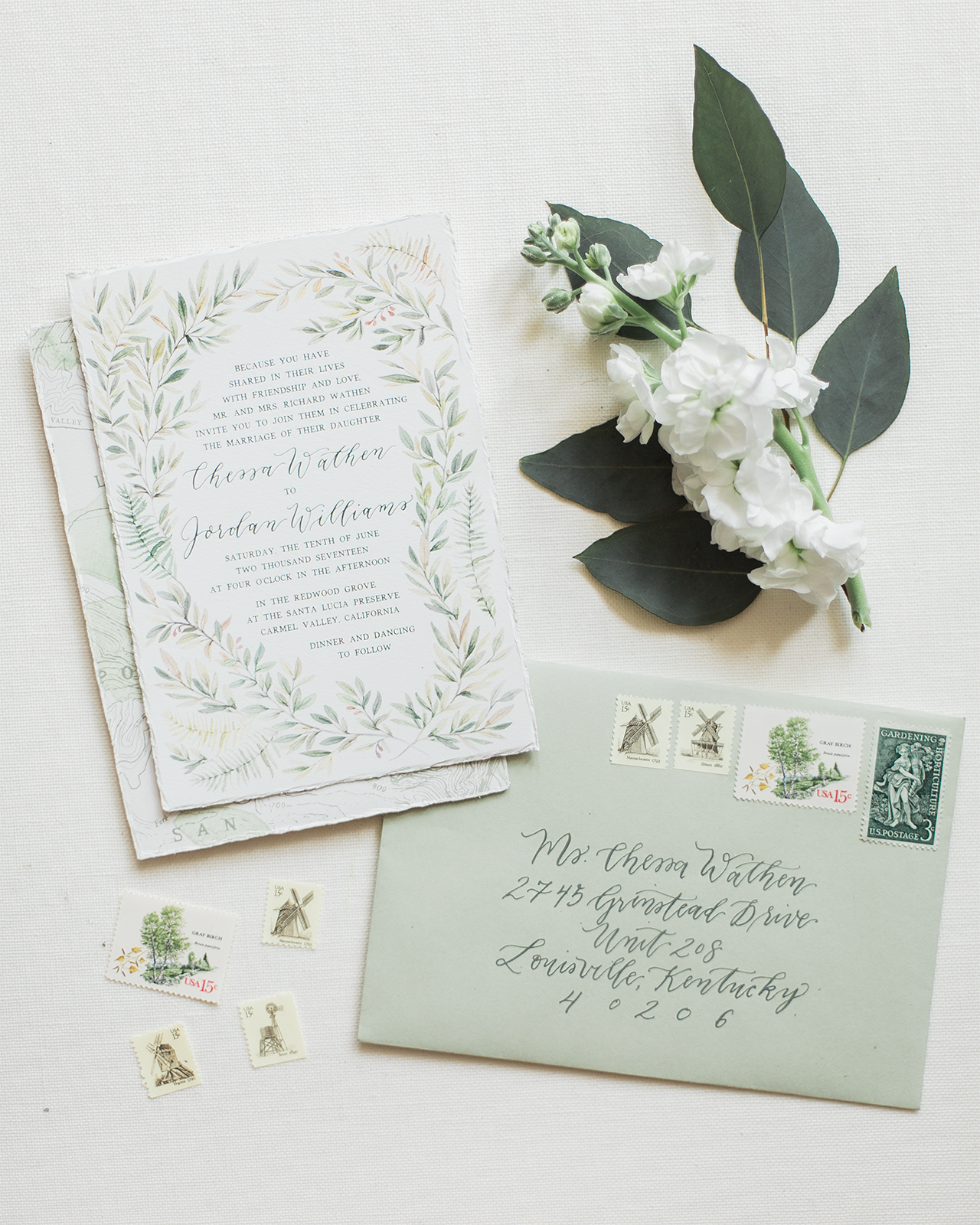
Of her inspiration, Emily shares, “I’ve found that I gravitate towards a style that feels romantic and organic but refined, a little imperfect without being too messy. I want my invitations to convey the formality deserving of a wedding without feeling stuffy or too traditional.”

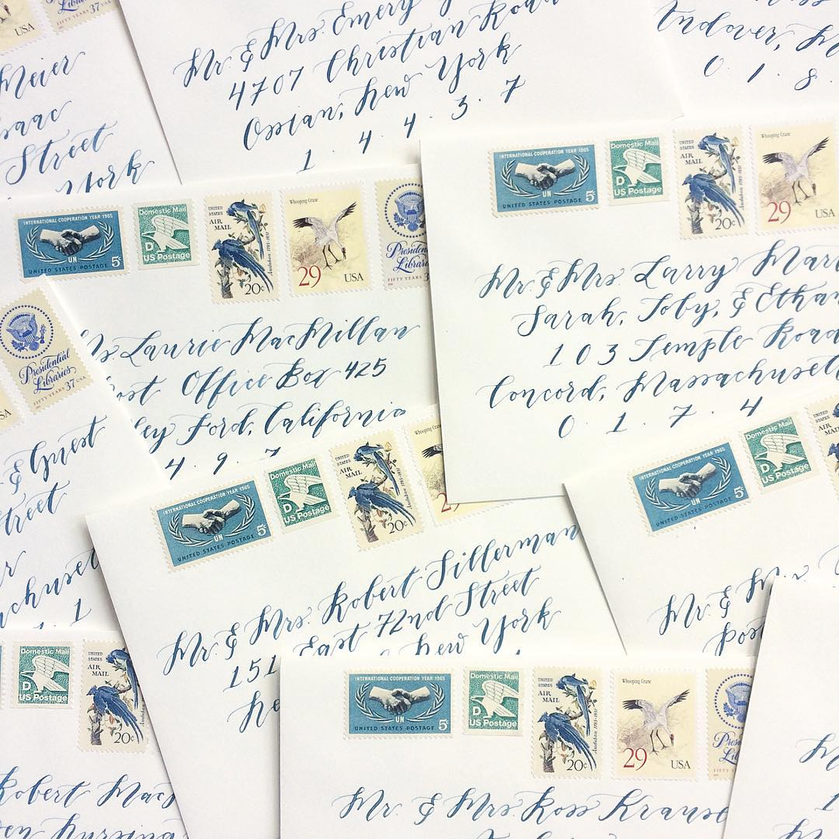
Calligraphy and Vintage Stamp Envelope Inspiration from Emily Rose Ink

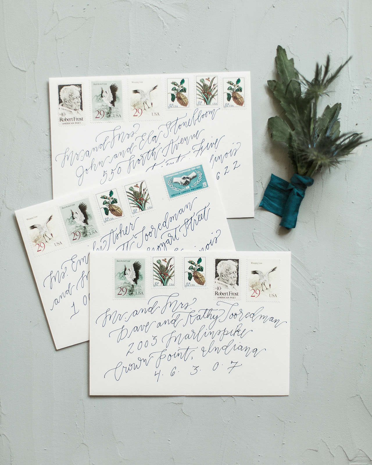
Emily likes to use vintage stamps with her wedding projects. “It’s fun for me to choose stamps that correspond to the couple’s geographical location, their history, or their interests, and they dress up an envelope in a way that makes each guest feel like they are opening a beautifully decorated gift when they receive their invitation.”

Wedding Calligraphy Inspiration from Emily Rose Ink

Wedding Calligraphy Inspiration from Emily Rose Ink

Wedding Calligraphy Inspiration from Emily Rose Ink

Photos: Leah Emerson Photography

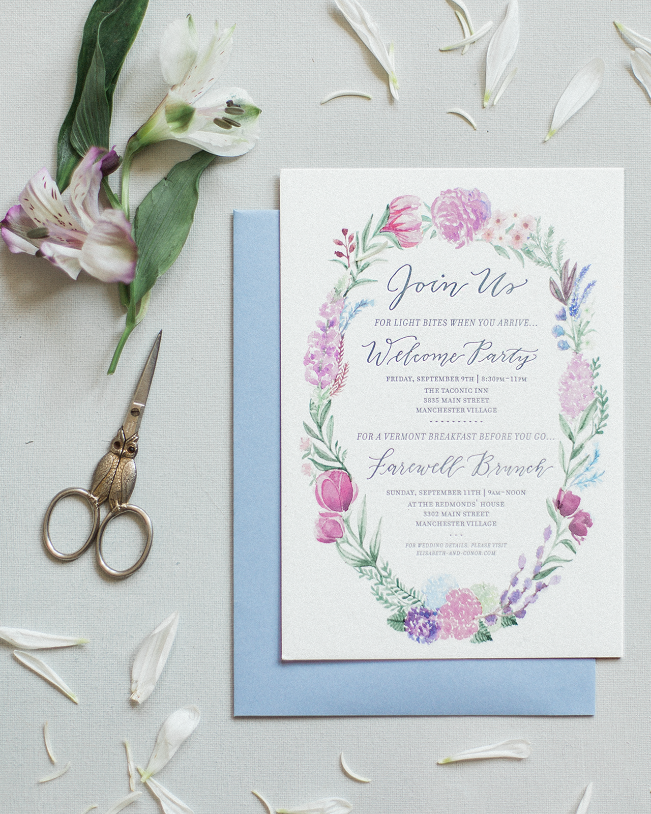
“I am definitely inspired by nature and often my invitations have a sense of place – whether it’s a venue illustration or a floral border inspired by the local colors and varieties of flowers that will be used in their wedding,” shares Emily. This is one invitation for a welcome party that I’d want to frame afterwards!

Wedding Calligraphy Inspiration from Emily Rose Ink

Photo: Tim Tab Photography

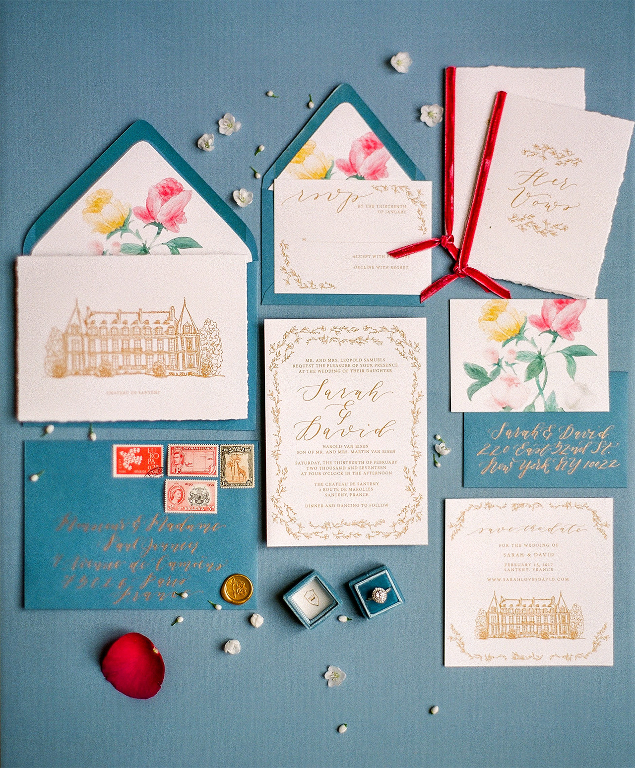
I love this color palette for an invitation suite. That’s such a pretty blue and I love how it pairs with the reds.

“Lately I’ve been doing a lot of venue illustrations – both detailed architectural line drawings and watercolor scenes inspired by the natural beauty of the venue — and I love giving guests a preview of the wedding in this way,” says Emily. “The invitations also then serve as mementos for the couple, pieces of art that they can cherish forever.”

Wedding Calligraphy Inspiration from Emily Rose Ink

Photo Credit: Lea Emerson Photography

Wedding Calligraphy Inspiration from Emily Rose Ink

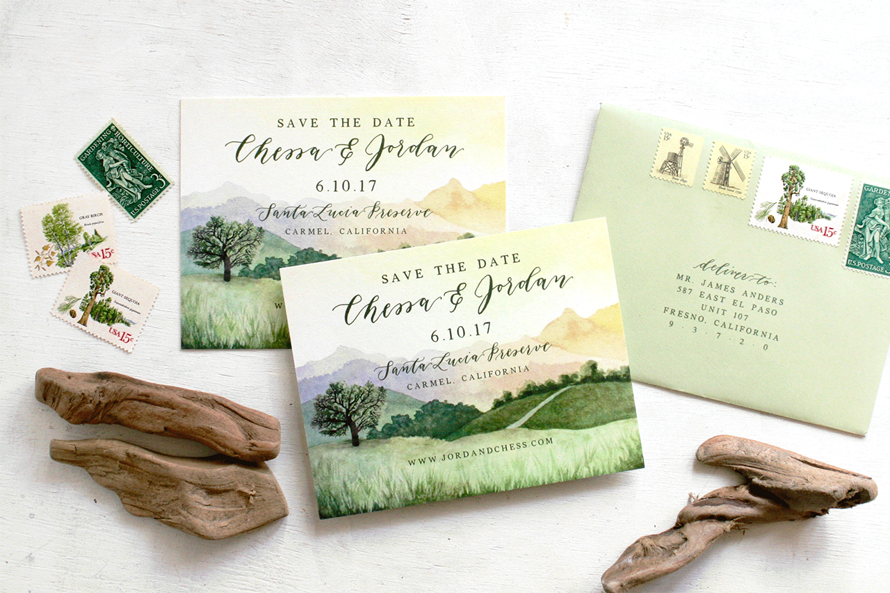
Check out these Save the Dates by Emily! Talk about a keeper — the California landscape looks so cool on those cards.

Wedding Calligraphy Inspiration from Emily Rose Ink

Photo: Maria Harte Photography

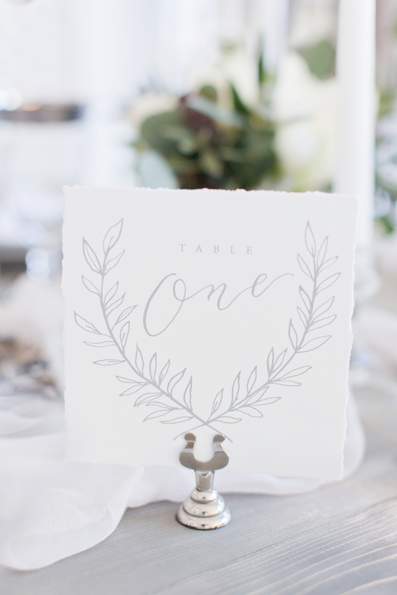
Here’s an example of when subtle is so perfect. The soft gray tones of the lettering and vine illustration on this table card makes the design feel more modern.

Thanks so much to Emily of Emily Rose Ink for sharing a peek of her work. See you soon, friends!

Emily Rose Ink is a member of the Oh So Beautiful Paper Designer Rolodex – you can see more of her work right here!