Melissa + Francisco’s Spanish Calligraphy Wedding Invitations

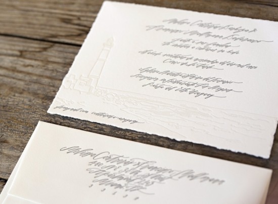
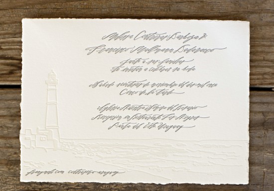
It’s always a good day when a wedding invitation from Kathryn at Black­bird Letterpress shows up in my inbox.  Kathryn created these gorgeous wedding invitations for an upcoming wedding in Uruguay; the invitation design was inspired by a lighthouse near the wedding venue.  The invitation features the beautiful hand lettering of Betsy Dun­lap (written in Spanish!), and I love that the bride and groom added a wax seal to the envelope prior to mailing the invitations out to their guests!

From Kathryn: The bride and groom are getting married in Uruguay.  Melissa, the bride, sent me a few photos of the shore and lighthouse where they were getting married and I designed from there.  The couple are originally from Argentina and Venezuela and live in Miami.  The invitation is written in Spanish in Betsy Dunlap’s beautiful calligraphy.  Melissa also wrote a sweet post about the invitations on her blog showing a beautiful wax seal detail they added to the envelope.

Thanks Kathryn!

Design and Print­ing: Black­bird Letterpress

Cal­lig­ra­phy: Betsy Dun­lap

Black­bird Let­ter­press is a mem­ber of the Designer Rolodex – you can see more of their beau­ti­ful work right here or visit the real invi­ta­tions gallery for more wedding invitation ideas!

Photo Credits: 1 – 3 by Ben Christensen Photography, Wax seal image by Melissa

Pretty Paper in the Office: Hand Drawn

Being a fan of hand lettering, it should come as no surprise that any hand drawn element would catch my eye.  The perfectly imperfect touch adds just the right amount of charm and whimsy to any blank canvas, or in this case, any blank sheet of paper.  Inspired by drawings, doodles, and brushstrokes, I’ve put together a round up that will soften the straight and narrow lines of office stationery.

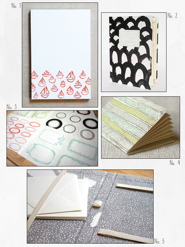
Hand drawn inspired office stationery roundup
No. 1 Sailboats notepad by Linda & Harriett; No. 2 Address book with handmade cover by My Name Is Rabbit; No. 3 Letterpress sticker set by 1 canoe 2; No. 4 Herringbone jotter by Wit & Whistle; No. 5 Monogrammed letterpress stationery set by Book Meat

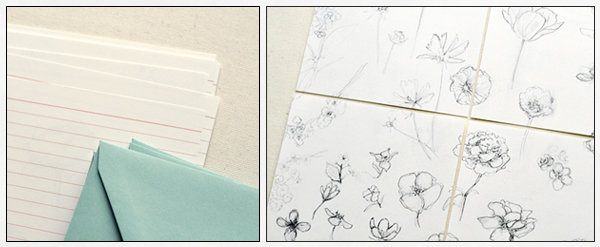
Hand drawn office stationery detail

Last, but certainly not least, is This Year’s Flowers (a stationery set) by Paper & Type.  I was sold upon seeing the romantic floral illustrations on the back of each sheet.  Paper & Type recommends that letters be four pages in length so that, once put together, you will have also mailed a piece of art!

{images via their respective sources}

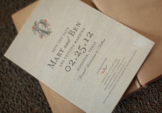
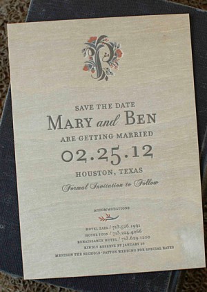
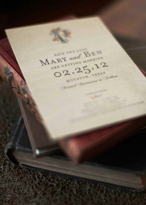
Mary + Ben’s Elegant and Rustic Wood Veneer Save the Dates

Mary and Ben’s save the dates are a wonderful mix of elegant and rustic, modern and classic.  Melissa and Amy from Atheneum Creative were inspired by Mary and Ben’s love of nature, pairing delicate blooms with simple and elegant text.  Once again, they partnered with Sideshow Press to letterpress print the save the dates on a thin sheet of wood veneer for a subtle rustic look.

From Melissa + Amy:  Mary and Ben love the outdoors and nature and the idea of bringing in natural textures, like wood and burlap, but did not want their wedding to come across as too earthy.  We developed a wedding logo that would really convey their love of nature while keeping it simple and personal, eventually deciding on a 4-color letter P (for the groom’s last name) intertwined with blooming flowers.  We kept the type very modern, giving us that subtle rustic look we wanted.


Thanks Melissa + Amy!

Design: Atheneum Creative

Letterpress Printing: Sideshow Press

Check out the Designer Rolodex for more tal­ented wed­ding invi­ta­tion design­ers and the real invi­ta­tions gallery for more beau­ti­ful cus­tom invitations!

Photo Credits: Chelsea Davis Photography

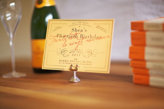
Shea’s Veuve Clicquot-Inspired 30th Birthday Party Invitations

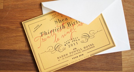
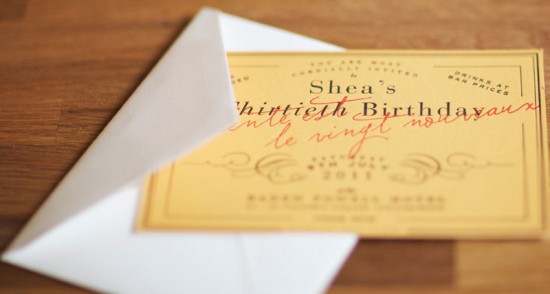
These 30th birthday party invitations are so much fun!  Amy from the Brisbane, Australia-based St. Gertrude Design and Letterpress created the design around the client’s love for champagne – what better way to celebrate a thirtieth birthday?  The invitations combine letterpress and giclée printing, elegant flourishes, and a bright and happy color palette.

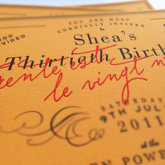
From Amy: My lovely client Shea is a self-confessed champagne fiend.  Her friends know her as quite the champagne connoisseur, so we worked with the theme to create a Veuve Clicquot-inspired invitation that set the tone for a sophisticated 30th birthday party.  The invitations were letterpress printed in two colours onto Pearl White Crane Lettra, then coloured in the very distinctive Veuve palette using a giclee printer.

The first little hint the recipient got was this happy, happy, happy burst of Veuve yellow peeking out from pearl white cotton envelopes.  In place of the grand widow’s red signature, a phrase was scribbled: “Trente est le vingt nouveaux” (“Thirty is the new Twenty”).  Those who spoke French laughed.  Those who didn’t Googled it.  Then laughed.

Thanks Amy!

Photo Credits: Structured Pieces

2012 Monthly and Weekly Planner from Laurel Denise

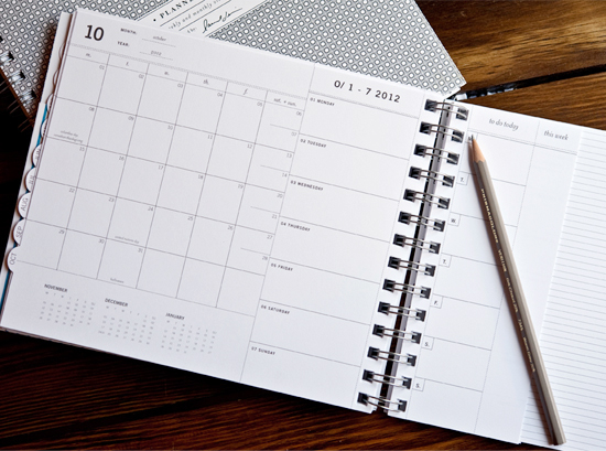
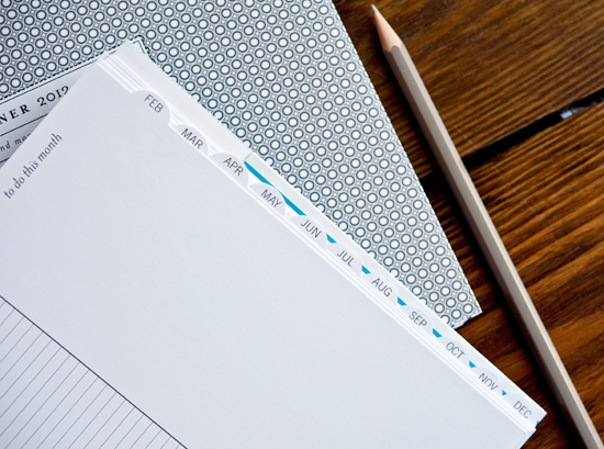
It always happens right around this time of year – requests start pouring in for fabulous planners and organizers.  As it turns out, it’s hard to find a planner that is both functional and pretty!  For the last few years, my favorite planner has been this amazing monthly and weekly planner from Laurel Denise, and I’m thrilled to share the 2012 edition with all of you today!

Laurel’s 2012 planner comes in a variety of colors, all spiral bound and with tons of space to write out to do lists and goals for each month.  You can view monthly and weekly pages at the same time, and at 7″ x 8.5″ the planner is easy to carry around in a purse or tote bag.  You can read all about the design right here!

For something a bit extra, Laurel is generously offering Oh So Beautiful Paper readers a special large format to do list that you can use in concert with the 2012 planner.  You can download the PDF right here!  Thanks Laurel!

Photo Credits: Marcy May Photography