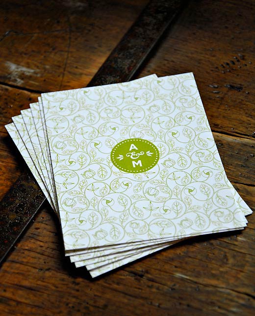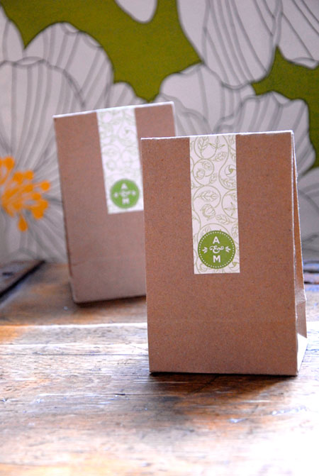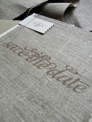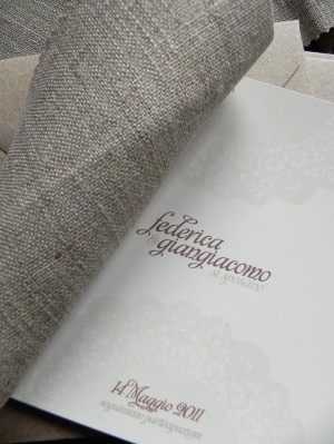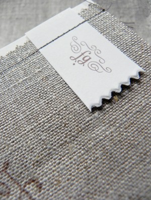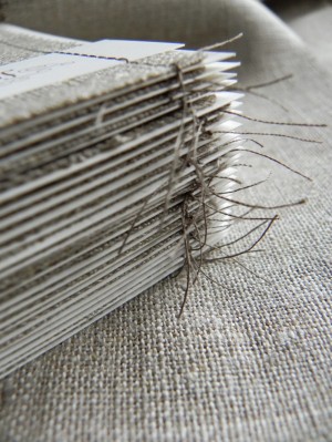
Hello there!  It’s Kate from Wit + Delight, filling in with Jane while Nole takes a well deserved blogging break.  Nole featured our Save the Dates almost a year ago, and I thought it’d be fun to share our wedding invitations with you all.

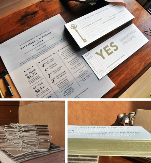
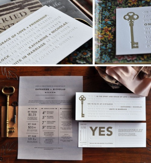
We knew that we wanted the invitations to be simple and classic, with a vintage twist.  We decided on a somewhat unconventional format, using a blind hit with letterpress for most of the typography, emphasizing our names.  The vellum sheet served as a place to put additional information.  We added subtle details, such as gold edges, vellum wraps, and guests were asked to tear the perforated edge of the rsvp card to return.

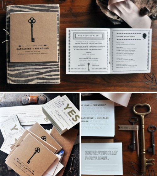
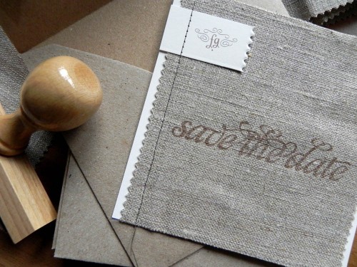
Our programs integrated some design elements from our save the dates, but still felt classic and refined. Â We printed the entire piece digitally, punched holes along the center fold, and tied the piece together with twine. Â They turned out beautifully!
{image credits: kate gabriel}

