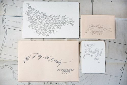
Red Calligraphy + Ribbon Wedding Invitations

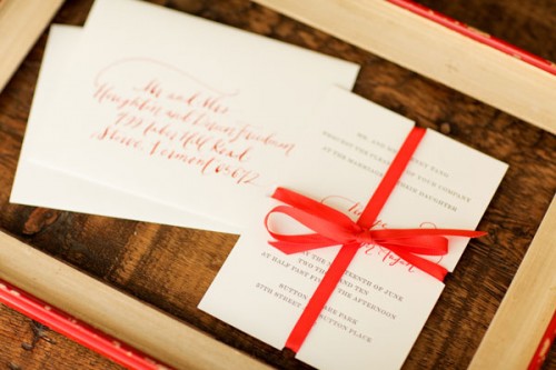
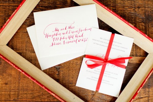
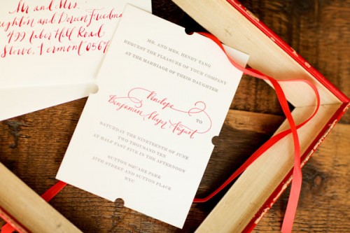
Red, gray, and white is one of my favorite color combinations any time of year – but is even more so during the winter holiday season.  Bryn from Paperfinger provided calligraphy for these wedding invitations, letterpress printed  in a gorgeous shade of red and soft gray by Coeur Noir.  I also love the use of red ribbon and notching detail for an added little touch.

red-calligraphy-letterpress-wedding-invitations-ribbon

red-calligraphy-wedding-invitations

red-calligraphy-letterpress-wedding-invitations

{all photos by Jen Huang Photography via paper tastebuds}

Happy New Year!

Happy 2011 everyone!  It was so nice to take a little break and unplug last week, but I’m slowly easing back into my routine.  I still haven’t really wrapped my head around 2011 yet, have you?  2010 was such a whirlwind and full of transition from start to finish.  I met some of my favorite bloggers (and make new friends) at Alt, moved to a new apartment that feels more like home, and lost my grandmother – all within the first month of 2010.  A winter storm left us with more than 2 feet of snow and kept us housebound for nearly a full week.  A bit later in the year I quit my day job (yay!), started a second blog, and then the months started to fly by even faster.  There are more big changes in store for 2011, but I’m optimistic about the challenges to come.

I’ll be back with some beautiful wedding invitations just a bit later.  But since I didn’t do my usual weekly round-up last week, I thought I’d do a quick round-up to start off the week:

I hope you all had a wonderful holiday and New Year!

{image via mary ruffle}

Best of 2010 Wedding Invitations: Calligraphy + Blind Impression Maps

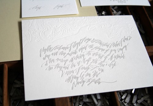
There’s nothing like a beautiful letterpress blind impression to make me go a bit weak in the knees, but combine that technique with map design details and modern calligraphy, and I’m officially swooning.

New Orleans Map Modern Calligraphy Letterpress Wedding Invitations

Modern-Calligraphy-Topography-Letterpress-Wedding-Invitation

Both invitations are the result of collaborations between Kathryn from Blackbird Letterpress and calligrapher Betsy Dunlap.  Printed on super thick paper with Betsy’s calligraphy letterpress printed in a soft gray, both invitations are truly frame-worthy works of art.  Check out Riley and Robert’s New Orleans wedding invitation suite here and Phyllis and Armstead’s topographic map wedding invitation suite here!

{image credits: Blackbird Letterpress}

Best of 2010 Wedding Invitations: Metallics + Foils

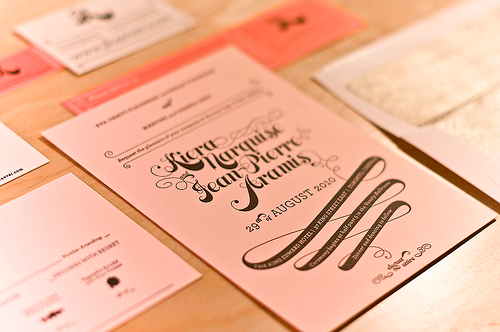
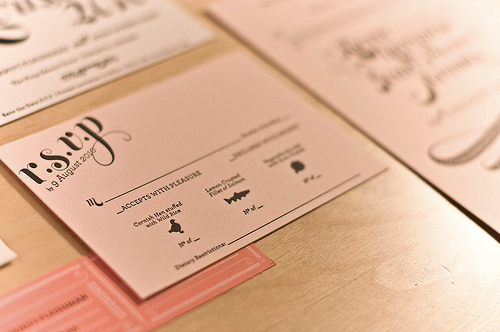
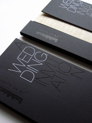
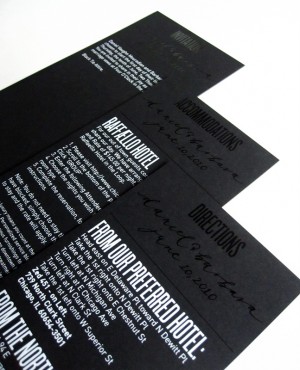
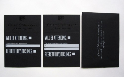
If this year was any indication, I’m expecting metallic inks and foil stamp elements to be a big trend in 2011 wedding invitations.  Kiera and JP’s gold and pink wedding invitations were one of my personal favorites from 2010, and Dan and Barbara’s modern black and white wedding invitations received one of the biggest reader responses of 2010!

Pink-Gold-Letterpress-Wedding-Invitations

Kiera and JP’s wedding invitations are both whimsical and elegant – and quite possibly one of the most sophisticated uses of pink that I’ve ever seen!  Check out the original post right here.

Pink-Gold-Letterpress-Wedding-Invitations

Dan and Barbara’s wedding invitations combined crisp and modern black and white design elements with romantic calligraphy from Mara at Neither Snow – so gorgeous.  Check out the original post right here!

Black-White-Modern-Foil-Stamp-Wedding-Invitation Black-White-Modern-Foil-Stamp-Wedding-Invitation

Black-White-Modern-Foil-Stamp-Wedding-Invitations

{image credits: kiera and jp; barbara mouradian}

Best of 2010 Wedding Invitations: Youngna + Jacob

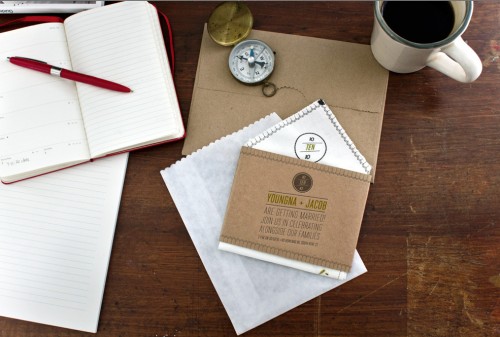
I’m cheating just a teeny bit with this next favorite pick, since this is the first time I’m featuring Youngna and Jacob‘s wedding invitations.  I first found these invitations through Tina (aka Swissmiss) on twitter back in August, and I’m thrilled to finally have a chance to feature these lovely handkerchief wedding invitations.
Modern-Handkerchief-Map-Wedding-Invitation

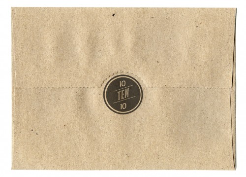
Modern-Handkerchief-Map-Wedding-Invitation-Envelope

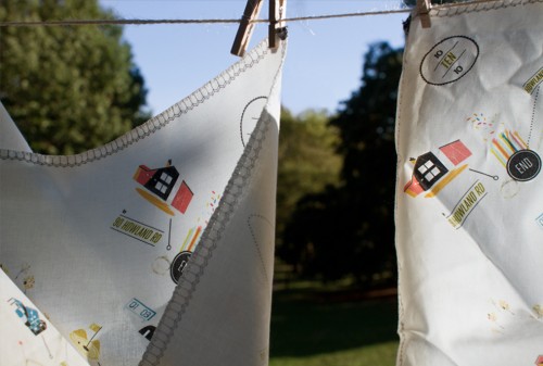
From Youngna: Jacob and I selected our designer (our friend Kelli Anderson) before our invitation idea.  I’d bookmarked a lot of concepts/typefaces and color schemes that spoke to me, but I also knew we weren’t going to have strict wedding colors.  I had liked a set of invitations I saw that were printed vintage handkerchiefs on a wedding blog, and also thought it’d be great to incorporate either fabric or some other non-paper materials.
Modern-Handkerchief-Map-Wedding-Invitation

Modern-Handkerchief-Map-Wedding-Invitation

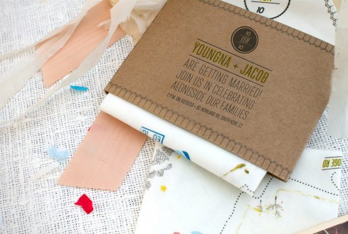
We had driven up to the wedding location once and there was a notably windy path to get there that included passing this wild-looking former mental hospital, going under a covered bridge, and then passing many distinct-looking landmarks. Then, we sat down with Kelli and started expressing ideas.  We talked about using minimal text to reduce the number of different pieces that were part of the invitation – I’m always shocked by those invitations that have 4 or 5 or 6 inserts – it’s so much paper!  We were able to keep the text minimal by directing people to our website where they can find the bulk of wedding details and only putting the key info on the sleeve that wrapped around the hanky.
Modern-Handkerchief-Map-Wedding-Invitation-Unfolded

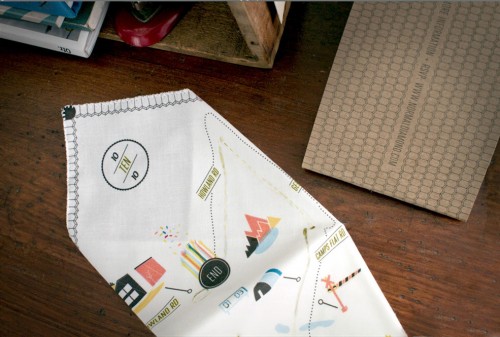
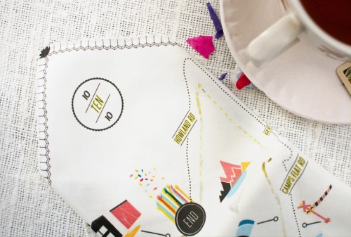
Based on our driving experience to the wedding location, winding through the woods and up the mountain, we also proposed that the invite incorporate a map which would serve as equal parts keepsake and functional item.  Kelli suggested the map handkerchiefs, which Jacob and I immediately loved.  I then gave Kelli written directions and pictures of some of the notable buildings and landmarks that I’d photographed along the way, which she plotted out against Google maps.
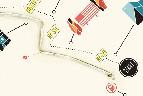
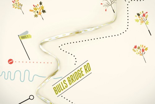
Modern-Handkerchief-Map-Wedding-Invitation-Detail

Modern-Handkerchief-Map-Wedding-Invitation-Detail

Modern-Handkerchief-Map-Wedding-Invitation-Detail

We went through a few rounds of tweaks since I really wanted the map to be accurate, and Kelli really made all the elements of the design so beautiful.  The typeface on both the handkerchief and elsewhere on the invite is inspired by old 1950s “Welcome to…” travel postcards.
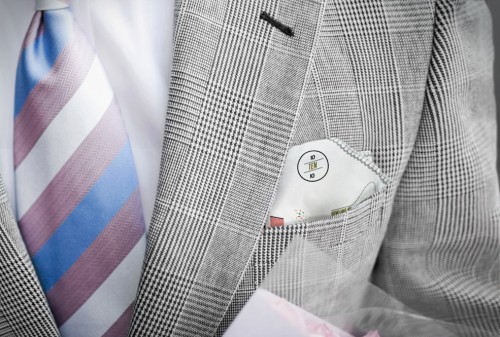
Modern-Handkerchief-Map-Wedding-Invitation-Pocket-Square

We like the idea of people bringing these to the wedding (or hanging them in their apartments — something a few friends have written to us to let us know they have done), guys tucking them in their suit pockets, and them being used again and again for all different purposes.
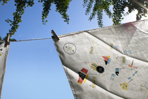
Modern-Handkerchief-Map-Wedding-Invitation-Corner

Modern-Handkerchief-Map-Wedding-Invitation-Hanging

Thank you so much Youngna and Jacob!  For more on the making of these beautiful map handkerchief wedding invitations, definitely check out Kelli’s blog!

For more wedding invitation inspiration, check out the wedding invitation gallery!

{image credits: Kelli Anderson}